Mobile Photography/Art Tutorial – Tintype by Hipstamatic: Nice results, troubling interface
We are delighted to publish Jerry Jobe’s latest mobile photography/art tutorial for our reading and viewing pleasure. This week Jobe takes a look TinType by Hipstamatic. Read his thoughts as he puts it through its paces (foreword by Joanne Carter).
TinType by Hipstamatic is free and you can download it here
“Last time I covered an app that emulated a particular type of photography: Polaroid, or instant, photography. This week I go back to the dawn of photography and the time when photo prints did not come on paper, but on metal: the tintype.
Polaroids were all about catching the moment; tintypes were the opposite. Painstakingly staged and allowing for no movement, tintypes have a static look that warrant the use of a permanent metal to print them.
The app Tintype is made by Hipstamatic, who have some experience with the look in their Tintype Hipstamatic Pak, which included the Tinto 1884 lens and D-Plate and C-Plate films. When separating the Tintype look into its own app, you’d expect that Hipstamatic would add value by giving you more control over the look of the resulting output. Unfortunately, that expectation is both true and not true”.
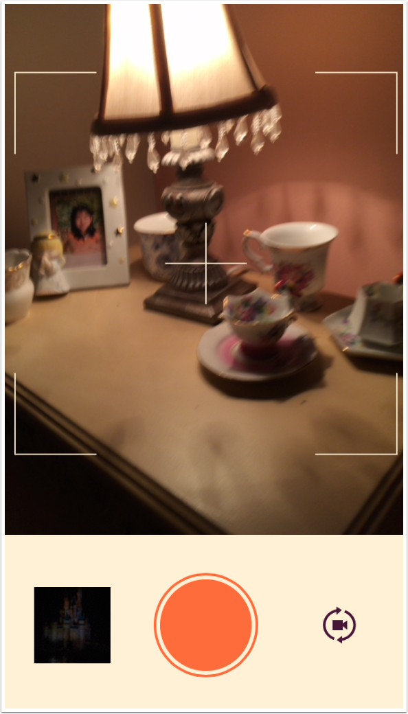
Just like Polamatic, the app is simple to use. It starts you with the camera, with controls to choose an image from your library or switch from the rear to the front camera. There’s a box in the center to show you what would be included in a square image.
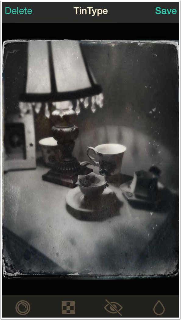
After capturing the image, you are taken to the Edit screen with the effect already applied. At the top are options to Delete or Save the capture. At the bottom are four buttons. From left to right, they are Style/Crop, Frame, Eye Intensity, and Depth of Field.
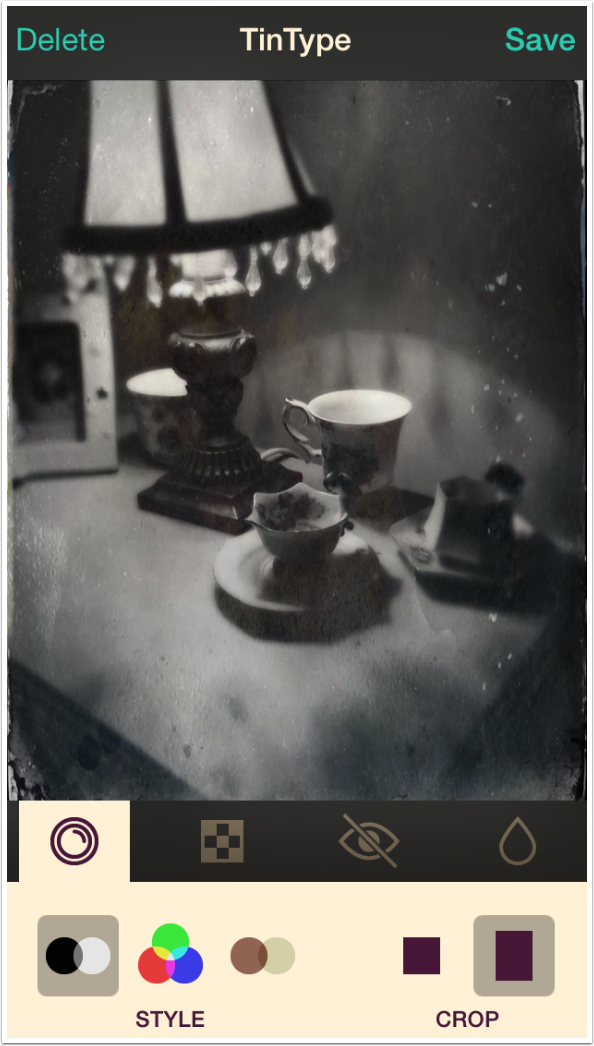
Tapping the Style/Cop button brings up the options for Style and Crop. The three Styles are black and white, color and sepia. Black and white is the default.
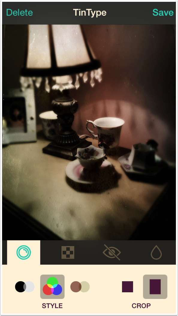
The Color Style is a muted color, as you would expect from an emulation of a process from before Technicolor.
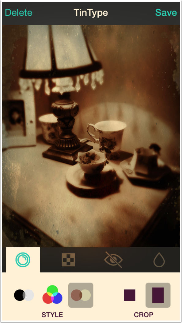
The Sepia has a bit too much color for my taste. I would take my sepia images into Snapseed or some other editing app to desaturate them further.
Crop leaves you with two options: original and square. Tintype does not allow for zooming or dragging the crop box; a square crop is always taken out of the exact center of the image, whether the image is captured or comes from the Camera Roll. This is the first instance where the user is allowed some control, but not nearly enough.
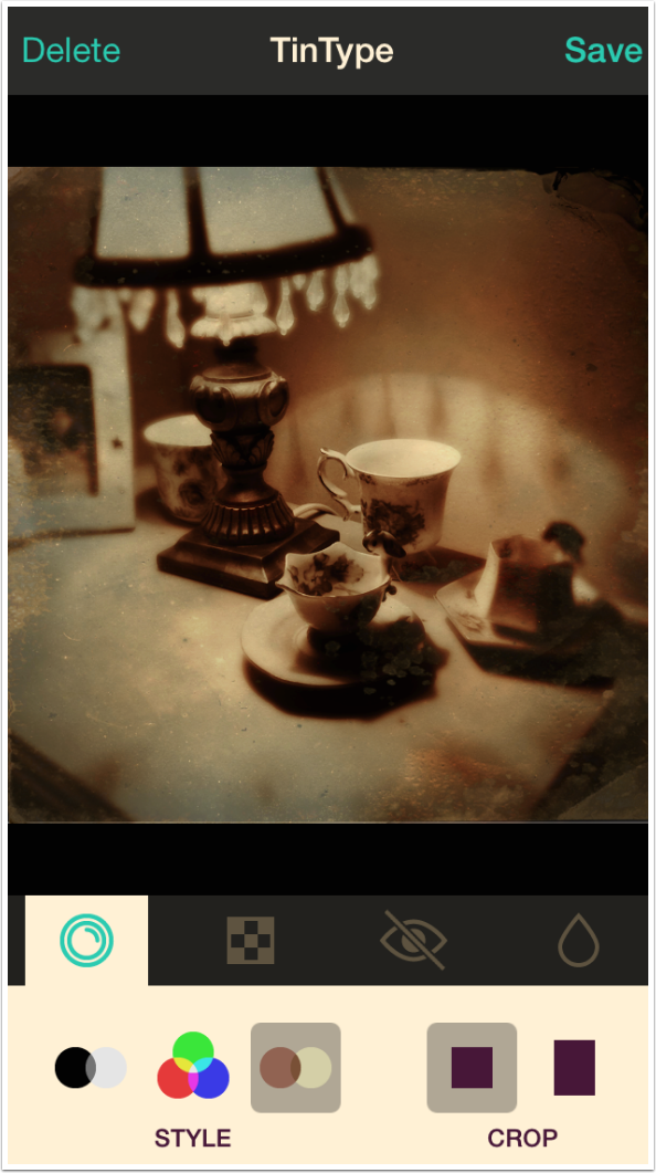
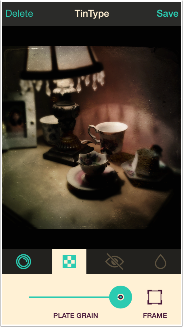
Under the Frame control are Plate Grain and the option to turn the Frame on and off. Plate Grain is a slider that controls the amount of grunge. Below I’ve shown Plate Grain at maximum.
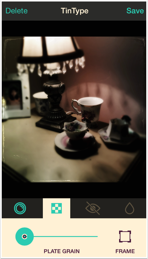
Next I show the Plate Grain at minimum. The Frame button just turns the frame on and off. There is no option to rotate the frame or grain to get different looks. The frame and grain are part of the Style; there is no way to use the frame for the Black and White Style with the Sepia tint.
The next option is Eye Intensity. If you look at old tintypes, they had a way of emphasizing the eyes of a portrait subject by sharpening and lightening them. Because our current image is a still-life and not a portrait, the Eye icon has a slash through it. There are no eyes to intensify. I will therefore go into my library to get a portrait.
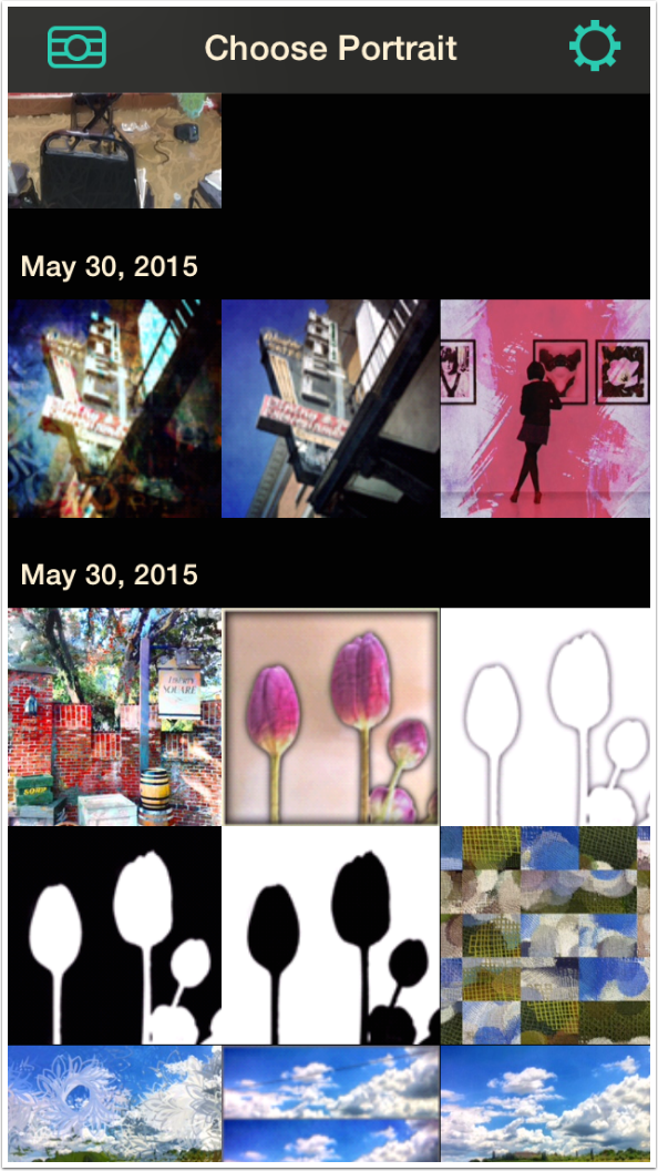
As you can see below, Tintype does not give you a list of albums. Instead they show a “Moments”-style representation of your Camera Roll and Photo Stream, with no option to choose from other albums you may have.
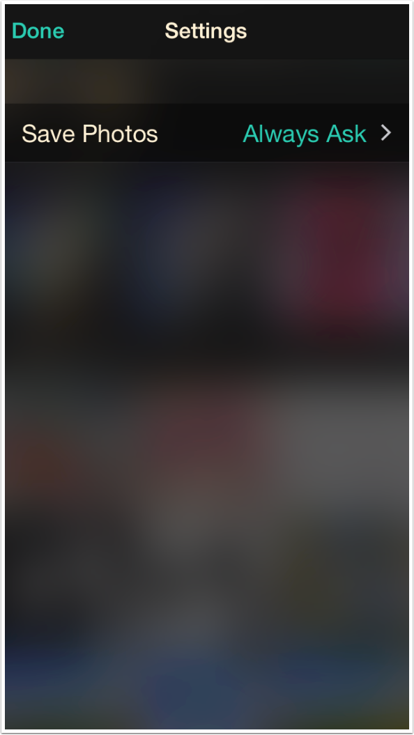
By the way, the Library view is where Settings are found (the Gear icon at the upper right). The only Setting is the Save Photos option. Right now I have that set as Always Ask. The different Save options will be discussed in a moment.
Below I’ve loaded a selfie, and selected the Eye Intensity option. It’s a slider which defaults to the middle position. It is only available if the app can determine that the subject is a portrait with visible eyes.
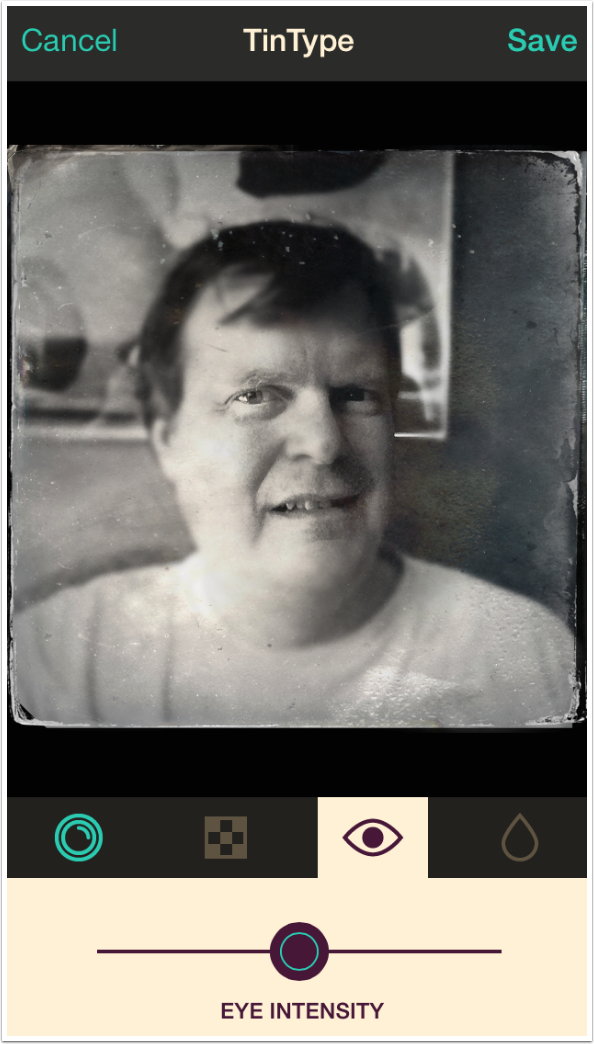
The slider controls sharpness and lightness together. Below I like the sharpness when the Intensity slider is at the max, but not the lightness.

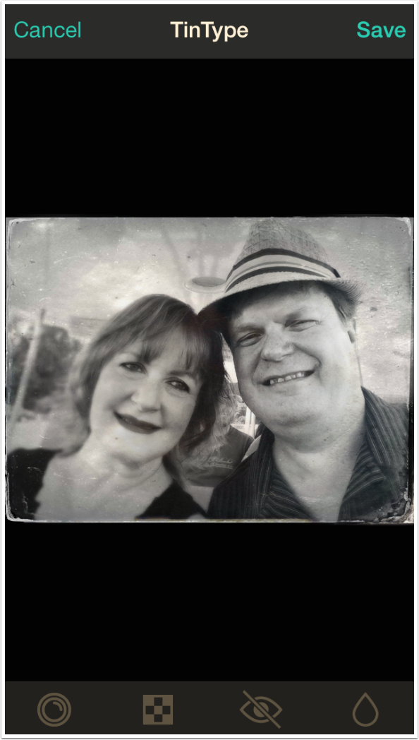
The eye recognition is hit or miss. The image below has two sets of eyes, but Tintype was unable to recognize them. The same thing happens when there is only a single eye, such as when a selfie cuts off one side of your face. (I’d love to be able to have a really intense single-eye shot.) The lack of user control is also a problem here. The app should allow for an “intensity area” or areas.
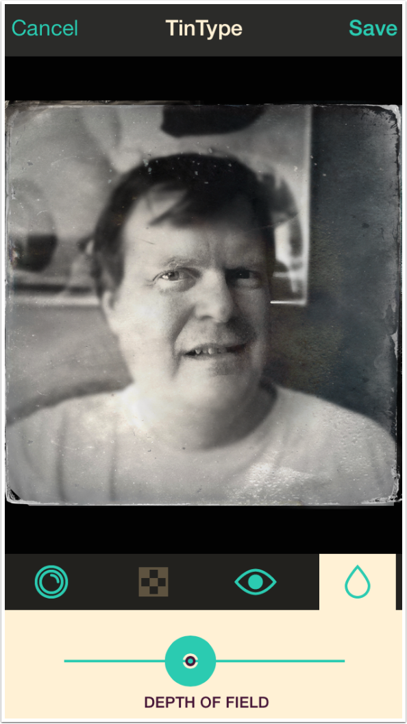
The last control is Depth of Field, or the amount of blurring toward the edges of the image. Below you can see that Tintype allows for a large amount of blurring.
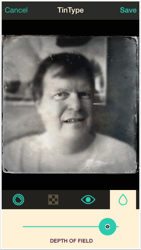
That was too much; my jawline nearly disappears. Below I’ve dialed it back so there’s even less blurring than the default.
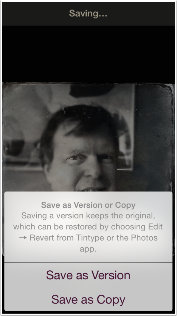
Up at the top right of the edit screen is the Save button. When the Settings (shown above) are set to Always Ask, tapping Save will ask you if you want to save a Version or a Copy. Saving a Version means that you will be able to Revert that image to the original while within the Camera Roll, outside of Tintype. I, for safety’s sake, prefer to always Save a Copy. I changed the Settings after capturing the screenshots to reflect that I always want to save a copy.
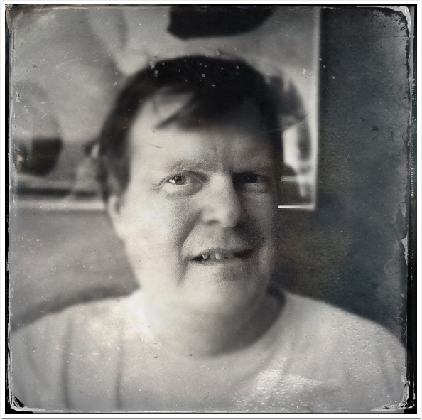
Here’s my Tintype selfie.
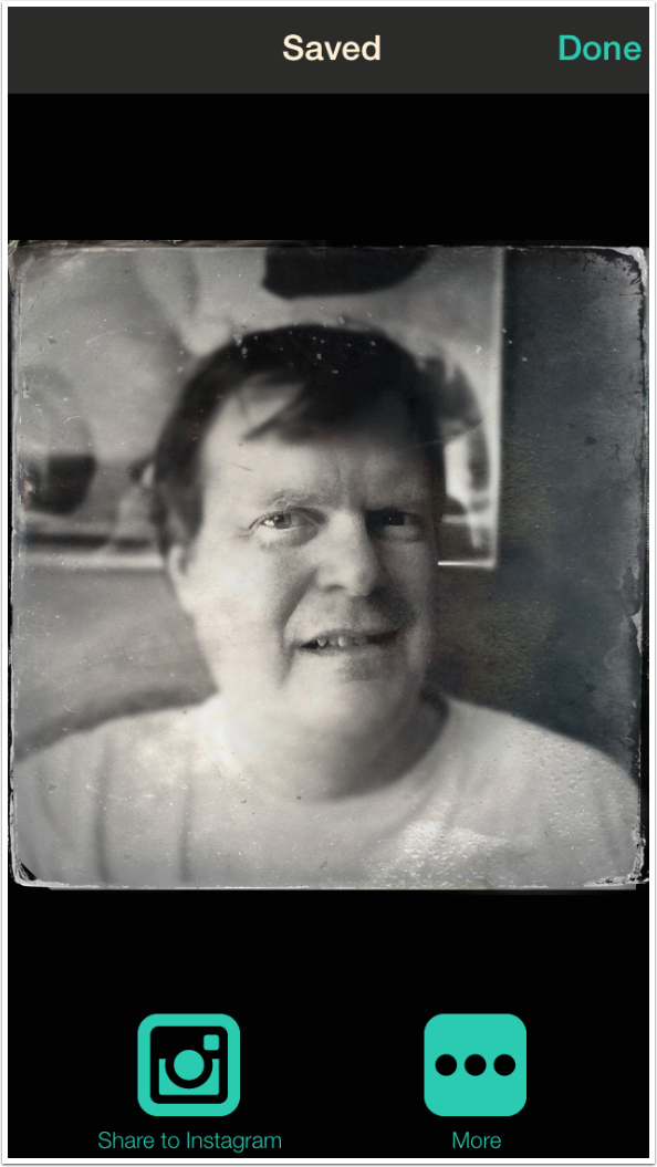
Once you’ve saved your image, you are taken to a screen where you can Share your image. If you don’t wish to Share, tap Done at the upper right.
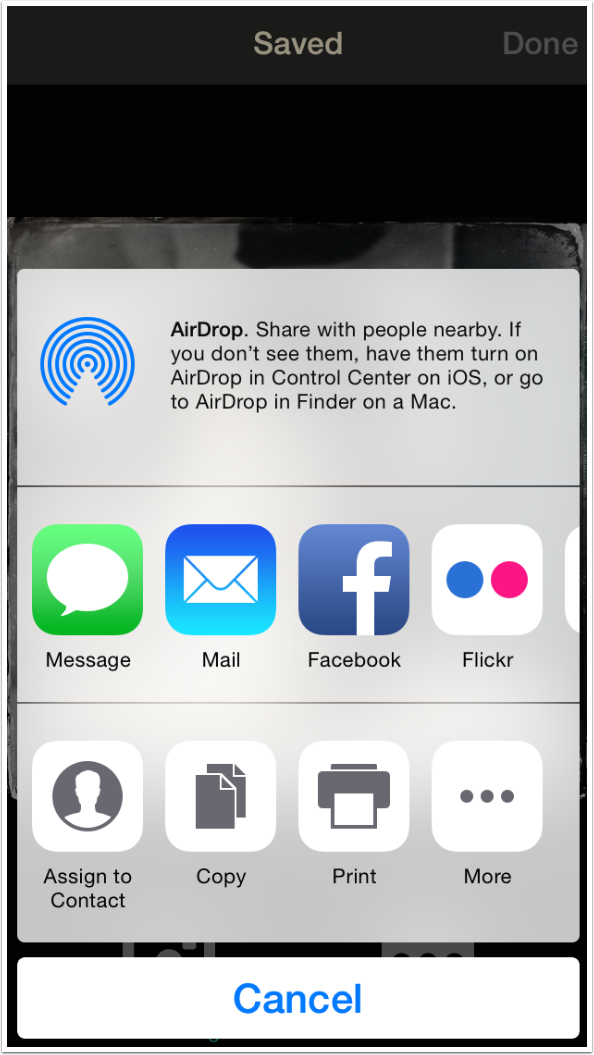
Tapping the More button brings up the standard iOS dialog.
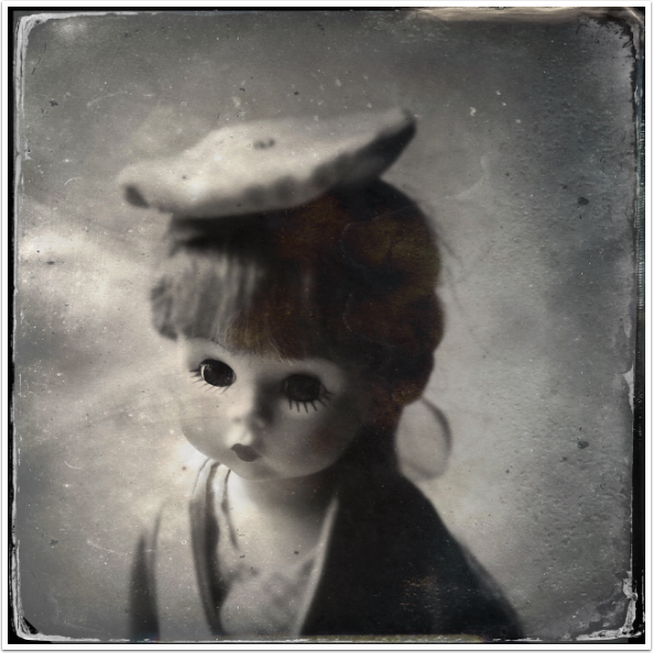
Once again, I want to emphasize that the eye recognition is chancy. Whereas it wasn’t able to recognize the two pairs of eyes in the example I showed above, it had no problem with the doll below.
I’m torn on Tintype. I like the results a lot, but the lack of control – only slightly more control than is offered with the Tintype Pak in Hipstamatic – means that I can’t really justify recommending it. I hope that the folks at Hipstamatic improve the user interface, rather than abandoning the app altogether.
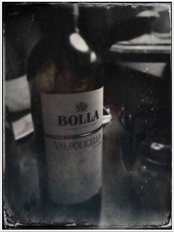
Let’s finish with a few examples. First, a bottle of red.
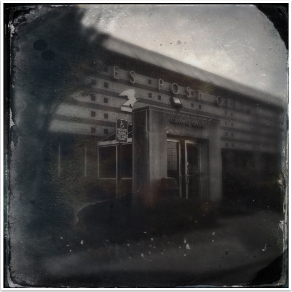
Next, a shady post office.
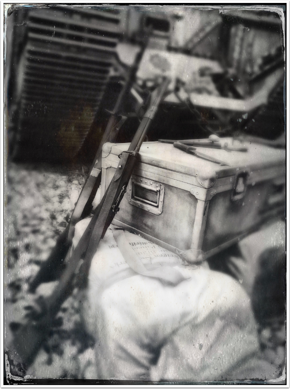
Finally, an image from Hollywood Studios that’s really suited to a tintype effect.
Until next time, enjoy!
TheAppWhisperer has always had a dual mission: to promote the most talented mobile artists of the day and to support ambitious, inquisitive viewers the world over. As the years passTheAppWhisperer has gained readers and viewers and found new venues for that exchange.
All this work thrives with the support of our community.
Please consider making a donation to TheAppWhisperer as this New Year commences because your support helps protect our independence and it means we can keep delivering the promotion of mobile artists thats open for everyone around the world. Every contribution, however big or small, is so valuable for our future.
Jerry Jobe
Never content with just scratching the surface of what an app can do, Jerry Jobe decided to pass on what he learned about imaging apps to others. He’s constantly trying to figure out just what tools other artists have used, and trying to incorporate them into his own work, in an attempt to find his style. He’s written tutorials on over 145 apps so far, which you can find (along with his Song of the Day entries) at http://enthusiasmnoted.wordpress.com/ He lives near Atlanta, Georgia, where he also finds a creative outlet in acting and directing in community theater.
One Comment
Diana Nicholette Jeon
I like Tintype, and I always have. I agree about the Sepia, though. It’s way too rust colored and gaudy. I am not bothered by the lack of controls, I guess because I am not one to typically just use one app to process any given image. The thing that bugs me more than the lack of controls is when there are multiple people in an image or a single person but not in the “central portrait” location and it fails to identify their eyes as “eyes”, thus not allowing me access to the eye control feature. THAT bugs me.