A Picture’s Worth… With Rudy Vogel
Welcome to another new section to theappwhisperer.com, this new section is entitled ‘A Picture’s Worth…’ and it is a subsection of our Photo App Lounge column. A Picture’s Worth… is where we ask iPhone photographers that have taken or made, as the case may be, powerful iPhone art to explain the processes they took. This includes their initial thoughts as to what they wanted to create, why they wanted to create it, how they created it, including all apps used and what they wanted to convey. We also ask these incredible artists to explain their emotions and how the image projects those feelings.
This is another totally unique section to theappwhisperer.com and one that offers the unique facility for the reader/viewer to find out more about an image and also for the artist to explain the complete process and message.
Today we are talking to Rudy Vogel, otherwise known as ‘The Renaissance Man of iPhone Photography’. Rudy has had several private and public showings and his pieces have already worked their way into private collections. His work has been shown at various exhibitions and galleries around the world, including: The Annual Munson Massachusetts Spring Art Show; GaleriaZero, Barcelona, Spain & in Chelsea, London; The Forbes Galleries & The SOHO Gallery for Digital Art, New York, NY; The Los Angeles Center for Digital Art, The Orange County Center for Contemporary Art and, The Giorgi Gallery, in California; and, The Lunch Box Gallery, Miami Beach. Much of his recent work can be viewed at ‘the premiere iPhonegraphic Art Collective in the world’, Pixels At An Exhibition, with the url: www.pixelsatanexhibition.com.
We previously interviewed Rudy in our A Day In The Life column, if you missed that you can read it here.
In this A Picture’s Worth … today, Rudy talks us through his incredible image ‘Samurai Dojo’, enjoy…
(If you would like to contribute to this section or if you have seen an image that you would like to learn more about, just email Joanne@theappwhisperer.com and we will get it all set up).
The Birth Of A Concept
JC – Rudy, please explain to our readers how you create your art, in that what you conjure up in your mind before you start to curate?
RV – ‘For this exercise, I wanted to share with the readers a rather non-traditional approach to creating art. For the most part, artists, especially realists, begin with a subject matter and theme. Whether a person, horse, architecture, landscape, still-life or other matter and, then the artist begins to recreate that vision in their mind’s eye yielding their own personal signature emblazoned on the artwork. Yet, in the end it still remains a person, horse, architecture, landscape, still-life or, whatever, but with a personal twist or, two or three. For me, my subject matter often begins with a complete abstraction that, in the end, will result in another abstraction; that is intended to suggest or, imply to the viewer a subject through its title. Often, the image explains itself, but sometimes it requires a little coaxing for the viewer to appreciate.
The title for me is almost as important as the artwork itself since it frames it, gives it life and meaning and, aids the viewer in deciphering the concept I am trying to impart. I also try to incorporate some humor and whimsy whenever warranted. Nothing like underscoring a piece through eliciting a smile on the face of the viewer. That then becomes my exclamation point! Most significantly, it is not necessarily the message that I am creating that is important but the impression left with the viewer. This is most meaningful; it is the final brushstroke. Why do I say this? Because the artwork, I believe, becomes a piece of me and once that piece has been wholly created then it is to be named. Not ‘Rudy’ of course but an extension of my thought or, my creativity. It is this concept that allows us to become one with our Creator so to speak. The name or, title, imbues it with significance: its vestige in perpetuity.
So, I often challenge myself by taking the most inane image I can create through my stanchion app “Decim8,” to ultimately create something as breathtaking as I can from a line, a curve, a splotch of colors and so on, then running these components through various apps. The workflow, before its start, I have already envisioned. When the process begins, I already know the apps I intend to use. But sometimes, I even surprise myself by running it through another random app for a “let’s-see-what-happens-now” moment.
As I said during the interview, I make my own luck when creating art. I kayak over my own river, not someone else’s! So, let’s begin unfolding the process I used for creating a piece I entitled “Samurai Dojo.” Later in this article I will explain how this title was birthed’.
First Image
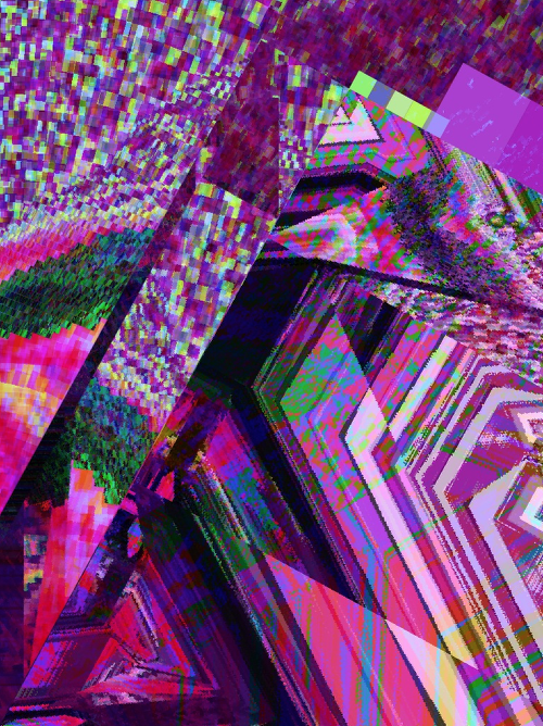
‘The first image in this walk-though is one of countless I create using Decim8. This app is my factory, so to speak. With it, especially in its latest incarnation (Note: With Decim8 3.0.1 you can now create your own presets allowing for infinite possibilities), I can stretch lines, create splines, mesh colors, devise angles and random patterns and, ultimately ‘smash’ an initial image into enumerable nuggets secretly lying therein for me to pan and use for creating my golden artistry. So, this rather complex image to the right has some beautiful colors and lines, but it contains particular components that caught my eye and thereby served as my starting point. It is through these random patterns or groupings of lines and/or angles that my mind starts to envision an end-point where various components can be intermeshed together yielding an altogether different and compelling image’.
Second Image
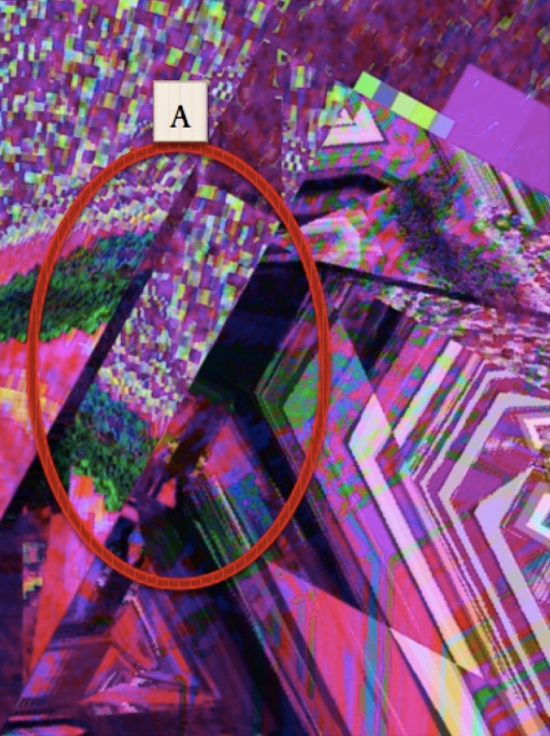
‘In the second image, within the red circle [A] one can plainly see one component I reference: a jumble of colored blocks bordered by a harsh black line to the left ending in a jagged green edge. It’s straight, it’s colorful, and it looks like an ornate sleeve with a hand bursting through to me! But, there are two other elements buried inside this image that caught my eye: first a head’.
Third Image
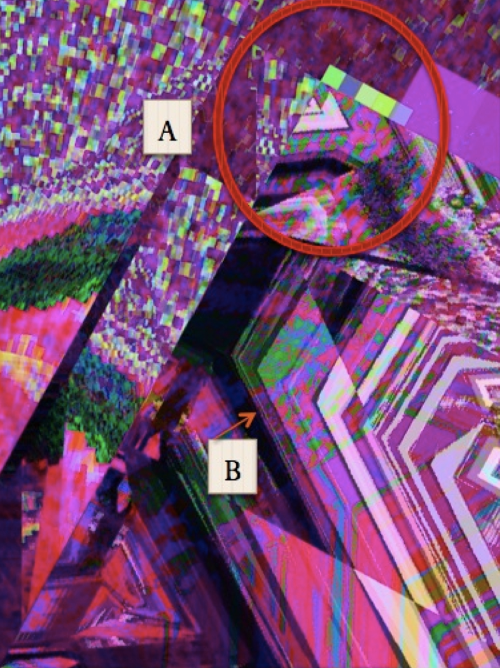
‘In the third image within the red circle [A] you can see a line of colored blocks alongside the top of two interspersed triangles. If you look closely, you see the makings of this head I reference and, as your eye is drawn down to the bottom, the angles connote the shape of torso [B]’.
The Process
JC – Rudy, where do you go from here? What system do you use?
RV – ‘Now that I have some of the key components for a new image, I begin the workflow process. For this piece, I decide to use the new app, Popsicolor. This app is from the creator of the now famous Percolator app, John Balestrieri of TinRocket. Popsicolor is a very cool app turning pix into dripping, magical selectable dual-color watercolor art of three various depths. But there is much more to this app than meets the untrained eye. What it also creates is an output that can be envisioned as a single multilayered image, with a grainy surface or, texture that has depth and tone when used as a layer within a multi-blended image.
The output from Popsicolor, for me becomes another tool (not necessarily a final piece) within my sleek, rectangular box of iTricks. Having a layer filled with grain, depth and tone can yield amazing blended effects when thought of as rough texture that has shadow and lines innately embedded within. A lot of the “layer building” that would commonly be created on a non iPhonegraphic canvas over time is now built for me with one app.
Thinking ahead, I will then take this output (or, for me, a component) and, alter its landscape through another very cool app, iColorama S one of my new “fave” apps! Within this app lie an infinite number of possibilities akin to my stanchion app, Decim8. Within iColorama S, I will be using its versatile “Glass Effect” function to elicit some pretty stunning redesign. The control I have in iColorama S to change the landscape is still somewhat primitive but still more than adequate since it allows me to control the variation, extent & size of the applied feature, its opacity and, with another radio button, the masking of that effect.
Once I have created the next component in iColorama S through my workflow, I have planned to use another “fave” app Pixlr-o-matic, like the prior two apps, a treasure trove of infinite possibilities. Pixlr-o-matic allows you to vary an image based on three primary species of effects: 1. Film 2. Lighting and, 3. Borders. Each species has a series of families of effects that you can download and apply. I don’t have enough room in this article to mention them all so I encourage you to download as many as you care to and play with them ad infinitum. I know that with one family of effects within the Film species there is a bundle of 11 effects called “Soft” I know I will be using one of them for my final output. Within the Lighting species there is a bundle of 11 effects called “Smoke” and, another bundle of 40 effects called “Space” I know I will probably be using both. Finally, within the Borders species there is a bundle of 26 effects called “Squared” I know I will be using one of them.
Of course there is a degree of randomness involved when applying any effect from any app on your iPhone, but as you can see and, as I said during my interview, it is important to manage your workflow and know your apps in-depth. The final steps will be achieved through the Image Blender app, where I commonly use one of the eighteen blending techniques. I usually have a few in mind when starting the work on the piece in this app, but the beauty with this app is you may wind up using a technique you hadn’t thought of applying initially which makes the whole process so perfectly fun! Once this step in my workflow is achieved, I then turn to my foundation app, Iris Photo Suite for fine-tuning, resizing and sharpening (which, by the way should always be the last thing you do with any image to avoid pixelization, unless of course that is the effect you care to achieve). Now my workflow is complete and the final output is ready for watermarking (I use the Impression app exclusively for this step) and viewing’.
Fourth Image
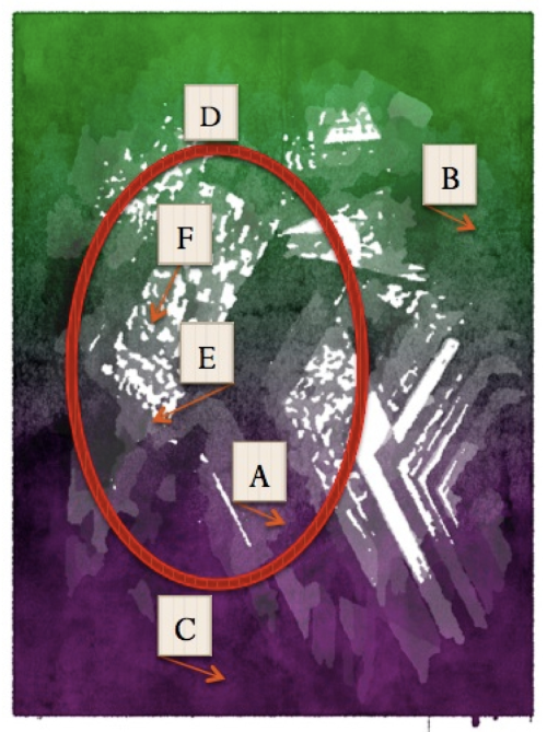
‘The fourth image shows the output from having applied Popsicolor on the first image using “Bold Focus” and, the highest resolution turned on. I chose the color green for the top (creating a “green screen” effect) and purple for the bottom knowing that this color will ultimately be screened out and turned into black further within the workflow when applying the Pixlr-o-matic app. Notice the layering [A], the grain [B], the shadows [C] and so on. When thought of as a layer you can realize that embedded within, a lot of “layer building” has already been accomplished. Within the red ellipse [D] you will also notice the hilt and glistening of a sword [E]. I had to ‘Apply’ and ‘Save’ several times before I got the effect I wanted. You also can notice that the sleeve [F] has taken on an altogether different look that will be useful later on in the workflow’.
Fifth Image
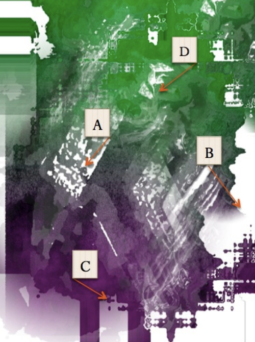
‘In the fifth image you can see the result from using the iColorama S app. As mentioned earlier, I applied the Glass effect and manipulated the controls and masking to yield the result I wanted. Notice how the sleeve [A] is taking form; the landscape [B] and shadows [C] are used to create the extension of what will ultimately be the body of Samurai. You can already see some nice layering and texture being applied. Finally the shadows of a mask are also beginning to take form. This effect with a hefty dose of fine-tuning was performed several times and what you see here is the end result’.
Sixth Image
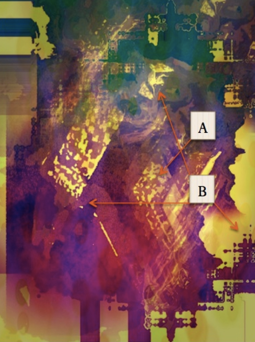
‘In the sixth image, you can see the output from one pass-through using the Pixlr-o-matic app. Here I have applied one of the “Soft” (i.e., Film) and “Smoke” (i.e., Lighting) effects. At this stage of the workflow process you can begin to see the rough lines of the samurai & his armor taking form [A] as well as his sword, mask and the ancient Japanese landscape taking shape [B]. But, this image is far from complete. Another pass-through using the Pixlr-o-matic app is required for the next step to be complete’.
Seventh Image
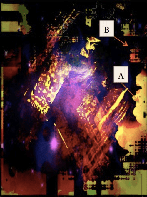
‘In the seventh image, I have run the image through Pixlr-o-matic a second time applying one of the “Smoke” (i.e., Lighting) and “Square” (i.e., Borders) effects. Now you can begin to see key elements taking form: His sleeve, hilt and glistening sword edge are more pronounced; his war mask is affixed onto his head; his mane of black hair is evident; his armor has been attached and is glowing, ready for battle; and, finally, to enhance the drama of the piece, the ancient Japanese landscape has taken shape. There is even a hint of his Geisha standing off in the distance [A], wishing him a mighty victory; and, a primitive Kanji [B] in the upper right-hand corner takes form’.
Final Image
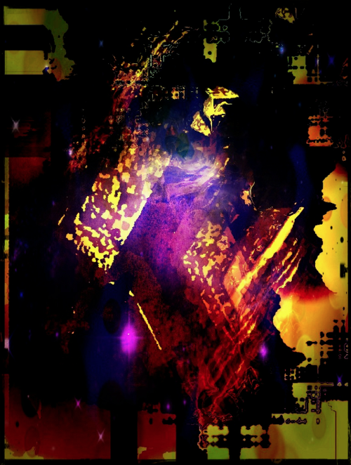
‘In the eighth and final image you see the result of two additional apps being used. Image Blender was used blending the sixth and seventh images together using the Overlay effect and then masking here and there to make several of the image elements more pronounced. I then applied a second pass-through utilizing the resultant output from the first pass-through with the seventh image, applying the Multiply effect to increase contrast and enhance the lighting on the samurai’s armor. Iris Photo Suite was then used on this resultant output to increase image size, run it through Histogram for final Auto-Correction (i.e., applied through “Auto Level” and my own adjustment using the lever button) and then as the final step, I applied Sharpening to my taste. Voila! I introduce to the “Samurai Dojo.”
Catharsis
JC – Rudy, I would like you to explain your emotions and feelings before, during and after the process and what the final image means to you and how you intend it to be interpreted by others.
RV – ‘I named this piece “Samurai Dojo” because first, the name simply spoke to me and secondly, the image connotes just that, a Samurai dressed in his suit of armor, razor sharp sword in hand, ready to wage battle on the enemy. Or, to just conquer more lands to quench his infinite thirst for power for that day. It may also be, that in his heart, he yearns for the unrequited love of another Samurai’s Geisha who believes must be his. Ultimately, we never truly know what emotion sends a man to war. But in this piece, it was brutally obvious to me that this Samurai is seasoned, possesses a blood-thirst for power, and will go to any extent to meet his lust for ascension and revenge. That is why this Samurai is a “Samurai Dojo” a leader amongst leaders in the ancient past of Japanese lore.
Each piece is obviously personal because it results in an extension of self. This piece elicited a definitive and provocative emotion within Self and it was my belief that it would accomplish the same for the viewer. Therefore, the image clearly gave birth to its name.
By partaking in my craft, I enjoy creating pieces that emote; that draw the viewer “in”; that may also, at times, paint a smile on their face; something that the viewer can ultimately relate to. For me the grade is achieved when a viewer comments back and asks: “How did you do that?” By asking me this question I know I have struck the ultimate cord and achieved yet another rung. But it never ends there. I have to continuously outperform myself and create new inquisitiveness, drama, whimsy, intrigue or something fantastical to keep the viewer interested.
Therefore, while creating a piece which can many times take quite a bit of time, I find myself criticizing Me for missing something in the process or, just not getting something right or, one of a myriad of other possibilities. To be frank, I sometimes just leave a piece be, let it lie dormant for a while for a rebirth later on. It will then speak to me in fresh vocabulary. Or, who knows, maybe a new morsel appearing on the iTunes Appstore will I find resulting in the final ingredient required in my pursuit for the “recipe of magical quandary.”

9 Comments
Gina Costa
This series is such a wonderful addition to the discourse in “ways of seeing” and thinking about visual material, especial what a “photograph” today can be.
I hope these are all archived and later published. I am a museum professional and arts writer (and of course Iphoneographer) and working on this phenomenon.
Kudos!
Rudy Vogel
Thank you for your insight Gina! I echo your thoughts. :))
Gina Costa
Keep inspiring us Rudy!
Rudy Vogel
Thank you Gina!!! ;))
Gina Costa
You are welcome:):) xxxx
Photogenix
Great article – personally I have really limited success with Decim8 but to be fair my mind struggles a little with abstract. I do keep playing with it though. It’s a great image but to me looks like a frenzied guitarist on stage 🙂
Rudy Vogel
Keep on keepin’ on – Decim8 will reveal the more you delve into it! To me a Samurai Dojo to you a frenzied guitarist – that is the beauty of abstraction it creates a world of multiple interpretations which is truly the beauty of the art…….never one voice but a voice of many! Thank you for your comment!!
:))
Robert Lancaster
Amazing work!
All of the apps mentioned are amongst my favourite apps.
I am still very much a newbie in the field of abstract iPhoneography.
I learnt a stellar amount from this article.
Thanks very much to the interviewer and interviewee.
Rudy Vogel
I am so very glad Robert that you found this article to be informative! Would love to see the results of your efforts. Keep pushing the envelope!! :))