Image Blender Tutorial – ‘Creating A Digital Collage’
Image Blender, created by Johan Andersson, is best described by the developer: “This is a simple and clean application with a single purpose, blending together images. You can use multiple blending modes like Multiply, Overlay, Screen and many more.” It is a bit more than just this….”You can move, rotate, resize and mask the top image by choosing two images and tapping the preview.”
Even though Image Blender only allows you to work with two images at a time, with it’s flatten function you can build layer upon layer to create any possible of combinations. In this tutorial I will show you how I used four different images to create a dramatic digital collage.
We hope you will feel inspired to try Image Blender for yourself after reading this tutorial. It is one of the most popular Photo apps available for the iPhone/iPad. It retails for $2.99/£1.99 and you can download it here.
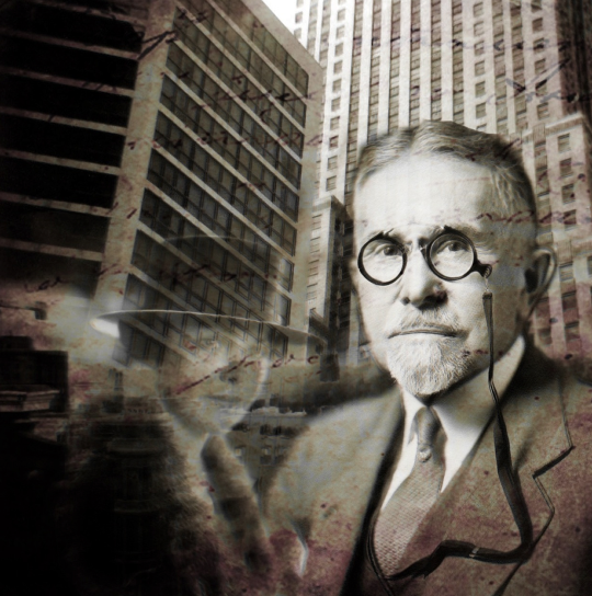
Each of the images that used to create my collage were brought into my iPad and prepped in some fashion before I used them to create “Captain”. I won’t be discussing how I did this…I’ll leave it up to you to create your own images to use for your collage.
The above is the final image, the one I am going to show you how to create.
Step 1
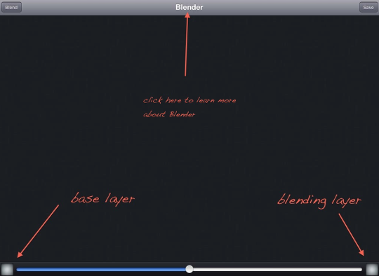
When you open Image Blender, this is the first working screen. The button/screen on the bottom left is where you pull in your base layer. The one on the right is for the blending image. (There are a number of functions available to you that I won’t be using in this tutorial. Image Blender has a nice tutorial built into it that you can activate by touching the Blender name at the top of the screen).
Step 2
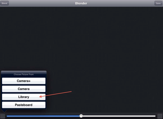
Touching this screen will bring up this pop-up selection window. I went to my camera roll to bring in my base image.
Step 3
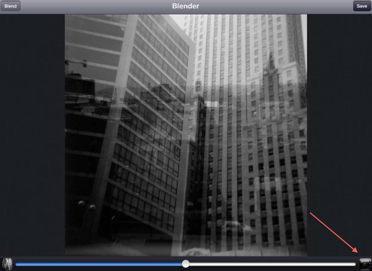
I then went to the screen on the right and brought in my second image. I now had two different cityscapes to work with. Again, the image shown in the left screen is always the base layer while the right screen is your blending image. This is important to keep in mind as you build your collages.
Step 4
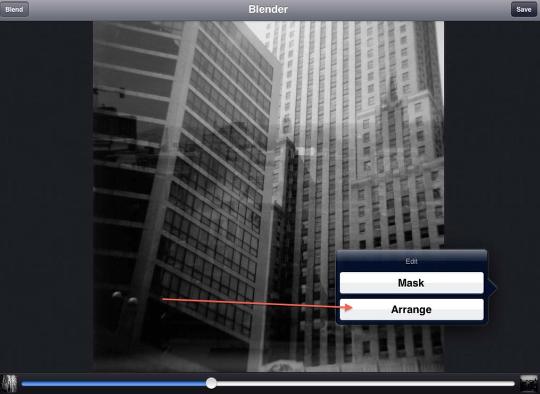
Now it was time to use Image Blender’s “Arrange” function to resize and place the top image where I wanted it. To activate this, double tap on the screen and the “Mask/Arrange” menu will appear. Click on “Arrange”.
Step 5
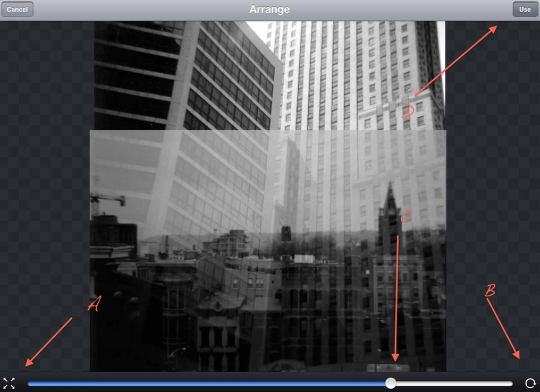
The top image will become a bit more visible allowing for easier adjustments. You can also use the slider bar (C) to change the image’s opacity. I’ve also pointed out two controls on the bottom of the screen, (A) and (B). If these have a lock symbol showing in their centers make sure to click on them to unlock these controls. (A) controls size while (B) controls rotation. Using the standard two- finger pinch/hold control, you can resize, rotate, and/or move the top image to where you need it in your collage.
When you’re happy with your adjustments, click on the “Use” button at the top right (D). This will activate you’ve done. (A note here. If you decide you don’t like what you see after clicking on “Use”, double click on the screen again to bring up the “Arrange” menu…and continue on).
Step 6
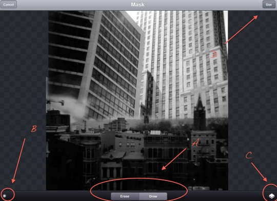
With the top cityscape placed where I wanted it, it was time to do some masking. While this screen shot doesn’t show this, I had double-tapped on the screen bringing up the “Mask/Arrange” menu…and this time had picked “Mask”. Once in the “Mask” screen, you have several controls at your disposal. The “Erase/Draw” controls in the center (A) allow you to erase parts of the layer while draw lets you put them back! The brush symbol on the left (B) gives you two types of brushes…and solid brush and a more feathery brush which is showing right now. There are no brush size controls but you can zoom in and out of the image using the standard two-finger pinch. The control on the right (C) allows you to adjust the opacity of the two layers. You can find more on this in Blender’s tutorial.
I typically will use the solid brush to erase away the major parts of the layer and then switch over to the feather brush to softened the edges blending them into the base layer so there are no hard edges showing.
Once done with your masking, click on the “Use” button at the top (D).
Step 7
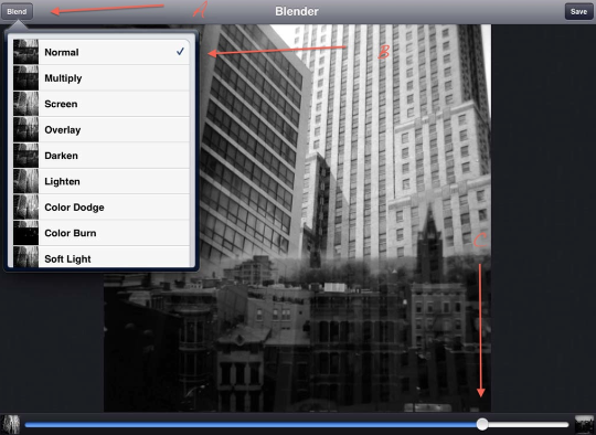
Time to do some blending. Click on the “Blend” button (A) which brings up the Blend Mode menu. I always need to try several different modes before settling on the one I feel works best. I’d suggest you do likewise. This time I decided on “Normal”, clicked on that and then used the slider bar to set the opacity at 85%.
Step 8
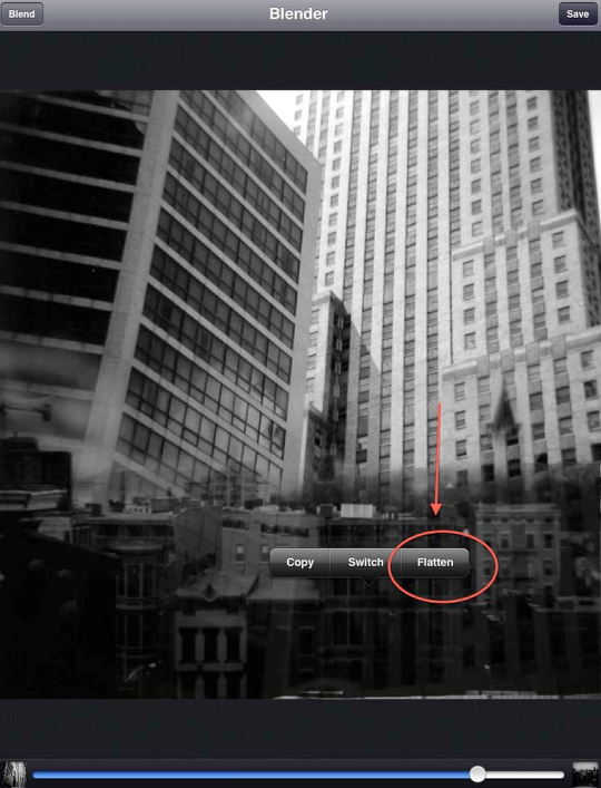
Okay…time to “flatten” my layers so I can continue to build my collage. To bring up this menu, touch and hold on the screen until it appears. Click on “Flatten” which flattens the two layers. If you look at the preview screen on the left, you’ll see this is now your base layer. The blending layer screen is blank…ready for you to choose your next image!
Step 9
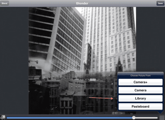
As in the beginning, I clicked on the screen, click on “Library” and went to my camera roll for my next image….my “captain”.
Step 10
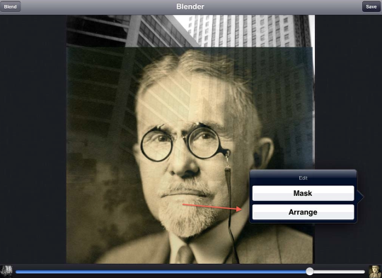
I double-clicked on the screen, brought up the Arrange menu, clicked on this…
Step 11
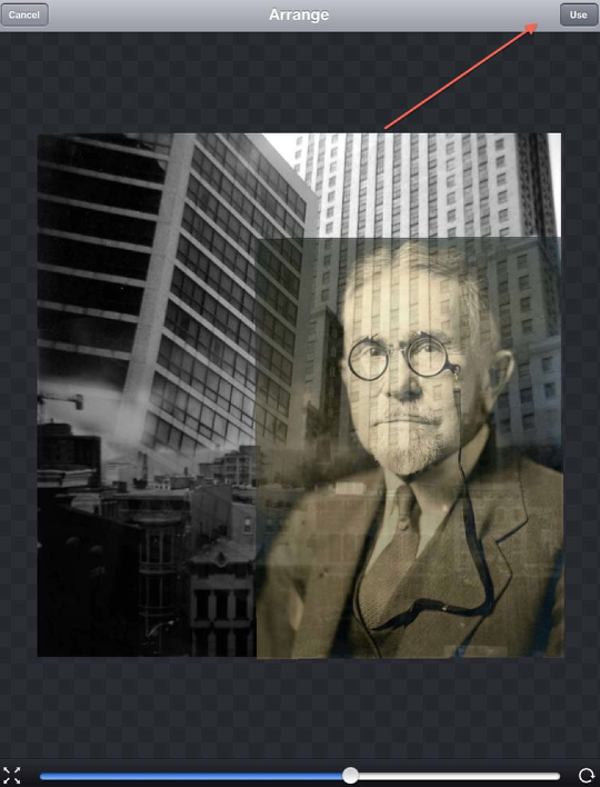
…and placed my “captain” where he needed to be for this collage….and clicked on “Use”.
Step 12
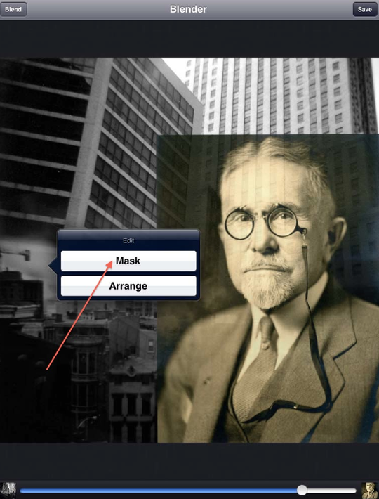
I brought up the Mask menu, clicked on this as before.
Step 13
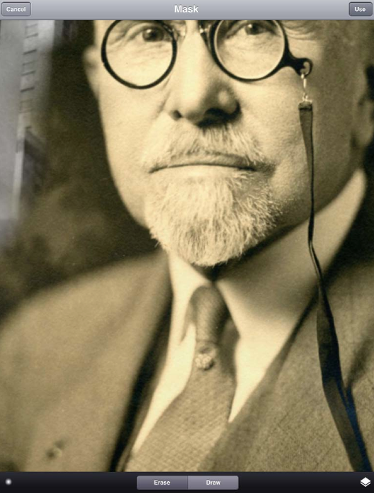
Using the Erase/Draw and brush controls as the first time, I zoomed in and out of my image, getting the “captain” ready for blending.
Step 14
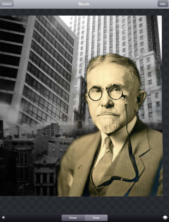
Here’s what the “captain” looks like before I start his blend.
Step 15
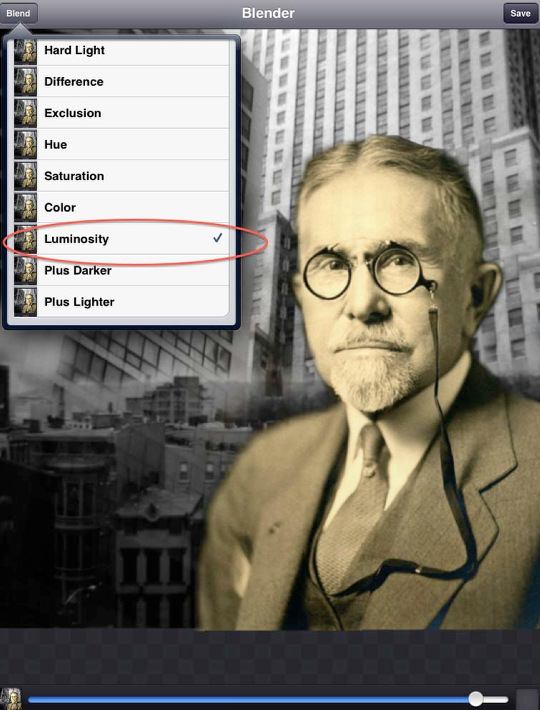
Clicking on the blend button and bringing up the blend modes, I tried several of them before deciding on the “Luminosity” mode at 95%. You’ll see why I chose this in the next image…
Step 16
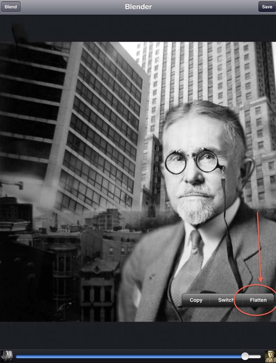
The “captain” went from a sepia-toned vintage gentleman to a silver-toned “captain of industry”…more in keeping where I wanted this collage to go!
I once again touched and held the screen, bringing up the flattening menu and clicked on flatten. (A side note. I also click on the “Save” button at the top after I flatten. This saves the image as is in my camera roll…and good thing to have just in case you mess up big time later on!!)
Step 17
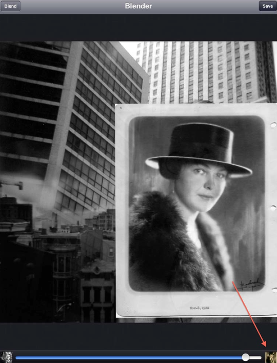
So far I’ve used three different images to build my collage. One more to go! The woman that stood behind the “captain”. (You know…for every good man there was a better woman behind him…) Since the steps used to bring her into the collage are just like above, I’m going to go through this pretty quickly.
Step 18
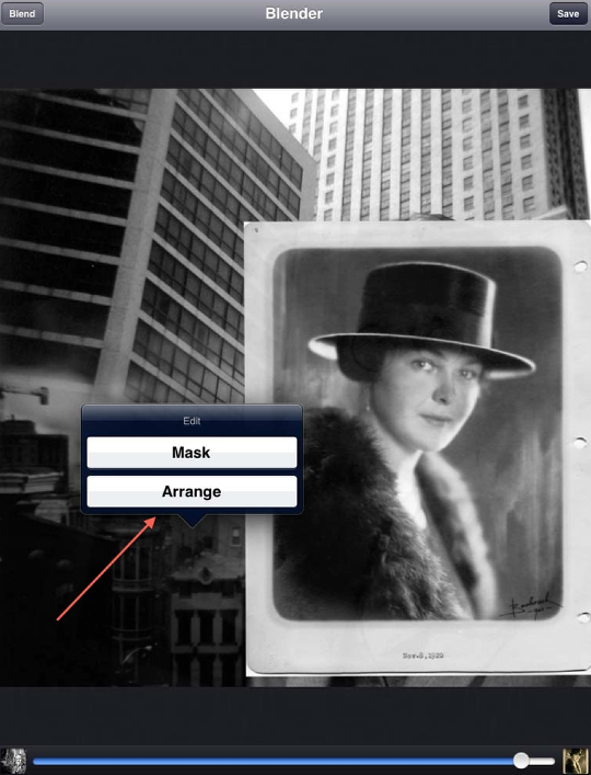
Clicked on “Arrange”….
Step 19
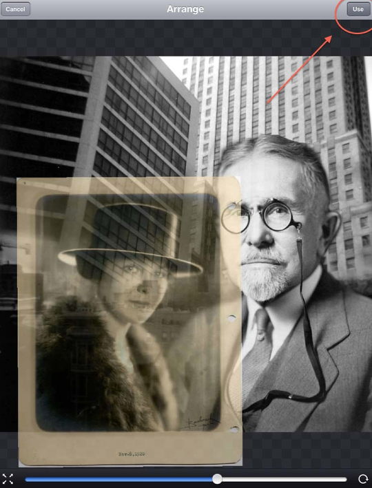
Placed her…
Step 20
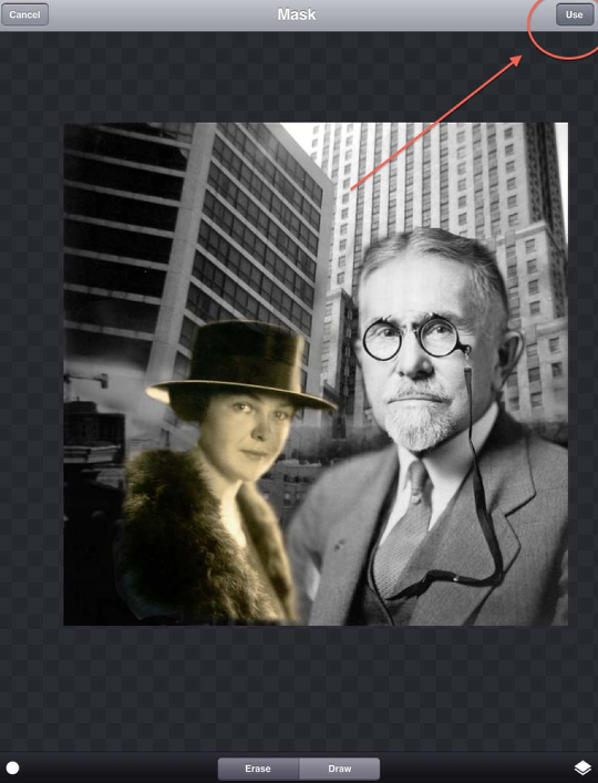
Masked her….and clicked “Use”.
Step 21
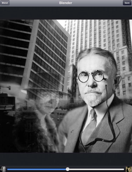
I used the same blending mode as with the “captain”, Luminosity but with her I used 50% opacity to give more of that “standing behind” feel to the image.
Step 22
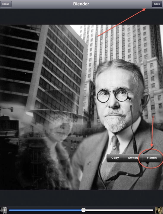
Finishing up, I clicked on Flatten…and saved this to my camera roll.
Step 23
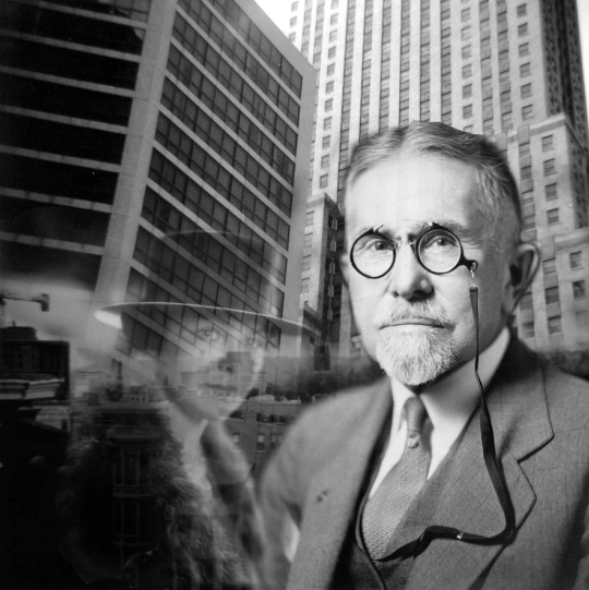
Here’s what the collage looks like at this point. Nice…but needed some more character. As much as I enjoyed using Image Blender, it was time to go to another app…and add some grunge! Which I did…and the final results can be seen at the beginning of this tutorial.
I hope you found my tutorial useful and enjoyable. Please do not be shy about leaving comments and/or questions about what I did. I do appreciate hearing any and all feedback!! Thanks in advance!!

12 Comments
fraggs
great tutorial thanks, I have this app and didnt realise it was so versatile. Will be giving it a go!
RajGohil
such a great app…
thanks you for showing step by step tutorial, really helpful.. 🙂
melia
this was awesome. thanks David. and thanks Joanne for bringing it to us
David
Thanks everyone!!! Your comments and feedback are wonderful!!! I’m so glad you like this tutorial!
avito
Awesome tute. I have Blender and have played with it a few times. This is a much-needed tutorial because this is something I wanted to get better at and take advantage of the app, as well as broaden my skill base. Thanks for the excellent tutorial. It was well written and easy to understand, even for a relative novice. Thanks David, and thanks as always Joanne and gang at The App Whisperer.
David
Thanks avito! I’m glad this was helpful! I continue to find that there is always something about an app that I didn’t know before…that’s why I like the fact that the AppWhisperer publishes tutorials…I learn so much myself when I read what others post all the time!
Irene Oleksiuk
David, this is a great tutorial! You explain everything so well with all the details. Love the image too. How do you put the arrows in?
David
Thanks Irene!! I do appreciate your feedback!!!! The arrows…I use the “Preview” app that came with my Mac. In the Tools drop down you’ll find Annotate and in there are the arrows and such. Check it out…nifty little tool!!
Carol
Wonderful, Dave. Concise, easy(ish) to follow, and such a great app which deserves to be better understood. Well done!
David
Thanks, Carol! I’m not sure how to take the “easy(ish)” part…what could I have done to make it easier????
Egmont van Dyck
This is an excellent tutorial. I have learned much and will refer to it often Thank you David for not only sharing but also the the selection of subject matter.
David
Thanks Egmont! I do appreciate your feedback and comments…and I’m so glad you enjoyed my tutorial!!