Repix – Review/Tutorial Of This Brand New iOS Photography App
When I was asked if I wanted to take a look at a beta version of a new app and then write about it…well…of course I did! So after a couple of emails to get myself set up as a “tester”, the app Repix showed up on my iPhone 5. What follows is my first look at what this app can do…and I found many things that impressed me! (Please keep in mind as you read this review, that I was looking at a Beta copy so what you will see when it hits the App Store may be somewhat different. Also…I only had a short window of time to take a look…and then get this to The App Whisperer!).
To download Repix – click the links below:
Repix is free to download and comes with additional brushes via in-app purchase. We are offering $5 iTunes vouchers in our giveaway today, to enable you to unlock the Masters Collection of brushes – don’t miss that. To view that offer, go here.
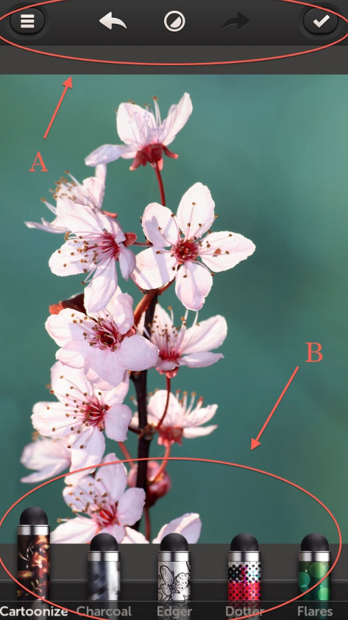
Opening Repix, I was greeted with this screen. As always when looking at a new app for the first time is…what are these icons for??? So…I just started pushing them. I’ll save you some time and tell you what I found.
The icons at the top (A) proved to be the main control panel for the app and I’ll take you through those in a minute. The bottom icons (B) that look like stylus pens are Repix brushes that allow you to selectively paint its effects on your image. I counted 21 different effects plus 1 pen called “Undoer” and another called “Eraser”. I won’t be covering all 21 pens in this review…but I will show you what a couple will do. (I also say a bit more on how the pens work later on.)
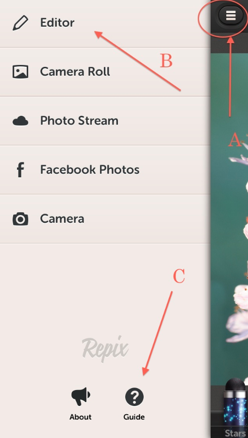
Let’s do a quick run through of the top control panel. Clicking on the icon at the top left corner (A) opens this pop-up screen. Here you can access your images from the shown sources. To return to the main screen, just click on “Editor”. I would also recommend spending a little time with the “Guide” (C).
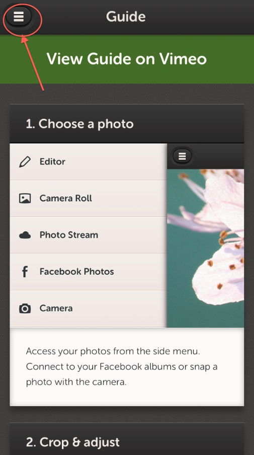
The Guide that I viewed was rather brief in its descriptions so I’m hoping that they add more meat to this in the future…but it will get you started. I will have to admit that I didn’t view the Vimeo guide so maybe there’s more there. In any case, after you’re done with the Guide, click on the icon at the top left to return to the last screen…and from there back to the main screen.
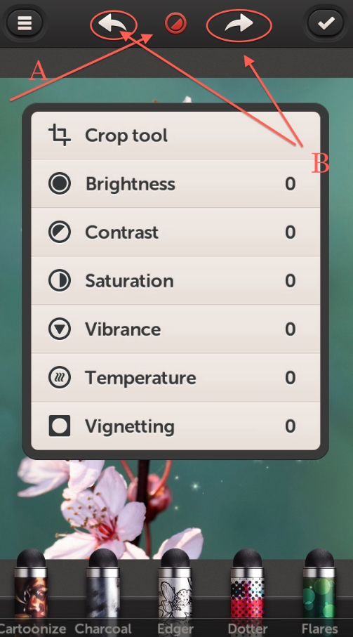
Clicking on the center icon at the top (A) will open this control panel that gives you access to the shown tools. Each of the tools, as you will discover, are control by a slider and give you percentages as you slide back and forth. I found these very easy to use! To close this panel, just click on the icon. The arrows (B) are the effects undo/redo buttons. These will undo/redo one “layer” of effects at a time…or if you hold down the undo button, you will be asked if you want to reset to original.
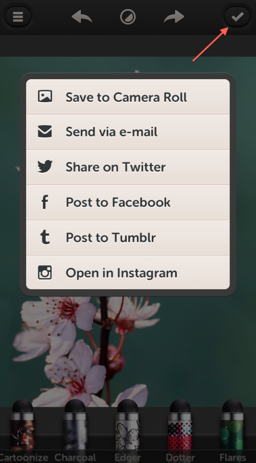
The final icon at the top right corner opens your share options.
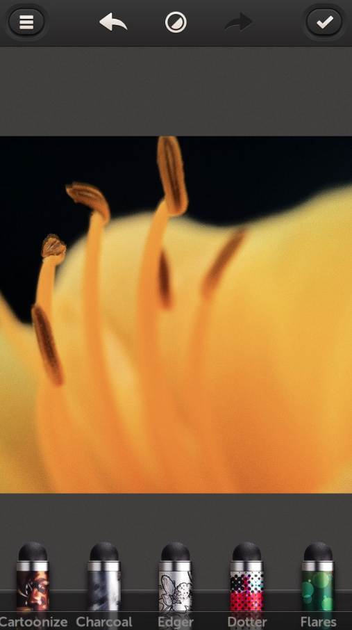
I thought it would be fun to bring in one of my images to use as the “source image” for the rest of this discussion. This would be a good time to point out that Repix lets you zoom in and reposition your image using the usual two-finger pinch controls. Talk about being able to get up close and personal!!
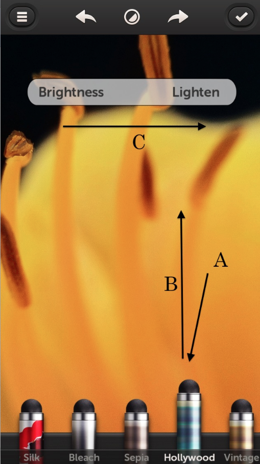
Many of the brushes have “hidden” controls associated with them that, depending on the brush, allow you to set their brightness, roughness, or size. To access these controls, first click on a brush (A), then tap on the brush, hold and slide your finger upwards (B). This will open the control panel at the top (C). Sliding your finger across the screen left or right will adjust, in this case, the brightness of the “Hollywood” effect. Once done, just tap on the screen to close. Pretty nifty if you ask me!!
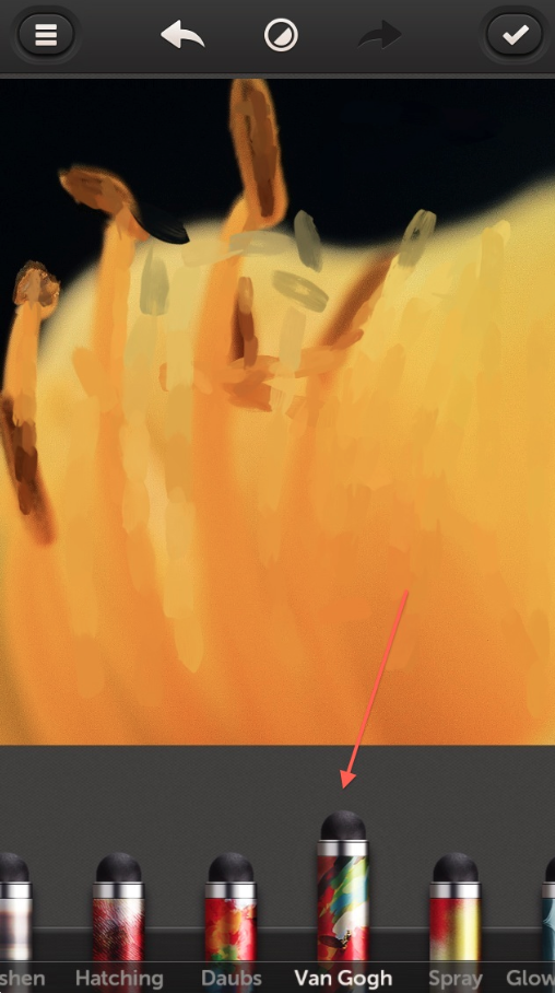
Play time. I chose “Van Gogh” and then zoomed into my flower image using the finger pinch technique. I then used my finger tip…couldn’t find my stylus…and painted in this effect on different parts of the flower. (Here’s something I noticed as I painted…the effects are cumulative meaning that the more you paint, the more of the effect you build on top of the image. Play around with this…you can get some great “depth” effects in this manner!)
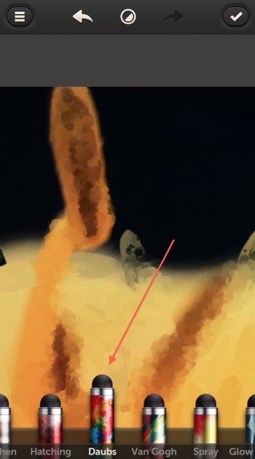
You don’t have to save or click on an icon to add another layer, just pick another effect and continue building! Switching over to “Daubs”, I painted over my last layer…
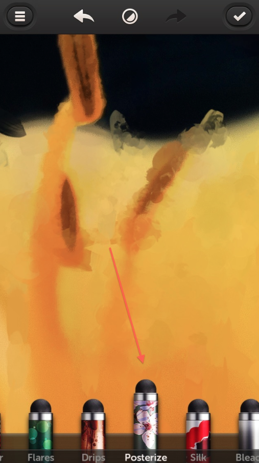
Two effects are never enough when you can go for three…so I added a bit of “Posterize”!
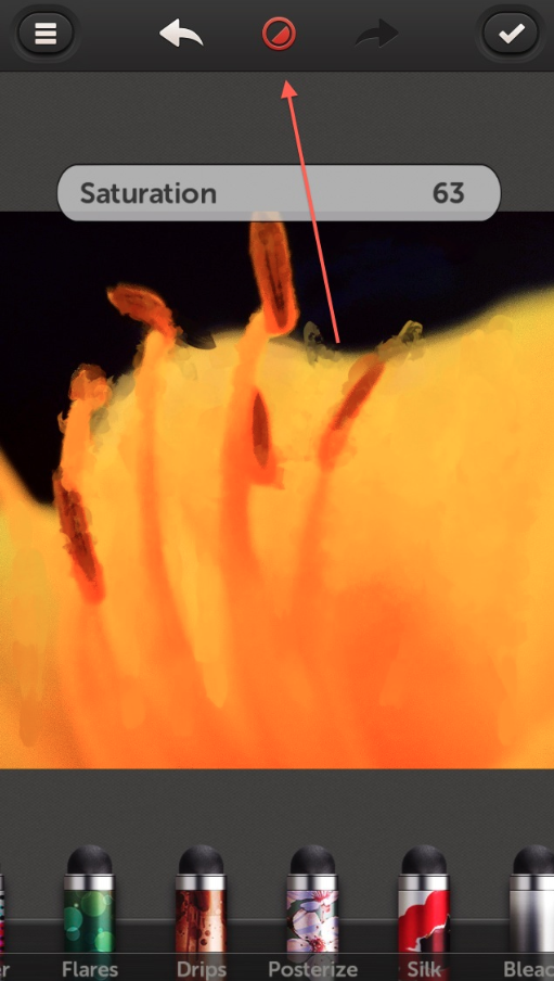
One last touch. I Clicked on the top center icon bringing up the tools panel. From here, I picked “Saturation” and hyped the colors a bit. Well…more than a bit…
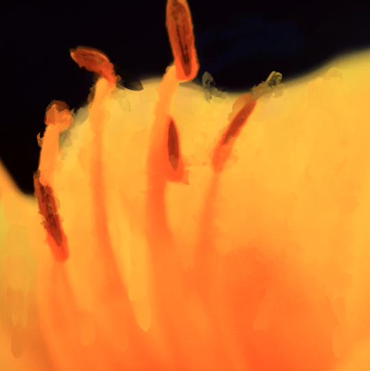
Here’s the final image…so far.
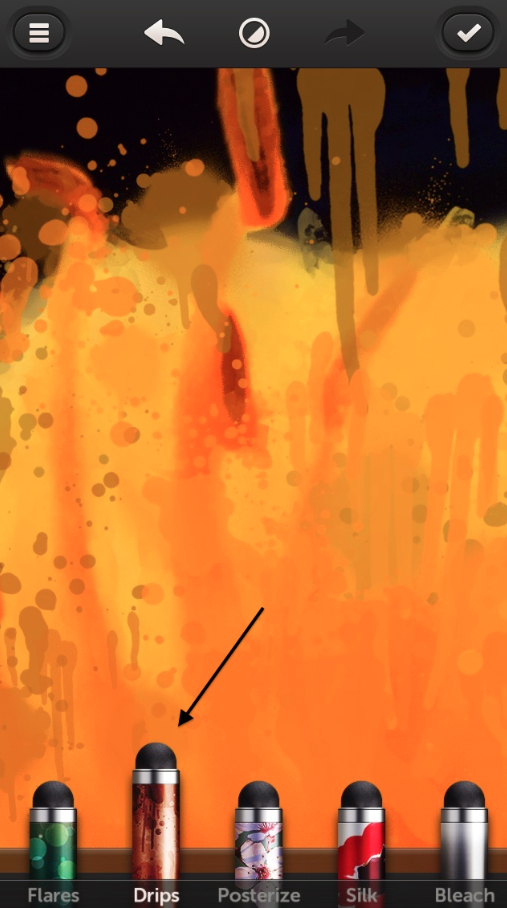
I wanted to show you a couple of the effects that I found to be a hoot to use! The first one is “Drips” which paints a drip pattern all over your image as you drag your fingertip on the screen.
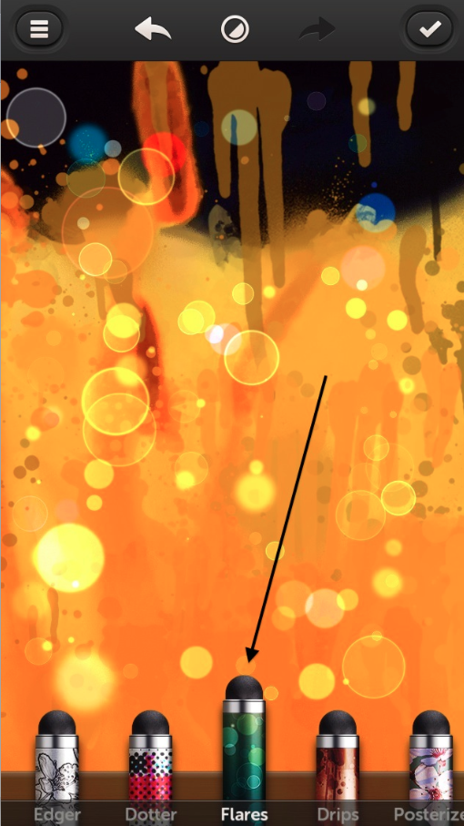
Another one is “Flares” which puts down those bright circles you see in this screen shot. There are bunches more like “Dotter”, “Spray”, “Hatching”…you just have to play with them all!

Don’t you just love the mess I created! Wow!!
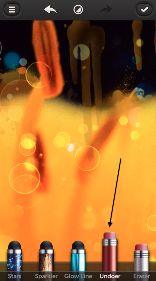
Okay. Maybe a little much. This is when the brush “Undoer” came in handy. Using it across my image allowed me to “tone down” the intensity of my last layers vs. clicking on the “Undo” arrow, which would have removed it all. I really like this feature!
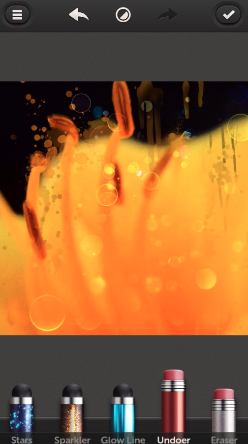
Hopefully from this screen shot, you can see the difference in the image after I used the “Undoer”.
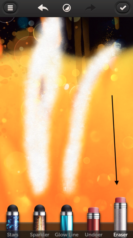
One last effect…the “Eraser”! This removes everything…all your effects, your image, everything…giving you a clean slate to add in effects or if use in the beginning, take away parts of the image you don’t want. Another great tool to have.
So there you have it…my quick look at this brand new app. I would definitely say this is one you need to add to your bag of tricks when it comes out. Lots of fun effects in an app whose interface is very user-friendly!
Additional Important Information
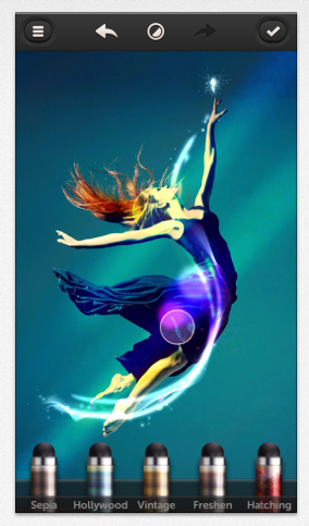
As David explained above this was the beta version of Repix that he tested and very often with beta versions, the developers add additional items to the final version. This is what has happened with Repix on launch today. The following list below, details the additional brushes available with this version today:
We are offering a great giveaway today of $5 for several of our readers. This will enable you to unlock the complete Masters Collection via in-app purchase – don’t miss that – go here to enter.
FREE:
1. Cartoonize
2. Charcoal
3. Edger
4. Dotter
5. Flares
6. Drips
7. Posterize
8. Silk
9. Bleach
10. Undoer (not a real brush)
11. Eraser
PAID:COLOR BRUSHES (set €1.79/$1.99/£1.49)1. Sepia2. Hollywood3. Vintage4. FreshenARTISTIC BRUSHES (set €1.79/$1.99/£1.49)1. Hatching2. Daubs3.Van Gogh4. SprayLIGHT BRUSHES (set €1.79/$1.99/£1.49)1. Glow Smoke2. Stars3. Sparkler4. Glow LineOR UNLOCK EVERYTHING WITH MASTER’S COLLECTION FOR €4.49/$4.99/£3.99



14 Comments
Mark Schnidman
Fantastic and as always an excellent Tutorial/Review by David. I’ve downloaded the app and would love to unlock. At the end of the article it says go here to enter but I don’t see the link. Help.
Deborah aka Blaquira
You can also start by erasing the entire image. You’re left with an entire white canvas. At that point you can start to paint, cartonise and so on. And only that part of the image will reappear!
David
Mark ~ thanks! Glad you like it. As for the link, just hover over the words “go here to enter” that are in bold. This is the link. Sorry for the confusion!
Deborah ~ I hadn’t thought of try that…thanks for the tip. As I said in my article, I had a very short time to play around with my beta version before my deadline…so now I know a new trick to try out! Thanks so much for sharing this!!!
Deborah aka Blaquira
You are most welcome!!
Carolyn Hall Young
Another gem. Thank you, David!
Laurence Zankowski
David,
Sort of off topic, but are you doing the ellipses and arrows on the iPhone or are these screen snaps then taking into your computer? If on iPhone, name of app.
Thanks
Btw, downloaded it, will play to see if any thing comes from it.
Be well
Laurence
Dave
Carolyn ~ Thank you so much!! Always appreciate hearing this!!
Laurence ~ These are screen shots that I then used my Mac app, Preview, to add the arrows and such. I’ll have to see if there’s an iPhone app that will do the same thing…probably is!
Tmas
Great App.
melia
thank you David, for always doing the hard part for us. great tutorial as usual.
David
Tmas ~ I thought so as well!
Melia ~ And thank you! This was a fun one to put together…I’m hoping to do more on this app in the near future!
KazaD
Great view and the app looks fantastic.
However, my one (and only) complaint is that it’s yet another photo editing app that allows you to import from your camera roll but also requires you to have a camera on your device (yes, old school here, still have a first generation iPad which serves me very well, most times). I’ve downloaded it to my phone and it’s fantastic but I hate editing on that tiny screen. I honestly don’t see why I need a camera (as opposed to having one as a fantastic option) if I can import from my camera roll.
David
KazaD ~ you make a good point…and one that I’ve never thought about as all my devices come with cameras. I guess this is another case of a developer choosing not to support earlier devices or iOS versions. The best thing I can suggest is to let them know that you’d like that support included in their app. I’m sure you’re not the only one out there with the same concerns!
KazaD
Thanks for you reply David. I did contact Repix and they responded that the first generation iPad is not supported due to performance issues – I can (technically) appreciate that, it is an old device, and I’m glad that there are lots of lovely editing apps that are still working on it
Nicole E Handy
Please help my phone crashed with all my stuff gone and I can not find Repix anywhere, it is no longer on Google play?