Mobile Photography/Art – Tip Of The Day – Number 3 – The App Whisperer
Welcome to another brand new section from your favourite mobile photography website and one of the most popular in the world. Today, we’re publishing our third Mobile Photography/Art Tip Of The Day to our brand new section of the site.
Every day we will publish a short quick tip to help you with your mobile photography, this may be related to editing your image, capturing your image, printing your image, all manner of things, across the complete photographic and art mobile genre – we’ll be featuring great mobile street photography tips, great blending tips, great cloning tips, we will cover it all from some of the greatest mobile photographers and artists in the world.
We’ll also have a widget in our right hand column, displaying the Tip of The Day every day, just click on that and you will be taken to our tip of that particular day’s page and can read the whole piece.
We are delighted to publish our third Tip Of The Day article today with a great tip from our wonderful Columnist Janine Graf. Janine writes to her iSights Column and it is so fabulous, bursting to the brim with humour, creativity, talent and fun – take a look here.
Over to you Janine (foreword by Joanne Carter)…
‘One of the problems I run into often is color. When doing a composite image oftentimes the images you are merging together have been taken under different conditions. For example, the rhino I always use in my flying rhino images was taken at high noon in the middle of summer in California. The balloons I use for her were taken around 4:00 pm in Seattle. In the case of this image called “Electric Feel”, the background was shot near my house around 10:00 am or so. Oh mercy, the lighting and color differences!
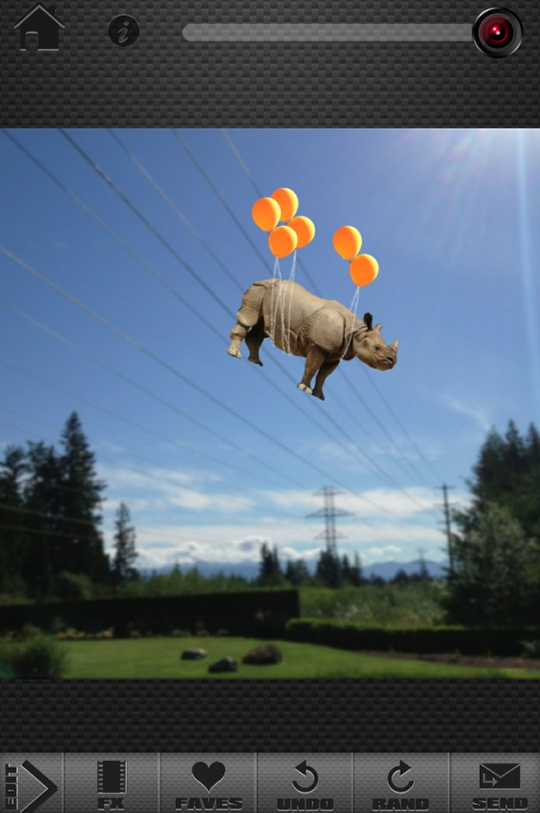
As soon as I was finished putting all the pieces together, I knew immediately that the combination of colors and hues looked awful (that green grass is muddy looking in comparison to the bright orange of the balloons, at least that’s how my eyes see it). So what I like to do in situations like this is turn the whole thing black and white and my app of choice for black and white (and all color in general) is ScratchCam.
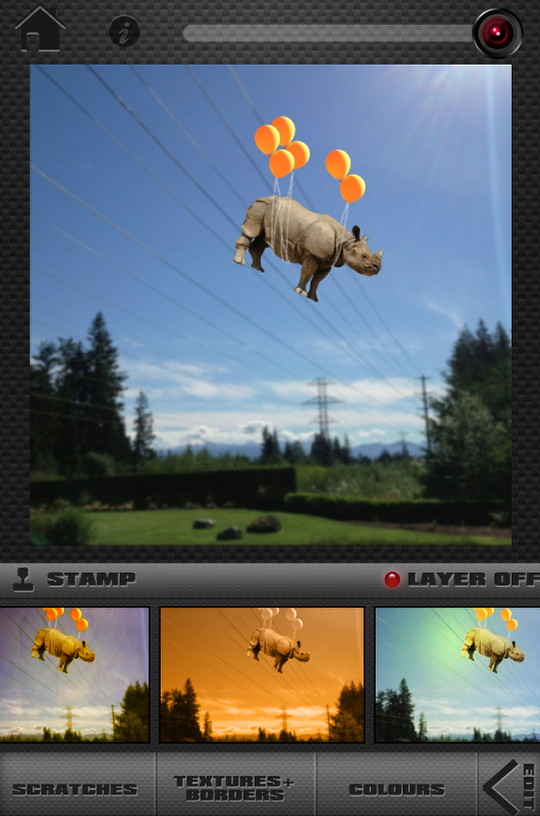
I always go into ScratchCam with an open mind thinking maybe one of their full color options could work miracles on mismatched colors and hues, and sometimes it does come through . . . and sometimes not.
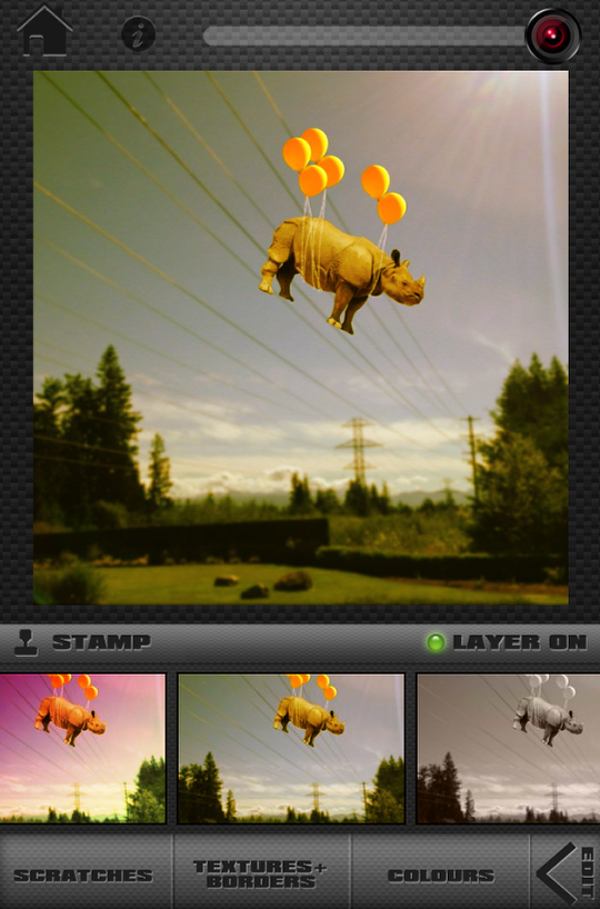
My favorite full color filter in ScratchCam has a really wonderful warm tone to it . . . and makes my rhino look like she overdosed on Vitamin C chewable tablets. I guess black and white it is then!
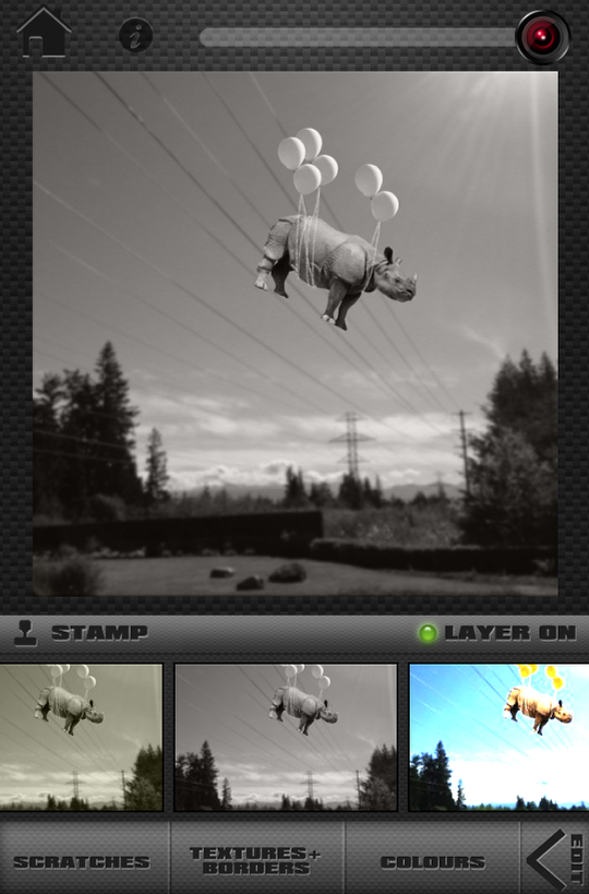
See, doesn’t black and white look much better?! So next time you are struggling with mismatched colors and hues, think about black and white. It has saved many images of mine from the fate of the delete button.
8 Comments
Jerry Jobe
Great tip, Janine! And I’d rather see an orange rhino than no rhino!
Janine Graf
Aw thank you Jerry! 😀
David
So…that’s how you do it! You use Scratchcam to subdue that Rhino!! Very clever indeed!
Janine Graf
Yup! ScratchCam to the rescue every time! Thank you David!
Veevs
Great tip Janine and one that I do a lot 🙂
Janine Graf
Thanks Vivi! Yeah, converting to black and white saves me A LOT! 😀
Carlos
Thanks for the tip Janine!
My 2 cents (pence in UK). Another great program to even out the different color discrepancies is distressedFX. Really…any app that allows you to add a layer or tones of color / B/W to your final composite works. Brings the whole piece together.
Janine Graf
You’ve got that right Carlos! ScratchCam is just my preferred go-to texture / color app. It was one of the first apps I downloaded in fact. I need to play around with distressedFX more; have only spent maybe 10 minutes with it. I found it a little wonky (for the lack of a better word). 🙂