iPhone Photography Tutorial – ‘Atmospheric Mobile Photography Shooting’ – By Paul Brown
We’re delighted to publish Paul Brown’s atmospheric workflow tutorial for mobile photographers. This tutorial focuses mainly on the fog that we have all been experiencing in the UK this week but of course, it’s not country specific – we are sure you’ll find this tutorial incredible useful wherever you find yourself.
We have published several of Paul Brown’s workflows recently. Please take a look at our Paul Brown archive here. Over to you Paul (foreword by Joanne Carter)…
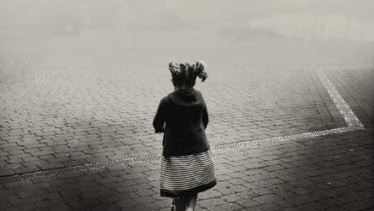
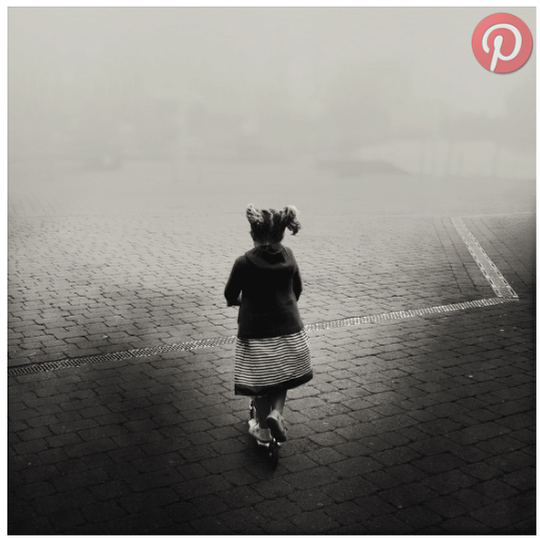
“What are the most atmospheric conditions you can take a photograph in? For me, my iPhone tapping finger starts twitching at the hint of fog. So when the weather forecast predicts fog for tomorrow I know I am all set for a spot of iPhone photography.
Fog is such a tease though. A truly ethereal element. I look out of my window full of the excitement of a child expecting a snow day and nothing. All is not quite lost. Sometimes it lingers on grasslands in the countryside. As opposed to street photography where like a fisherman I can sit in one location and wait for the action, with fog I often have to set out and hunt for it.
This iPhoneography workflow was born out of frustration. Living primarily in the city it felt so long since I last saw fog and so I decided to try to create a foggy atmosphere where none existed. This is my first experiment and I share my workflow in full together with my thought processes. Some processes may not be necessary but I feel iPhoneography is as much about the journey as the end result.
iPhone photography apps used: Filterstorm • Hipstamatic • Snapseed • Superimpose • VSCOcam
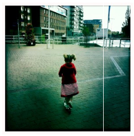
Hipstamatic ~ initial capture:
This combination is John S Lens and Blanko film:
I really like this iPhone photograph in it’s own right. The subject is obviously important but the zig-zag line running across the image gives added interest. It leads the eye in the direction the figure may be heading. As always, if I start with what I consider a good capture I have a full range of options with regard to processing. I don’t have to be dictated to by the image, I am very happy with this straight out of camera (SOOC):
Even so, I decide to play:
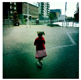
Filterstorm ~ this iPhone photograph was captured with an iPhone4. As a result it was already below the 2,000px x 2,000px minimum resolution I target. I therefore selected Filterstorm to crop the border away and retain the 1:1 ratio. At the same time I increased the image size to my minimum target resolution. I always do this at the earliest opportunity for quality and printing reasons:
This is { image one }:
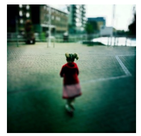
AfterFocus ~ I started the process of creating a narrow depth of field (also known as depth of focus) by quickly running the image through AfterFocus iPhone photography app. With no manual masking I simply went straight to the final screen in the process and selected a suitable gaussian blur level with circular bokeh. Using the Fading BG tool I positioned the focal line roughly at shoulder level with focus gradually fading to the bottom of the buildings ahead. Automatically the bottom portion of the image is affected in the same manner. This is corrected in the next stage:
This is { image two }:
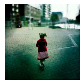
Superimpose ~ image one was layered over image two within Superimpose. A mask was created in 3 stages.
- Part of the top of Rene’s head became blurred as part of the previous process. I therefore masked the top half of Rene using a combination of magic wand and brush tools
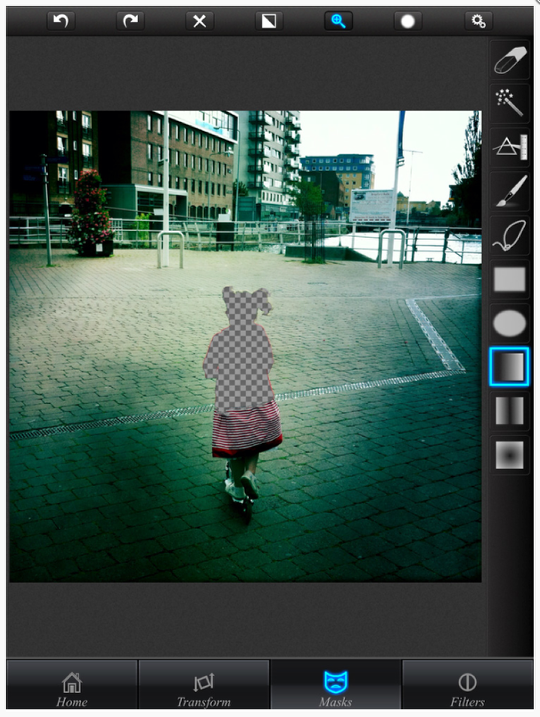
I wanted to bring the bottom half of the image back in to focus so I extended the mask by applying a linear gradient mask centered over the focal line from the AfterFocus process:
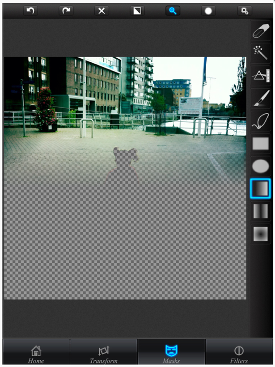
This process has masked the wrong part of the image but is the easiest way to create the mask accurately. I therefore simply invert the mask to reveal the part of image one I wish to retain and reveal image two beneath the masked area:
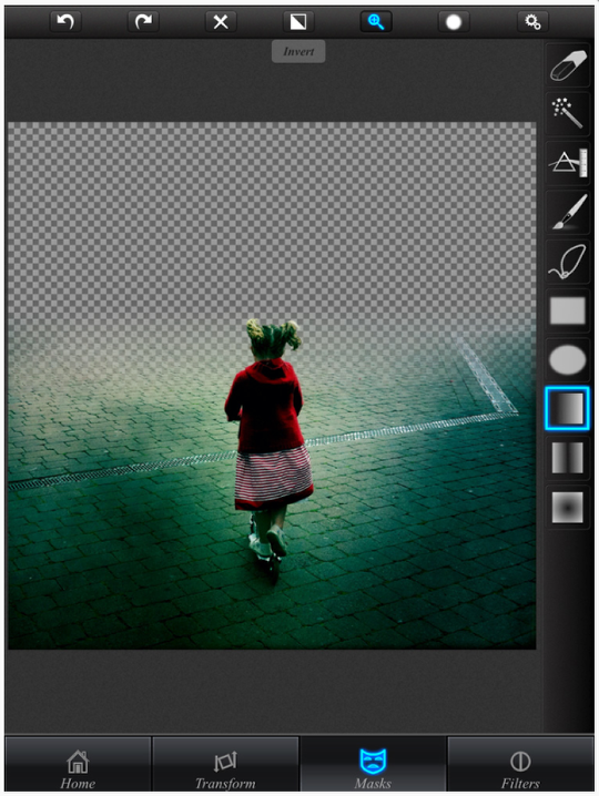
As this is an experimental iPhone photography workflow (aren’t they all), I think it’s best practice to save the mask within Superimpose. This is { image three }:
Many will argue that the previous 2 processes can all be accomplished within AfterFocus. It is true that AfterFocus contains many manual and automated masking tools and this effect can be achieved. However, my concern is quality. The edges of masks and the gradual blending of masked and unmasked regions can result in pixelated areas and harsh boundaries. I have found through experience that specialist iPhone photography masking apps such as Superimpose generate far superior results.
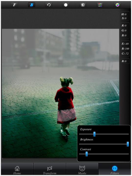
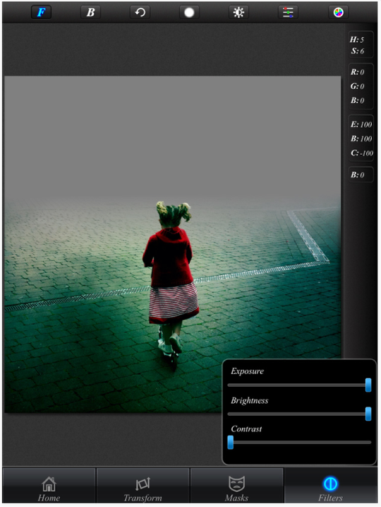
Superimpose ~ At this stage I wanted to introduce a foggy impression. I am trying to limit the number of iPhoneography apps I use – it adds extra challenge but also simplicity. I therefore import image three as the background (in reality I simply combine the layers from the previous process) and load the mask I saved from the previous process as the foreground. I then switch to the filters tab and adjust brightness, exposure and contrast of the background:
This is { fog process one }:
VSCOcam ~ I test the result by bringing the image in to what I always intended to be my final stage of processing by adding a VSCOcam filter:
The filter is X5 with some adjustments made:
- Exposure +1
- Contrast -3
- Tint +6
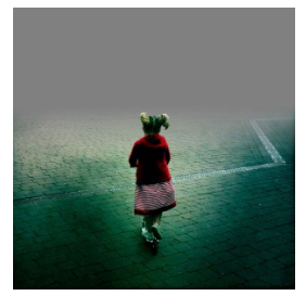
Superimpose ~ The foggy look has been achieved but not to my satisfaction. I therefore repeat ‘fog process one’ but this time with a maximum extreme filter applied to the background layer:
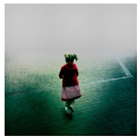
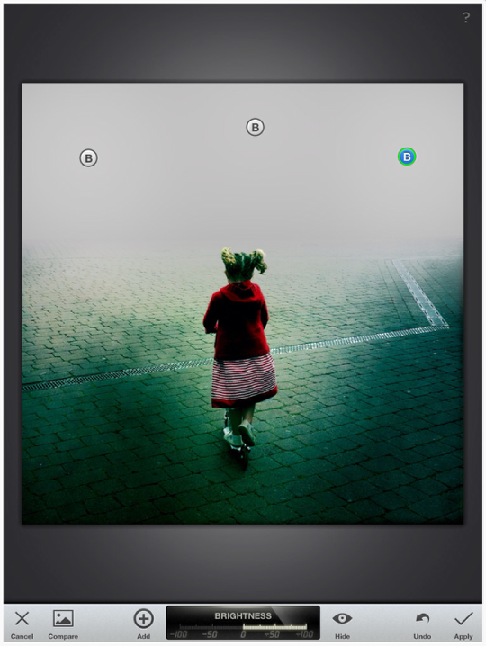
Snapseed ~ the previous process completely obscures the background. There is no opacity. However, the fog is far too grey and therefore I need to brighten it. I could conceivably repeat the previous process in Superimpose by merging the layers applying the mask again and brightening the background. Instead though I decide to import the image in to Snapseed and apply selective adjust as I feel this gives extra levels of control:
This is { fog process two }:
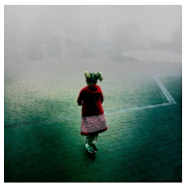
Superimpose ~ the 2 foggy versions (‘fog process one’ and ‘fog process two’) are imported in to Superimpose and a large gradual gradient mask applied to gradually increase the density of the fog with height. Opacity and gradient levels can be adjusted to taste:
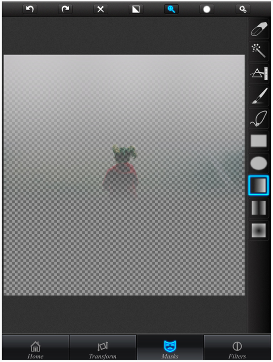
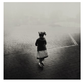
VSCOcam ~ This is a repeat of the earlier results test. I add the final VSCOcam filter:
The filter is X5 with some adjustments made:
- Exposure +1
- Contrast -3
- Tint +6
Fog iPhone Photography – examples from this week
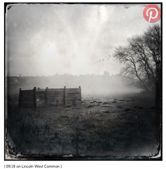
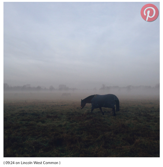
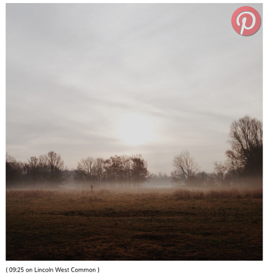
Continuing my foggy theme I guess I should have been a little more patient because no sooner had I created my own iPhone photography fog machine than mother nature provided the real thing. Not exactly a real ‘pea souper’, more a very subtle patchy mist.
As always, I hope you enjoyed my iPhone photography workflow. Apparently I should now have a call to action but I make no demands. If you wish to share please do. If you wish to leave a comment please do. Whatever though, thank you for reading and I hope to see you again.

8 Comments
Elaine (sunflowerof21)
This is great Skip. Thanks for sharing. Fabulous images, as always! Elaine x
Skip
Hi Elaine, thank you very much. It really is a pleasure.
Laurence Zankowski
Joanne,
Paul,
This started out as a ho hum tutorial, but then, i let it sink in. I like this, and so I will keep it as a home screen bookmark.
I have a feeling in the machinations of the App Whisperer, there is a pdf of some sorts, post iOS 7, tutorial doc being made. Or at least i hope so. I would use it.
Be well
Laurence
Skip
Thank you Laurence, I guess the problem with sharing the whole raw process and maybe occasionally taking a wrong turn is that the workflow gets a little bloated. It can be streamlined but I think we learn from mistakes just as much as successes so I shared it all – the diamond and the rough :-). I’m not too sure what Joanne has planned but knowing her lots! Have a great weekend.
Marc Simons
Thanks for the tut! This is very helpful!
carolnicola
Most excellent Skip! I learn so much from your thoughtful and well-explained tutorials, and I so appreciate your time.
One question pls. Did you follow the image sizes thru the manipulations as you have done before? I am new to all this and your tutorial where you tracked image size was very helpful.
In looking back at the app workflow, I think all the apps work with hi res and would maintain the original image size. But when I load some of my images into VSCO cam, it immediately tells me it is down-sizing, altho it doesn’t say to what size. At that point I stopped because my goal in all this is to print as large as possible. So I don’t know what the VSCO cam export size is.
Any thoughts pls? Thank you.
Carol
carolnicola
I wrote to VSCO cam to find out what image size the downsize to. Since I am using an iPad3, they downsize to the native camera maximum size of 5MP.
If I was using an iPhone 5s, it would be 8MP. Seems very strange to me.
And frustrating. It’s a bit limiting to assume larger images would not be imported and allow the app to work on them. Guess I will use other apps for now.
Tracy Mitchell Griggs
Very thorough – my goal for 2014 is to learn how to mask and layer – don’t know how to do this at all – I will use this tutorial to experiment – thanks