iOS Photography Technical Tutorial – iColorama Masking Revisited by Jerry Jobe
We’re delighted to publish Jerry Jobe’s latest iOS Photography App tutorial today. This time Jerry has revisted the iPad app, iColorama and updated a previous tutorial based on masking. We’re sure you’ll all enjoy this very much. Over to you Jerry (foreword by Joanne Carter).
“One year ago I wrote my first tutorial on iColorama. It was on masking, a favorite topic of mine. It’s a step up in your thinking when you first realize that, rather than applying edits to an entire image, it’s possible to edit just part of an image.
iColorama’s masking potential already set it apart from other photo/art apps a year ago. In the past year, however, it has changed radically. The main change is in the ability to export and import masks, making them both reusable and modifiable. The number of available brushes has grown from about 200 to over 1000. The “Show Mask” button allows you to see the mask now. In other words, it really is an entirely new way of masking compared to that first tutorial.
As I look back at the tutorials I’ve written in the last 16 months, there is certainly a lot of potential for the tutorials to become obsolete as the apps change. This one, however, is the only one I feel compelled to rewrite completely. The old one is nearly useless now.
So let’s get started, shall we? For the first part of my tutorial, I will be using a background made with the new Preset>Pattern feature. The patterns available (nearly 200 as of this initial release) are in black and white, with the capability of changing them to other colors. Here I’ve got two nearly identical shades of blue, which lowers the contrast.
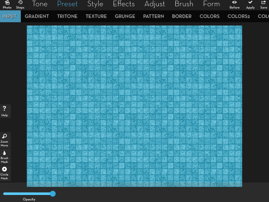
At the bottom of the left side of the workspace, there are two masking buttons: Circle and Brush. They are now labeled, unlike the earlier version. We’ll start with the Circle Mask. When I choose a masking option, Circle or Brush, the mask button turns red and a red border appears around the work area. This is so you can keep track whether you are masking, changing the view or some other function like moving the top image in Blend or using the Artist Brushes. In order to add a circle mask, you tap the New button on the masking toolbar. A double Circle appears over the image. The
Inner Circle
is 100% masked, fading to the
Outer Circle
. The
Outer Circle
and beyond is 0% masked. You can change the distance between the Inner and Outer Circles (the “softness” of the mask) with the Blur Radius slider.
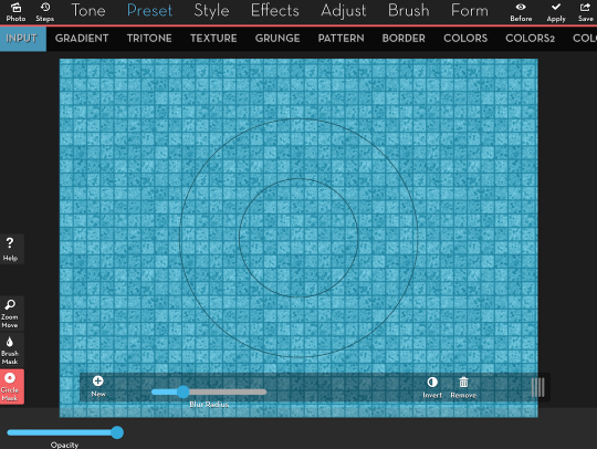
You can’t see any difference between inside and outside the mask in the image above because we haven’t chosen a function yet. We literally have nothing to mask out. So I chose Preset>Colors2>1 so that the difference between masked and unmasked would be more apparent. I also resized the circle with a two-finger pinch, moved it with a one-finger drag, and lowered the Blur Radius.
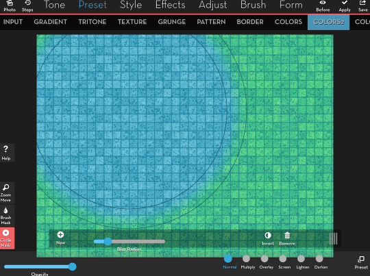
By default, the mask operates to “mask out” the changes. In other words, the mask “cuts a hole” through the changes to let you see the original image below. So in the image above, the circular mask cuts through the yellow color and lets you see the blue below. But sometimes you want the opposite effect – you want to “paint in” the changes with your mask. In that case, you tap the Invert button, and that swaps what is and isn’t masked. Below I’ve tapped the Invert button (it shows as blue) and added another circle, which I dragged down and to the right.
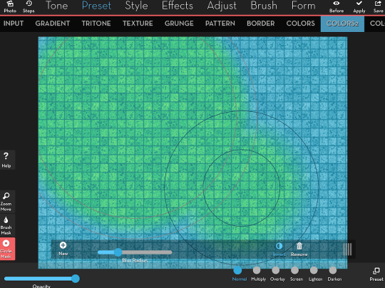
Tapping the Circle Mask button hides the circle guides and the masking toolbar, but the mask remains in place. This shows you, without obstruction, how the masked change looks.
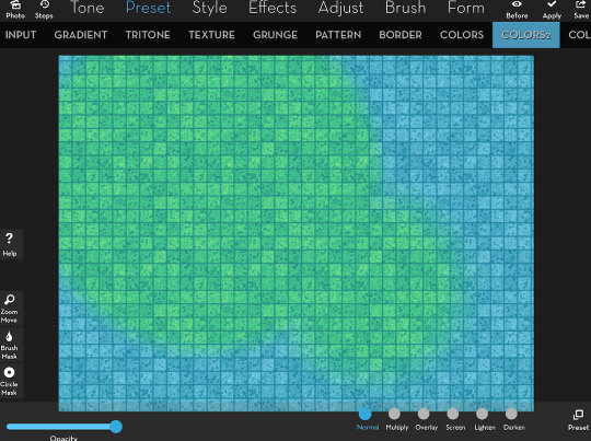
As with all masks, you can change the effect you’re masking without having to rebuild the mask. In the image below, I’ve merely changed the function from Preset>Colors2>1 to Tone>Tint>1. The mask is still inverted, and the Tint is painted into the circles.
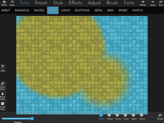
One button I did not discuss on the masking toolbar is the trashcan, or Remove. That button would clear an entire brush mask, but when using Circle masks, Remove takes away one circle at a time, in reverse order to the way they were placed (most recent is deleted first). Below, I tapped Remove once.
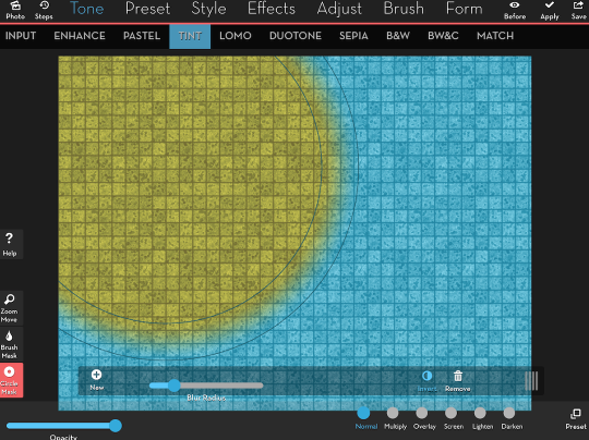
Combining circles can accomplish quite a bit of your masking needs, but more accurate masking is done with brushes. The brush toolbar has been redesigned, with labels to explain the function of the buttons. From left to right, they are Paint and Erase; Brush Size slider; Brush pickers, divided into Groups and Single brushes within the Group; Settings for the brush; Import and Export of masks; Invert, Remove and Show the mask.
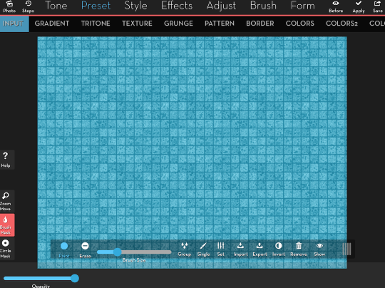
We’ll start by picking a brush to use. You do that by picking first a Group of brushes, then a Single brush within that Group. A year ago, the approximately 200 brushes were divided fairly evenly among just four buttons labeled 1-4. This new system does make it easier to keep track of where your favorite brushes are. At this time, there are 57 different brush groups. We will be selecting from the “misc” group.
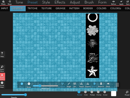
I tapped the Group button once again to dismiss the Group menu, and tapped the Single button to bring up the list of brushes within the Misc group. I am going to be using a cloud brush once again – #35 of the 74 brushes in the group.
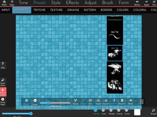
I want to apply white clouds over the background. In order to apply a single color, I use Preset>Gradient>1. This covers the whole image with white – I want to paint in the clouds instead. So I tapped the Invert button, to change from “cutting out” with the mask to “painting in”. Then I tapped once on the image to paint my clouds.
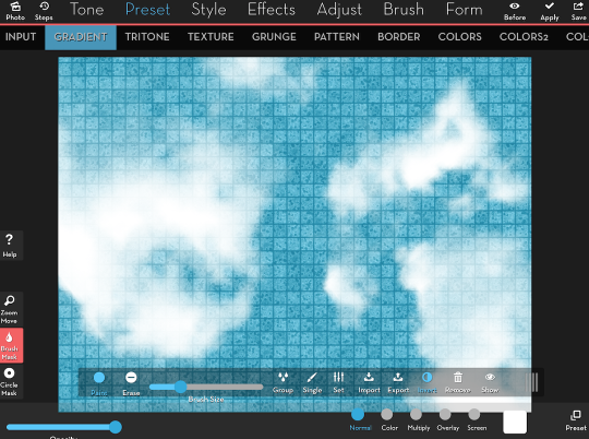
But they’re huge! They cover the whole screen! There’s a slight bug, soon to be fixed, that sets the initial brush size too large. So I lower the Brush Size using the slider, then tap Remove to delete the mask, and Invert to go back to painting in.
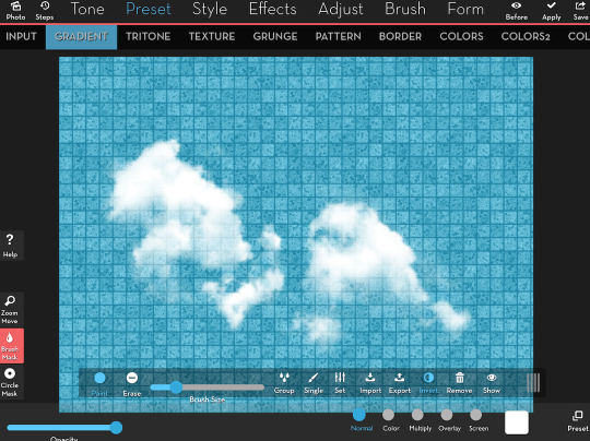
Below I’ve lowered the Brush Size again and tapped up and to the right, laying in more clouds.
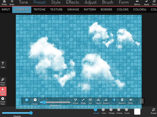
There’s something funny about those clouds. They don’t look quite natural. Why is that? To my eye, it’s that their orientation – exactly the same – makes it obvious that we’re using the same clouds again and again. Perhaps if they turned, it wouldn’t be so obvious. On the other hand, if they were another sort of brush, like a drip, it would be unrealistic to have the drips running every which way rather than straight down. Rotation of the brush is handled under Brush Settings, and we’ll take a break to look at that. I’ve darkened the background to make the brushes more obvious, and I’m choosing brush #2 under the group Doodles – some arrows that will readily show rotation.
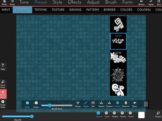
I tap once, and the arrows are pointing up and slightly to the left. Why are they not pointing to the right, as in the thumbnail? The switch for Manual Rotation is turned on, which means that slight changes in the way your finger or stylus touch the screen will affect the rotation of the brush. Turning it off means that the rotation will be affected instead by the Rotation slider immediately underneath.
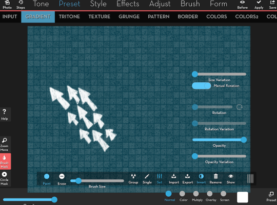
Below I’ve turned Manual Rotation off, and each time I touch the screen, the brush is turned the same way.
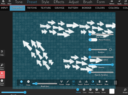
Finally, I made several touches, some with Manual Rotation and some without, and changed the function from Preset>Gradient to Style>Edges>6.
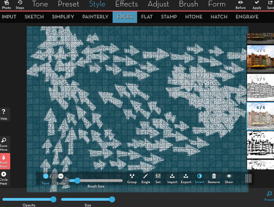
Let’s return to the clouds, and make strokes rather than just touching the screen. As I slide the brush around the screen, the brush rotates (whether I’m using Manual Rotation or not) to fill in the area where I’m stroking. This also makes the interior 100% opaque, even though the edges of the brush are only partially opaque. Hmmm, I could invert this mask and make it into a border for a painterly image – but I won’t do that now.
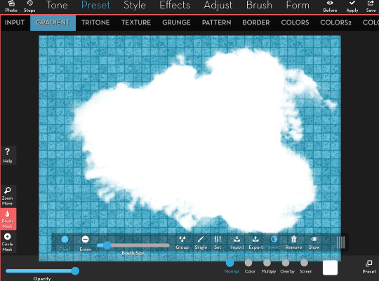
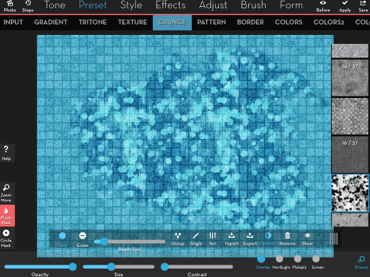
Once again, as with all masks, you can change the function that is being applied with the mask. Below, I’m using Preset>Grunge>17.
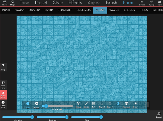
And the next image shows me using Form>Glass>1. Looks like I had a spill. Cleanup on Aisle 6!
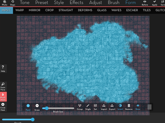
Let’s see what happens when we use the Show Mask button. The dark red overlay that appears will always be over the portion of the image that is NOT affected by the function (in this case Form>Glass). It’s the part that remains the same after the mask is applied. It’s up to you, and how your brain works, whether or not using Show works for you. Prior to Show becoming available, I used Preset>Gradient to paint in a color that made an obvious difference in the image, then changed the function to whatever I was trying to apply. That method still works best for me now, and I will use it as we continue this discussion.
Masks stay in place when you hit Apply. Therefore, you can layer multiple functions on top of the same areas of your image. Below, I’ve applied the Form>Glass, and added Adjust>Exposure to darken the area and add more contrast.
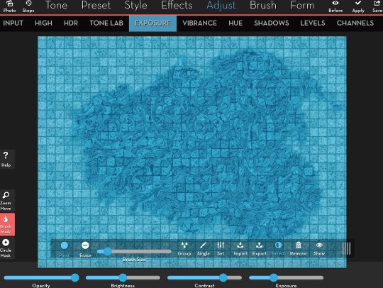
Let’s go through the process of masking very specific portions of your image. I want to treat the girl different than the background, so I want to create a mask over either the girl, or the entire background. I believe it will be easier to paint in a mask over the girl. The default brush is Basic>1, a very soft-edged round brush.
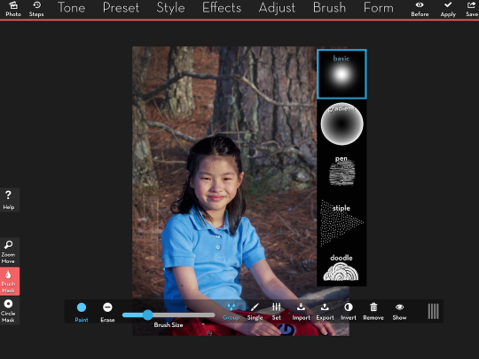
I want to have a stronger edge when painting over the girl, so I choose Basic brush #5.
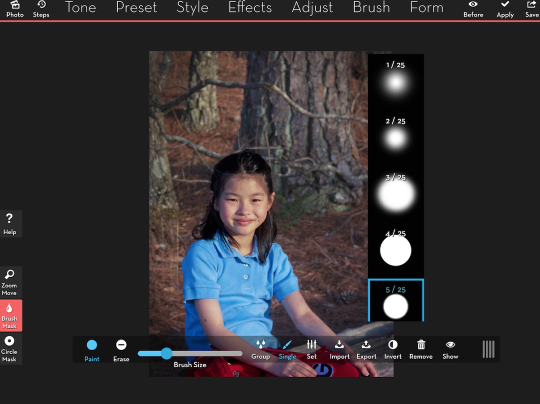
I take the brush down to a small size and start painting. It’s still fairly large, though, and not good for the fine work necessary around the edge of the girl.
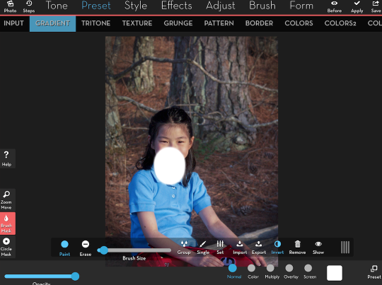
I tap the Zoom Move button and use a two-finger pinch and drag to zoom in on the girl. Notice how the Zoom Move button is blue while active and a blue line surrounds the workspace. If you touch the screen to zoom or move while the Brush is active, you will make brush strokes. Pay attention to whether the current function is Zoom (blue) or Brush Mask (red)!
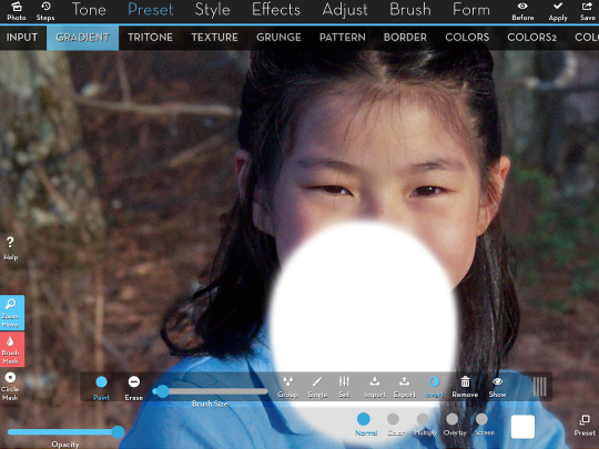
I tap the Zoom button to deactivate Zoom and start brushing. The Brush size is relative to the workspace. In other words, as I zoom in, the brush remains the same size on the screen – it doesn’t get larger as I zoom in. So I can make much finer brushstrokes without touching the Brush Size slider by zooming in. I can get right up to the edge of her hair.
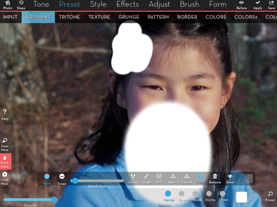
By zooming and panning, then brushing and erasing (which uses the same brush at the same size as Paint), I fill in the entire girl. But (initially at least) I want the changes to apply to the background. Since the Invert button is on so that I can Paint in changes, I’ll need to turn it off to affect the background.
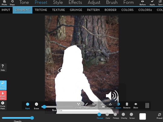
Below you’ll see the white now covers the background, and all I’ll need to do is change the function from the Preset>Gradient white. First however, since I went through a lot of work to create the mask, I want to save it by tapping Export, which will save the mask to the Camera Roll. I can then reload it at any time if I want to create a different version of the same image.
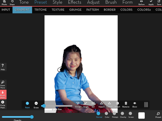
Below is the saved mask. It is the mask that is not inverted. In iColorama, white conceals and black reveals your changes. So the mask, as saved, will allow changes to the background. If I reload it and want to make changes to the girl, I will have to invert the mask.
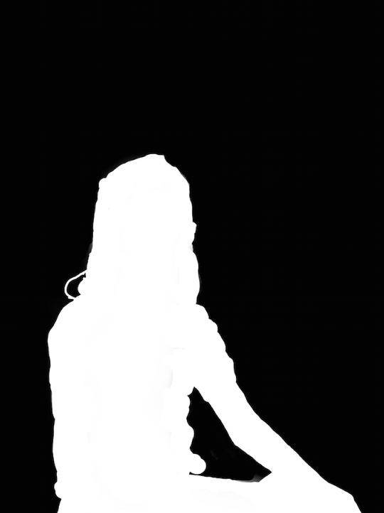
I’ve decided I want to do a mixture of old and new – old background and new girl. So I choose Tone>Sepia>17 to give the background an old coloring.
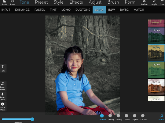
Then I add Preset>Grunge>35, and lower the Opacity slightly. See, the multiple changes are only applied to the background.
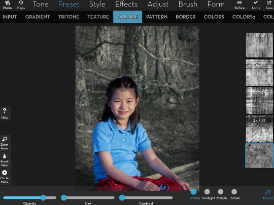
Next I add Preset>Border>23.
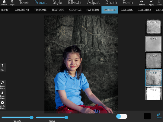
I finish off the background with Preset>Border>27, with Opacity lowered to about 60% so it won’t be even darker.
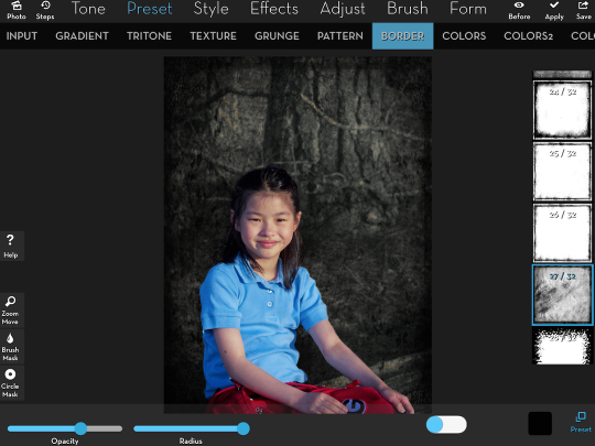
Now I want to make changes to the girl, so I access the Brush Mask toolbar and tap the Invert button.
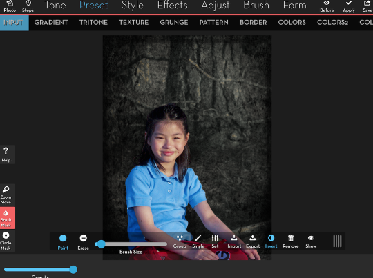
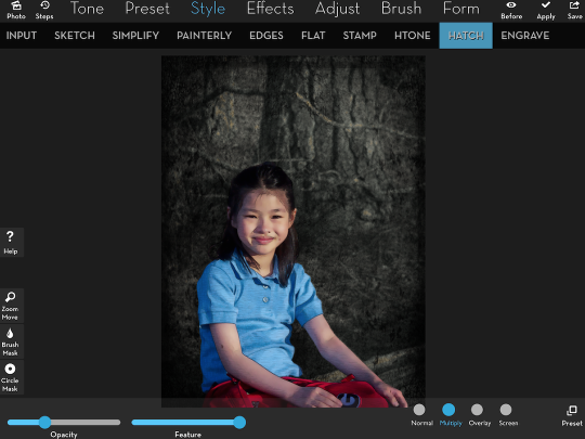
I use Style>Simplify>1, Style>Edges>1 and Style>Hatch>1 in Multiply mode with the Opacity at about 25%.
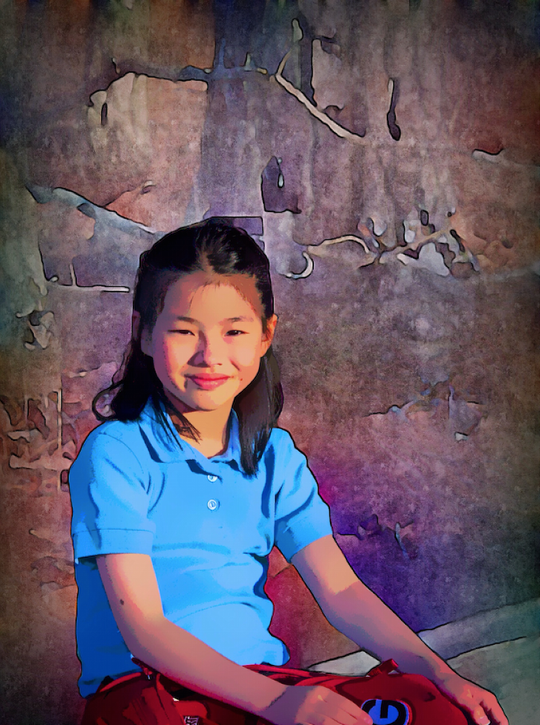
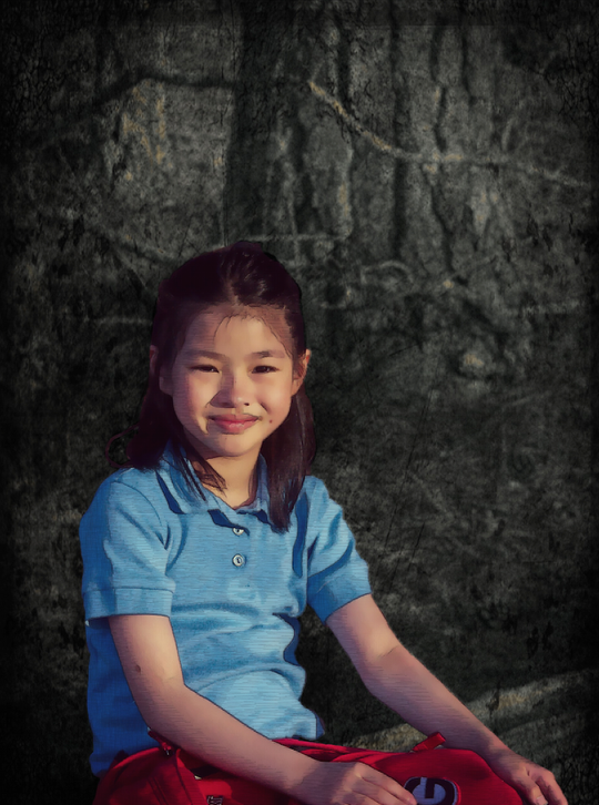
My finished image.
Another advantage of having saved masks is that you can manipulate them directly. I’m going to walk you through manipulating a mask directly in order to create a drop shadow for a blended image, something not currently available in iColorama. We start by going into Effects>Blend and loading the mask as an image over a background the same size as the photo of the girl.
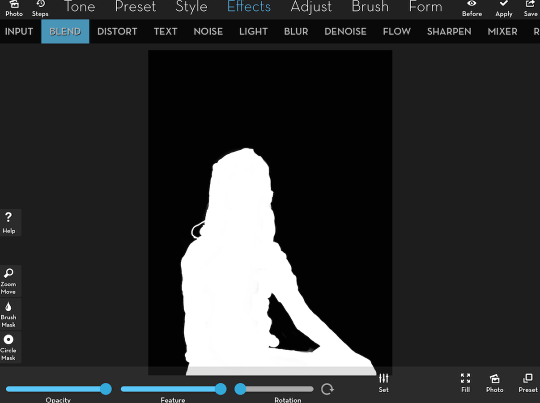
We want our drop shadow to be down and to the left of the girl, just as the shadows are in the original photo. So we drag the top image in the Blend down and to the left.
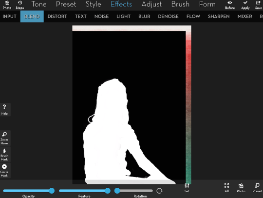
There’s an edge now that we want to be black in the modified mask, so we want to paint black over the edge. I choose Preset>Gradient, change the color to black, and bring up the Brush Mask to Invert the mask so we can paint the black in.
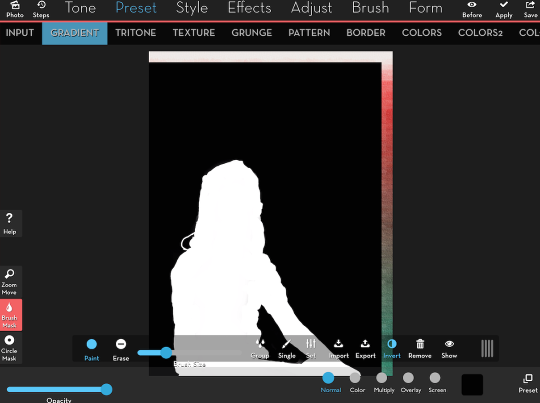
I lower the brush size and start to paint around the edge.
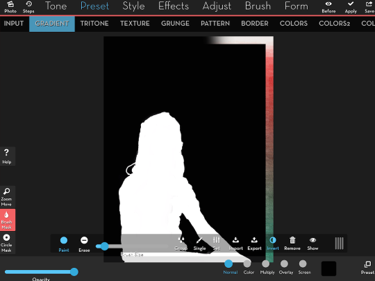
Shadows are not sharp, so I apply Effect>Blur>2 with the Feature slider down at about 30% so it isn’t too fuzzy. I Save the finished, blurred mask.
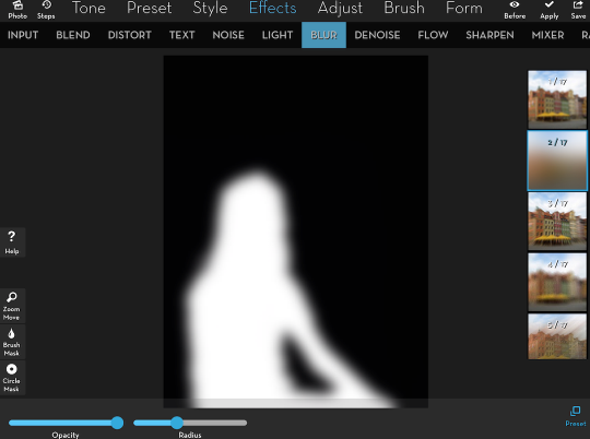
Now I can go back to my background by using the History function (Steps). I choose the first step, before I’d started modifying my mask.
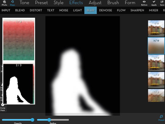
In order to create a shadow, I Import the blurred mask from my camera roll and Invert it. (I have to Invert it so that my shadow is created where white is in the mask.) Then I add a black gradient and lower the opacity so it’s more like a shadow.
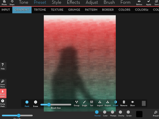
Next I load the sharp mask and invert it so I can add the girl back over the shadow. I use Effects>Blend to load the simplified, edged, hatched girl on top.
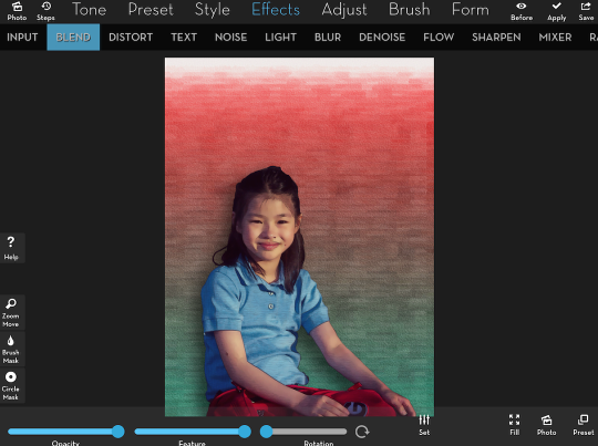
A slight crop, and here’s a finished image.
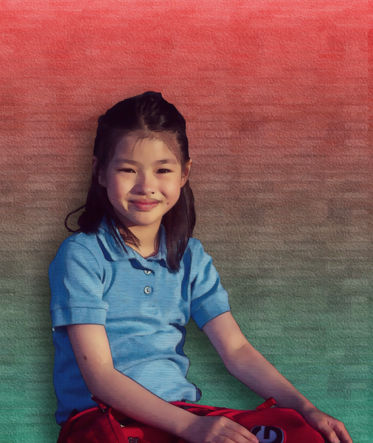
I hope that this masking tutorial for iColorama is a real improvement over the one I posted a year ago, and that the ability to use circle or brushed masks, and the ability to save, reload and modify masks is a real boon to your iOS artwork. Enjoy!
Being able to revisit an edit without rebuilding a mask is certainly a boon to me. We’ll close today with several treatments of the same image we’ve been using. Some of them are done entirely within iColorama, and some use the mask to blend in images from other apps. Our first is done entirely in iColorama.
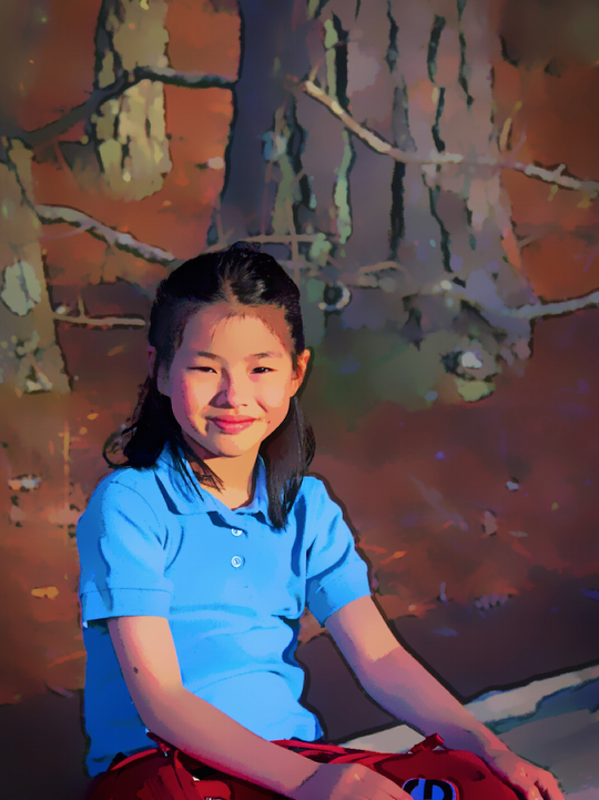
In the next one, the background was darkened in iColorama, but the girl was done in Artoon.
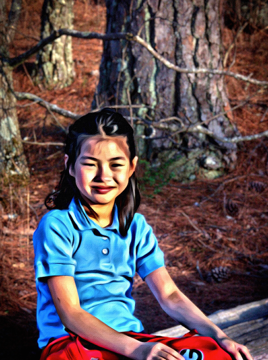
Next, the girl was done in Moku Hanga.
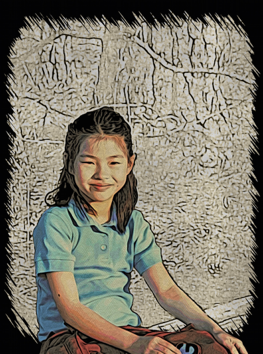
Finally, another image entirely with iColorama.
