iOS Photography Tutorial – PhotoCopier – ‘Emulating the Masters’ By Jerry Jobe
We are delighted to publish our latest iOS Photography Tutorial by Jerry Jobe. This week Jerry puts PhotoCopier through its paces and creates some very pleasing results. Don’t miss this, over to you Jerry (foreword by Joanne Carter).
PhotoCopier retails for $0.99/£0.69 and you can download it here.
“Last week I covered PicGrunger, an app that always makes a big impression. By that I mean that the effects were strong and not easily modified. But adding texture to an image is not always best achieved by scarring the image with a lot of grunge. PhotoCopier, by Digital Film Tools, is an app that gives your images the look of famous paintings, movies, images and processes. It allows you to modify just how much your image looks like the masters by giving you control of the color, tone, texture grain, detail, brightness and vignette. This is not an app for radically changing the look of your image; it’s a finishing app that can give just that last touch that’s needed”.

PhotoCopier is a universal app, and as usual, I’ll be showing the iPad version. The controls for the iPhone version are the same, except that the sliders are grouped into three categories rather than all being available at one time.
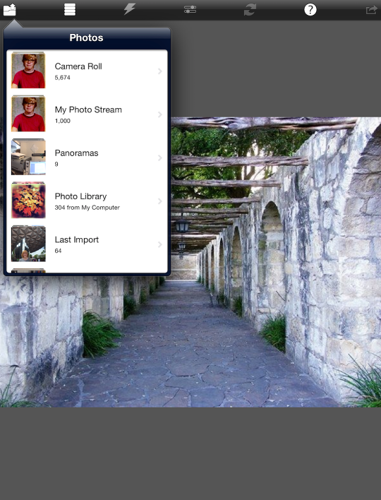
There are six buttons across the top of the screen. From left to right, they are Load (seen below), Filter, View Original, View Sliders, Reset Sliders, Help and Save. I’ve chosen a low-resolution image I took at the Alamo several years ago to work with. (PhotoCopier will save at a maximum resolution of about 4MP; decent, but not full resolution.)
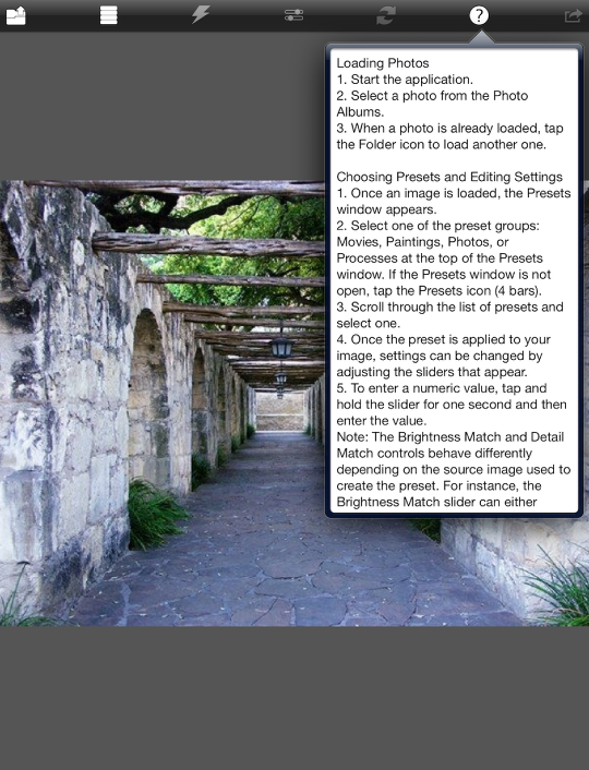
Help is a text file that is certainly better than nothing; but it would be improved with some screenshot examples.
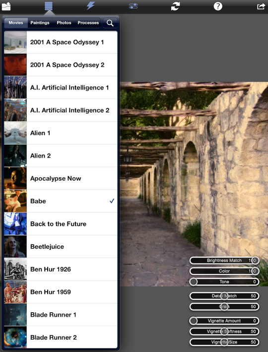
PhotoCopier has a whopping 233 different filters grouped into four categories: 91 Movie looks, 72 Paintings, 40 Photos and 30 Processes. Each filter has a thumbnail of the original to give you an indication of the look that will be applied, but the thumbnails are too small to give you more than a hint.
Below you’ll see a check on the Babe filter. It gives a pinkish-yellow, warmer look to the image (which was originally very blue). When I chose a filter, the sliders that apply for that filter appear in the lower right, grouped into three sections. The first group will include Brightness, Color and Tone; the second will include Detail, Grain, and Texture; and the thirds will have Vignette Amount, Softness and Size. These sliders can be hidden to show the image by tapping the center Slider button at the top.
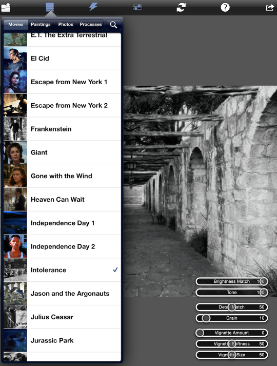
Next I scrolled down and chose the Intolerance filter, from the D.W. Griffith silent classic. Since it’s a B&W filter, the Color slider disappears.
The JurassicPark filter gives a blue nighttime look.
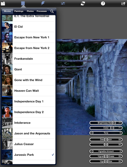
Each filter has a color, brightness, grain, and amount of detail associated with it. It also has a set of default slider settings. I’m not really sure which filter I changed to now – I believe I changed back to Babe and moved the Brightness Match and Detail Match sliders.

The controls for the first two groups of slider work the same way – if the slider is all the way to the left, the image retains the original characteristic, but if the slider is moved all the way to the right, your image takes on the characteristic of the filter. In the screenshot below, I’ve moved Brightness Match all the way to the left and the original brightness of the Alamo shot is retained.
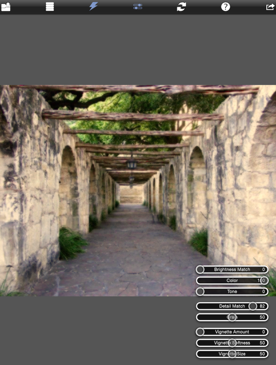
Move it all the way to the right, and it takes on the darker tones of inside the barn in Babe.
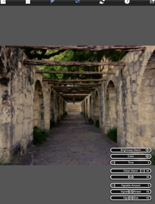
Color works the same way. In the above image, the Alamo has taken on the warm colors of the movie. In the image below, I’ve moved Color to 0 and it’s back to the original bluish cast.
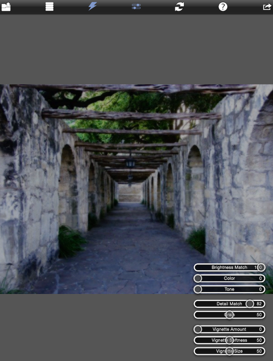
Tone is used to take out all original color and create a duotone, using the two predominating colors in the filter image. It is originally set at 0, but the image below shows Tone turned to 100%, which creates a sepia image.
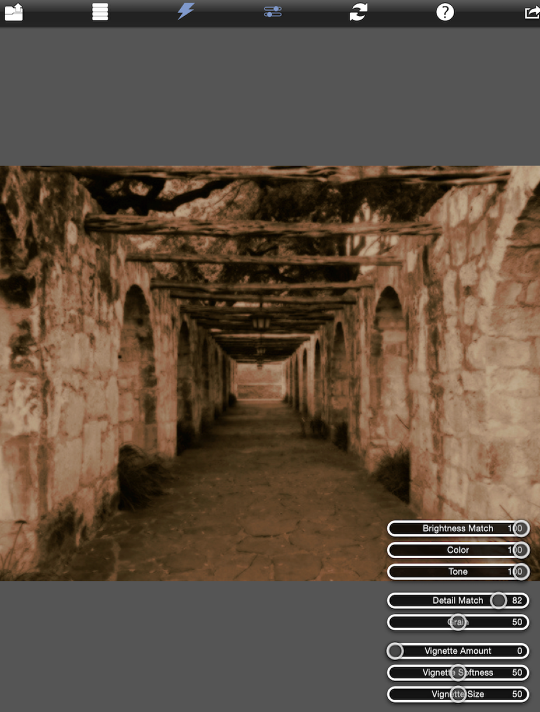
Detail Match addresses the sharpness of the image. In this case, Babe had a soft, nostalgic focus, so putting Detail at 100% above gives the image a glow. That glow is removed in the image below by setting Detail Match to 0.
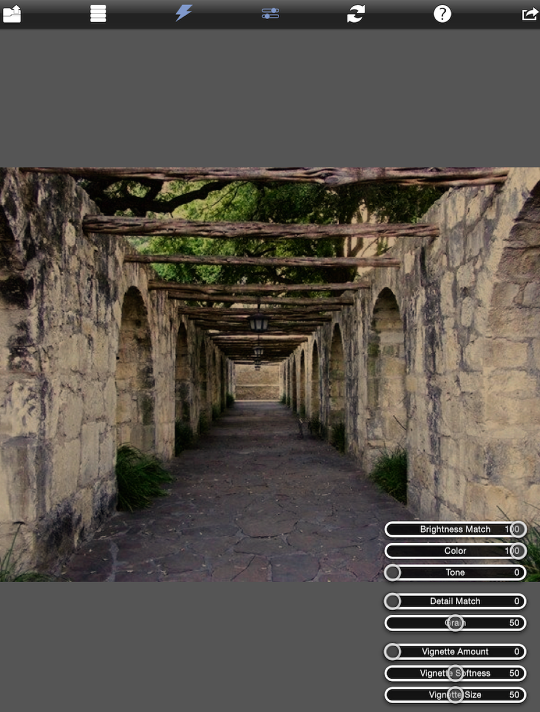
Grain is grain; there is nothing much that can be said about that. You can either keep what you have, or add the grain from the filter image. It does bring up one problem I see with PhotoCopier – there is no zoom capability that would allow you to see the grain or texture you are adding up close. The addition of zoom and full resolution would be greatly appreciated.
The Vignette controls are fairly self-explanatory. Amount is strongest at 100 and nonexistent at 0. Softness is maximized at 100 and you’ll get a hard edge at 0. Size is smallest at 0 and largest (completely disappearing off the side of the image) at 100.
Vignette controls are not part of the individual filters. This means that changes to the Vignette sliders are carried forward if you change filters. All three can be instantly reset (for no vignette) by tapping the double arrows, or Reset Sliders button.
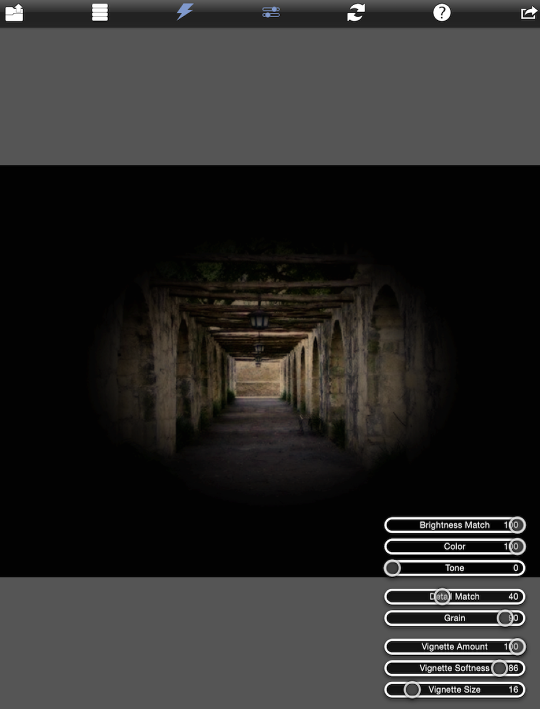
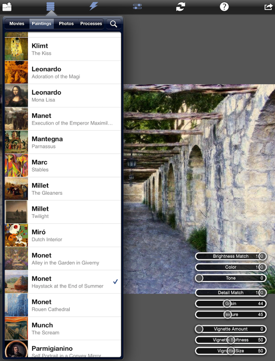
The next set of filters is Paintings. Paintings have a texture, while Movies do not. As you can see below, there can be multiple works by a single artist for you to emulate.

Below I’ve chosen Bruegels’ BabelTower. Notice that the Vignette settings are remaining at a level that almost completely obscures the image. Tapping the Reset button or moving the Vignette Amount slider to 0 will fix that.
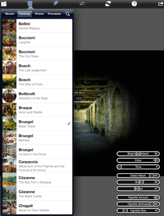
In the image below I’ve removed the vignette and boosted the Texture to 100. That’s too much texture – I’m seeing some banding.
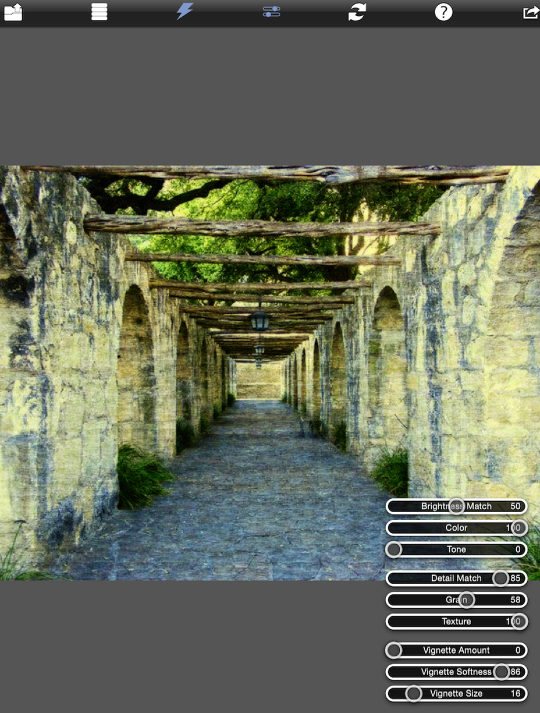
Putting the Texture back to 47 gives a pleasing effect.
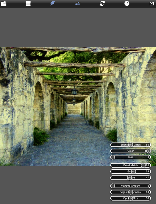
Each artist has their own texture. Below I’ve changed the filter to Monet’s Haystack at the End of Summer, and in addition to the color changes, you’ll notice a different texture than the Bruegels.
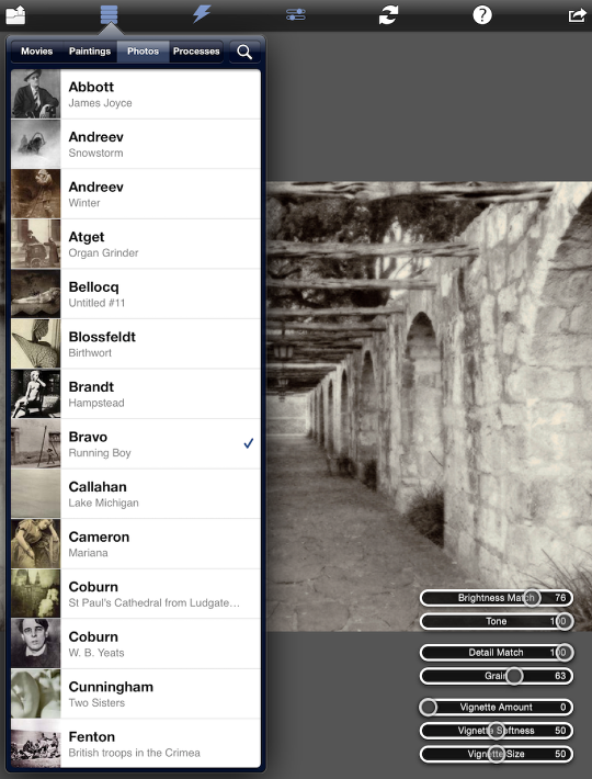
The next set of filters is Photo, and I’ve chosen Running Boy by Bravo. It softened the details, lowered the contrast and removed the color.
I like that, and want to save it. That’s just a matter of tapping the Save button at the upper right, and confirming by tapping on the big red Save button that appears. There are no social network options within PhotoCopier.

And here’s the result. It’s tiny because it was low-resolution to start.
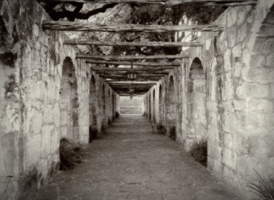
The final group of filters is one that’s fascinating to students of photography – Processes. It has everything from Cyanotype to Palladium to Polaroid SX70 to Wet Plate. Below I’ve chosen a nice Infrared setting.
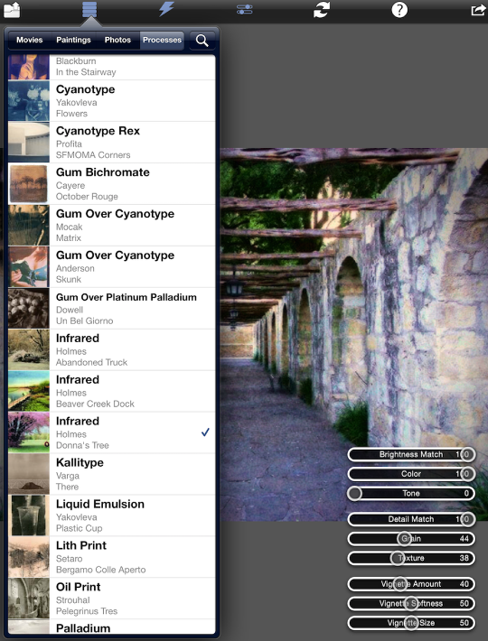
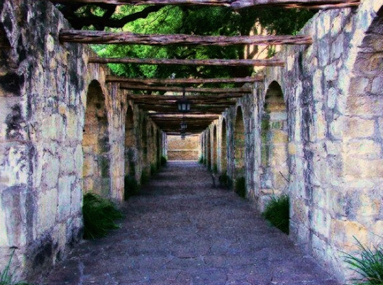
And here’s the result.
PhotoCopier is capable of producing many subtle and effective looks for your images. With 233 filters to choose from, you are bound to find something you like. These next two images are of a higher-resolution photo, given the same filters as the last two examples. First, here’s Bravo’s Running Boy.
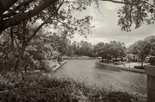
And here the Infrared filter from Processes gives a nice pinkish cast to the plaza.
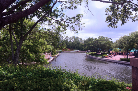
The Paintings filters can give texture to smooth images, such as this cartoonish image of my daughter. (Botticelli’s Adoration of the Magi)
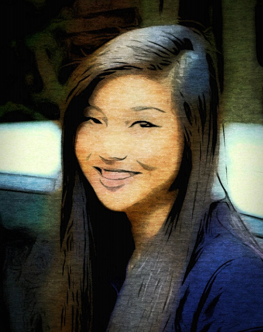
Cezanne’s The Black Castle and a strong vignette add to this macro photo of a flower.
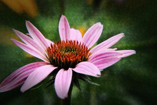
And what better to add to this painted image of my daughter than Vermeer’s Girl with a Pearl Earring?
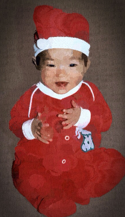
I highly recommend PhotoCopier. You’ll spend many productive hours giving your image a touch of the Masters. Enjoy!


6 Comments
Susan Maxwell Schmidt
I adore PhotoCopier, it’s actually been my secret weapon for some time. I could swear I’ve successfully saved images larger than 4mp with it on my iPad, tho. I’ll have to investigate.
Susan Maxwell Schmidt
I finally got around to looking into this. I have no problem saving a 12 megapixel image as a 12 megapixel image using PhotoCopier on my iPad 3.
Jelly Beans
Jerry, what is the app the produces artificial lighting like standing at a window with blinds? I thought it was LensLight but now I’m not sure.
Respectfully, Appaholic…
sms
Rays might be the app you’re looking for 🙂
Jerry
Jelly, I believe the app you’re talking about would be Rays. I reviewed it along with Lens Light exactly a year ago on enthusiasm noted.
Jelly Beans
Thank you very much, Jerry and sms. I will have to make a note when I see one of your great reviews so I can recall later when I need it.
FYI, your articles are awesome; I even like your music videos!
Keep up the good work!
Jelly