iPad Photography App Tutorial – Pixelmator Part 4 – Brushes, Smudgers and Erasers by Jerry Jobe
We are delighted to publish Part 4 (of 5) of a wonderful series of tutorials covering the brand new Pixelmator app for iPad. If you have missed Part 1, please go here, for Part 2, go here and for Part 3, go here. This time Jerry discusses Layers and Selections in this extensive tutorial. We’re quite sure you will find this tutorial invaluable (foreword by Joanne Carter).
Pixelmator for iPad retails for $4.99/£2.99 and you can download it here
“I have to admit I’ve dreaded this part of the series on Pixelmator. Put a brush in my hand and disasters occur. I immediately revert to drawing stick figures larger than houses – and the houses have curly smoke coming out of the chimney.
But Pixelmator offers brushes, smudgers and erasers that allow you to create art from scratch, without any photos. So here I am, trying to explain tools that hopelessly overmatch my meagre skills. Buckle yourself in and let’s get started.
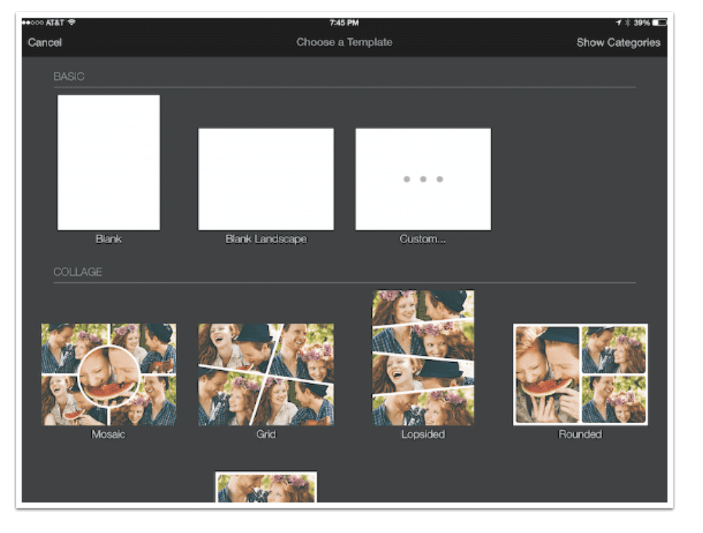
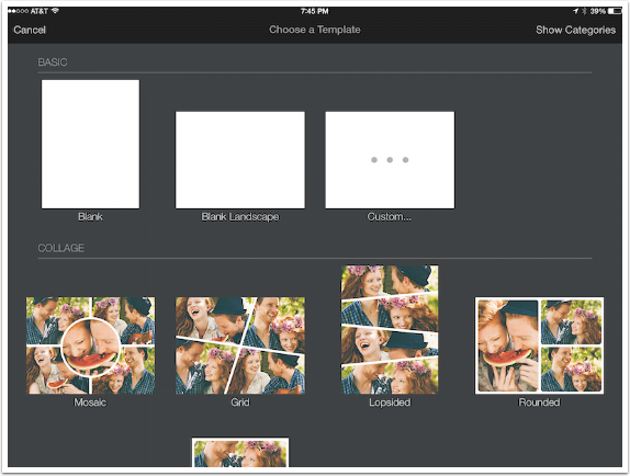
Pixelmator allows you to start with a blank canvas – Portrait, Landscape or Custom, which lets you set the dimensions of the canvas. All produce a plain white canvas”.
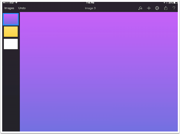
I did not want to paint on a white background, so I used the technique outlined last week to add a colored background by adding a layer. I didn’t like the flat yellow, either, so I added the blue-purple gradient you see below. That gives me three layers, two of which will never be seen and just take up precious space. I could delete the white and yellow layers, but that wouldn’t show you anything new. Instead, I am going to merge the layers into a single layer.
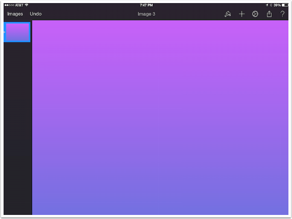
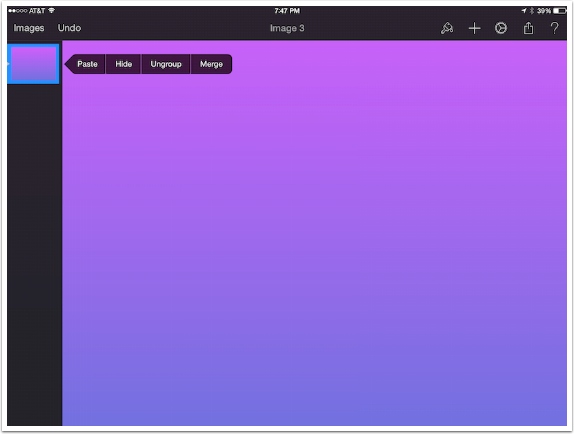
The first step in merging layers is to group the layers in the Layers palette. This is accomplished by dragging the layers on top of each other. Below, in the layers palette, instead of seeing three layers, you see one with a tiny triangle in the highlight border. The triangle signifies a group.
The menu bar for a group is different than the one for a single layer. You can’t assign Styles to a group; you can’t duplicate a group. But you can merge the layers of the group, clearing space for more layers for your project.
Now that the background is ready, we can begin to paint. The background can be painted directly. For maximum flexibility, though, painting should be done on a blank layer. The quickest way to do that is by pulling the Layers Palette down until the + sign appears. Tapping the + will create a blank, transparent layer for painting.
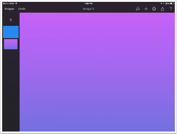
The blank layer shows as a “graph” in the Layers palette.
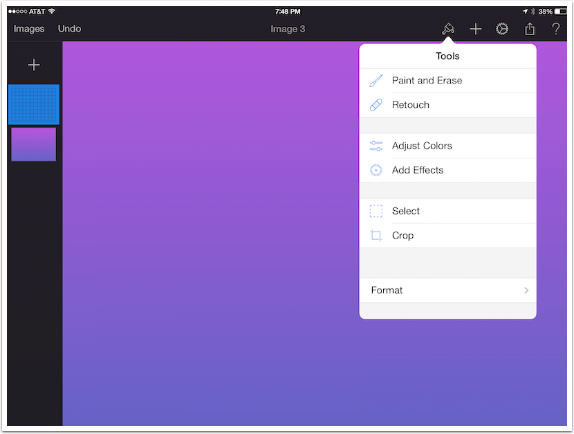
The brushes are found under “Paint and Erase” in the Tools menu under the Paintbrush icon.
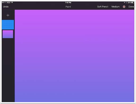
The menu at the top right changes, and the top center says “Paint” to tell you that you’re in painting mode. From left to right are the Brush Tip (Soft Pencil), Brush Size (Medium), Color (a brick color), and Done, which exits from painting mode.
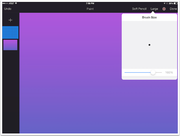
Let’s take a look at Brush Size. When you the Size menu first appears, you’ll see a number of choices ranging from Very Small to Very Large, and a slider at the bottom. You can choose one of the options or move the slider. It is only when you move the slider that you see an actual representation of the brush tip, as shown below. Because the currently selected brush is a pencil, even a brush at 160% (Large) is not large at all.
We looked at the Color Picker in the last instalment. The only feature I want to point out in the Color Picker in relationship to painting is the eyedropper. Since Pixelmator does not allow you to create custom palettes for use in a project, it becomes crucial to use the eyedropper to ensure you are using the same color throughout your project.
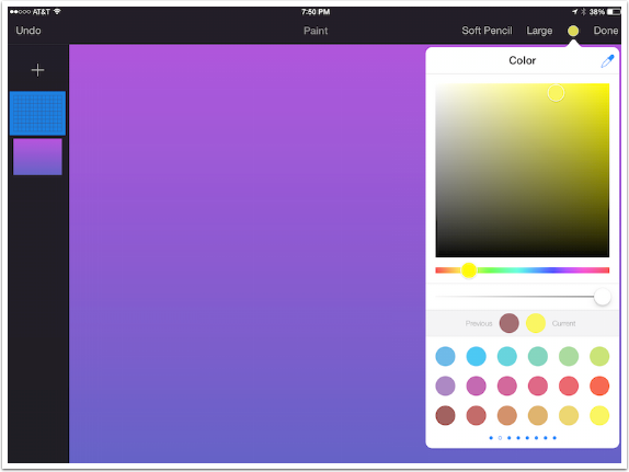
The color is changed to yellow and a stroke is made on the screen. If you look at the Layers Palette, you will see the line on the blank layer, not on the gradient layer.
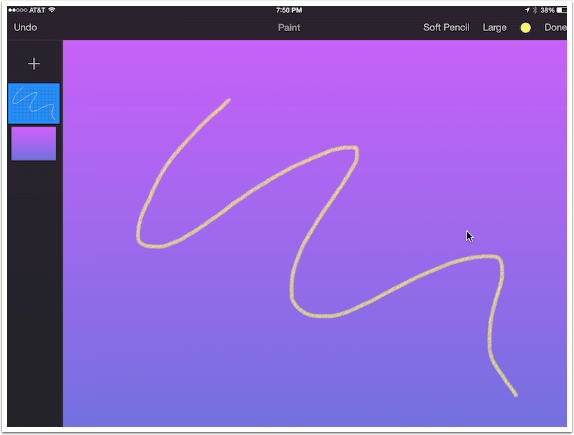
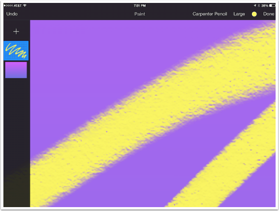
As I will throughout this exercise, I tap the Undo button to remove the stroke I just made. I change the Brush Tip to Carpenter Pencil and make another stroke. I did not change the Brush Size; Large for the Carpenter Pencil is a much larger tip than the Soft Pencil tip.
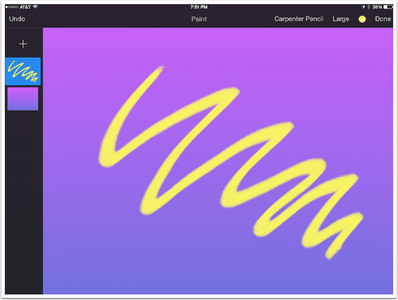
By using a two-finger pinch, I am able to zoom in and see the detail of the brushstroke. Note: The brushstroke size is relative to the image, not the screen. Zooming in will not make a Large brushstroke capable of creating fine details – the brush size must be made smaller in the Brush Size picker.
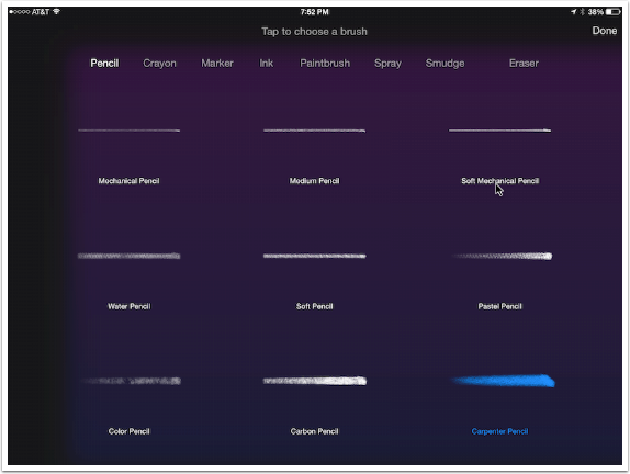
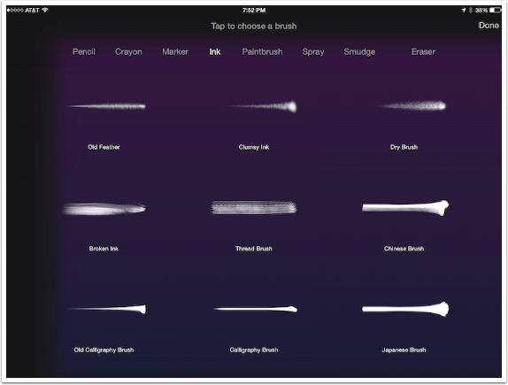
Let’s take a look at the various brush tips. They are broken into categories, with nine different tips in each category. Here are the pencils. The currently selected brush tip, Carpenter Pencil, is highlighted in blue.
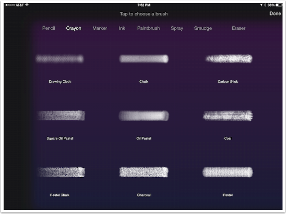
The next category is Crayon, which also contains Chalks, Charcoals and Pastels.
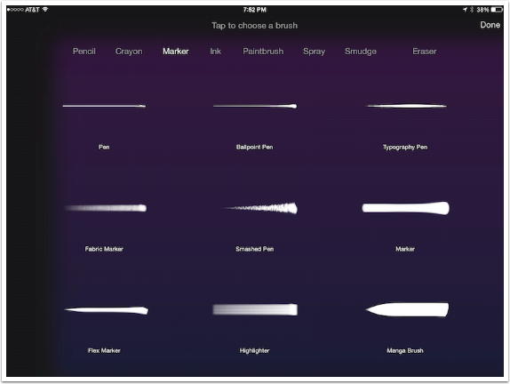
Below you’ll see the Marker category, which includes Pens.
You might want to use a brush in the Ink category for calligraphy.
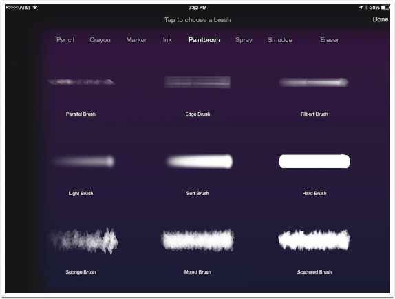
The Paintbrush category contains the largest brush tips.
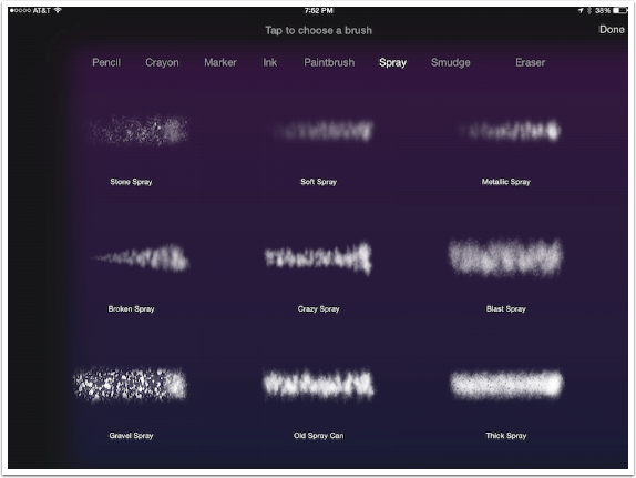
Finally there are the Spray brushes. That makes 54 different brushes for applying color to your project.
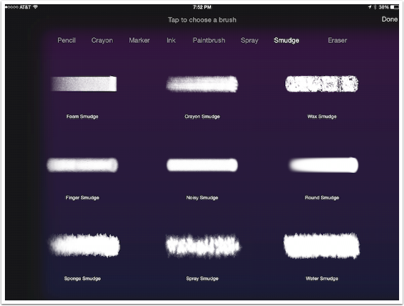
The Smudge category will not apply new color. Instead, these brushes blend pixels together, like using a clean brush on wet oils, or your finger on chalk.
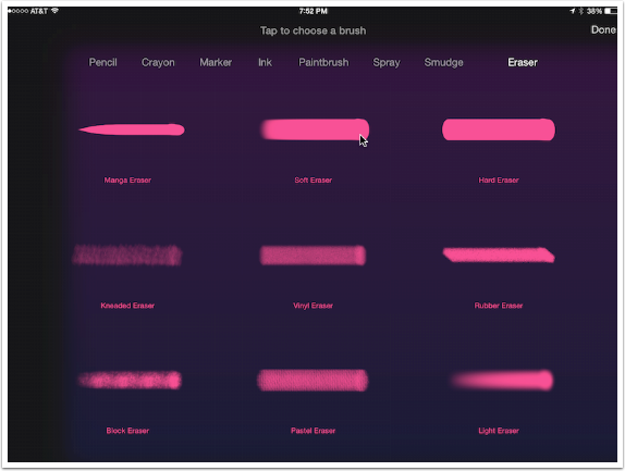
Finally, there are Erasers, which remove pixels from the layer. Erasers can be used on any layer, not just layers you have painted on. Therefore, you can erase part of an image, a letter, or a shape. They are red so that you have a visual cue to stop you from erasing something inadvertently.
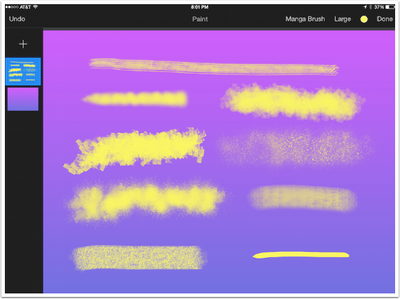
Below I’ve made a series of brush strokes using a variety of tips. I had to change the brush size from tip to tip to make them relatively consistent in size.
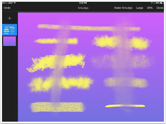
Next I used a Water Smudge brush to show you how pixels are moved around and blended by a Smudge brush.
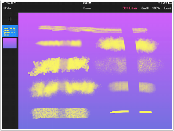
Both Smudge Brushes and Erasers do not carry color, so the Color Picker is replaced by a Strength (opacity) indicator. The Strength indicator shows you the opacity as you move the slider, or you can choose from Very Soft to Very Hard. To the left I’ve used a Kneaded Eraser at about 50%
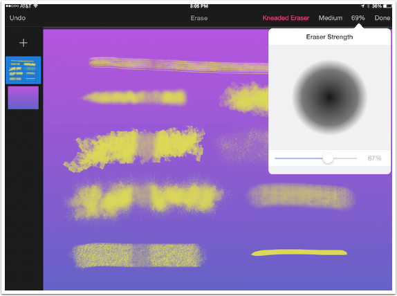
Below I change to a Soft Eraser at 100% opacity, and made a stroke on the right side, erasing the yellow completely.
As I said earlier, there are advantages to painting on a blank layer. You can then take the entire layer and resize and rotate it.
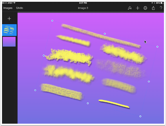
You can also add a drop shadow, as seen below.

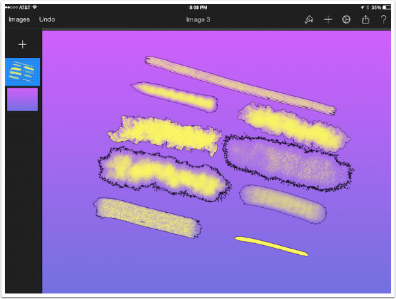
Stroke can give you some unexpected results with soft-edged brushes, as seen below.
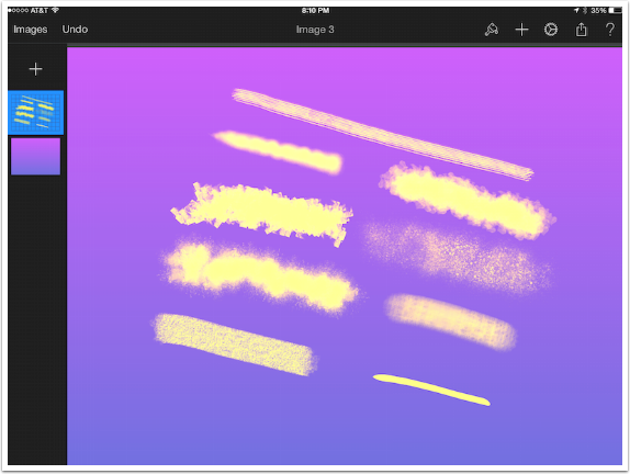
You can also change the blend mode of the layer. It may not seem like I made a change, but the brush layer blend mode has been changed from Normal to Linear Light.
Don’t expect me to try to paint anything representational. Below I hid the yellow paint layer and added another layer where I painted several strokes in different colors with the Mixed Brush tip. I blended them with the Sponge Smudge (I believe). Then I added another layer, made a purple squiggle (as you can see in the Layers Palette), and changed the blend mode of the squiggle to Divide.
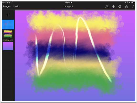
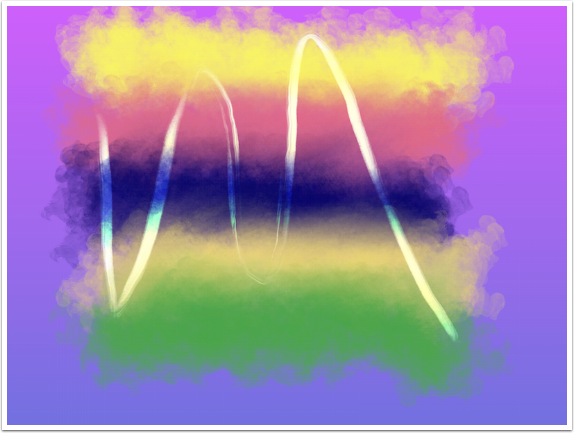
And here’s a Rothko-like abstract.
I hope that this entry to the series on Pixelmator has been valuable to those of you who know their way around a set of paints. It strikes me, as a novice, that Pixelmator has a relatively robust set of paint tools, but cannot compete directly with more specialized paint or sketch programs like Procreate, ArtRage or Sketch Club. I hope that I have shown you enough to pique your interest in Pixelmator.
Next time we’ll wrap up our look at Pixelmator with a glance at Retouch and Adding Effects. Until then, enjoy!
Please support us
TheAppWhisperer has always had a dual mission: to promote the most talented mobile artists of the day and to support ambitious, inquisitive viewers the world over. As the years passTheAppWhisperer has gained readers and viewers and found new venues for that exchange.
All this work thrives with the support of our community.
Please consider making a donation to TheAppWhisperer as this New Year commences because your support helps protect our independence and it means we can keep delivering the promotion of mobile artists thats open for everyone around the world. Every contribution, however big or small, is so valuable for our future.



One Comment
Carolyn Hall Young
This is a terrific series Thanks, Jerry, for your work and intelligence. Thank you, Joanne, for publishing it.