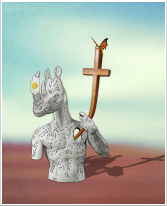
Mobile Art – Creative Tutorial with Wayman Stairs ‘Everyone Has Their Cross To Bear’
We are hugely delighted to publish this absolutely fantastic creative mobile photography tutorial by Wayman Stairs, an amazing surreal mobile artist. Stairs has provided a video tutorial as well as stills and text descriptions of each step. We are sure you will love this! Over to you (foreword by Joanne Carter).
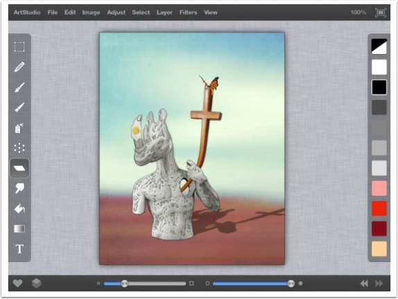
“In this video I will show the steps I took to create my image titled “Everyone Has their Cross to Bear”. All images were captured using my iPhone 5c and edited on my iPad 3, primarily with Art Studio. Other apps used include iColorama and Glaze. I use the photo transfer app to transfer images from my phone to my iPad because it does not lose the quality of the image and its easy to use. All images are my own and I did not use a stylus for any of this, just lots of finger painting. I am going to break this down by layer to hopefully simplify it.
Background Layer:
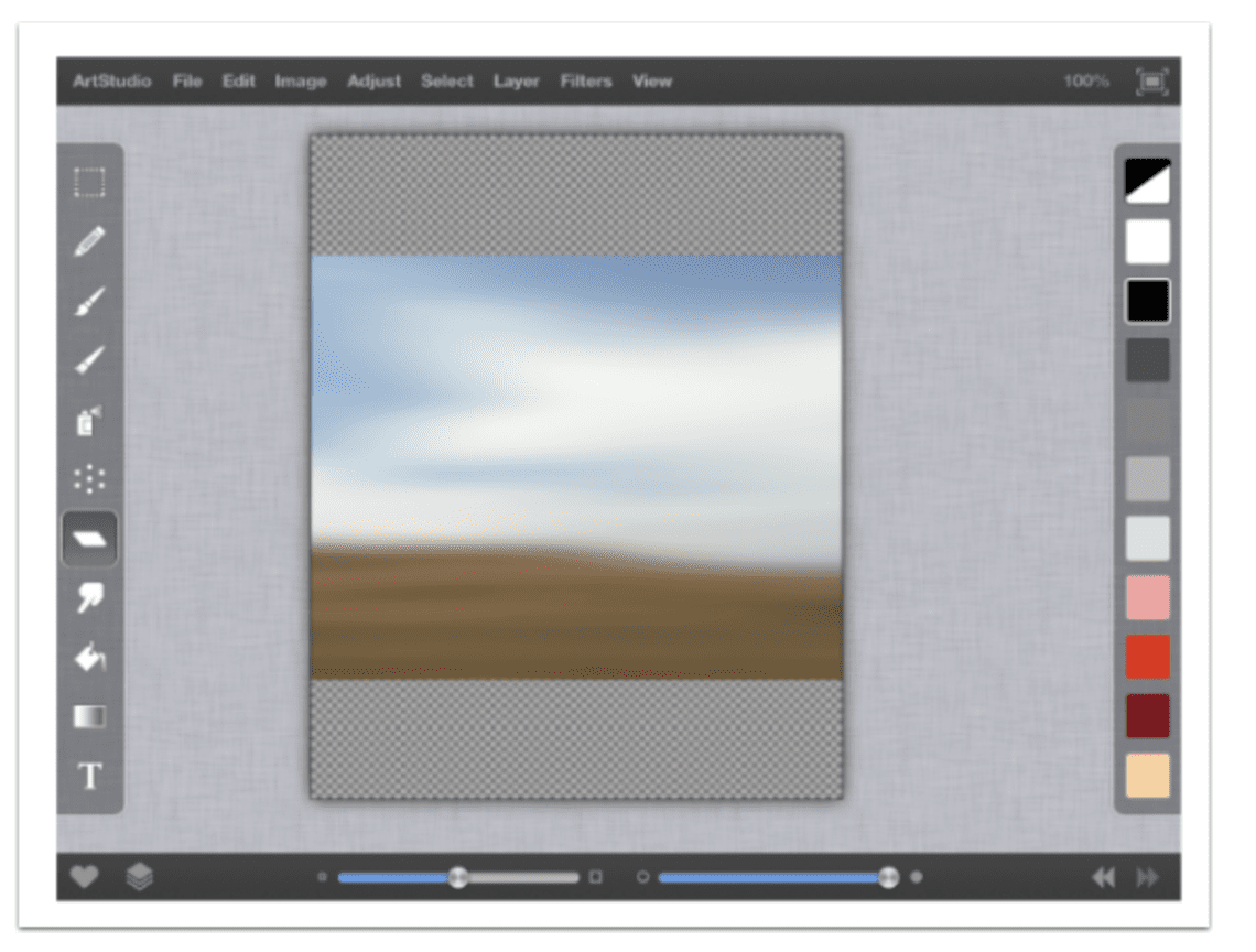
1. Like many of my images, I start by creating a background. So first thing I do is import (File/Import/Insert as a Layer/Import from Photos) a landscape image. This one was previously blurred, but I did this using Art studio (AS) [Filters/Blur/Gaussian Blur] and set both the horizontal and vertical radius to the maximum setting and hit apply”.
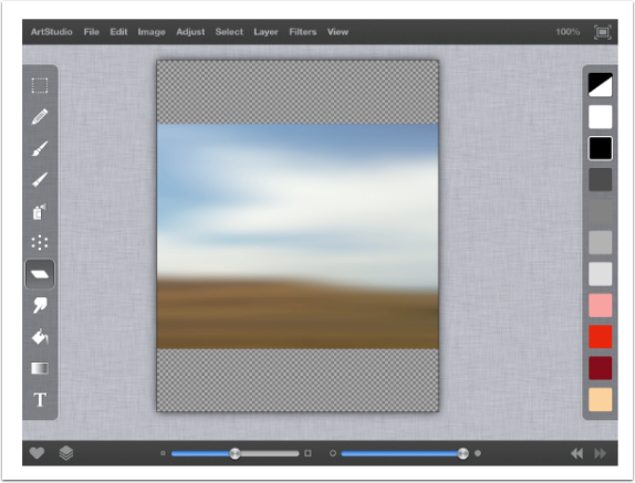
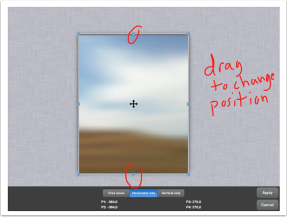
2. I wanted my final image to be in portrait layout and my image I imported was landscape. In order to fix that, I stretched the image vertically (Edit/Distort Layer).
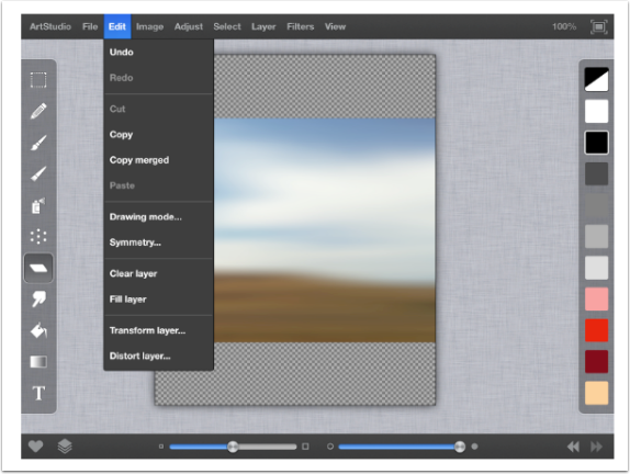
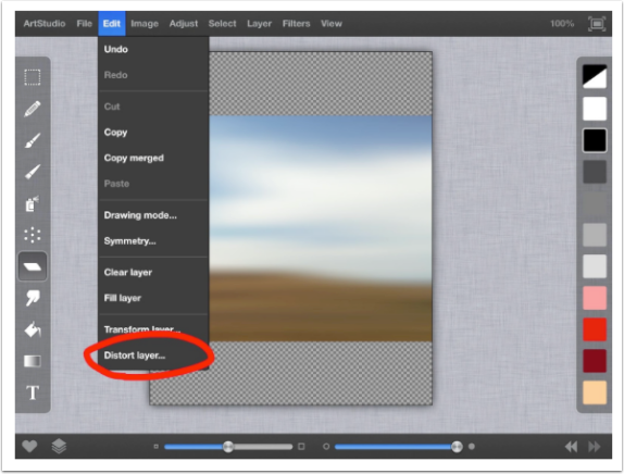
Once you select distort layer you can drag the buttons the direction you want to stretch. By dragging the points up and down, I can stretch the image to my liking.
Rhino Head
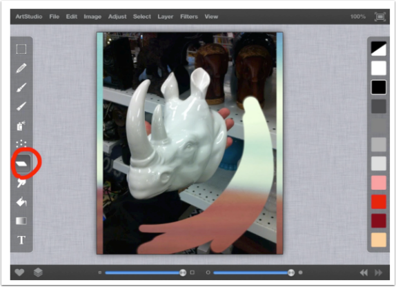
I then imported an image of a rhino head. I do not want the background, just the head, so I select the eraser button on the left toolbar (rhombus). Then I begin erasing the background, by swiping my finger until all that is left is the head. I will usually save these images as a PNG file with a transparent background, so that I can use them in the future.
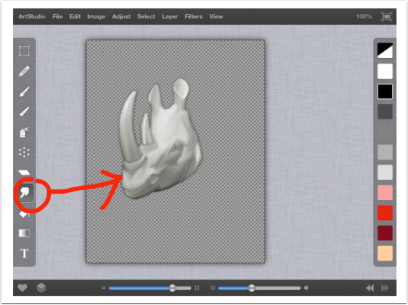
I did not like the shiny nature of the head, so I decided to give it a bit of a painted texture by using the smudge tool (pointed finger). Again I dragged my finger across the head to give it a smudged look. Each tool in AS has multiple choices within, I used the standard smudge tool. You can also create multiple favorite brushes. I have a cloud brush, big eraser and small eraser just to name a few.
Body
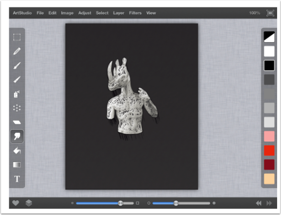
Next I imported a statue image I had created using the same steps as previously mentioned for the head.
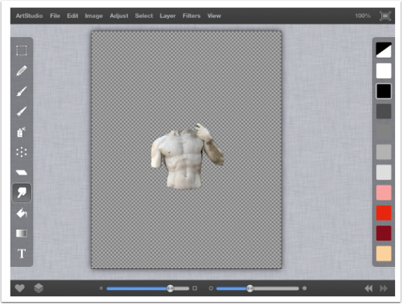
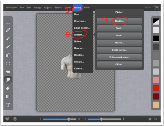
I wanted to give it a longer neck to attach the head to so I decided to elastify (Filters/Distort/Elastify) it.
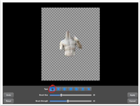
I selected the finger tool, which allows me to stretch out the neck by dragging it with my finger.
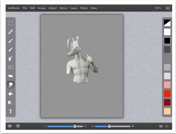
Then I move (Edit/Transform Layer/Move,Scale,Rotate) the head on top of the neck to complete my main character. I use this method to move most things around unless I really don’t want the layer to rotate then I select move/scale.
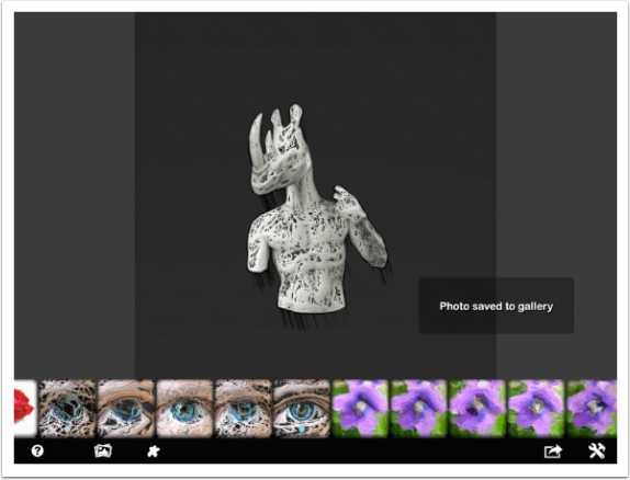
I then exported the rhino man as a png (File/Export/PNG/Export to ‘Photos’) file with a transparent background and import it into glaze (step not shown). After selecting a glaze option I saved it and exported to my camera roll.
Then I import the glazed image back into AS and blend it with the original.
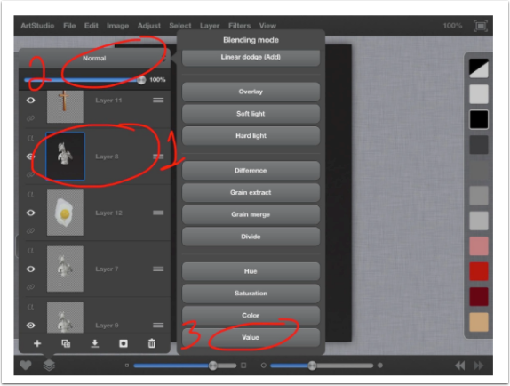
To blend I selected the layers button on the bottom left then Blending Mode on the top and Value. This gets rid of black background on the outside and leaves me with my rhino man. I also imported a png from my stamp library of a hole and placed that in rhino man’s chest (step not shown). I also had to erase a portion of the chest to make the hole look real.
Cross and Butterfly
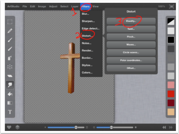
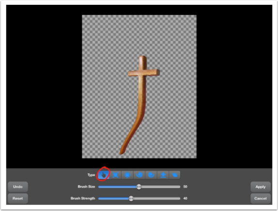
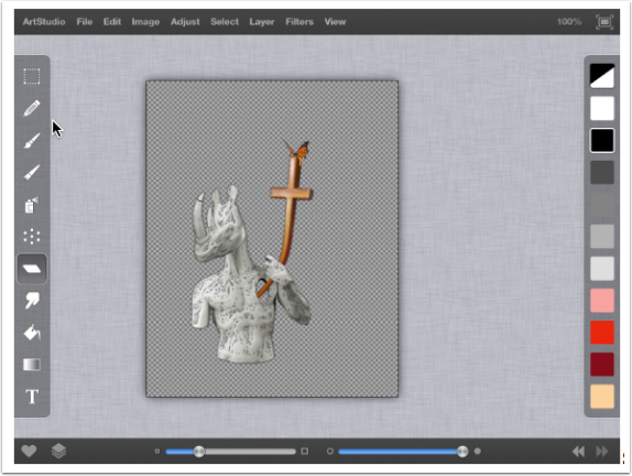
My next component is a wooden cross. Again I am going to elastify (Filters/Distort/Elastify) this just as I did with the neck of my rhino man, so that it looks like its coming out of his chest and held by his hand. To make it look like his hand was holding it, I simply erased the portion of the cross that was on top of his hand after I stretched it out.
Then I also placed a melted butterfly from my stamp library on the top of the cross.
Shadow
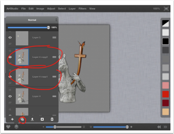
I create a duplicate layer selecting the layer button (bottom left), then after selecting the layer I want duplicated, I select the duplicate button (double square w/plus sign).
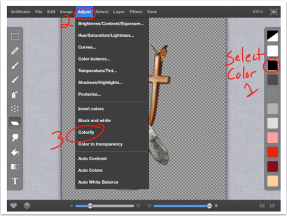
Now I need to color this image black (Select Color on Right/Adjust/Colorify).
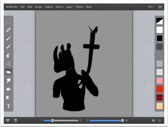
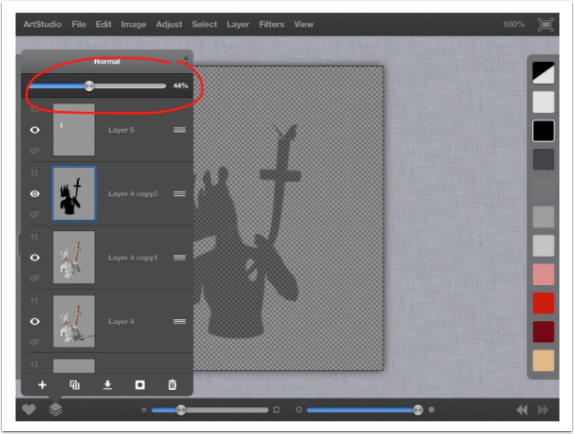
I want my shadow to be transparent so I select my layer button again then slide the scale on the top to 44% change the opacity.
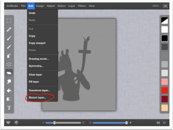
Now to make it look like the shadow is on the ground, I am going to distort the layer (Edit/Distort Layer).
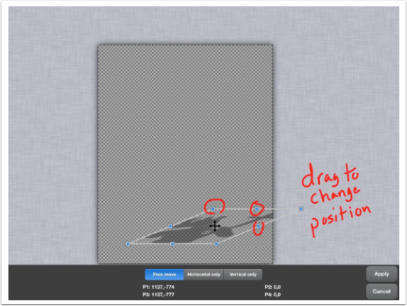
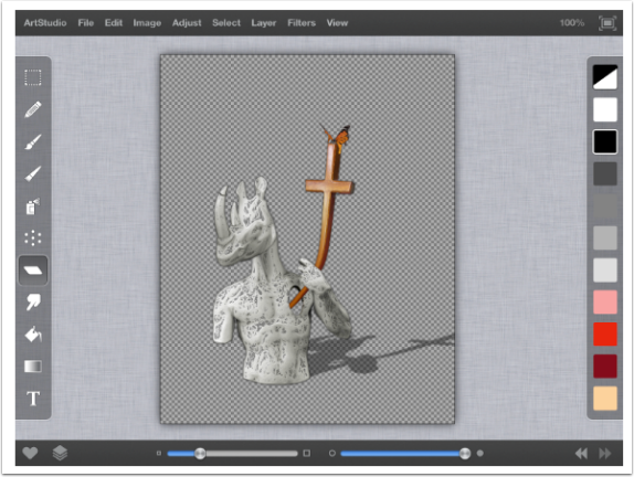
Using the free move option I drag the top middle button down and to the right and experiment with the other buttons until I like the appearance of the shadow.
Egg
Now I am going to add the final piece to the puzzle, an egg image from my stamp library. I want to make this look like it is wrapped around rhino man’s horn so I am going to distort (Filters/Distort/Elastify) it.
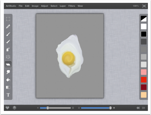
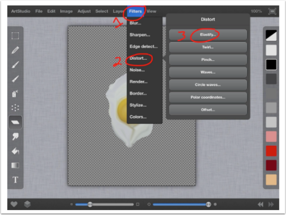
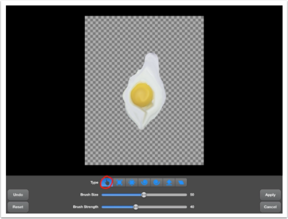
Then I erase a hole where I want the horn to go.
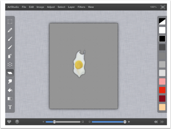
To finalize the image I combine all my layers together and there you have it.
If you have any questions feel free to look me up on IG, Facebook or Flickr and ask away. I know my instructions may be a bit confusing; I’m not the best writer and tend to be the king of run on sentences.



3 Comments
Laurence Zankowski
The first thought as I saw his background was of Yves Tanguy and his work. By the time I saw the finsished piece I added de Chirico as influences or strong influences. Yes the ghost of Dali hangs about here but it is Tanguy that resonants off this image. Great work, fantastic use of a few apps, a keeper tutorial. Thanks for the find Joanne!
Be well
Laurence Xankowski
Chad Rankin
Congrats on your continued exposure and development of process. Very technical and well written tutorial Wayman. Keep up the great work. In follow up to Laurence, I agree with the Yves Tanguy landscape resemblance. Great Surrealist and one of my favorites.
Lee Atwell
Wonderful tutorial, Wayman – thank you! Your creativity is inspiring!