Mobile Photography App Tutorial – Shift by Pixite: A User Related Update
I just spent three weeks going over an app that changed dramatically almost two-and-a-half years after I first wrote about it (Snapseed). Here’s an example of an app that I first covered sixteen weeks ago, and which has already changed dramatically due to input from users like me: Shift by Pixite. Back in January, I wrote “Because Shift bases everything on a randomizer, and all the choices are made behind the scenes, I just don’t know what it’s capable of. So I can’t recommend it”. Pixite heard that kind of statement from us here and added much more control to their brand-new filter-building app. It is certainly enough to change my mind about recommending it (and to ruin your suspense if you thought you’d have to wait for the verdict until the end of the column).
This article will only cover what is new about Shift, which means that if you want to know basic operations, such as opening files, saving them and sending them to other apps, you should return to the first article from January.
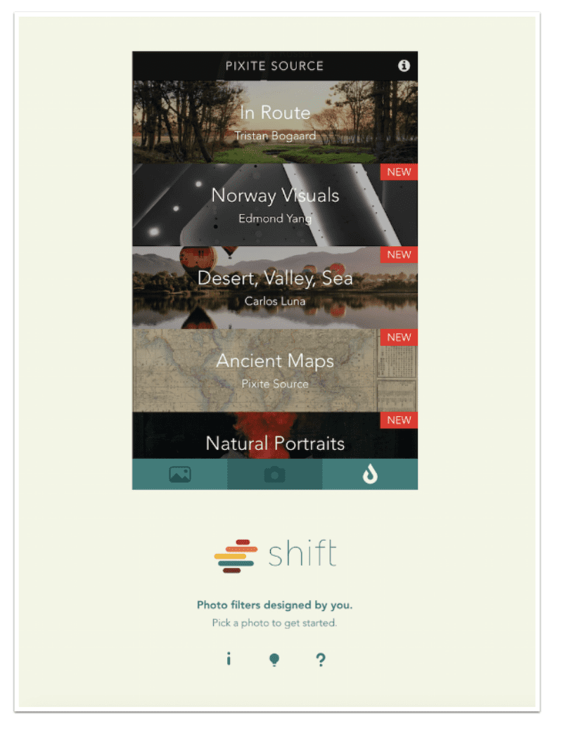
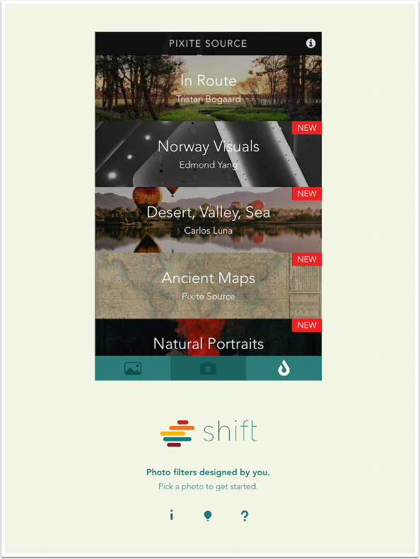
One new feature that is added is available when bringing an image into Shift. In addition to selecting an image from your library or using the camera to capture one, there is now a selection of images for your use called Pixite Source. It is a simple matter to choose from a collection of fine images from Pixite users to help you develop your own re-usable filters using Shift. All they ask is that you credit the image creator if you post them anywhere. I will be using an image from Tristan Bogaard’s “In Route” series in this tutorial.
The first thing you’ll notice is that the number of presets has increased ten times, from three to thirty. Actually, there are 29, since the Original preset returns all adjustment sliders to zero and Color and Texture overlays to None. The Randomizer still plays a prominent part in the new Shift, with the Shuffle button at the right side underneath the Preset row. Below that, at the bottom, are the three buttons that allow for customization and control of the filters: Adjust, Color and Texture.
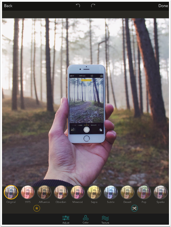
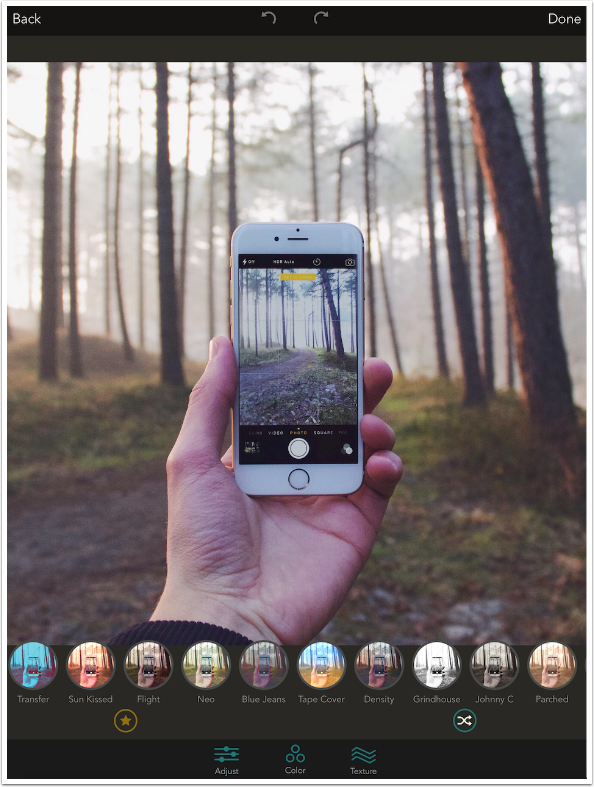
You scroll through the available presets by swiping left and right on the Presets row. The thumbnails will contain your image, for easy choice.
Once you select a Preset, an Opacity or Intensity bar appears between the Star (Save Filter) button and the Shuffle button. Swiping left and right increases and decreases the intensity of the filter.
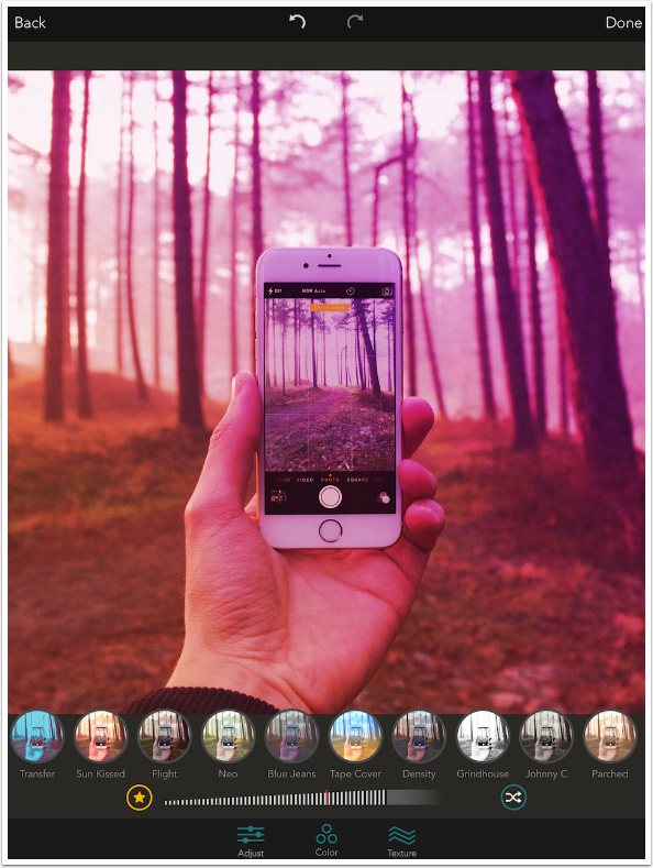
I’ll be using the Archived preset as the basis for my filter.
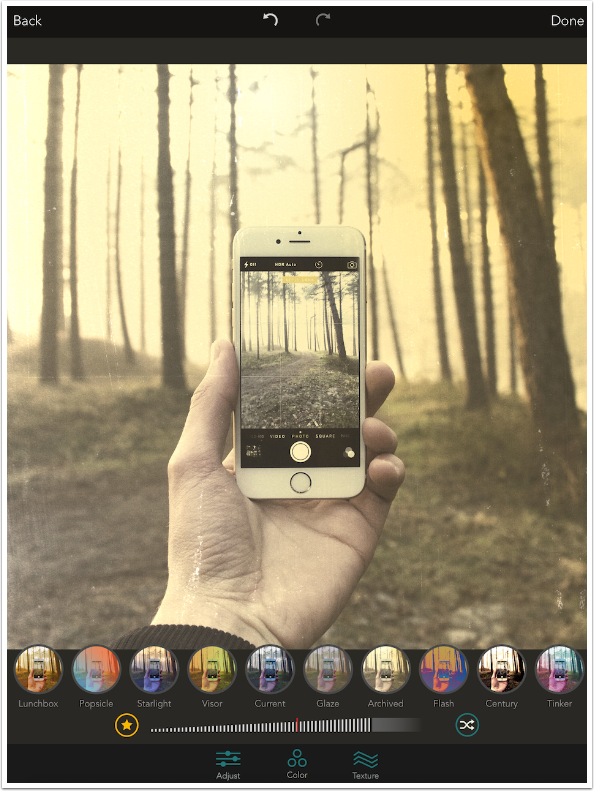
The applied Texture can be moved on every screen except the Color screen. Below I’ve moved the Texture with a two-fingered pinch and drag on the Main screen, but it can also be moved on the Adjustment or Texture screens.
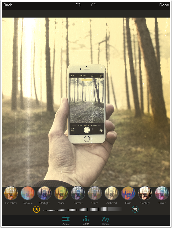
Below you’ll see the Adjustment screen. Adjustment values are part of a filter, and are affected by the Intensity slider. The Intensity slider is moved to the top on the Adjustment, Color and Texture screens. Intensity affects Adjustment, Color and Texture all at the same time.
The Archived preset already increased Brightness to 47%. All Adjustment settings have negative as well as positive values, so you can decrease as well as increase Brightness, Contrast, Saturation and Temperature.
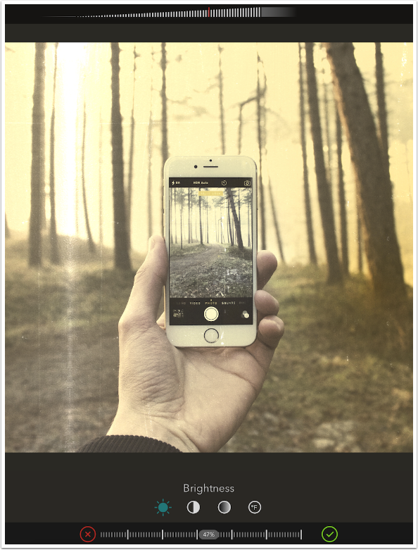
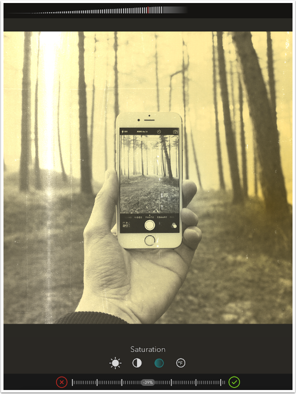
Tapping on the four icons at the bottom will reveal the sliders for that particular setting. Below I’ve tapped the third icon, the Saturation setting. The preset Archived has an initial Saturation setting of 0. Tapping the check at the right end of the slider accepts the change; tapping the X at the left end of the slider cancels the change.
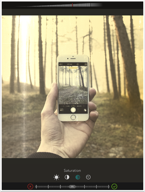
Swiping the bottom slider decreases the Saturation of the underlying photo to -39%.
The Color screen, shown below, handles what I called “Light Leaks” in my previous article. Below the image are three bars: Blend mode, Presets and Hue. The Blend modes, from left to right, are Normal, Multiply, Overlay, Add, Screen, Desaturate and Psychedelic. Tapping and dragging on the image will reveal the two or three gradient controllers, in the form of small white circles.
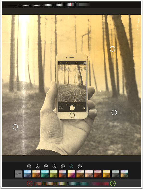
Swiping the Hue slider will change the colors in the Gradient. Below I’ve changed the basic color from yellow to blue.
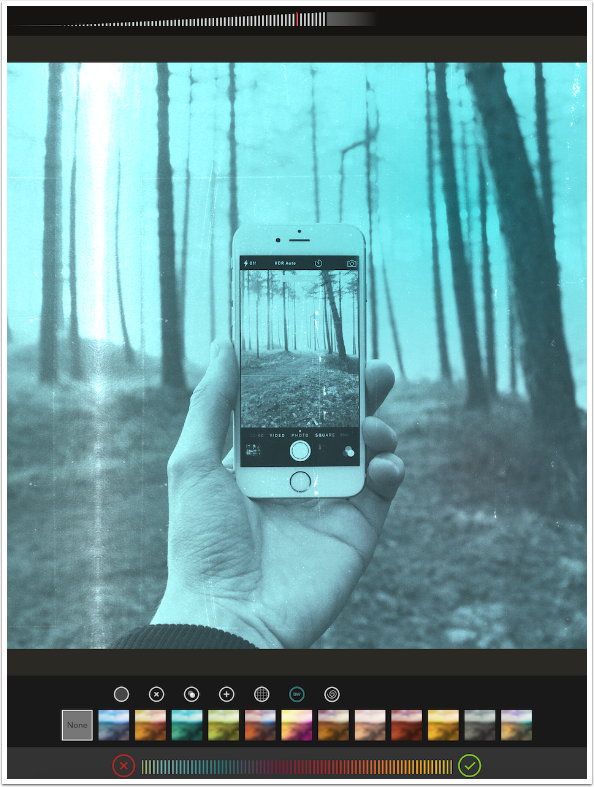
Below I changed the Blend mode to Multiply, which introduces more of the original color back into the image.
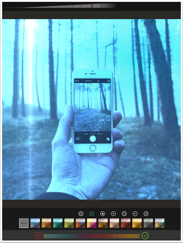
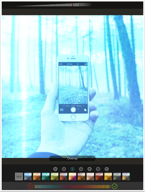
Some Blend modes will wash out your photo so much that you should revisit Adjustments to darken it or increase the contrast, such as the Overlay mode used below.
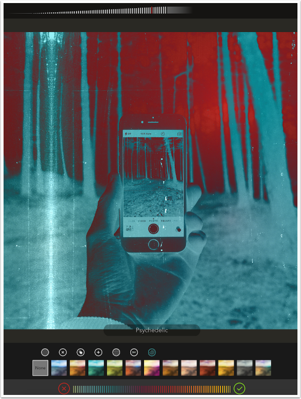
The Psychedelic Blend mode, at higher intensities, really does a number on your image. Remember, the Intensity slider at the top of the screen changes intensity for Adjustment, Color and Texture at the same time; there is no separate Color Intensity slider.
The screen below shows that moving the gradient controllers closer together will create a strong demarcation line between the colors in the gradient. Tapping the preset value, marked with the “shuffle” double arrows, again will randomize the placement of the gradient controllers, moving the colors around the image.
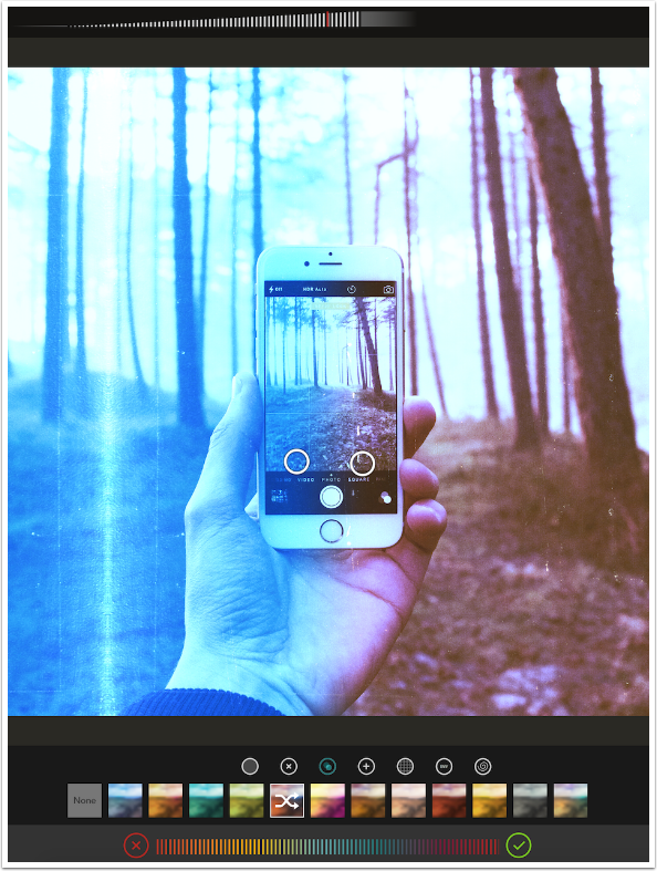
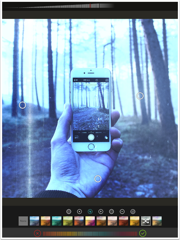
The preset above seemed to me to have only two gradient controllers. No matter how I pinched and dragged, I only saw two controllers. The preset I used below has three. Just realize that you may have to work to find the all the controllers; some presets seem to place the controllers outside the image.
The Texture screen also has three bars at the bottom: Blend mode, Texture and Texture Intensity. One quirk of Shift is that Blend mode affects both Color and Texture. If you set your Color mode to Overlay, then come into the Texture screen and change the Blend mode to Multiply, then both the Texture and the Color will be applied in Multiply mode. This, to me, is needlessly difficult. Separate blend controls for the Color and the Texture would be greatly appreciated.
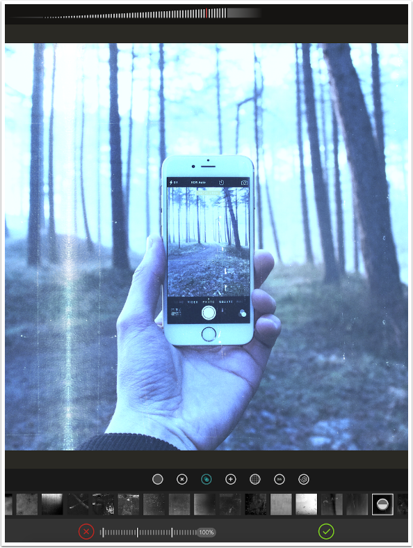
Below I’ve chosen another Texture. The one I’ve chosen is marked with a split circle.
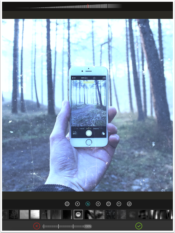
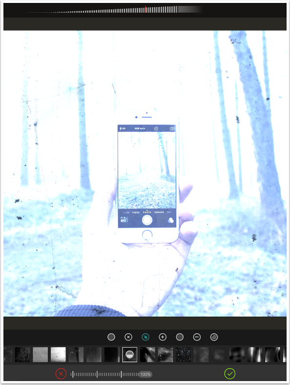
As you might imagine, the split circle means you can invert the texture, swapping black for white. Tapping the thumbnail again will invert the texture, as shown below.
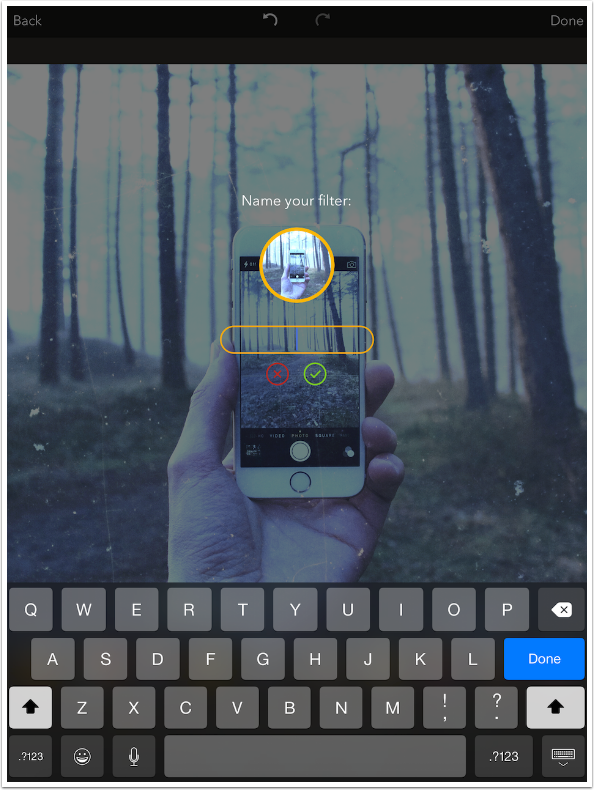
When you have created a filter that you might wish to use again on another image, return to the Main screen by accepting the changes with the check icon, then tap the Star icon to save the filter. A dialog and keyboard as shown below will allow you to name your filter.
All in all, these changes to Shift, allowing for control of the effects, are a vast improvement. The randomness of the previous incarnation of Shift was off-putting to anyone who doesn’t appreciate hitting a shuffle button over and over again to find a look that works. I appreciate how quickly Pixite was able to realize that and add some robust controls for their users.
There are two changes I’d like to see, however. One is the separation of the Color and Texture blend modes that I mentioned above. The other would be an enhancement: the addition of a vignette control. I think that the ability to darken or lighten the edges of the image would be a dandy, if not necessary, thing to have.
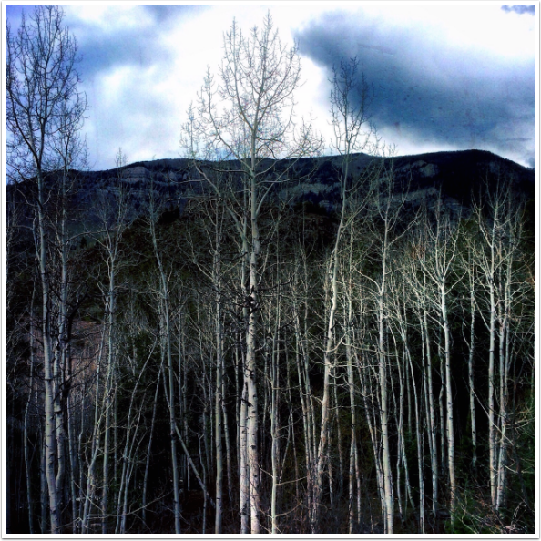
The image I’ll leave with has a vignette added using Snapseed. It does not use a preset provided by Pixite; I created this filter entirely from scratch. Until next time, enjoy!
Please support us
TheAppWhisperer has always had a dual mission: to promote the most talented mobile artists of the day and to support ambitious, inquisitive viewers the world over. As the years passTheAppWhisperer has gained readers and viewers and found new venues for that exchange.
All this work thrives with the support of our community.
Please consider making a donation to TheAppWhisperer as this New Year commences because your support helps protect our independence and it means we can keep delivering the promotion of mobile artists thats open for everyone around the world. Every contribution, however big or small, is so valuable for our future.
