
Mobile Photography/Art Tutorial – ‘Polarr Photo Editor’ – Part 1 – Finding a Niche
We are delighted to publish Jerry Jobe’s latest mobile photography/art tutorial for our reading and viewing pleasure. This week Jobe takes a look at the app Polarr Photo Editor. This is Part 1 of a 2 part series. Read his thoughts as he puts it through its paces (foreword by Joanne Carter).
Polarr Photo Editor is free and download it here
“The iOS mobile photo app market is getting crowded as it matures. There are only so many things that people are wanting or needing to do with their photos. Developers who want to enter the market in a big way have to give users a new function, or rework the way more traditional functions are done.
This is especially difficult with a new basic photo editor. Given that thousands of apps out there will do Brightness, Contrast, Temperature, Sharpening, Exposure, and even Curves, how can you possibly give the user added value over the existing monsters like Snapseed, Filterstorm Neue and others?
Polarr is a new basic editor that seeks to become your app of choice, but does it offer enough to catch the loyalty of users? Let’s take a look and find out.”

Polarr is a free, universal app. I’ll be showing you screens from the iPhone version today, but it works on the iPad as well. There are paid features which are disabled in the free version, and we’ll take a look at what you get for your money later on
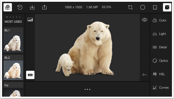
The workscreen is always in landscape mode, which is odd on the iPhone, but reasonable. It’s a crowded screen. The image that is loaded by default is a sample photo of a polar bear and its cub. (Polarr – polar: get it?) We will work with that image in this first tutorial. Once you load your own photo, then future ventures into Polarr will load the last edit session.
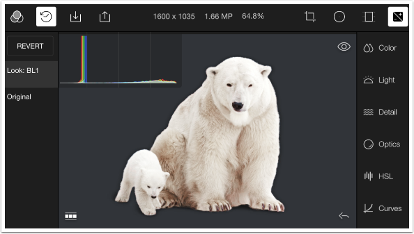
Across the top of the screen are buttons for Filters, History, Import and Export; the dimensions, file size and zoom percentage; Crop, Circle Mask, Gradient Mask and Controls. The left side holds the Filters or History steps. The right side holds the controls. You can see the control categories in the image below – Color, Light, Detail, Optics, HSL and Curves. Controls which are not shown, but can be accessed by scrolling down, are Toning and an Adjust All box.
The three dots at the bottom are a button for settings/help. On the portion of the screen that holds the image being edited, there are four buttons. Starting clockwise from the top left, they are Histogram, Before, Undo and Expand, and I will show you their functions shortly.
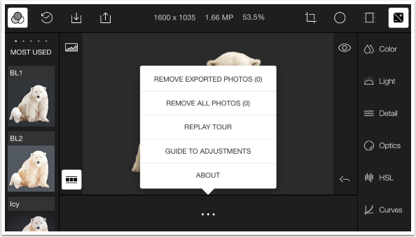
Let’s take a look at settings/help. Polarr has a gallery of sorts. Every photo that you import is placed into the gallery, which is shown at the bottom of the screen along with the “three dots’ icon. You should periodically clear out that gallery by choosing between “Remove All” and “Remove Exported”. (Polarr assumes that those images you have not exported are still being worked on, which is a fair assumption.) There are two different types of help: a Tour, which plays when you open the app for the very first time and can be replayed here; and a Guide to Adjustments. (“About” is boilerplate text.)
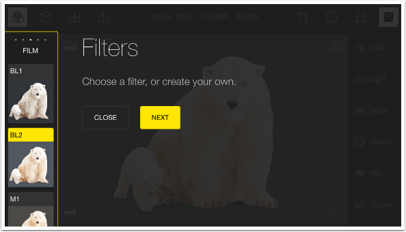
The following screen is from the Tour, showing the Filters on the left side of the screen.
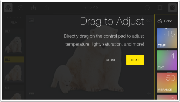
The next screenshot is also from the Tour, and shows that you can change the controls, or adjustments, by swiping or dragging on the boxes for that adjustment.
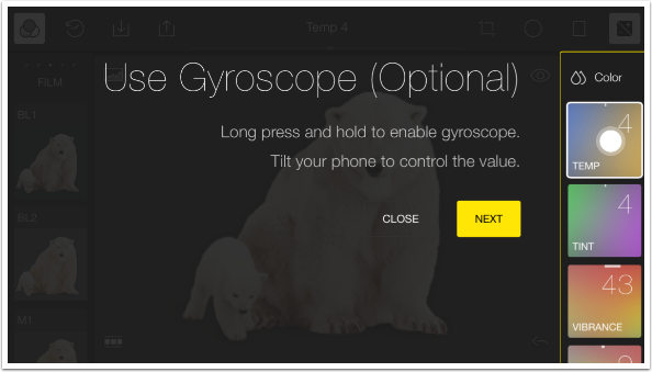
The next feature described is Polarr’s addition to the editing workflow: Gyroscopic controls. You can change the values of the controls by holding the control and tilting the device at the same time.
Let me tell you right up front that this particular feature (to continue the “polar” puns) leaves me cold. In no way is my editing enhanced by trying to see the changes I am making happen in real time on the iPhone screen while twisting the device around. In addition, when editing on the iPad I am rarely holding the device upright, so that it can detect the left and right movement of the tilt. So, for me, gyroscopic control of adjustments is an absolute zero. (Stop with the puns already!)
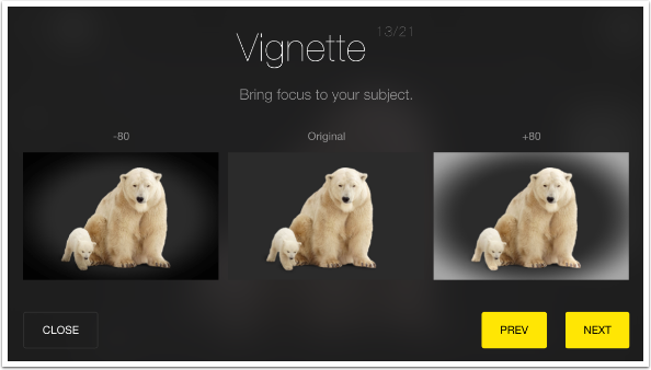
The Guide to Adjustments gives you 21 slides that show you what to expect from the various controls available within Polarr. This is of value to novices, but most experienced users will already be familiar with the terms used.
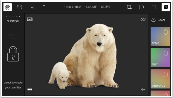
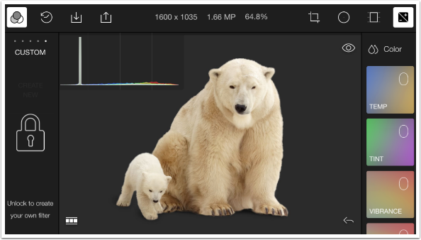
In the image below, I have done a horizontal scroll through the Filter categories (Most Used, Modern, Film, Art) until I reached the final one, Custom. At this point I encounter a lock, which tells me that I have to unlock Polarr before I can save off sets of adjustments to create my own Custom Filter.
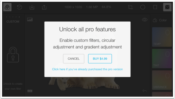
Tapping the lock brings up a purchase dialog box. Custom Filters are a “Pro” feature (along with Circle and Gradient masks) and only come after a relatively steep outlay of $4.99. This is such a large amount, compared to the cost of similar features in other apps, that I would ponder long and hard before making that expenditure. I haven’t bought the pro version yet. I will be able to show you Circle and Gradient masking in the next tutorial, because Polarr gives you a preview of that feature.
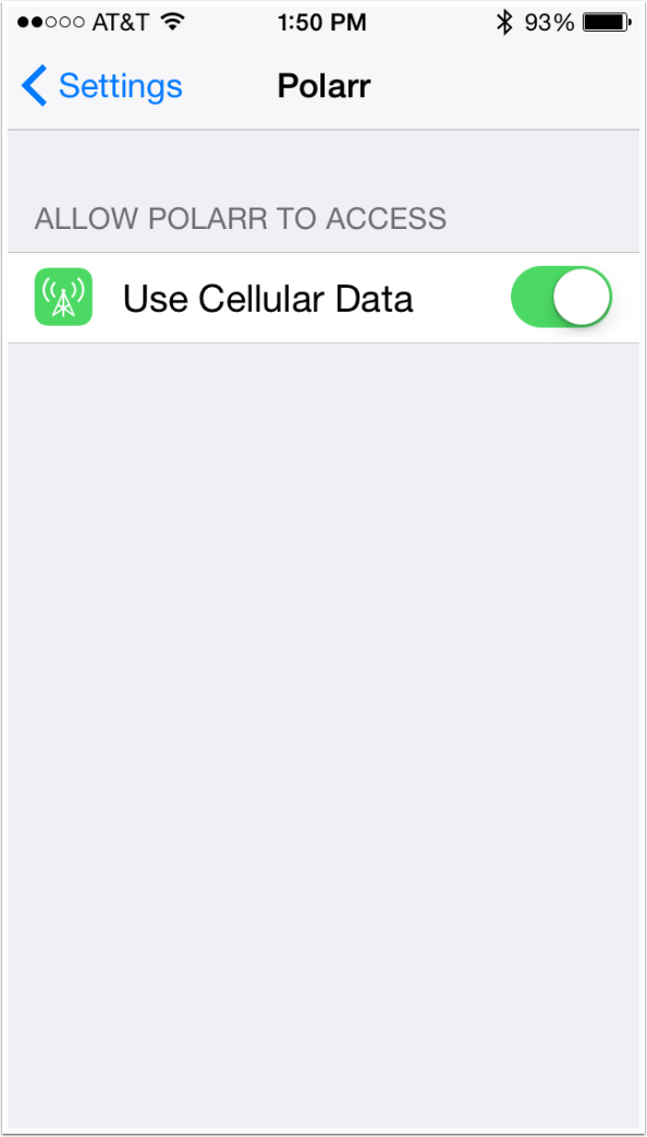
Before we actually start working on our image, let me show you a “hidden” setting of Polarr. If you go into the Settings app and scroll down to access the settings for Polarr, you will find that there is a single switch: Use Cellular Data. I know of no reason whatsoever why you should let your photo editing app use Cellular Data. Turn it off.
The next screenshot shows the Histogram. Most of you should be familiar with histograms. They show the distribution of tonal values in your image, with darker tones to the left and lighter to the right. This image, since it is dominated by the dark gray background, has a large spike towards the dark end of the histogram graph. Most of the time, when you are capturing an image, you want to expose your photo so that there are no spikes. There should be a more even distribution of tones. That is not possible when you have a plain background like we have here, so the spike should not worry us.
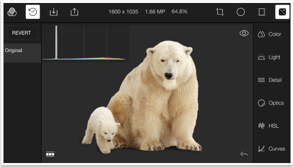
I leave the Histogram showing, and tap on the “clock” icon to show the History rather than the Filters on the left side. The steps of history are shown with the last edit at the top, immediately below the Revert button. We have not made an adjustment yet, so the only step is Original.
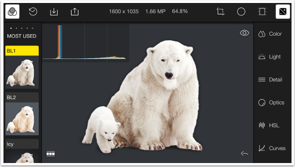
I change back to Filters and tap filter BL1 (one of the Film filters). Filters are a combination of Adjustments, so choosing a Filter (or Look, as they are referred to in the History steps), essentially changes the values of certain adjustments. You will be able to see the new values when you access the Adjustments. Compare the new histogram, after the application of the filter, to the prior one.
If I return to the History, I find a new added step – Look: BL1.
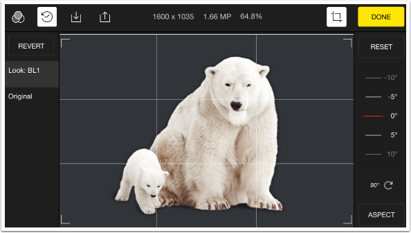
The Crop tool both crops and straightens. The dial on the right is used to straighten by swiping vertically on it.
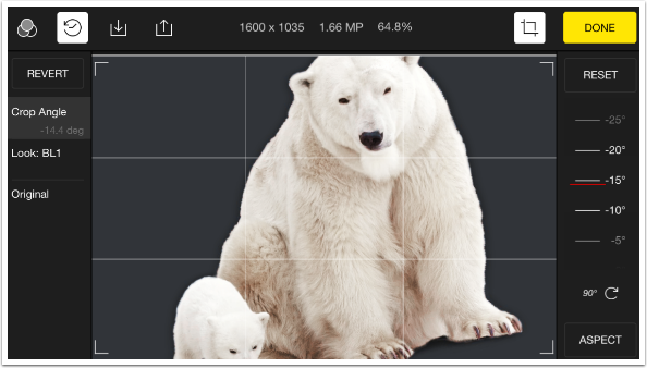
Below you’ll see I swiped down to rotate the image counter-clockwise. As with most straightening functions, some of the image is rotated right off the screen – Polarr will not attempt to fill the “triangles” created when you rotate a rectangular image.
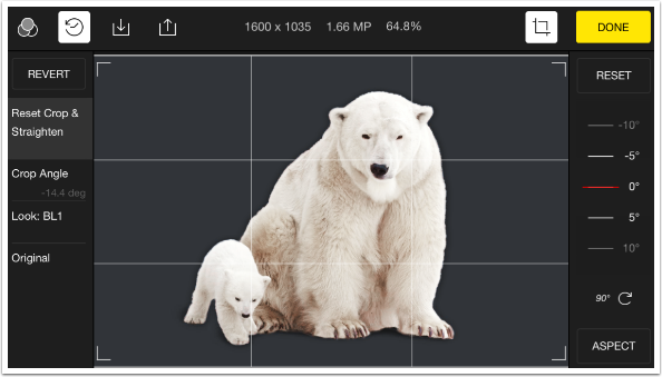
The angle can be returned to 0 by swiping the dial or tapping the Reset button.
There is no freeform crop in Polarr. You have to choose from one of the available Aspects. I chose the 1:1, or square aspect. I can now resize the cropping box or move it around.
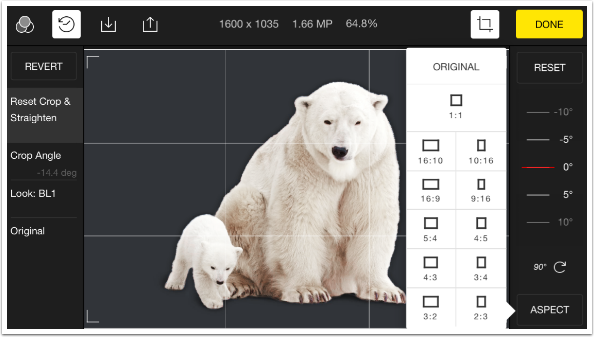
I moved the resulting crop box slightly to the left to center the bears.
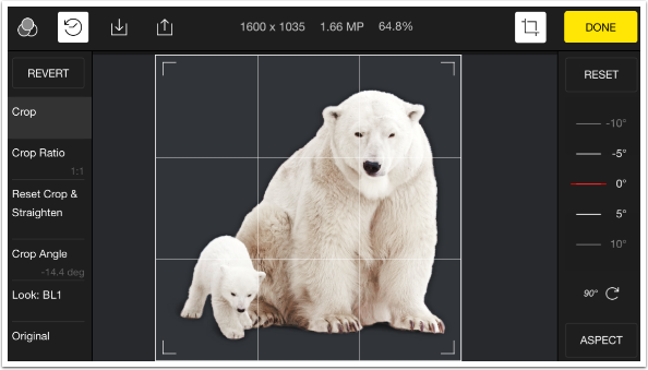
Below I’ve done two things: I applied the crop, returning to the main screen, and I tapped and held the Eye, or Before, button.
Notice how History now has several steps. It includes the Crop Angle, or straightening, then it includes the Reset of the Crop Angle. If you make multiple adjustments to the same control, one right after the other, all those adjustments are included in History. As you might imagine, History can get cluttered quickly.
Also, even though the screen shows the Before image, the Crop is still in place. For purposes of a Custom Filter and the Before button, Crop is not considered to be an Adjustment. The Before button and Custom Filters only show changes in Adjustments.
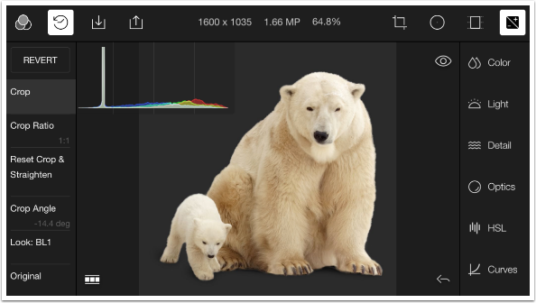
At any time, you can back up a single step by using the Undo button (the arrow at the lower right of the image) or multiple steps by tapping the appropriate History step. Below I only backed up one step. I had chosen the 1:1 Crop Ratio, but had not yet moved the box and executed the Crop.
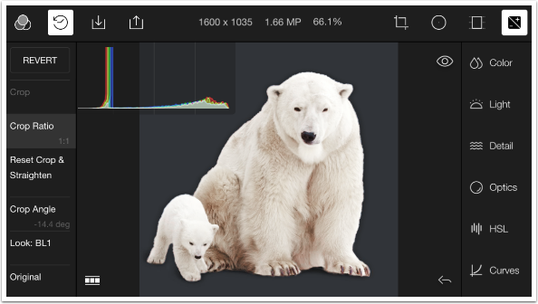
I restored the Crop step by tapping it in the History steps. Then I opened up the Color adjustments on the right side by tapping the word Color. The values for the four adjustments (Temp, Tint, Vibrance, and Saturation) are not zero because the chosen Filter, BL1, contained value changes for all of them.
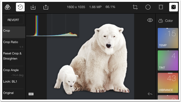
I swiped right on the Vibrance box to increase the value to 79. An entry was added to History.
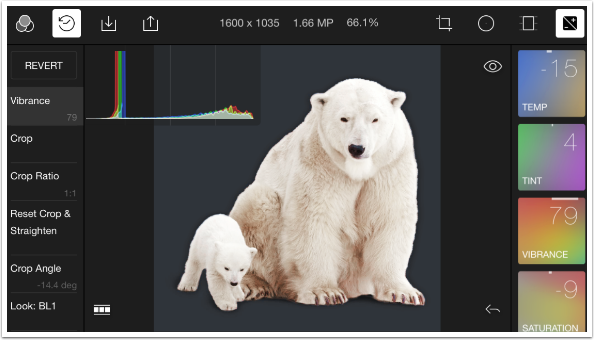
I swiped left to bring the Vibrance value back to 53. Another History step was added.
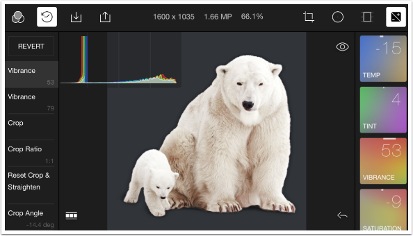
In order to clean up History, I tapped on the Crop step, then readjusted Vibrance to close to the final value I’d arrived at. It’s easy to change the values, but hard to hit a particular value. In this example, I moved it for a while until I got a 52, acceptably close to 53.
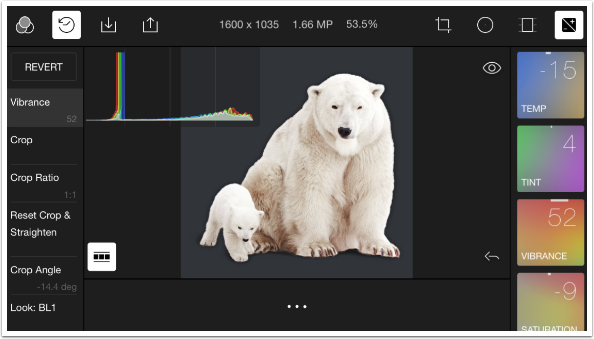
I discovered an undocumented feature at this point by turning my iPhone to portrait mode: a before and after comparison. This “before” image shows the uncropped original, unlike the before image produced by tapping the Eye icon. Rotating back to landscape mode brought me back to my editing workspace.
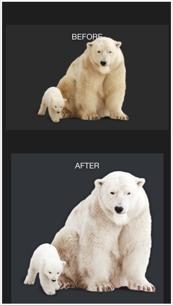
A warning: if you tap and hold an Adjustment box without tilting the device, the value will still change. Below I held the Temp box, and within a couple of seconds it had zoomed up to the maximum warmth. Results are unpredictable, so when you want to change an Adjustment by swiping, start to move your finger immediately.
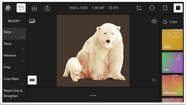
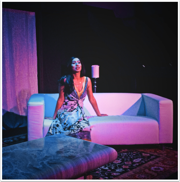
I Imported an image of a lovely actress from my most recent production to show you how imported images appear in the “gallery”. You can see a thumbnail at the bottom of the screen, next to the “three dots”. I find the gallery to be unnecessary clutter. The normal reason for a gallery is to enable the app to hold layered files, which can’t be held in the Camera Roll. Polarr does not use layers, so it should be the user’s decision to save files they’ve worked on, not the app’s.
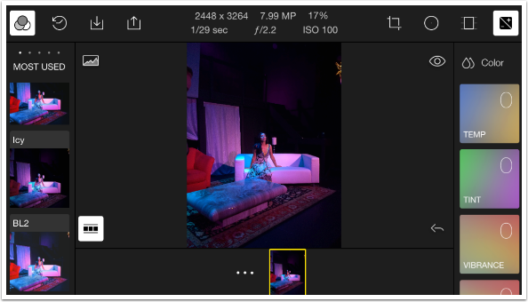
Exporting refers to saving the image on the Camera Roll or sending it to social media.
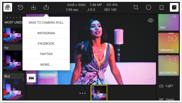
Below is my cropped, modified, saved image. There are some complaints on the App Store about the resolution of the saved image, but I can’t confirm those complaints. This image is about 1640 pixels square, which would be accurate based on the crop of the original. On the iPad, I modified an image imported from my DSLR at 3872×2592, and Polarr saved the modified image at the same size. Maintaining the resolution is an absolute must for editing apps, and any app that reduces the resolution should be an immediate candidate for the app garbage dump.
So far our investigation of Polarr has not revealed anything that would outright disqualify the app from regular use. Neither has it found anything to distinguish Polarr from any other basic editor. Join me next time as I continue to search for Polarr’s niche in the app world.
Please Support Us…
TheAppWhisperer has always had a dual mission: to promote the most talented mobile artists of the day and to support ambitious, inquisitive viewers the world over. As the years passTheAppWhisperer has gained readers and viewers and found new venues for that exchange. All this work thrives with the support of our community.
Please consider making a donation to TheAppWhisperer as this New Year commences because your support helps protect our independence and it means we can keep delivering the promotion of mobile artists that’s open for everyone around the world. Every contribution, however big or small, is so valuable for our future.


One Comment
Carlos
Always happy to see your walk through of app’s Jerry. Thank you!