Mobile Photography/Art Tutorial – Brushstroke Part 2: Canvas the Area
We are delighted to publish Jerry Jobe’s latest mobile photography/art tutorial for our reading and viewing pleasure. This week we have published Part 2 of Jobe’s two part series on the app Brushstroke. If you missed Part 1, Please go here. Read his thoughts as he puts it through its paces (foreword by Joanne Carter).
Brushstroke retails for $3.99/£2.99 and you can download it here
“In part 1 of my article on Brushstroke, I covered the painting and color presets. Part two covers the finishing touches: adding texture with the underlying Canvas; Adjusting the painting; and adding a signature to your work.
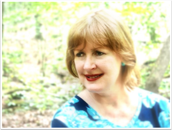
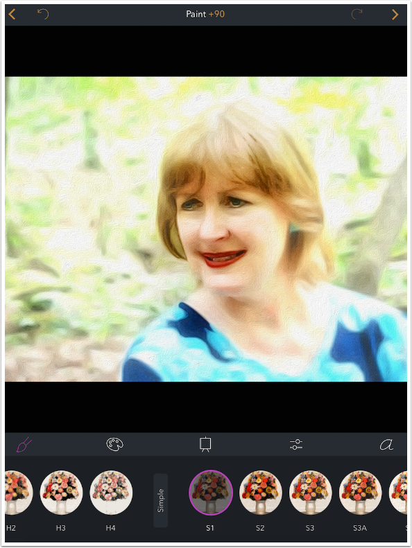
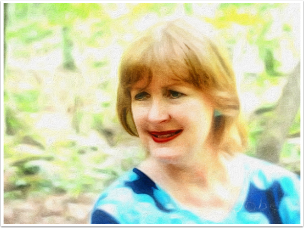
The image I’ll be using is a portrait of my wife. The background was lightened and blurred with iColorama to let her features stand out”.
First I want to choose a Painting preset; I choose S1, from the Simple group.
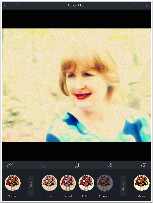
After trying several Color presets, I choose Emerson from the Tones set.
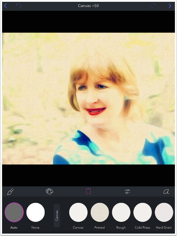
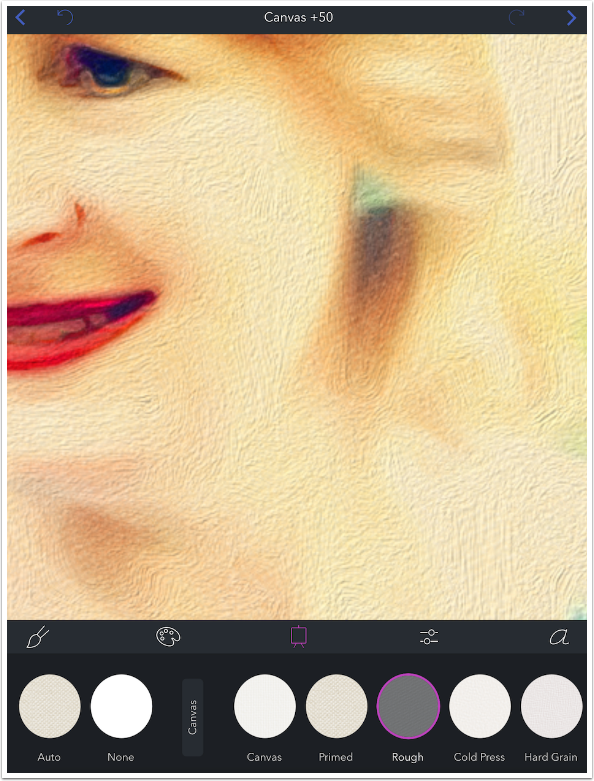
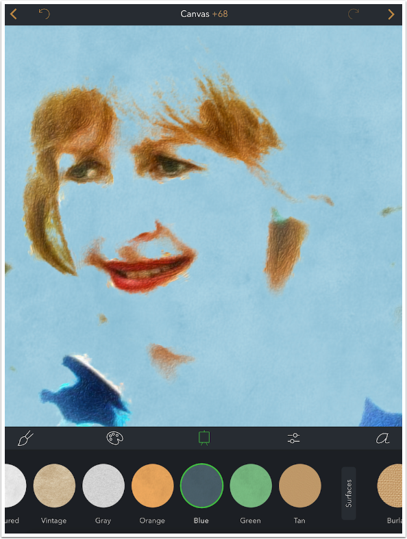
I move on to the Canvas setting. There are fewer Canvas settings than the dozens of Painting and Color presets – 31 in all (not counting Auto and None). There are five in Canvas, eight in Papers, six in Surfaces and 12 in Illustration. Auto depends on the Painting preset chosen, and is taken from one of the existing canvas types. If you look closely at the grayed-out Auto texture, you will see it is the Primed texture, found under Canvas.
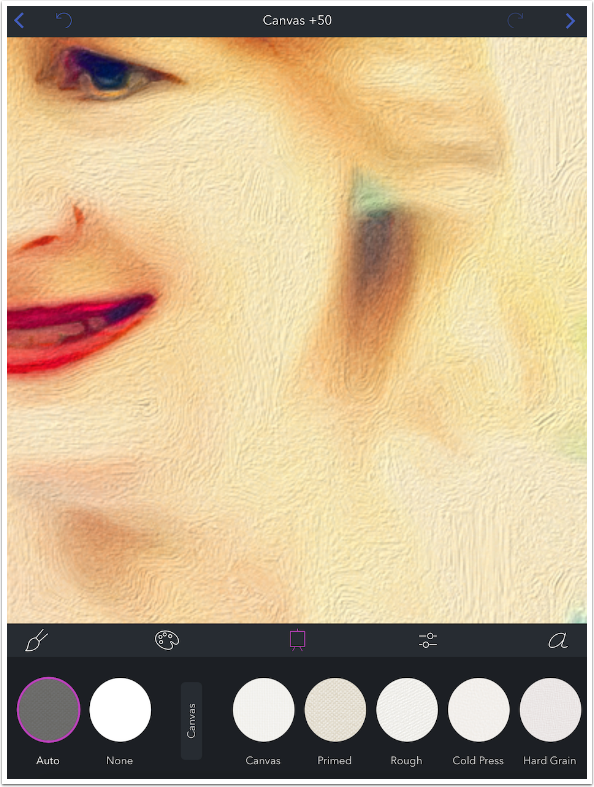
When I zoom in using a two-fingered pinch, you’ll see that most of the texture seen is from the brushstrokes themselves, and not from the underlying canvas. Canvas, for the most part, is a very subtle effect. You’ll have to look very closely to see much difference in the Canvas and Papers category.
Below I changed the canvas to Rough. Compare the Auto and Rough version to get an idea of the subtlety of the difference.
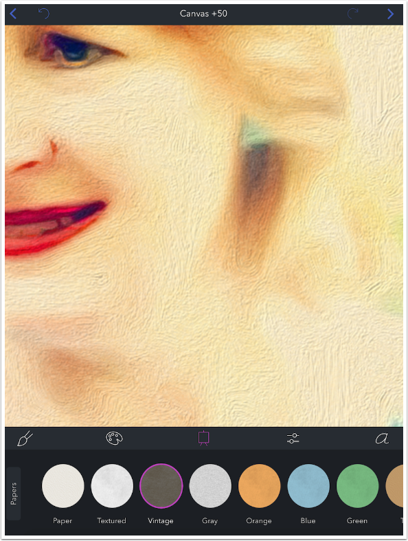
Papers are smoother, as seen with the Vintage Paper canvas below.
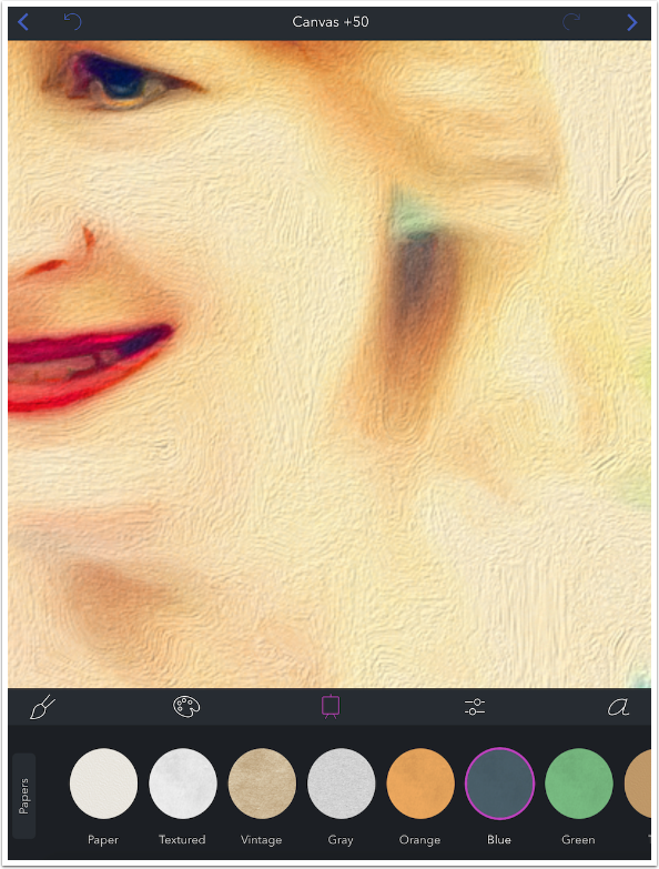
The fact that the canvas is Blue makes no difference if the paint covers the entire canvas, as is the case with Painting preset S1.
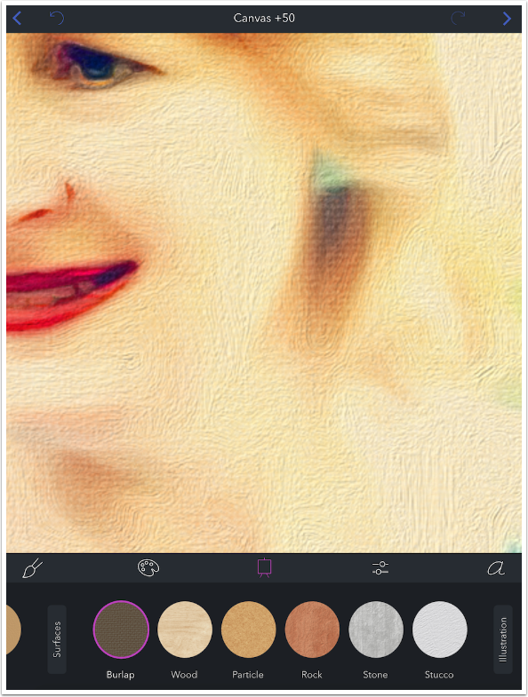
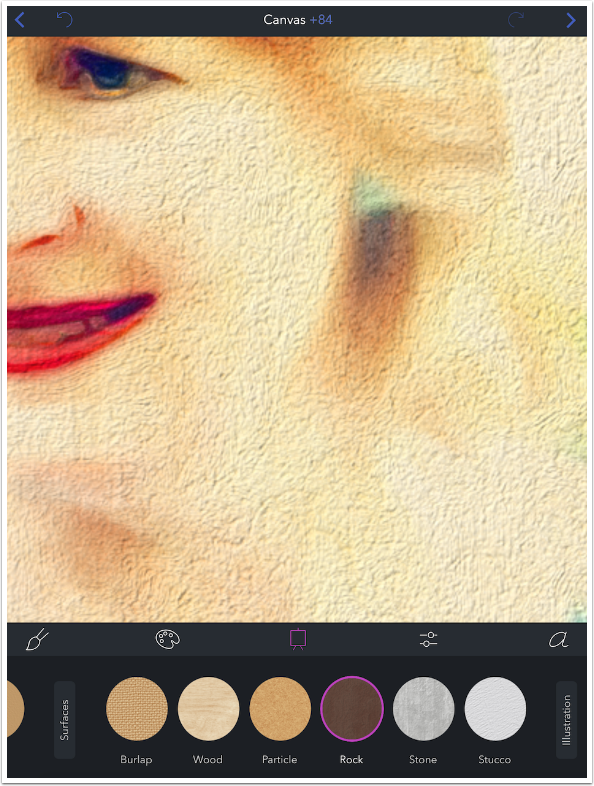
When we move on to Surface presets, we have strong textures that push their way right through the paint. It is easy to see the Burlap texture below.
Rock is even more obvious.
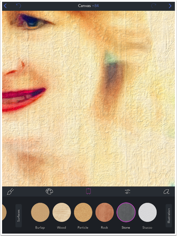
Also obvious is the strong verticals in the Stone preset. Canvases cannot be rotated or resized in Brushstroke, so be cautious with the more obvious textures.
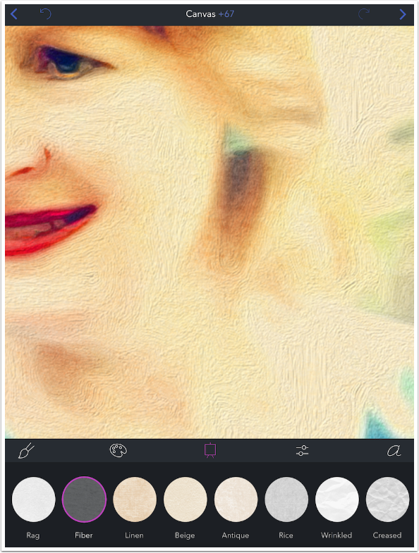
The Strength control at the top center is especially of use with the Illustration canvas textures. The Strength control does not control the depth of the texture, such as you get in the Surface textures. The pits in the Rock, Stone and Stucco presets are not affected by swiping left and right on the image. Instead, the control increases the contrast in the shades of the texture, such as those found in the Fiber preset below.
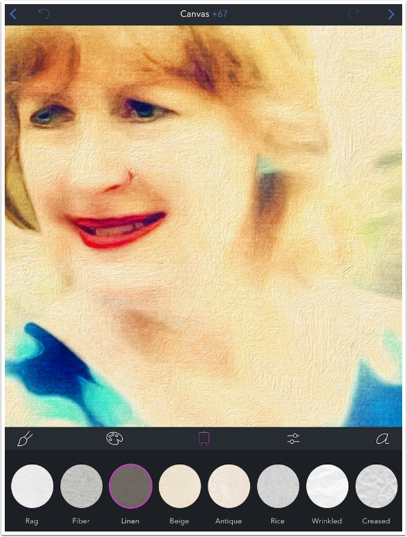
These changes in shade make for a more obvious canvas, even through the paint. Linen, in particular, changes the way the paint shows on the canvas.
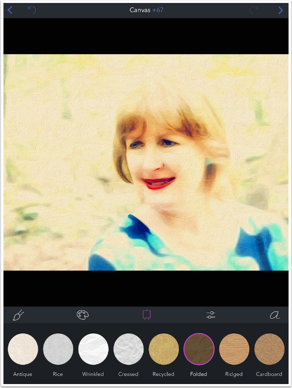
Care must be taken when using Wrinkled, Creased or Folded presets as well, because you can’t move the folds if they fall across an important part of your image.
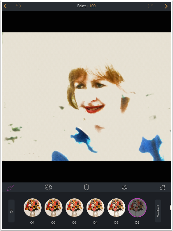
So you may be wondering, why does Brushstroke have Blue, Green and Orange canvases if those colors do not show through the paint? The answer lies in the fact that some of the Paint presets do not cover the entire canvas. With those presets, the color of the canvas matters a great deal. Below I’m changing the Paint preset to O6 in the Oil group. The Canvas preset is None, since I wanted to show what the O6 preset looked like without a canvas. I increased the Paint setting to +100, to have the maximum amount of paint for this preset showing.
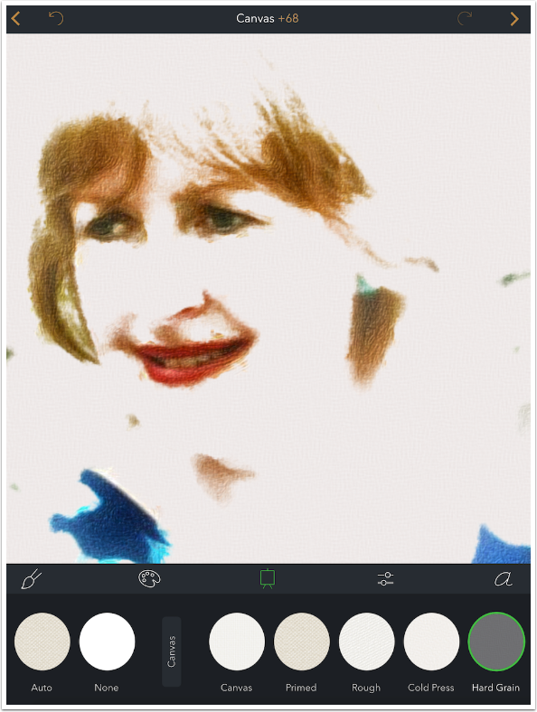
I change the Canvas preset to Hard Grain, and you can see the “depth” of the canvas in the whitespace.
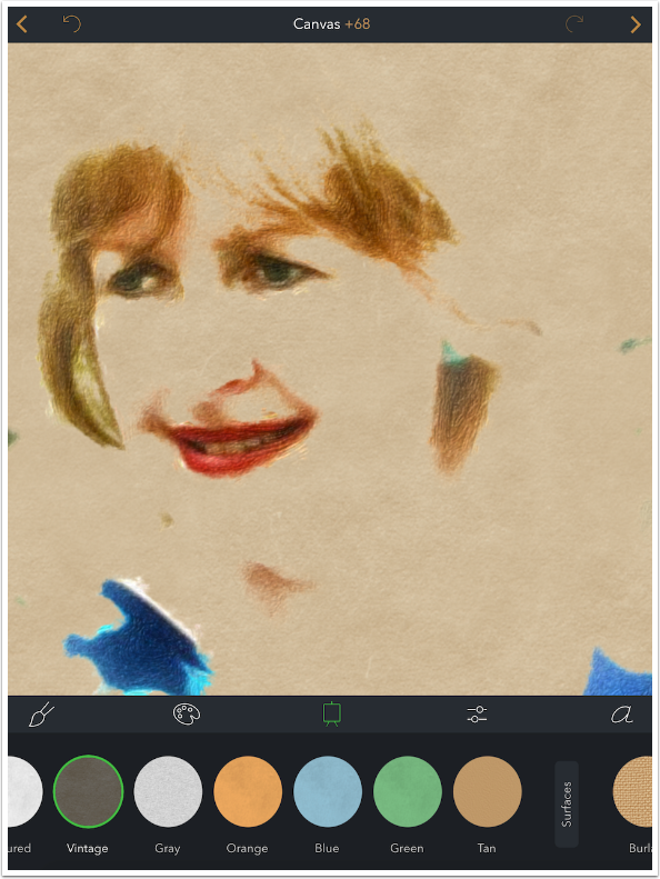
I change to Vintage, under Paper, and now you can really see that the paint does not cover the entire image. The brown Vintage paper takes up most of the image, with only the color painted onto it (not the white parts of the original).
Now you can use that Blue canvas to get a blue background. Unfortunately, just like the rotation and size of the canvas, the colors are fixed. You can’t make the blue a little more green, or a little less saturated. It is what it is.
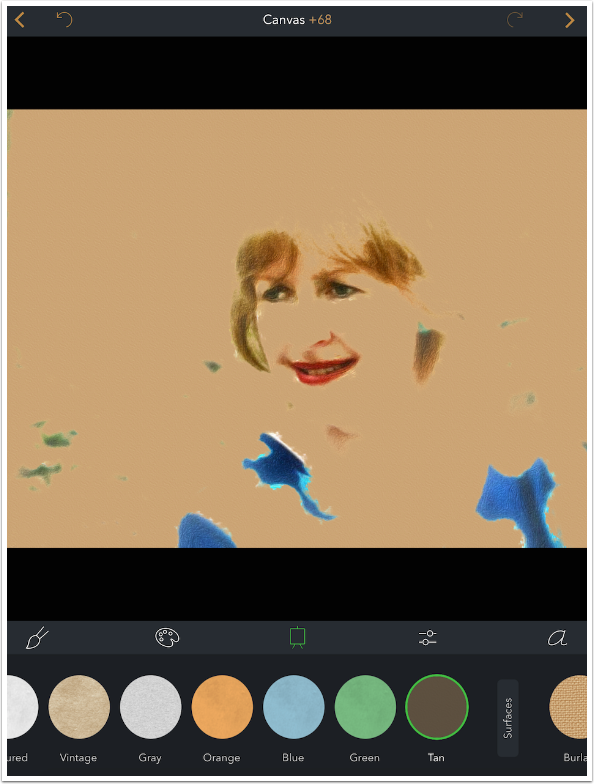
I zoomed out on the image, and used the Tan canvas to show you that none of the whites in the original are painted onto the canvas with the O6 Paint preset.
I will show you four more examples. First, Susan is painted on a Rock wall.

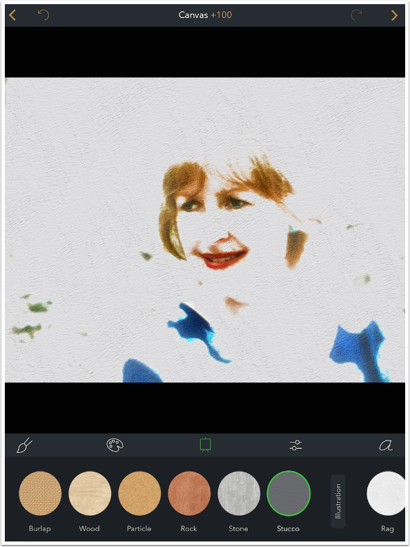
Next, onto Stucco.
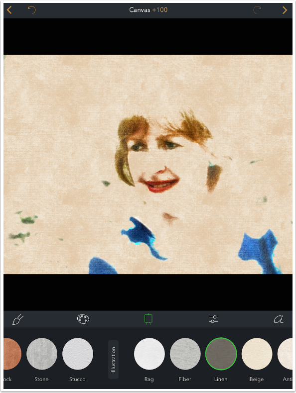
Now, the color of the Linen shows through.
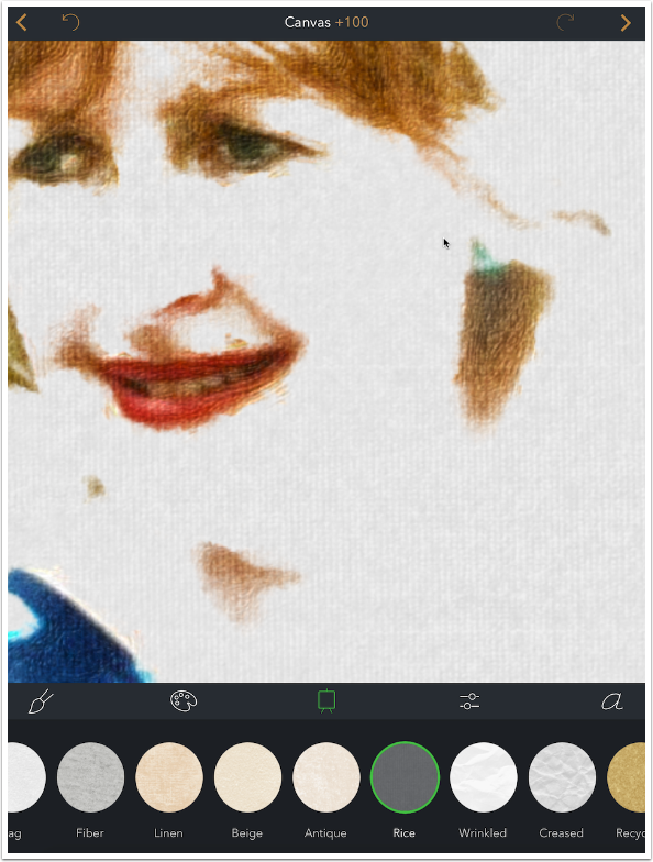
Finally, I zoom in to show you the Rice texture before moving on to Adjustments.
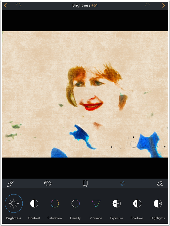
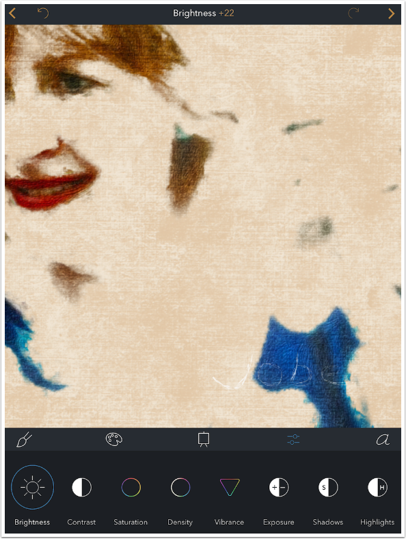
Adjustments, found under the sliders icon, are standard adjustments that you’ll find in most apps. The difference here is that the adjustments only apply to the painted areas. If the canvas shows through, then Brightness, Contrast, Temperature, etc. will not apply to the blank canvas.
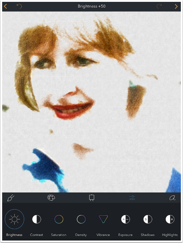
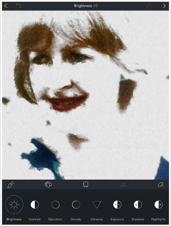
Most of the controls are set at +50, or midway, as you can see in the upper center above. Below I swiped left to reduce the Brightness setting to zero. Notice how it only affects the paint, not the Rice paper canvas.
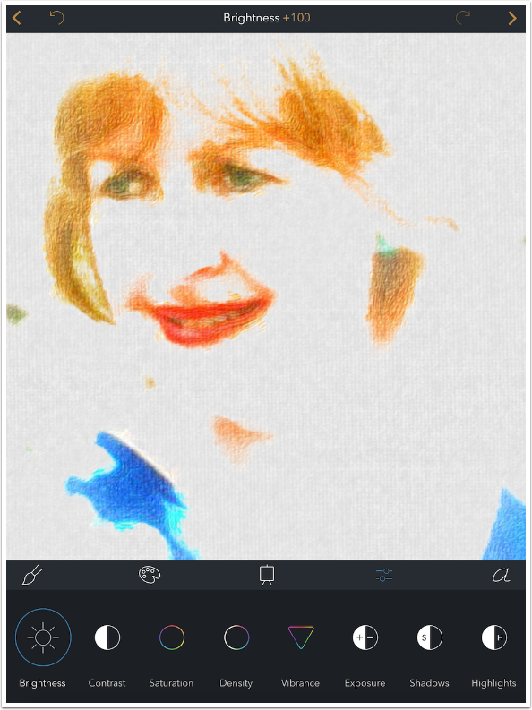
Brightness at +100 is more attractive than what I would have imagined.
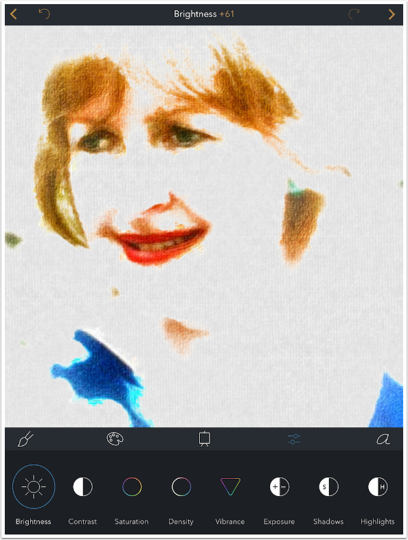
A single tap on the header (in this case Brightness) will return the setting to its default value. Instead, I reduced it from +100 to +61.
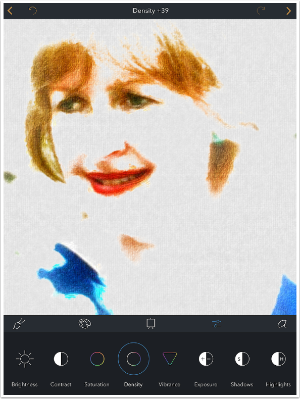
The default value for Density is +39, not +50.
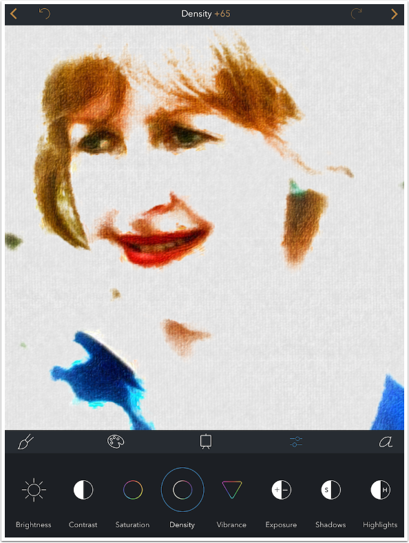
Increasing the Density will darken the paint without losing saturation.
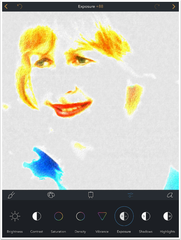
Some Adjustments will only make subtle changes to your paint. Exposure is not one of them.
Increasing the Thickness control will make it seem as though you’re really piling on the paint.

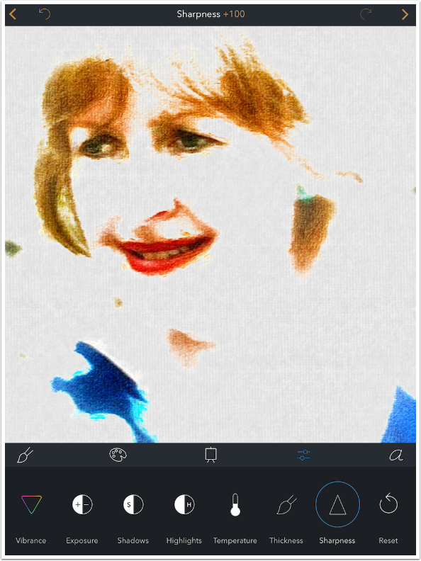
If you’re posting your work online, you might want to increase the Sharpness before saving, as sites like Facebook make your images lower resolution (therefore mushy). Sharpness defaults at 0, and can only be increased.
There is also a Reset All button at the end of the Adjustment menu, for conveniently starting over.
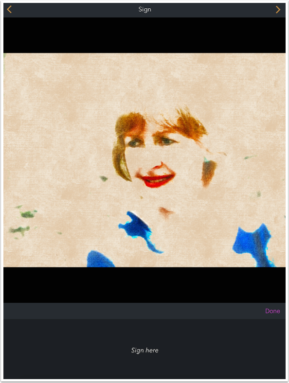
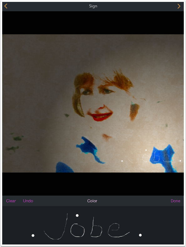
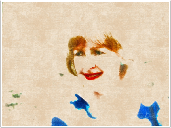
I really liked the Linen canvas, so I switched back to it. Now I’m ready to sign my “masterpiece”. Tapping the “a” icon on the menu, I am given a place to sign. The signature will be saved and applied to future images in Brushstroke.
I use a stylus for this, since it’s really difficult to see what’s happening when you use your finger here. As soon as I make the first stroke, a number of things happen. First, a “spotlight” appears on the image to show where the signature is applied. Also, three buttons show up: Clear, Undo and Color. Clear removes all strokes, Undo removes the last stroke, and Color allows you to change the color of the entire signature.
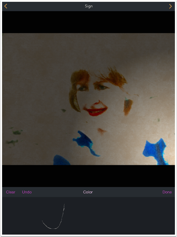
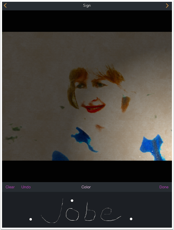
I continue with my signature. You cannot change the width of the pen stroke. If I make a mark I don’t like, like the “e”, then I can Undo and try again.

If you just tap, and do not drag your stylus/finger, then a dot appears that is thicker than the pen width. It may be a bug, but I can see where it could be used decoratively.
Using a two-fingered pinch at this point will allow you to size and move your signature.
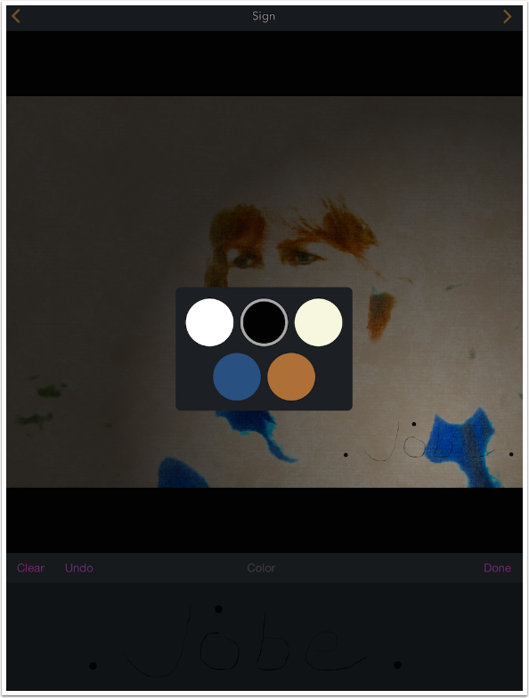
Tapping Color brings up a palette. The bottom two colors are based on the image being painted.
Tapping Done takes you back to the main workspace, and the signature is applied. Because the pen is so thin, this can result in your signature coming close to disappearing entirely. Those three black dots help me find my signature.
You can try to thicken the lines by drawing over and over the lines, but I find that tedious and of little use.
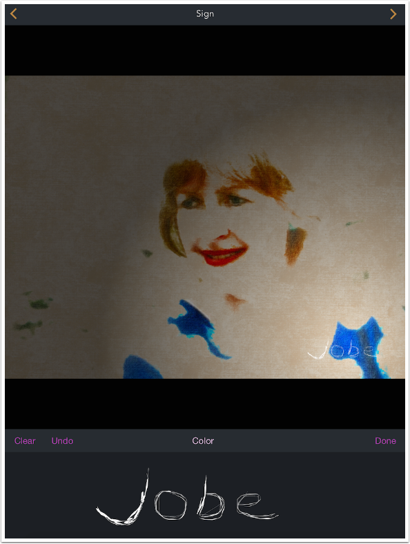
Here’s the “thickened” signature, once it is applied. Even when I darken the paint using the Brightness adjustment, it’s hard to see
Here’s my finished image.
The signature stays in place and will automatically be added to your next image unless you clear it. If you Clear it, then you will have to sign again – Brushstroke does not allow for a “gallery” of signatures. Below I’ve gone back to S1 (Simple), and the same signature is applied at the same place.
So, what’s the verdict on Brushstroke? For me, the number of Paint presets (101) and Color presets (75) balance out the lack of control over any single preset. You can always find some look that suits your particular image.
Two features are nearly useless: Crop and Signature. Crop looks like a relatively simple fix, and Signature would be improved with a Pen Width adjustment.
One other bug that I would like to die is the fact that switching out of the app while in the middle of an edit forces you to start over. I encountered that numerous times in the course of creating this tutorial.
Three improvements worth looking into would be allowing for the Canvases to be resized/rotated, allowing a color picker for canvas color and signature color, and allowing for the saving of Favorites. Combinations of Paint, Color and Canvas presets as well as Adjustment settings could be saved in a file of minimal size.
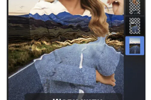
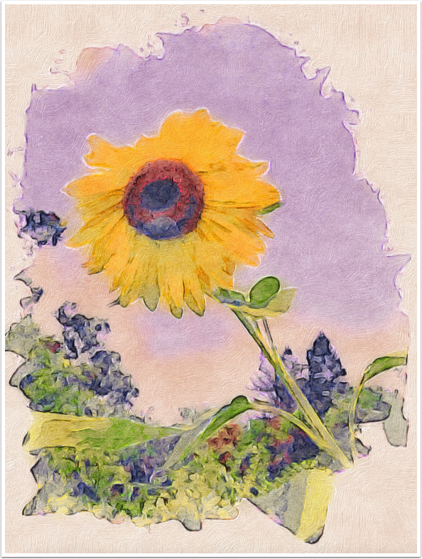
I have a real fondness for Brushstroke, and I’m always finding new combinations that intrigue me. As always, the real value comes when you jump between apps, and get combinations that become unique to you. My first example along this line uses Stackables on top of the Brushstroke image to add some additional texture.
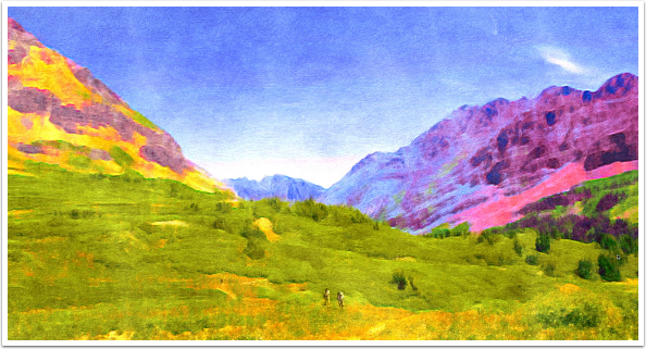
The second example went from iColorama to Brushtroke, then back to iColorama for blending a touch of the original back and a bit of recoloring.
My last example also used iColorama to blend the original figures back at bottom center – Brushstroke made them into blobs. Until next time, enjoy!
TheAppWhisperer has always had a dual mission: to promote the most talented mobile artists of the day and to support ambitious, inquisitive viewers the world over. As the years passTheAppWhisperer has gained readers and viewers and found new venues for that exchange.
All this work thrives with the support of our community.
Please consider making a donation to TheAppWhisperer as this New Year commences because your support helps protect our independence and it means we can keep delivering the promotion of mobile artists thats open for everyone around the world. Every contribution, however big or small, is so valuable for our future.
Jerry Jobe
Never content with just scratching the surface of what an app can do, Jerry Jobe decided to pass on what he learned about imaging apps to others. He’s constantly trying to figure out just what tools other artists have used, and trying to incorporate them into his own work, in an attempt to find his style. He’s written tutorials on over 145 apps so far, which you can find (along with his Song of the Day entries) at http://enthusiasmnoted.wordpress.com/ He lives near Atlanta, Georgia, where he also finds a creative outlet in acting and directing in community theater.