Mobile Photography / Art Tutorial – Satur8: Color Gradient Tool
We are delighted to publish Jerry Jobe’s latest mobile photography/art tutorial for our viewing pleasure. This time Jobe features Satur8 and the outcome is not entirely favourable…. (foreword by Joanne Carter). Take it away Jerry…
“Being an app developer is hard work. Even when you come up with a great idea and an app that delivers on that great idea, users are constantly looking for what’s next. Therefore, you have to come up with another great idea or update the first app on a regular basis with more good stuff. No one can succeed 100% of the time, so sometimes you miss.
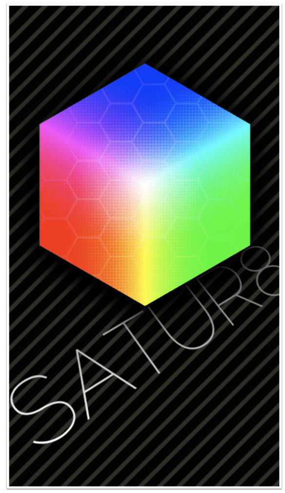
My next two articles will be about apps that miss. Kris Collins developed a wonderful app called Decim8 (review/tutorial in April 2013) that glitches and mangles your images. He followed Decim8 with a color gradient app called Satur8. It came out about the same time as my Decim8 article. It has not been updated since. (As a matter of fact, Decim8 has not been updated since January of 2014.)
If Collins had decided to abandon his apps and take them off the App Store, I would not be writing this article. But since both Decim8 and Satur8 are still being sold, I feel they are fair game for criticism. No one should still be making money off products they care nothing about.
Let’s take a look at Satur8 and see how it fares on its own, without comparison to Collins’ other app. First of all, let me say that it is iPhone only, and because there is no HD version, it does not look pretty on the larger screen of an iPad. However, it does handle larger images fine, so the results look better than what you see on the screen”.
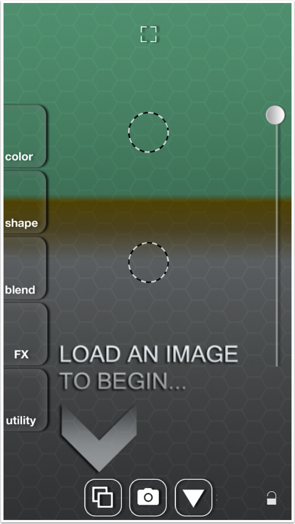
You are asked to load an image to begin. You can also capture an image with the camera, but capturing a photo in an editing app is never recommended. Even before you load an image, you can see that a randomly-coloured gradient is already put in place by the app.
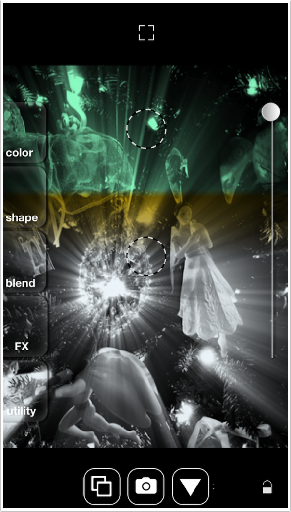
I loaded a black and white image so that it will be easier to see the colors assigned by Satur8. On the right is an opacity slider, on the left are menu buttons, and the block at top center hides both the menu and the slider. There are two dotted-line circles you can move around the screen to control the direction and size of the gradient applied.
When you tap the block to hide the controls, it changes to a cross. Tapping the cross brings back the other controls.
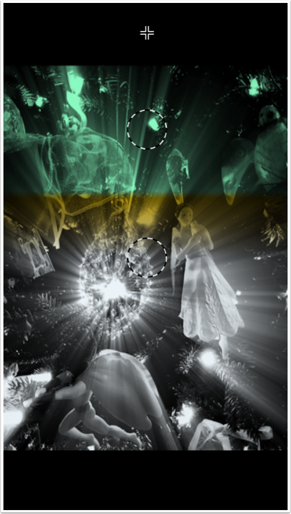
By moving the two circles, either together with two fingers or separately, you can change the direction and size of the gradient.
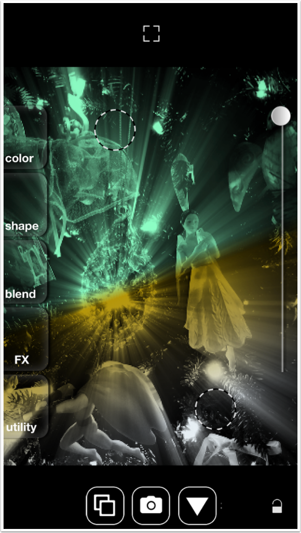
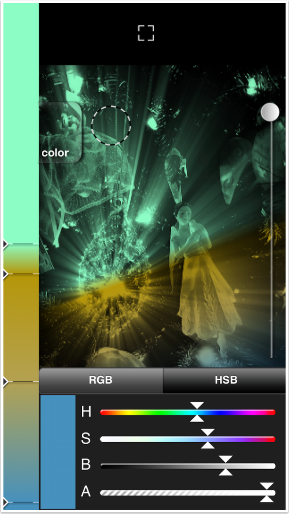
When you tap one of the menu buttons, that task becomes the operative task. I’ve tapped the Color button and the colors in the gradient are shown along the left side. The various colors are represented by a triangle and a line. This particular gradient has four colors.
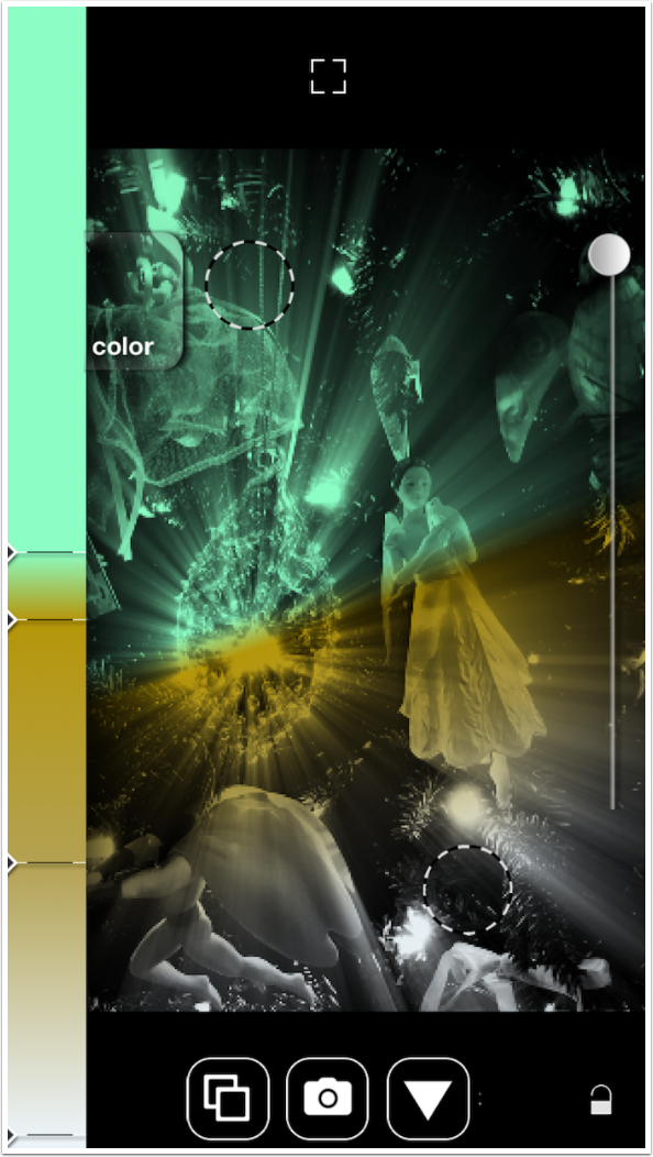
Tapping the triangle at the left end of the line opens up a color picker. You can choose an RGB picker or an HSB picker. Regardless of which type of picker is chosen, there is also an Alpha slider for the opacity of the chosen color. (The Opacity slider at the right of the screen affects all colors equally.)
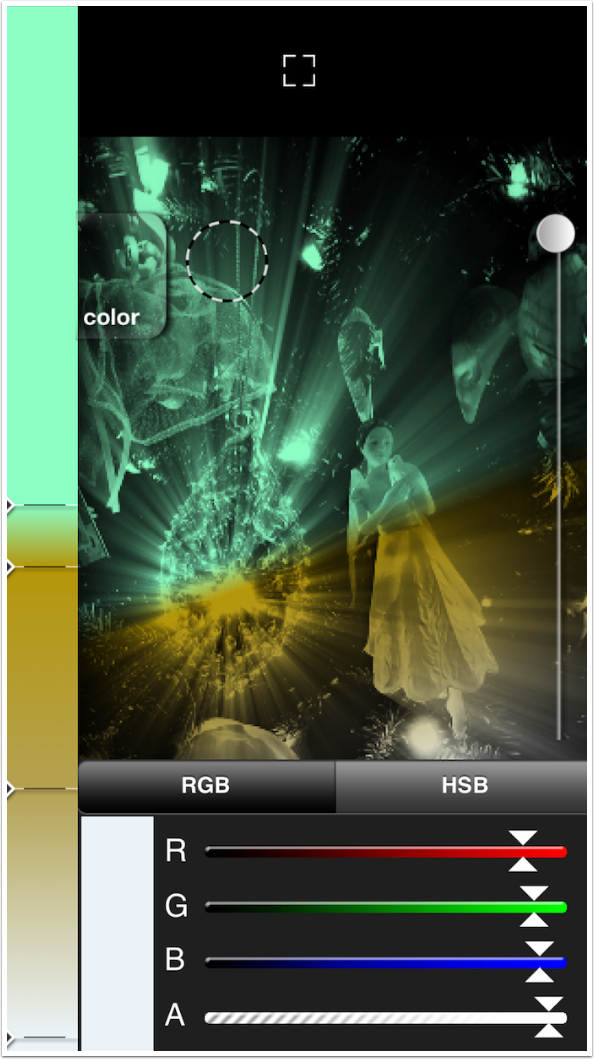
Below you’ll see the Hue, Saturation and Brightness sliders of the HSB picker.
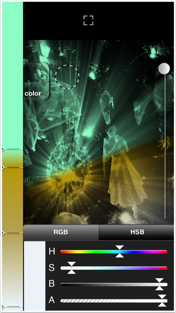
By moving the sliders, I raised the Saturation and lowered the Brightness. That gives me a nice medium blue.
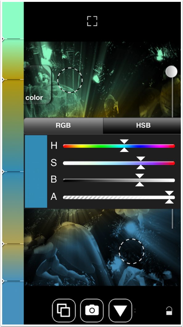
Dragging any of the lines will move the colors along the gradient. Double-tapping anywhere along the gradient will add a new line, giving you the ability to add a new color to the gradient.
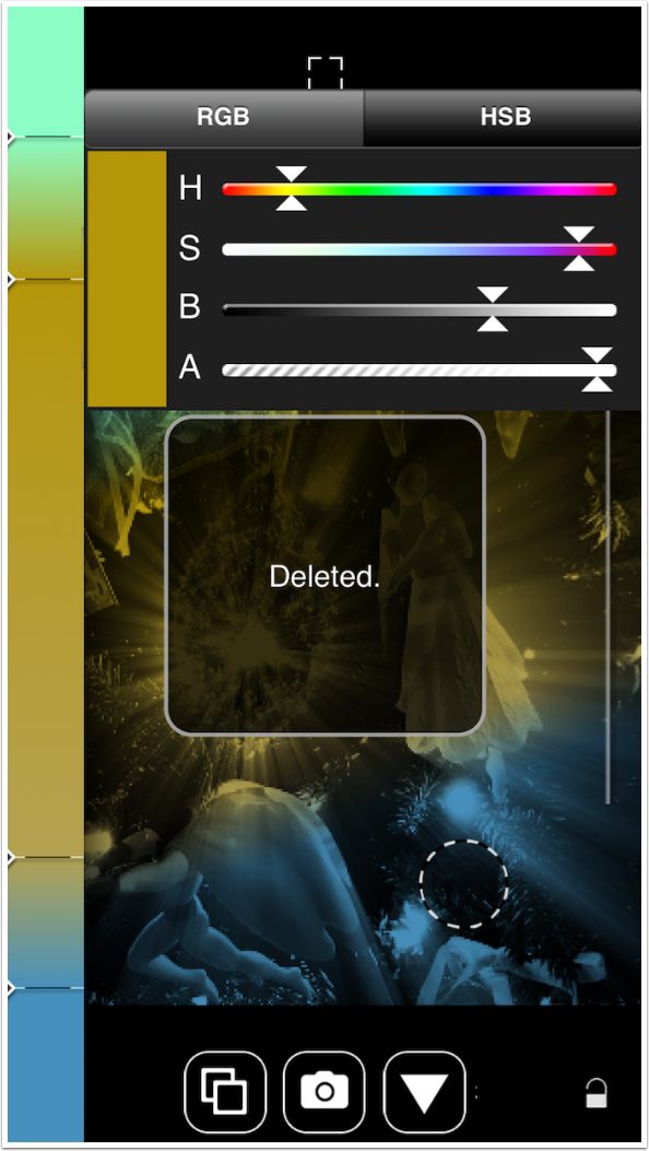
To delete a color from the gradient, press and hold the triangle, then drag it off the gradient to the right. This can be a pain to manage, but if you are successful, then the “Deleted.” box will confirm the deletion.
Tapping the menu button will close that menu item and bring back the full menu. If the button is obscured, as the Color button was obscured in the above screenshot, tapping anywhere on the image will do.
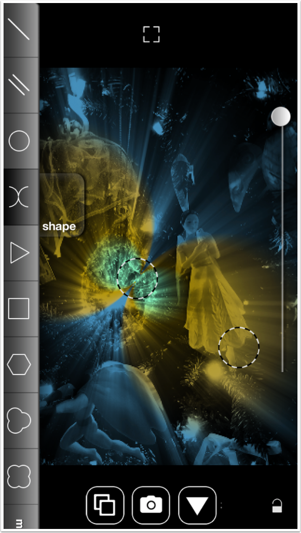
The next menu button is Shape. You are not confined to a simple linear gradient; circles, triangles, and other shapes are available. In the screenshot below, the top color of the gradient is assigned to the center of the circle, and the other colors take over as we move out from the center.
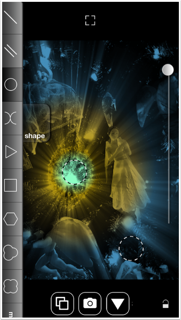
Next we see the double semicircle Shape. You can move the circles on the image to enlarge or shrink the Shape.
The next menu button is Blend. The blend modes are labeled with cutesy icons, and there is no text anywhere that identifies them to those of us that are familiar with blend modes. The “moon” shown below seems to darken the image; is it Multiply? Darken? Color Burn? We don’t know.
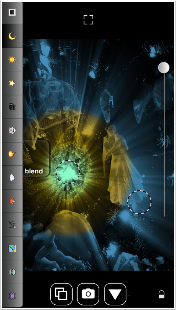
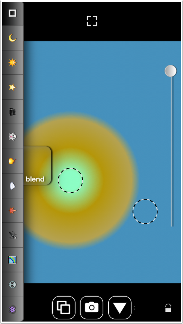
The top Box is definitely Normal. Therefore you can use this blend mode to create images that are entirely a color gradient with no hint of the underlying image.
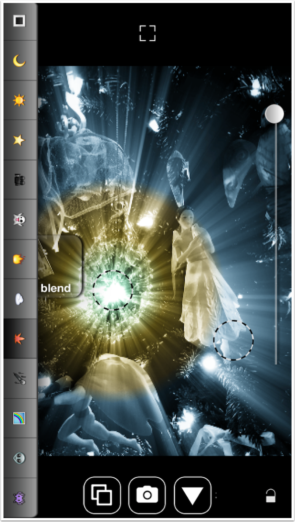
For this image, I find the “leaf” blend mode to be most pleasing to me.
The next menu button is FX, which gives you several ways to manipulate the look of the gradient. The top button cycles through four values: Smooth, Hard, Lines and Noise. Smooth (the default) gives you smooth transitions between the colors in the gradient.
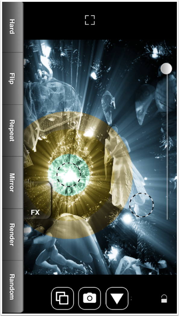
Hard gives you hard transitions between the color. You can see the hard edges of the color circles in the image below.
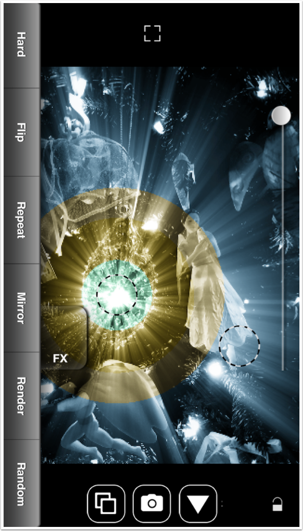
Lines gives you only transitions, striping your image.
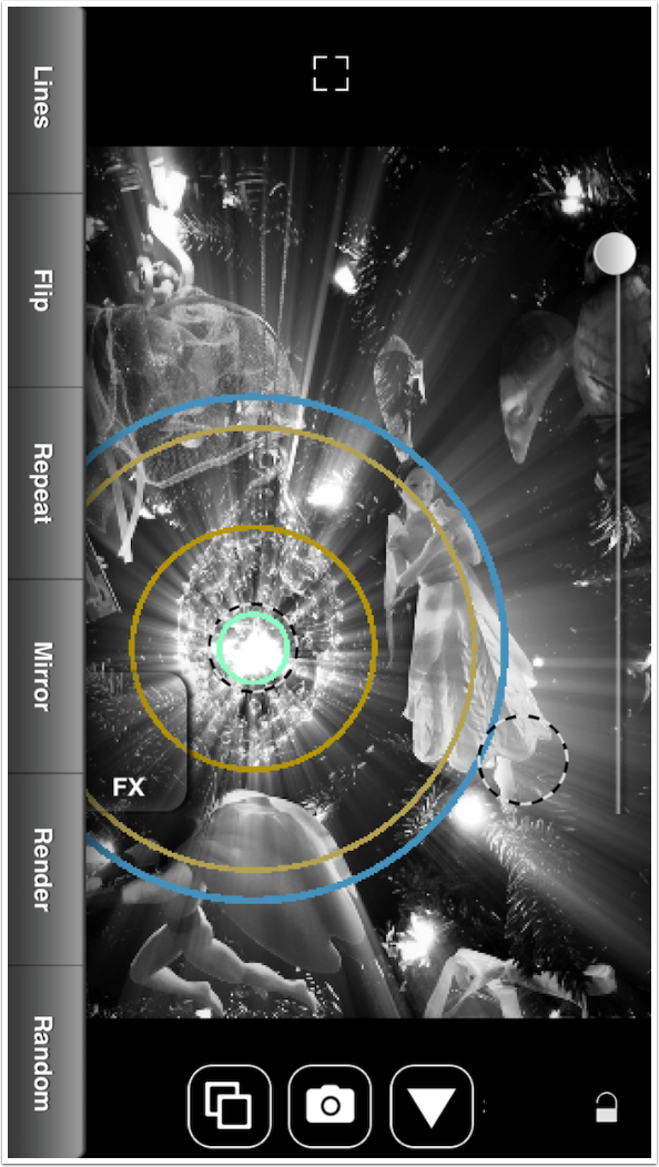
Noise is more obvious in Normal blend mode. You can see the “noisy” colors, shifting back and forth between tones, in the image below.
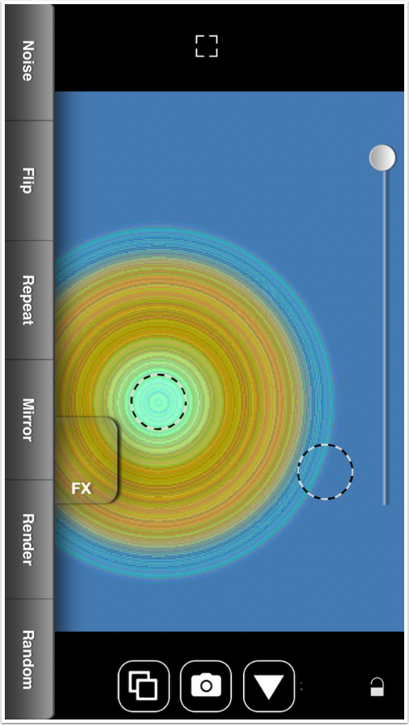
The next button is Flip, which flips the dotted circles. In the image below, the lower right “puck” becomes the center of the circle. Tapping Flip again reverts to the original.
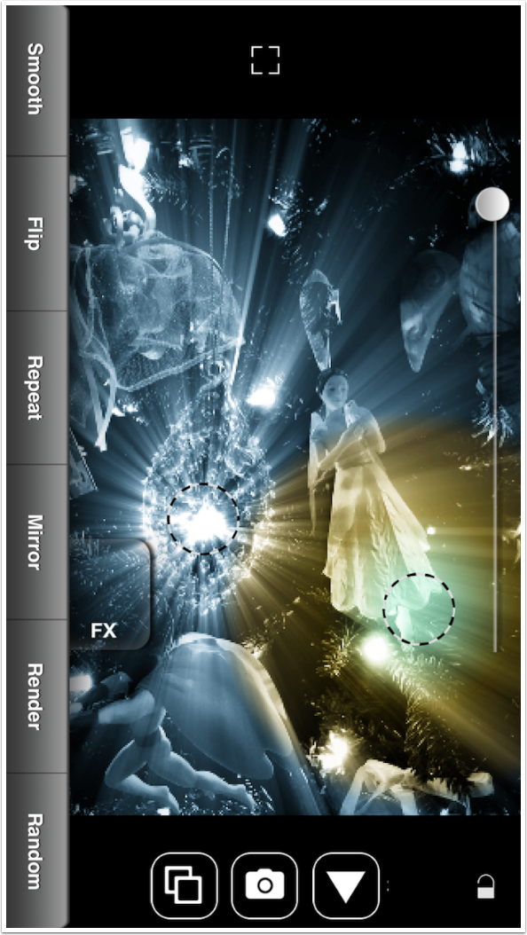
Repeat allows you to cycle multiple times through the full gradient of colors. A Repeat slider appears on the right side of the screen to control the number of cycles.
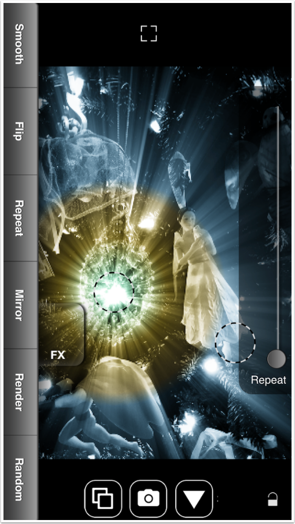
It doesn’t take much movement of the Repeat slider to make a big difference; I see four cycles from the slight adjustment I made to the slider.
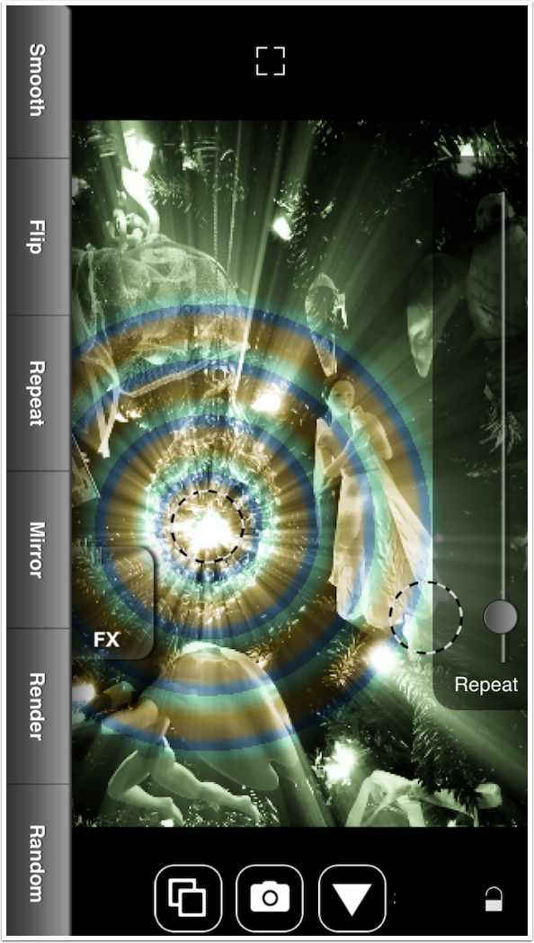
The next button is one you need to avoid, in my opinion. Mirror does cycles like Repeat, but flips the gradient on alternating cycles. In our example below, it goes green-brown-blue-blue-brown-green. The problem is that additional taps of the Mirror button does not revert back to normal; it adds an additional cycle, just like the Repeat slider. In trying to get rid of these additional, unwanted cycles, I ended up crashing the app.
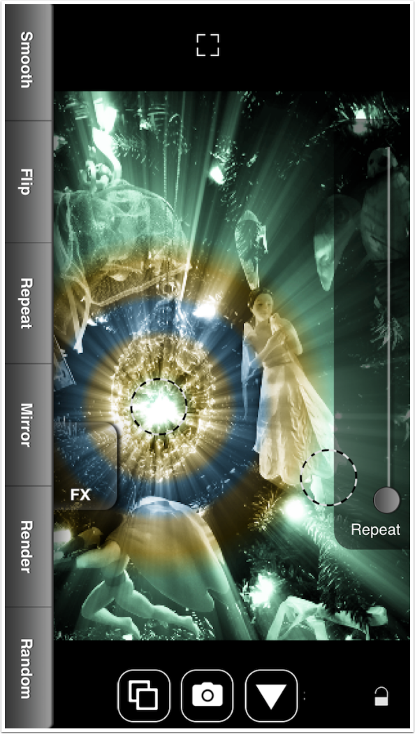
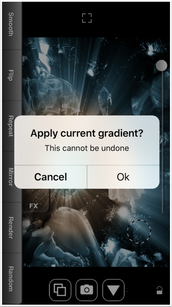
Render allows you to “layer” changes. It applies the current gradient, then allows you to add another, totally different gradient before saving. Render will ask for confirmation before applying.
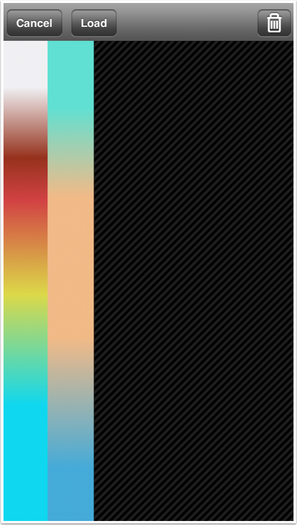
The Utility menu button brings up four options: Stash, Recall, Reset and About. Stash and Recall allows you to save and restore the color gradients you create. These gradients are just the colors; the placement, shape, blend mode, FX and opacity are not saved. Below you will see two gradients that I stashed. This list of saved gradients can be edited with the trash can button at the top right.
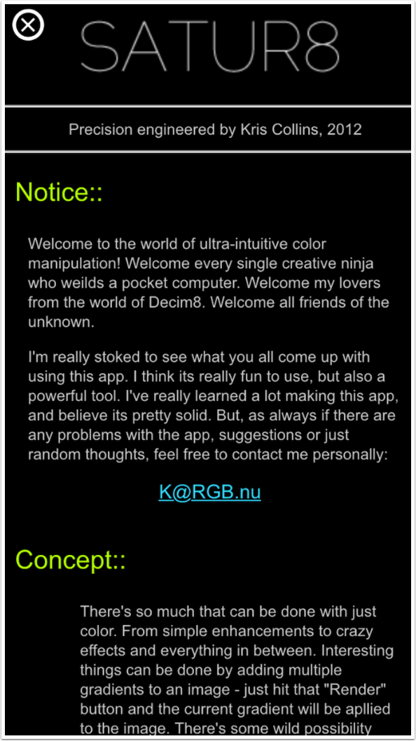
The About screen is useless, explaining nothing about the app or how to use it.
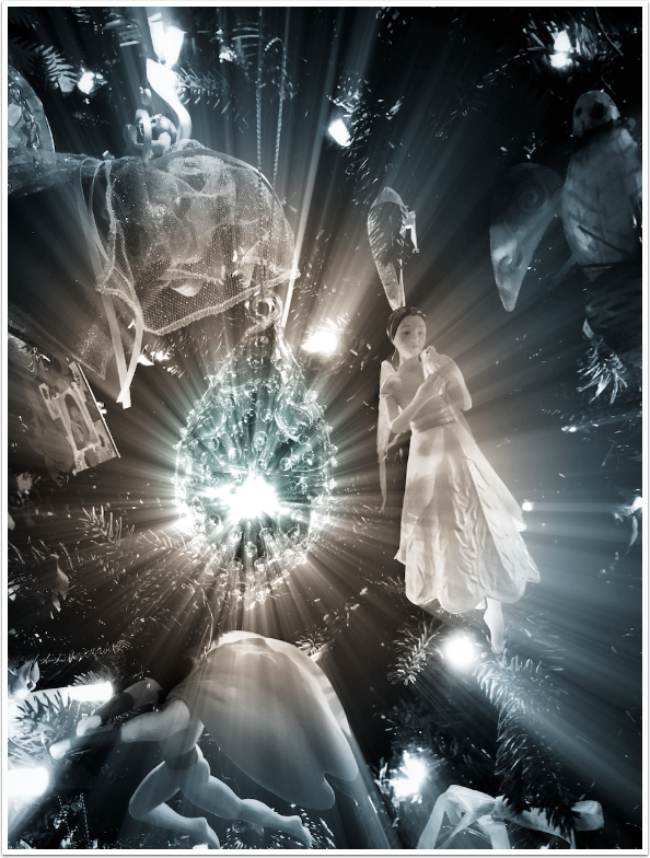
Bottom line: Satur8 is rather limited in effect and can be hard to control. It has never been updated beyond a bug fix in the first week of release. I would recommend against buying it. But if you already own it, you can get some use out of it. Here’s the circular gradient I’ve been showing you, with the opacity reduced to make it more subtle.
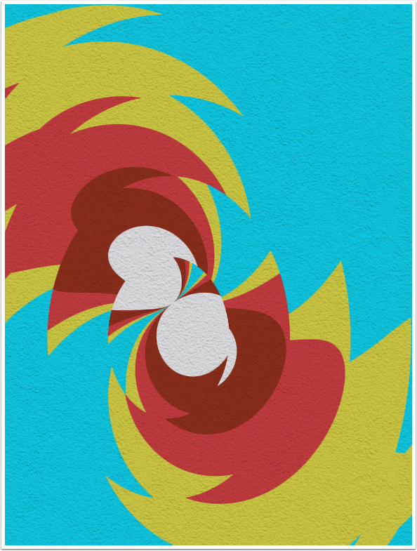
Using the Normal blend mode gives you color gradients that can be manipulated in other apps. Here I used the Deforms and Texture functions in iColorama.
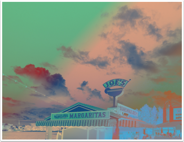
Using some of the unlabelled blend modes can produce some surprises as well. This image uses the “alien” blend mode.
I wish I could recommend Satur8, because of my affection for Decim8, but I just can’t. Next time I’ll be covering another app misstep. Stay tuned!
TheAppWhisperer has always had a dual mission: to promote the most talented mobile artists of the day and to support ambitious, inquisitive viewers the world over. As the years passTheAppWhisperer has gained readers and viewers and found new venues for that exchange.
All this work thrives with the support of our community.
Please consider making a donation to TheAppWhisperer as this New Year commences because your support helps protect our independence and it means we can keep delivering the promotion of mobile artists thats open for everyone around the world. Every contribution, however big or small, is so valuable for our future.
