Mobile Photography / Art Tutorial – Tinrocket Apps: This and Waterlogue
We are delighted to publish Jerry Jobe’s latest mobile photography/art tutorial for our reading and viewing pleasure. This time Jobe takes a look at two apps by Tinrocket called This and Waterlogue. . Read Jobe’s thoughts as he puts it through them through their paces (foreword by Joanne Carter). Take it away Jerry…
“Tinrocket, maker of such App Store favorites as Percolator, Waterlogue and Popsicolor, released a new app last week. In looking through my tutorials, I realised I had yet to cover a single one of their apps, so I thought I’d take the opportunity to remedy that situation. We’ll start with the new app called This and also take a look at Waterlogue”.
This
Tinrocket’s new app is called This, and it is a labeling app. That means it gives you pointers and fonts to allow you to label your image. So the first question you must ask is “Do I have any use for this app?” I had to answer in the affirmative, because my screenshots often need some annotation, but I don’t go through the tedium of labeling them. What makes the labeling tedious? Drawing the line, then going to a text function, then moving the text around so it can be seen, then redrawing the line to that new text position. So, I thought, if I were to make a simple labeling app, I would want to anchor the end point, then be able to resize and move the text without the end point moving. As it turns out, that is exactly how This operates. This is a universal app that sells for $1.99.
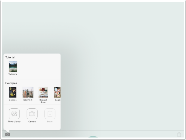
This has a very minimal workspace. When you open it, you will see the Camera at the lower left, and the Save box at the lower right. That’s just about it. The Camera is used for loading from the Camera Roll, capturing an image, Pasting an image you copied, or loading an example image.
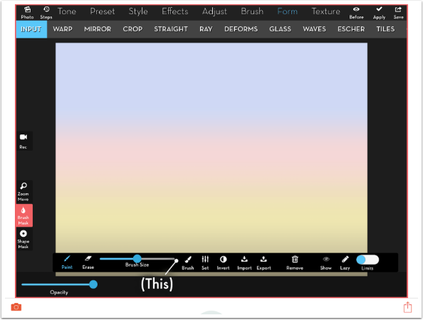
I load a screenshot from iColorama. As I said, I have a very specific need for this type of app.
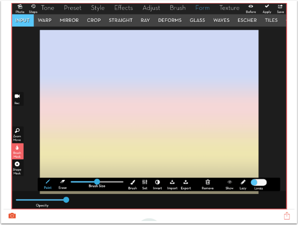
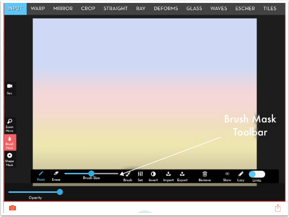
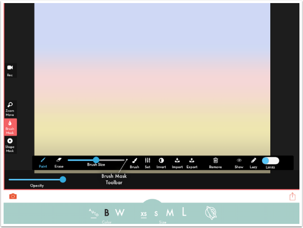
Below you’ll see that I tapped on the iColorama Brush Mask toolbar. This sets the end point, the place on your image you wish to label. It has a dot on the end point, but that can be changed. At the other end of the line is the default text, (This).
Tapping on the default text brings up the keyboard, which you use to type the text.
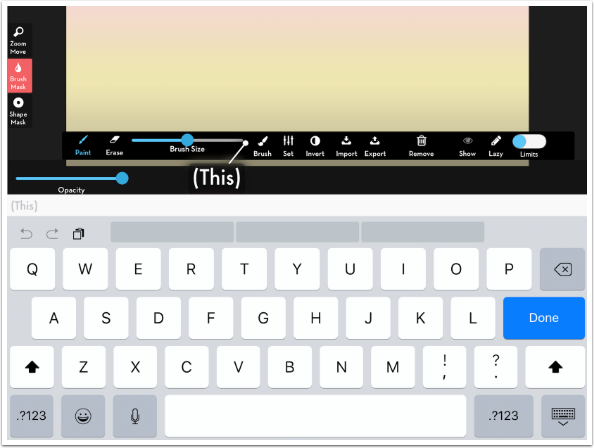
I type in “Brush Mask Toolbar” and tap the Done button. There’s enough text that it ends up obscuring the entire line and end point. That’s no problem, because we can move the text.
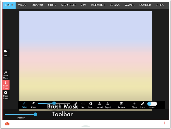
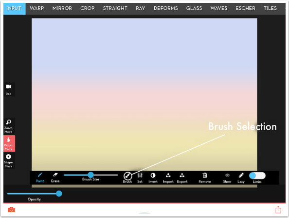
I drag the text up over the light gradient (my image in iColorama). This recognises that the white text might be difficult to read on such a bright background, so it automatically changes the color of the text, line and end point to black. That’s great for the text and line, but now the end point is lost against the black toolbar. This does not allow you to mix white and black in a single label (text, line and end point).
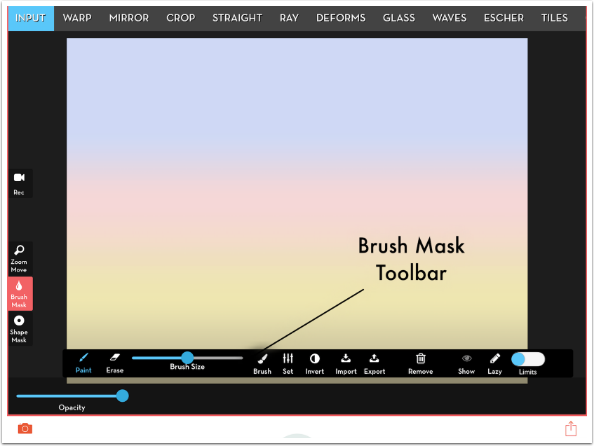
I move the text again, over to the right side. Since part of the text is over black, and none is over white, This changes the color of the label to white. Now the end point can be seen. Notice that This adds a bit of shadow to the text as it crosses from a light to a black background, to improve legibility.

Tapping the end point changes its look. In the image below the dot changes to an arrowhead.
Tapping again changes to a circle. I moved the end point and changed the text to show how the circle can be useful.
Continuing to tap the end point can also change the line. Below it has changed to a dotted line. Eventually it cycles back around to the initial dot.

You may have noticed a semicircle at the bottom center. If you tap that, some manual controls appear. The first control is color. It can be used to force your label to black or white, instead of allowing the app to make that decision with Auto.
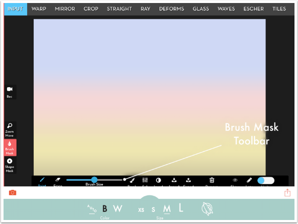
The other control is Size. In the image below I’ve changed the size from Medium to eXtra-Small. Changes in text size can only be done manually.
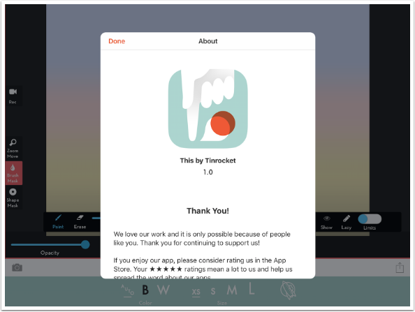
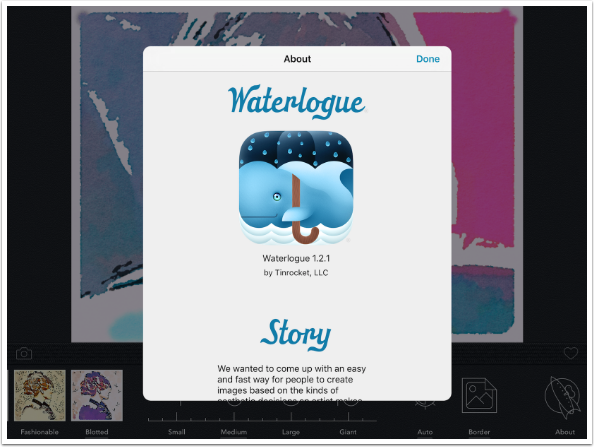
The final icon at the bottom, the Tin Rocket logo, pulls up an “About” window with contact information.
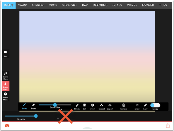
In order to delete a label, just tap and hold on a label. A big red “X” appears and the label is erased.
The Save box at the lower right allows you to save your labeled image to the Camera Roll, or export it to various services.
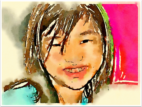
Here’s the saved image, with a couple of extra labels.
Waterlogue
Waterlogue is a watercolour filter app, which is also a universal app selling for the relatively hefty price of $3.99. The splash screen includes a “distilled water” pun.
Waterlogue also has a minimal interface. The Camera button is Load, the Heart is Save. The various filters are represented with thumbnails at the bottom. (Hey! I used This to label the screenshot!)
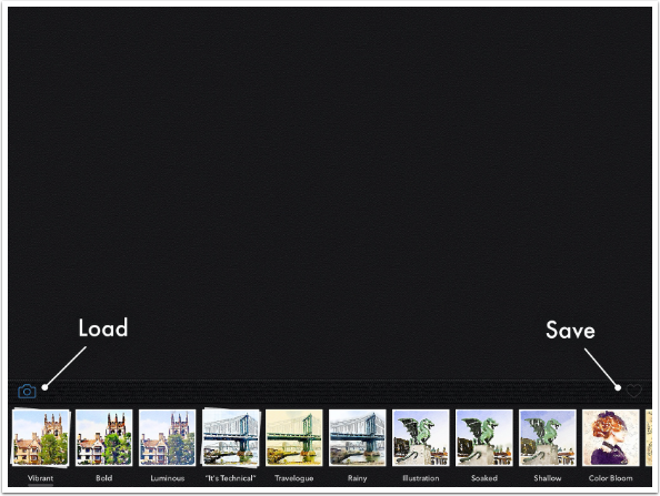
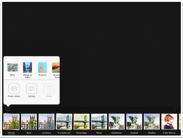
The Load button loads from the Camera Roll, captures an image, Pastes an image you copied, or loads an example image for you to experiment with.
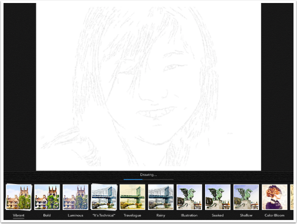
When you load an image, Waterlogue shows you its process of drawing and painting. It only takes a few seconds, which is always appreciated.
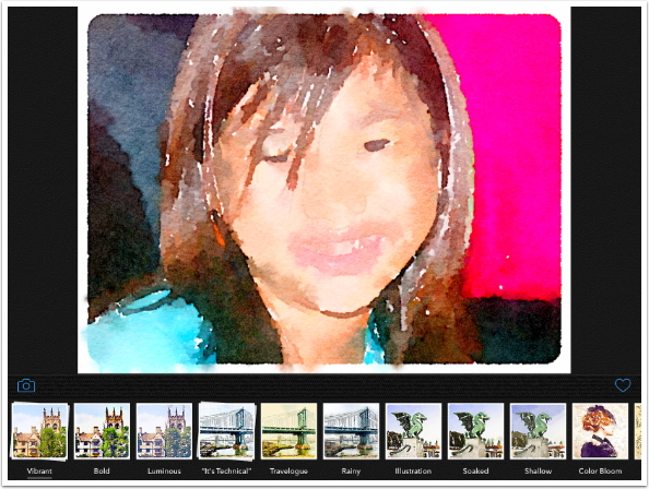
This is my image with the default Vibrant filter applied. Could be useful for blending, but not something I like as-is.
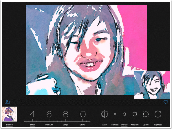
Choosing another filter (I chose Bold below) adds a preview thumbnail to the lower right of your image. You need to tap the thumbnail to actually apply the filter to the image. The thumbnail is only partially successful in anticipating what the final image will look like.
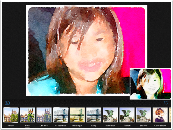
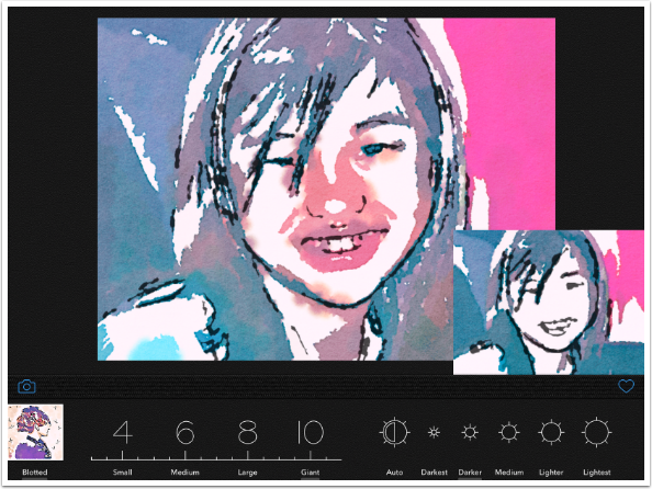
Compare the thumbnail above with the actual image with the Bold filter applied below. As I said, only partially successful.
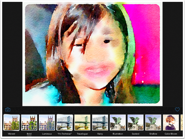
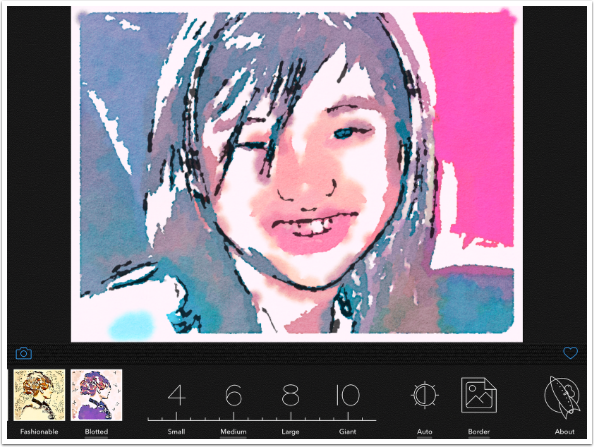
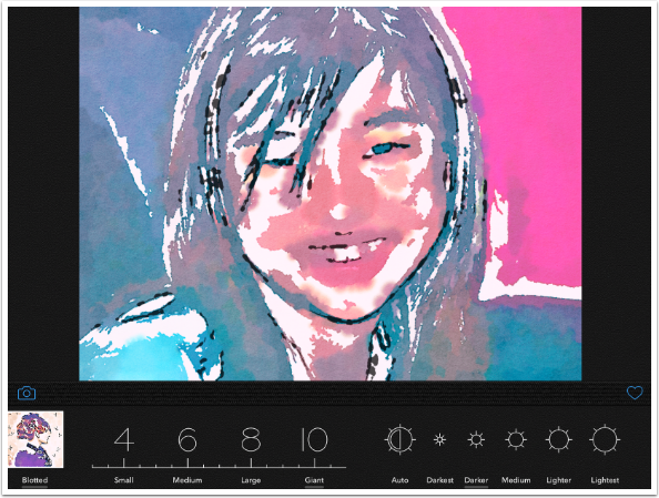
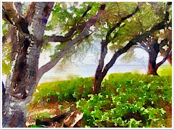
There are twelve different filters in Waterlogue, each with its own combination of lines, colouring and spread (emulating the watercolour absorption into the paper). The example below is the last filter, Blotted.
Beyond the filters are a few controls for changing the look of the twelve filters. We will start from the right and move to the left.
The Tin Rocket logo once again brings up an “About” window with contact info and not much else.
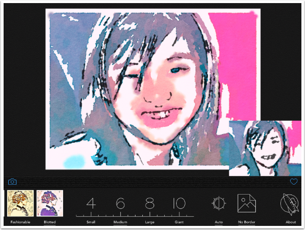
The next button from the left allows you to remove the default border (my preference). Once again, there is a preview thumbnail which you tap to apply to the full image.
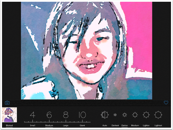
The next button, Auto Brightness, expands out to different options when you choose it. A preview thumbnail appears.
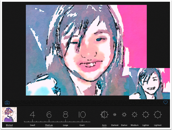
Here is the image with the Darker option chosen. It does darken the colors somewhat, but the main difference seems to be in the spread of the colors on the face.
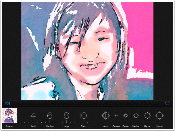
Changing the setting to Lightest definitely lightens the color and increases the spread.
The last setting is “Size”. I put Size in quotes because it doesn’t seem to change the size of the brushes, and it definitely doesn’t change the size of the image (even though it tries to make you think it does). The look of the control, making you think it’s a slider, is a trick also. You can only select Small, Medium, Large and Giant.
Look at the size of the thumbnail above (Small) compared to the one below (Giant). That’s what I mean when I say Waterlogue tries to make you think it’s changing the size of the image. The output is the same, regardless of what Size you select.
Below is the image with Giant applied. It definitely changes the look of the filter. I would suggest trying the various sizes with the filter you’ve chosen for your images, rather than trying to figure out ahead of time what you expect. It only takes a few seconds.
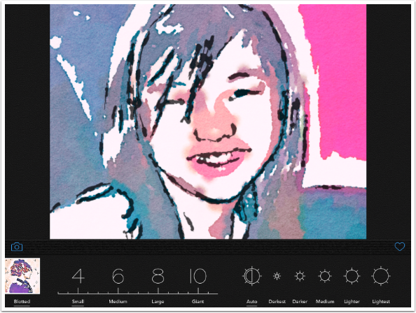
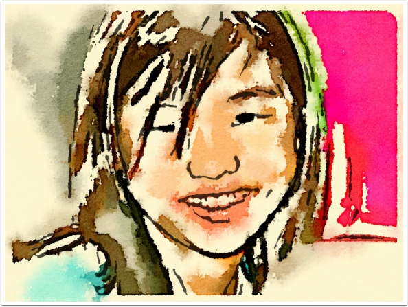
I’ve changed the Brightness to Auto and the Size to Small. I like the result.
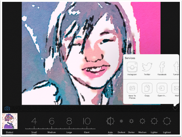
Tapping the Heart brings up the Save box.
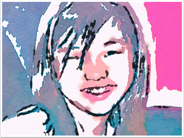
Here’s the finished image. The drawback for me is that you can see the paper texture in the medium tones, but you can’t see it in the white of the paper. This makes it an artificial look to me. An additional Paper Texture control would be a nifty addition.
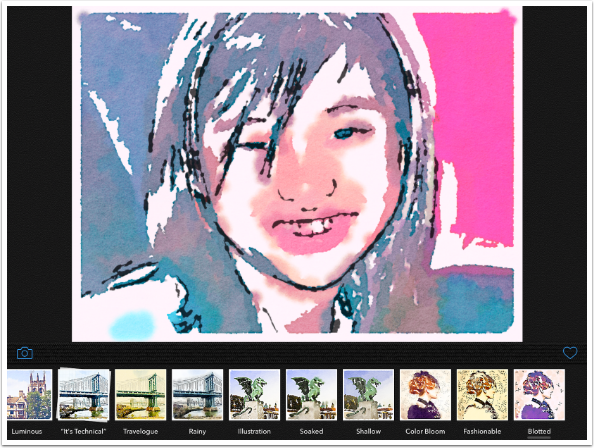
My favorite filter, Fashionable, does use a coloured paper, but you still can’t see the texture in the unpainted paper. Here it is with the Giant setting.
And here it is with the Small setting.
Of course, you can always use Waterlogue output in a blend. Here’s an image taken through iColorama. I blended the original back in slightly for a bit of definition, then added a paper texture to the entire image, even the white.
I like Waterlogue, but I’m not bowled over by it. It certainly doesn’t seem like a four-dollar app. Maybe that’s why I haven’t covered any Tin Rocket apps. I know people who love Percolator, Popsicolor and Waterlogue, but the canned looks seem obvious to me, and the controls do not vary the look enough. For me, the only value comes when they are buried deep in a blend. Many would disagree.
Until next time, enjoy!
Donating = Loving = TheAppWhisperer.com
TheAppWhisperer has always had a dual mission: to promote the most talented mobile artists of the day and to support ambitious, inquisitive viewers the world over. As the years passTheAppWhisperer has gained readers and viewers and found new venues for that exchange.
All this work thrives with the support of our community.
Please consider making a donation to TheAppWhisperer as this New Year commences because your support helps protect our independence and it means we can keep delivering the promotion of mobile artists that’s open for everyone around the world. Every contribution, however big or small, is so valuable for our future.
Joanne Carter
Joanne Carter is a British photography journalist, editor, curator, and the founder of *TheAppWhisperer.com*, one of the world’s leading platforms dedicated to mobile photography and art. Since its launch in 2009, TheAppWhisperer has become an international hub for artists of all levels to discover, learn, exhibit, and engage with contemporary photographic practice.Built on principles of inclusivity, accessibility, and artistic excellence, Joanne has spent almost two decades championing mobile photography as a serious artistic medium. Through interviews, critical essays, exhibitions, competitions, and education, she has helped shape and document the evolution of mobile art on a global scale.Her work has taken her internationally, lecturing on photography and mobile art at institutions and events including the Museum of Art in Seoul, South Korea, alongside appearances in the UK and Europe. She has served as a juror for international photography and mobile art awards across Portugal, Canada, the United States, South Korea, Italy, and the UK.Joanne is also the founder of *TheAppWhispererPrintSales.com*, one of the first online galleries dedicated exclusively to collectible mobile art, connecting artists with collectors across Europe, the United States, and Asia.Before founding TheAppWhisperer, Joanne worked extensively in print journalism and photographic publishing, including roles at a paparazzi photo agency and as deputy editor of a leading photography magazine. Her freelance journalism, criticism, and commentary have been published widely in both the UK and the US, with bylines in *The Times*, *The Sunday Times*, *The Guardian*, *Popular Photography*, *NikonPro*, *DPReview*, *Which?*, *Vogue Italia*, *LensCulture*, the *BBC*, and more recently, the *Financial Times*, where her published letters on photography continue to contribute to wider conversations around the medium.Alongside her editorial and curatorial work, Joanne’s own photographic practice has been exhibited internationally across the UK, Europe, South Korea, and the United States. Her work increasingly explores themes of grief, loss, death, memory, and the body.Her current research interests centre on grief, death, and poverty, with forthcoming postgraduate study leading towards doctoral research in these areas.Joanne is currently developing new long-form writing and photographic projects and is available for commissions, editorial projects, speaking engagements, and collaborations.Contact: joannetheappwhisperer@gmail.com)