Mobile Photography / Art Tutorial – Glitché Part 2: Deconstruction At A Price
We are delighted to publish Jerry Jobe’s latest mobile photography/art video tutorial for our viewing pleasure. This is Part 2 of Jobe’s Glitche Tutorial (if you missed Part 1, please go here). Take it away Jerry…
Glitche retails for $.99/£0.79 and you can download it here
Part one of our look at Glitché showed you how to bring images or video into the app, how to create an animated GIF, and the first half of the available effects. Part two will wrap up the look, and there’s a lot to cover!
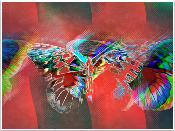
The effect LCD also makes multiple copies of your image, with color shifts. The color can be shifted further with the slider, and the Mode button will rotate through some subtle color changes. I liked this look so much that I saved it off and used it as the basis for a piece I’ll show at the end.
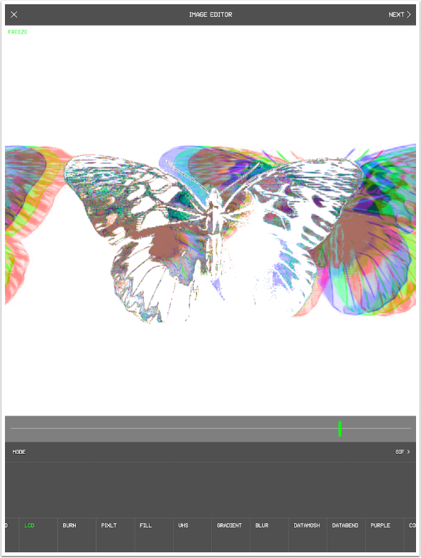
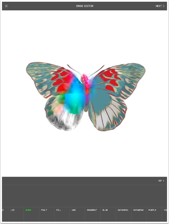
Burn is an effect you paint on with your finger/stylus. It intensifies the saturation and creates a melted, or blooming, look.
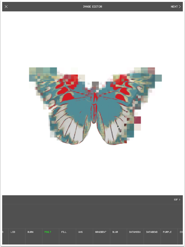
Pixlt stands for Pixelate, like news shows do to blur someone’s face. A light brush with your finger will crate small pixilated blocks, but it doesn’t take long for those blocks to become large if you brush harder or leave your finger in one place.
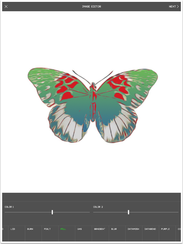
Fill allows you to tap any color within your image and recolor it with a gradient that uses Color 1 and Color 2. Color 1 changes the gradient color toward the top of the screen, and Color 2 changes the bottom.
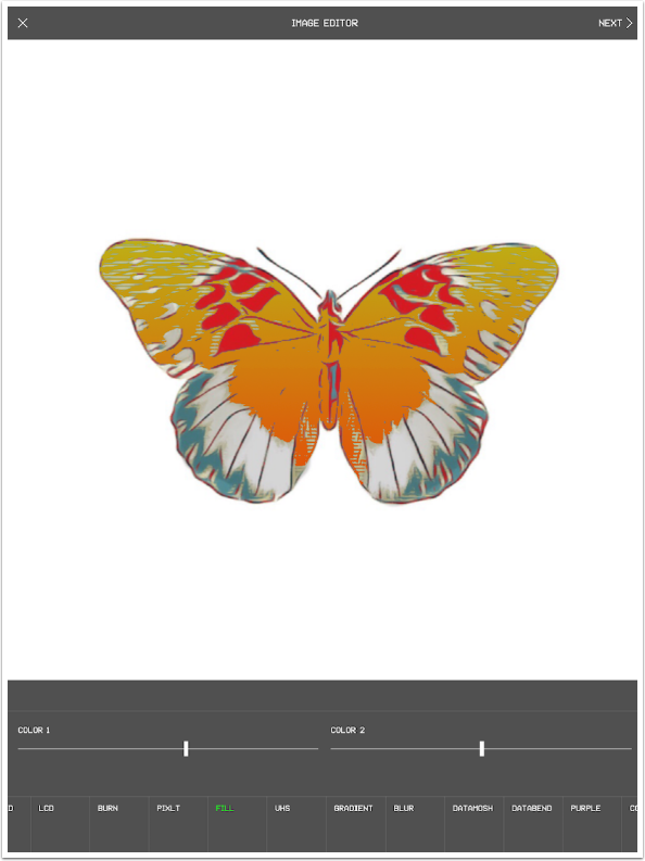
Below I changed Color 1 to a green and Color 2 back to a cyan.
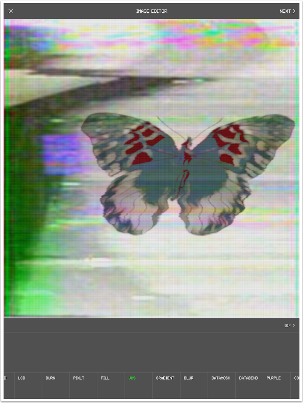
VHS gives you glitches that look like an old VHS tape (ask your parents, kids) with a flick of your finger. The changes will continue unless you tap the screen to freeze it.
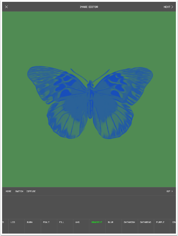
Gradient is a two-color gradient map with one color assigned to the lighter colors and one to the darker. The colors change as you move your finger around the image. The More switch adds additional colors to the two, and the colors are changed in the same manner.
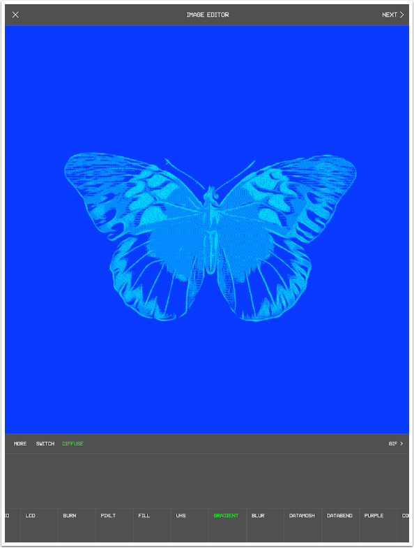
The Diffuse option does some preprocessing on the image, making it grainier. You can use the More and Switch options in conjunction with Diffuse.
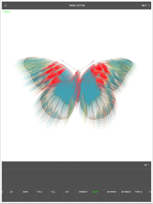
Blur gives you a multi-level motion blur, with the direction of the motion depending on the stroke you make.
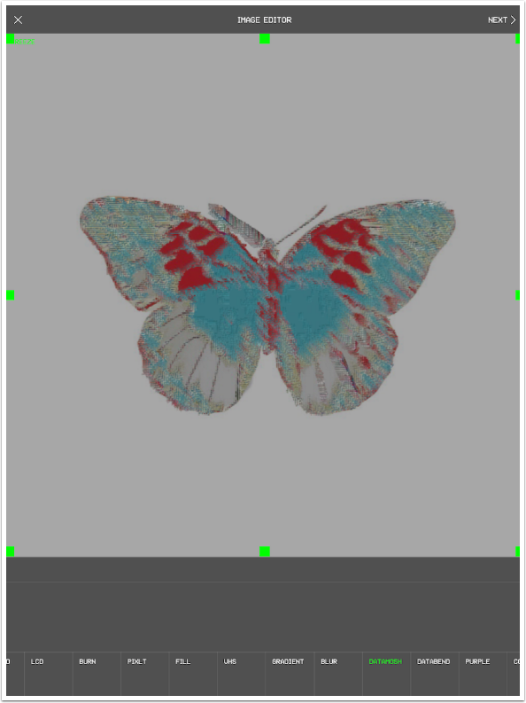
Datamosh smears the image into gray. It will continue to smear in a direction you choose until the screen is tapped to freeze. This is an ugly effect in my eyes.
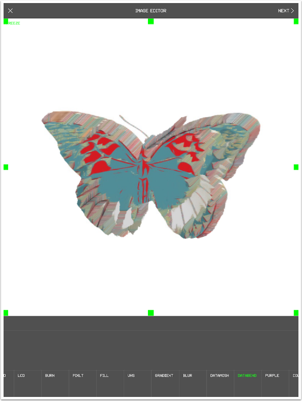
Databend works somewhat the same, except there’s none of that ugly gray.
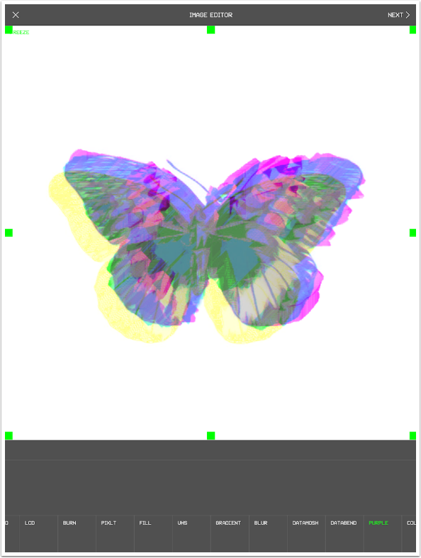
Purple smears the color channels. This can result in some interesting looks.
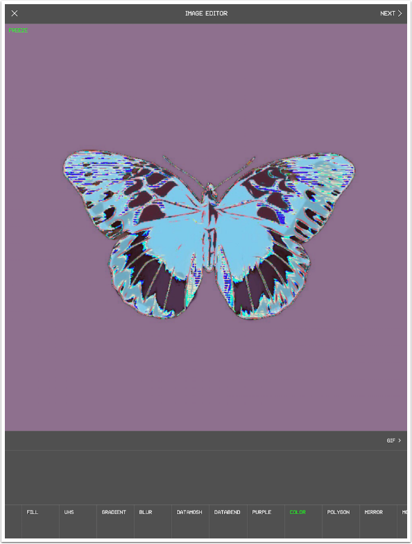
The Color effect is pretty straightforward: All the colors change as you move your finger around. This can be difficult to use in a precision way because you need to freeze the changes or they continue until they return to the original.
Polygon is interesting, but not all that useful. A reflective angled shape is placed over the image.
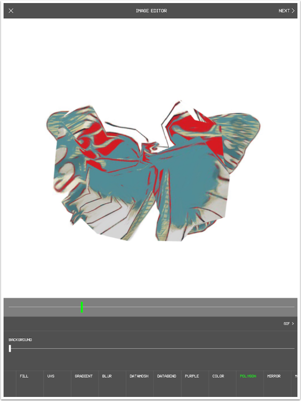
You can change the size of the polygon with the slider or a two-fingered pinch, and you can drag the polygon around the image.
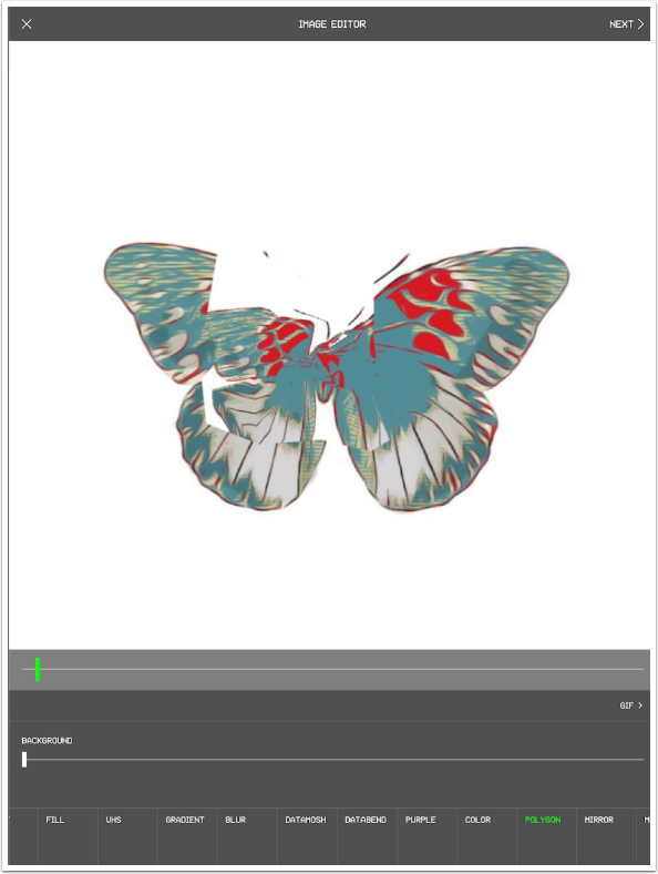
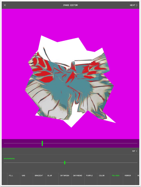
Moving the Background slider overlays the image with a color, leaving only the polygon reflecting the original image.
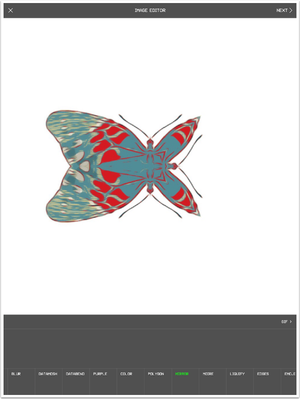
The Mirror effect mirrors your image around a line. It’s a two-step process: First you tap to establish the midpoint of the line, then you drag to rotate the line around that point. It’s very difficult to control, since the mirror changes as you lift your finger. I got a fairly useful image below, but it was purely by chance.
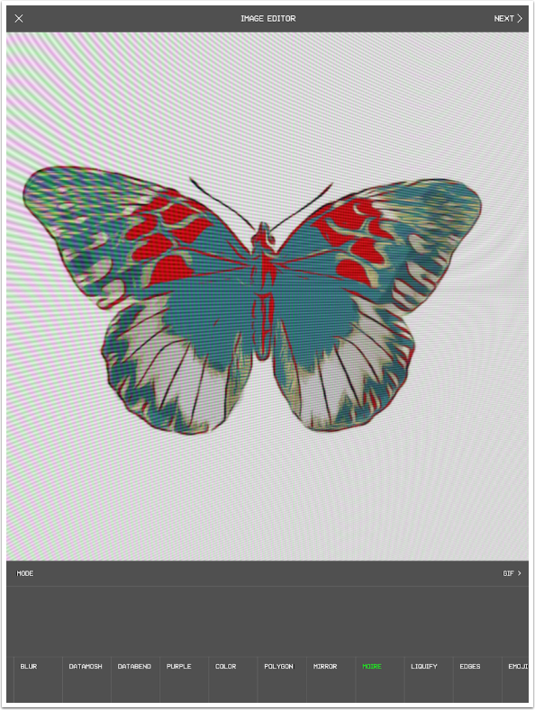
Moire brings you an effect that looks as though you’re taking a picture of a computer screen. It can be changed with a stroke on the screen. Not a look I’m trying to find; I usually want to get rid of it.
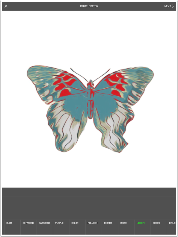
Liquify allows you to melt your image with a stroke, and without the color blooming that you get in the Burn effect.
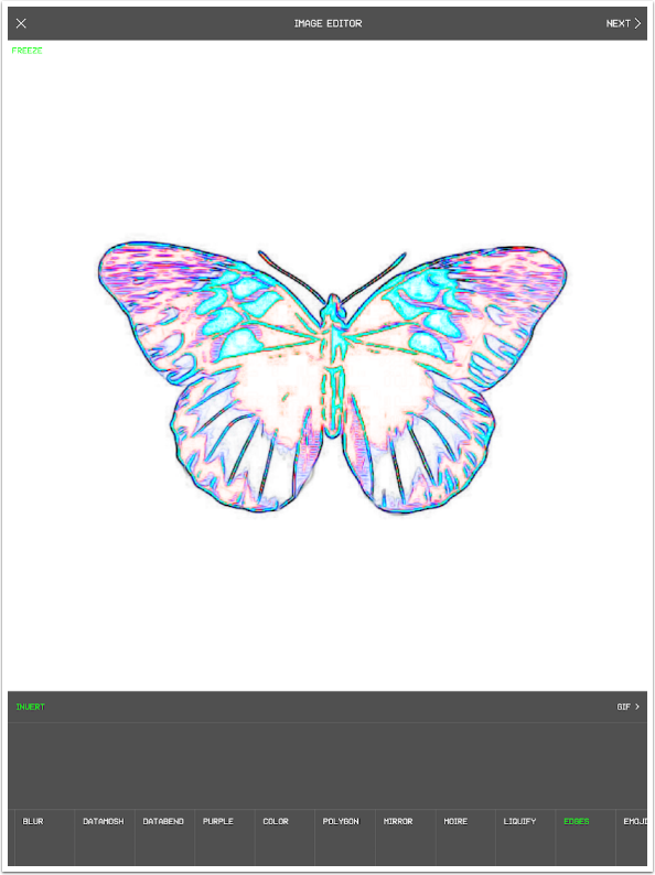
Edges gives you bright colored edges on a black background. Touching the screen multiplies those edges, making them thicker.
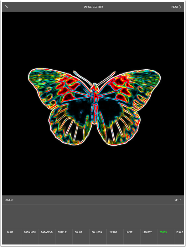
These edges can be inverted by tapping the Invert option.
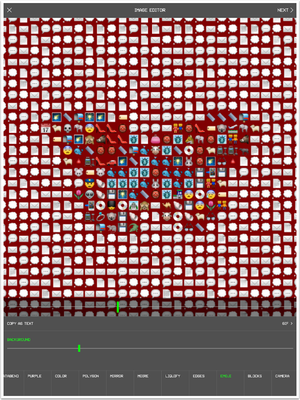
The Emoji effect is kinda fun. It replaces your image with emojis. The emoji used is based on the color in the image. Since this image is mostly white, you’ll see a lot of paper, envelope and speech bubble emojis.
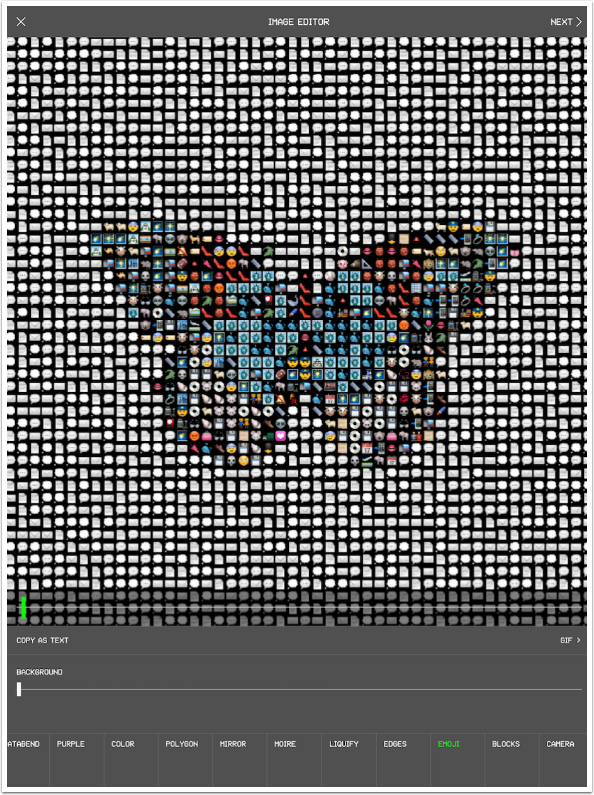
The top slider increases the size of the emojis, and the Background slider changes the color of the background from black.
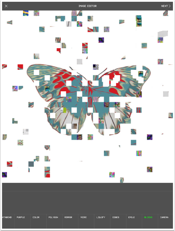
The Blocks effect “explodes” your image, displacing squares to different areas of your image. A stroke on the screen increases the displacement.
The last effect is Camera, and it gives your image the look of a cheap security camera. The slider increases the glitch effect. This effect does not freeze, so it’s the luck of the draw what you’ll get when you hit Next to commit your changes.
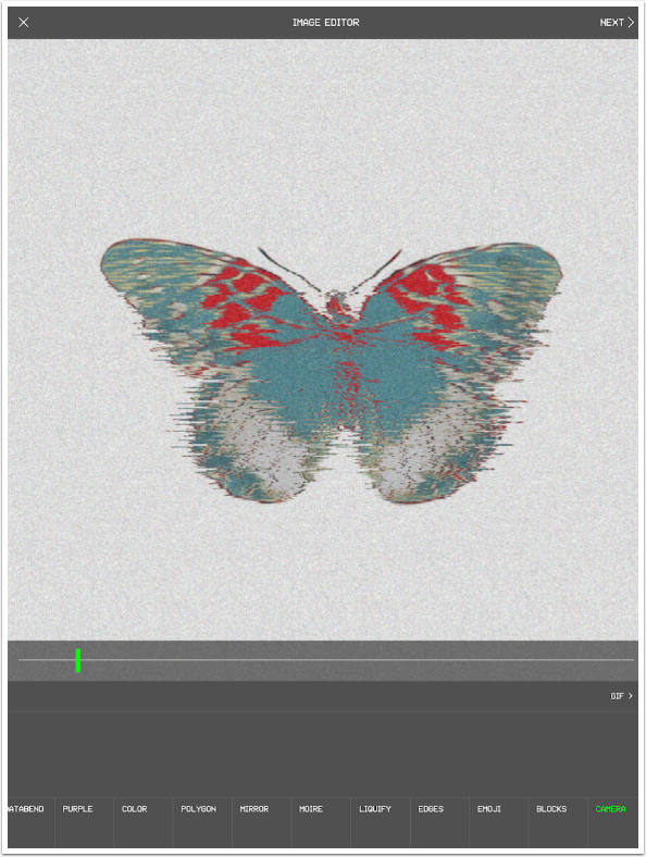
When you hit Next, you are taken to the Preview screen. There’s still quite a bit you can do. The slider, which I’ve moved below, blends your effect with the original. It seems to be a blend based on color, with the effect appearing in different areas of color on the original. I haven’t found much use for the slider yet.
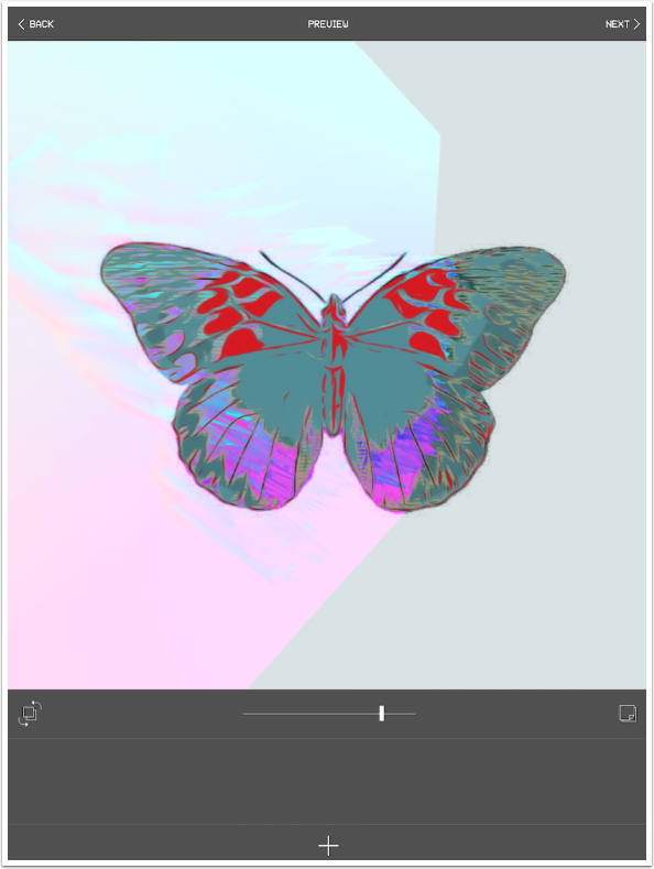
The double box with arrows swaps foreground and background for the blend. Below you’ll see the original peeking through the effect.
The + sign at the bottom flattens the effect and takes the flattened image back into the Image Editor for any additional effects you may want to apply.
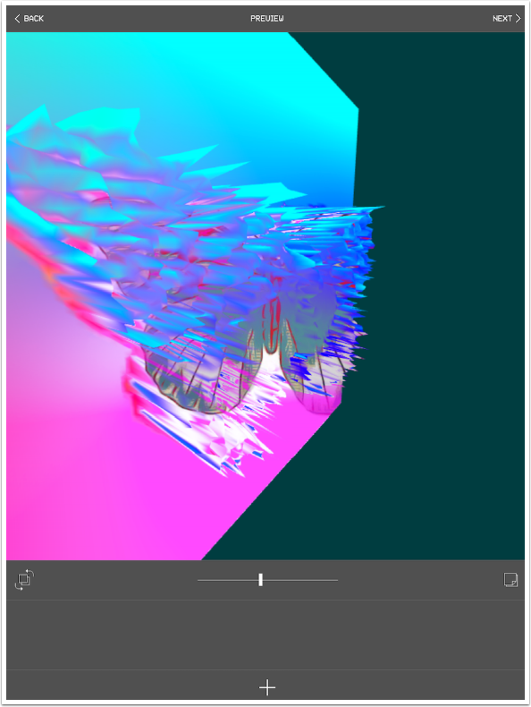
Tapping the box with the curled edge on the right of the screen brings up a submenu with three options: Txt/Emoji, Collage and Frame. (Delete is there to be able to delete the changes made on this screen without having to return to the Image Editor.)
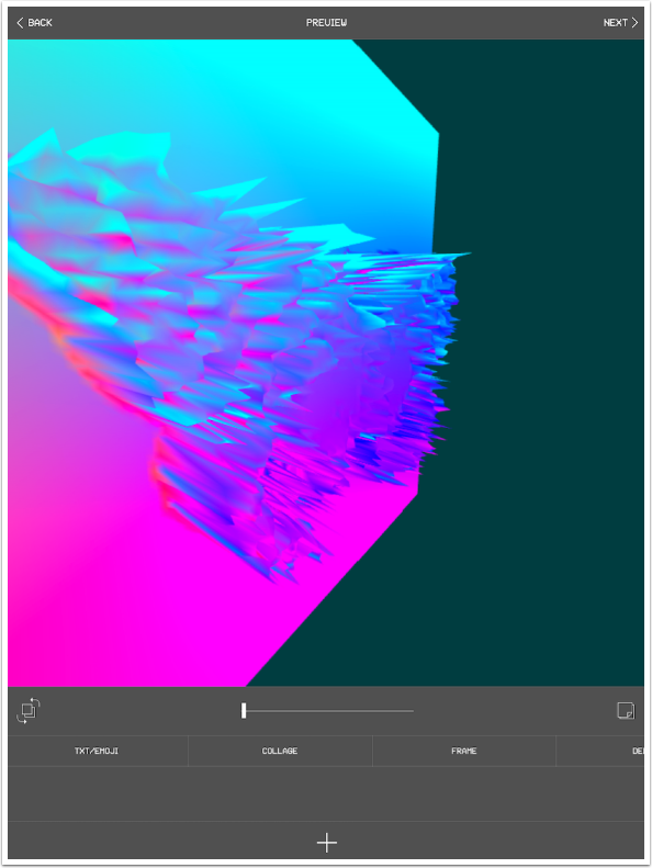
Txt/Emoji allows you to add text or emojis on top of your image. The text changes size, becoming smaller as you type more characters in. It is always centered on your image, and it is always on a single line. The text color can be changed using the slider, but it won’t change the color of emojis. The font for the text cannot be changed – it’s a font like that found on old CRT screens – all caps.
All in all, a fairly useless option.
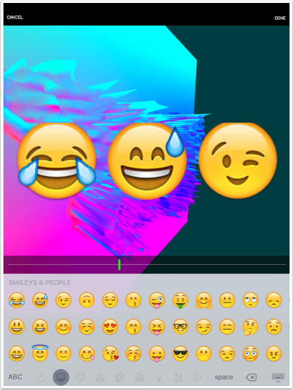
Collage allows you to drop in another image on top of your Glitché image. When you press Collage, you are taken to your Photo Library to select the additional image. Once you have selected an image, you are brought a Crop and Rotate screen (not shown) to place your extra image. This is the only place you get to move the foreground image around, and you can’t see the background image to place it on. Then you move on to the screen below to Remove Colors.
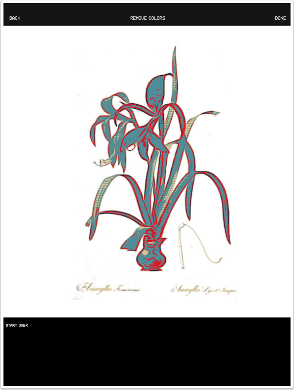
A tap on the surrounding white eliminates the color from the image. Notice the checkerboard pattern that denotes transparency, and that the white on the interior of the image is not deleted.
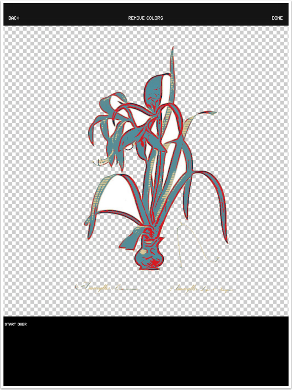
Tapping Done brings your collage together. Collage is a better option than the Text option, but the inability to see the result until you commit makes it a poor choice in comparison to layering or blending apps.
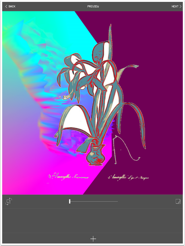
The Frame option lets you turn your Glitché image into a frame for another image. Once again, you are prompted to choose an image from the library and resize it within the square.
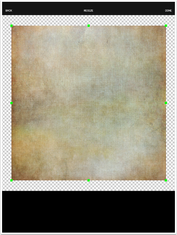
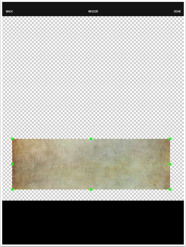
In an odd twist, changing the ratio of the image does not squash the image, but instead cuts off the image. Below, the texture image fills the rectangle on the long side, from left to right, but the top and bottom are cut off.
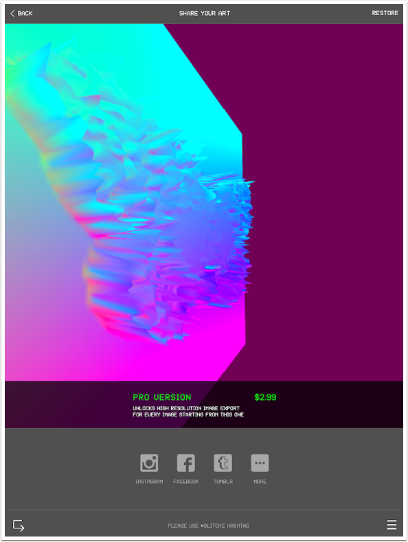
Glitché saves at a low resolution, so the first in-app purchase is the “Pro Version”, which includes “high res”. This “high res” is only 2400×2400, which hardly counts as high res these days. It is, however, better than the original 768×768. I had already bought the Pro Version on my phone, and it carried over to the iPad without re-purchase.
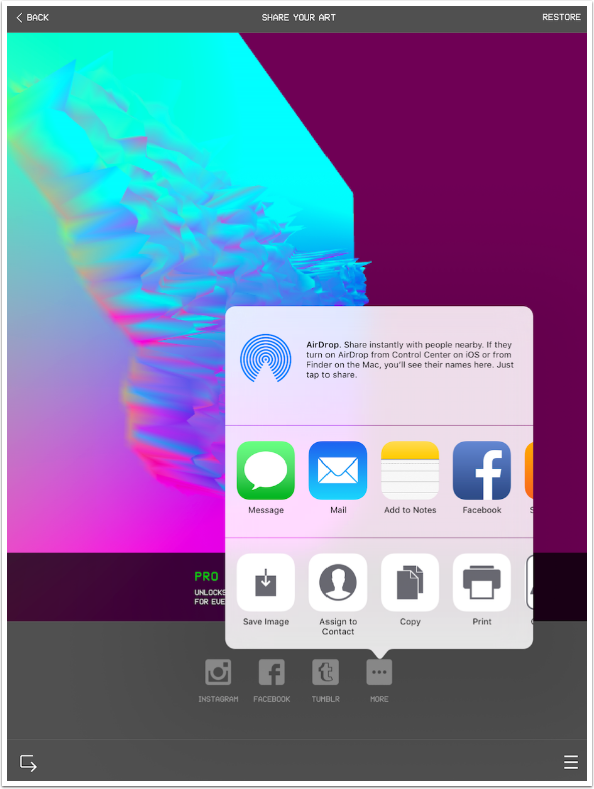
In order to save to your Camera Roll, you have to tap More and then Save Image. It’s an annoying extra step.
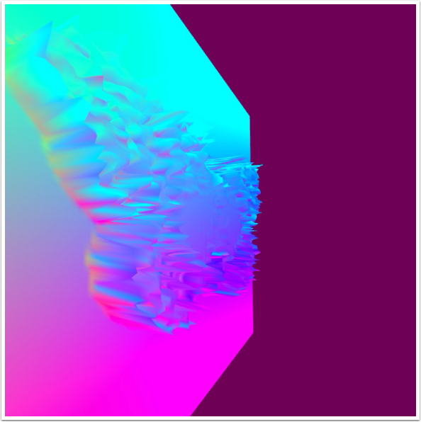
Here’s the low res save of my image.
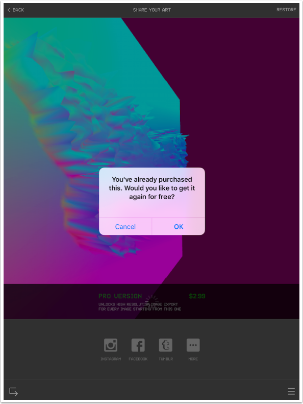
Below you’ll see the dialog box that appeared when I asked to get the Pro Version on my iPad. However, I also wanted you to see the return arrow icon at the bottom left. This works the same way as the plus sign on the Preview screen – it flattens the effect and returns you to the Image Editor for further effects.
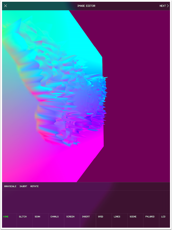
Here I’ve returned to the Image Editor.
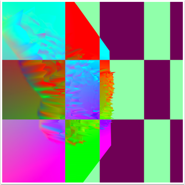
I added some Invert, and saved this at the higher resolution.
You may have noticed that Glitché only works with square images. However, you can process rectangular images by making them a square. Below I’ve brought in a portrait image and squeezed it down to fit into the square.
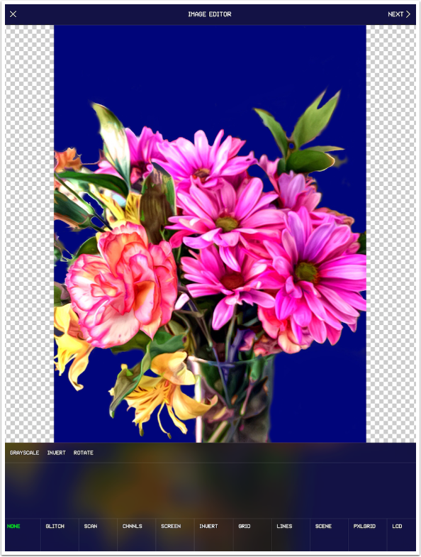
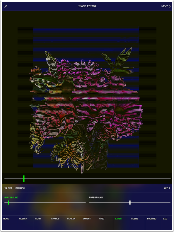
When I process it, it has black bars on the side that make it into a square. Those black bars can be cropped out in Snapseed or some other app.
Although I don’t typically work in video, I thought it only fair that I should give one a try, just to give my readers a look at how Glitché performed. The first roadblock I encountered is that video is the other in-app purchase, requiring another $2.99 to unlock. I bit the bullet and bought it; should you?
After loading the video, you are given a chance to trim it using the green bars on the ends of the video to move in the beginning or end. When you press Done, you are taken to the Video Editor. You choose your effect, then begin manipulating the effect by touching the screen or moving sliders. The video moves forward as you touch the screen or move the sliders – you are recording the changes as you make them. If you lift your finger, then the video pauses, waiting for further manipulation. The only way to keep a particular look throughout the remainder of the video is to keep your finger absolutely still, but still in contact with the screen.
As soon as you reach the end of the video, manipulating each frame, you are automatically taken to the Preview screen. Text, Collage and Frame are still active for videos.
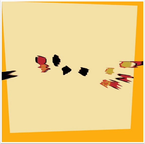
Here’s a short video that uses the Invert effect. Notice that the output is still square. (The poor resolution is a function of the original video, taken with the iPad.)
It is still possible to layer additional effects by taking the video back through the editor using the + button on the preview screen. My other example doesn’t use this capability; it’s a video from the Matter app that uses the Grid effect. The first part of the video uses the slider to “zoom out”, then I slowly rotate the image through 3-D space.
Glitché is more of a discovery app than it is an app that is used to produce a specific result. Whether you get a usable result is largely a matter of chance. For example, here is a simple image created in iColorama that I used the Scene effect on.
It’s OK by itself, but I really like the result after I run it through RollWorld and Stackables
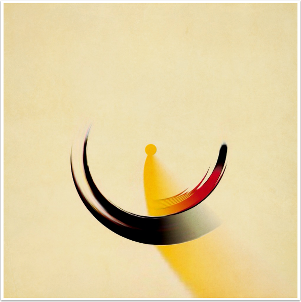
And, as promised at the beginning of Part 2, here is an image blended in iColorama using the LCD effect. I call it “Butterfly Parade”.
Glitché is not a perfect app. Although the effects produced don’t need a resolution higher than 2400×2400 (it is a deconstruction of the original, after all), I mildly resent having to pay an extra three dollars for that feature. Hitting the user for another three dollars to process videos brings the total cost for the app to seven dollars, which is (relatively) expensive. It can be hard to manipulate and get it to look just right. And there’s the square limitation.
Nevertheless, with experimentation, Glitché can yield some interesting results that can spark your creative output. You just may need to work at it awhile.
Until next time, enjoy!
TheAppWhisperer has always had a dual mission: to promote the most talented mobile artists of the day and to support ambitious, inquisitive viewers the world over. As the years passTheAppWhisperer has gained readers and viewers and found new venues for that exchange.
All this work thrives with the support of our community.
Please consider making a donation to TheAppWhisperer as this New Year commences because your support helps protect our independence and it means we can keep delivering the promotion of mobile artists that’s open for everyone around the world. Every contribution, however big or small, is so valuable for our future.
