Tips From Amazon To Make Your App Stand Out In The Soon To Be Crowded Amazon App Store
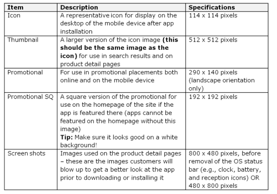
The momentum is certainly growing in the Amazon camp regarding their brand new Appstore for Android. They have now published some tips to help make your app really stand out. Take a look at this chart below…
Do’s and Don’ts
They have also published some Do’s and Don’t’s to help you on your way, these are the Do’s:
Do’s
• Create separate app icons and thumbnails. These images should be the same with dimensions being the only difference between the two. This will be the first image customers interface with, so keep the image simple, vibrant, and most importantly clear.
• Fill the space required with all images. For icons especially, if your image is not a perfect square, or if it has a curved border enclosing the image, add a transparent background. Icons show up against both a white background and a black background in our store.If you have a non-transparent white background to fill the dimensions for the required image, it will look broken against the black background.
• Provide screenshots that really show what your app can do – put your (app’s) best face forward. This is your opportunity to show-off your app’s best features.
• Make sure you own the rights to the images you use. Think the top selling apps have cool images? The developers behind those apps think so too. So, if you want to use someone else’s images you must prove that license-free images are indeed free, you own rights to and/or can use the images without a license, or have permission to use licensed images.
• Use high resolution images only – stretching and morphing images just to fit our required dimensions will look … well, stretched and morphed. Aka, not great.
Don’ts
• Use whitespace to fill the required dimensions
• Cut out important parts of the image (think about all those old family pics where no-one has feet. Looks funny, right?)
• Watermark the image or try to alter the colors from the real color (this is especially important for screenshots. Altering the colors and/or image for screenshots alters the customer’s expectations. Altering the colors for the icon leaves customers with an inconsistent experience and they’re not sure if this is the “real” version of the app.
• Squeeze words into the image or icon – remember, your picture is worth a thousand words! You don’t need to tell a story on top of the picture. If there’s text you think is important to include with your app listing, include it in the details about the app so we can use it on the detail page for that app.
• Add a wannabe iTunes app sheen (you don’t need to put a glossy 3D effect over your icon)
• Add a drop shadow to the bottom or around your images. When the images are small, the drop shadow can look like a mistake or smudge.
• Stretch your images to meet our requirements – stretching just makes them pixilated and looks bad.
