iPhone Photography Tutorial — How to add Texture, Tone, and a Hint of Rusty Color to your Image – By Rad Drew
Our new mobile iPhone photography tutorial section is in full swing and we’ve received much acclaim from the mobile photography community, thanks to all. If you’ve missed our previous tutorials you can read them here.
This is my first tutorial for theappwhisperer.com (of many), we hope 😉 Joanne will very soon by publishing my A Day In The Life of article, so look out for that. I can tell you a little about myself here, photography has been a love for years. I earned a degree in Journalism with an emphasis in photography and shot for years with a 1972 Nikkormat FTN, switching to digital only 6 years ago. And then SHAZAM! In the summer of 2010 I got my first iPhone! It’s changed the creation game with its Mobility! Portability! Inconspicuousness! And all in the palm of my hand! . To me, there’s no question that fine art is being created using this new tool. I’m lovin’ the ride and enjoying all the fantastic work I’m seeing across cyberspace and in gallery’s around the country. I recently published a book entitled, ‘In Good Light, Images of the Circle City’. It is a collection of fine art photographs made in Indianpolis, Indiana. It’s a beautiful hardcover collection with 92 images, you can learn more about it here.
Read this easy to follow tutorial and see if you too can create a similarly wonderful shot. Links to apps used in this tutorial is at the end of this article.
I’m not certain of the precise origins of this workflow, but it most certainly is not my creation! I’ve learned variations on this theme from several masters of the craft. Here’s my take on this approach.
Step 1
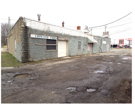
For this image, I started with a ClearCam shot. I chose the ClearCam camera app because it was an overcast day and I didn’t see the need for an HDR application. ClearCam takes six quick shots and saves the one that it deems to be the best. Here’s that initial ClearCam shot; the BEFORE shot.
Step 2
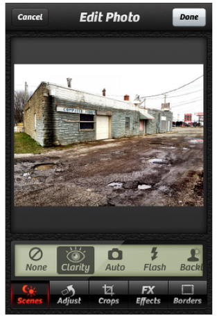
I chose to enhance the image using Camera+. This app has a filter called Clarity that does a wonderful job of balancing the color and contrast of an image very quickly. You always need to make sure that you like the result, but I find that more often than not, I do. Here’s a look at the Camera+ interface just after I’ve hit the Clarity filter button.
Notice below how the detail in the road and the building front has been drawn out compared to the version before.
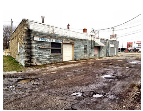
PhotoForge is the next app I used, not to be mistaken with PhotoForge 2. Nothing against PhotoForge 2, it’s just that I find the original app easier to use. I just like the interface better. I use Forge to do three things:
1. Sharpen using Unsharpen Mask…
2. Add a Water Color filter and
3. Add Oil Paint filter.
The combination of the oil and water give the image some color and texture and does especially wonderful things to an overcast sky.
Step 3
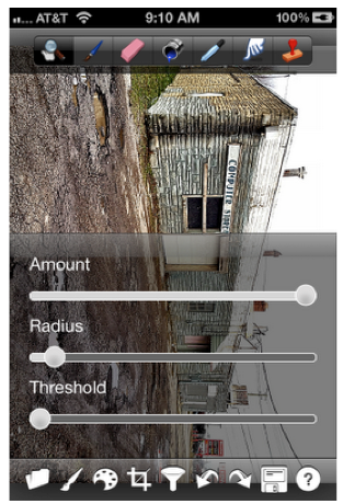
So, using PhotoForge, I sharpen using UnSharpen mask. You’ll find Unsharpen Mask… by clicking on the filter icon (the funnel). The settings are shown below: Amount all the way to the right, Radius to “taste,” and Threshold unchanged. You can experiment with this and try different variations, but this is what I do. You’ll want to adjust for each image. It’s easy to over-sharpen if not careful.
Step 4
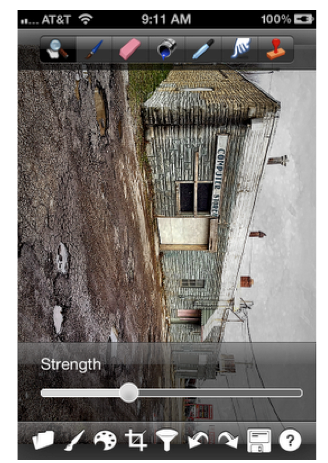
Next, I add a dash of water color to the image, as shown below. (Water Color filter is in the Funnel icon, too.) You can see how the sky now has some color where there was none before. This is another thing that you’ll do to taste; I usually move the slider about 25-40%. Sometimes I find that I like to darken the Water Color a little and then lighten the image later using Curves in FilterStorm.
Step 5
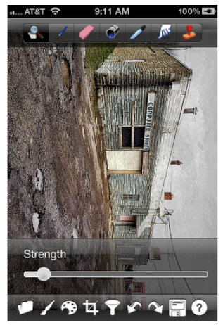
After adding the Water Color, I sharpen again, this time using the Sharpen (not unsharpen mask) filter. I use just a very small amount so as not to over-sharpen.
Step 6
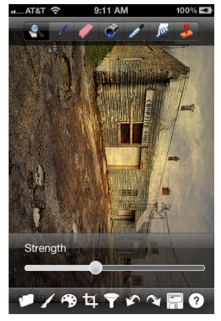
Finally, I add the Oil Paint filter. Again, this is done to your taste. I rarely go over 40% and usually just “season” the image with a small “dash.” You can see how the image has been given a rusty tone and how the filter has enhanced the detail in the sky. Remember how blank that sky was in the original shot?
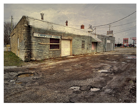
After saving the Photoforge work, the image now looks like this. Compared to the before, there is more detail and a hint of color, and the sky is much more interesting. Sometimes, at this point, I open the image in Filterstorm and lighten it to taste using Curves before doing the selective sharpening described below.
Step 7a
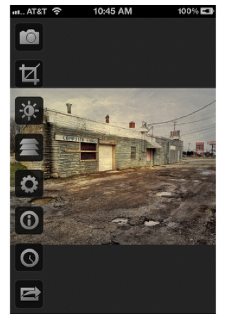
At this point I used FilterStorm to do some selective sharpening of the lettering in the sign, the pot holes, and anywhere else I want to draw the viewer’s attention. Even subtly sharpened areas of the image will draw the eye.
Load the image into FilterStorm…
Step 7b
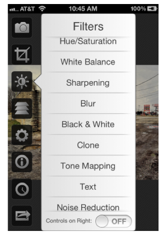
Select Sharpening from the Filters menu…
Step 7c
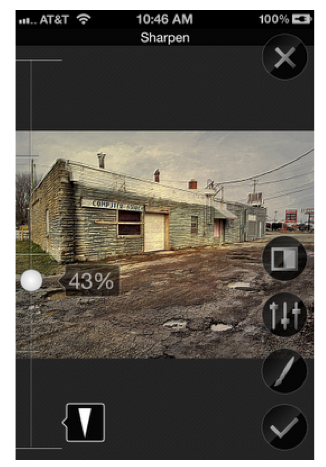
Move the slider to the desired level of sharpening. Keep in mind that we’re going to use the mask feature to sharpen only selected portions of the image. When you move the slider, before we apply the mask, the entire image will appear sharper.
Step 7d
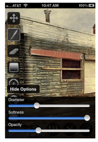
Next click the Masking Icon (the brush) and select its desired diameter, softness and opacity. The Diameter should be set to correspond to the size of the area you are going to brush. I usually have the Softness up all the way so that there is no sharp line between what is sharpened and what is not. Opacity I usually start low and increase it as necessary. Now, click the brush and “paint” in the areas you want to sharpen. You can see by the mask color below that I’ve sharpened the lettering in the sign. You can apply this sharpening to any area in the image to which you want to draw the eye. After saving this, the image will appear only slightly, but significantly, different with the sharpening in the critical areas.
Step 8
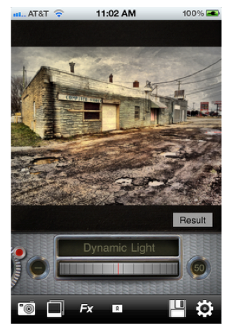
The last step to my process for this image, was to add touch of Orton effect using the app Dynamic Light. The Orton Effect adds a wonderful softness to the image.
Load the image in Dynamic Light…
Step 8a
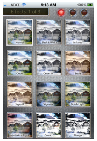
Click the FX button to open the filter menu (below). Choose Orton from the menu.
Step 8b
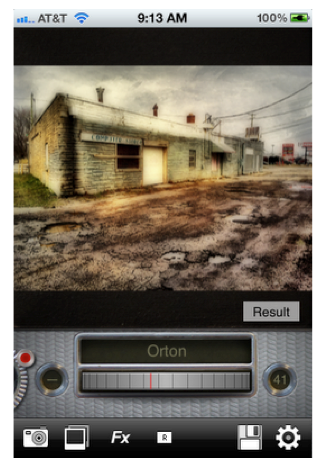
Use the dial to select the percentage of Orton to apply. Move the dial back and forth to see how it effects the detail and the light of the image until you find the “sweet spot.”
Final Image
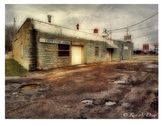
The final image looks like this. The irony of the sign, Computer Store, and the dilapidated condition of this former establishment, seem to be truly a sign of our times. I especially love the rain-filled pot holes out front.


8 Comments
David
Great tutorial…great image! Thanks for sharing this with us, Rad!
Rad
Thanks, David!
Egmont van Dyck
I greatly appreciated this tutorial as I have a desire to learn more about applications and how to use them for editing within the iPhone. I particularly like seeing the screen shots which demonstrate nicely the various steps take to achieve the final image.
Thank you Rad Drew and Joanne
Rad
Thanks, Egmont!
Adrienne Parks
Rad, Excellent article. LIke the way you break down the use of masks. That’s always been my stumbling block. Thank you for taking the time to break down the process.
Adrienne
Rad
Thanks, Adrienne!!
Robert Lancaster
Awesome tutorial. Thanks dude!
It is great to see how a whole bunch of my favourite apps can be used to produce an amazing piece of art.
Rad
Welcome, Robert! Glad it was useful! –Rad