Streets Ahead – Sixth Edition – By JQ Gaines
We’re delighted to publish the Sixth Edition of Streets Ahead, the wonderful Women’s Street Photography Column that JQ Gaines runs and we publish every Monday.
If you would like to join the Streets Ahead Flickr group, please go here – over to you JQ (foreword by Joanne Carter).
“I would like to thank everyone for participating in the Streets Ahead Flickr group. There were many fantastic submissions and I was extremely impressed with the quality of the images. For this weeks Streets Ahead Showcase I picked 10 favorite images from this week’s Streets Ahead Flickr group submissions. I then wrote a little something on why each was chosen. I have to say that it was extremely difficult to narrow my decision down to only 10 images, as there were so many worthy photos submitted. I will repeat this process each week.
I look forward to seeing your best mobile street shots”.
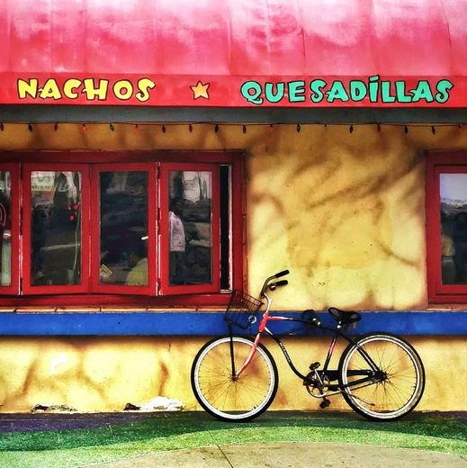
‘Nachos and Quesadillas’ – Sharon LuVisi
Flickr Link
This is a delightful shot featuring the 3 primary colors (red, blue and yellow)… with an old-fashioned bicycle as the subject. I happen to like the simplicity of this composition, and am particularly fond of how the windows appear to be a repetitive (or continuous) pattern that wraps itself around the picture… the window on the right looks as though it could be the beginning of the first window on the left. And the feeling of continuity is complimented by the circular wheels on the bike. The line of lights are a nice visual punctuation to the green border… and the reflections in the window (both inside the restaurant and outside on the street) give us some visual intrigue.
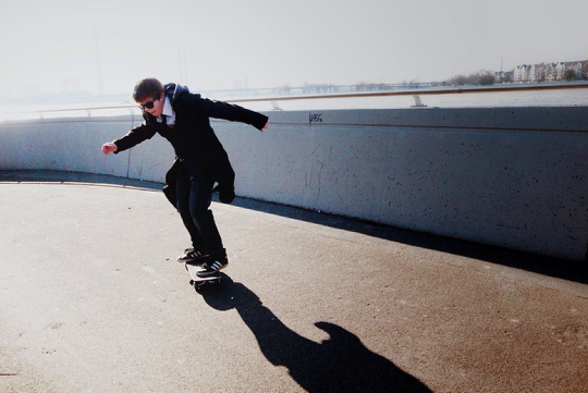
“Surfin’ ” – Misses Jones
Flickr Link
Misses Jones saw and caught a very cool moment. Not only are the lines, light and tones simple and elegant… but the fact that this young man is skateboarding in clothes that suggest “informal gentleman’s attire” is absolutely fabulous! I can’t help but see a young Bob Dylan in this photograph….
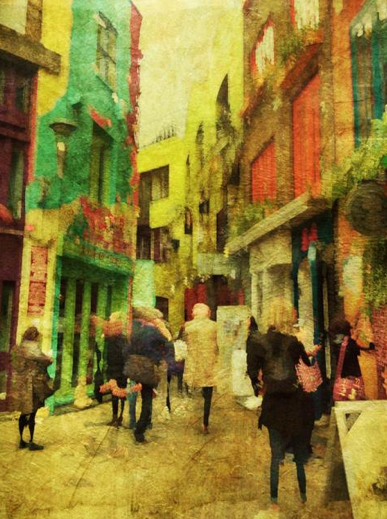
‘The Colourful Neal’s Yard’ – Vivi (Veevs)
Flickr link
One of the most interesting and controversial styles that is emerging in the mobile photography movement is one that embraces the painterly look using street photography as its source… and I think this is a really good representative of this style. Veevs took a straight street shot and then artistically rendered it using a few different apps to acquire this painterly texture…. yet, at the same time, we don’t get the sense that this is a composited image (which I happen to appreciate.). I think the overall composition, colors and textures are quite effective… and I’d definitely be interested in seeing how this translates onto a canvas print.

‘I’m leaving on a jet plane, don’t know when I’ll be back’ – Ferguscat1 (Liz Traynor)
Flickr link
This is an image that works on several different levels for me. Liz cropped and framed this image into a very effective composition, using the frame of the poster as a great visual aid in defining the space. Obviously, the first thing that catches our attention is b&w vs. color. However, the longer I looked at this picture, the more I saw a world of opposites. On one side is a man… and a woman is on the other side. He has his back to us. She is facing us. He is in b&w. She is in color. Her eyes are making contact with us. He is covering his. These are just a few of the obvious differences I spotted, but I am sure that there are many more to be discovered if we take a few minutes to pause and view. So if anyone has any more “items” to add to the list, please share them with us!
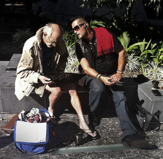
‘Disconnected but still connected’ – by Ferguscat1 (Liz Traynor)
Flickr link
This is a great capture where the modern meets up with the old. Clearly the older man is seriously checking out some online activity… which is an interesting juxtaposition as to what our impressions of him (and his attired) might be. We’re faced with the question “Is he is an eccentric or a homeless person?” However, no matter what his social status may be, his body language suggests that he’s a man of authority. I like the urban gray tones with the punctuations of blue, red and green… the primary colors of the digital world.

‘Love’ – by Jeanette Vasquez
Flickr link
Here we are presented with two people walking between two dark vertical lines. Not only does this subtly divide the space nicely, but it also keeps our eyes completely focused on the couple. And personally speaking, nothing is more heart warming than an older couple holding hands. Jeanette saw a wonderful tonal balance between these two people… he’s dressed in white, while she’s wearing mid and dark tones. Ohhhh, and the best part for me is that he is carrying the shopping tote!

‘The Porter’ – Lee Atwell
Flickr link
The porter’s body gesture in this image immediately reminded me of an old Fred Astaire or Gene Kelly film. This man exudes a wonderful sense of self-confidence. And the fact that he is standing with only one foot firmly planted on the ground (while leaning on a trolly with wheels… on a sloped sidewalk), suggests to us that he is in complete control of his physical self. It also looks as though he has his left hand in his pocket, which gives us the impression that he is also in control of his emotional self (with perhaps a touch of defiance.) Compositionally, I think Lee framed this shot beautifully. She used the sign pole as a tool to divide the space… and this created a dynamic sense of balance to the square format. I also think she made some great post-processing choices. The sepia tones with a scratched texture gives us a feeling of “timelessness.”
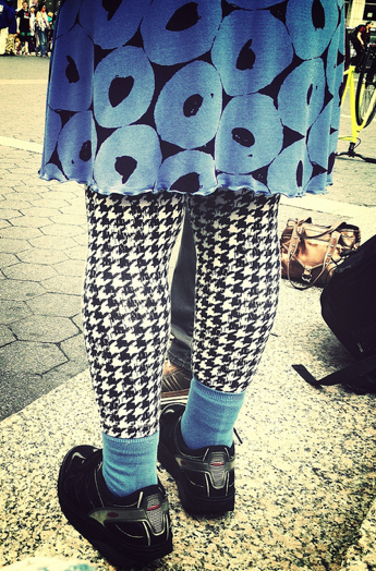
‘Saturday Blues’ – by Jeanette Vasquez
Flickr link
I think this photograph is a wonderful (and fun!) example of how someone’s attire can speak louder than their actions or facial expressions! Personally, I love this eccentricity and quirkiness… and I’d be willing to bet everything on the fact that Jeanette took captured this shot in the Lower East Side of NYC. This totally sings “East Village.”

‘The Whistler’ – Tracey Renehan
Flickr link
I think this is a great black and white cinematic photograph! Tracy did a fabulous job in keeping this man’s face in focus, while blurring our impressions of everyone around him. We can definitely feel his upbeat stride as he quickly walks through a crowd of people on a busy street.
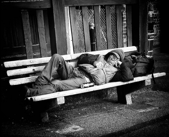
‘Untitled’ – Louise Fryer
Flickr link
This image immediately caught my attention… not because of the man sleeping on the bench (although, I did find myself sympathizing with him). But because I was intrigued by all the tones, textures and strong lines that filled this photograph. Very nicely seen, Louise!

8 Comments
Cecily
These are so wonderful! Congratulations to all really fabulous work!! Love your descriptions JQ!!
Catherine
What a fabulous collection and wonderful commentary! Congratulations everyone! 😀
Sharon LuVisi
Ah….one of my images has been featured again! You’re the best, JQ. Really. And I’ve come to love the surprise of finding this out. It makes my day. Thank you for allowing me to be in such amazing company.
Tracy Mitchell Griggs
Thanks for the nicely curated selection. I really enjoy your curatorial, thoughtful commentary about the images. My only suggestion, is that the Flickr group artists who are submitting, also add the apps used to create their masterpieces (as a requirement for consideration/selection) and add those beneath each image that is displayed here. It helps those of us who are seeking to expand our repertoire and experimentation.
Cheers and keep up the great work~
Sharon LuVisi
Tracy, good point. I have always added every app used into my tags on Flickr. I’m often puzzled why, at times, mobile photographers don’t include that info. What good is your knowledge if you don’t share it with others? Doing so benefits us all and helps us grow as a community.
lee atwell
I adore this column and your commentary JQ – it inspires me to spend time with the photos that you feature and i love that! I feel myself getting wonderfully lost in the images with your words, insights and reflections. Congratulations to all! I am very honored to have my image included – heartfelt thank you!
JQ Gaines
Lee, Sharon, Tracy, Catherine and Cecily: Thank you all so much for your kind support and encouragement to this Women’s Photography Collective. _/\_ It’s such an honor to be involved in this community with you ladies… and that’s no lie!! 🙂
And yes, Tracy… I agree. It would be really interesting to share what apps we use in our work. I think it’s an important component to helping each other learn and grow artistically!
MartinaP.
Brilliant column and wonderful selection – congratulations to all the artists.
I love this column and I think it’s great, JQ, that you take time to comment on the pictures, it makes the column so interesting.