Mextures – iOS Photography App – The Launch And The Story Behind The Development
It’s with great pleasure that we have been granted permission to republish this article by Merek Davis the developer of Mextures. Mextures is an app we have featured many times on theappwhisperer.com and have published several tutorials as well to help you get the most from it. If you’ve missed those, please go here.
Mextures has proven to be a popular app and in this very competitive market, we were intrigued to read this article. As with all great successful projects, there’s always a team behind the product and that’s the case here too. This article explains the highs and lows, the initial idea, design and launch, we think you’ll enjoy this, thank you to Merek Davies.
The Start
“So here we are in June, 9 months later after I decided one night with the support of two friends, to give away a pack of 8 grainy textures, and I have a top 5 app. It’s been a long, strange, frightening and humbling road…
Mextures was the result of a mistake. There I said it. It started out as an idea I had late one night while talking with instagrammers Even James Atwood and Sam Gray on Skype. I sell textures to professional photographers and I had a new set I was going to try. It was different (it’s the film grains and such) from what I had previously sold, so I offered to have them try it out. I expected it to fail in the commercial world. I felt that the entire pack was worthless and not a good idea. I almost canned the pack altogether, but they both ended up liking it so I decided to release it on Instagram, to get more feedback almost as a testing ground. But not wanting to sell through Instagram, I decided to just give them away in a square format.
The name Mextures was a joke that Evan came up with. He kept using it over and over, and the name eventually just stuck. I was pretty nervous launching something on Instagram because at the time, no one had ever tried to do marketing like that. Not only that, I wasn’t really confident in them. I had been using them on my own pictures on IG for a while, but they were my babies…. you know? I understood them, but I wasn’t sure how others would react. So I released them and that night, I had 24 downloads. I ran into the bedroom and screamed to my wife “THEY LOVE THEM BABE! 24 downloads! It’s a success!!”
Excitement
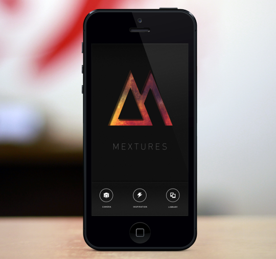
At that moment, the 12 hour legacy of Mextures could have ended, and I would have been the happiest ever. It was a really cool moment for me. It helped me on a personal level to take more risks. Since then, it’s just been a snowball…. I don’t know why. I honestly don’t. I really think is super humbling to have connected with so many people as a result of a mistake.”
I still think back to that moment of having a whopping 24 downloads that night, and how excited I was. The success of Mextures up to this point still emulates that feeling I had that night 9 months ago. Every day, I look at the hashtag #mextures, and now #mexturesapp to see what people are creating. It’s a reminder to me of how creative people can be with just a few tools, and a limitless brain.
Now, back to why I created this app. I realized that the process that people were going through to add these square textures to their photos was a long and daunting process using multiple apps. I began sketching up app ideas with the UI and UX planned out as to what would make this soon to be imagined app an easy process. The main focus of this app, among those other problems I was going to solve, was to create a non-destructive editing process. There was nothing more frustrating to me editing on the iPhone than spending an hour or so editing a picture and then pressing undo 20 times to remove a funky edit that wasn’t working, and then having to remember those 20 steps to get back to where you were.
Fast. Quick. Non-destructive. Non-linear. iPhone App. That’s all it would take…… I could take this on, right?
Design
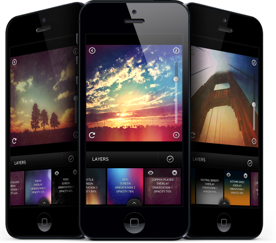
In October, my friend Brandon, from HeyBrandon.com and Febrauary Son, and I set out to design the Mextures app. This was his first mobile app, and this was my first mobile app, so we had a good amount of trial and error. So many doodles on paper and Photoshop mockups explaining the process were sent to him. Here’s what the first rendition ever of Mextures looked like. It’s come a long way from these first designs!
After many revisions and versions, we finally settled on the design you see in the app today. I believe the total revisions for the main screen was only 14…. only.
In February, I set out to find the perfect developer. After 18 different interviews I found the one who saw my vision for the app. Wes Billman was found after I posted a last desperate plea on twitter for any referrals. Drew Wilson recommended Wes. After a few emails back and forth, he was hired. We started work almost right away and in a few weeks, he had built a working app! It was like black magic to me. Straight up voodoo. Now, that’s the Disney version of the story. He had many late nights, and had to follow my confusing workflow that I had asked for. Many Skype calls were had with discussions of me saying, “So, x and y need to happen with z happens.” and his reply would usually be, “Ok, that could be done, but let’s just start with getting x built correctly and then see if y can work.” I was ambitious, and he was realistic but equally ambitious as well. I also knew nothing about coding an app, so I’m sure Wes had a fun time trying to explain code to me – the coding knowledge equivalent of a toddler. A few more months of curating textures, scope creep adding new features and getting the app in tiptop shape, and we submitted it to Apple. That was an exciting moment when we could all stepped back and admire our work. We had done it, and beat our time goal. I know this is a condensed version, and I could write an entire blog post about any of these parts that went into creating this app (maybe someday I will), but I want to cover the outline without inundating you with a novel.
Launch
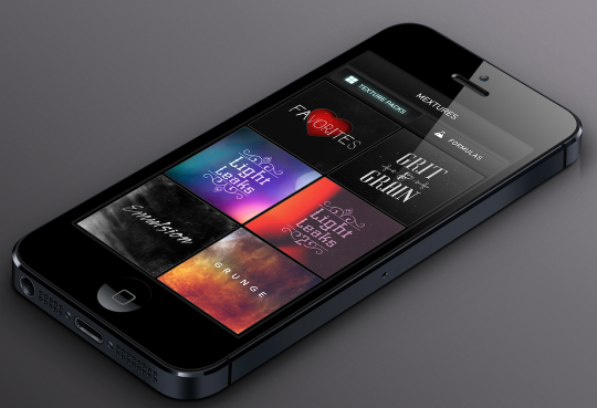
We launched on May 30th. I didn’t sleep for two days straight. I think I was less nervous on my wedding day than launching this app. Launch day, we reached #3 in the Apple App Store and the #1 Photo App by 5pm. The following day, I woke up to us at #2 in the entire store. We remained there for 8 hours. That was a surreal moment and something that exceeded my wildest imagination. For the next 7 days. we stayed as the #1 app in the Photo/Video category, and hopped between #5 in the top paid apps. The Instagram came out swinging for us. I have never felt more love from a complete group of strangers (and incredibly close friends). The support from that community was humbling to me. This was something that the were a part of from day one. They motivated me and inspired me to do this. Complete strangers. I still think thats incredible.
I took a screenshot of the moment we hit #2 for my kids when they don’t believe me.
Contemplation
My takeaway from this, the entire process of Mextures, is that it is one of the most involved and rewarding projects I’ve had so far. I never would have imagined how it would have come to this point last July. Over 162 thousand #mextures tags on Instagram as of today June 8th, and already 6,500 #mexturesapp tags in the first week of launch is humbling. People are using and creating with this app! An app that wouldn’t have existed unless I took the plunge from the same old same old process I had been stuck in.
I don’t want this post to take a sharp detour into Tony Robbins land, but I must. There were people telling me that an app to apply textures didn’t seem like a good idea. There were/are people who told me that this whole idea was “kind of meh,” “It’s already been done before” “You’re going to create an app? But you’re a photographer.” I didn’t even have the first clue as to what to do or where to start. I used apps on my phone all the time, but creating one? Forget about it. There was hundreds of questions I had and doubts diving into something with all my energy. I would need to take a break from photography career to focus on this. I would likely bring in less money to my family as I ran full speed with this idea. I am so grateful to have a wife who supported me in this, and who has been honest enough to tell me when something wasn’t good, or even when it just plain awful. Yes, she also told me when things were perfect too.
The Future
The future of Mextures is bright. One in which I have a massive vision as to where it can be in just one year. These textures mean so much more to me than just an image file. It represents a dream that I had. It represent a complete paradigm shift in my career. It represents close friendships that were forged. And most importantly to me, it represents that there is nothing that is not attainable. Here’s to the app with a weird name that sounds like Mexican food!”.

2 Comments
Pingback:
Kim
Incredible behind the scenes look into an amazing app!! Love it!! So much hard work and trial and error to come out with such an amazing app! Congrats Merek Davis! I look forward to the journey Mextures will take me on and those in the iPhoneography community!
🙂