
Technical Tutorial – ‘Fragment’ iOS Photography App by Jerry Jobe
We’re delighted to publish Jerry Jobe’s latest technical tutorial, this time on the new and popular app Fragment by the developers of the uber popular app Tangent, amongst others. Jerry has as always created a totally fabulous tutorial to help guide you though. Take a look – we also have some promo codes to giveaway today too! Over to you Jerry and thank you so much…(foreword by Joanne Carter).
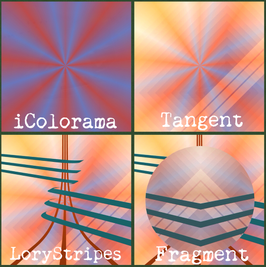
“So, just after I said that I had wrapped up the look at the apps of Pixite and Ben Guerrette, another one was released. It has all the goodness of Deco Sketch, Tangent, and LoryStripes, and it’s called Fragment. Tangent adds colored shapes and patterns to your image, LoryStripes adds 3-D stripes that you can mask so it looks like they go behind objects in your image, and Fragment breaks the image into geometric shapes, giving you control over how the shapes and the underlying photo is handled. Sound confusing? It isn’t – you’ll catch on quickly once you see some examples and start using the app yourself.
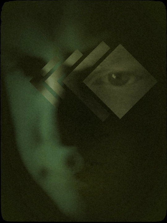
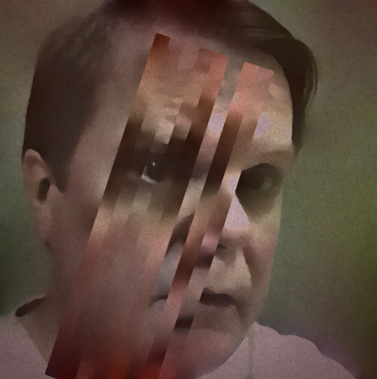
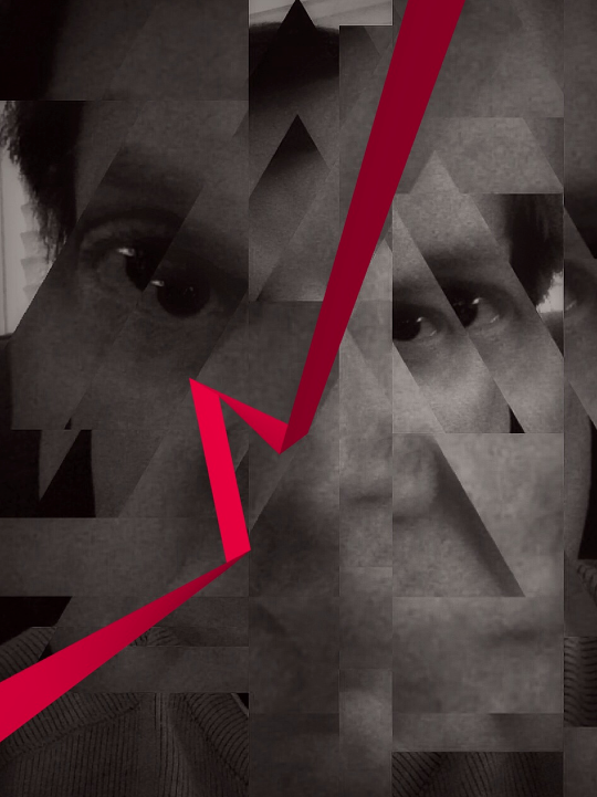
As a matter for fact, let’s start out with an example: a moody selfie. It was black and white to begin with; Fragment added the overlapping diamonds, and the green and the blur on the background. After Fragment, I took it through Vintage Scene to add some yellowed grime.
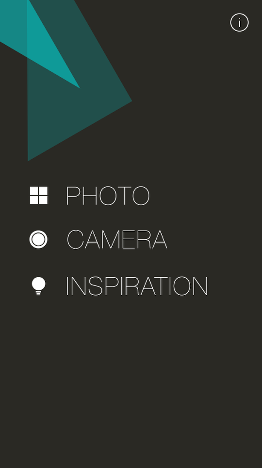
While I usually display screenshots from the iPad version of an app, today I’m using the iPhone version. When you bring up Fragment, you’ll see a familiar first screen: Choose an existing Photo from you albums; take a picture using the Camera, or get Inspiration or Help.
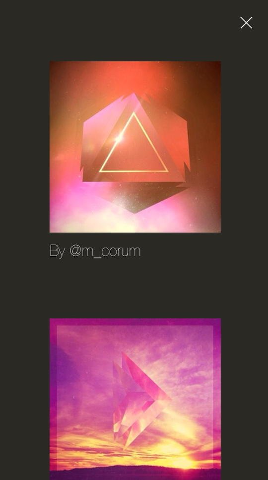
Inspiration is great – it allows you to see even more examples of the kinds of things that can be done with Fragment. (Much better than the examples I’ll be showing you of my own work, I’m sure.)
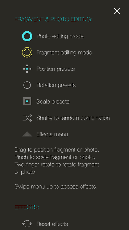
Help is straightforward. It describes each icon in a couple of words. As usual, the help is terse at best. I might as well say at this point, though, what I consider the major drawback to the help in Tangent, LoryStripes and Fragment: it’s only available before you load the image. Once you’re into the editing portion of the app, you have to back out to use the help. And that’s not fun at all.
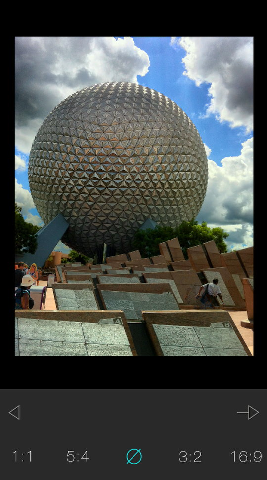
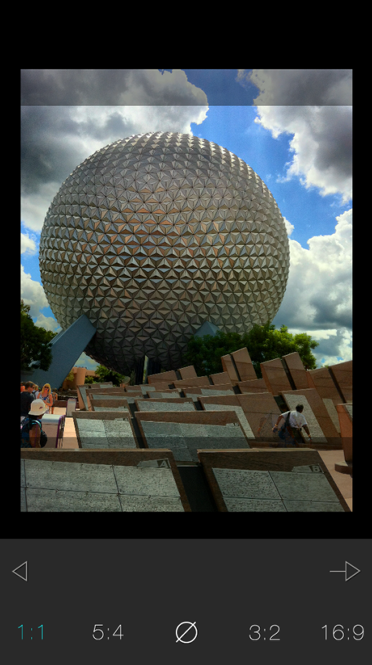
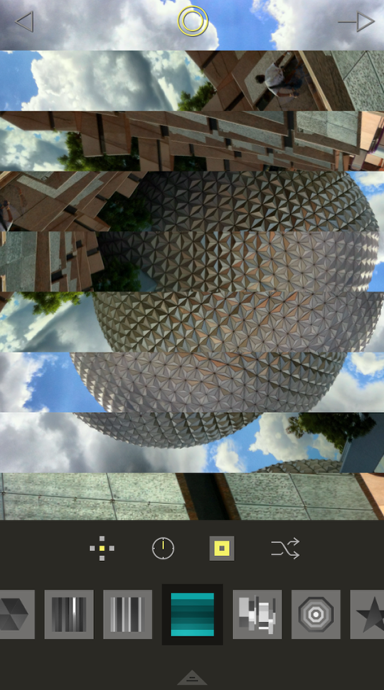
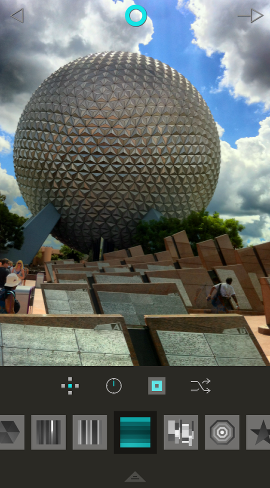
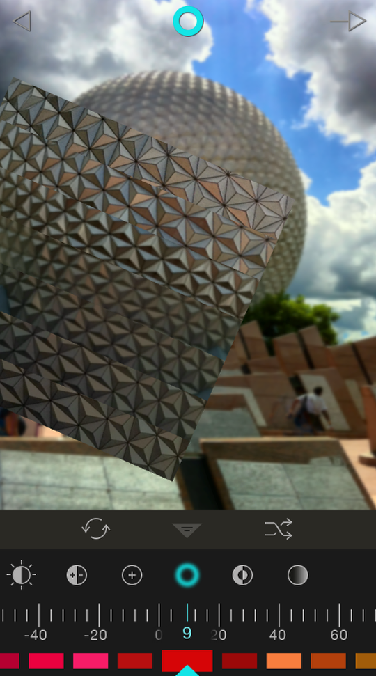
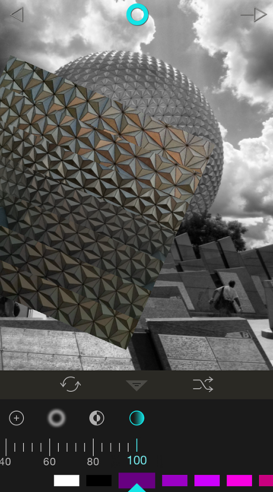
I chose an image taken at Epcot with vividHDR (a terrific camera app). It is loaded into the crop screen, where you can choose between several popular crop ratios. This crop screen has been added to LoryStripes and Tangent, by the way.
Choosing one of the ratios puts an overlay on your photo. You can pinch and drag to fit the image correctly within the overlay. You can’t change the shape of the overlay to a user-controlled crop ratio, and you can’t rotate the image. To accept the crop (or no crop), tap the right-facing arrow.
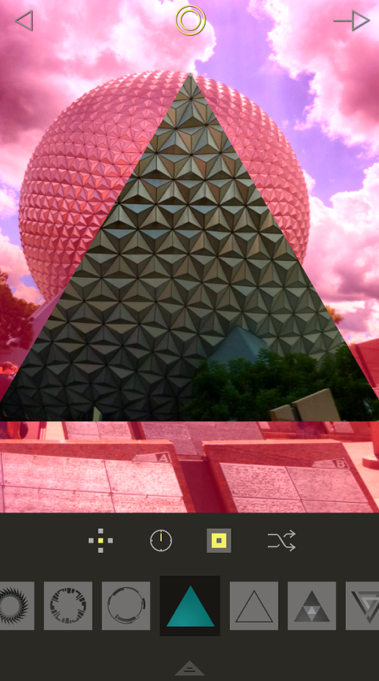
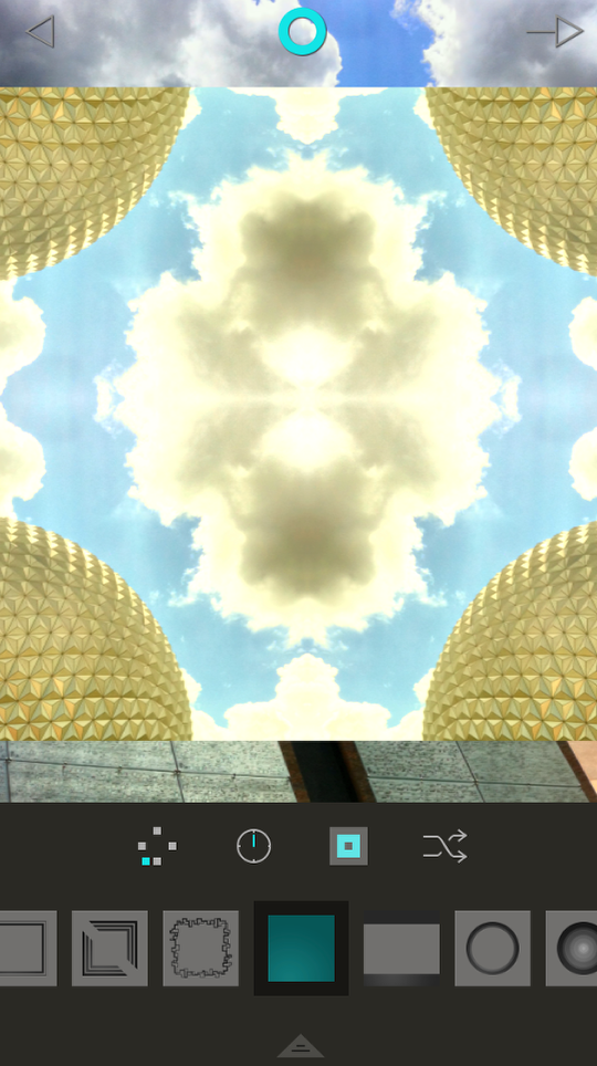
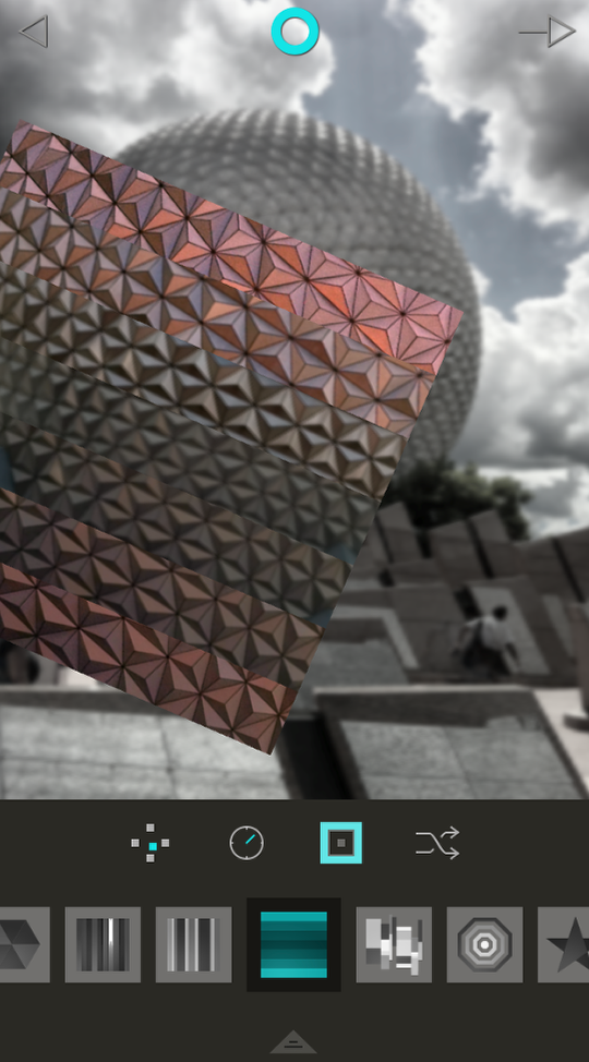
Fragment responds by applying a random fragment to your photo. In this case, it’s a triangle. Below the image are 4 buttons: Position, Angle, Zoom and Shuffle. Below that you will see the different methods of fragmenting your image. At the bottom is a pull-up menu for adjusting both the fragmented and unfragmented portions of the image.
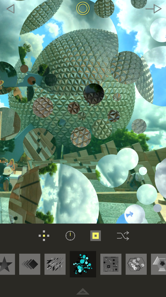
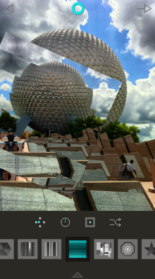
I find the Shuffle button to be invaluable in giving me ideas of how to handle my image. Tapping it shuffles both the Fragment (the shapes used, the positioning of the shapes and the positioning of the image within the shapes) and the Characteristics (coloring, brightness, contrast and blur of the fragmented and unfragmented image). Here it’s come up with the “bubbles” shape.
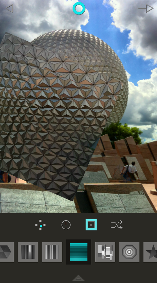
I tap it again and it comes up with the horizontal stripes. This is the shape I’m going to work with.
I want you to notice the lightness/darkness of the stripes within the shapes. As a portion of the shape gets darker, it is treated more like the unfragmented portion of the image when applying Characteristics. If you decide to blur the background, then some blur will be applied to the darker portions of the shape.
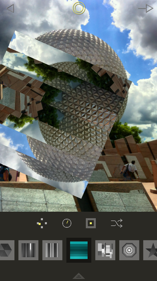
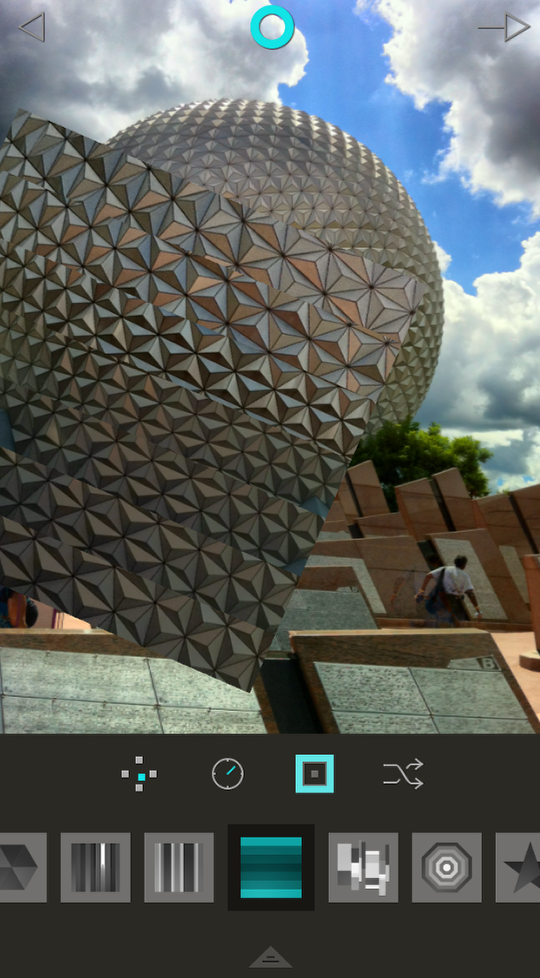
Next we’ll talk about manipulating the shape. There is a button at top center that changes between a yellow double circle and a blue single circle when you tap it. When it’s the yellow double circle, then the Position, Angle and Zoom buttons, and any pinching or dragging, apply to the shape. When it is the blue single circle, then the buttons and gestures will move the image within the shape. Below I’ve pinched and dragged the shape over to the left. Notice how the Position and Angle buttons change appearance to reflect the movement of the shape. The Zoom button reflects the shrinking of the shape – but only roughly. There are three settings on the Zoom button, 50%, 100% and 200%. If you pinch the shape, the button will reflect which of the three sizes you are closest to.
Below I’ve tapped the Zoom button and it goes to the next setting – 100%.
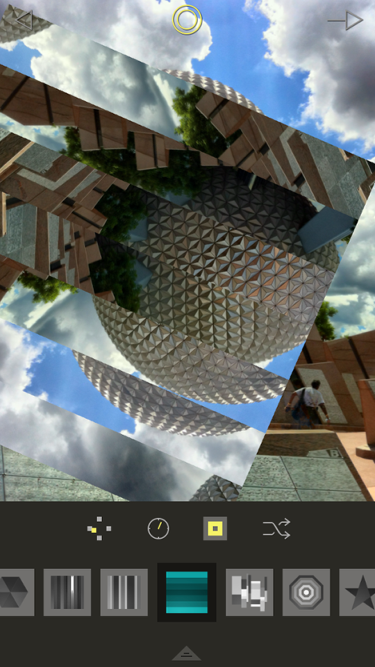
I tap it again and it goes to 200%. Tapping the Position button (not shown) will move it top, right, bottom, left or center. Tapping the Angle button (also not shown) will rotate in 45° increments.
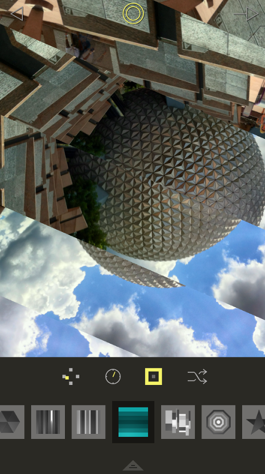
Below I’ve tapped the yellow double circle to change it to the blue single circle. Notice how the indicators within the Position, Angle and Zoom buttons have changed from yellow to blue also. Now any gestures or button manipulation will apply to the image within the shape. If all buttons are at their default positions, then you won’t be able to see the shape. It’s still there, though.
I tapped the zoom button to take the image within the shape down to 50% and dragged it slightly to the left.
I didn’t like the result, so I used another pinch-drag to expand the image within the shape.
Tapping the Angle button rotates the image within the shape 45°.
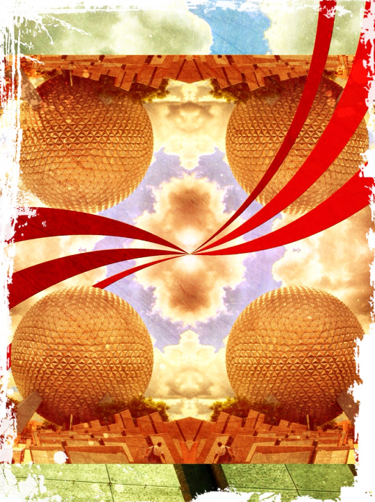
I’ve temporarily changed the shape to a solid square in order to show you what happens if you move the image around in the shape and you encounter the edge of the image. Fragment will mirror the image so that you aren’t left with a solid color, but will fill the shape with the image. Below I’ve dragged the image down left, and the mirroring occurs to the right, the top, and the top right.
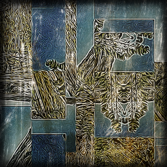
Just to show you what you can do to take advantage of the mirroring, the image below was taken through LoryStripes and Scratchcam to create a pleasing final image.
Now let’s return to our stripes. I’m ready to edit the Characteristics, so I tap the arrow at the bottom to bring up the Characteristics menu. (By the way, I call it Characteristics, but Fragment calls it Effects in the Help.) At the top of the menu are three buttons. The circular arrows are the Reset button, which sets all the Characteristics (or Effects) back to zero. You will be asked to confirm. The downward-facing arrow closes the Characteristics menu. The Shuffle button is NOT limited to the Characteristics; tapping that will change the shape and the image within the shape. It is highly recommended that you avoid using that button after setting your shape and its Position, Angle and Zoom.
Next, here are six buttons for choosing which Characteristic is affected. These, from left to right, are Brightness, Contrast, Additive, Blur, Invert and Desaturate. Beneath that is a sliding scale that determines the strength of the chosen Characteristic and whither it is applied to the image within the shape or without. To the left, or a negative value, affects within the shape; a positive value affects the background. Finally, there is a scrollable color palette. This color will affect four of the six Characteristics: Brightness, Contrast, Additive and Invert. This color is not tied to a specific affect. If you choose the blue-green seen below and change the Brightness, you cannot choose a separate color for the Contrast.
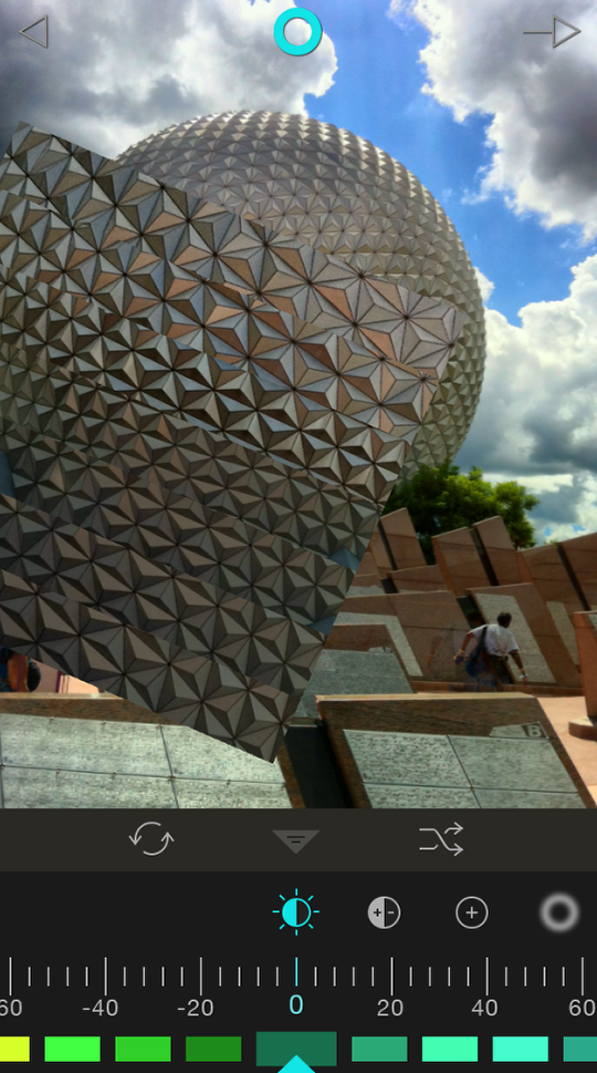
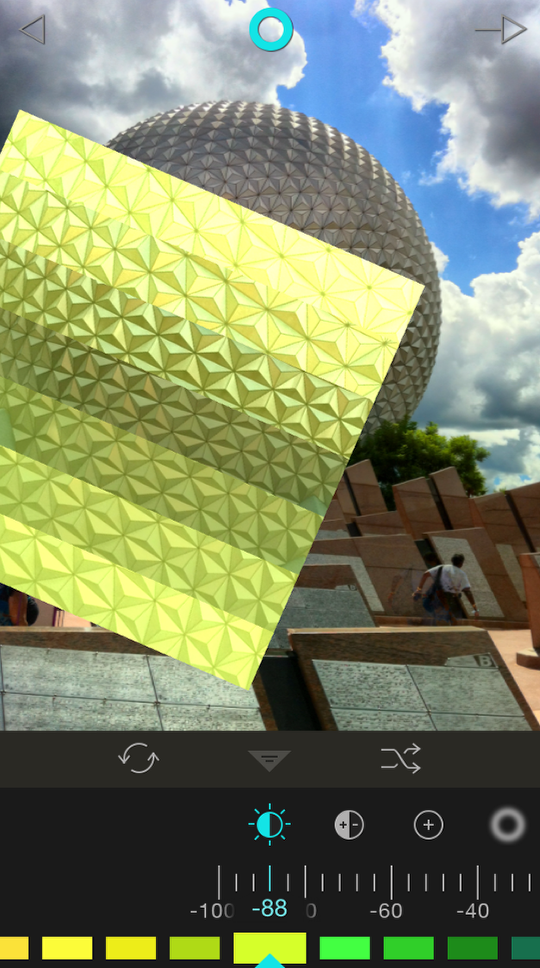
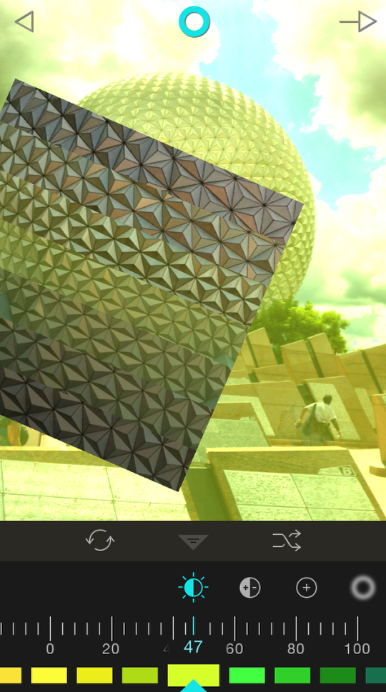
Below you’ll see I’ve chosen a yellow-green and moved the slider to -88. That made the image within the shape brighter and yellow-green.
By moving the slider to a positive 47, that yellow-green and brightness affects the background.
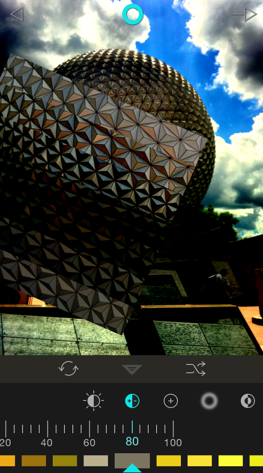
Contrast will (of course) affect the contrast of the area changed – by increasing the darkness of the darkest areas. If Brightness is at 0, changing the Contrast will darken the area. Below I’ve increased the Contrast to a positive 80, which darkened the background.
The middle of the shape has gotten darker, also! Why is that? It’s because, as I explained earlier, the darkest portions of the shape (in this case, the middle stripe) pick up some of the Characteristics of the background.
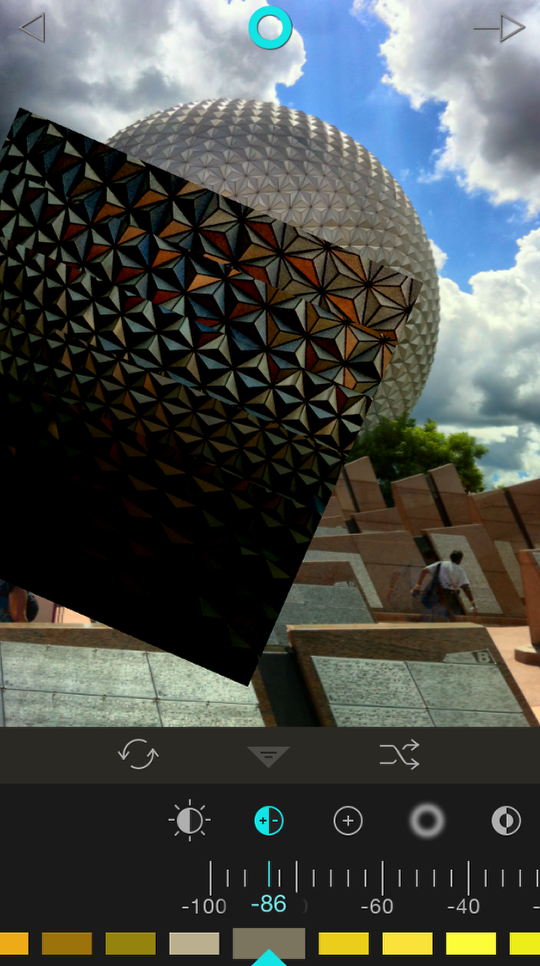
Below the slider was set to -86 to affect just the area within the shape.
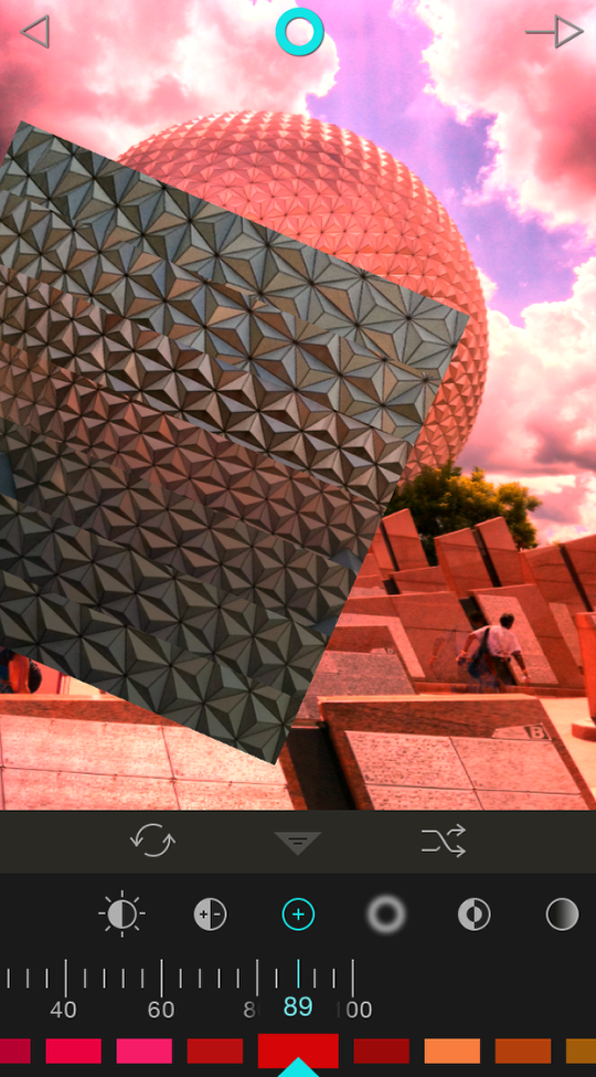
Additive adds color without adding as much brightness. Below I’ve added color to the background (+89).
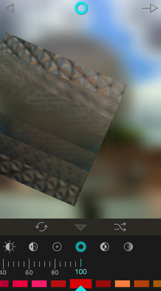
The next Characteristic is Blur. It’s a very strong effect. Below you’ll see the Blur on the background at a modest +9. Notice the color isn’t used.
Here it is at +100. It’s so strong it even affected the entire image within the shape!
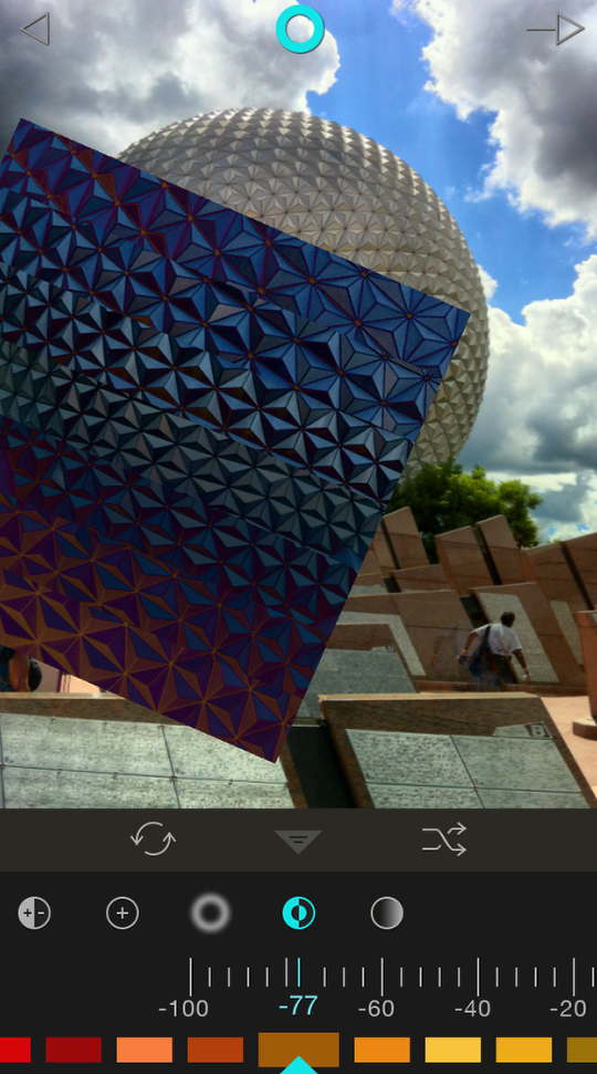
Invert inverts colors, not luminosity, so it’s not like a color negative. It also takes into account the color added. In the image below, I added orange to the image within the shape (-77). The inversion process changed it to blue, orange’s opposite on the color wheel.
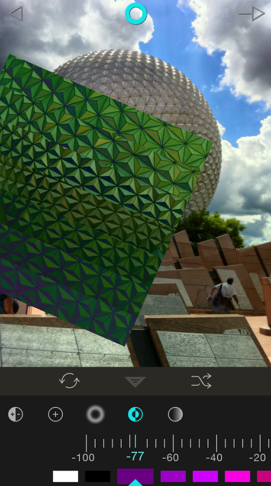
By changing the color added to purple, Invert creates a green tint.
The final Characteristic is Desaturate. Color does not affect this Characteristic, either. The +100 used here changed the background to black & white, not a purple duotone.
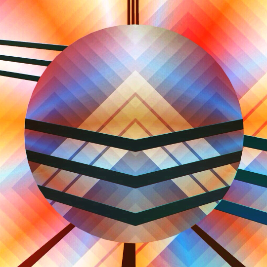
Below I’ve desaturated and blurred the background, and gave a pinkish tint to the image within the shape. I’ve also exited the Characteristics menu. I’m now finished with this phase.
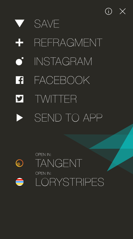
Tapping the arrow at the upper right takes me to the Save menu. In Tangent, you can Retangent; in LoryStripes, you can Restripe; and here in Fragment, you can Refragment. I choose to Refragment.
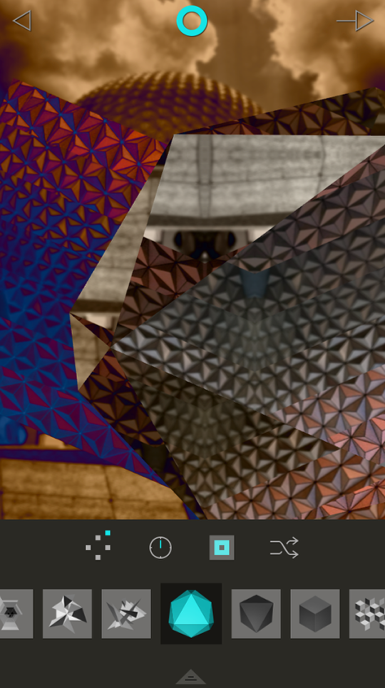
The randomizer this time added the icosahedron (it’s a real word! I looked it up!) and some of the Invert as well. Funky!
Bottom line: Fragment is a worthy addition to the stable of graphic arts apps from Pixite. It not only is an easy way to chop up and skew your images, it also helps to spark your imagination and take you down new creative paths. Let’s see some examples. Keep in mind, my workflow is seldom limited to a single app. Fragment is no exception.
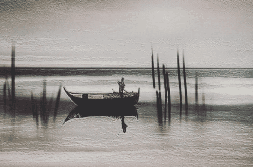
The first example was a landscape, Fragmented. Then I used Tangled FX and Modern Grunge.
You don’t even need to start your workflow with an image. Here’s an abstract created using apps alone.
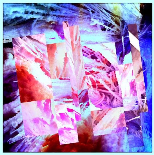
You can see the steps I used below. I started with a gradient in iColorama. Then I applied a style from Tangent. I striped and Restriped with LoryStripes. I made the final major adjustment in Fragment, and then took it back into iColorama for a hit with Tone Lab 4 for added color/contrast.
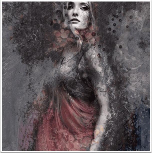
I especially like how Fragment can give us a fractured look at ourselves. The following selfie was taken through iColorama after Fragment for simplification and texture.
The next selfie was Striped with LoryStripe. It’s titled after an Elvis Costello lyric, “Our Love Got Fractured in the Echo and Sway”.
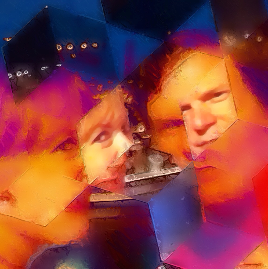
A normal, pre-concert shot became “We Had a Time” with the help of Fragment, Glaze and iColorama.
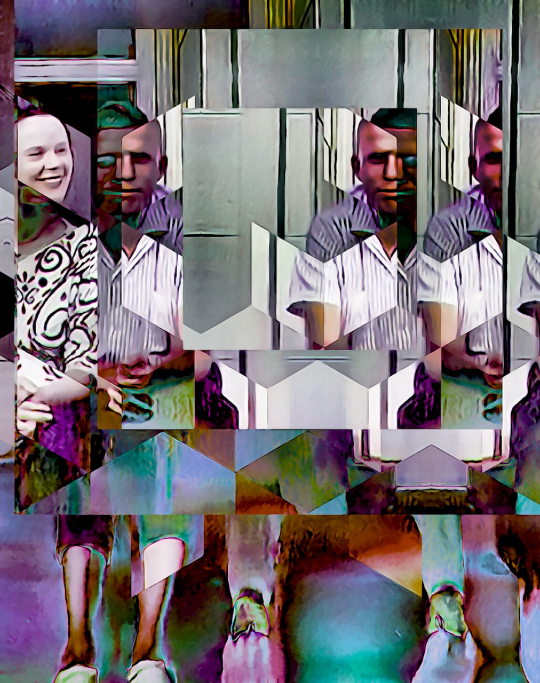
An old photo was Fragmented and Refragmented. A Pencil FX version was created, then merged back into the fragmented version in iColorama. It’s called “Relationship Dynamics”.
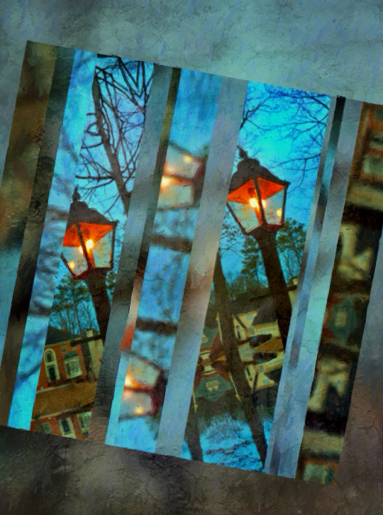
“Put That Light Out” is a simple photo of our welcome light, Fragmented and taken through Glaze and Distressed FX.
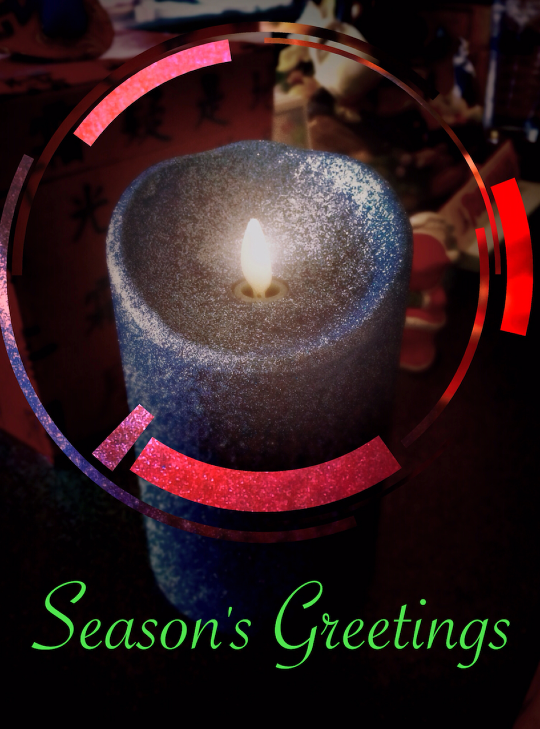
Finally, a couple of images in keeping with the season. First, “Flocked Up” was shot in Oggl and Fragmented.
And Season’s Greetings from The App Whisperer! Enjoy!
Joanne Carter
Joanne Carter is a British photography journalist, editor, curator, and the founder of *TheAppWhisperer.com*, one of the world’s leading platforms dedicated to mobile photography and art. Since its launch in 2009, TheAppWhisperer has become an international hub for artists of all levels to discover, learn, exhibit, and engage with contemporary photographic practice.Built on principles of inclusivity, accessibility, and artistic excellence, Joanne has spent almost two decades championing mobile photography as a serious artistic medium. Through interviews, critical essays, exhibitions, competitions, and education, she has helped shape and document the evolution of mobile art on a global scale.Her work has taken her internationally, lecturing on photography and mobile art at institutions and events including the Museum of Art in Seoul, South Korea, alongside appearances in the UK and Europe. She has served as a juror for international photography and mobile art awards across Portugal, Canada, the United States, South Korea, Italy, and the UK.Joanne is also the founder of *TheAppWhispererPrintSales.com*, one of the first online galleries dedicated exclusively to collectible mobile art, connecting artists with collectors across Europe, the United States, and Asia.Before founding TheAppWhisperer, Joanne worked extensively in print journalism and photographic publishing, including roles at a paparazzi photo agency and as deputy editor of a leading photography magazine. Her freelance journalism, criticism, and commentary have been published widely in both the UK and the US, with bylines in *The Times*, *The Sunday Times*, *The Guardian*, *Popular Photography*, *NikonPro*, *DPReview*, *Which?*, *Vogue Italia*, *LensCulture*, the *BBC*, and more recently, the *Financial Times*, where her published letters on photography continue to contribute to wider conversations around the medium.Alongside her editorial and curatorial work, Joanne’s own photographic practice has been exhibited internationally across the UK, Europe, South Korea, and the United States. Her work increasingly explores themes of grief, loss, death, memory, and the body.Her current research interests centre on grief, death, and poverty, with forthcoming postgraduate study leading towards doctoral research in these areas.Joanne is currently developing new long-form writing and photographic projects and is available for commissions, editorial projects, speaking engagements, and collaborations.Contact: joannetheappwhisperer@gmail.com)
One Comment
oz
Thanks so much for taking the time to educate! great article.
One question.. when I use the fragment app- it significantly reduces resolution. Is there a way to avoid this?
Thanks