
iPhone Photography Tutorial – PopAGraph – Part 2 – By Jerry Jobe
We’re delighted to publish Jerry Jobe’s latest tutorial this time it’s on the app ‘PopAGraph’ and is in two parts, this is part 2. We published Part 1 last week, if you missed that, please go here. We think you will really enjoy this, over to you Jerry (foreword by Joanne Carter).
PopAGraph is free and here’s the link to download it
“In the last entry we started discussing the PopAGraph app. One thing I didn’t mention is that typing the name of the app over and over is like typing a secure password – all those random capitals!
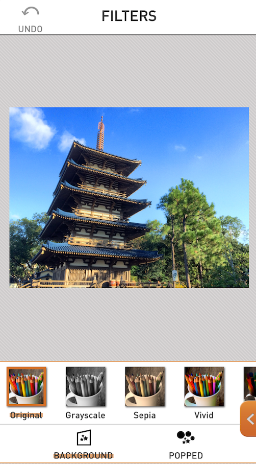
But that’s my problem, not yours. At this point, our image is masked and ready for “popping”. Notice that in the screenshot below, I’ve moved on to the Filter portion of the workflow. Even though the masking red is not shown, the image is divided by the mask into two sections – the background and the popped portions. Each portion can have a different filter applied to it by using the buttons at the bottom.
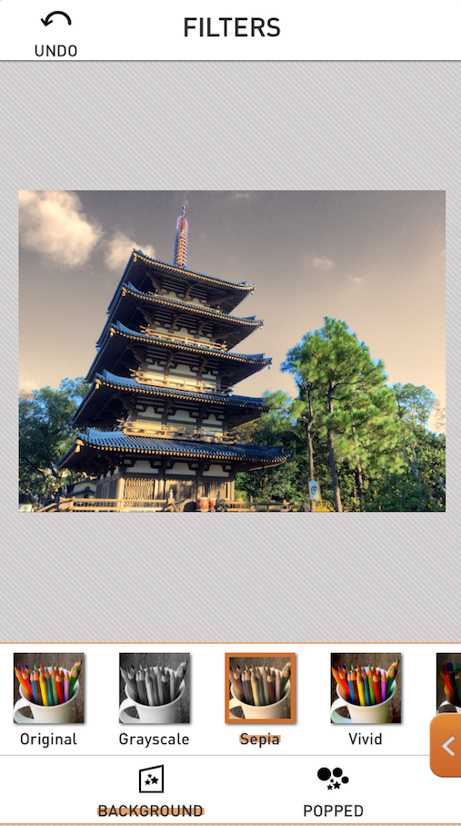
I start with the background, and try a Sepia filter. To me, that emphasizes the blue we were unable to mask out too much.
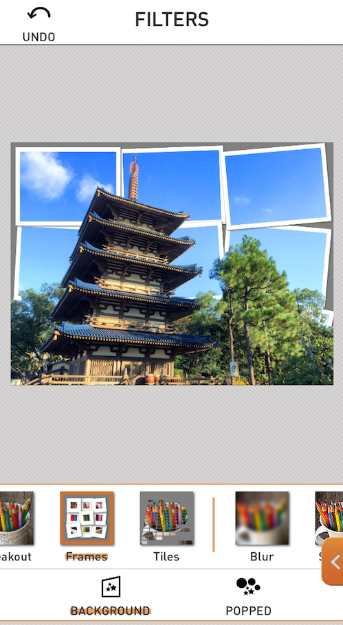
Next I try Frames, which makes the background look as though it was made of several photos.
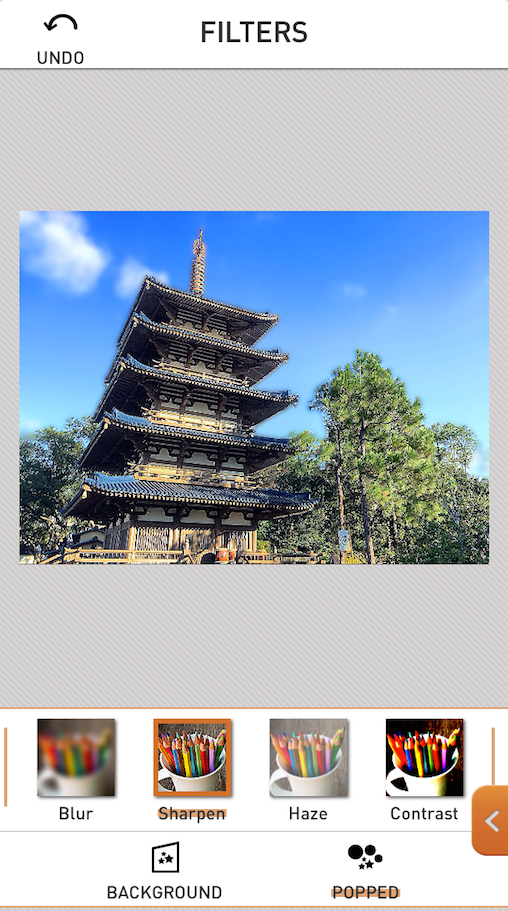
I can’t really decide what I’m going to do with the background yet, so I move on to the foreground, or popped portion. I decide on a simple sharpening. The filters are not customizable, so while this may be a little too sharp for my tastes, I have no choice in the matter.
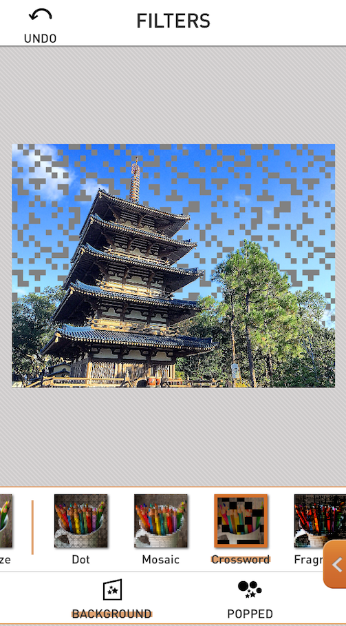
For the background I decide to go with Crossword for the moment. This will help show how filters and the areas surrounding the frames interact later on, but is not my ultimate choice for the background filter.
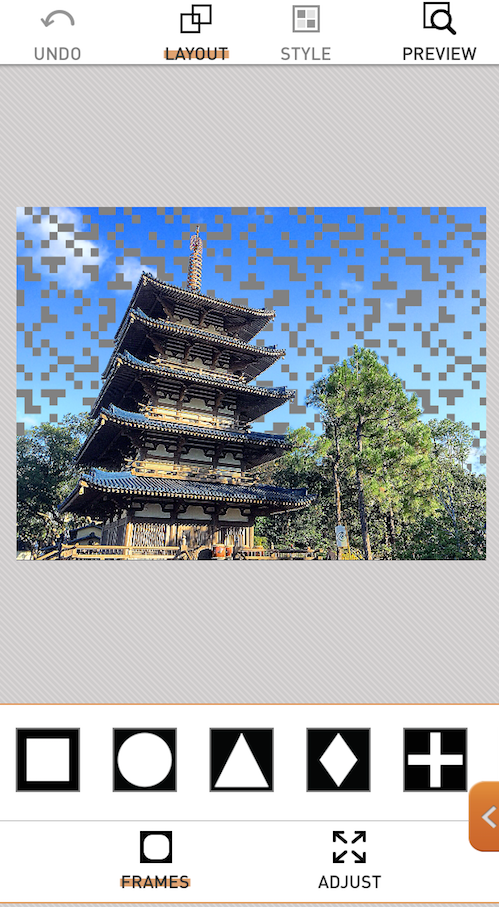
Next we move on to Frames. There are 15 frames available, and it is possible to combine shapes or have multiple frames on a single image.
When you choose a frame, it appears in the workspace with handles on it that allow you to change the size of the frame and move it around. In PopAGraph, the handles do not allow you to change the aspect of the frame or the lettering, so it doesn’t matter which handle you use. When the handles are active on a frame, that frame can be deleted with the button at the bottom.
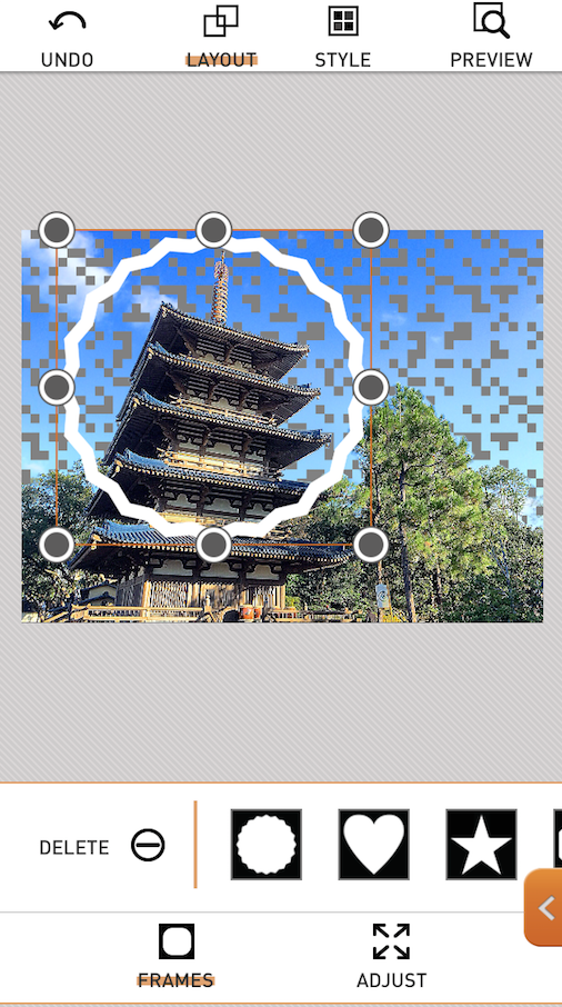
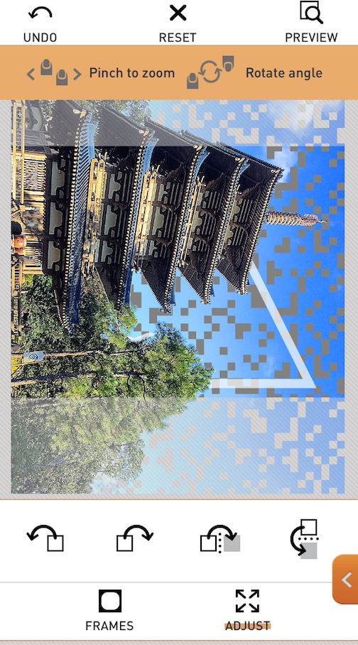
Adjust is not used to move or change the frame, but to adjust the image within the placed frame. The instructions at the top refer to zooming and rotating the image, and the box buttons near the bottom refer to rotating and flipping the image. By the way, if you look at the frame at this point, you will see it’s a merging of two frames: the rippled circle and the triangle.
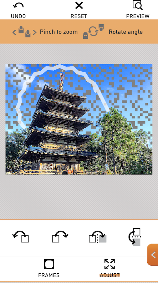
Below you’ll see I tapped the second box button and the image has rotated clockwise. The original aspect is kept, so if I accepted the rotation, those “dimmed-out” portions at the top and bottom would be cut off.
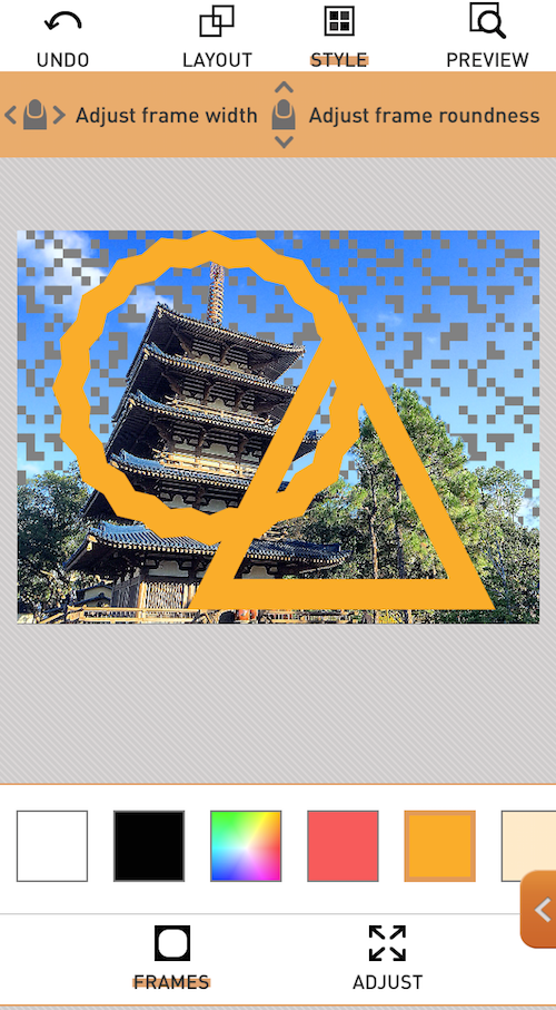
I hit the Reset button, then the Frames button at the bottom to leave Adjust. At the top of the screen I tap Style to make changes to the frame itself. When you’re in Style, you’ll see instructions at the top: swipe left and right to change the width of the frame(s), and swipe up and down to round the corners. At the bottom are some swatches to change the color of the frame(s).
Two points about this screen: the only frame that allows rounded corners is the square one. Swiping up and down on this combination pictured makes no difference whatsoever. The second point is that any changes you make affects ALL frames used. It’s not possible to have a blue frame and a white frame in the same work, and it’s not possible to have a thin frame and a thick frame.
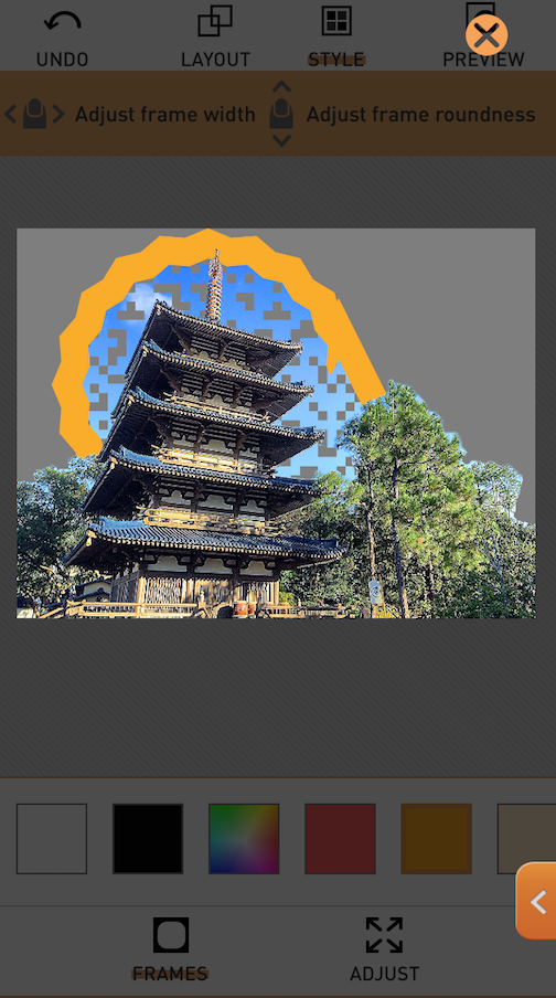
The Preview button at the top allows you to see how the finished image will look, based on the current settings. To return from Preview mode, tap the X button at the upper right.
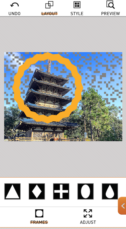
I decided I don’t like the combined frames, so I returned to Layout and tapped the triangle. When the handles appeared, I tapped the Delete button and it’s gone, leaving me with the rippled circle.
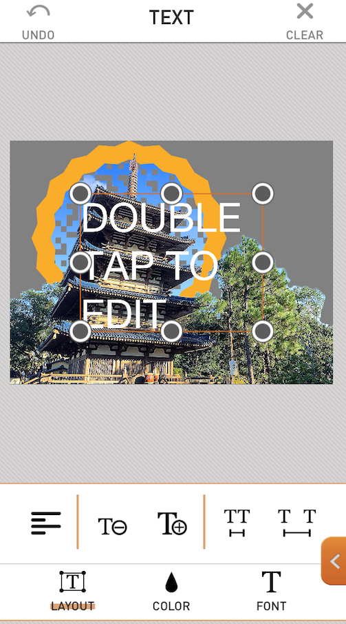
After setting the Frame(s), you can optionally add text. You change the text by double-tapping the default text. Only one text box is allowed, so you’ll have to do the layout entirely within a single box, with all the spacing you require. When Layout is chosen on the bottom toolbar, you’ll have options to change the paragraph alignment, the size of the text, and the spacing between characters. You can also change the size of the font by moving the handles on the text box after entering your text.
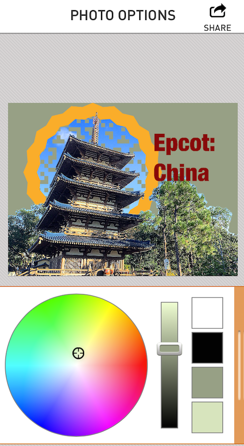
Color is changed just like the color of the frames: there are a series of swatches. If you choose the multicolored swatch, a color wheel appears as in the screenshot below and you can fine-tune your color choice. The color wheel is exited by tapping the orange column with the white lines at the right.
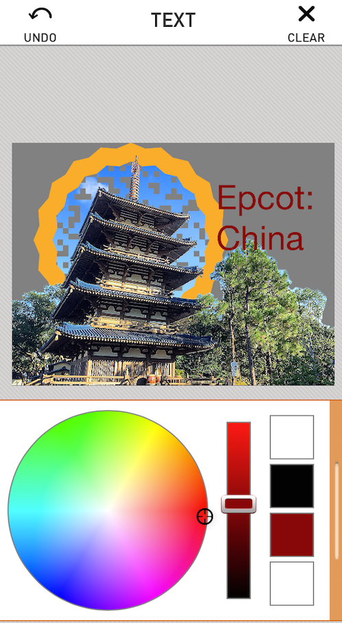
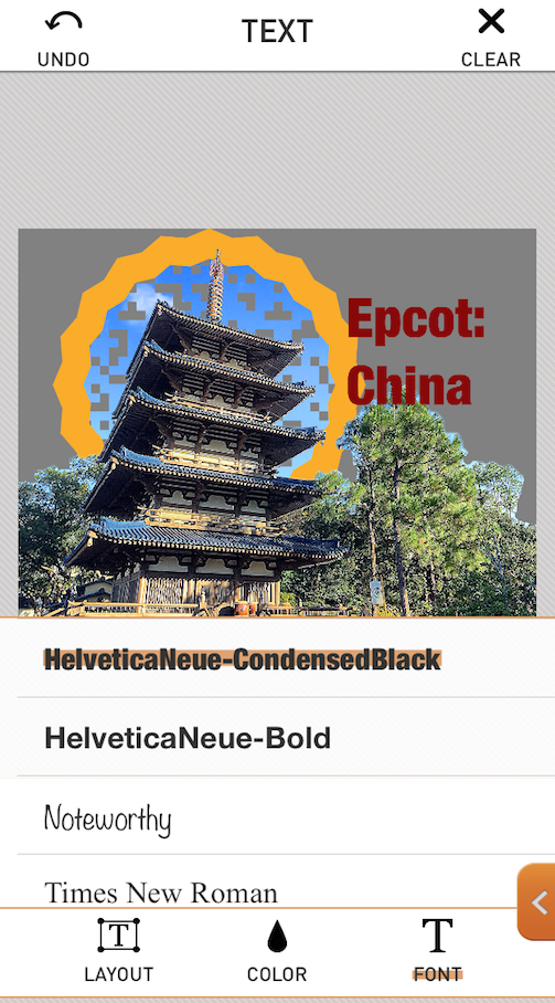
The font choices are rather minimal. At the moment, PopAGraph only has 16 possible choices, and three of those are variations on Helvetica. (By the way, don’t worry – I know I’ve entered the wrong country name here, but I go back and fix it later.)
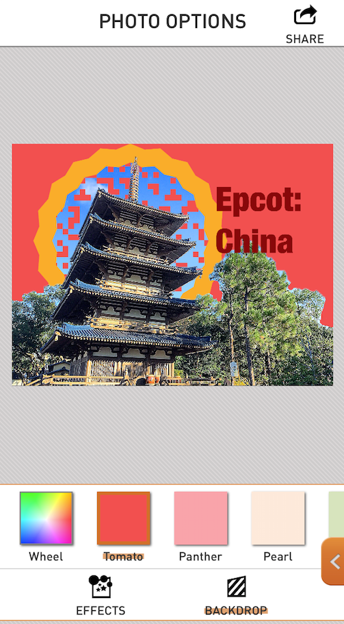
The final option on the workflow is Share, but before actually saving the image, there are some final changes to make that are contained under the Share button in the right-hand menu. (In the iPhone version these options are contained in the Share section, but in the iPad version there is another section that’s called Effects. The options work the same on both versions.)
The first thing I want to do is change the standard gray backdrop. This is the area outside the frame that hides the background of the original image. Once again, you have a series of swatches, and below I’ve chosen Tomato. Not this time.
I tap the multicolored swatch, and get a color wheel, which allows me to choose a desaturated yellowish green.
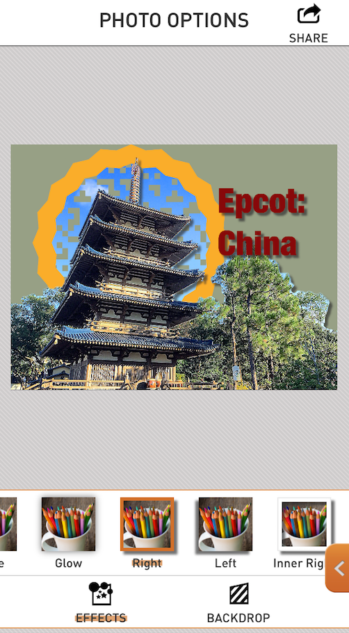
In addition to the backdrop color, you can tap Effects at the bottom and change the shadowing. You can either choose a dark glow, or one of several types of drop shadows. Once again, these are either on or off – you cannot modify the opacity or amount of blur. The difference between a normal, inner and outer drop shadow will be shown in the next series of screenshots. First is the normal drop shadow, which affects only the popped area and the text.
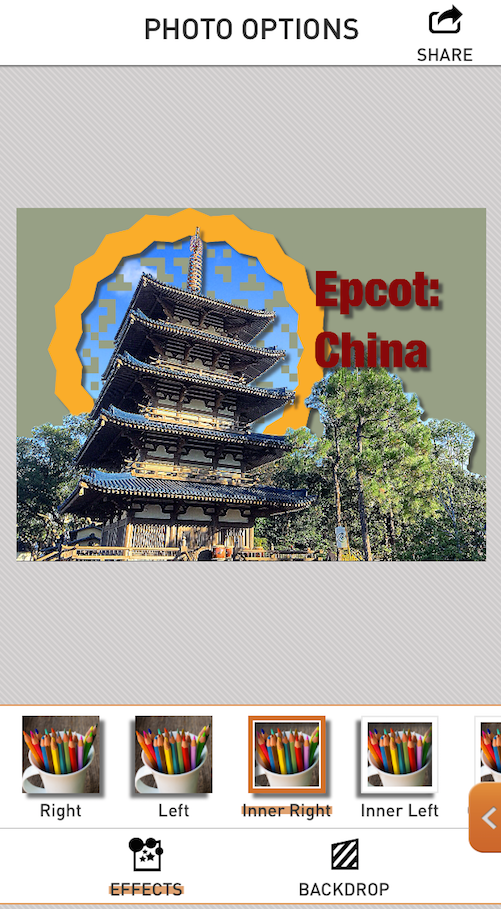
Next is the Inner drop shadow, which also includes the Frame.
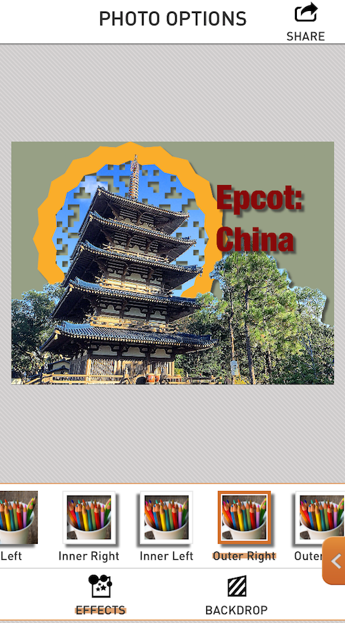
And finally there is the Outer drop shadow. In this case the background area is “pulled up” to the frame level, and gains a drop shadow. This is why I chose the Crossword filter on the background, so you could see that the filter knocks out a portion of the background so you can see the colored backdrop underneath and use a shadow on it.
One of the options for Backdrop is Clear. This will create a PNG file with a transparent backdrop that can then be brought into other programs. In this way, you can have a textured backdrop instead of a solid color. One caveat, however: you may want to nix the shadowing in PopAGraph if you have a Clear backdrop, because the partial transparency does not work all that well. In the screenshot below I have taken an image created in PopAGraph with a clear backdrop and a drop shadow into Leonardo to put it onto a textured backdrop. There is a dark shadow, but as it fades, some lightness creeps into the shadow, ruining the effect against the dark backdrop.
Even if you lighten the backdrop, there will still be a telltale color shift, as shown in the image below.

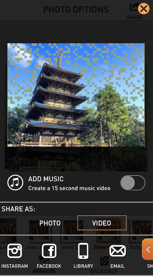
I have some fixes to do, so I go back and change the background filter to Pencil and change my text to read the correct country, Japan. Now I’m finally ready to save my result, so I tap the Share button at the upper right. The following screen appears. Where’s my frame? PopAGraph defaults to the option of saving a 15 second video of your work as it “pops out”. I’m not sure what the use of this video is, other than to advertise the app, so I switch the “Share as:” option from video to photo.
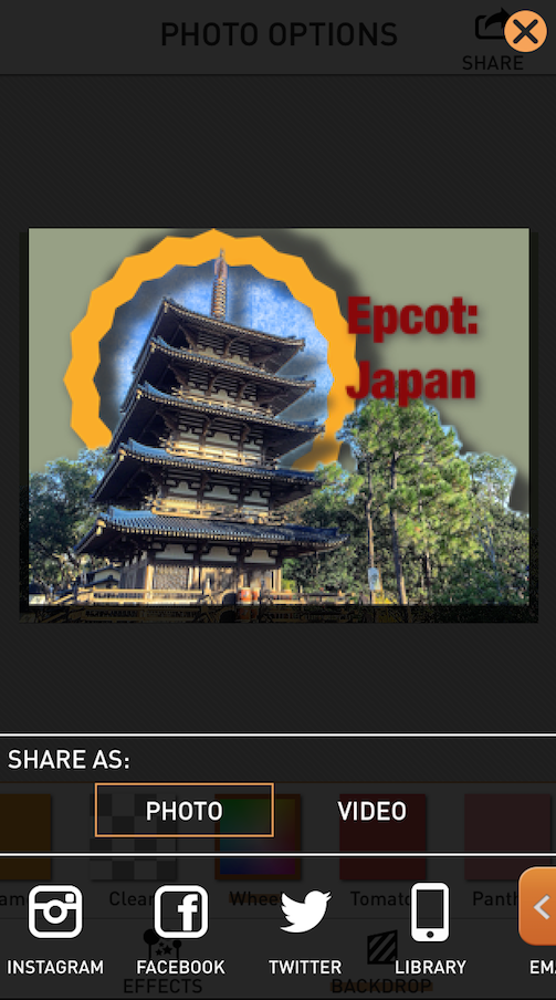
When I choose “Photo”, I am shown a representation of my final image. Unfortunately, it’s not a very good representation, with a grotesquely inflated shadow. Don’t worry, because the rendered image will look like it did before you came to the save screen, not this monstrosity. I tap the iPhone icon to save to the library.
And here’s my final image. Pretty cool!

I like working with PopAGraph, despite its drawbacks. It would be helped immensely with finer masking controls, further customizability of frames, text, and shadows, and more fonts. But it is fun and can produce some neat images.
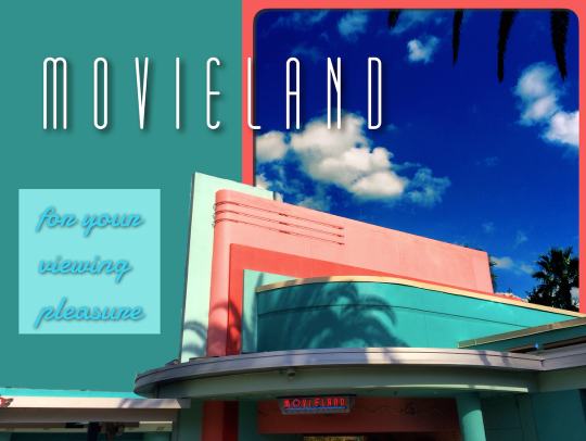
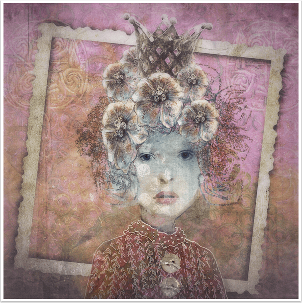
Of course, limitations in one app can be fixed in another. In the image below, I did not add text in PopAGraph. Instead I added the text in Phonto (covered last November), and was able to use more appropriate fonts and lay out two text areas.
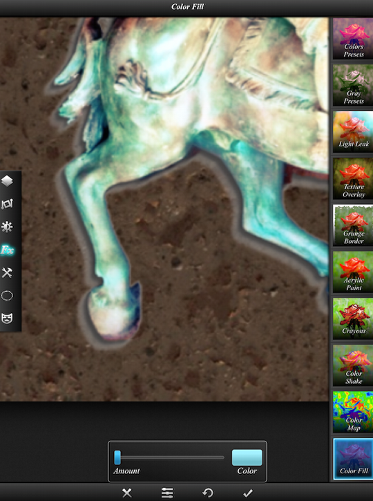
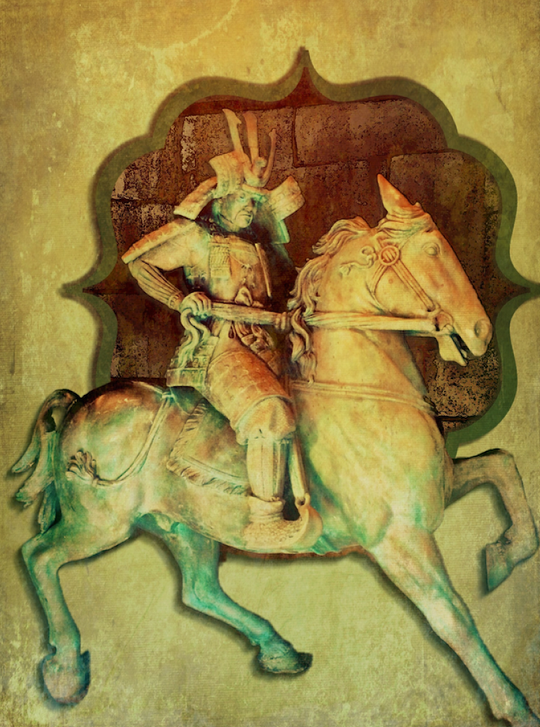
And in my final image, I added Distressed FX (covered this month) to bring the flat backdrop in with the spirit of the stone samurai.
I hope that you enjoyed the tutorial, and find PopAGraph a nice addition to your editing arsenal. Enjoy!
Jerry Jobe
Never content with just scratching the surface of what an app can do, Jerry Jobe decided to pass on what he learned about imaging apps to others. He’s constantly trying to figure out just what tools other artists have used, and trying to incorporate them into his own work, in an attempt to find his style. He’s written tutorials on over 145 apps so far, which you can find (along with his Song of the Day entries) at http://enthusiasmnoted.wordpress.com/ He lives near Atlanta, Georgia, where he also finds a creative outlet in acting and directing in community theater.

One Comment
Chris Monty
Wow! What manner of sorcery is this?