
iPad/iPhone Photography Tutorial – iColorama from the Beginning – Part 1
We’re delighted to publish our latest iPad/iPhone Photography Tutorial, this time our wonderful editor Jerry Jobe takes us back to basics with iColorama. If you’re not familiar with it, this is a great introduction,(foreword by Joanne Carter).
iColorama for iPad retails for $2.99/£1.99 and you can download it here.
iColorama S for iPhone retails for $2.99/£1.99 and you can download it here
iColorama is a full-featured art app. Do you want to base your art on an image? iColorama allows you to change the tone, the colors, the grain, the noise, the size of the image before creating art with it. Do you want to distort the image? Well, it’s got Distort and Glass to help you do that. How about combining images to make a composite or collage? Blend has got you covered. Artistic treatments? iColorama’s effects run from oil to water and many, many in between. Add text? Yes.
What about if you want to start from scratch? Create something totally new? Well, iColorama can handle that as well, with gradients, hundreds of built-in brushes and the ability to import your own.
With all that iColorama can do, there are two things it just can’t be. Those two things make it necessary for me to write a beginner’s tutorial for this app that I’ve covered so often before. One, it cannot be a simple app. Although it’s possible to slap on a filter and export the saved image to Instagram, that is using less than 1% of its capabilities. Two, it is not a layering app. For those who were introduced to digital imaging with desktop behemoths like Photoshop, this means that you will have to rethink the way you do things. This tutorial will help you make the first steps towards using this feature-laden app efficiently, yet playfully. Yet it’s long; too long, I fear, to be contained in a single article as I would have liked.
iColorama’s splash screen is artwork created in iColorama by various talented artists. The splash screens stay in place for several months, then are replaced as part of a new release that adds multiple additional capabilities to the app.

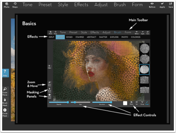
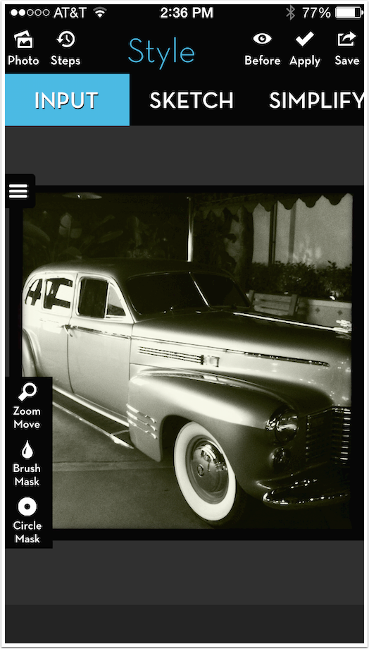
Real estate is at a premium on the workspace, due to all the available features. You’ll see that shortly. You might not guess that when you initially open iColorama, and you see only the top menu bar and the few left-side buttons.
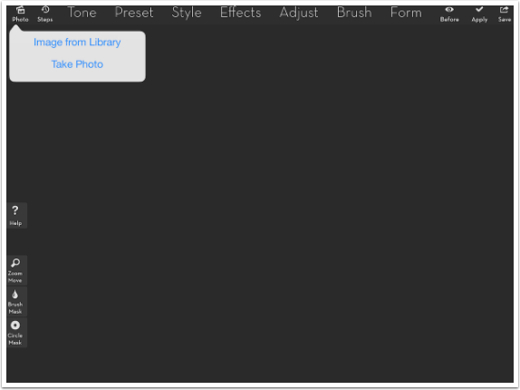
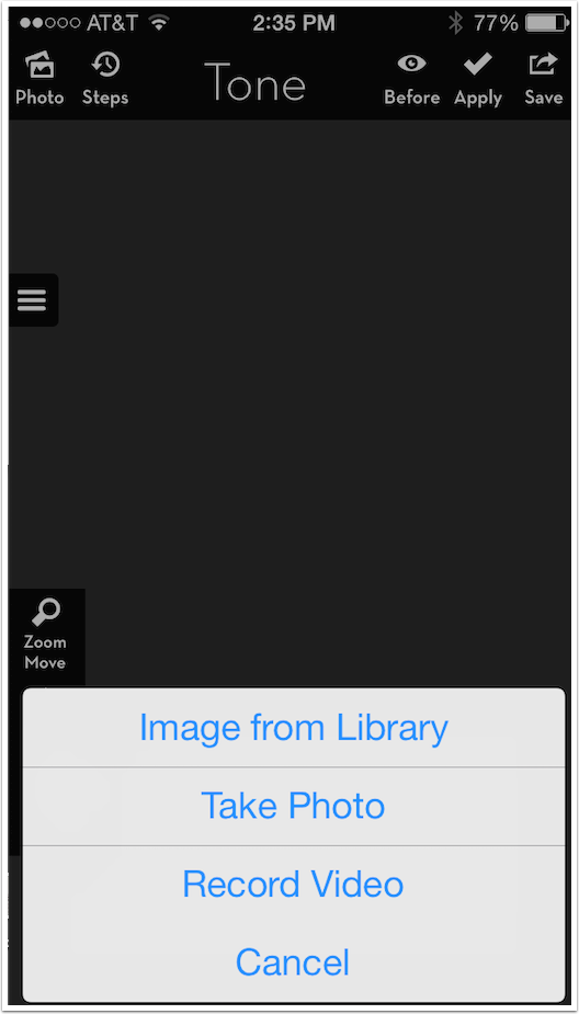
The first thing you will need to do is to open an image. There is no “create blank canvas” feature, so if you want to start from scratch, you would start by loading an image that is the size of the canvas you desire, then overlaying color on top of that.
You can also take a picture using the device camera, but that is not iColorama’s strong suit. However, it is an excellent, quick way to capture a texture for you to use in your art. (The subject of texture creation and use could take an entire volume.)
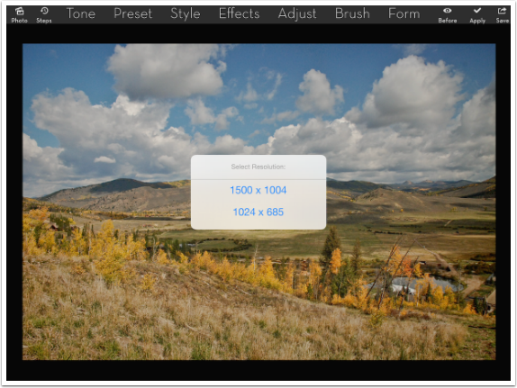
When you bring in an image that is over 1024 pixels on the long side, the app will ask you if you want to keep the original size or downsize it. Some effects can take quite some time, and even become impossible at higher resolutions. However, these “impossible” tasks are very rare, so it is my recommendation to use the higher resolution and wait patiently for any task that takes more time than a fraction of a second.
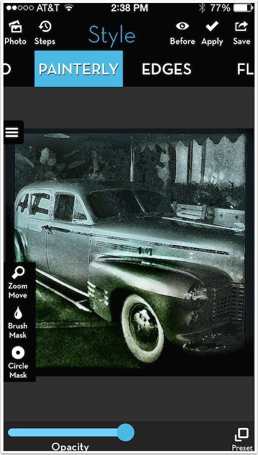
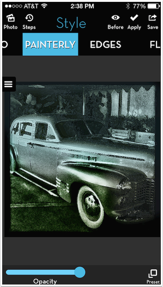
On the left side of the screen is a button for help. The help file is not comprehensive, but then it couldn’t be without being a book. What is does have is a scrollable document with several graphics like the one seen below. What it shows you is that you have a main toolbar at the top. When an option is selected from the main toolbar, a submenu bar appears underneath it with several options. The submenu is horizontally scrollable.
When a submenu option is selected, sliders and buttons appear along the bottom to help you adjust the effect. A further breakdown of the submenu option is accomplished through the use of presets. If these are available, a Preset button will appear in the lower right. Standard notation for presets take the form of Main>Submenu>Preset. For example, Effect>Blend>Multiply means that you tap Effects in the top toolbar, then Blend in the submenu, then tap Preset and choose the Multiply preset.
Let’s take a break for a minute and talk about iColorama S. iColorama was designed to be used in landscape mode on the iPad. In porting the app to the smaller, portrait mode iPhone (to say nothing of the at times slower processing speed), it was decided that the apps should remain separate, and not be universal. This does mean that the apps are purchased separately for iPhone and iPad, but I have no problem with that when the apps are supported as fully and creatively as iColorama. There are some initial differences in the look and operation, but they are superficial and can be shown in just a few screens from iColorama S.
As I said, changes had to be made to make iColorama S fit the smaller, portrait mode screen. The first thing to go is the help file. Aren’t you glad that I’m writing this article to help you through?

Once again, you have to open an already existing image or take a photo. If you’re wondering about “Record video”, let me just tell you that takes you to Videomator, the sister video app that essentially enables you to apply options under the Tone submenu to your videos. Videos are not processed in iColorama S.
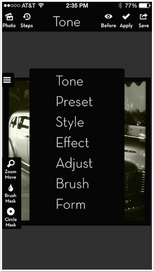
Another change in iColorama S is that there is not enough room for the Main Toolbar – there’s only room for one word! Just a few months ago, the menu structure in iColorama S was changed to follow the one in iColorama, and the main toolbar was changed to a drop-down menu which contains all the Main options.
The Submenu bar is still horizontally scrollable, but there’s room for fewer options at a time. Input is the default submenu item that does not change the image.
You will see that the Help icon on the left side of the screen is replaced by an icon with three horizontal lines. The purpose of that button is to clear the Zoom, Brush Mask and Circle Mask buttons so that portion of your image is not concealed.
Below you’ll see the results of hiding those buttons. Just tap the “Hide” button again to restore those three buttons.
Those are the major differences between the two versions. There is one minor one to discuss later. For the most part, however, operating both apps is similar.
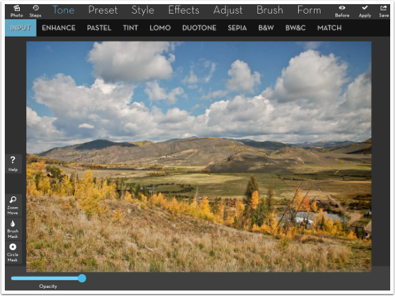
As we return to the iPad version and look further into the help file, we see descriptions of the other buttons at the top that flank the main toolbar. There are the standard Import and Save buttons at the corners. Before is a toggle switch that shows you the image with and without the current effect.
The remaining two buttons are the meat of what distinguishes iColorama from a layering app: Apply and Steps. In iColorama, you are given opportunities to modify and discard your effects; to experiment freely; and nothing takes effect until you hit the Apply button. You can even save multiple versions for later blending and never hit the Apply button, and each new effect will affect the original, not build one on top of another. If you do hit the Apply button, an entry is made in History, and you can use the Steps button to go back in that history and remove those applied effects.
Remember: if you want to build on what you see on the screen, hit Apply before moving on to the next effect. If you don’t want to build on it, then Save the result. And if you want to return to a previous state, use Steps.

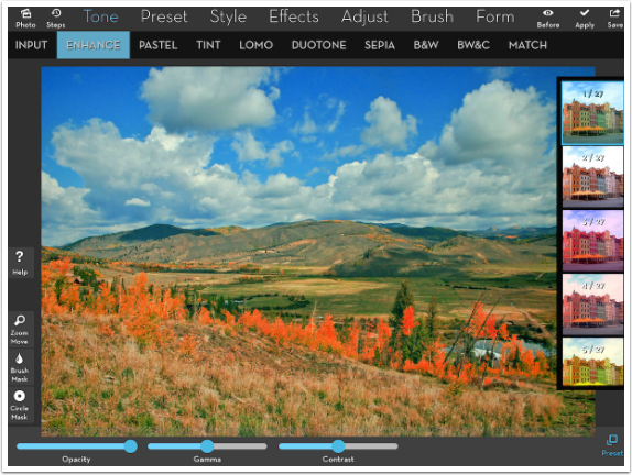
Let’s work our way through an example. Below you’ll see that I’ve chosen Tone from the Main menu. Input (no change) is the default submenu item selected.
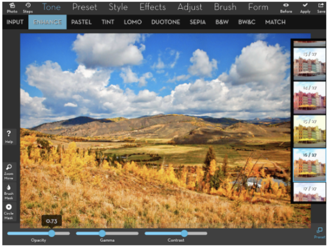
Next I chose Enhance from the submenu. Two sliders, Gamma and Contrast, and a Preset button appear at the bottom. Most of the time, the first preset is applied automatically when a submenu effect is chosen (Adjust>HDR is a notable exception.)

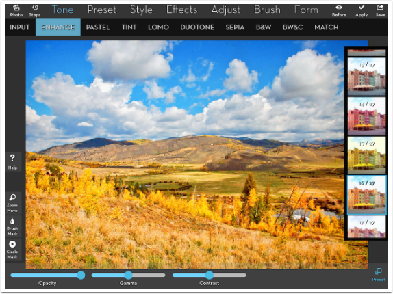
Tapping the Preset button brings up a scrollable vertical list of thumbnails. Scrolling down will show you other options.
Below I’ve chosen #16 of 27.
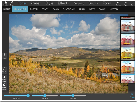
What happened to my effect below? Nothing really – I tapped the Before button to compare the change from the original made by the Tone>Enhance>16 effect. (By the way, if you tap and hold the Before button, it will stay in “Before” mode, not showing the effect, until you hit Before again.)
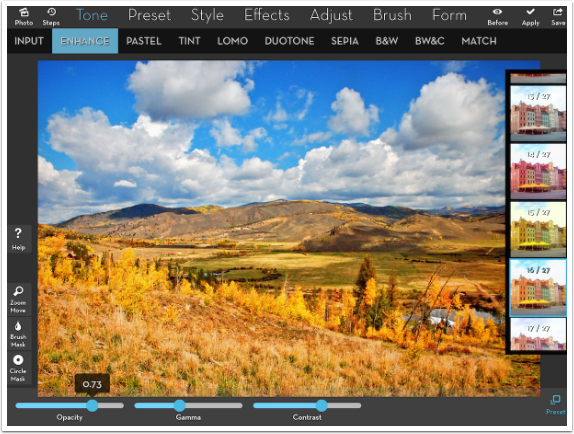
The sliders on the bottom are your friends – especially the Opacity slider. Often an effect is too intense and can be brought into line with use of the Opacity slider. Below, even though I increased the Contrast, the effect was made more bearable by decreasing the opacity to .73 (or 73%).
I’m going to stop here, and take a breath. A lot of material has been covered, and we’re about halfway through the rudiments of iColorama. Don’t despair, and rejoin me next time as I show you the tip of the creative iceberg that is iColorama. Enjoy!
Jerry Jobe
Never content with just scratching the surface of what an app can do, Jerry Jobe decided to pass on what he learned about imaging apps to others. He’s constantly trying to figure out just what tools other artists have used, and trying to incorporate them into his own work, in an attempt to find his style. He’s written tutorials on over 145 apps so far, which you can find (along with his Song of the Day entries) at http://enthusiasmnoted.wordpress.com/ He lives near Atlanta, Georgia, where he also finds a creative outlet in acting and directing in community theater.

7 Comments
Mick David
Want to be sure to catch part 2 of iColorama seen you on Facebook
Carlos
Thank you Jerry.
Sara Augenbraun
This is extremely helpful!! I cannot wait ’til the next tutorial on iColorama by Jerry Jobe!
Patria
Hi Jerry,
I have been using icolorama for awhile now and still not clear what the difference between icolorama s and icolorama are. I edit on an ipad. Hardly ever on my phone. Is the resolution different? Is there a reason why I should use icolorama S instead of icolorama?
David
That’s the best I have heard yet for a tutorial…..
Easy to learn from…
Thank you Jerry
Jay
Do I need to buy separate apps for the iPad and iPhone?
Jay
Leslie
Just got my iPad Pro with pencil. I have experience with IColorama on iPhone 7Plus. What is new that I can use on iPad Pro? And how do I use the pencil? On which effects? Thank you for any guidance. I’m stumped.