Mobile Photography – A Picture’s Worth with Cattis Carlander – TheAppWhisperer
‘A Picture’s Worth‘… is where we ask mobile photographers that have created powerful mobile photography/art to explain the processes they took. This includes their initial thoughts as to what they wanted to create, why they wanted to create it, how they created it, including all apps used and what they wanted to convey. We also ask these incredible artists to explain their emotions and how the image projects those feelings. We have published a few A Picture’s Worth articles recently, if you have missed those – please go here.
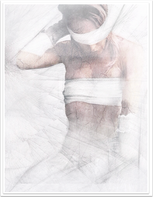
In this A Picture’s Worth today we asked Cattis Carlander to tell us more about her wonderful image ‘Bound’. Cattis has explained eloquently all we wanted to know. We think you will enjoy this very much.
If you would like to contribute to this section or if you have seen an image that you would like to learn more about, just email Joanne@theappwhisperer.com and we will get it all set up). Foreword by Joanne Carter (over to you Cat).
“This one is one my so called “Conceptual Edits” and by that I mean that I have a very clear vision of what story, emotion, or message I want to embody, already before shooting.
The best way of working myself out of negative energies, has always been to express myself visually. I have been sketching and painting since I was just a little girl, however my interest for photography came much later and it wasn’t until I discovered mobile photo it became my first choice of tool. The touchscreen is just as much my camera as it is my canvas and the huge range of edit applications appeal to the painter inside me.
As a former actress, storytelling has become important to me as well. An image must have some kind of message, something more than just being a good a shot to make me satisfied with it. I often use myself as model and I don’t look at myself as anything but a tool.
This shot was taken quite long ago and during a time with sickness, physical pain and surgery. Long story and the details aren’t important here, but facts my own body had turned into a prison. I was literary bound – tied up by bandages and unable to release myself without help from outside… there were no exits, not even on the mental level. With that said I guess you have a good insight in what elements made me compose this image.
Now back to this picture: I did several edits of this shot, but never really succeeded to transmit my inner vision, or the emotions I was influenced by. Simply because I did the predictable; a bad feeling must be equal with a dark, kind of horror image. I needed to free myself from all those implanted ideas.
So I opened the image in app Decim8 and played with different effects, until I got a clinical ice-cold touch to it. I think it was the Brainfeed3R-effect that created a sliced, edgy kind of graphical version of the image, which made me realise that this state of mind was not about expression, but impression, not extrovert but introvert i.e.
That it was the lack of emotions, a sort of apathy, that would help me to embody my mental prison, through out my edit. Reminded of the times I spent at hospital and the environment from there (all that clinical cold white, you know), I started from scratch and erased all the edits I had in work.
Process:
Taken with iPhone 4s default camera. I used my headphones as shutter to get a better distance and fit the parts of my body that I wanted to work with.
I started to erase the background and parts of my body in app Repix. Then I used app PicsArt to add HDR and Cinerama effects and make the body more distinct. I also used correction tools; whitening teeth tool, to highlight the bandages and give them a bluish tone. Face smothering tool, on all uncovered body-parts, to remove life and freeze the pose.
Paper effect: applied it onto the body only, to make it look like an inner-organ, or veins and to increase the sterile feel, adding artificial life to it.
Then I opened it app Superimpose to blend it with my Decim8 version. I masked the body and placed it to get a dynamic composition. Blending mode normal. Opacity ca. 95%.
Then opened it in PicsArt again, turned on ‘Drawing-mode’ and followed up on the lines already added, to make them come through even stronger.
Finally RePix again and the brush ‘legacy’ to clean the background from saturation and increase the bluish tones”.
