
APPArt – Creative Tutorial – One Photo – One App by Bobbi McMurry – TheAppWhisperer
We’re delighted to publish this fascinating tutorial by our new Columnist to our APPart Column Bobbi McMurry. In this demonstration, Bobbi explains how to create a fabulous piece of art using only one app to one photograph, don’t miss this. Over to you Bobbi (foreword by Joanne Carter).
“This piece was for a Facebook challenge in which you create an image using only one photo and one app. This was a good exercise for me as I usually use a multitude of images and at least three apps. I also thought this would be a good image to do a tutorial with, due to its simplicity”.
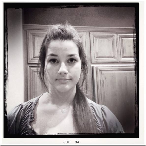
I chose this image and my favorite app ArtStudio. While I use this app regularly, I feel I’ve only scratched the surface of its robust capabilities.
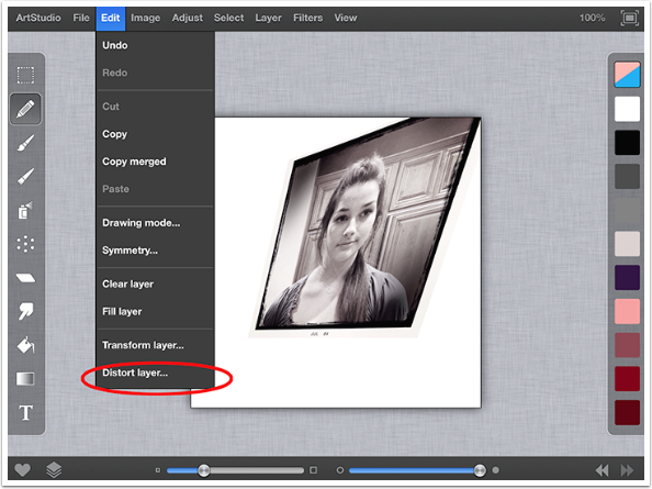
After importing the image, I distorted the image as shown.
Edit menu/Distort layer
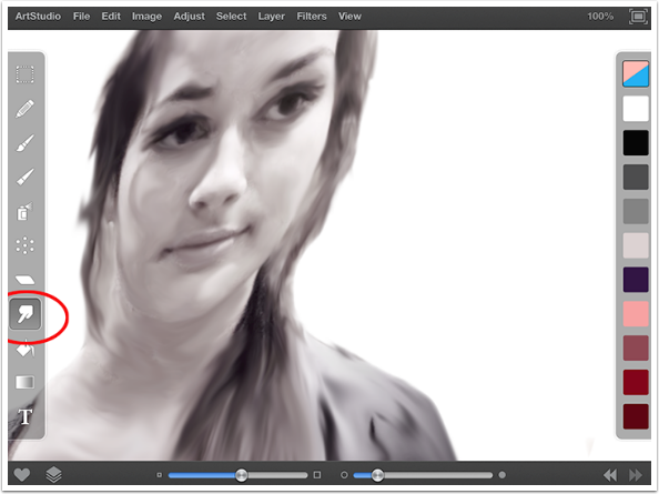
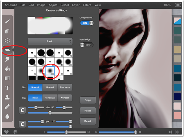
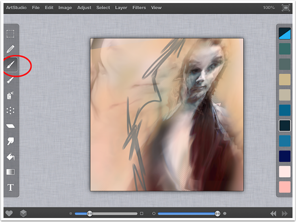
Using the eraser tool I removed the background and used the smudge tool to create a quick painterly look on the entire image. To create movement and emphasis I smudged some areas more than others.
Eraser Tool /Smudge Tool
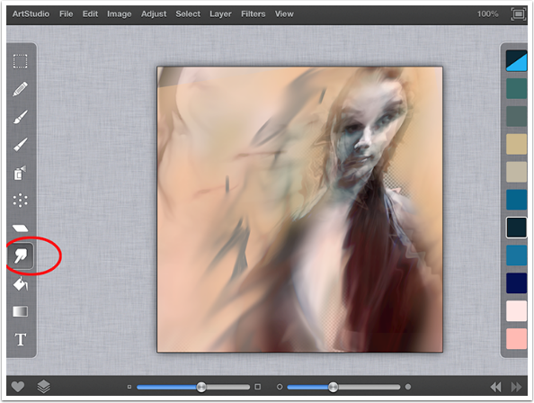
I used the airbrush tool and painted a very loose background that even covers parts of the figure. Then I smudged a little more.
Airbrush tool/Smudge tool
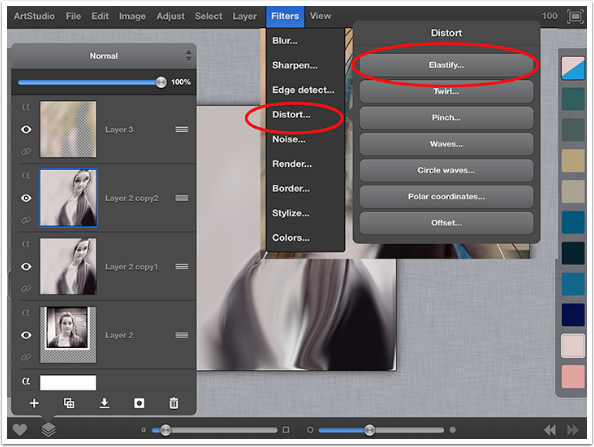
I then duplicated the layer, and further distorted this layer using the elastify filter. This filter is a lot of fun to use, and appears in my work frequently.
Layer/elastify
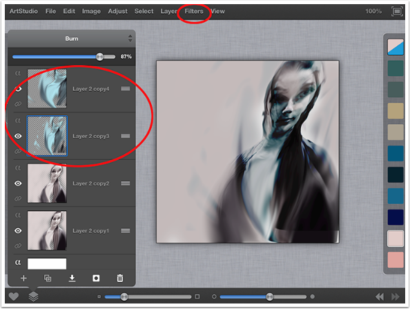
Here, I adjusted the color using the blending mode Burn. For those of you familiar with Image Blender, ArtStudio has the same blending modes and a couple more but you have more control for soft masking here.
Blending mode/burn
Next, I used the eraser tool with a very large and soft edge to selectively remove areas.
Eraser tool
My one complaint about this app is the limited number of layers on an image of any size. This image is 2448 x 2448 and is therefore only capable of 6 layers at any time. I would keep my layers much longer but because of this limitation, I am forced to merge layers more frequently. Here, I merged the top three layers.
Next, I duplicated the result of the merged layers and adjusted the opacity for this layer to 80%. I used the transform function to offset the two layers.
Then I merged the two layers, and duplicated that resulting image.
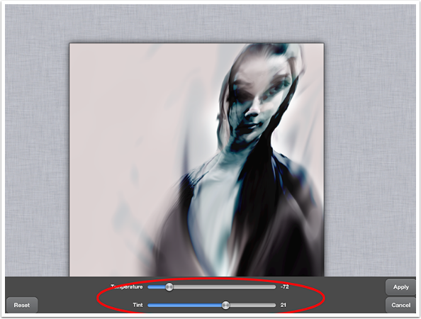
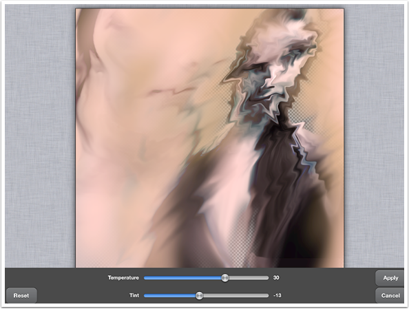
Here, I adjusted the temperature and tint to some rich blue tones.
Adjust tab/Temperature Tint
I duplicated the blue layer and used the elastify filter on both of the blue layers. You can name your layers in ArtStudio, but I rarely do because I merge them so frequently. Adjust the opacity levels on each of these layers until satisfied. Merge them together.
Filters/Distort/Elastify/Merge
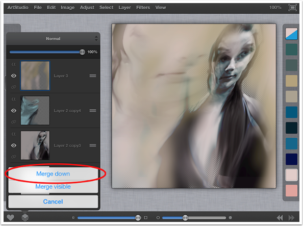
I merged down the top three layers.
Next, I duplicated the layer and used the elastify tool to distort. I adjusted the color using temperature and tint. Erased selectively, and adjusted temperature and tint again to intensify color on that layer.
Filters/Distort/Elastify
Adjust/Temperature & Tint
On the blank layer, I used a paintbrush to add color where desired.
This is where it gets really fun for me as I begin more of the drawing and painting part of the piece. I usually move very quickly between layers and tools and its very difficult for me to slow it down and document each step. I used a smudge tool to blend until I was happy. I repeated steps 10 and 11 several times until I was happy with the amount of color. I had each layer set to different opacities so all the layers could be seen at once. Additionally, I used different paintbrushes and colors to paint on layers above the main layer that way if I don’t like something; I haven’t ruined what I was already happy with.
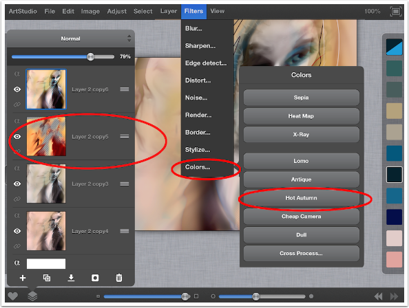
In the filters are several preset colors. One of my favorite presets adds intense, rich, warm tones called Hot Autumn. I have applied that filter to the second layer as shown.
Filters/Colors/Hot Autumn
I selected a portion of the darker area and created a rectangle. Adjusted the colors using varied tools under the adjust tab until I was happy. Then I added noise under the filters tab. I placed it horizontally over the image. Next, erase to reveal the desired portions of the figure.
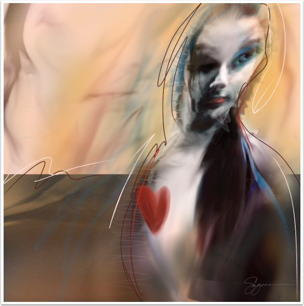
At this point, I just draw and paint sometimes directly onto the main image, or on separate layers depending on the look I am after. On this piece I used the pencil tool with a variety of different colors in a loose fashion to give a little movement to the piece. I also used the paintbrush tool to add the heart and some color on her lips.
Voila!
Bobbi McMurry
Bobbi McMurry received her BFA from Arizona State University where she focused on painting, drawing, and printmaking. After graduating, she spent many years as an Art Director for custom and newsstand magazines. She has recently rekindled her passion for creating personal images and has gravitated to the world of mobile art.Her work has been accepted into numerous juried exhibitions, and has been recognized in mobile art competitions including The Third Wave and the Mobile Photo Awards. Additionaly, her work is part of the current iPhonic Art Exhibit at Markham Vinyards in California. She has been featured on mobile photography blogs, and recently became a columnist for The App Whisperer. Bobbi lives and works in Phoenix, Arizona.


4 Comments
Carlos
Quite the transformation of a image.
Geri Centonze
I’ll have to study this again and give ArtStudio a try – thanks for sharing Bobbi
Carolyn Hall Young
Juicy tutorial, Bobbi.This makes me want to reconsider ArtStudio again…
Jelly Beans
Bobbi,
Congratulations on your new position! I look forward to seeing some KILLER tutorials and workflows from you.
A couple of comments:
1) please be patient with the reader. Not all of us have a BFA. Most of us were late to the dance and are trying to learn different techniques. i.e. “I usually move very quickly between layers and tools and its very difficult for me to slow it down and document each step.”
2) In reference to the above, number each step on the picture so those of us who are not so intuitive can follow and see (merge 9 & 10) or whatever step you are doing.
3) Request: Can you do a tutorial with Stackables so we can so how the pros create their formulas for blending textures and opacities?
Blessings, and Good Luck!