Mobile Photography Tutorial – Snapseed 2.0 in Depth: Part 2 (Filters) – TheAppWhisperer
We are delighted to publish Part 2 of a new three part series with the upgraded Snapseed app tested by Jerry Jobe. This is an extensive tutorial and series and we are sure you are all going to enjoy this. Previously we have published an overview video of Snapseed (here) and you can find Part 1 of this series (here). (Foreword by Joanne Carter).
“Even with the controversial elimination of the Grunge filter, Snapseed 2.0 contains many filter options to take your image beyond a naturalistic representation of what was captured. There are 11 of them, in fact, so we’ve got a lot to cover. Let’s go!”
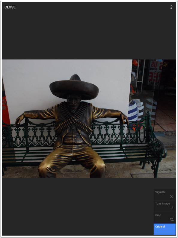
The first image you’ll see below is the original image of a statue on a bench in Cancun, Mexico. You’re seeing it on the Stack screen, which shows the steps taken at the lower right. Original is highlighted to show you the image without subsequent changes.
Next you’ll see the image with Tools steps added to get the image to a starting place for adding filters. (Tools were covered in the last instalment.) I cropped the image, used Tune Image to bring out the shadows, and added a slight Vignette.
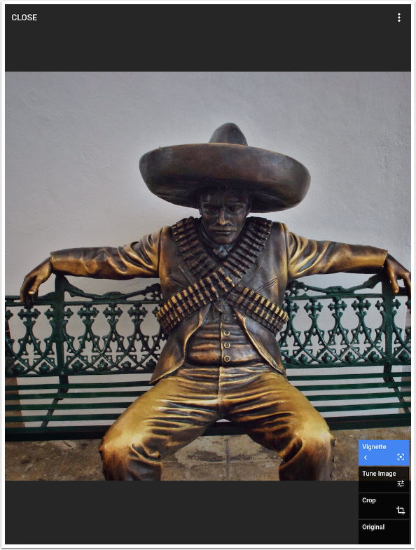
Tools and Filters are accessed by tapping the white Plus button at the bottom right of the screen. This is true whether you are using the iPad or iPhone version of the app. Because the iPhone screen is smaller, you will have to scroll down to see the Filters.
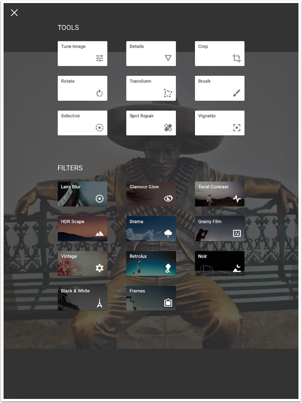
Lens Blur
The first of the filters is Lens Blur, which is a combination of the old Center Focus and Tilt Shift filters. There are two controls at the bottom: Linear and Style.
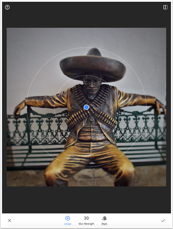
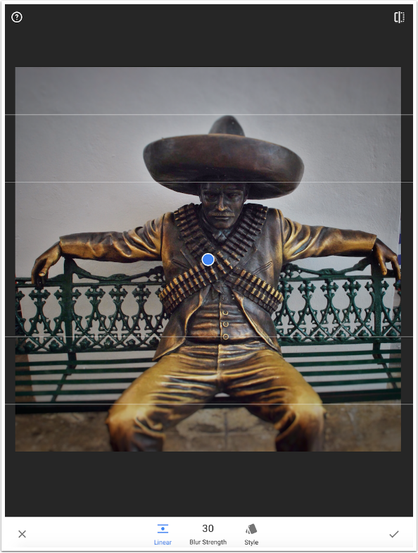
Tapping Linear changes between the “Center Focus” and “Tilt Shift” (circle vs. line) determination of the areas in focus.
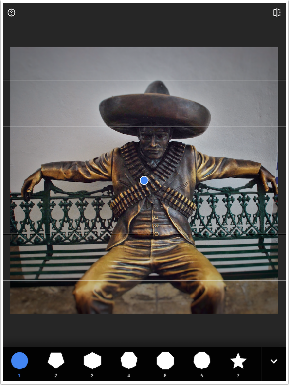
Style allows you to change the shape of the bokeh that occurs when blurring points of light. This image does not have the “points of light” necessary to see the different shapes. As a matter of fact, I have yet to edit an image where I can see any difference. However, by artificially manipulating an image until I created a point, I was able to confirm that Style does work, changing those points to a five-pointed star (7) and a heart (11).
The bonus feature of this version of Lens Blur is the ability to change the area of focus from a perfect circle to an ellipse by squeezing the edges. An ellipse is much more likely to achieve the look you want than a circle.
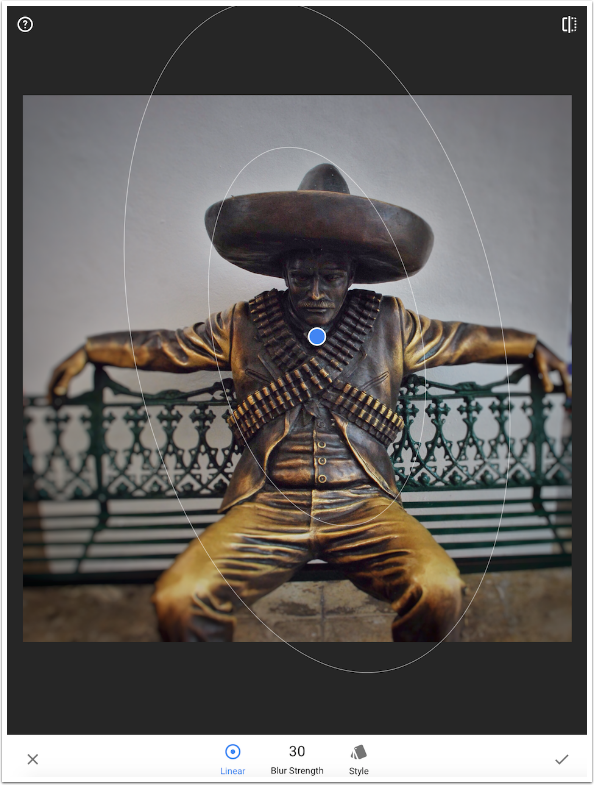
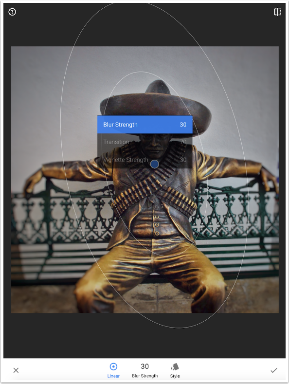
The controls for Lens Blur, accessed by swiping vertically on the image, are Blur Strength, Transition (the distance between the inner circle of focus and the outer circle of full blur), and Vignette (which follows the shape of the ellipse).
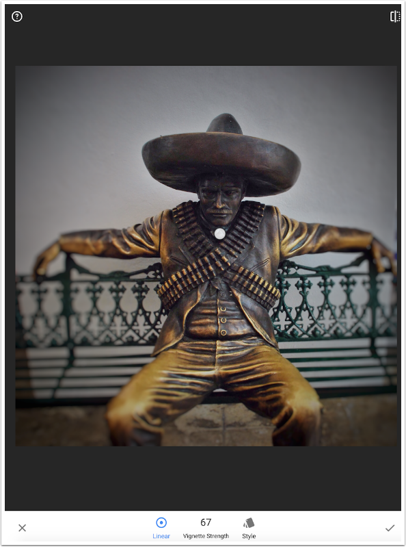
Both Vignette and Blur Strength can be adjusted much higher than what is pleasing. (I always appreciate the ability to access a full range of values – even ugly ones – rather than having the developer “rein me in” by putting an artificial limit on controls.) Below I have Vignette set to two-thirds of full, and that’s on the upper limit where I would push it.
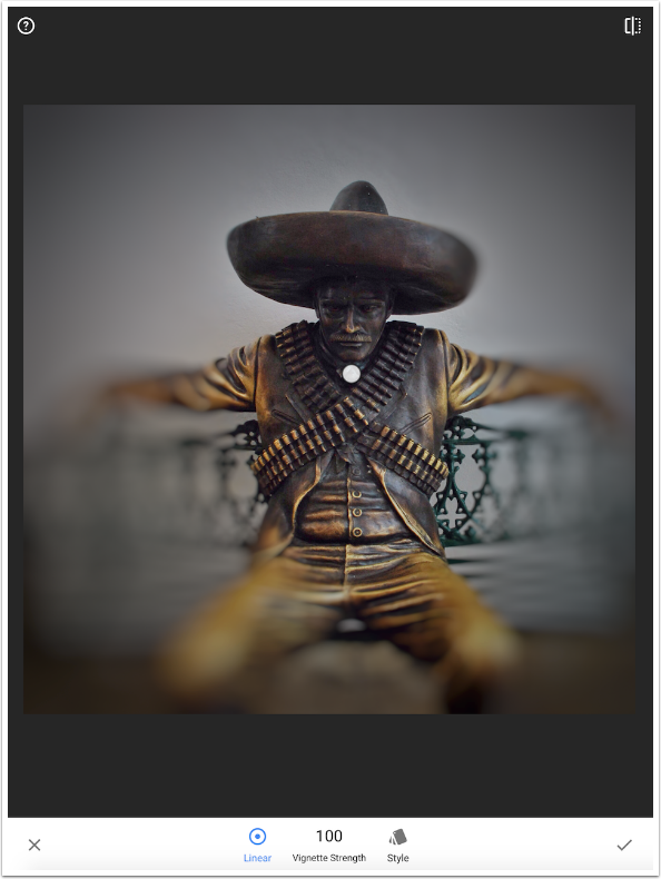
Next I push Blur Strength to 100, and that’s really too much.
Glamour Glow
In Part 1, I added Tools on top of other Tools as I progressed through the tutorial. I won’t be doing the same with filters, because that can end up a muddy mess. So as I move on to the next filter, I discard the changes from the previous filter.
The next filter is Glamour Glow. A couple of years ago I published a tip that showed you how to add a glow to photos by adding a blurred copy of the image over the original in Screen or Multiply mode. This module achieves the same dreamy effect in a single step.
There are five different styles available under Glamour Glow. The difference between them seems to be the color added as part of the glow.
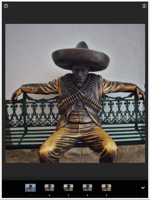
The controls are the amount of Glow, Saturation and Warmth.
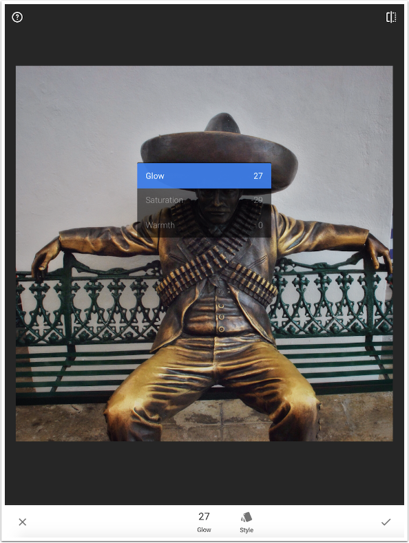
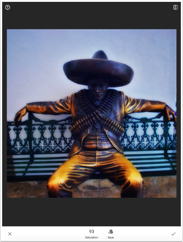
Below you’ll see a very saturated, blue version of Glamour Glow. The face of the statue is put into deep shadow by the glow.
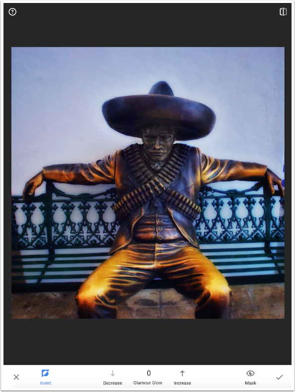
As a preview of Part 3, below you can see that I masked the glow away from the face of the statue. This targeting editing capability is available for both Tools and Filters.
Tonal Contrast
On the desktop, there’s a terrific Photoshop plug-in from Topaz Labs called Adjust. Rather then increase contrast throughout the image, it breaks the image into small areas and improves “local” contrast. The Tonal Contrast filter does the same kind of improvement of local contrast, and it’s a winner. (I’m not sure why it’s in Filters rather than Tools, but I’m just glad it’s there.)
The controls are for the low, mid and high tones in your image. The standard Contrast control, when lowering contrast, will pull all the shadows and highlights to the mid-tone. Shadows and highlights disappear, and everything becomes a uniform gray. Increasing contrast will push tones away from the middle and into shadow and highlight.
With Tonal Contrast, the raising and lowering of contrast takes place within the range specified. If you lower the contrast of the low tones, they remain shadows, and do not get pushed into 50% gray. (This is a hypothetical statement, since Tonal Contrast does not allow for lowering contrast. Once you see the effect, you’ll know why.) If you raise the contrast of mid-tones, they remain mid-tones and do not become shadows or highlights.
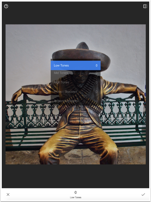
Below you will see a before picture. Even though the indicator at the bottom says High Tones is 100, I am pressing the divided square at the top right to show you the image before Tonal Contrast is applied.
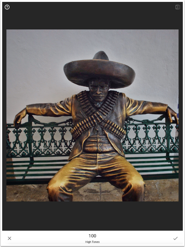
Compare that to the image below, where Low, Mid and High tones are all set to 100. Tonal Contrast really makes the image pop, without making it unnatural. (There is a hint of a halo above the statue’s arm on the right side that can be fixed by lowering the High Tones Slider. It doesn’t bother me at an initial glance, but it draws my eye if I think about it at all.)
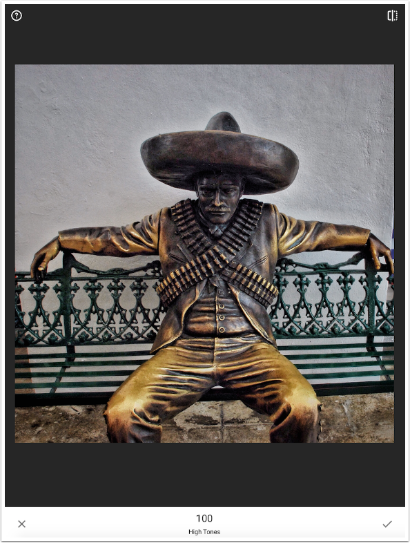
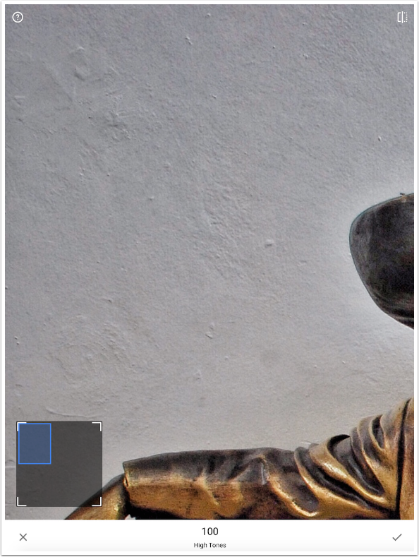
Look at the detail it brings out in the wall. Tonal Contrast should be used in addition to the Detail tool, since it emphasizes portions of the image that mere sharpening will not.
HDR Scape
HDR Scape is a scary filter to some. The default strength of 50 for all four of the Styles (Nature, People, Fine and Strong) results in over-the-top halos and muddiness, as seen below.
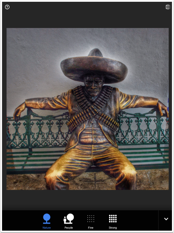
But that over-the-top quality can (and should) be adjusted with the controls of Filter Strength, Brightness and Saturation.
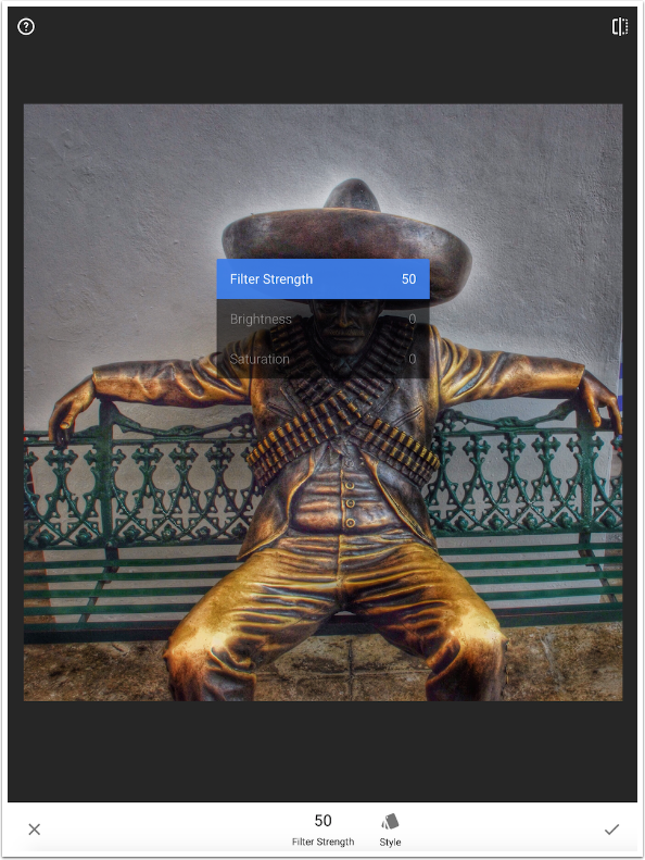
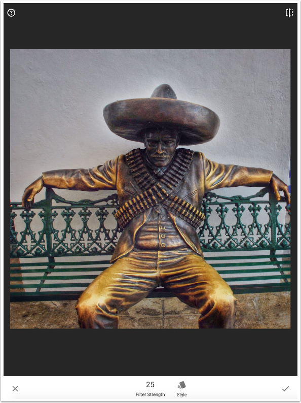
By dialling back the Filter Strength to 25, I can achieve a pleasing effect. A little bit of HDR Scape is enough – and you shouldn’t be scared of using it just because the first setting is too harsh
Drama
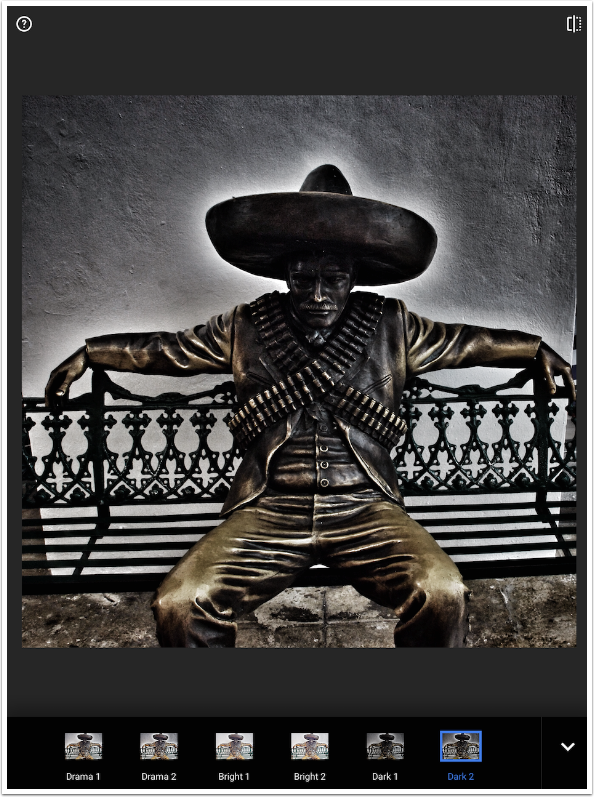
Drama is a desaturated version of HDR Scape. Once again, a high Filter Strength will result in unwanted halos.
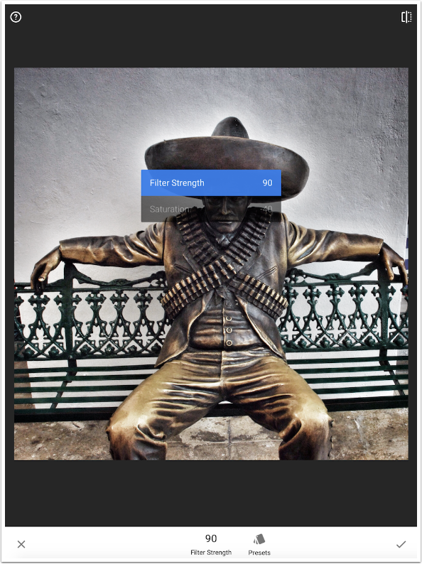
There are six Styles – two each of Normal, Bright and Dark.
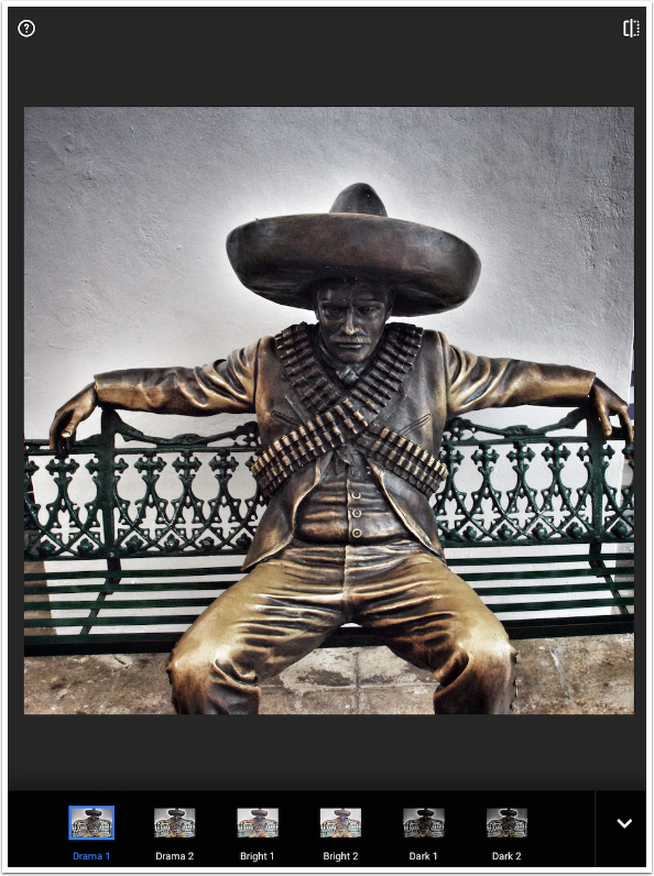
With Drama, just as with HDR Scape, it’s easy to go over the top. So use Drama in moderation (in your images and in your life).
Grainy Film
Different film stocks, back in the days of film cameras, introduced grain to an image. Sometimes it can be a pleasing effect, especially in black and white photos. Snapseed gives the user the opportunity to add some of this kind of grain into their digital images. It’s not a look I’m generally fond of. As a matter of fact, I wish that Snapseed would add a good noise-reduction filter. But if you want, you can add grain with the Grainy Film filter.
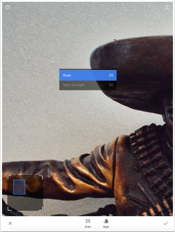
Below, I’ve zoomed in on the wall to allow you to see the added grain.
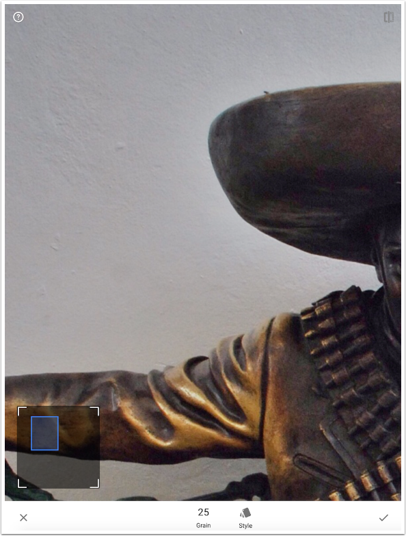
There are nineteen different styles of film available. As you might guess, from apps that do different kinds of film emulation, the styles can raise or lower contrast or brightness, they can add a color cast, or cross-processing tints to your image. This is all separate from the grain introduced.
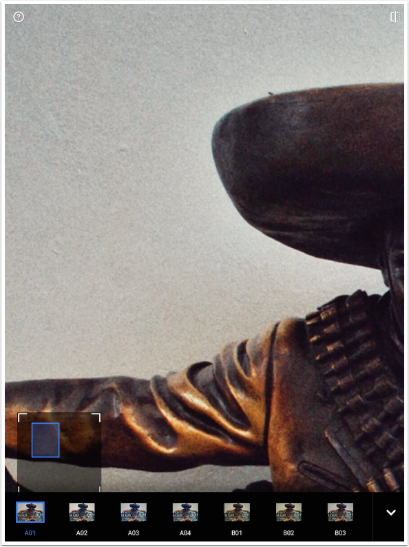
The controls are for amount of Grain and Style Strength.
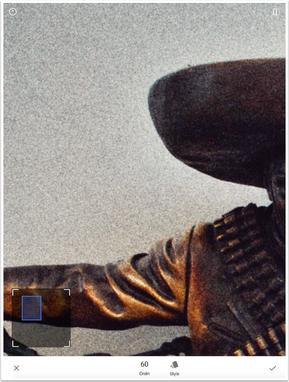
You can see that setting the Grain to just 60 on the scale of 0 to 100 will make the image very noisy indeed.
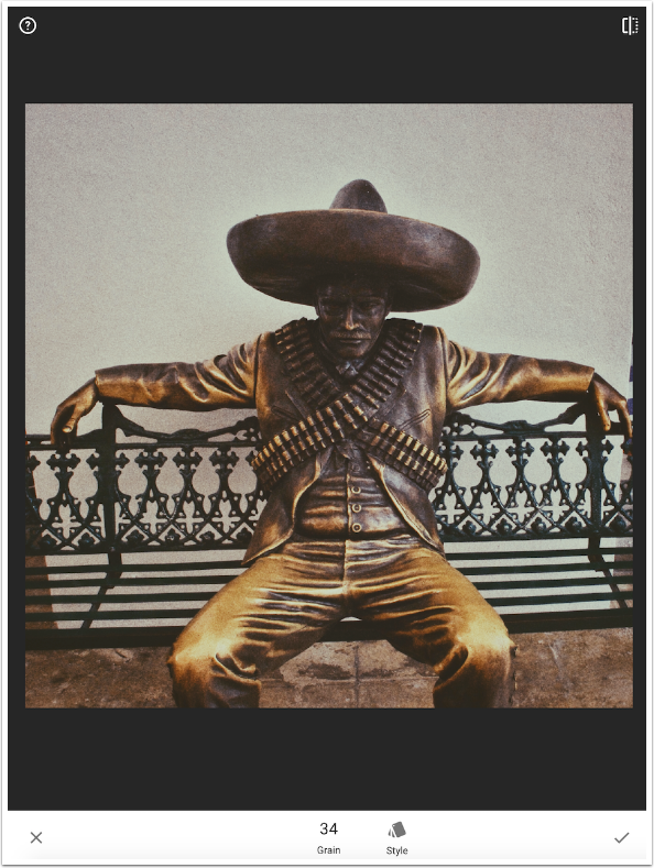
Below I’ve chosen a Style with a slight sepia tint and set the Grain at 34. Once again, not my style, but it works well and is easy to control.
Vintage
Vintage is the “non-textured” ageing filter. There are color casts and changes in contrast, but no scratches or light leaks. The default value adds a strong vignette that is centered. This vignette cannot be moved or changed in size or shape.

The controls are Brightness, Saturation, Style Strength and Vignette Strength.
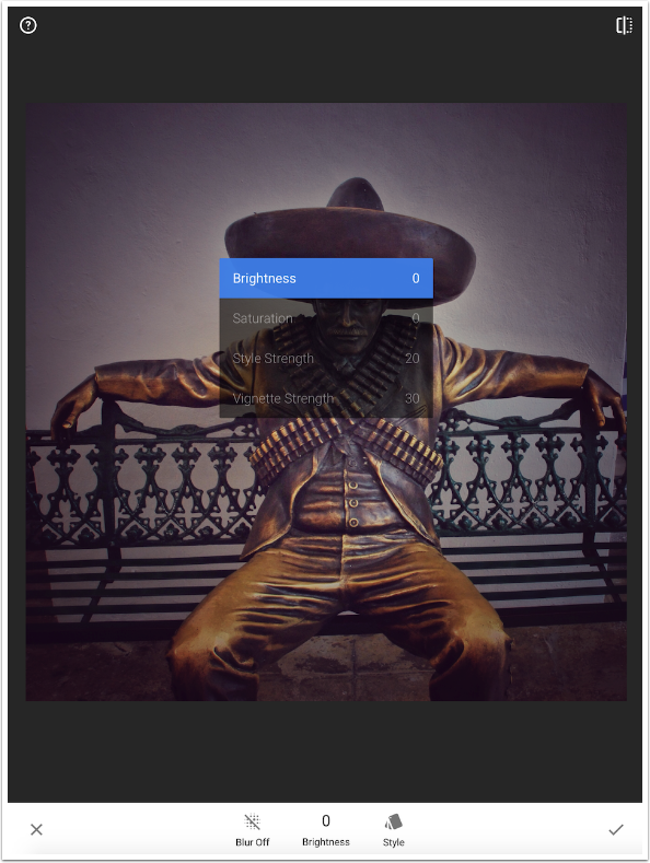
A Blur On button will add a blur to the vignette. The strength of the blur is fixed; changing the Vignette Strength will not affect the blur.
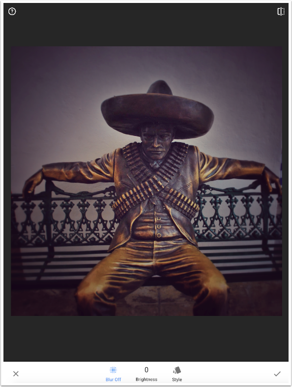
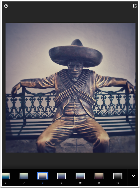
There are 12 different Styles. Those that have less distinction between the top and bottom of the thumbnail, such as number 2, will reduce the contrast in your image, giving it a faded look.
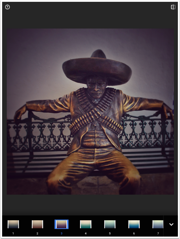
The color can be strong, as in this example of #6.
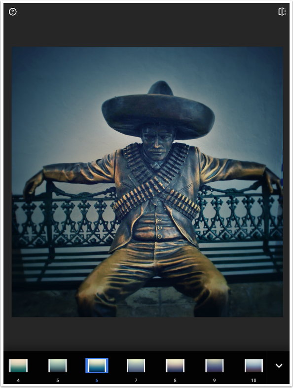
Number 8 shows the “fade” I mentioned.
Retrolux
Retrolux does all the scratches and light leaks. Like the removed Grunge Filter, I find that the intense changes made by this filter are not subtle enough for regular use, and cannot be made subtle enough within the app. (You have to save one version without the Retrolux and one with, and then blend them in another app.)
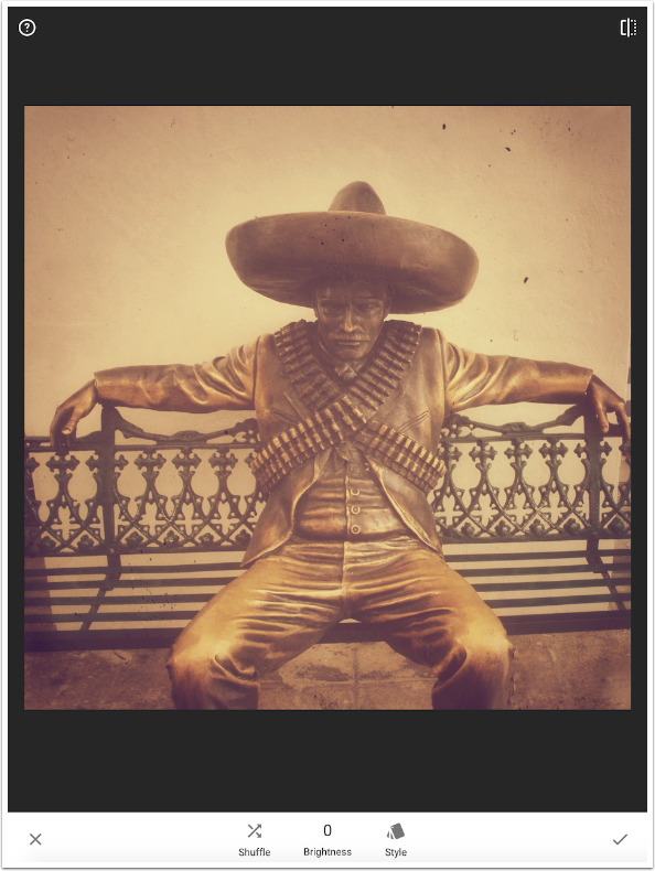
In keeping with the lack of control on this filter, it is based on a randomizer – the Shuffle button. Tapping the Shuffle button will randomly change the Style, the scratches and the light leaks.
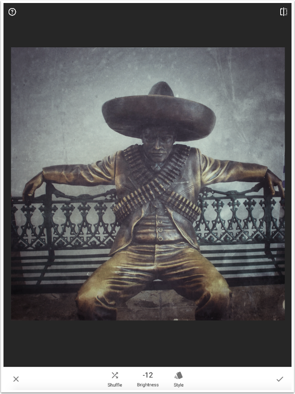
You can choose the Style from among 13 choices. You will notice, in the screenshot below, the crossed arrows within the thumbnail of the chosen style. You can tap that Shuffle button and the Style will not change, while the scratches and light leaks will change randomly.
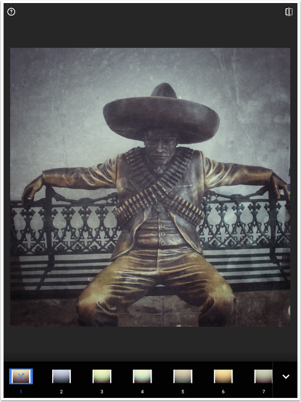
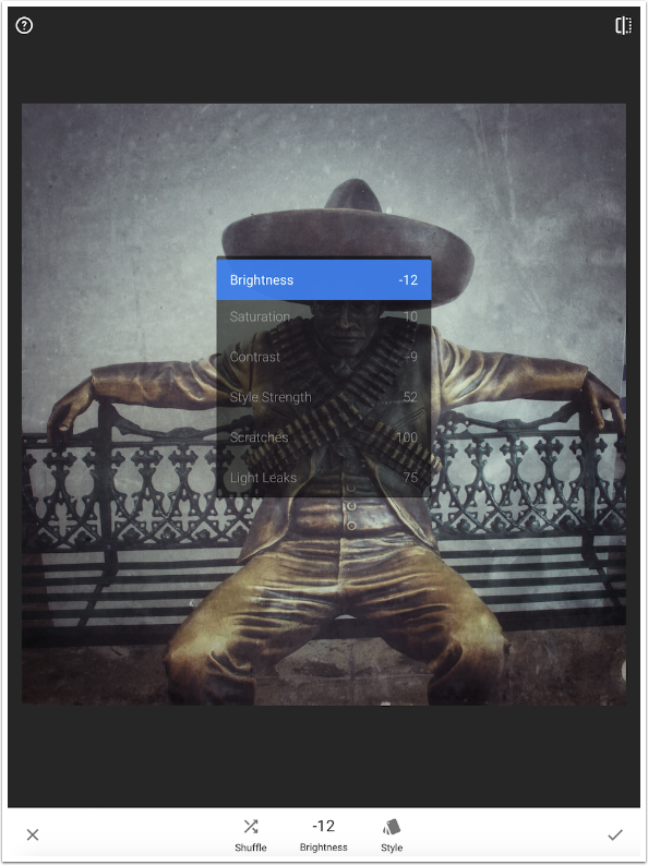
The controls are Brightness, Saturation, Contrast, Style Strength, Scratches and Light Leaks. The reason I said it is difficult, if not impossible, to make subtle changes is that if you reduce all sliders to zero, there is still a significant reduction in contrast. With certain styles, a glow is added even with the Style Strength at 0.)
Style 9 adds a glow as part of the style, as seen below.
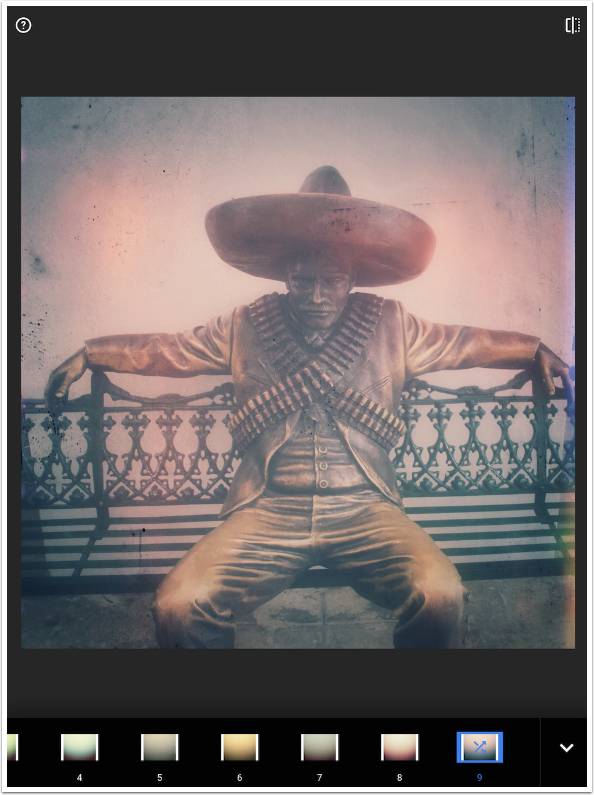
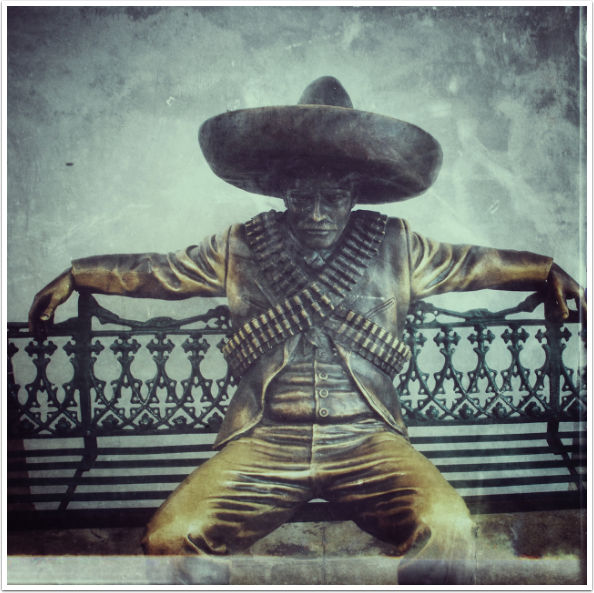
In spite of the lack of control of Retrolux, you can, with a little patience, get a pleasing result. I like the result I got below – I don’t like that it is nearly impossible to reproduce it.
Noir
Noir, to me, is a combination of the Grain Film and Black & White filters, with a little duotone and glow added in. I don’t really see the necessity of this filter, given that everything can be achieved elsewhere in Snapseed.
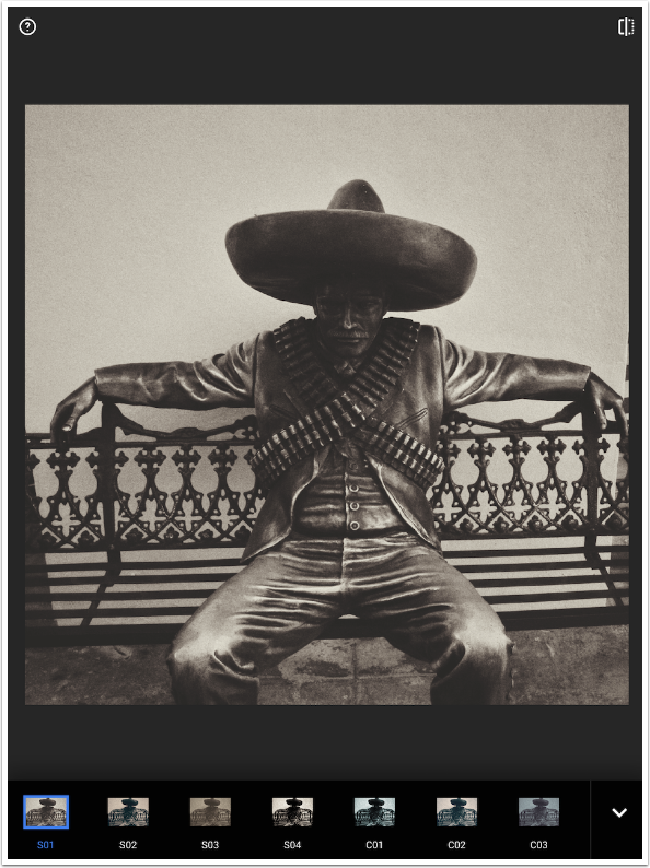
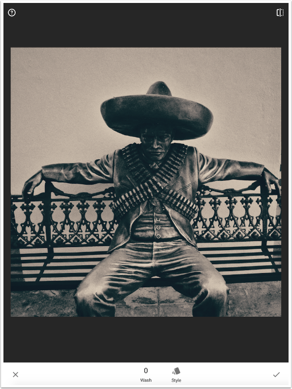
There are 14 different styles to choose from, with various levels of contrast and tints.
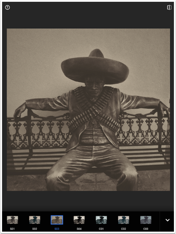
The controls are Brightness, Wash (a dark glow), Grain and Film Strength.
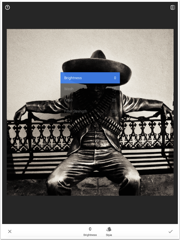
To have any chance of seeing into the shadows, you’ll need to turn Wash down to zero.
Black & White
The Black & White filter works the same as in previous releases. The controls are Brightness, Contrast and Grain. There are buttons for Presets and Color filters on the bottom.
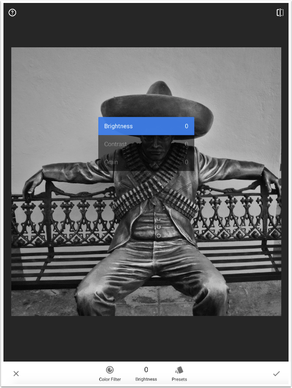
The Color Filters act as though you placed a filter of that color over the lens before taking the picture. In b&w photography, that means that that color will appear brighter in the image. For example, the tops of the statue’s legs are a bronze with a high yellow content. Therefore, those areas are lighter than they would be under a neutral or green filter.
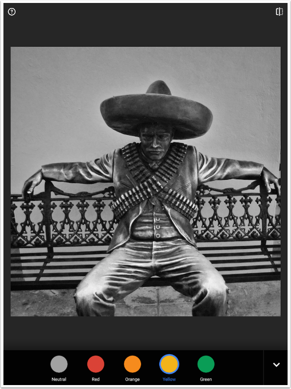
There are only six presets available for Black and White, as shown below.
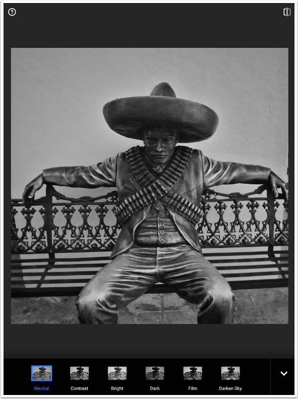
Adjustments can be subtle, but if you like, you can achieve a threshold-type result.
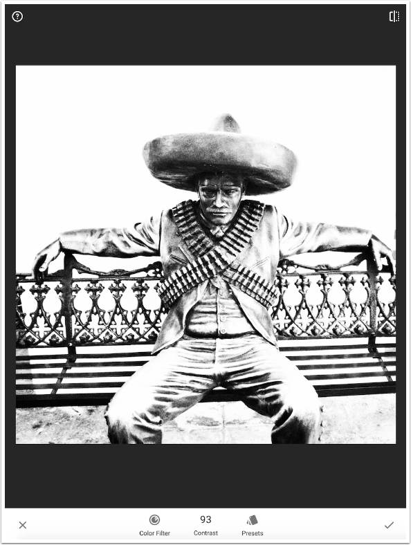
Frames
The last filter, Frames, hasn’t changed from previous releases either. You have 23 frames to choose from. The first 11 are primarily white; the last 12 are mostly black.
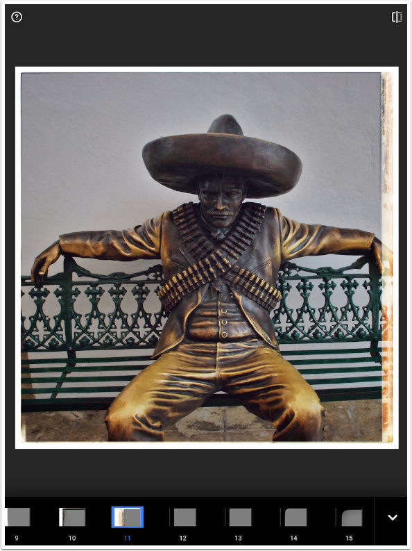
The only control is Frame Width. You expand or shrink the frame by swiping left or right.
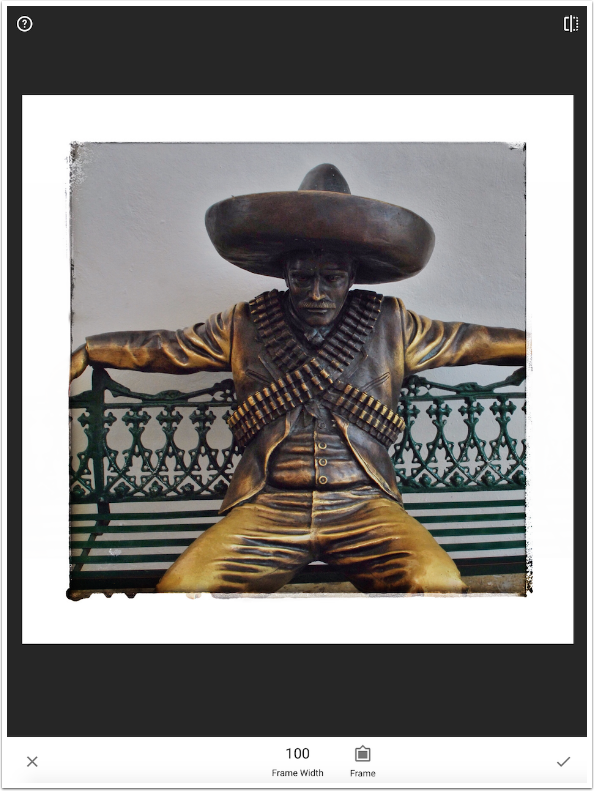
Below is my finished image for this instalment. I leave it as an exercise for the reader to tell me which filters were used.
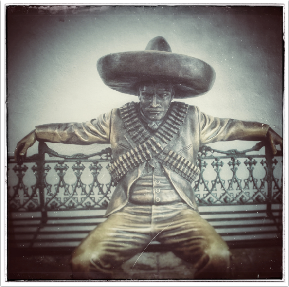
I have now covered the nine tools and the eleven filters. The real changes, and the real power of Snapseed 2.0, come with the addition of the Stack. The Stack is the basis for the final entry on Snapseed 2.0. Be sure to join me for that!


One Comment
Carlos
Thanks for the tutorial Jerry. Love Snapseed. Usually the first app I go to start working on an image. Great tools!
Wondering where this sculpture is. It looks like Emiliano Zapata, famous revolutionary from the early 1900’s.
http://en.m.wikipedia.org/wiki/Emiliano_Zapata