
Mobile Photography / Art Tutorial – Abstract Painting: It’s Time to Play
We are delighted to publish Jerry Jobe’s latest mobile photography/art tutorial for our reading and viewing pleasure. This time Jobe takes a look at the app Abstract Painting. Read his thoughts as he puts it through its paces (foreword by Joanne Carter).
Abstract Painting is free and you can download it here.
“Some apps I’ve discussed over the years are very serious photo editing apps, giving you’re the ability to manipulate curves or eliminate color casts. Some have given users serious painting tools, such as iColorama and Pixelmator.
Some apps, though, are not serious and give users tools to experiment with or to have fun with. These tools may take the form of stickers (which I loathe) or stock-figure cutouts (not much better). Most of these fun apps are not meant to be robust editing or painting apps, and have drawbacks in the user interface that reflect their simple nature.
Today’s app, Abstract Painting by Javier Casares Villaverde, is a free app that has the look of being as much an experiment for the developer as it is for the user. It has some very nice tools for creating abstracts, but the user interface has two minor and one major drawback that may keep it from being an essential app.
The first minor (in my eyes) drawback is that it is built exclusively for the iPad, and exclusively in portrait mode. There does not seem to be any real reason why this app could not be used on the iPhone. That is in keeping with the impression that the developer was learning as he wrote this”.
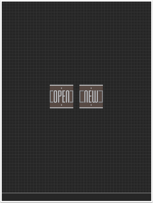
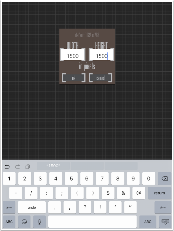
After the splash screen, you are asked to select your background for your painting. Abstract Painting allows you to paint on top of a photo, but you probably will want a plainer background for an abstract. Open allows you to use an image as a background; New allows you to specify the size of a new canvas.
Here we see the other minor drawback. Rather than quickly being able to choose an aspect ratio and/or size from a list, the pixel dimensions of the canvas have to be entered directly. That means switching to the numeric keyboard and typing in the first number, then tapping the next field, switching to numeric, and typing again. Can’t keep the pixel dimensions of a 5×7 image in your head? Well, I guess you’ll have to look it up. (If you want a 1024×768 canvas, you don’t have to enter those values. Just tap OK.)
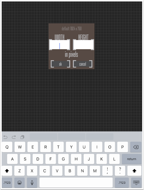
I choose 1500×1500, since a square canvas is easy to create.
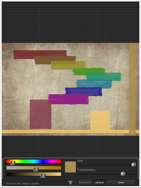
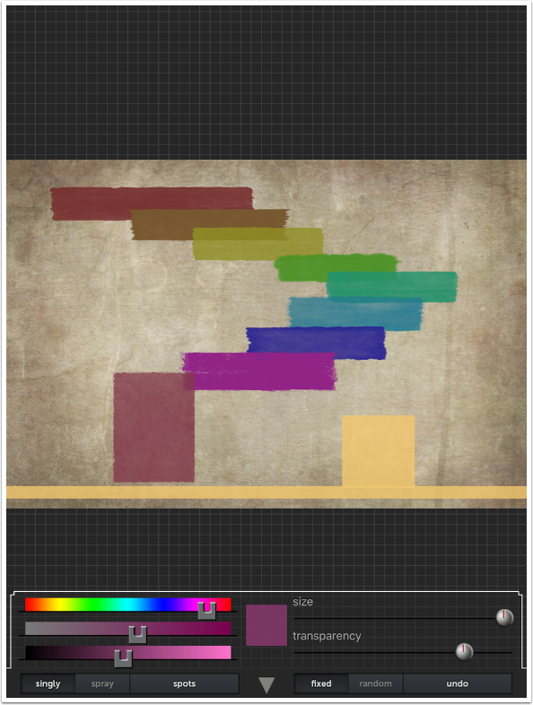
There are nine buttons along the bottom of the screen. From left to right, they are Solid Color, Gradient, Brush, Rectangles, Lines, Texture, Spots, Zoom/Drag, and Save. Below I have chosen the first button, Solid Color, because my canvas defaults to black. That’s not really an appealing color to use as a background.
You’ll notice that there are three sliders to the left that control the color: Hue, Saturation and Luminance. The square thumbnail next to the sliders shows the currently selected color. To the right of that are two more sliders, Size and Transparency. Along the bottom are three buttons: the downward arrow that closes the dialog, Fill with color and Undo.
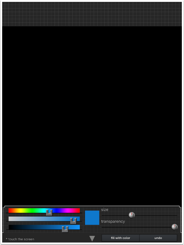
By tapping the screen, you can apply the color with a very soft-edged brush. Below I changed the color, size and transparency between tapping the image a second time.
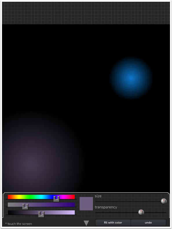
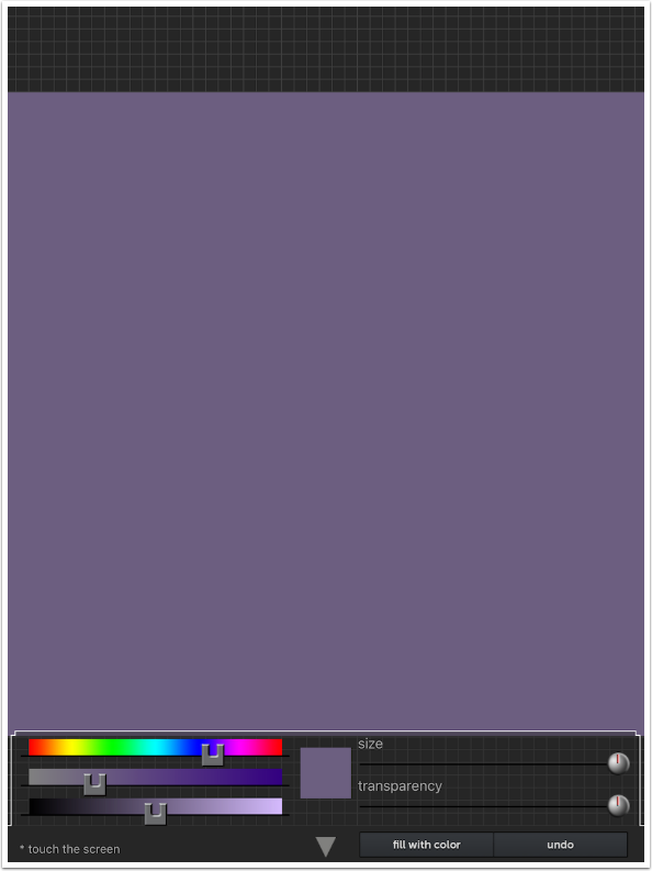
I still have that unwanted black background. I change my color and tap the fill with color button, and the color is applied to the entire background uniformly. I have the Transparency slider at 100% to cover the soft circles I made previously.
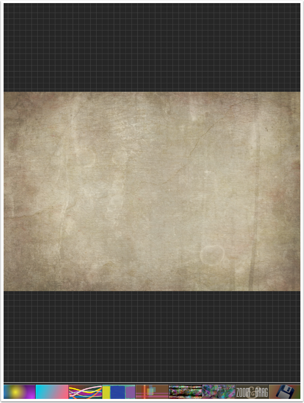
So you can see that you can use a solid background as your canvas, but for the purposes of this article I want to show you an abstract painted on top of a texture I created in another app. So I tap the Return button (the down arrow) and the Save button, and the dialog below appears. I don’t want to save the plain background, so I choose Camera Roll to select my background image.
The new background is a nice texture. Along the bottom are my nine buttons – we have already seen Solid Color and Save, the ones at the ends.
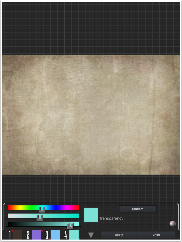
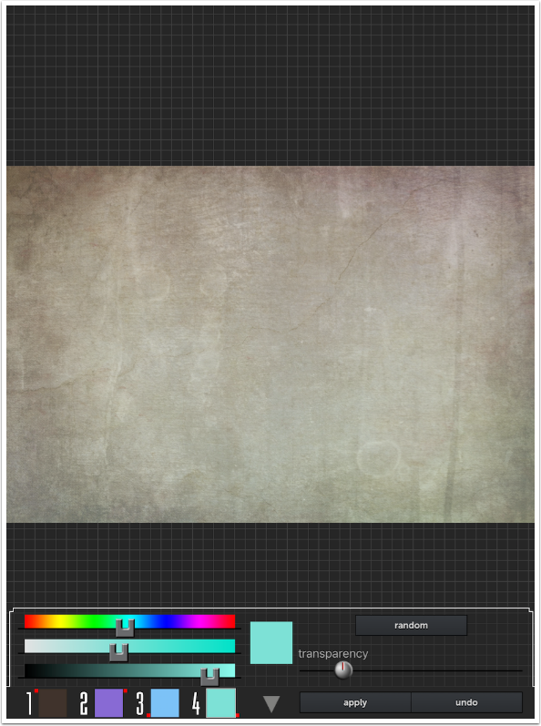
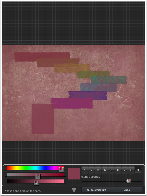
We move on to button 2, Gradient. Once again, we see the Hue, Saturation and Luminance sliders. On the right is a Transparency slider, and a Random button to choose the four colors that are part of the gradient. At the bottom left are four “wells” that hold the color. There is a red dot with each well that shows where on the image that color is placed. 1 is at the top left, 2 at the top right, 3 at the bottom left, and 4 at the bottom right. I clicked Random to get the four colors shown.
If the Transparency is set to 100%, I would see none of the underlying image. Below I’ve moved Transparency to about 70% and hit Apply. It’s too much for me, obscuring the texture.
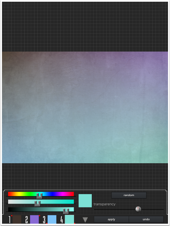
I have to hit Undo to remove the 70% gradient. Then I move the Transparency slider down to 20% and hit Apply again. This is a much more subtle tinting of my texture.
The Gradient cooled down the warmth of my texture, so I hit Undo again before moving on to the Brush tool. Because I have been using the Undo button quite a bit already, let’s take a break to discuss the main drawback to Abstract Painting: the Undo button only undoes the most recent action. Whether it’s applying a Gradient or making brushstrokes, you must immediately decide whether you want to keep that action before making another. That is not so much of an issue for Solid Color or Gradient, but it is a major issue with brushstrokes. Once I draw a second brushstroke, I can’t go back and undo the first. It is set in stone, and the only way to get rid of it is by starting over. Later in this tutorial I keep some brushstrokes I wouldn’t have because my finger skidded across the screen, making several brushstrokes instead of one – and there was no way to undo it.
Abstract Painting needs a more robust Undo function badly.
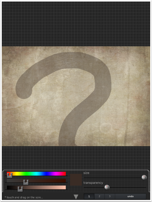
Below you’ll see the Brush tool. You will see the standard Color sliders and thumbnail, as well as Size, Transparency and Undo. The Size was at it’s largest as I made the stroke you see.
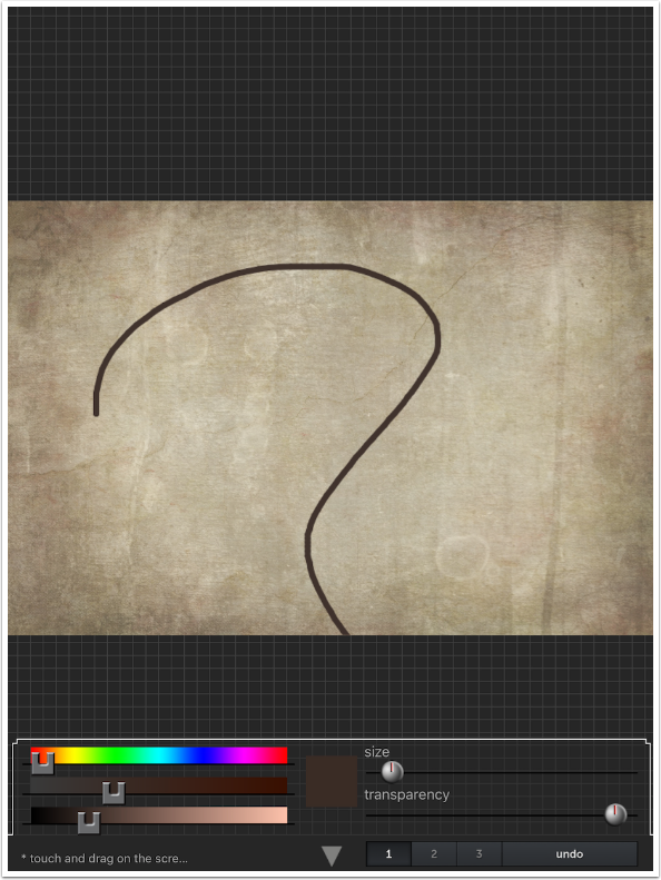
Decreasing the size and increasing the Opacity/Transparency (after tapping Undo) resulted in the stroke below.
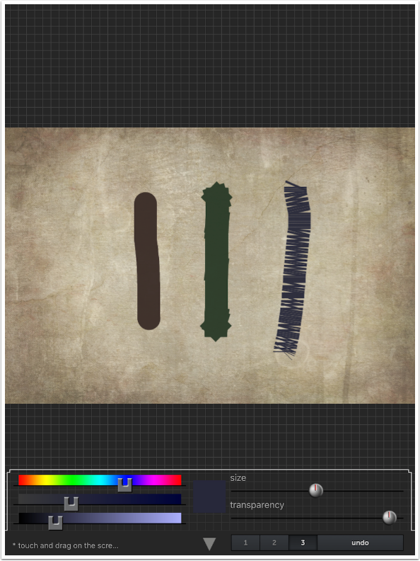
There are three brush types, controlled by the numbered buttons. 1 is the round brush, seen on the left. 2 is a square brush, seen in the middle. 3 is a kind of a stitch brush, as seen on the right.
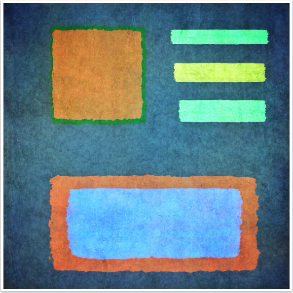
The next tool, Rectangles, may be my favorite. If you are familiar with the work of Mark Rothko, you have seen examples of the type of thing you can do with the Rectangle tool. It paints rectangles with texture and rough edges. You have nine different edge/texture combinations, illustrated below from top to bottom. The rectangles are produced by dragging out a bounding square defining the size of the rectangle. When your finger is raised from the screen, the rectangle is drawn in.
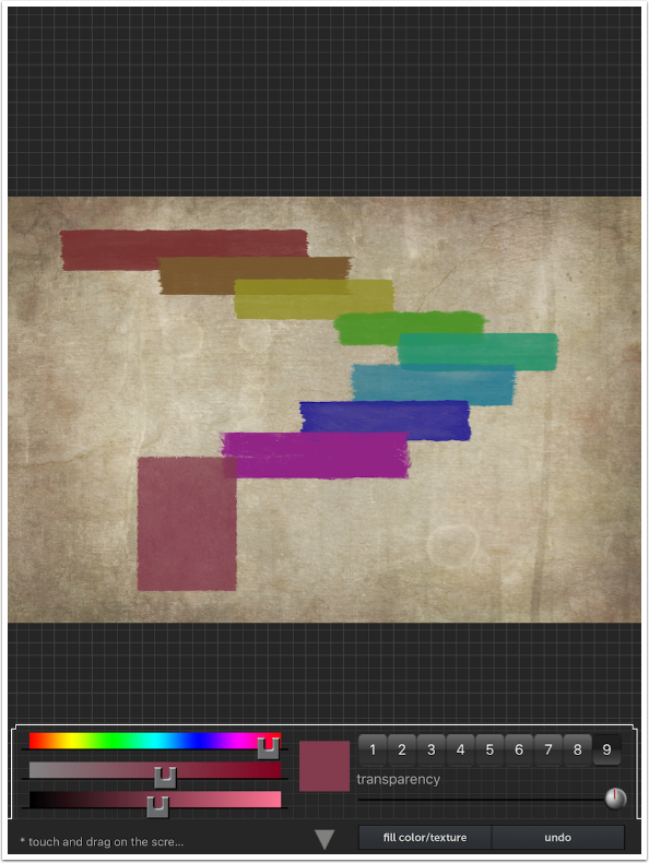
You can also tap the button at the bottom to fill the entire image with the color and texture of one of the nine presets. Notice below that it’s not a solid color. (I don’t want that fill going forward, so I tapped Undo after taking the screenshot.)
The next tool is Lines. In addition to Color, Size and Transparency, there are buttons for Horizontal and Vertical that determine the direction that the line formed radiates from your finger tap. I tapped at the bottom of the image and I have a horizontal orange stripe added.
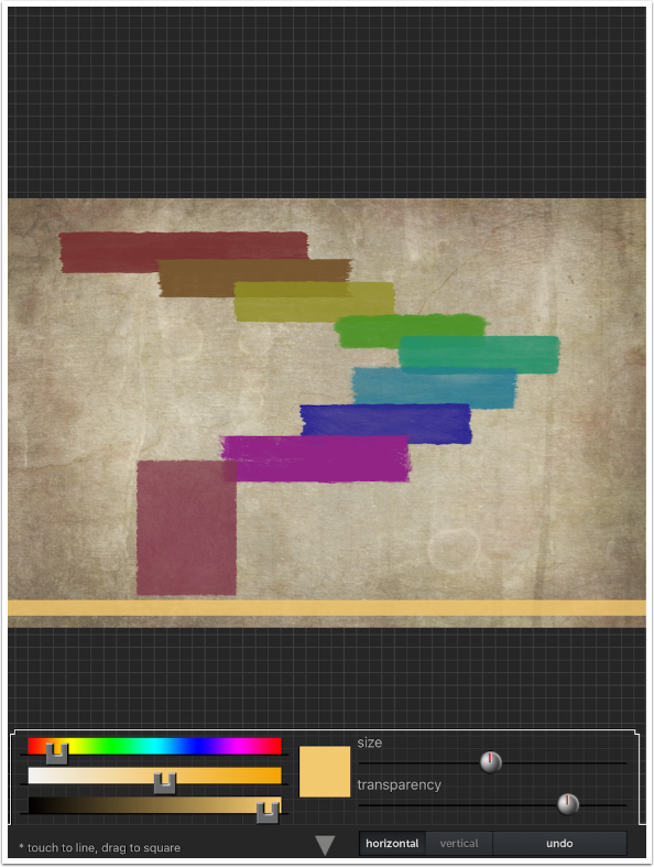
If you tap-and-drag instead of just tap, you can create a rectangle with a sharp edge instead of a line.
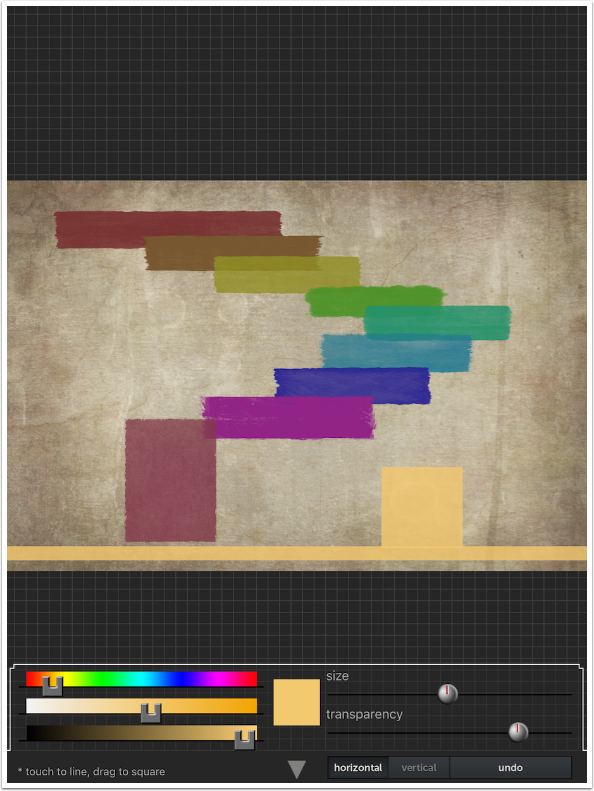
The Line tool does not create a very broad line, even when at maximum size, as shown below.
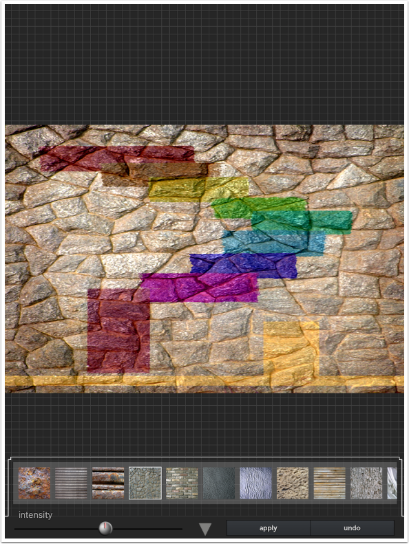
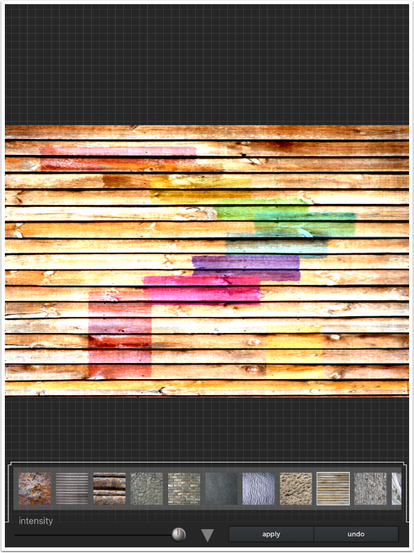
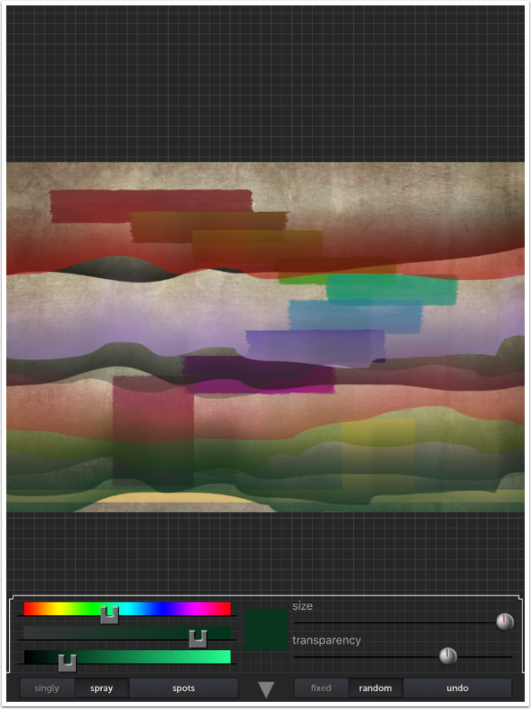
The next tool is Texture, which is applied over the entire image. There are eighteen different textures. The strength of the texture is controlled with the Intensity slider.
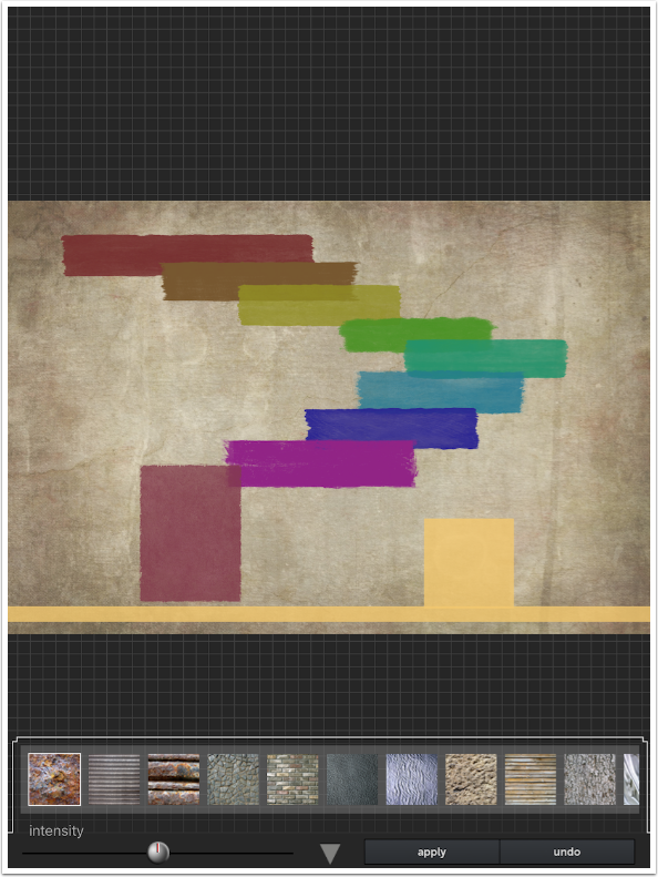
The Textures are mostly very strong stone or wood patterns. It is designed to make it look as though your abstract was painted onto the various surfaces.
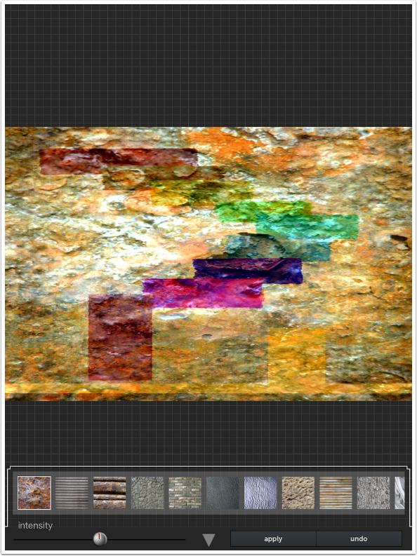
The Texture tool does not distort your image to follow the contours of the texture. For example, you don’t see the paint “running into” the cracks of the texture below.
Lowering the Intensity to almost nothing is usually pleasing, but the slider tends to “lock into” 0% if you try to set the Intensity very low.
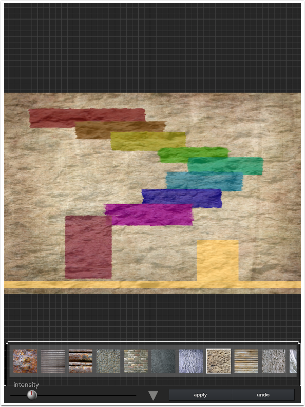
The blend mode seems to be Overlay, so you won’t lose your image entirely behind the Texture even if the Intensity is at 100%.
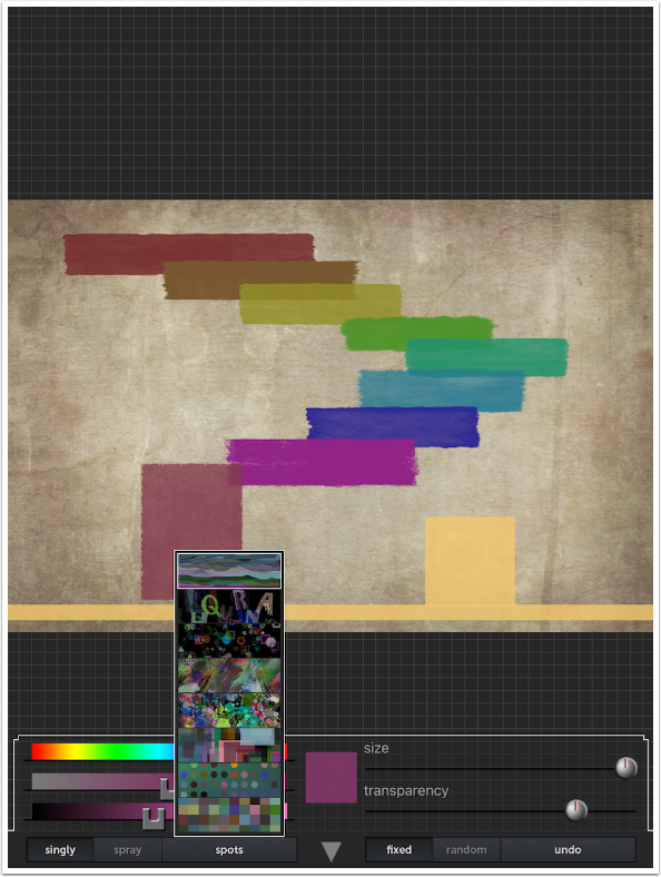
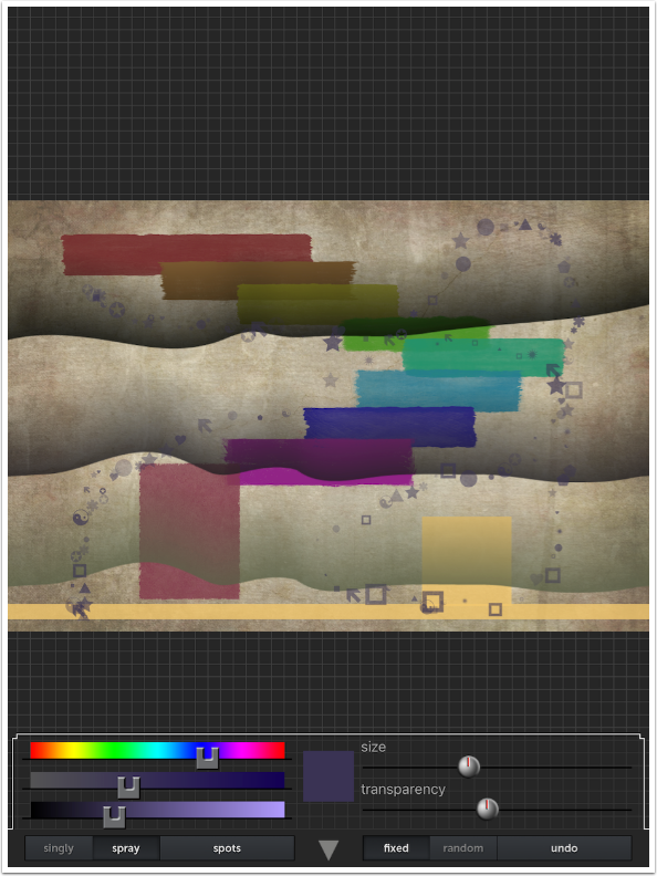
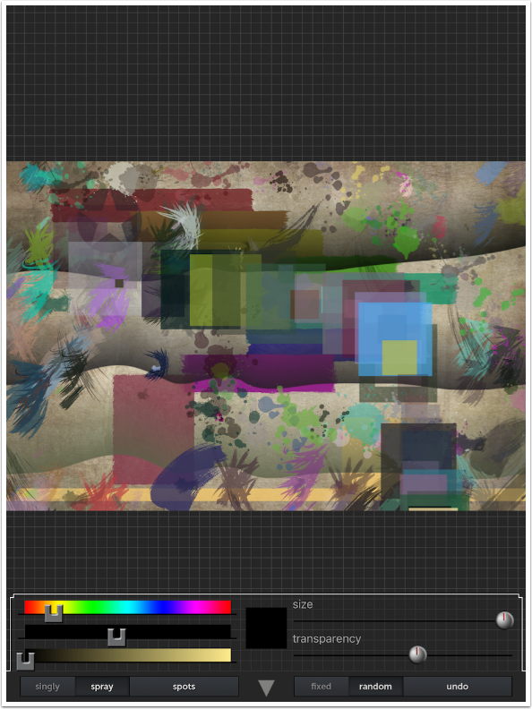
Spots are specialized brushes that can apply Singly or Spray (Continuous). The color of each “brush tip” can be Fixed or Random.
There are eight different Spot brushes, accessed in a pop-up menu from the Spots button.
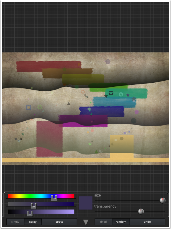
The first Spot brush is a kind of wave that fades out, like you see in pictures of the aurora. Below my color is Fixed at a light purple, and the single wave is because the “flow” is set at Singly.
I Undo, then change the color to Random. As I tap the screen in three different places, I get three different colors in the waves. This is where I foolishly did not Undo, so I am stuck with these three waves.
If color is Random and flow is Spray, then the color and Transparency change very rapidly as I drag my finger down the screen.
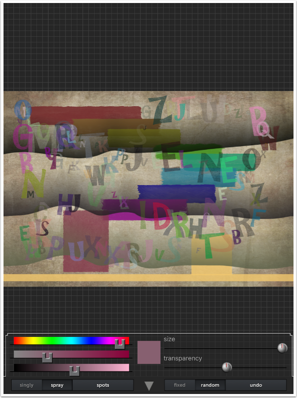
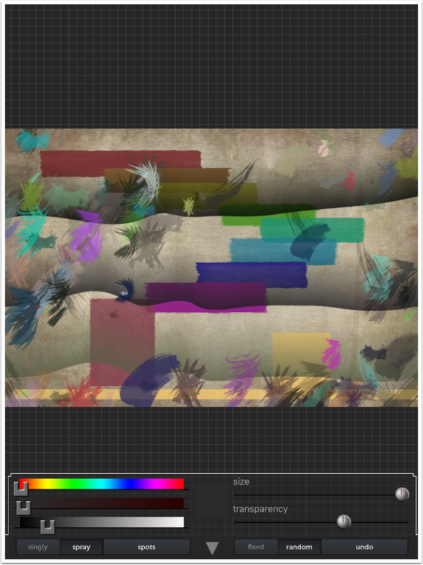
The second Spot brush is random letters. It’s not what I would call abstract, but I like the effect anyway. The main drawback in my eyes is that the maximum size is not very large.
Third is random shapes. The Size of these shapes is very small. (It seems that they are only small in Spray. Later I place a couple of shapes Singly and they are larger.)
As a matter of fact, the Size slider does not seem to affect them at all.
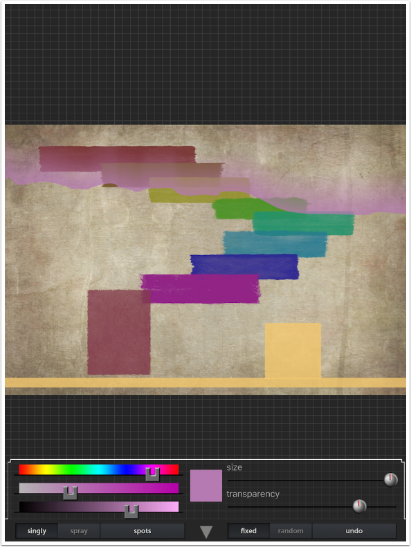
I love the swipes produced by the next Spot brush. I definitely keep this in my final piece.
The next Spot brush spatters paint. I keep the paint spatters and add a couple of Shapes Singly.
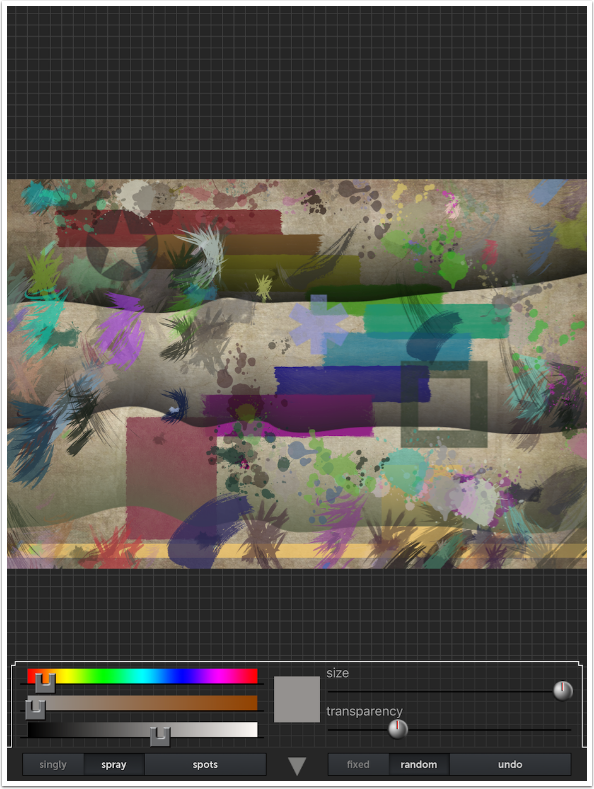
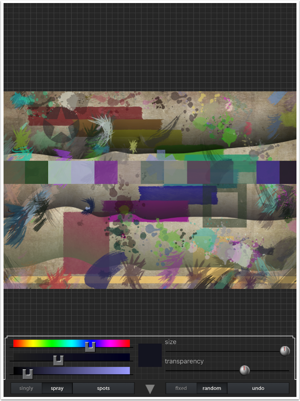
The next Spot brush paints overlapping blocks. Nice, but doesn’t fit in with my current piece.
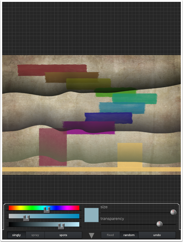
The Dots Spot brush locks in dots to a grid. No matter where I brush, dots will only be placed in the grid.

The final Spot brush places squares in a grid. Remember, Random not only changes the color as each square is placed, but changes the Transparency as well.
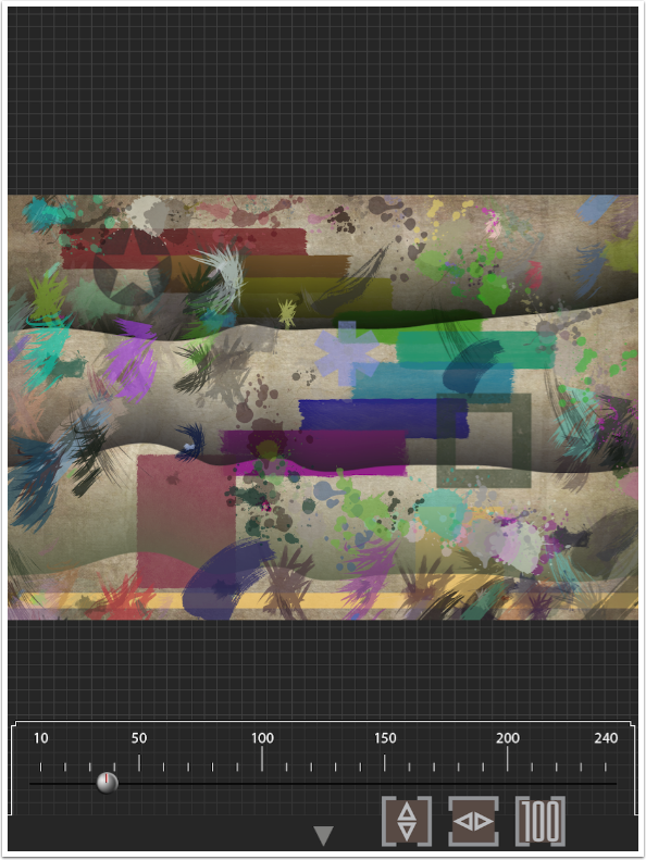
The last tool is Zoom/Move. You zoom using the slider, and move by dragging on the image. The three buttons are “fit” buttons. The first fills the screen vertically, the second fills the screen horizontally, and the third displays the image at 100%.
Once you’re zoomed in, you can change to another tool and do detail work. Below, I place another semitransparent Rectangle.
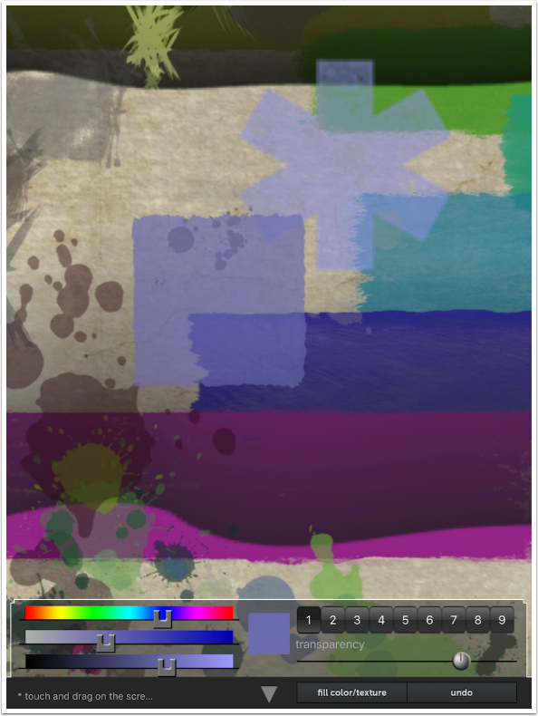
I also place two more single Shapes with the Spot brush.
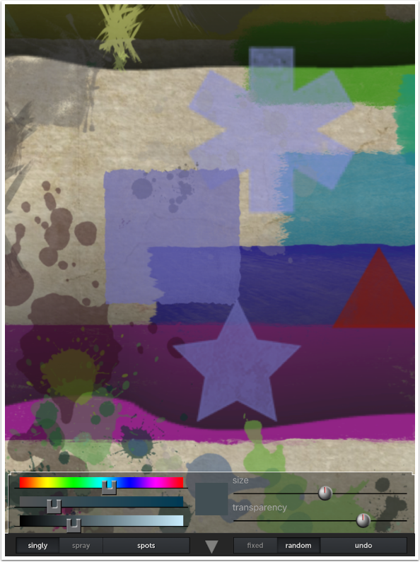
I return to the Zoom tool to zoom back out.
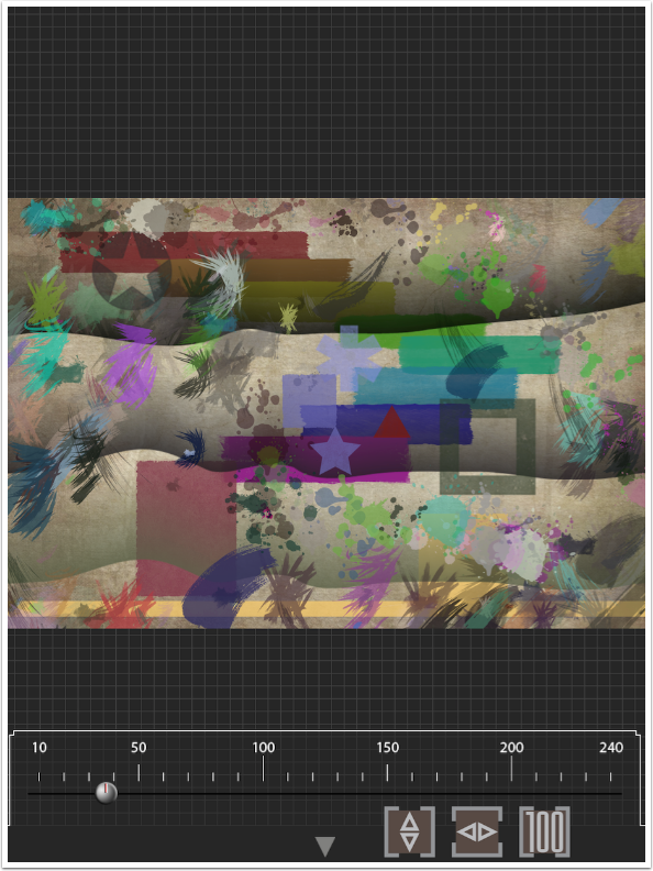
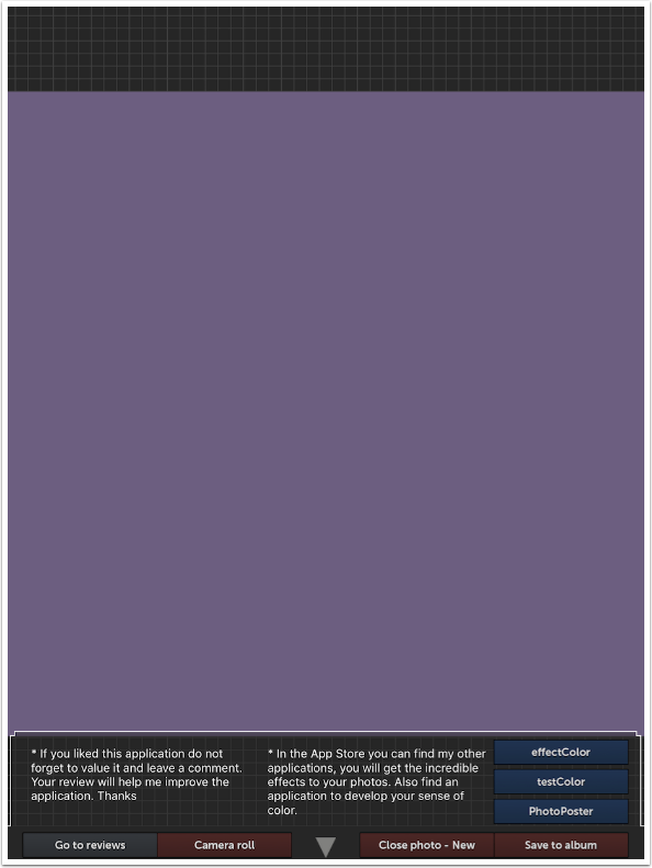
The Save tool has a single button that will save your image – “Save to album”. The other buttons will not save! Camera Roll takes you to your library to start a new painting based on an image or texture in your library. “Close photo – new” will close without saving and take you to the New dialog where you will enter the dimensions of a new painting.
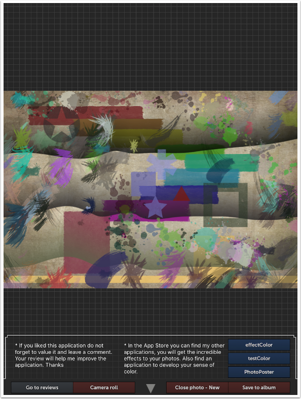
The remaining four buttons take you to the App Store, either to leave a review or view one of the developer’s other apps: effectColor, testColor or PhotoPoster.
Below I have my finished abstract, after taking it through Snapseed to give it a little pop.
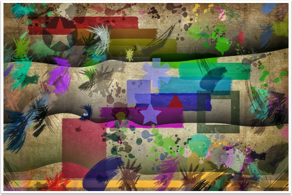
As I said earlier, it’s easy to make a Rothko-like abstract with Abstract Painting.
My final abstract went through Fragment, Stackables and iColorama to add shape and texture.
Abstract Painting is a fun app to play with or to get serious with. However, the lack of a useful Undo feature quashes the very experimentation that is the heart of the joy of creating abstracts. I constantly have to evaluate whether each stroke is a direction I want to follow, or be satisfied with an image that is not quite what I wanted. It’s a very nice app otherwise!
Until next time, enjoy (abstractly)!
TheAppWhisperer has always had a dual mission: to promote the most talented mobile artists of the day and to support ambitious, inquisitive viewers the world over. As the years passTheAppWhisperer has gained readers and viewers and found new venues for that exchange.
All this work thrives with the support of our community.
Please consider making a donation to TheAppWhisperer as this New Year commences because your support helps protect our independence and it means we can keep delivering the promotion of mobile artists thats open for everyone around the world. Every contribution, however big or small, is so valuable for our future.
Jerry Jobe
Never content with just scratching the surface of what an app can do, Jerry Jobe decided to pass on what he learned about imaging apps to others. He’s constantly trying to figure out just what tools other artists have used, and trying to incorporate them into his own work, in an attempt to find his style. He’s written tutorials on over 145 apps so far, which you can find (along with his Song of the Day entries) at http://enthusiasmnoted.wordpress.com/ He lives near Atlanta, Georgia, where he also finds a creative outlet in acting and directing in community theater.
One Comment
Robert Lancaster
Cool review Jerry.
Looks like an app I will have to download and create with.