Mobile Photography/Art Tutorial – ‘Polarr Photo Editor’ – Part 2: A Timely Update
We are delighted to publish Jerry Jobe’s latest mobile photography/art tutorial for our reading and viewing pleasure. This week we have published Part 2 of Jobe’s two part series on Polarr Photo Editor. If you missed Part 1, Please go here. Read his thoughts as he puts it through its paces (foreword by Joanne Carter).
Polarr Photo Editor is free and download it here
“Writing tutorials for brand-new apps can result in having incorrect information published. App developers, working under a deadline, will sometimes release an app that works, but is not entirely what they wanted. The app developers will then work the final changes into an update, which may or may not change how the app works shortly after its debut.
After I wrote Part 1 of this Polarr tutorial, but before it was published, Polarr had such an update to their app. It wasn’t that the app didn’t work, or was full of bugs – it just didn’t have all the features they had planned. As we continue with part 2, I’ll point out the changes, bringing the information on this app up to date”.
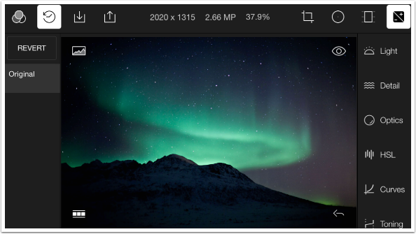
The first thing that changed is the default image. Last time I showed you the polar bear default image. It was changed to an image of the Aurora Borealis taken near the pole. I’ll be working with this image throughout this part of the tutorial.
I described, in part 1, the controls seen on the screen below. Across the top, we have Filters, which are collections of adjustments, followed by History, Import, Export, Info, Crop, Circular masking, Gradient masking, and Adjustments. History is shown listed at the left side of the screen. The individual adjustments are listed down the right side of the screen, grouped by categories. I illustrated the Color adjustments in part 1, so I will continue with the Light adjustments.
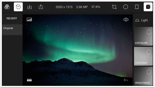
The Light Adjustments include Exposure, Contrast, Brightness, Highlights, Whites, Blacks, Shadows and Diffuse. I showed you last time that there are two ways to change the value of the adjustment “pads”: swipe left or right on the pads, or hold the pad and tilt the device (a cumbersome method that Polarr seems inordinately proud of).
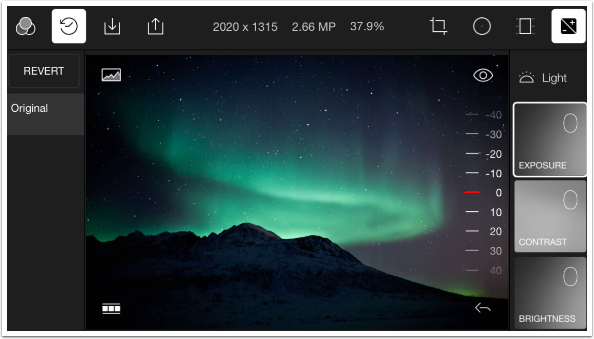
While watching the promotional videos provided by Polarr, I saw there was a third method to changing the value that was not implemented in the debut version. Tapping once on a pad reveals a dial with positive and negative values. The user can then swipe up and down to dial in a value for the adjustment. In the case below, the Exposure can be changed using the dial. Negative values darken the exposure, and positive values increase, or lighten the exposure.
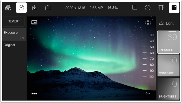
I increased the exposure to 69.
Below I returned the Exposure value to zero. Note, once again, that all adjustments made are reflected in the History. I changed the value to 69, 9, -28, -38 and back to zero. All these value changes are reflected in the history. All the history states are not recorded when you create a Custom Filter; only the ending values.
I also scrolled down to show the next four adjustments available under Light: Highlights, Whites, Blacks and Shadows.
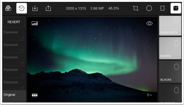
I tapped Shadows once and brought the value up to 83.
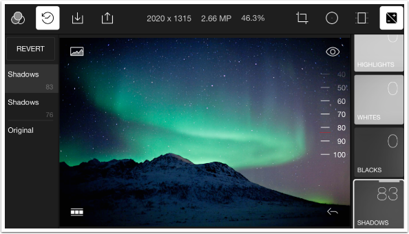
The final Light adjustment is Diffuse, which brings a bit of diffuse glow to the image. Below you’ll see that even a relatively high value of Diffuse (64) is still a subtle effect.
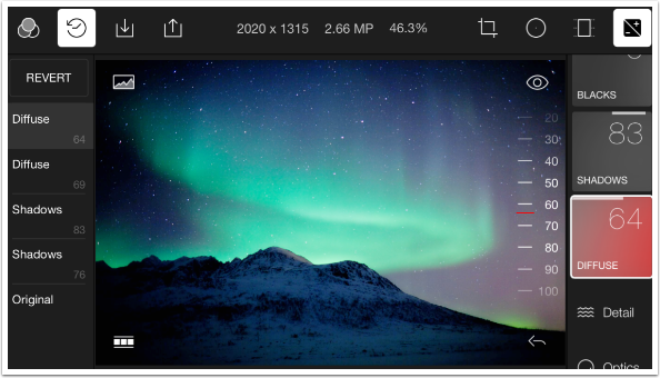
The next adjustment category is Detail. Clarity is equivalent to the Structure control in Snapseed, which sharpens larger details, but not the small ones. This is an attempt to sharpen the image rather than the noise, which is greatly appreciated. Sharpen will add sharpness to any noise present; it doesn’t differentiate.
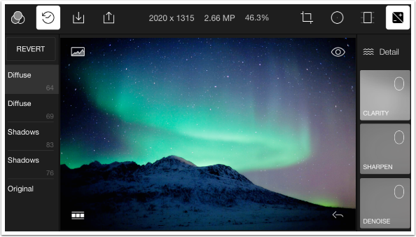
There are two other adjustments within Detail: Denoise and Dehaze. These two values are part of the paid upgrade. That means that I can experiment with those features on the default image, but as soon as I try them on my own image, they are locked.
The Denoise feature works fine. As usual, if you zoom in to examine how well the noise is eliminated, you will see that the averaging that takes place to eliminate the noise results in a blocky, painterly look that eradicates small details. (The price you have to pay for eliminating noise.)
Dehaze is hard to evaluate with the sample image, since there is no real fog or haze.
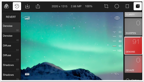
The next category is Optics, and that is further broken down into Vignette, Grain and Lens. The Vignette adjustments, shown below, are Amount, Feather and Highlights. The Highlights control indicates that this is not merely a black or white overlay. That would treat highlights the same as shadows. The Highlights adjustment allows highlights, like the pinpoints of the stars, to shine through the vignette if desired.
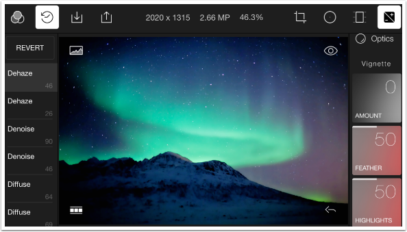
Grain controls are Amount and Size.
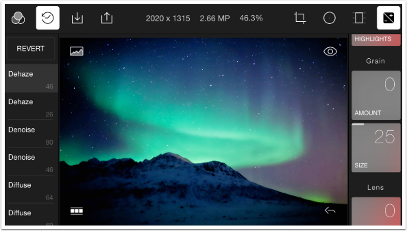
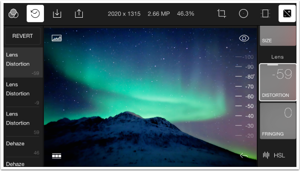
Lens controls are Distortion and Fringing. These are meant to correct Barrel or Pinhole distortion and Color fringing, but they can also be used to introduce those lens problems. For example, below I introduced barrel distortion to an image that didn’t have any.
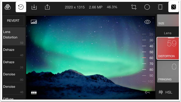
A negative value introduces pinhole distortion.
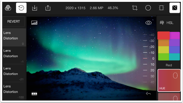
The next category is HSL (Hue, Saturation and Luminance). The eight blocks represent the standard “colors of the rainbow” (red, orange, yellow, green, blue, indigo, violet) plus aqua. Tapping the color block allows you to change the hue, saturation and luminance of the individual color. In the image below, Red is highlighted and I could change all the reds in the image (none, in this case).
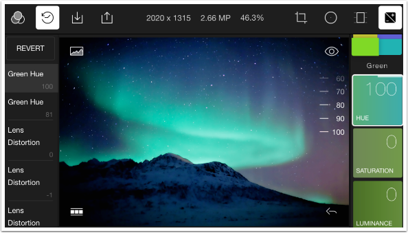
The Hue slider will not allow for a full change of color. For example, the Green hue value of 100 below changes the green to a blue, while -100 changes it to a yellow-orange. You cannot change a green to a red, magenta or purple.
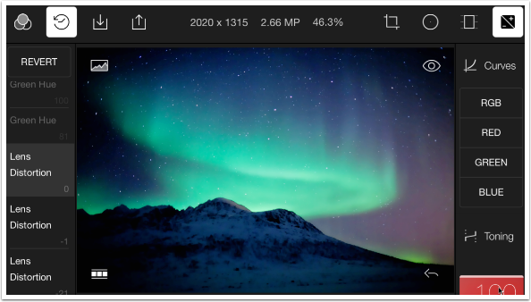
Polarr has curves control, and not only for the luminosity across the whole color spectrum (RGB), but for the individual color channels (Red, Green and Blue) as well. Huge treatises have been written on the use of curves, and it’s beyond the scope of this tutorial to describe the full use of a curves adjustment. Suffice it to say that curves help you pinpoint adjustments to a certain tonal range within your images – the shadows, midtones and highlights. Those adjustments can include change of color as well as brightness.
Below I’ve tapped the RGB curve button, and a sloping graph appears. This is the default curve, with darker tones to the bottom left and lighter to the upper right. There are two points defined on the curve: the black point and white point, at the ends. You can add other points to the curve by tapping anywhere on the curve (or line, as is the case with the default curve). Added points can be deleted with the use of the trash can icon in the curves grid.
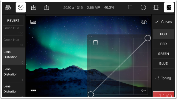
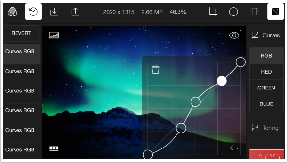
I started by tapping in the middle. I wanted to lighten the midtones while leaving the black and white points intact. So I dragged the middle point up, to lighten. This also lightened the shadows and highlights, because the entire curve is moved by moving the single point. I added two more points, one on either side of the midpoint. On the highlights side I moved the point back to the default line. But the shadows point was moved below the default line, making the shadows darker than the original. This change can also be discussed by means of contrast. When a slope is made steeper, the contrast is increased. So if we number the points 1-5, then we decreased the contrast between 1 and 2; increased between 2 and 3 (midpoint); decreased between 3 and 4, and kept it the same between 4 and 5.
The RGB curve changes luminosity. By manipulating the color curves, you can do the same kind of changes to colors. Perhaps you think the shadows are too blue. You can access the blue curve, place points at the shadows, midtone and highlights, then pull down on the shadow point, decreasing the amount of blue in the shadows. (Weird things happen if you don’t place the other anchor points. Don’t get discouraged. Powerful tools require more work to get them right.)
I did not really need a Curves adjustment in this case, so I deleted it before moving on.
The Toning control allows for creating a duotone. It tints the image with two colors, one for the shadows and one for the highlights. The controls for Highlights and Shadows are palettes to identify the tinting color. Thes controls are the hardest to work within Polarr. You can’t just change the color in one smooth move. It took me three moves of the Highlights control to get the circle to that saturated red, as evidenced by the three steps in History.
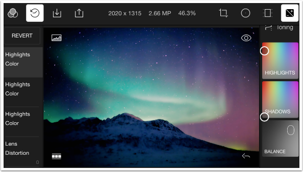
I had to move the Shadows puck even further, and that required even more steps. I now have my highlights tinted red, and my shadows tinted aqua.
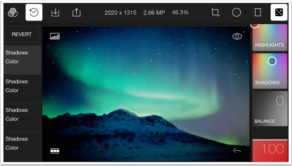
By moving the Balance to the negative side, I increase the portions of the image that are counted as “shadow”. The aqua affects the midtones and highlights as well.
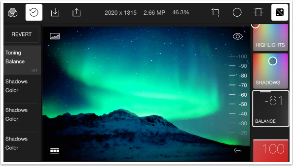
I think I prefer the Balance weighted towards the Highlights in this instance. It gives the sky a nice purple hue.
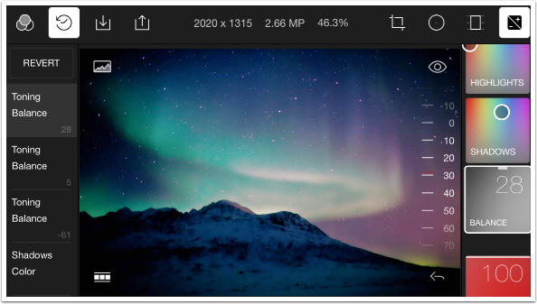
The final adjustment control is useful when applying filters (which, as I’ve stated several times, are collections of adjustment values). Adjust All defaults to 100%, so all filters are applied at full strength. By decreasing the Adjust All control, you can tone down those filters you find too strong.
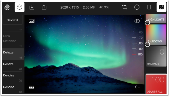
Below I adjusted, not a filter, but all the changes I had committed here. I lowered it to 65%, or about two thirds of full strength. I do that to show you how Adjust All works, not because I made the changes too strong and feel I have to pull them back. I later restored the Adjust All to 100%.

The changes made by the update, in addition to the new sliders/dials and the Denoise and Dehaze tools, included moving one function from paid to free: Custom Filters. You no longer have to pay for the in-app purchase to save your own collections of adjustments. In order to save your Custom Filters, tap on Filters and then scroll horizontally to the Custom group. There you will see a button marked Create New.
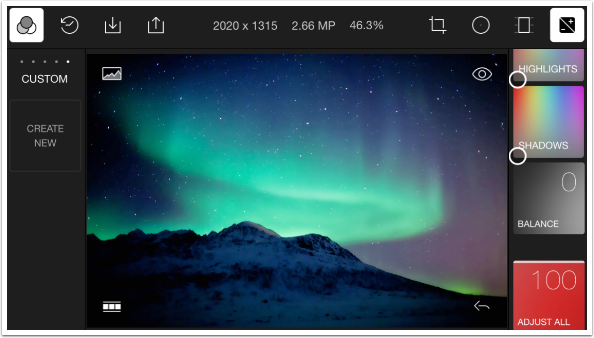
Next you will see the Custom Filter dialog, where you can name your new filter. There are three boxes. Crop is not checked because a crop was not included in our changes. Global Adjustments, which were made, is checked. There’s a big lock on the Local Adjustments, because that feature is part of the paid changes. Type in the filter name and press Save.
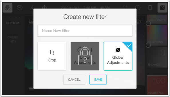
Pressing the lock icon anywhere in the app where it appears will give you the opportunity to complete the in-app purchase. Quite frankly, I had not intended to get the in-app purchase when it was limited to custom filters and circle and gradient masking. However, the Denoise and Dehaze features are intriguing. But $4.99 worth of intriguing? Perhaps not.
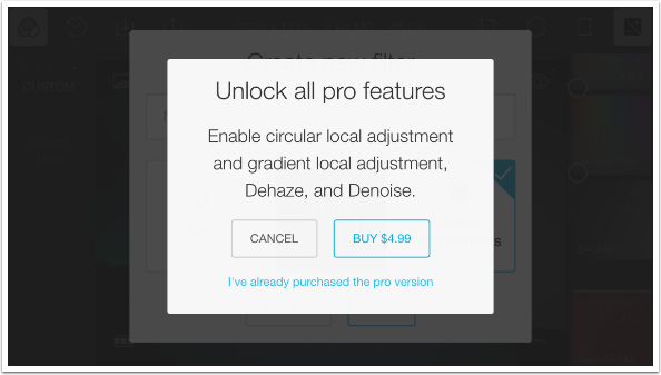
Let’s take a look at the masking. Once again, let me stress that this is only available without purchase when working with the sample image. It will not work with your own image, or save as part of your custom filter.
I start with circular masking. An ellipse appears over your image, which you can move by dragging the center button, and change by moving the two buttons on the edge of the ellipse. Once you have the circle/ellipse in place, all the adjustments are available to you. The adjustments are at 100% at the center of the ellipse, and fade out as the edges are reached.
The adjustments are not broken into categories, so you may have to scroll to get to the adjustment you require. Once you find the right one, the pad works the same way: side-to-side swiping, hold-and-tilt, or tap and move the dial that appears will all work to change the value of the adjustment.
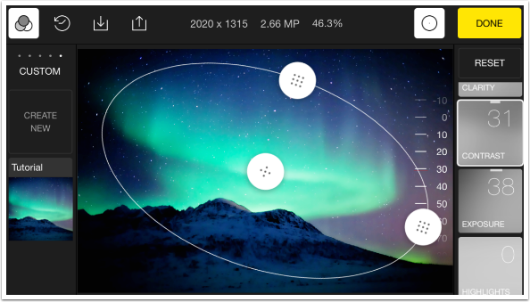
The Gradient masking works similarly. You’ve got a center button where the adjustment is hidden. However, you would think the adjustment would fade in at both top and bottom as it nears the outside lines. This is not true. It only fades in towards the bottom. It is a single gradient, not a mirrored gradient. So if I wanted the adjustment being masked to appear smoothly from the top to the bottom, I would have to drag the center button to the top of the image, and drag the bottom line to the bottom of the image. If I wanted to have the adjustment show more at the top, I would have to rotate the gradient 180 degrees using the button on the bottom line.
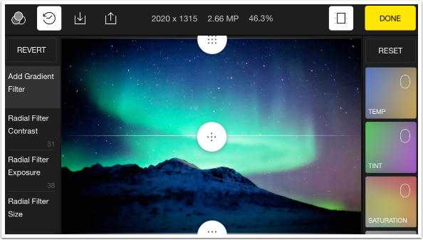
Below I’ve rotated the gradient as I’ve described, because I wanted to “warm up” the top of the image using the Temp adjustment. By the time the Temp adjustment reaches the middle line/button at the top of the mountains, the warming fades away to 0 and stays at 0 throughout the bottom of the image.

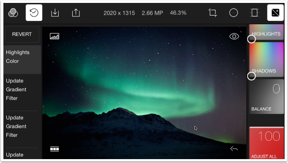
Let’s do a comparison of “before” and “after” the changes were made. Below is the “before” image, accessed by pressing the eye icon at the upper right of the image.
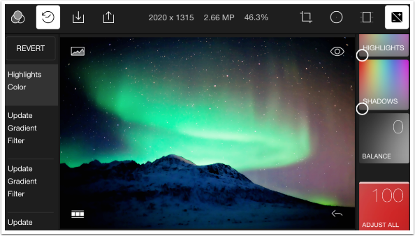
And next we have the “after”.
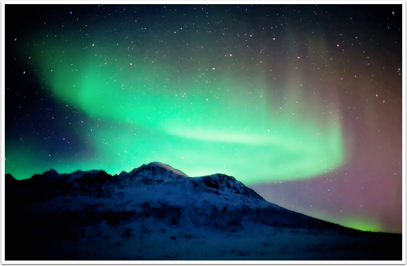
I saved the result, which is shown below.
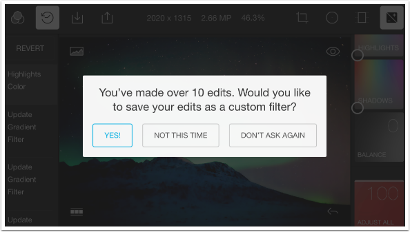
When you save, a dialog box appears asking if you want to save your changes as a custom filter. I’ve already done that, so I choose “not this time”.
Applying Custom Filters is simple. Just import your image, go to the Custom filter category as shown below, and choose the filter you’ve added. I called mine Tutorial.
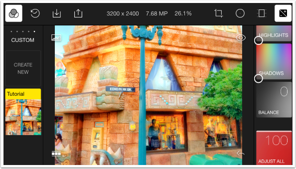
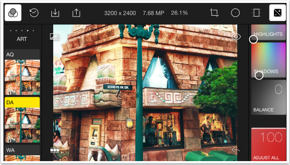
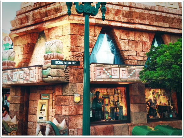
The Tutorial filter was too bright and washed out for this image, so I switched to the Art category and chose DA.
So, bottom line: should you choose Polarr as your basic photo editor? It is free in its initial version, and the adjustments work well, if a trifle clunky. The masking is nowhere near as good as the masking in Snapseed, which is also free. In addition, the masking in Polarr is a hefty (for an app) added expense. Snapseed does not offer Curves, Denoise or Dehaze (but Denoise and Dehaze in Polarr are an extra expense).
I would say that if you were familiar with Curves and wanted a free, quick way to make those adjustments, then the free version of Polarr will be of value to you. Otherwise, I’d have to say I feel a chill towards Polarr.
TheAppWhisperer has always had a dual mission: to promote the most talented mobile artists of the day and to support ambitious, inquisitive viewers the world over. As the years passTheAppWhisperer has gained readers and viewers and found new venues for that exchange.
All this work thrives with the support of our community.
Please consider making a donation to TheAppWhisperer as this New Year commences because your support helps protect our independence and it means we can keep delivering the promotion of mobile artists thats open for everyone around the world. Every contribution, however big or small, is so valuable for our future.
