Mobile Photography/Art Tutorial – iColorama 3.91: More Art Choices Than You Can Shake 1000 Brushes At
We are delighted to publish Jerry Jobe’s latest mobile photography/art tutorial for our reading and viewing pleasure. This week Jobe takes a look at the hugely popular mobile photography and Art iPad app update to iColorama. Read his thoughts as he puts it through its paces (foreword by Joanne Carter).
iColorama retails for $2.99/£1.99 and you can download it here
“Teresita Garit, the developer of iColorama, is everything you could wish in a developer of an art app: she is responsive to users and develops tools that she would use in her own artwork. Every month or two she comes out with a new release full of goodies, presented with no hype. When I say “no hype”, I mean that sometimes it is difficult to realize from her change description in the App Store whether a change is good or monumental. Let’s take a look at the changes for release 3.91 of iColorama. (As usual, these changes are for the iPad version. In this case iColorama S, the iPhone version, mirrors it somewhat but not entirely)”.
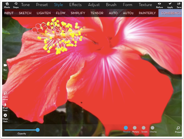
New Coherence (faster)
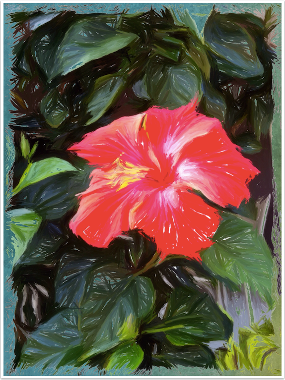
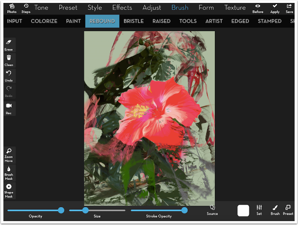
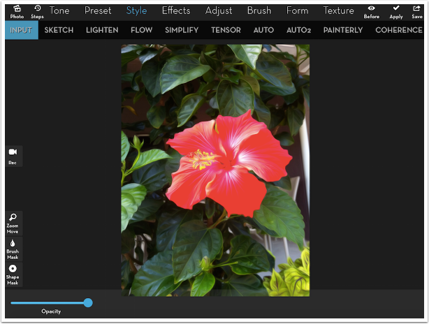
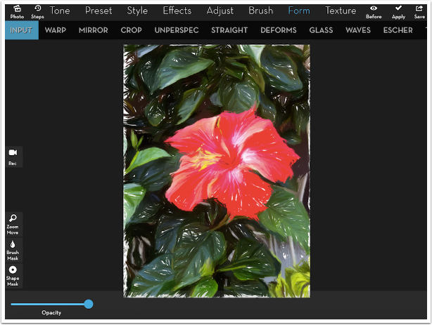
The first change adds a few presets to the Style>Coherence function. I will be working today with this image, which was used in my recent class at the mDAC (Mobile Digital Art and Creativity) Summit.

These new presets do even more smoothing than the default Preset 1. I can not determine how much faster they are, but I suggest you take a look at some of the extreme smoothing in the new presets. The example below shows Preset 1 on the right side of the screen, with the original on the left. The dividing line runs down from the “Y” in “SIMPLIFY”.
Continuous Brushing (in settings)
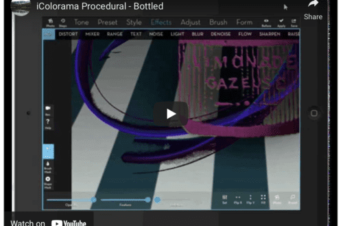
I covered this in my last video tutorial, and now it’s finally part of the release. Please watch the video for further information on this important setting. You will thank me for it.
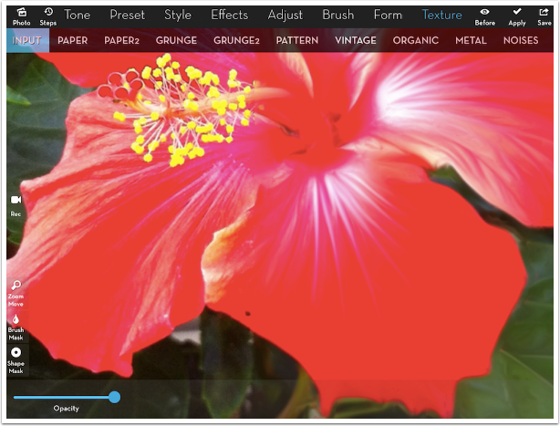
Textures ungrouped
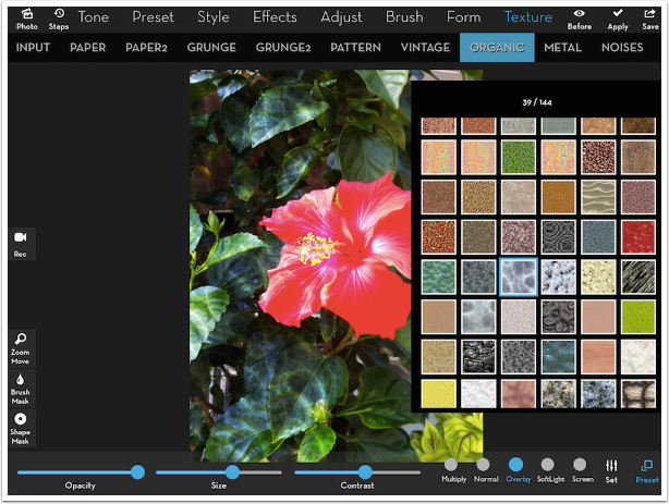
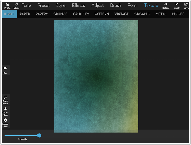
Well, they are ungrouped in a way. The path to textures was Preset>Textures, with all 500+ textures as presets under that heading. (This is still the way they are in iColorama S, the iPhone version.) I would say they are unbunched, because instead of 500+ presets under one heading, Textures now have their own top menu entry, and all those textures are regrouped under nine subheadings: Paper, Paper2, Grunge, Grunge2, Pattern, Vintage, Organic, Metal and Noise. You can see those subheadings below.
Now, instead of having to scroll and scroll through endless entries, there are a more manageable number of textures – anywhere from 28 (Noise) to 233 (Vintage). Patterns behave the same way they did when they were a separate category under the Preset menu. They have just been moved to the new Texture category.
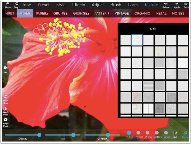
Below I’ve chosen entry #2 under the Paper category, a nice canvas texture. I’ve raised the contrast to make the texture easier to see on the right side of the image.
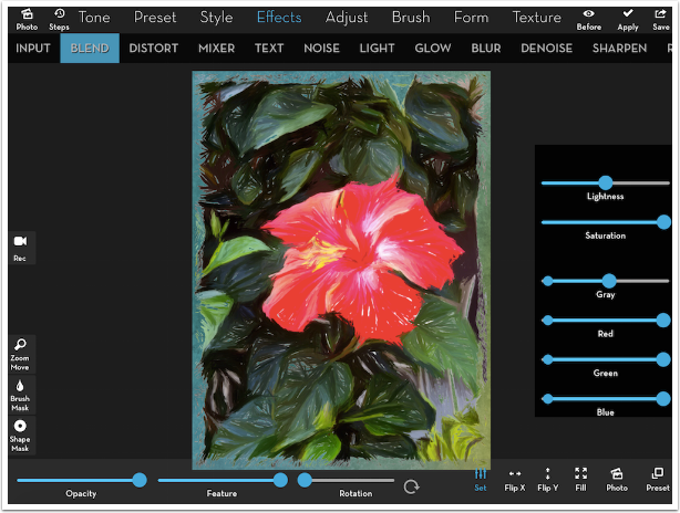
Here’s a hint on textures. The default blend mode is Multiply, which eliminates the highlights and only blends the shadows onto the image. Most textures are monochrome, which means that you are blending black and dark grey into your image. Above you can see the gray dots of the canvas texture over the red bloom. This can tend to make your images dull or muddy.
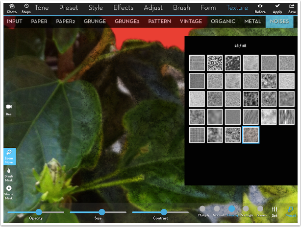
I suggest using Overlay or Soft Light blend modes when using a monochrome texture. Instead of adding gray, these modes make the existing colors lighter or darker based on the luminosity of the texture. Then I will usually increase the contrast and lower the opacity. That’s what I’ve done below with a Noise texture. See how the dark texture is green rather than gray.
Watch out though. Whether a texture is colored or not, Overlay and Soft light can tend to oversaturate the image, especially if the color in the texture amplifies the color in the image. That is not a problem with the bluish texture below (on the left side of the image) because while the texture in Overlay saturates the green and red of the foliage, the blue cuts those colors.

An undocumented change
Before I get to the final change listed in the “What’s New” description in the App Store, I need to bring up an undocumented change that, at first glance looks like a deletion of features. A bit over a year ago, in release 3.81, three new brush types were introduced, and I did a tutorial on them. The types were Paint, Plane and Bound. Below is a screenshot, and I see Paint. What happened to Plane and Bound?
As it turns out, Plane and Bound became unlabelled presets under the Rebound brush. The three presets are Rebound, Plane and Bound, respectively. Let’s give a short refresher on Plane vs. Bound brushes.
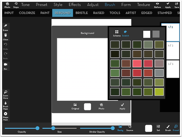
First of all, I want to change the Background, or Canvas color. I tap the Background icon, then the white color square in the Background window (NOT the one on the bottom between Source and Set). I then tap Swatch in the color picker, to see a set of colors from the flower image I’m painting.
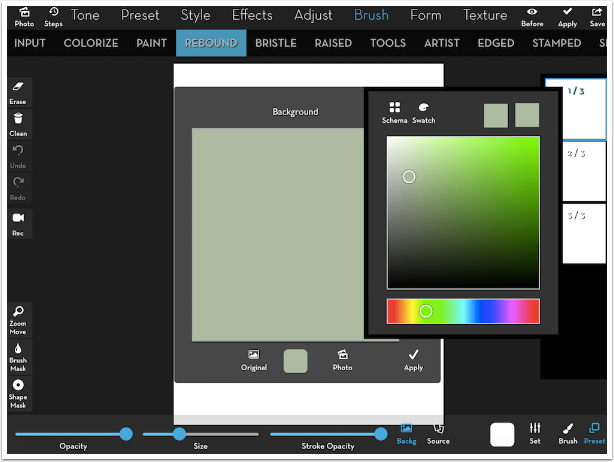
After choosing a green, I tap Swatch again to return to the regular color picker. I can now pick a lighter shade of that same green from the flower image.
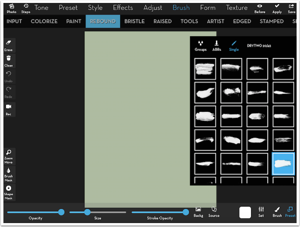
I tap Apply (in the Background window, NOT at the top) and I now have a nice green canvas to paint on. I’ve already chosen my Plane preset, so I’m ready to select a brush. I choose #20 in the DRYTWO brush group.
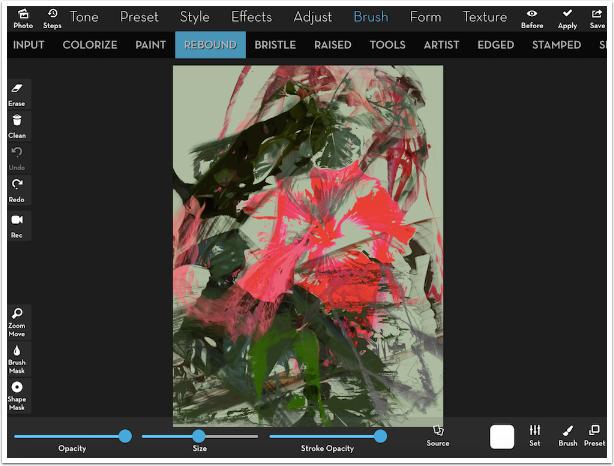
After increasing the size, I start making short strokes around the image. Plane brushes are smeary, and impart a love of action and movement to your painting. They pick up the color from the source, but then move them around. Notice how the pink from the flower is now smeared over the left side of the image.
Since Bound is a different preset under the same brush subcategory, there is no need to apply the Plane brush before using the Bound brushes on the flower itself. I changed to preset 3 (Bound), then, using the same brush, started dabbing inside the flower. Bound brushes recognize the edges between the red flower and the green leaves, and respect that boundary. As long as I touch in the flower, the relatively large brush will not sneak out into the surrounding area.
Bound brushes, like Rebound brushes, pick up a lot more detail from the underlying image. It begins to look a lot more like the actual flower.
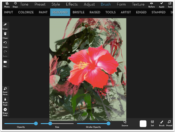
Rebound brushes capture even more detail than bound. Below I finished off the flower with preset #1, Rebound.
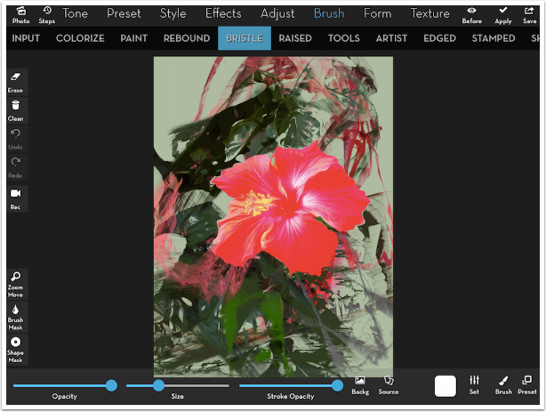
Before Continuous Brushing, you would have to re-establish the Background and Source when switching between Brush types. (You have to hit Apply when moving between brush types, or your previous brushing is lost.) Every time, you would be presented with a fresh white canvas, and the Source would be the most recently applied change, not the original image. Now your background stays as the most recently painted version, and your source is the original image, not the painted one. Below I’ve decided to use Bristle brushes on a leaf. I now will paint on top of the image painted with Plane, Bound and Rebound, and my source is the original photo.
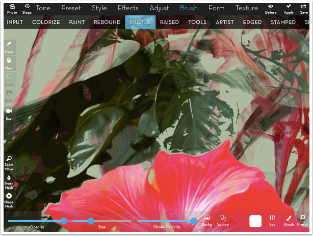
I zoom in on a leaf so that you can see the detail of a Bristle brush.
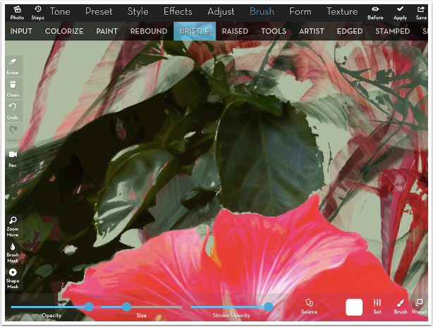
Now look at the painted leaf. Compare how you can see the actual brush strokes, where you can’t see those strokes on the flower painted with Bound and Rebound.
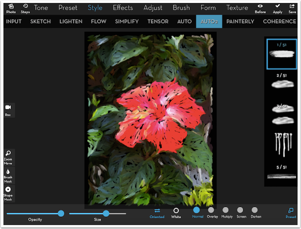
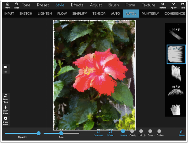
Auto2
The final new feature in this release of iColorama is Auto2, and it’s a doozy. You’ll find it under the Style menu, next to Auto. Auto is an automatic painting method, where all the brush strokes go the same way. Different presets under Auto change the stroke direction and size: Preset 12 is large vertical strokes, while 13 is small horizontal strokes. Auto2 expands on Auto, exploding into millions of different combinations for auto painting.
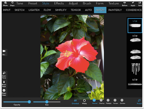
The first difference between Auto and Auto2 is hinted at with the button at center bottom – Oriented. Yes, Auto2 is not limited to a single direction. Instead, the direction of the brush follows the underlying image, just as you would do when painting.
The second difference is the Presets for Auto2 – fifty different brushes to use to auto paint. Then, preset number one allows you to access any of the hundreds of brushes provided within iColorama, plus any Photoshop brushes you may have installed. It’s an embarrassment of riches.
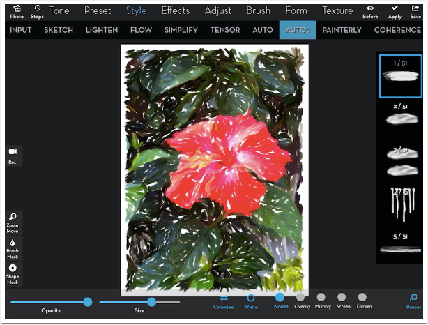
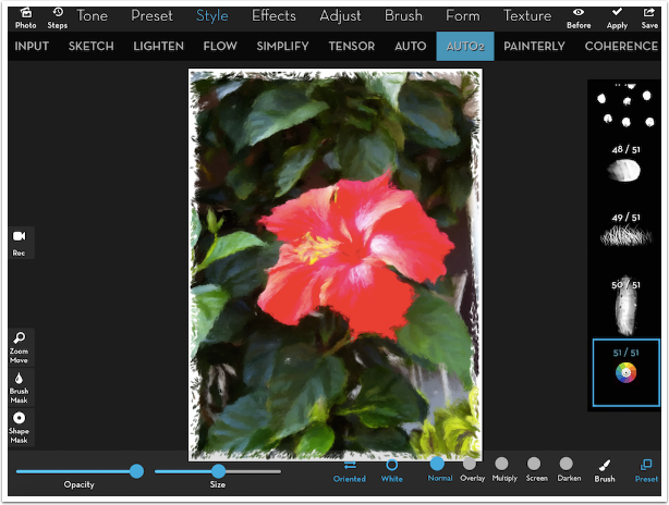
Below I’ve tapped on the first preset without changing the Size slider or tapping any of the buttons. It takes a little time to process, but is worth it. Notice how the strokes follow the leaves and flower.
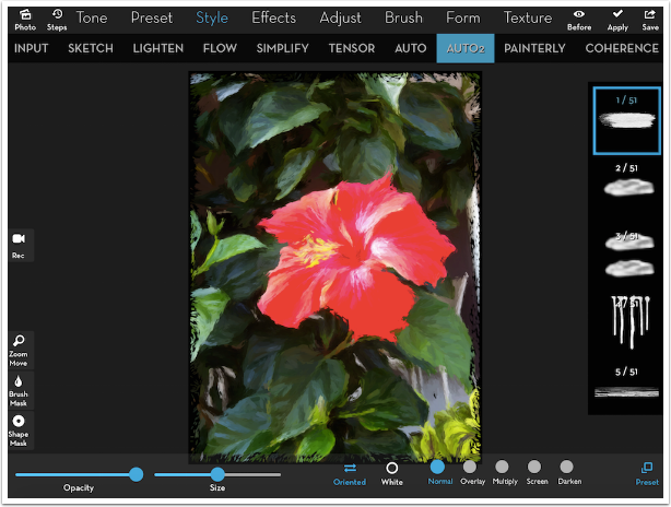
By default, Auto2 paints on a black canvas. As the size of the brush increases (I moved the Size slider to the right), more of the canvas can be seen between the brush strokes.
If you don’t like the black canvas, just tap the White button at the bottom and the canvas will now be bright white.
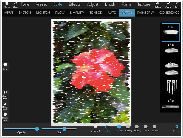
Of course you can tap Oriented and make all the brush strokes horizontal, but who would want to?
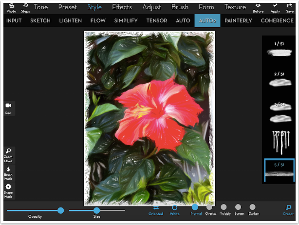
Changing the brush makes a huge difference in the look of the painting. A long, thin brush is shown below (5/51).
You need to look at the overall outline of the brush to get an idea of what the painted stroke will look like. Brush 21, because it is rectangular overall, will produce strokes that look like you were dabbing with a small square sponge.
The last preset, #51, is marked with the iColorama logo. When it is tapped, a new button appears at the bottom right: Brush.
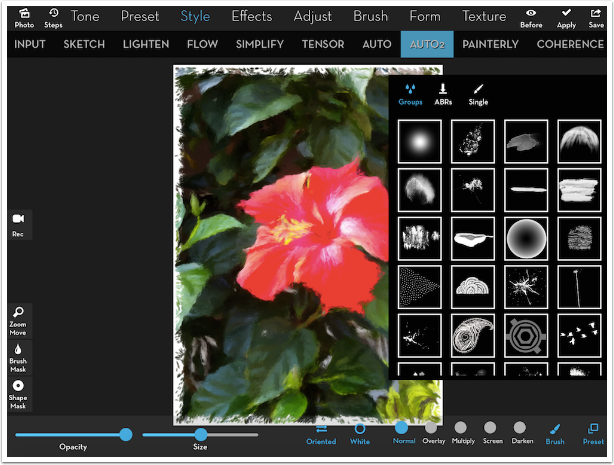
Tapping the Brush button will bring up the standard iColorama brush picker, with Groups and Single brushes within the groups. You can even select the ABRs (Photoshop brushes) that you have previously installed.
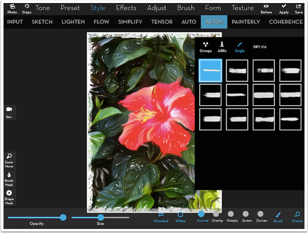
Below I’ve chosen the first brush in the DRY group.
Some people have (let’s face it) complained about the white or black border that is introduced, where we see the canvas under the painting all around the edge of the image. One solution to the “problem” is just to crop the edges under Form>Crop, as I’ve done below.
Another solution is to provide your own canvas. Below I’ve used Gradient, Lineal and Textures to build a canvas. Of course, I saved off my painting first – don’t forget to do that!
Then I brought the painted image back with Effects>Blend, and brought up the settings. By moving the button on the right end of the Gray slider to the left, the white canvas was dropped out, showing the new canvas beneath. I kept some of the white in the center by blending a second copy without using the Gray slider, masking it to the middle of the image.
Here’s my piece using Auto2.
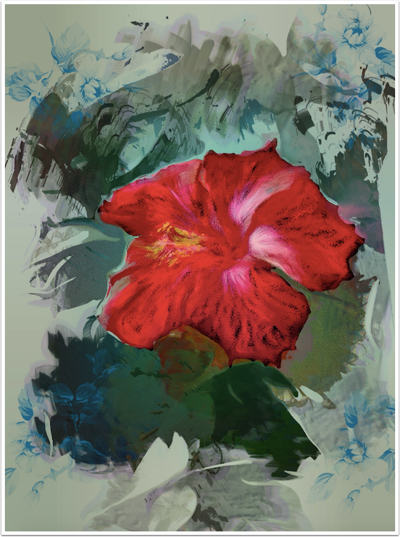
It doesn’t do any good to say iColorama couldn’t get any better, because it does so regularly. Auto2 gives you the opportunity to be a painter without ever touching a digital brush to a canvas. However, consider all the possibilities that are opened up by combining painting done by the user with masked-in auto painting. That’s just what I’ve done with my final piece, which combines the Plane brushing on the background with Auto2 painting on the flower alone. Until next time, enjoy!
TheAppWhisperer has always had a dual mission: to promote the most talented mobile artists of the day and to support ambitious, inquisitive viewers the world over. As the years passTheAppWhisperer has gained readers and viewers and found new venues for that exchange.
All this work thrives with the support of our community.
Please consider making a donation to TheAppWhisperer as this New Year commences because your support helps protect our independence and it means we can keep delivering the promotion of mobile artists thats open for everyone around the world. Every contribution, however big or small, is so valuable for our future.
Jerry Jobe
Never content with just scratching the surface of what an app can do, Jerry Jobe decided to pass on what he learned about imaging apps to others. He’s constantly trying to figure out just what tools other artists have used, and trying to incorporate them into his own work, in an attempt to find his style. He’s written tutorials on over 145 apps so far, which you can find (along with his Song of the Day entries) at http://enthusiasmnoted.wordpress.com/ He lives near Atlanta, Georgia, where he also finds a creative outlet in acting and directing in community theater.
You May Also Like
AppArt School – How to use the Afterlight app to improve your Street Photography
AppArt School – Ten iOS Painting Apps that offer Tutorials, Community Features, or Resources to Help Improve your Painting Skills