Mobile Photography / Art Tutorial – Formulas Photo Lab Effects: A Beautiful Mess
We are delighted to publish Jerry Jobe’s latest mobile photography/art tutorial for our viewing pleasure. This time Jobe features Forumulas Photo Lab Effects and the outcome is not entirely favourable…. (foreword by Joanne Carter). Take it away Jerry…
“New apps by established developers can be missteps for a variety of reasons. Last time I covered Satur8, by the developer of Decim8. Satur8 is hard to control, has no explanation of blend modes, and has not been touched since initial release.
Today’s app is Formulas, by Samer Azzam. Azzam has written the fabulous Stackables app, as well as a highly respected camera replacement app (Pro Cam XL) and a “tiny planet” video app (Living Planet). Formulas is positioned to be a “light” version of Stackables, the excellent texture app that I covered in a three-part series about a year ago. Stackables required a three-part tutorial because it is such a robust app, with many controls and options. Stackables offers layering, which allows for multiple textures to be combined and saved off as a preset, or formula. The steep learning curve means that some people would appreciate a shortcut: let others create these presets or formulas and let a user apply those formulas to their own images.
So I understand the reasoning behind Formulas, and, as you’ll see, I appreciate the results. It’s the execution that I find to be a major misstep”.
Forumulas retails for $2.99/£1.99 and you can download it here.
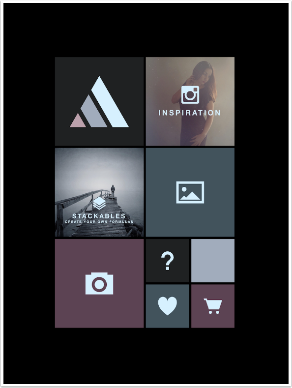
The opening screen, shown above, resembles the screen for Stackables. Here is where we see the first problem. Formulas is available for both iPhone and iPad. While Stackables on the iPad forces the user into landscape mode, Formulas forces you into portrait mode. Combined with the inability to zoom in on your work, this means that it can sometimes be difficult to see exactly what results you are getting, especially on landscape-oriented images, like the one I’ll be using.
The triangle logo takes you to the website for Formulas, which is still under construction. The Inspiration square takes you to Instagram and the #formulas_app hashtag. Stackables takes you to that app’s entry in the App Store. The “landscape” logo takes you to your library, and the Camera logo takes you to the device’s camera. The heart and the shopping cart also take you to the App Store, and the Question mark allows you to contact the developer or enable help tips.
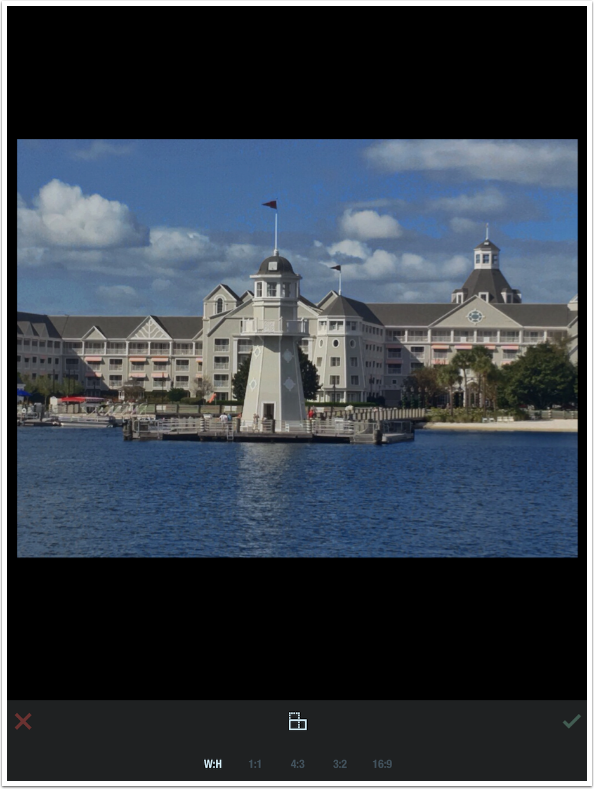
After you load an image, you are taken to the Crop screen. There are four width/height options, and a button to change portrait to landscape or vice-versa. There is no custom crop option. The crop box is static, and you move and zoom the image within the crop box. When you are satisfied, tap the check mark on the right.
Below is a screenshot of the workspace. At the bottom are three buttons for Formulas, Frames and Auto-Adjust; a series of thumbnails, and a slider for adjustment that defaults to 100%. The default option selected is Formulas, and the default thumbnail is None.
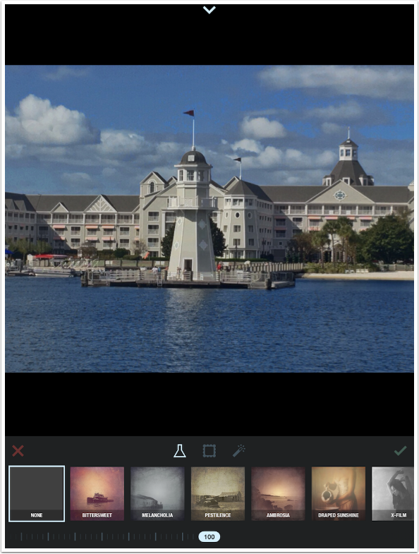
There are 37 built-in formulas, identified by the scrolling thumbnails. Once you select a thumbnail, that formula is applied to the image. I chose X-Film, but once I’ve chosen it, I can’t tell what it is called. The thumbnail is replaced by two buttons: the Star, which allows you to choose a Formula as a favorite, and the Person.
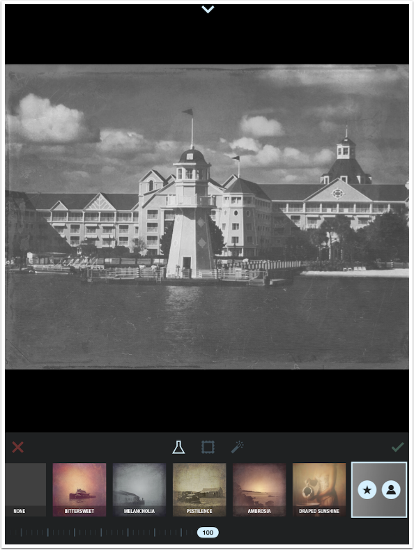
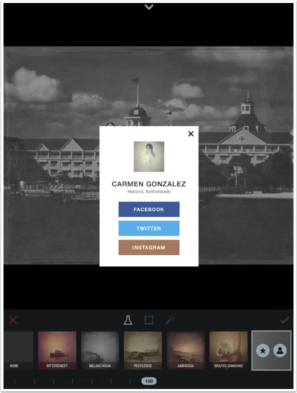
Tapping the Person button brings up a window which identifies the creator of the Formula, and gives ways to get in touch with that creator.
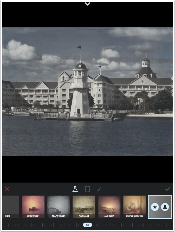
The slider at the bottom controls the opacity of all the textures that are part of the formula at once. If, as is the case with X-Film, the formula adds grunge as well as making the image black and white, you cannot keep the image fully black and white while reducing the grunge. It is all or nothing. (Stackables allows you to change the opacity of all parts of a formula individually.)
Another drawback of Formulas becomes evident while moving the opacity slider. On my iPad 4, each time I move the sliders or choose a new thumbnail, I have to wait for the change to process. Each time is 3-5 seconds. So not only do I not get a real-time indication of my change, the wait becomes a major nuisance. Do I prefer this Formula at 50%? 60? 45? I will settle for a level just because I don’t want to have to wait again.
Perhaps I shouldn’t complain about a few seconds. But the wait times for Stackables are noticeably slower.
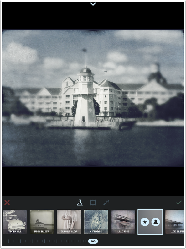
Some of the Formulas depend on the subject being in the center of the photo. It works fine with my lighthouse shot, but the blur that is part of the Déjà Vu formula can’t be moved so that the flag remains in focus.
This next screenshot shows that the Draped Sunshine formula will obscure a good portion of the top of your image.
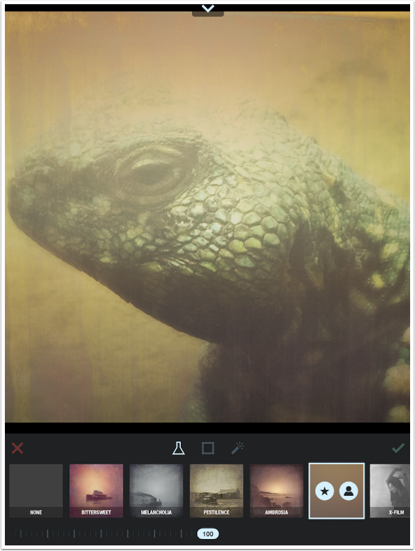
Tapping the Star button makes that formula one of your favorites. The button turns yellow to indicate being a favorite.
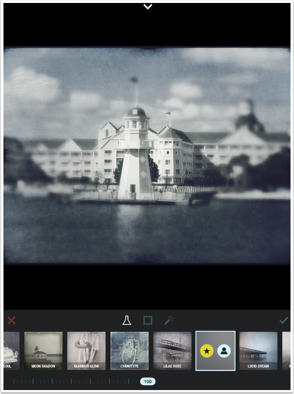
Tapping the Flask, or Formula, button again shows you just your favorite formulas. Notice the star that is now part of the Flask icon.
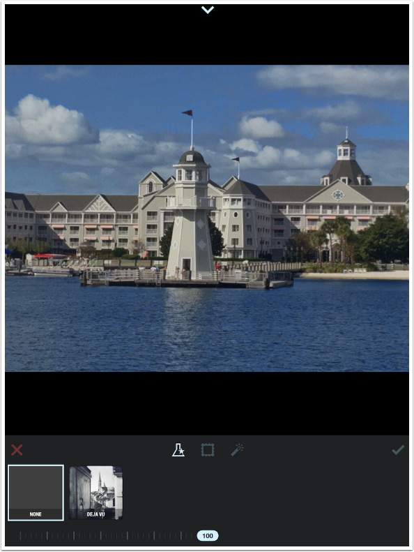
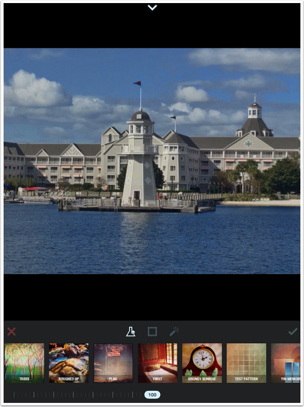
Tapping the Flask again adds the Stackables logo to the Flask. If you have Stackables installed, then all your user formulas are automatically accessible in Formulas. Those who have read my Stackables tutorial should recognize the formulas built during that tutorial: Grungy Sunrise and Yin Memoir. Once again, while individual layers of these formulas are adjustable within Stackables, you are only able to adjust the formula as a whole in Formulas.
I decided on the Glazed formula at about 90% and tapped on the Frame button to access the frames. Frame also defaults to None.
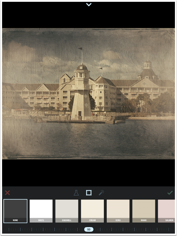
The great thing about the Frames in Formulas is that they do not overlay the image. They are built around the image. Notice that the image becomes smaller and the white frame surrounds it in the image below.
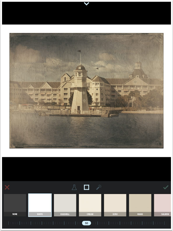
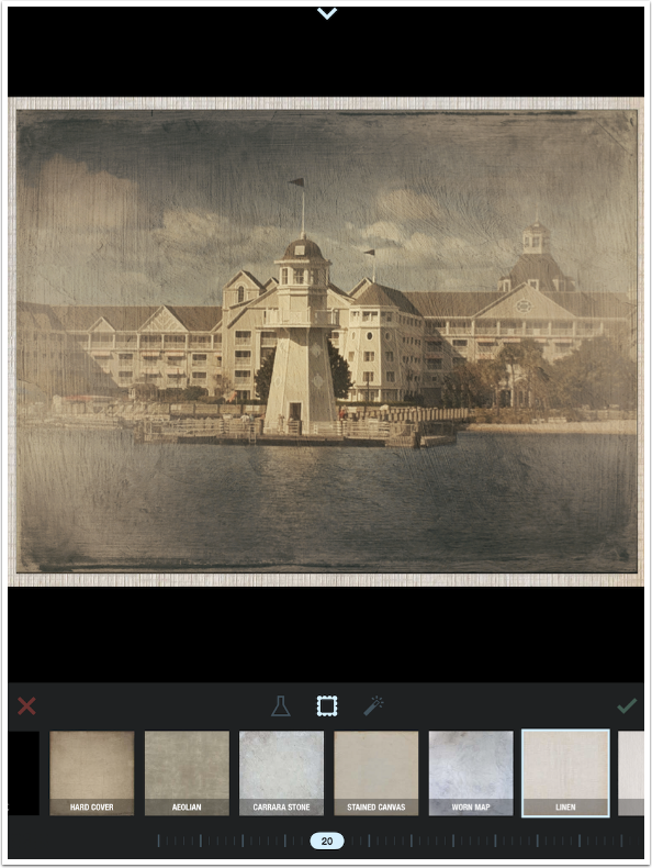
I choose the Linen Frame and move on to the slider. Notice that the default value is 50. This is not an opacity slider; rather, it is a width slider.
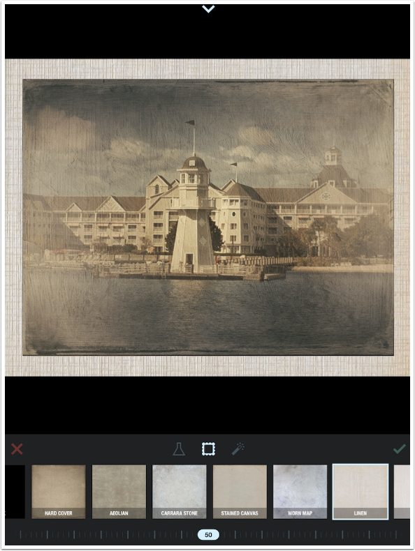
Below I’ve increased the width to 100, turning it into a fair mat for my image.
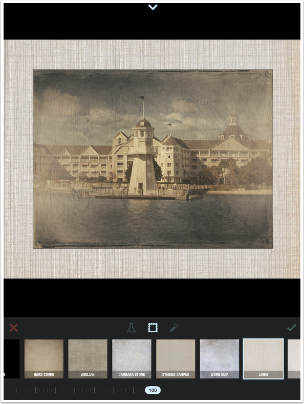
A value of zero would get rid of the frame entirely. I find that any value below 20 is too small to be really useful.
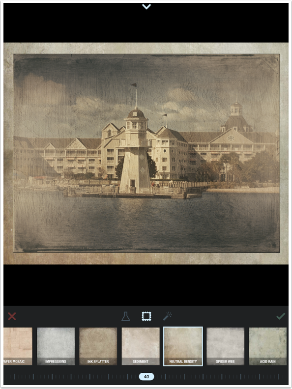
I settle for the Neutral Density frame at a width of 40.
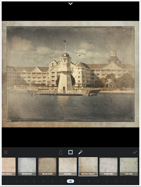
The last button is Auto-Adjust, which can only be turned on and off. It offers no control over the adjustment. It generally raises the contrast and saturation – only you can decide if that is a worthy change for your image. In this case I don’t like it and turn it off (waiting another few seconds for it to take effect).
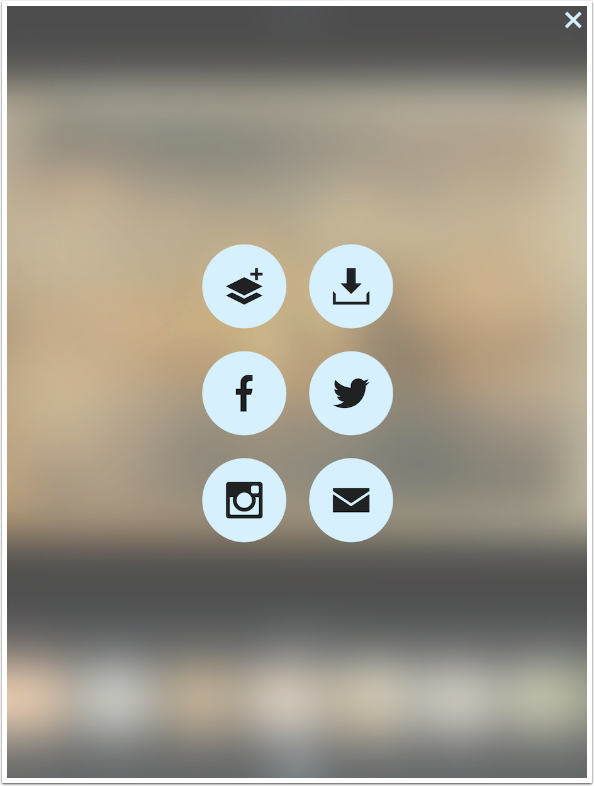
Tapping the X at the left of the toolbar will discard your changes and take you back to image selection. Tapping the check mark at the right will bring you to the share screen seen below. You have options to Save to your photo library or share the image to Facebook, Twitter, Instagram or email. The first option, adding a layer, allows you to re-enter Formulas and add another formula on top of the first.
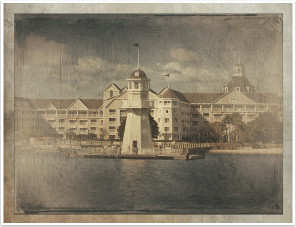
Here is my finished image. I really think it is nicely rendered, which accounts for the word “beautiful” in the title for this article.
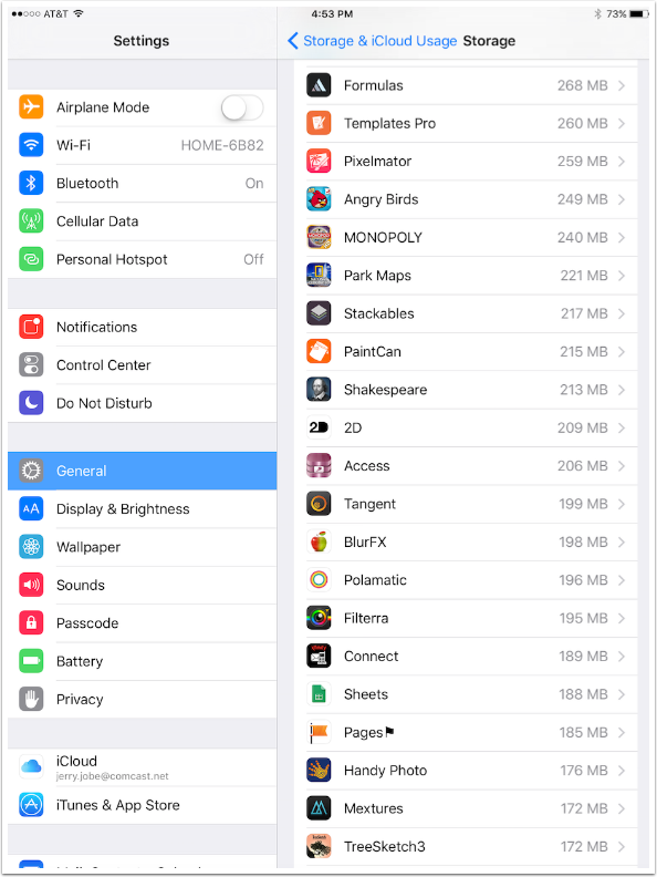
Before I go on to show you layering of formulas and some other examples of work using Formulas, I wanted to point out another drawback. For many of us, space for apps is at a premium. We can only have a few of the really large apps loaded to our devices. Stackables, which gives you much more control over your textures, and also includes formulas, is actually a smaller app than Formulas. Formulas is more than 50MB larger!
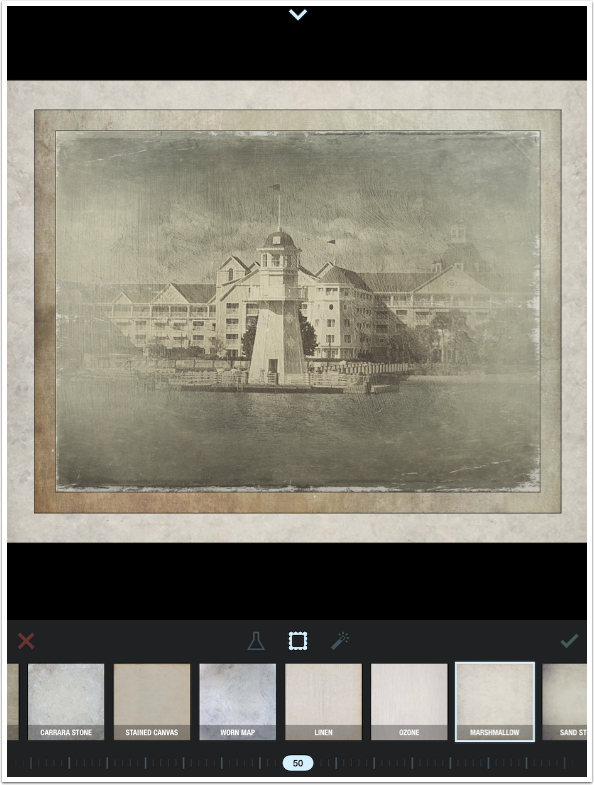
Below I brought my image back into Formulas for another “layer”. I added a touch of the Nordic Winter formula, and it was applied to just the image, not the frame. Then, when I added the Marshmallow frame, it surrounded not just the lighthouse image, but the first frame as well. This is something you need to keep in mind when “layering” formulas: new formulas do not affect existing frames, but new frames surround existing frames.
The downward arrow at the top of the screen opens up a palette which holds the layers or sessions. You can hide the sessions or delete them. You can also rearrange the sessions by dragging the session’s thumbnail.
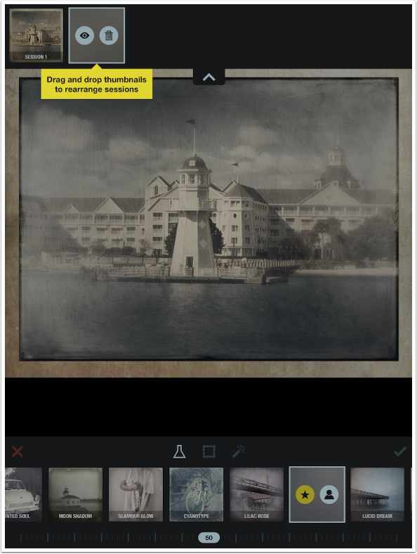
It does change the look of the image to swap layers around. You can see that somewhat by comparing the above and below screenshots.
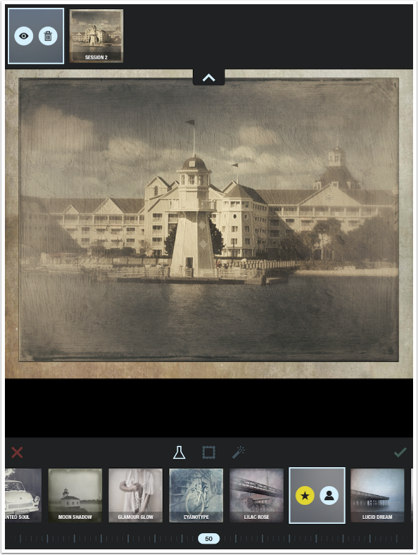
Formulas can achieve some beautiful results. However, as a subset of Stackables, it can achieve nothing that Stackables can’t as far as textures, yet is a slower and larger app. The frames are nicely done, and I really appreciate them not encroaching into the image itself, but they are hardly worth the price or size of the app. My recommendation is to stick with Stackables and learn how to use that, even though the learning curve is much, much steeper.
The example below was the first image I processed with Formulas when it was released last summer. It’s from MontereyBay, near the aquarium.
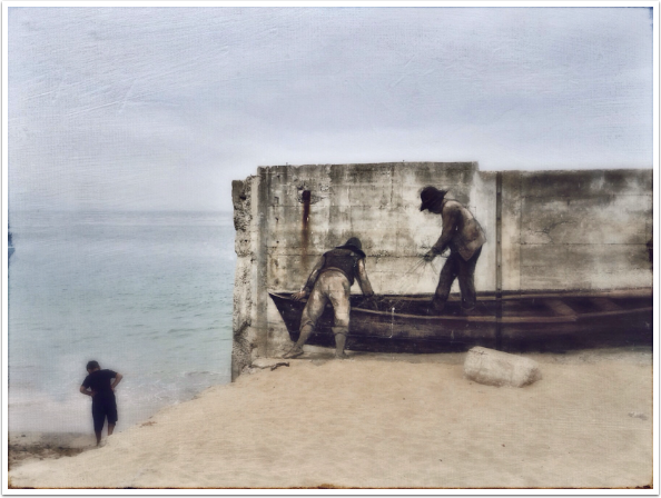
The final image was taken through Formulas, then Brushstroke. Finally, the two images were merged in iColorama.

You know, writing about apps with major drawbacks is not very much fun for me. Let’s see if I can’t get back to covering more useful apps next time. Until then, enjoy

One Comment
Egmont van Dgyck
Jerry Jobe missed the real issue of why there is Formulas. Stackables is unable to stack multiple layers of filters and then set each layer at a percentage the strength of the effect.
While stackable is a good program it has several issues. First, you cannot adjust the strength of the filter that is applied to one’s image and you could not stack multiple user created filters. The other biggest issue with Stackables is that you can not really save your filters other then to export one at a time as an attachment.
Also it is unfortunate that Jerry does not added the awfulness of the filters presented in Formulas and only a very small amount that has not been updated since the release of the application. The program is also over priced for the limited amount it does.
What I do not understand that developers cannot be consistent in there program development. Like Jerry mentioned, in Stackables you work in landscape mode and in Formula in vertical mode. The other biggest issue is not being able to zoom in and see the effect on one’s image.