Mobile Photography / Art Tutorial with 100 Cameras in 1: Making a Game of it
We are delighted to publish Jerry Jobe’s latest mobile photography/art tutorial for our reading and viewing pleasure. This time Jobe takes a look at the app 100 Cameras in 1 by Stuck in Customs. Read Jobe’s thoughts about this app as he puts it through its paces (foreword by Joanne Carter). Take it away Jerry…
Stuck in Customs is free and you can download it here
“Photography and mobile art are fun pursuits. They can be all-encompassing, or a hobby that helps you pass the time in your down moments. Games can do the same. However, I find it strange that some would consider mobile photography and art a game. This is one of the quirky aspects of 100 Cameras in 1, a texturing app from Trey Ratcliff.
Ratcliff, on his website Stuck in Customs, offers several paid online courses in photography, including one that parallels his book on HDR. (I have not watched any of the free tutorials nor enrolled in any of the courses; that is not what I cover here.) His emphasis on HDR is surprising, considering that his app is a texturing app, like Stackables, Mextures, Photo Copier or Distressed FX.
100 Cameras in 1 is also odd in its connection to Game Center. As you use it, pop-ups tell you that you’ve earned a point for this and that, like saving a picture, accessing a menu item, and using particular filters. I, quite frankly, can’t be bothered with all that. The points seem to be their own reward, for you to “compare with friends”, and I can’t think of a greater waste of my time.
The bottom line, for me, is how useful the looks achieved though using the app are to me, and how easily I can achieve them. So let’s take a look”.
There is a free iPhone version of the app, and an HD version for the iPad for $2.99. We will explore the iPad version in this tutorial, and see the differences in the iPhone version at the end.
The iPad version starts with a video. This, unexpectedly, startled me. I am not used to having sound blare at me from a filter app.
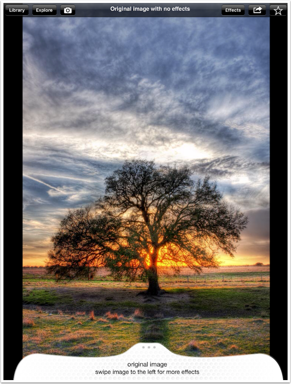
After the video, the workspace appears, along with a sample image. Across the top are six buttons. Library accesses your images; Explore gives you help; the Camera allows you to take a picture; Effects brings up a Filters menu; Share; and Create Favorite. At the bottom you are instructed to swipe left to get the next filter effect.
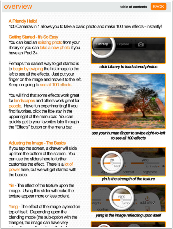
Below you’ll see the help for 100 Cameras in 1. It is better than the help in many apps, but not as detailed as you might like.
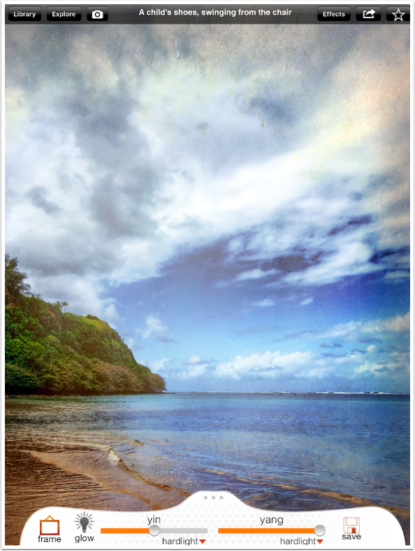
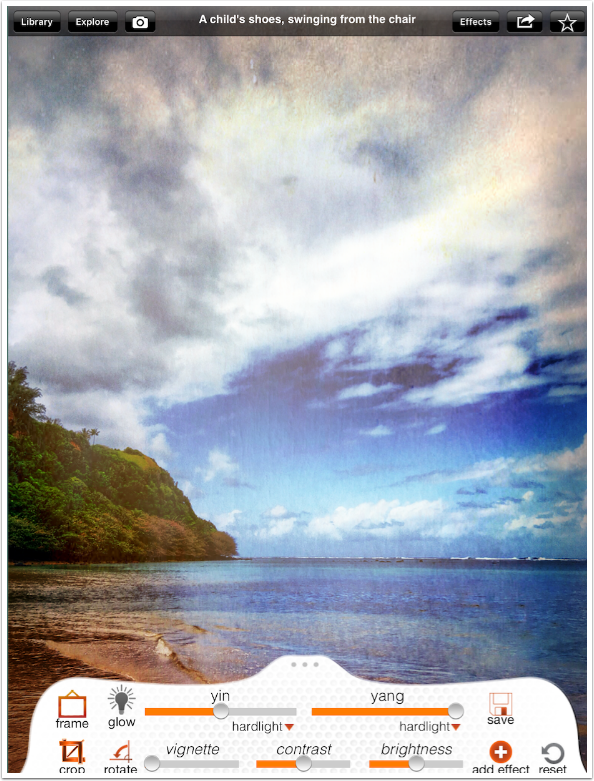
As you swipe from filter to filter, you will notice the heading at the top center changing. All of the filters are identified with a phrase. Below, that phrase is “A child’s shoes, swinging from the chair”. These filter names are neither explanatory nor concise for easy remembering. I suggest you “favorite” ones you like.
At the bottom, you will see that the “drawer” not contains buttons and sliders that allow you to modify the filter. We will explore those controls in a moment.
If I continue to swipe left, other filters appear. This one is “When I was dirty and you laughed”.
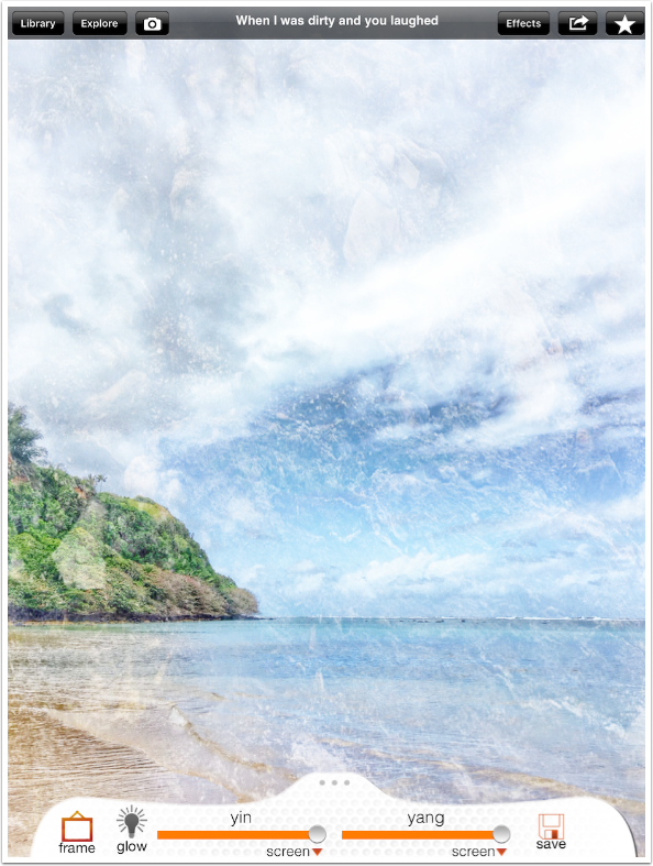
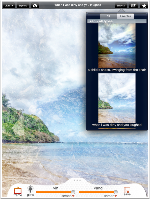
You will probably tire quickly of swiping through 100 different filters. If you tap the Effects button, you will see thumbnails of the filters applied to your image. You can scroll down through all 100 filters. Once you have established some favorites, you can tap the Favorites button and your choices will be limited to those favorites.
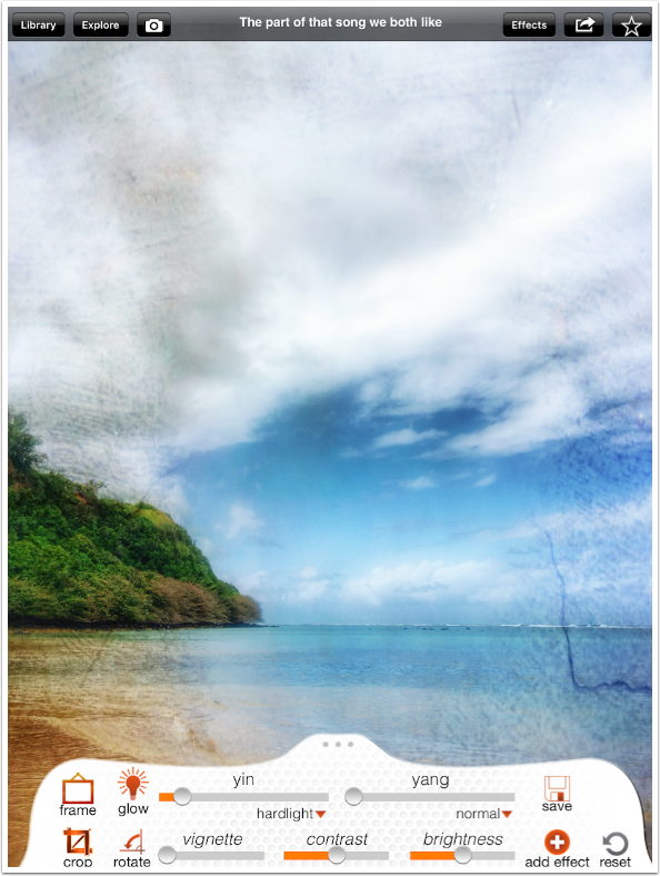
I choose the filter “The part of the song we both like” and try the controls at the bottom, starting with Glow. Glow is either on or off; there is no control over the amount of Glow applied.
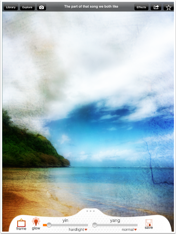
If you pull up on the “drawer” you will see further controls. Below I have not changed any of the controls except the Glow.
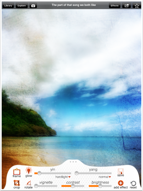
Below you will see the filter without Glow applied.
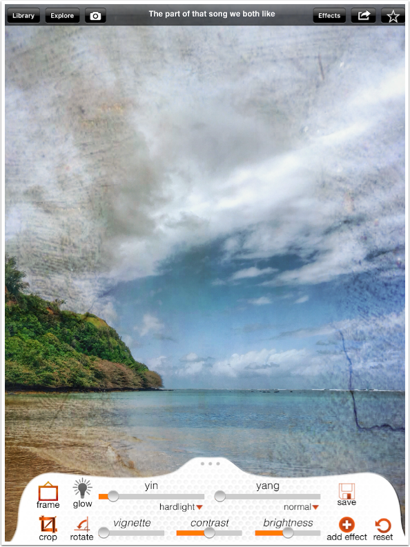
The slider marked “yin” is the filter strength slider. Increasing the slider makes the overlay more obvious.
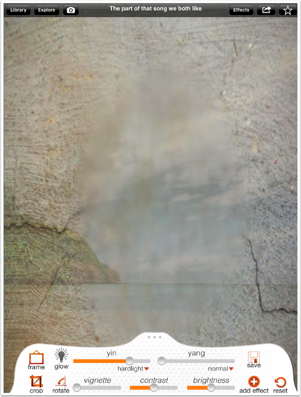
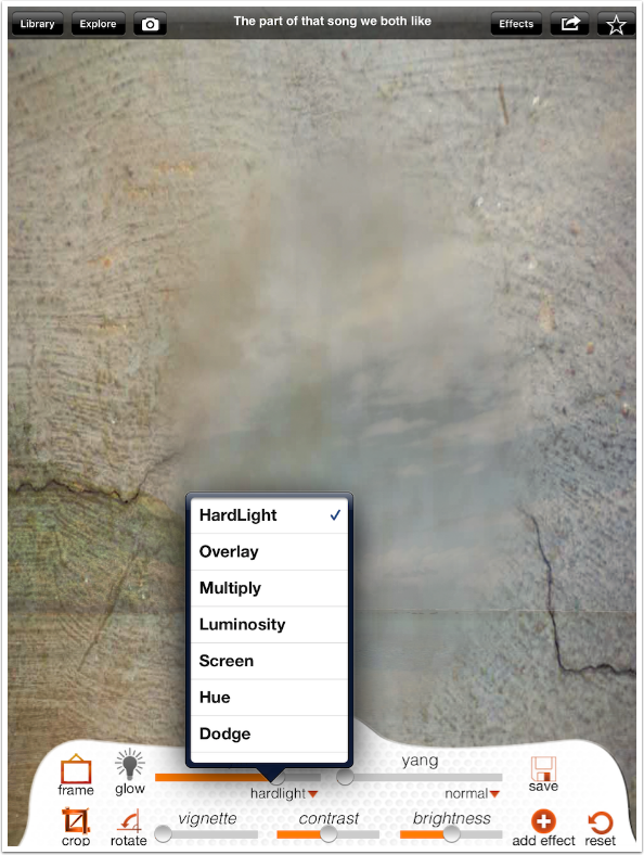
Under the slider is the blend mode indicator. Tapping it brings up a menu that allows you to change the blend mode.
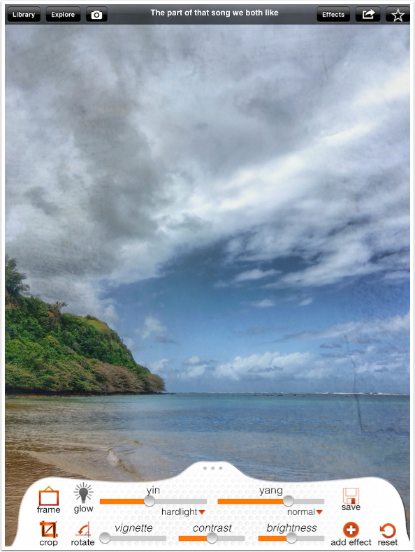
I am unconvinced that these blend modes work properly. For example, this Hard Light mode should intensify the underlying image. The dark cracks should darken the underlying pixels, and parts of the filter that are lighter than 50% gray should lighten the underlying pixels. 50% gray would not affect the image at all. Instead, what I see here is more of a Normal blend mode – when I increase the slider to 100%, the filter completely hides the image.
I changed the blend mode to Multiply, and that seems to work correctly, darkening the image.
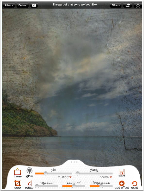
However, the slider does not let me take the filter down to nothing! I take the slider down to 0 in Multiply mode and I can still see the cracks. It works that way with every blend mode.
To be honest, the blend modes and yin slider do seem to work correctly on some filters. This is an example of a filter where they don’t work. I do not have the time to assess how many or which filters have problems. It has been two and a half years since the last update to 100 Cameras in 1, and the developers have had plenty of time to correct these bugs.
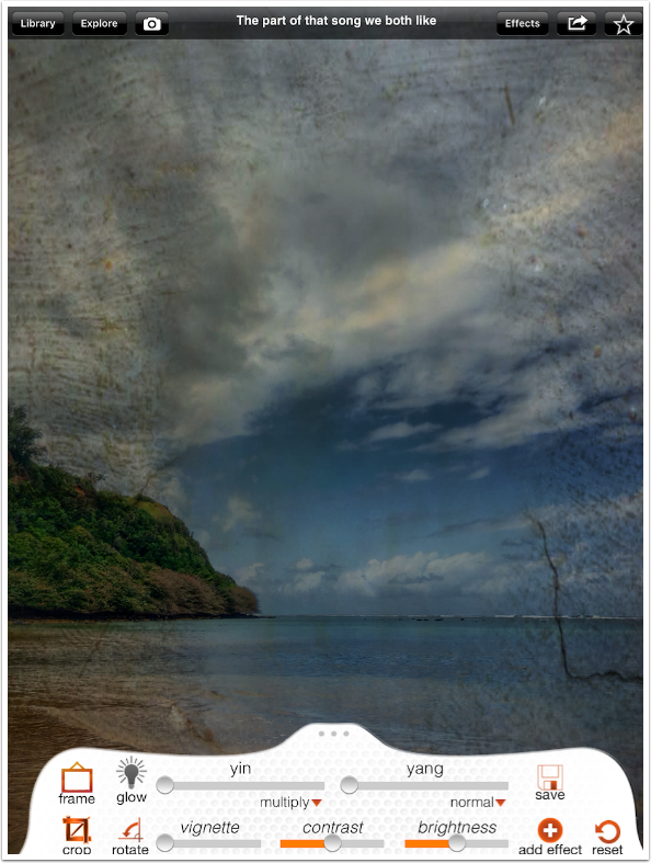
The “yang” slider is explained as applying the filtered image to itself. This would be useful to intensify an image – overlay and hard light would increase saturation and contrast, multiply would make it darker and screen lighter. How, pray tell, should Normal affect it? Normal blend mode is a fade, so fading between an image and itself should not be detectable.
In the case of this filter, “Normal” uses the original image to blend with the filtered image, thereby decreasing the amount of filter seen. Of course, other filters don’t work this way. It becomes very confusing, and you have to try every slider and blend mode for each filter, rather than having a feeling of what they will do.
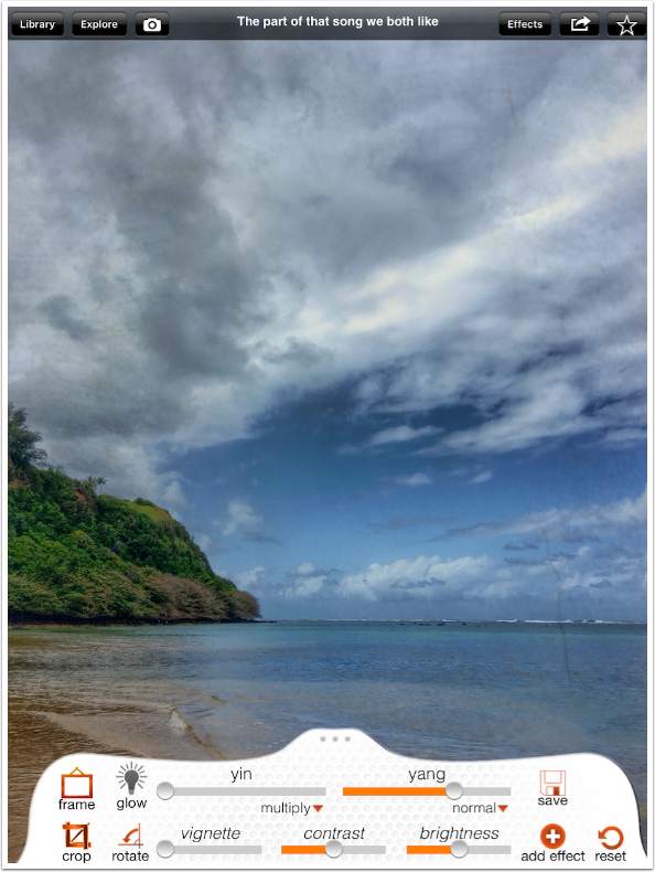
I change the yin (filter) blend mode back to hard light and use the yang blend mode of normal to lessen the effect.
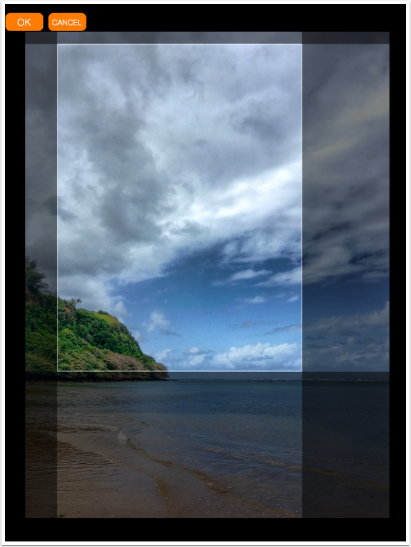
The Crop tool has no presets. You can maintain the original ratio by using a two-fingered pinch and dragging the crop window around, or you can move the individual edges. If you want to change a rectangle to a square or a 3:2 to a 4:5, you have to make a visual guess.
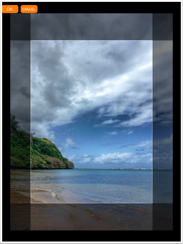
Below I did the pinch and drag to maintain the ratio of the original. I did not Accept the crop. However, if you do, the settings for the filter reset to their original settings. Whatever changes you’ve made to the yin and yang sliders and blend modes will have to be made again.
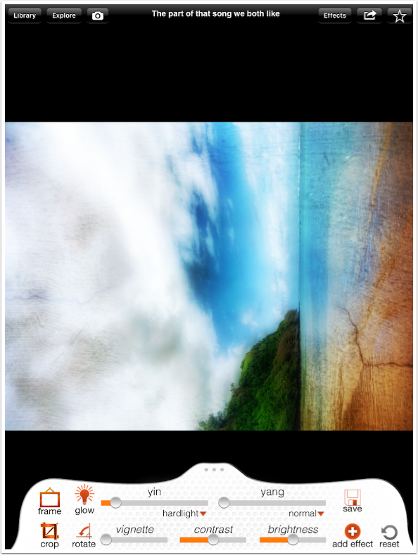
Rotate is a simple ninety-degree rotation counter-clockwise. You have to tap it four times to return to the original.
I next try to decrease the contrast. When I do, I notice that a glow is added even though the Glow indicator is off.
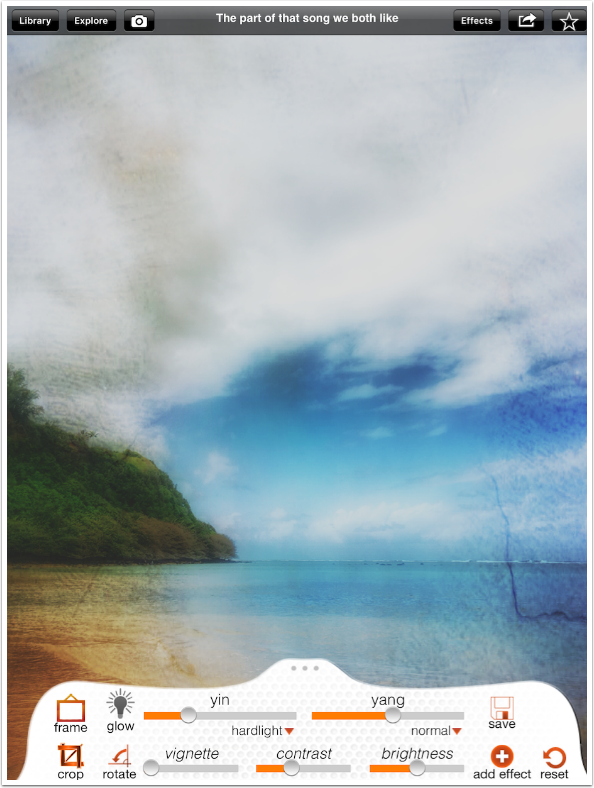
I tap the Glow twice to turn it on and off again, and it disappears.
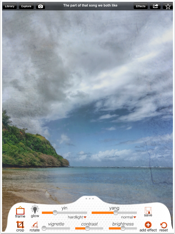
The same glow is added when I try to increase the Brightness.
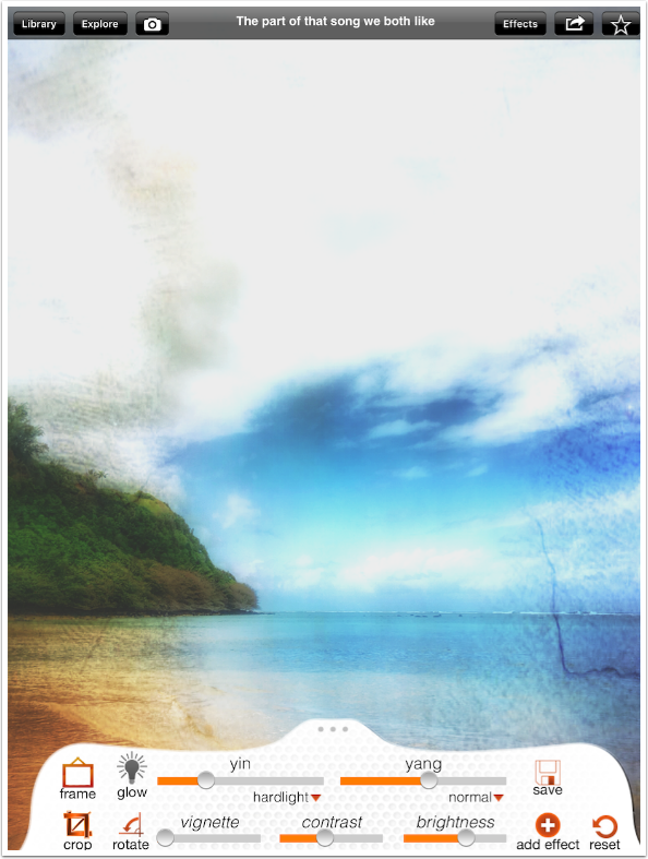
Once again, I have to double-tap the Glow indicator to get rid of it.
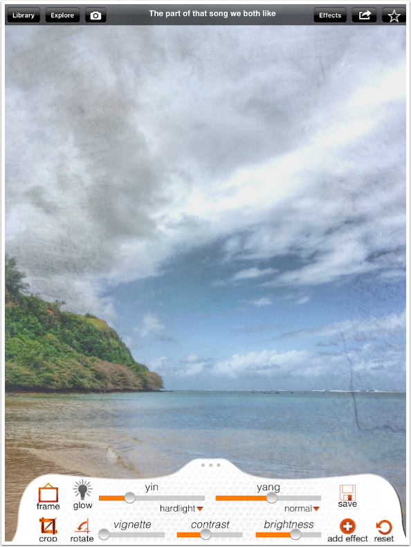
The Frame button pulls up a menu where you can choose from only six different frames. None are modifiable in any way – rotation, width, color or opacity.
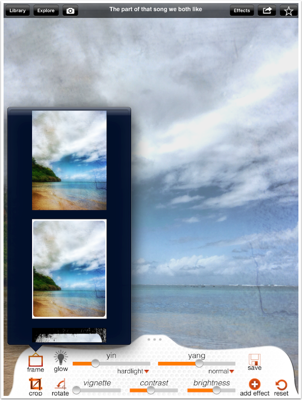
Below I show a “torn’ white border. The top thumbnail in the menu removes the frame.
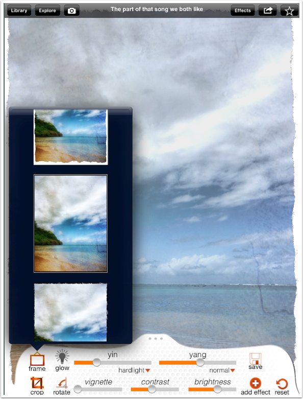
Once you have changed any setting, the Reset circular arrow turns orange. Tapping it returns the settings to their original setting. This becomes important since this app saves the last changes you made to the factory filter settings. It then becomes difficult to return to the settings as delivered.
At any time, you can tap the image to see it without the top menu and the “Drawer” at the bottom. Tapping the image again restores the controls. (Don’t worry, you aren’t seeing things. I did change the filter from the previous screenshot.)
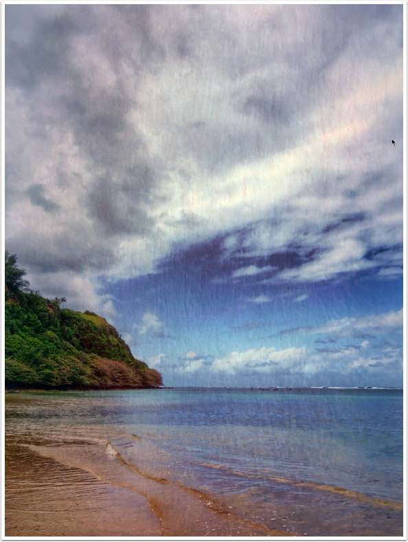
When the “drawer” comes back, it is closed, and you need to open it up again.
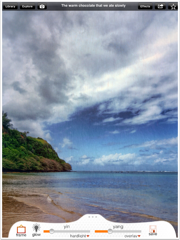
One of the good things about 100 Cameras in 1 is that it allows you to “layer” effects. If you are happy with a filter, as I am with “the warm chocolate that we ate slowly”, then I can tap the Add Effect button to flatten the image and add another filter.
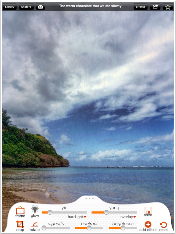
The flattened image then becomes the “original” image, ready for more filters.
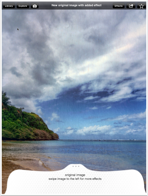
I choose “a child’s shoes, swinging from the chair” as my second filter.
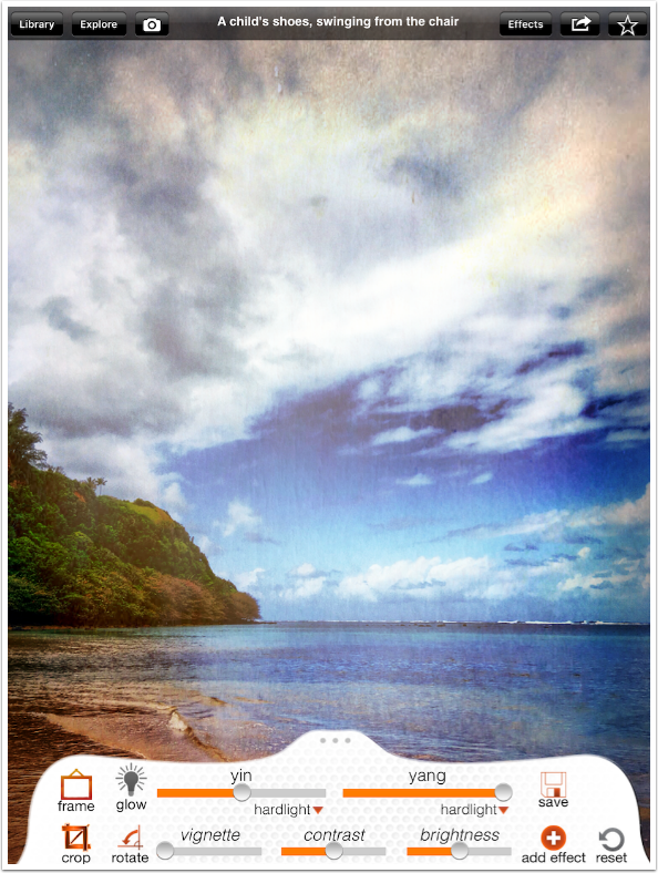
I lower the yin slider, which is the filter, and the yang slider, which is intensifying the effect by adding the image in hard light mode.
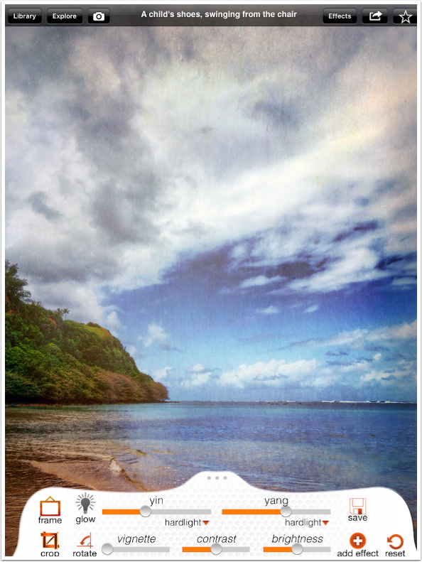
I also add some vignette. The vignette, like frames, is not modifiable by size, shape, position or falloff. Opacity is the only control.
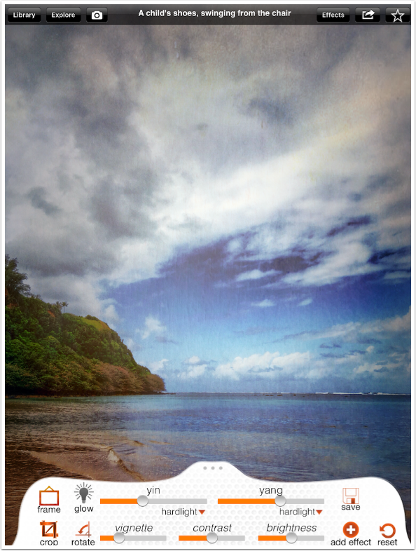
I tap the Save button in the drawer to save the image to the Camera Roll.
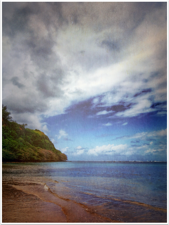
In order to work with another image, I have to tap the Library button in the upper left.
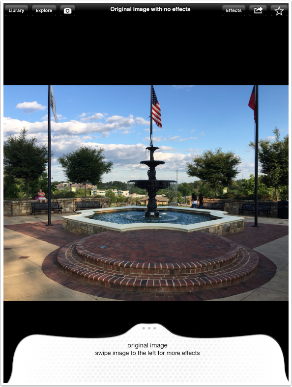
That allows me to choose another original image.
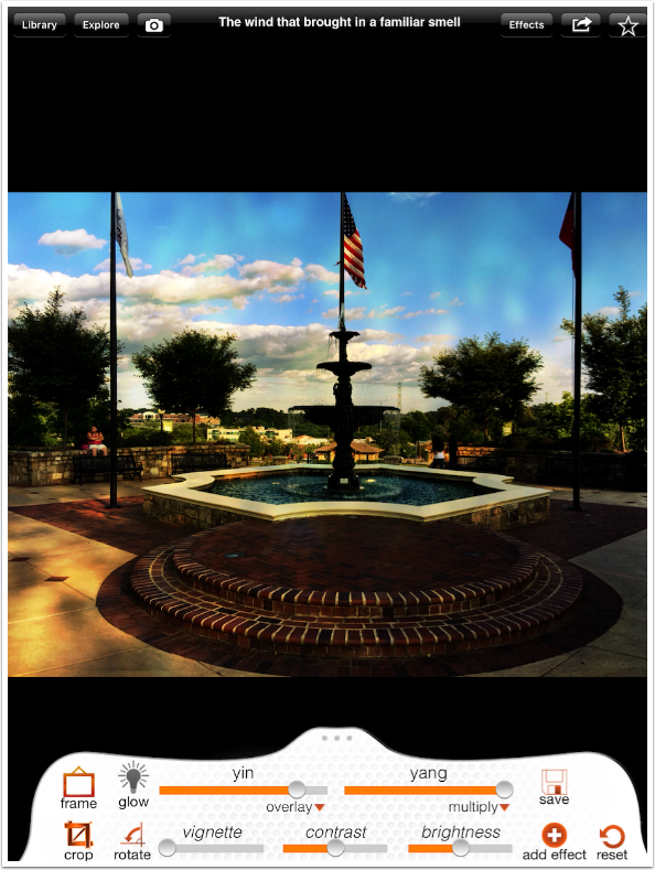
I look at “the wind that brought in a familiar smell”, but the smell is not acceptable as is.
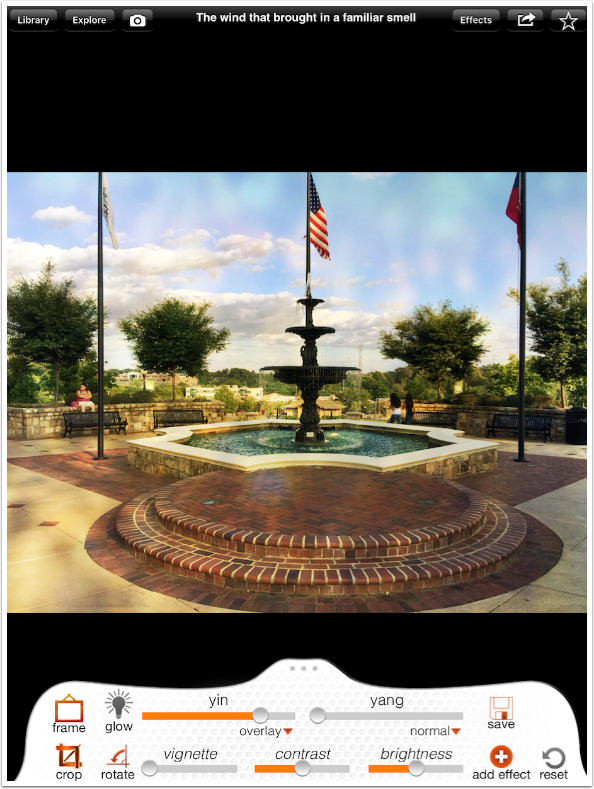
For illustration purposes, I choose the blend mode of multiply for the yang slider to show that it darkens the image appropriately in this filter.
I find “the stone edges where we sat” to be a more appropriate filter for this fountain image. Tapping the Share button at the upper right shows me that in addition to being able to save to the camera roll (as I can do with the Save button in the drawer), I can email, print or share on various social platforms.
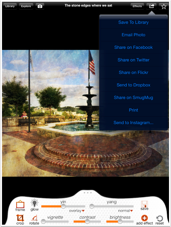
Here’s the finished image.

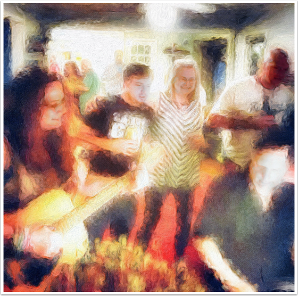
Of course, landscapes are not the only types of images you may want to filter. Here’s a party shot with “a warm couch on a cool afternoon”.

I think I want some glow on such a fun scene, so I tap the Glow indicator.
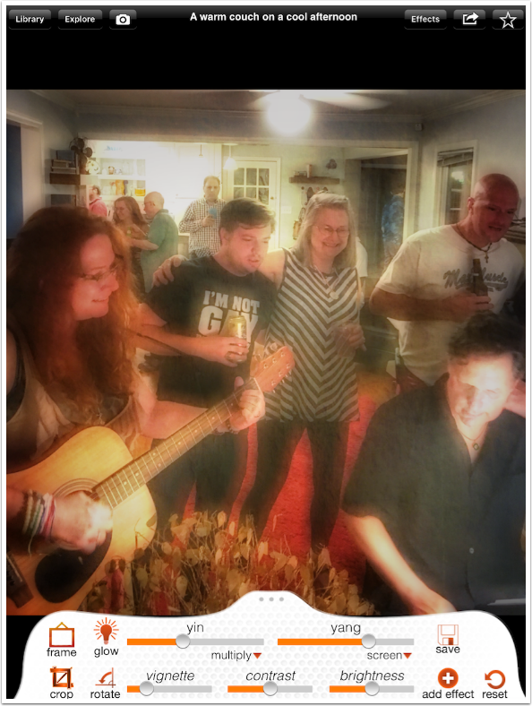
Unfortunately, when I save, it gives me this dark mess.
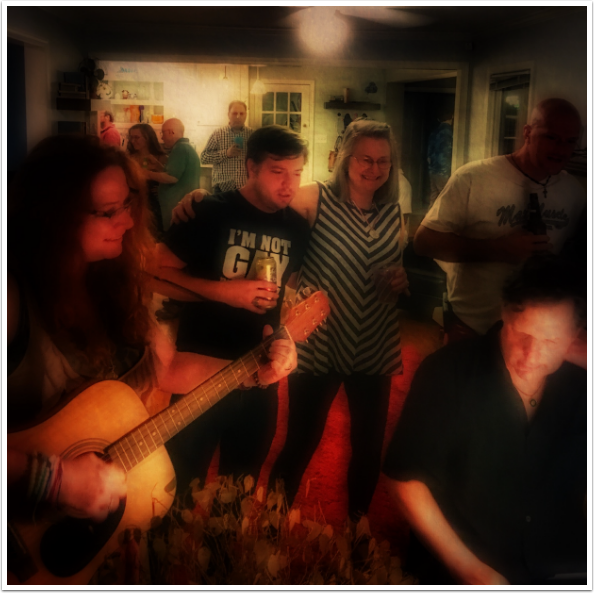
I go back make a brightness adjustment and turn Glow off and back on, and save again. This is more like what I saw on the screen, but it’s washed out more by being a bit brighter.

I turned it into a painting by using Brushstroke and iColorama.
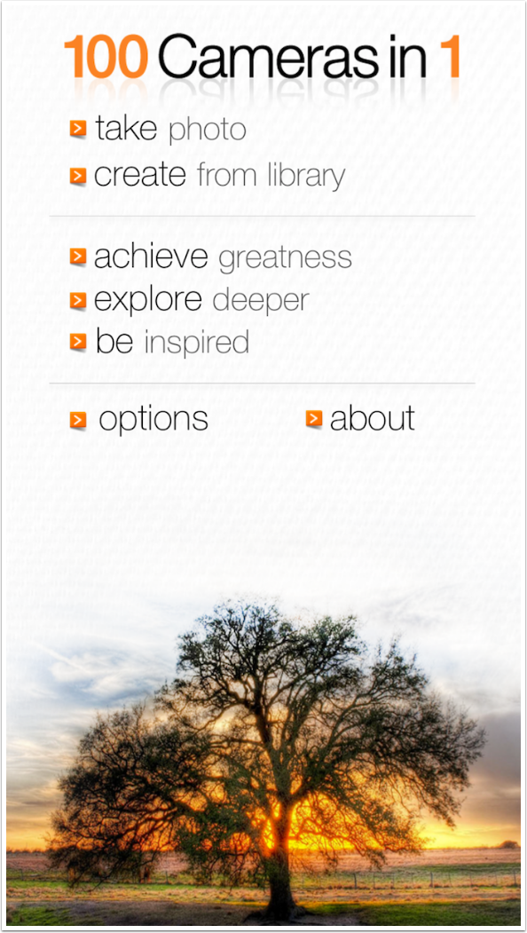
Now let’s take a look at the iPhone version. There is no opening video, and you are prompted to capture or load an image right away.
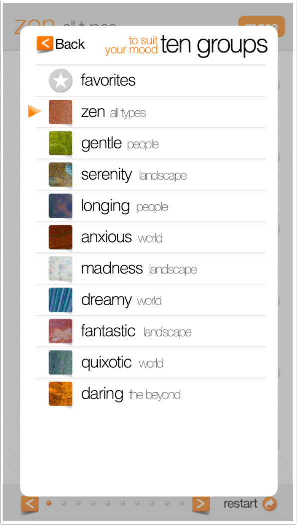
It still has ten groups of filters, each with ten filters.
There are immediately problems. First of all, I can see that it will crop to a square. When I adjust the crop square and accept the crop, I find I have a partially-transparent border on the bottom and right of the image. Then, I see that there isn’t the control over the filter that is present in the iPad version. Instead of yin and yang sliders and blend modes, vignette, contrast and brightness, I am given a single unlabelled slider. Also, I have no way of knowing what filter I’m using because it doesn’t show on the screen. (It is highlighted when I go back to the menu, but it sure isn’t available to me as I write the tutorial!)
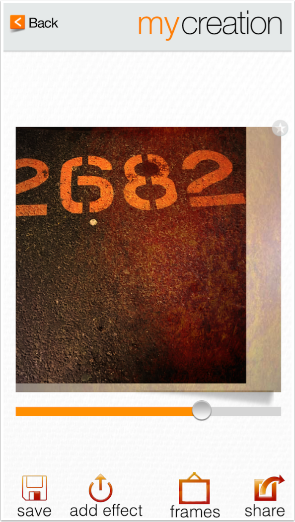
That partial border is present even when I save the image.
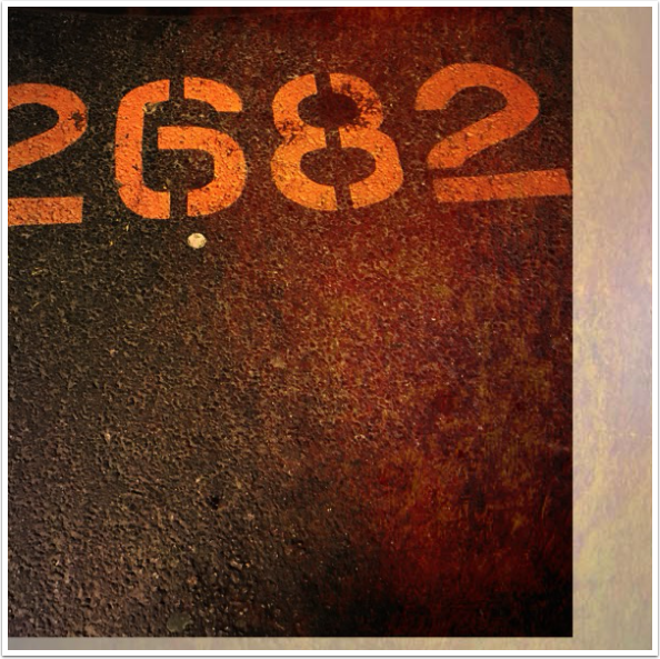
I am more careful the next image. I can see that the crop window is a square, but I try to leave it as is, a landscape crop.
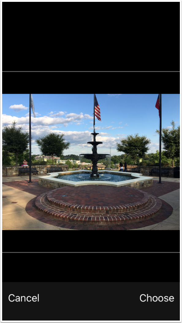
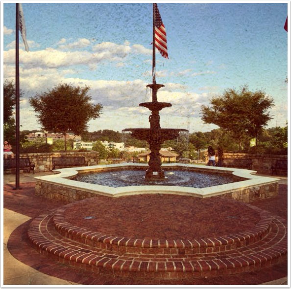
It doesn’t matter, because 100 Cameras in 1 automatically crops it to a square.
I really, really wanted to like 100 Cameras in 1. The interface looks good, and I appreciate the effort in coming up with the 100 quirky little names for the filters. I especially wanted to like it because Trey Ratcliff seems to be well respected in photography circles, and has gotten good reviews on his courses and on this app. However, I can’t make it work consistently, and it hasn’t been touched in over two and a half years. The iPhone version is nearly useless. In addition, it is constantly trying to tell me that what I’m doing is a game. Unfortunately, in this game there are no winners.
