Mobile Photography / Art Tutorial – Uptown & Co.: Graphic Curiosity
We are delighted to publish Jerry Jobe’s latest mobile photography/art tutorial for our viewing pleasure. This time Jobe takes a look at an app called Uptown & Co. Take it away Jerry…(foreword by Joanne Carter).
“I’ve been writing weekly tutorials for nearly four years now. I write them because I like to see my readers get inspired by them, trying new apps and techniques. I have not tried to monetise these tutorials, because I don’t do them for financial rewards. It helps me continue, though, when I’m able to pick up some of the apps I cover for free. I keep an eye out for free apps with another app called Apps Gone Free. I found today’s app through it becoming free for a day last week. (It normally sells for $1.99). Link to download”.
The app with the odd name Uptown & Co. comes from Roadrocks, and it produces “vintage filters and insignias”. They developed it to create custom signatures for your images, but the insignia are too large and overwhelming for that. It really is more for inexpensive graphic advertising, where the company name is paramount. I don’t have much need for an app like that, so my first criterion for an app, usefulness, has to be set aside. Let’s look at ease of use and quality of results to help you determine whether it’s worthwhile to you.
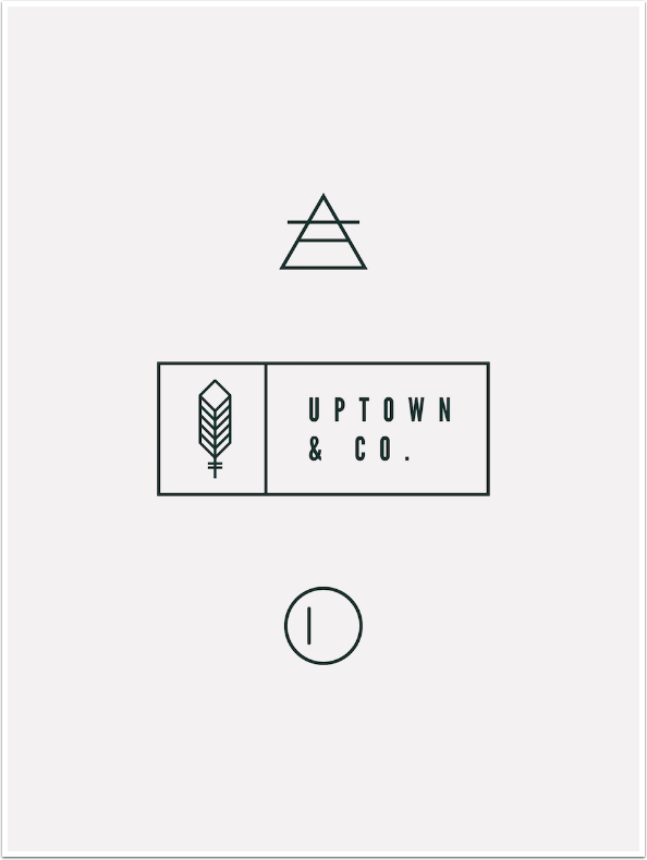
You can capture an image with the camera or import from your Photo Library. The “Tribe” button takes you to the Uptown and Co. Instagram account (which as of this writing has no posted images). The “i” button at the lower right addresses an email to support, but offers no information.
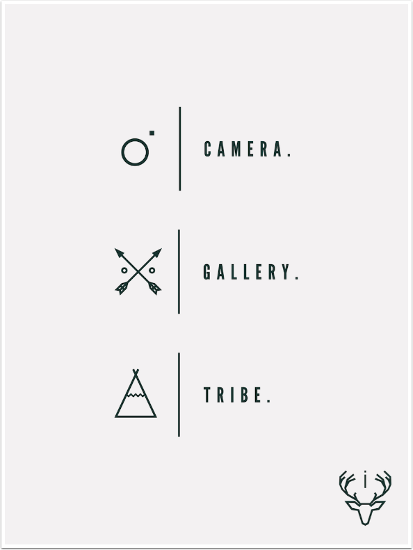
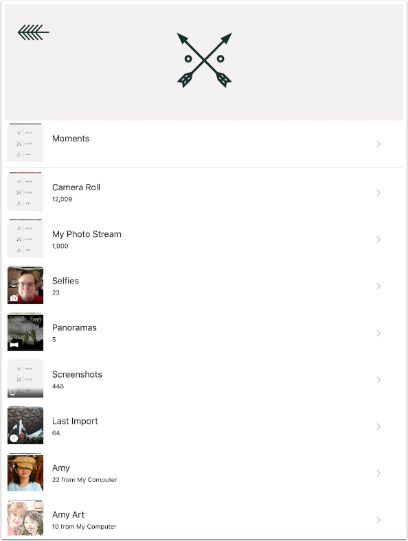
Below you’ll see that I chose to select from the Photo Library.
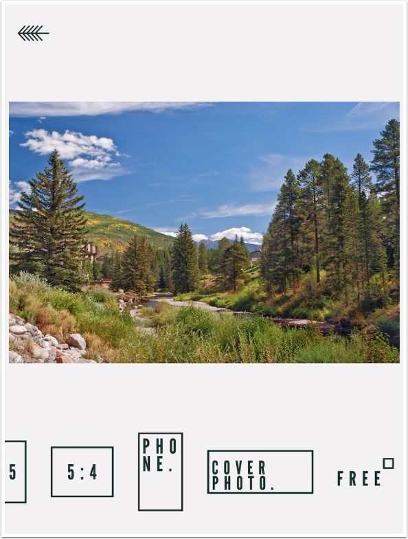
You are given a chance to crop your image. You cannot return to Crop without discarding any further work, so crop now or forever hold your peace.

If you do choose to crop, you are given a number of different crop ratios, including iPhone, Facebook Cover Photo, and Freeform.
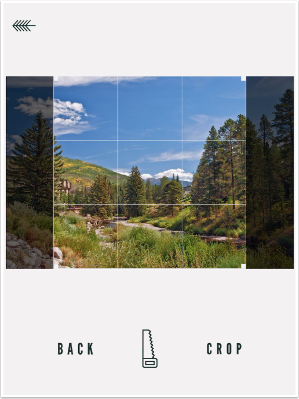
Once you choose your ratio, you can adjust and crop, or discard the crop by going Back. I discarded this square crop.
After cropping, you are taken directly to filter selection. The chosen filter’s thumbnail is marked with an X. In the case seen below, the chosen filter is None, or Original. The filters are numbered only, and have no names or descriptive text.
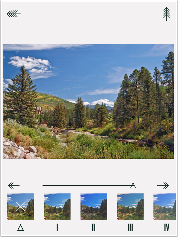
Once you choose a filter, the slider allows you to change the intensity or opacity of the filter.
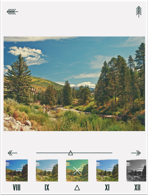
There are 64 filters in all. The warming filters, cooling filters, cross-processed filters and black and white filters are all mixed together, which makes it difficult to find the particular ones you need. They’re a nice selection of filters, but I wish they were more organised.
By using a B&W filter and reducing the opacity, you can desaturate the image. There are no separate Brightness, Contrast and Saturation controls.
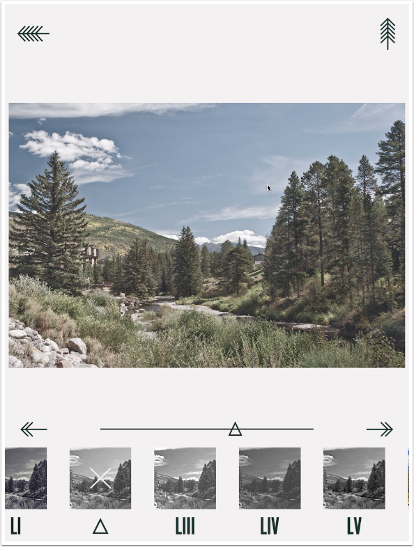
Once you have your filter in place, tapping the right arrow continues to choosing an insignia by tapping the Roadrocks box, or returning to the filters by tapping the eye icon

There are, by my count, 54 “vintage insignias” available in Uptown & Co. Scroll horizontally to see all of them.
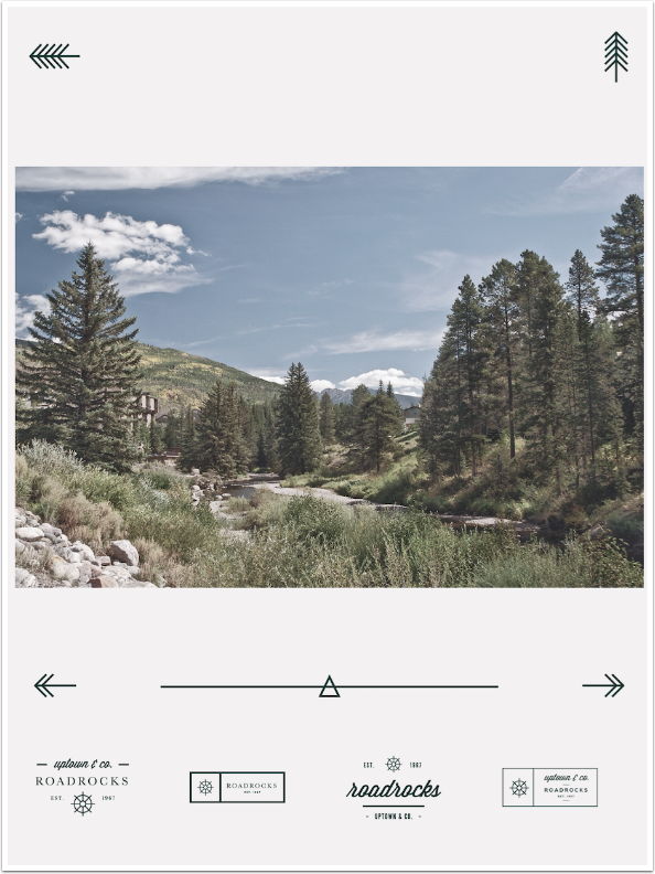
I tap the third insignia and it is applied to my image. At the same time the image is darkened. There is no indicator along the insignia to indicate which was chosen, as there is with the filters.
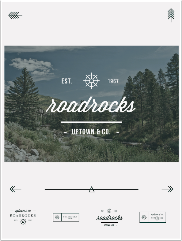
The slider controls the size of the insignia. It can be dragged around the screen with a single finger, but you can’t use a two-fingered pinch to resize or rotate the insignia. There is no method to rotate the insignia at all.
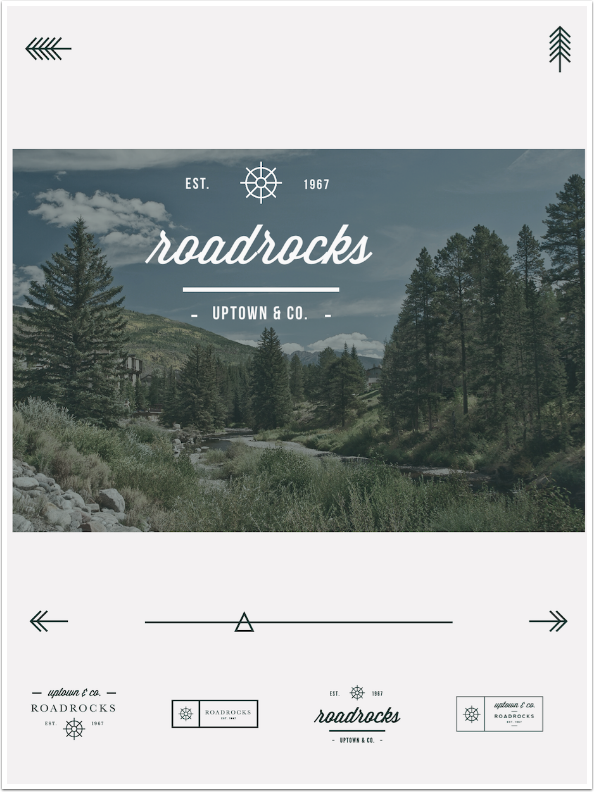
Once you resize the insignia, you are taken out to the insignia controls. The box allows you to change the insignia, the lightbulb allows you to change the tint and brightness of the image, the pen allows you to change the text, the shapes allow you to change the small shapes within the insignia (like the spoked wheel below), and the three circles allow you to change the color of the insignia.
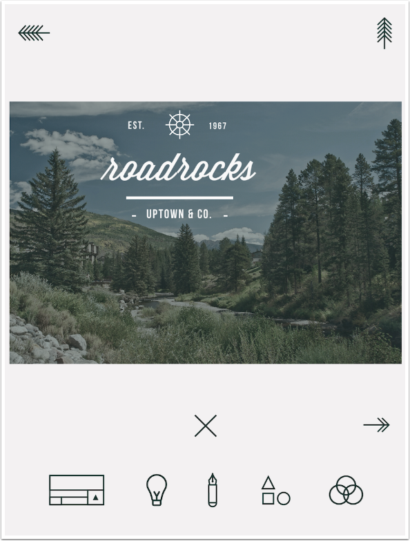
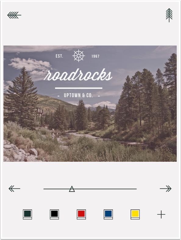
The lightbulb takes you to the following screen, which adds a color overlay to the image. The slider controls the opacity of that overlay. The purpose of the overlay is to make the insignia more legible. There are default colors of brown, black (the default, seen below), red, blue and yellow. The + sign takes you to a color picker to choose a different color.
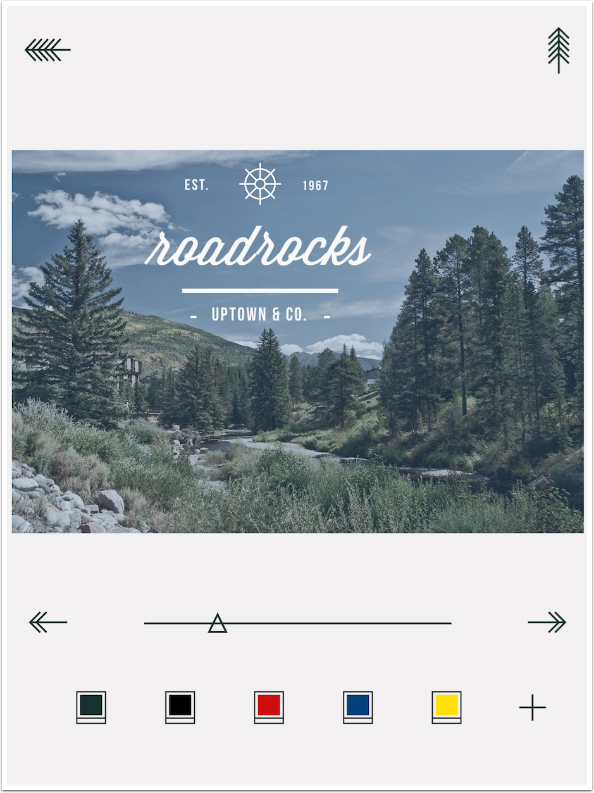
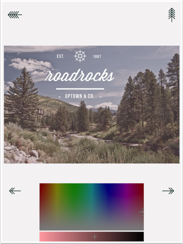
The color picker is in two parts. The larger block chooses the color and saturation of that color; the bar at the bottom controls the lightness.
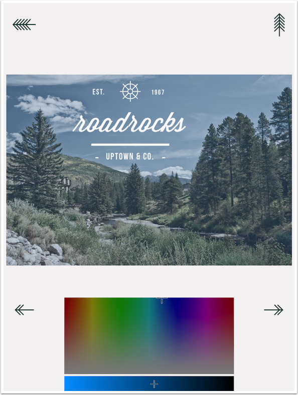
Below I changed the color from a blue to a pink, and you can see how it affects the image.
The chosen color does not show up in the thumbnails – those choices remain the same.
The Pen allows you to change the text. There are two to four text areas in each insignia. The numbers at the top of the screen are used to switch between the text areas. I is “Roadrocks” in the default text in the insignia; II is “uptown & co.”; III is “EST.”; and IV is “1967”. Enter your replacement text using the keyboard.

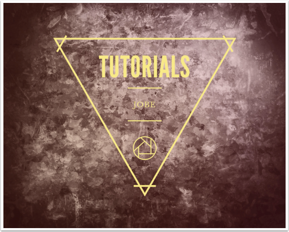
Below I changed Area I to “tutorials”, and I’m ready to change Area II to “Jobe”.
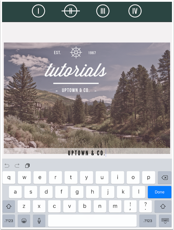
The font used for each area is determined by the insignia used, and cannot be changed. The size of the font changes based on how much text is entered. There is an upper limit to the size, based on the height. Since I replaced “Uptown & Co.” with the much shorter “Jobe”, the text does not fill the allocated space’s width.
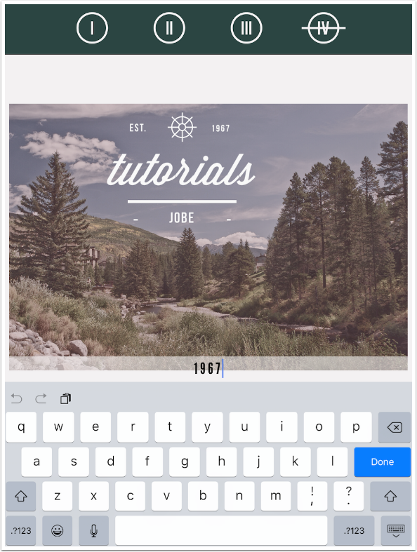
Below I went back and changed the position and size of the insignia. Although it’s not shown below, making the insignia smaller can make the text disappear. If you try to fit too much text into an area or shrink the insignia too much, the text will disappear entirely. One of my later examples ran into this problem, forcing me to change the text I planned to put there.
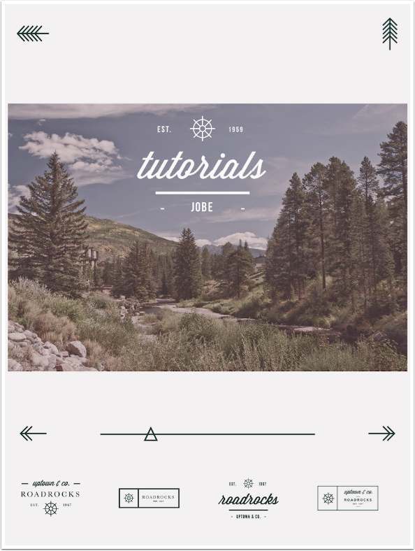
The Shapes icon allows you to change the single interior shape within the insignia. There are 178 different shapes available, including single initials.
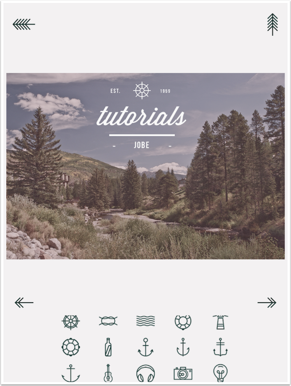
Since my tutorials have to do with mobile art and photography, I changed the shape to a camera.
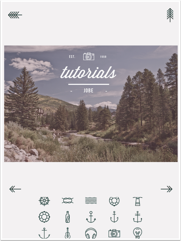
The Colors icon presents you with a number of colors, represented by Xs.
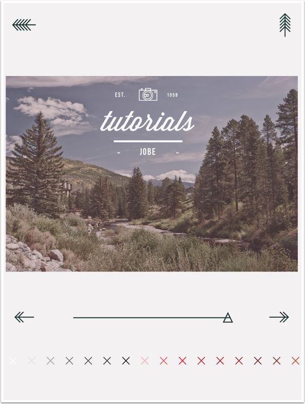
The slider controls the opacity of the insignia.
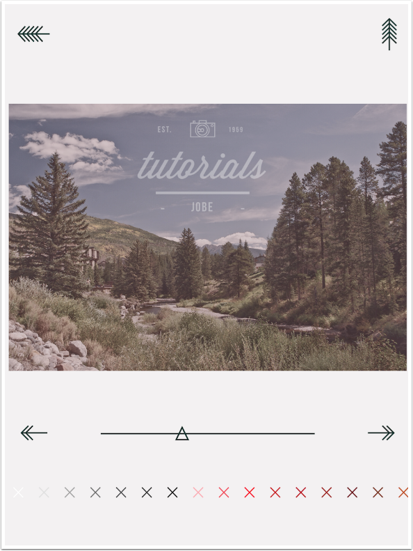
The insignia is always a single color, and there is no capability for shadows.
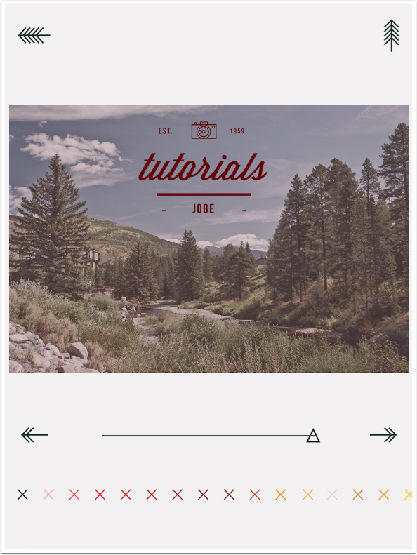
I decided on a yellow for my insignia. Since there are no other options to change, I tap the up arrow at the upper right to save the image.
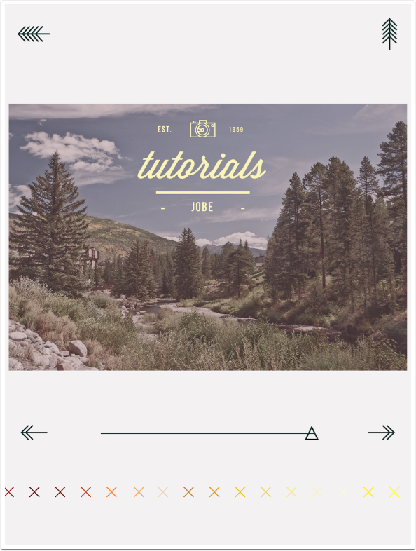
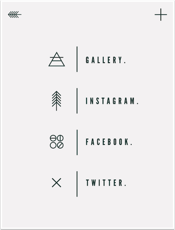
The save options include the Photo Library, Instagram, Facebook and Twitter.
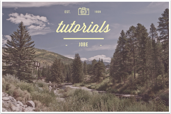
Here’s my saved image. Now that it’s larger, you can see a major drawback for a graphics app like this. There are breaks in the “r” and “s” of “tutorials”. When the app handles all the kerning, or spaces between characters, with no user input, then the app better get it right. Uptown & Co. does not.
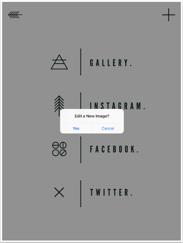
Tapping the + at the upper right of the Save screen takes you straight back to the source picker to start a new project. You can also tap the Back arrow at the upper left to return to editing the same image.
Here’s another example using the same image, but with a different filter and insignia.
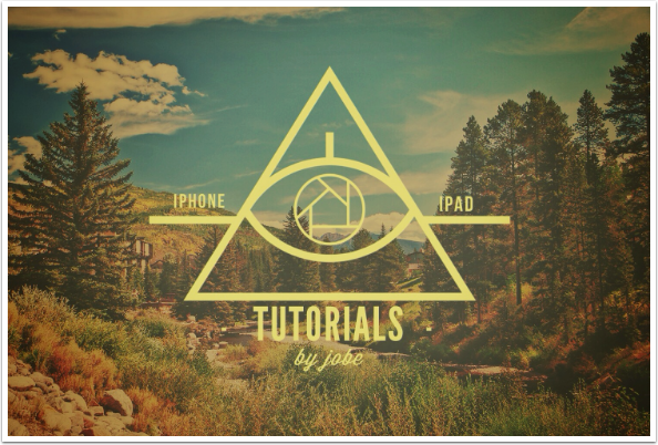
Don’t be afraid to mix your apps. I added a blue hexagon using Tangent, then filled in the “sticker” using Uptown & Co. I did not use any filter on this image.
However, I did try to use the word iPhone rather than iOS. The space allocated for that text area was so small that when I typed in the final “e”, it disappeared entirely.
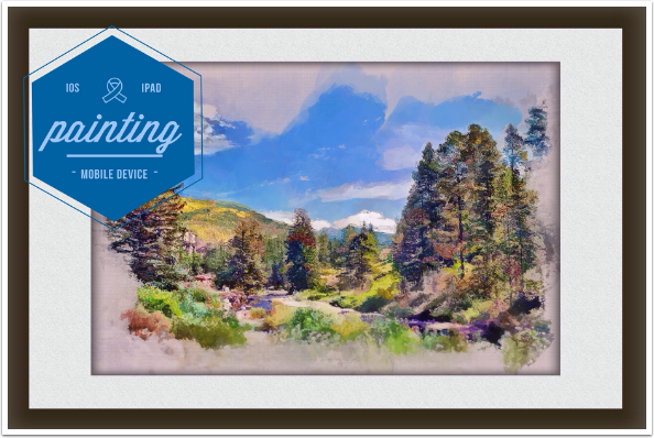
Uptown & Co. is a curious little app. It’s relatively easy to use, but to what end? It’s not flexible enough or accurate enough to use for professional applications, but it’s not useful for much more than that. What it most reminds me of is the title pages for Stellar articles. Look through Instagram at the tag #uptownandco and see if you don’t agree.
It’s so specialised that I don’t see myself doing anything more than fooling around with it, which is fine since I got it for free. If you can do the same, it might amuse you for an afternoon.
Until next time, enjoy!
Donating = Loving = TheAppWhisperer.com
TheAppWhisperer has always had a dual mission: to promote the most talented mobile artists of the day and to support ambitious, inquisitive viewers the world over. As the years passTheAppWhisperer has gained readers and viewers and found new venues for that exchange.
All this work thrives with the support of our community.
Please consider making a donation to TheAppWhisperer as this New Year commences because your support helps protect our independence and it means we can keep delivering the promotion of mobile artists that’s open for everyone around the world. Every contribution, however big or small, is so valuable for our future.
