Mobile Photography / Art Tutorial – Miscellany: Sizes of Files/Images; Big Photo; Snapseed; Over
We are delighted to publish Jerry Jobe’s latest mobile photography/art tutorial for our viewing pleasure. This time Jobe takes a look at some crucial miscellaneous issues that help will you understand more about some technical aspects to mobile photography. Take it away Jerry…(foreword by Joanne Carter).
“While I generally write articles about how to operate an app, along with articles about how to achieve a certain look, I will sometimes get drawn into discussions of a more general nature. When Snapseed introduced the ability to Export images in the PNG format, as well as the ability to edit RAW files, it drew me into a discussion on file and image sizes that I thought would make a good article. I also wanted to talk about some added features of Snapseed and Over, and those will be discussed at the end.
First, let’s talk about the size of a file. This is how much space it takes up on your device. All image file formats (JPG, PNG, BMP, TIFF, GIF, all the RAW formats, etc.) compress the data in some way so that the files are not enormous. JPG, the most common file format, offers several levels of compression, but the act of compressing the files loses some of the information. JPG is a lossy format. Lossy compression means that if adjacent pixels are similar enough, they are considered to be the same. When recreating the image from the data, these similar pixels will now be identical. Smooth gradients become stripes through file compression.
PNG format can result in either a lossy or lossless compression. Snapseed’s new Export format is a lossless PNG. It means the PNG will be a large file, but there is none of that “striping”. However, a Save or Save As in Snapseed will not result in a PNG, but in a JPG as always. That is because Snapseed wants you to be able to modify the edits you’ve made after saving the file, so they save a JPG and a “sidecar” file, an additional file with edit information.
Some people can see the effects of compression easily, even without the destruction of large areas of smooth gradients. These people are very concerned with the file compression that takes place with the different formats, and are willing to sacrifice space on their device as long as they can avoid compression “artefacts”. I am not one of these people. Some visual destruction that I can see easily has to do not with file size, but with image size – the pixel dimensions of an image.
Each pixel in your image is a square. When you resize an image downward – say, a 3952×2960 to a 2048×1533 – then pixels have to be discarded. Detail is lost. When you resize an image upward, pixels have to be created. This results in the “jaggies” – a smooth line becomes jagged, like stair steps. Why is this? Imagine a single white pixel on a black background. To us, it looks like a dot – it has no shape. But it is actually a square. Now, imagine that we resize the dot from 1×1 to 2×2, an increase from 100% (original size) to 400%. Now that there are four square pixels grouped together, it becomes obvious to us, just by looking, that we have a square. At a lower size, that square could be a circle, a curve, a smooth edge – but as you make it larger its square quality becomes obvious.
There are computer algorithms that try to compensate for the “jaggies”. One of the best is on the desktop, in a program called Genuine Fractals (now bundled with On1 Software as Resize). There does not seem to be anything comparable on mobile devices. When I want to resize an image, I use Big Photo, an app I covered in part a few years ago. The interface has changed somewhat, so let’s cover the entire app now”.
Big Photo
The above image is the icon for Big Photo resized upward. Below we see it at its original size. The options for Big Photo are along the bottom – Menu, Photo, Rotate, Crop, Resize and Info.
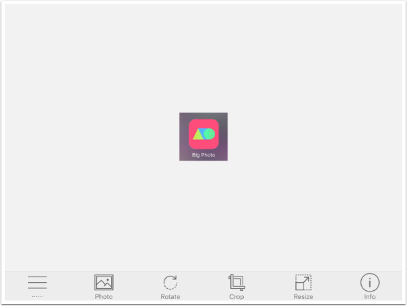
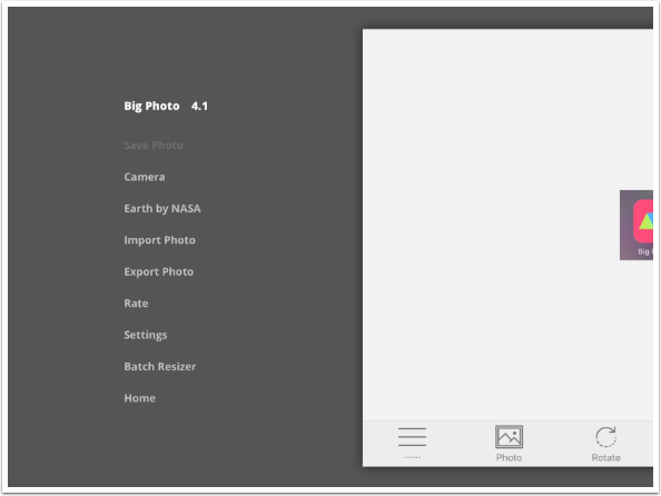
The Menu includes Save, Import, Export, and Batch Resizer options. (Batch Resizer is an extra expense, but Big Photo does not make that clear until you have stepped through all the choosing of photos. I don’t have the need for that extra.) It also includes a Settings option.
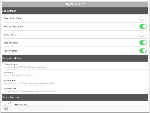
Below you’ll see the Settings. The Auto Save options are time savers – each time you use the Crop or Resize option, accepting the change automatically saves the result, and you don’t have to return to the menu to manually save the change.
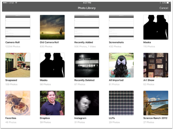
Tapping the Photo icon allows you to choose an image from your library. Big Photo recently was updated to handle the new iOS file scheme, but there were some problems that made the app useless for me for about a week, until the bug was cleared up.
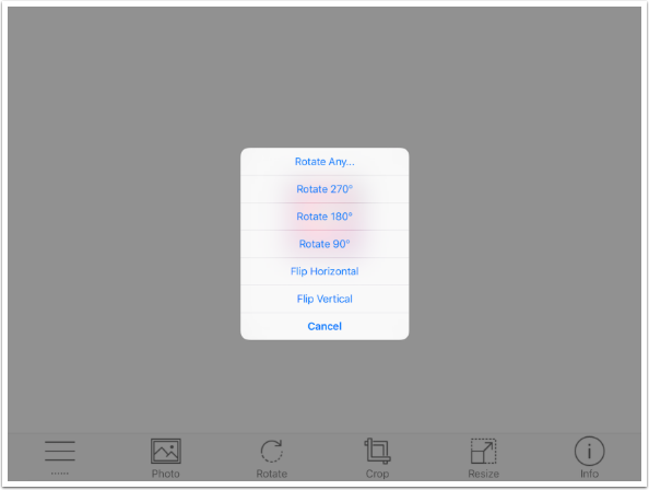
The Rotate menu item gives you several options for rotating and flipping your image.
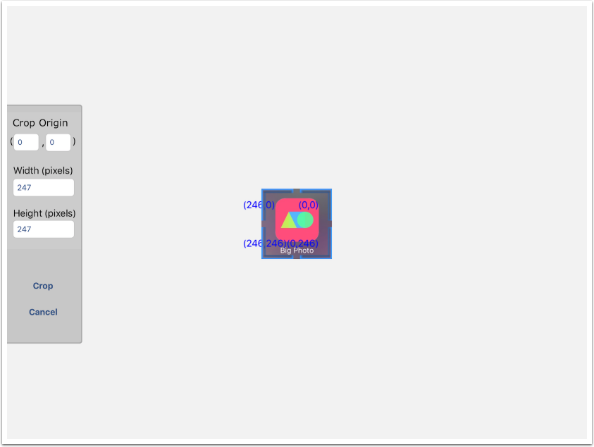
Crop involves some math. It’s not a simple drag of handles on a box. You have to enter the starting point of the crop and the resulting dimensions. It is more complicated to set up, but it results in a tremendously accurate crop.
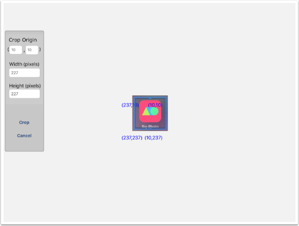
Below I want to shave ten pixels off each side of the image. I set my Origin to be at 10, 10. However, if I’m taking 10 pixels off of each side, that means I’m taking a total of twenty pixels off the height and 20 pixels off the width. So my dimensions will now be 227×227.
Before we Resize the image, I zoom in to make it full-screen so you can see that the pixels are, in fact, squares. It is obvious now that the curves, like the rounded corners of the pink icon and the rounded letters, are actually jagged. I’ll zoom in on the finished image in a minute and you’ll see that resizing upward serves to exaggerate the “jaggies”.
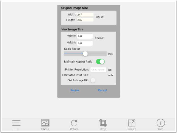
When I bring up the Resize dialog, I see that the image is 247 pixels square – a very tiny image. There are two boxes that allow you to enter the new width and height directly, as well as a slider that allows a percentage change, such as 50% or 400% of the original. You should leave the Maintain Aspect switch on, so that you don’t stretch the image by changing one aspect without changing the other, like changing the width but leaving the height the same.
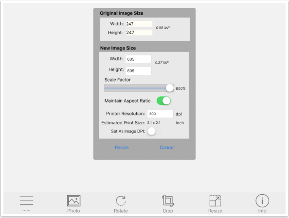
You can’t increase the size to any more than 600% of the original. Doing that with the 247-pixel square results in a 605-pixel square, which is still not large enough for most printing needs. The Printer Resolution fields at the bottom of the dialog tell you how big the image would be if printed at a specified DPI (dots per inch). This image will only be about two inches square on a standard printer. The Set as Image DPI switch refers to the metadata that is saved with the image, which can be used to tell the printer what resolution to use. I never use the Printer Resolution fields because I am rarely printing the image immediately after resizing.
Next we see the upsized image, zoomed in. The interior of the first “o” in Photo is an obvious indicator of the “jaggies” in this upsized image.
There is a way to “trick” the software into tempering the jagged curves. You can make the increases in a number of steps. If I turn off “Resize Auto Save” so that the intermediary steps are not saved, and then perform Resize several times with a maximum Scale Factor of only 200% each time, then I get a result that is somewhat blurred but not as jagged. This is because a single white pixel is not turned into a 2×2 block (400%), but pixels are created that are in between the values of two adjacent pixels. Our white pixel in the hypothetical above becomes a white pixel surrounded by gray pixels. It makes lines more blurry, but not more jagged.
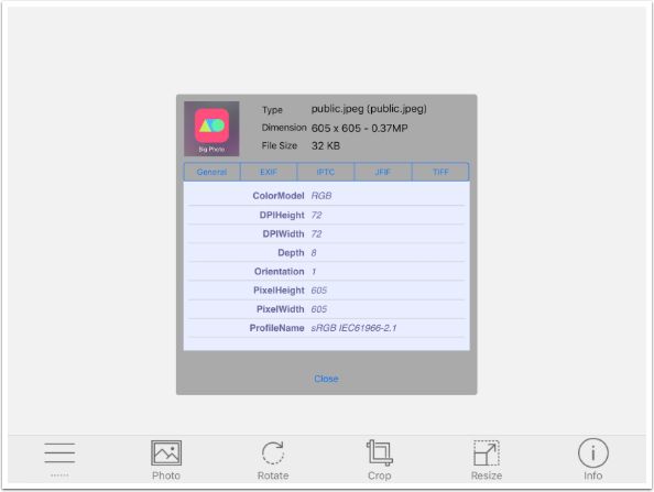
The Info button displays various information about the image. At the top of the box you’ll see the file type and file size
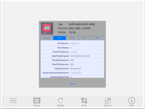
The EXIF info includes the information that it was a screenshot.
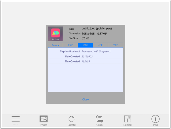
The IPTC info tells me it was processed with Snapseed, which is true: I used Snapseed to crop the screenshot.
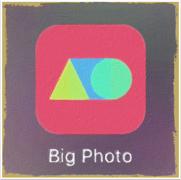
So: if you want to take a small image and make it larger, Big Photo does the job, although the results can be either jagged or blurry. Why might you want to accept those visual deficits in your work? Because you are going to change or alter the image after upsizing! Jagged lines and blurs are hidden if you use the bad image as the basis for a painting!
Snapseed
My desire to discuss file and image sizes came through a thread on new capabilities of Snapseed. If you took an image with, let’s say, 645 Pro and saved it as a TIFF, you did that because you knew TIFF is a lossless format. Modifying it in Snapseed used to mean that you would then have to save or export it as a JPG, which is lossy. Now, in the Settings, there are Export and Sharing Options which include the ability to save that TIFF image as a lossless PNG.
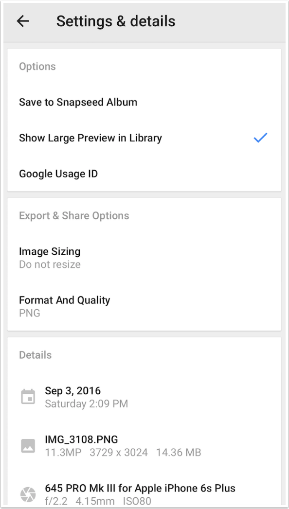
Snapseed also offers the ability to manipulate RAW files, a special set of formats that are captured with DSLRs. Since this is more of a pro photographer’s extra, which requires transferring images from the DSLR to the mobile device and editing them there, I will not be examining that feature.
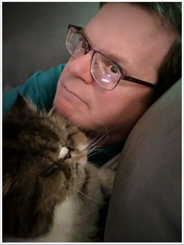
Snapseed did add a new feature that has nothing to do with the esoteric of file and image management. They decided to add a Face feature to do some quick adjustments to faces, like the adjustments you will find in apps like FaceTune and Photoshop Fix. To illustrate this feature, I’m starting with an image captured with the front-facing camera in low light, which accounts for the graininess of the image.
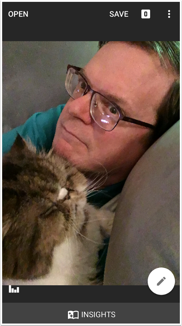
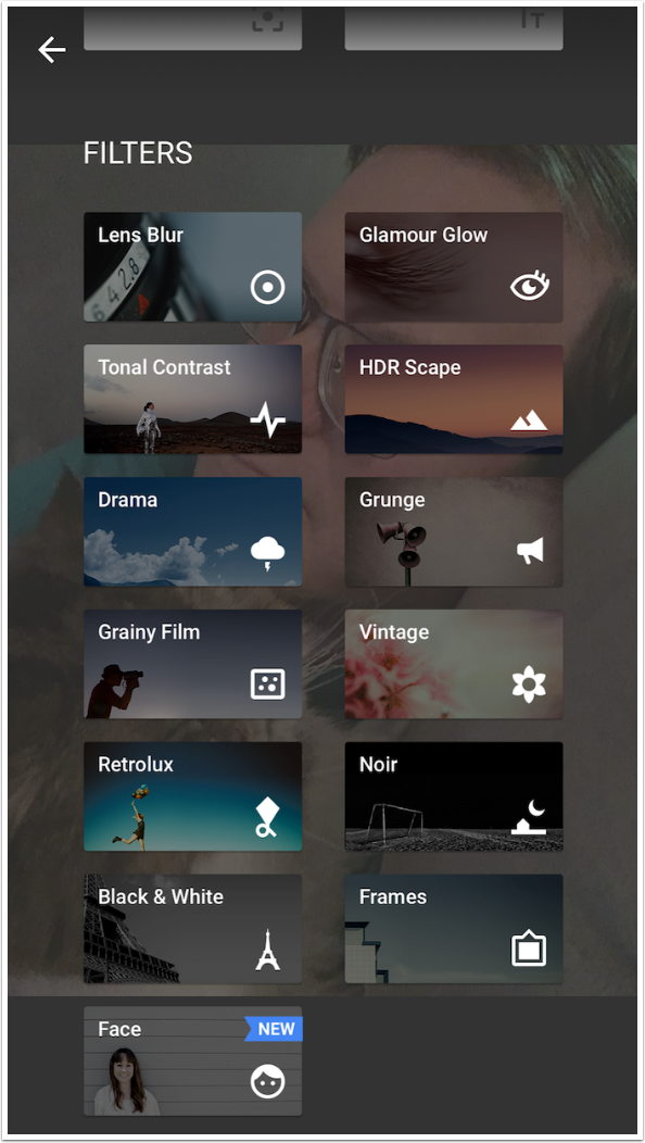
Scrolling down to the bottom of the filters, I find the Face module.
When I select the Face module, there is a short wait. Snapseed has to figure out where the faces and eyes are in the image. Then the Moderate preset is shown on the image. Moderate is one of five presets. You can see those five presets at the bottom, and the “swatches” icon is blue to indicate the presets are currently displayed.
The other indicator at the bottom, the small face, allows you to choose between different skin tones: None, Pale, Fair, Medium or Dark. These come in handy when the software can’t determine the proper skin tone because of the lighting. Pale skin can look dark in the wrong lighting.
As you can see, one of the adjustments made is Face Spotlight, highlighting the faces in the image. Since the face is not in the center, Snapseed determined that it should not apply a center spotlight, but one that covers the face, wherever it is in the image.
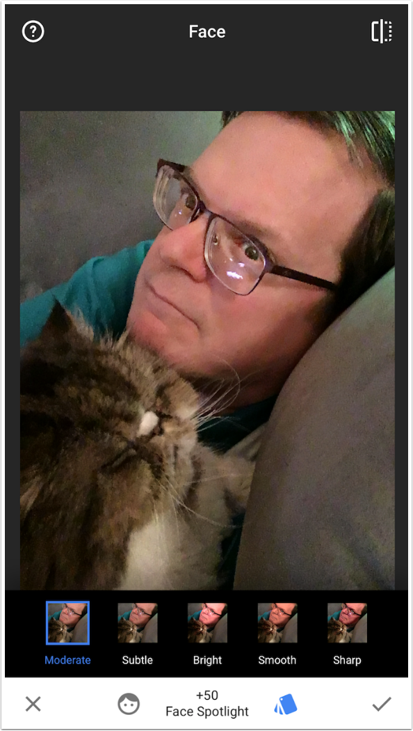
Swiping up and down shows the three controls within the Face module: Face Spotlight, Skin Smoothing and Eye Clarity. All start at 50% intensity in the Moderate preset.
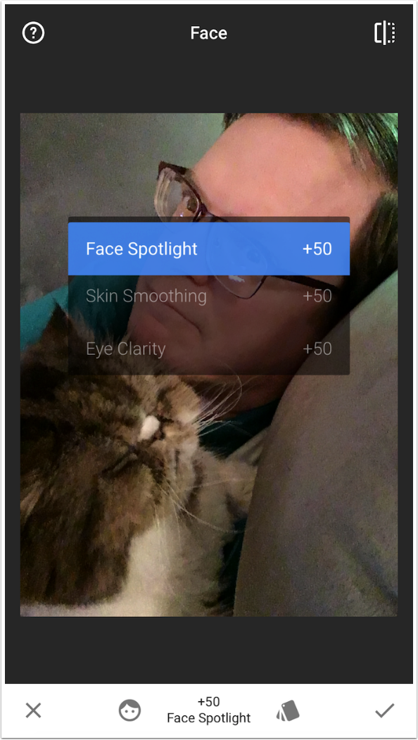
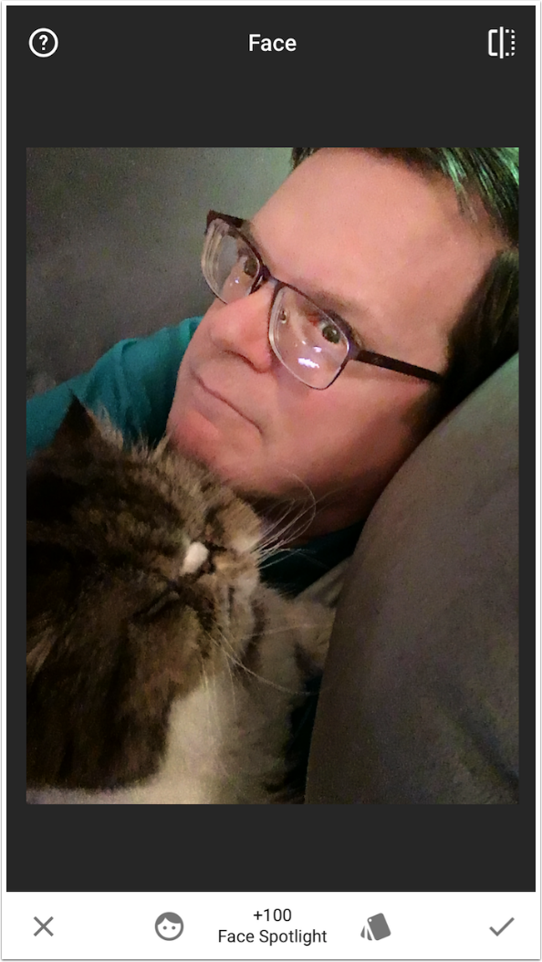
Below you’ll see the Face Spotlight at 100% intensity. It doesn’t just increase the brightness over the face. It brightens the shadows on the face, and darkens the surroundings. That way, the face doesn’t get blown out.
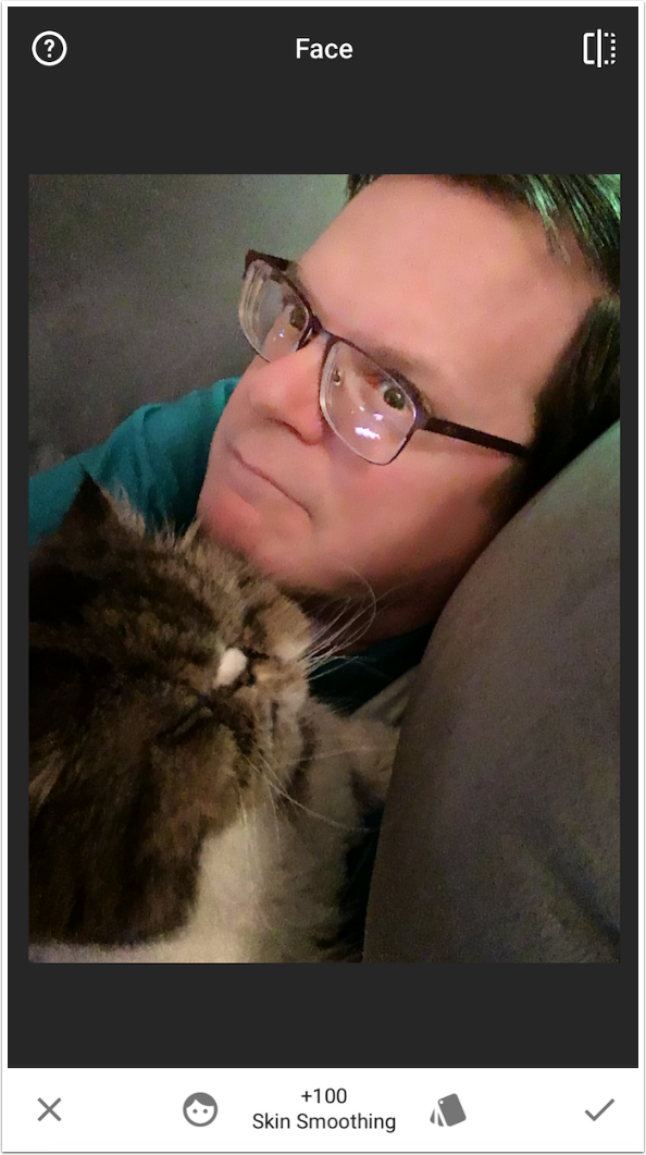
Skin Smoothing at 100% gives my face a plastic look, so I definitely don’t want to use that high an intensity.
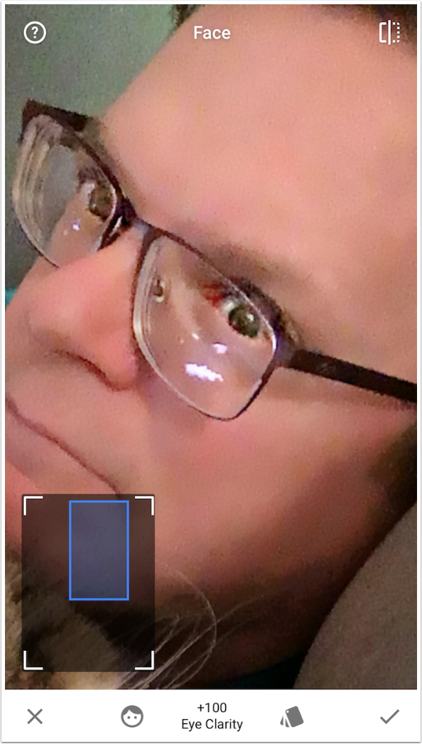
I zoomed in to show you the Eye Clarity at 100%. Eye Clarity whitens the whites of the eye and sharpens. It seems to have also sharpened my glasses. Use with caution.
For the finished image, I added some Lens Blur and lowered the Saturation. The Face module is a welcome addition to Snapseed, when used in moderation. It’s not as capable as some dedicated retouch apps, but it is fast and easy.
Over
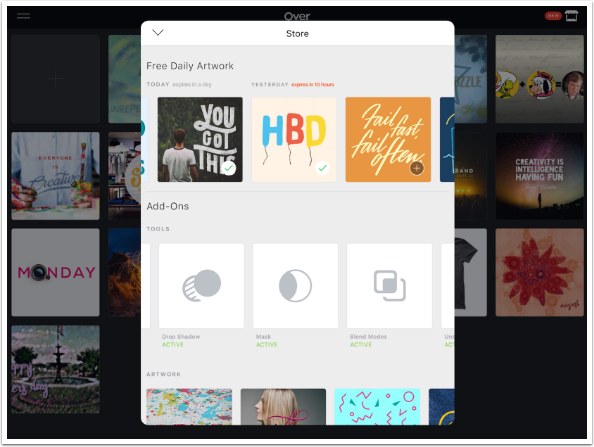
The text app Over added two capabilities that I thought I’d show you. These additions are not worthy of their own column, but they are worthy of being shown in this omnibus article. The two additions are Blend Modes and Curved Text. Curved Text is automatically added, but you have to turn on Blend Modes in the Store (it’s free).
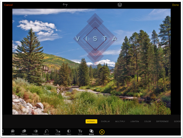
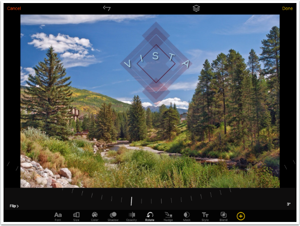
I’ve loaded an image that includes a geometric shape added in Tangent. I added the word VISTA with a shadow. Blend is a new icon, present when you’re manipulating text, all the way to the right between Style and Store. Once I select Blend, a number of blend modes are shown just below the image. Default is Normal.
The different blend modes will change how the text interacts with the image. Here you’ll see Multiply mode.
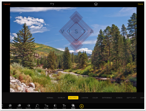
The shadow disappears in Difference mode, because it can get confusing deciding what should happen to a shadow with that mode. Should part of it get lighter on a dark area?
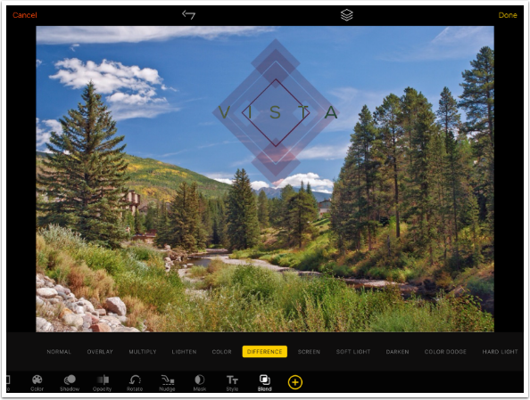
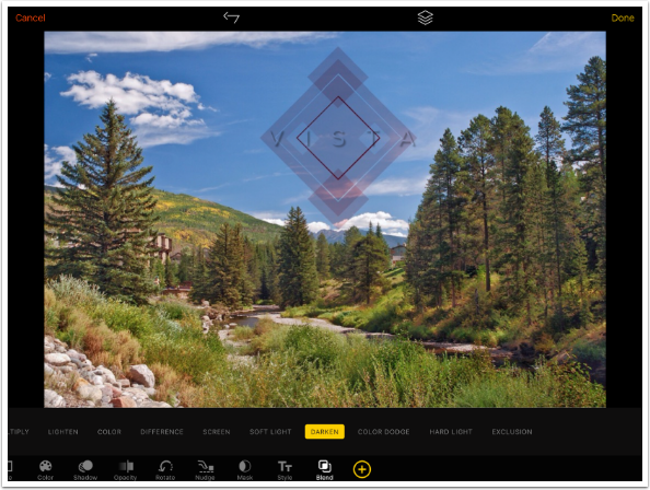
On the other hand, light-coloured text disappears in the Darken blend mode, leaving just the shadow.
Curve joins Align, Space and Caps under the Style Option. It’s a single slider, defaulting to the center (no curve).
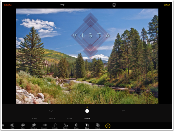
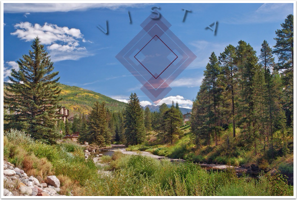
The change becomes more obvious more quickly as you move to the ends of the slider. At 92, the curve only covers about a quarter of a full circle. At 100, it becomes a full circle.
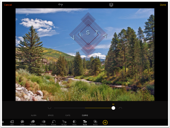
After adding a curve, I found I had to add a bit of rotation as well to straighten the text.
Below is my finished image, with both Darken blend mode and Curved Text.
I always appreciate it when app developers look to improve their apps with new capabilities – as long as they are as solid as Snapseed and Over. The Face module in Snapseed and the Blend Modes and Curved Text in Over are nice, small changes that don’t break what was good about the apps in the first place.
I hope that you aren’t too confused by the fact that I covered a lot of ground in this article. I wanted to have a short discussion of file and image sizes, and thought revisiting Big Photo would be a way to accomplish that. And the feature additions to Snapseed and Over deserved discussion as well. Until next time, enjoy!
Donating = Loving = TheAppWhisperer.com
Bringing you (ad-free) TheAppWhisperer.com takes hundreds of hours each month and hundreds of pounds to sustain. If you find any joy and stimulation here, please consider becoming a Supporting Member with a recurring monthly donation of your choosing, or possibly making a one-time donation. This is a not for profit website and one that can only grow with your support.
[seamless-donations]

2 Comments
Meri walker
As always, Jerry, you’ve done a magnificent job of clearly articulating distinctions that many people find difficult to understand !! Bravo and thank you for serving us all this way!
micropigmentación
Thanks for sharing your thoughts on pollinated. Regards