Mobile Photography / Art Tutorial – Microsoft Selfie and Prisma: A Couple of Tips
We are delighted to publish Jerry Jobe’s latest mobile photography/art tutorial for our viewing pleasure. This time Jobe takes a look at two apps, Microsoft Selfie and Prisma. Take it away Jerry…(foreword by Joanne Carter).
“Some apps, quite frankly, don’t need a whole lot of explanation. A tap, a choice made, a slider, and you’re done. However, just because they are simple and popular doesn’t mean that you can’t get more out of them with a couple of tips about them. That’s why I am covering a couple of very simple apps today: Microsoft Selfie and Prisma. (One other commonality between the apps is that they are available for Android as well as iOS devices).”
Microsoft Selfie
Microsoft Selfie is a free app that was released about a year ago. Its sole purpose is to remove the noise generated in low-light selfies created by the less-powerful front-facing camera. You are generally going to use it to capture photos, but you can also apply the same noise-reducing function to images in your library. There is a Gear button at the lower right that takes you to the settings for the app.
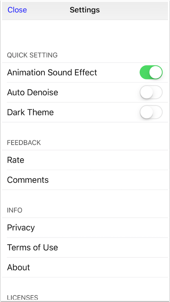
The Settings screen has three switches. The first is a real “who cares” setting: Animation Sound Effect. It doesn’t matter if it’s on or off.
The second setting, Auto Denoise, might as well be set to On. Later, when you see the available filters, you will see that Denoise is added as part of the filter anyway.
The third setting is Dark Theme. I would tend to leave that off, simply because the default bright theme throws a little more light onto the subject while capturing selfies. Extra light never hurts.
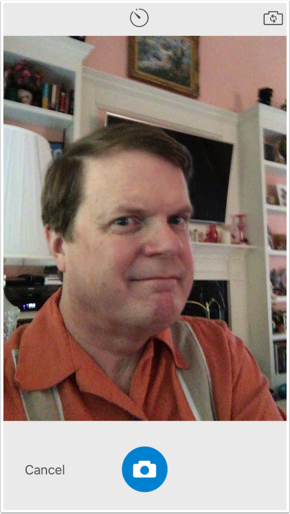
If you’ve chosen to Take Photo, the camera appears. At the upper center is a timer, which cycles from instant (shown) to three-second and ten-second delays. You can also capture using the back camera using the “camera choice” button at the upper right, so noise-reducing can be applied to portraits of others. The Capture or Shutter button is at the bottom center.
Focus and exposure can be set by tapping the appropriate place on the image, as with most cameras.
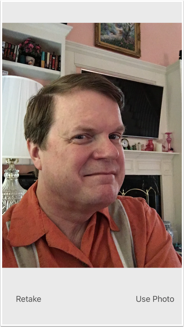
Once you capture an image, you are given the opportunity to use the photo you’ve captured or retake it.
If you decide to use the photo, you are taken to a screen with a number of filters along the bottom. The slider above that controls the amount of noise reduction applied. The Natural filter uses the exposure and white balance of the image just captured.
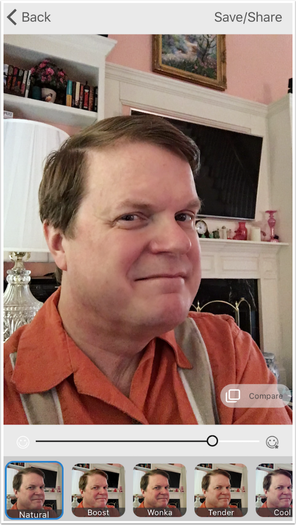
I zoomed in below and held down the Compare button to show detail of the original capture.
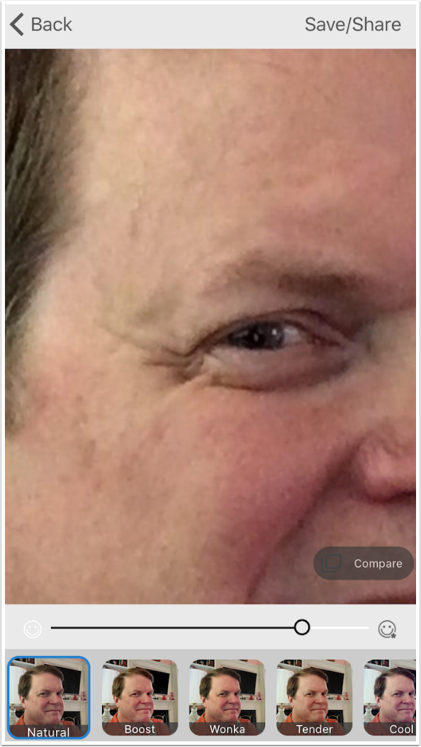
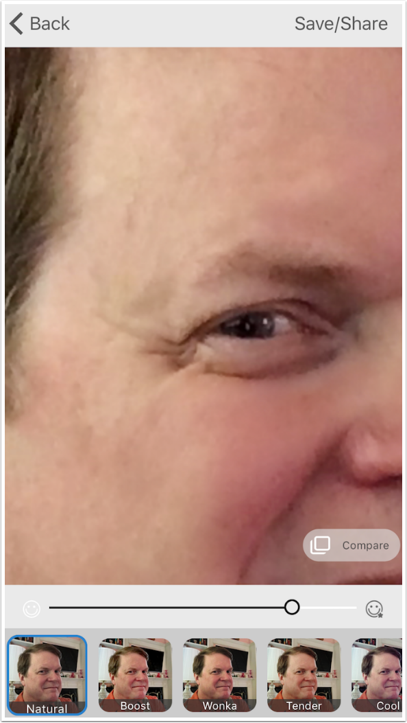
By releasing the Compare button, I can see the changes that Microsoft Selfie makes to the image. It’s much cleaner.
If you find the result too plastic, you can move the slider to reduce the amount of noise reduction.
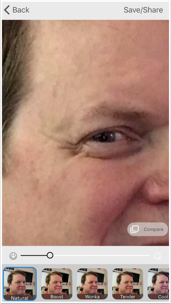
Whenever you choose a new filter, as I have below, the slider is reset and the default amount of noise reduction is applied.
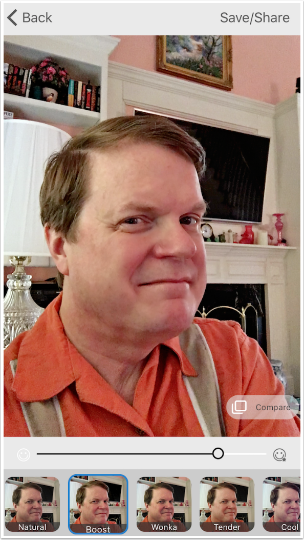
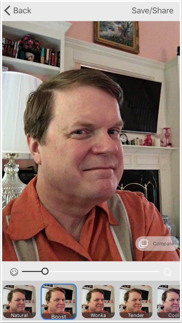
It would seem, from the image below, that the movement of the slider changed the amount of noise reduction and the amount of filter applied at the same time. This is not true.
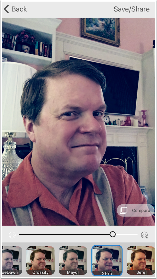
That can be illustrated with the use of another filter, XPro, which adds a lot of blue to the image. Here you’ll see it with the default amount of noise reduction.
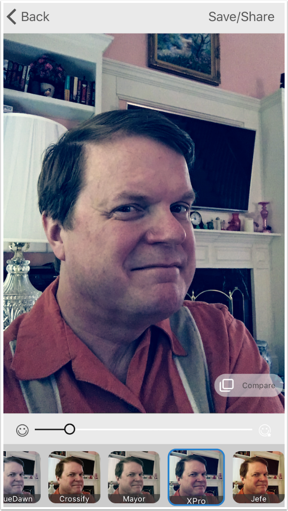
However, when I move the slider, the noise reduction is lessened but the blue in the filter remains the same strength.
When I tap the Save/Share button at the upper right, the image is automatically saved to the Camera Roll, and I am given the opportunity to share to Facebook or other apps. I am also allowed to go Back to work on the same image or go Home to capture another image.
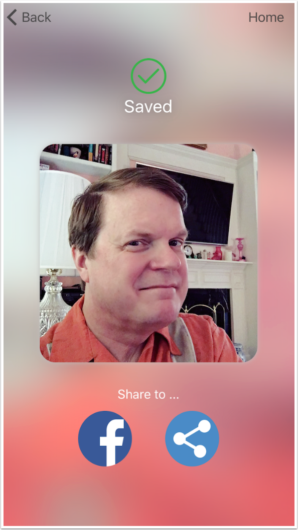
Here is the saved image. While it is cleaned up nicely, the image has its drawbacks: image size. MS Selfie does not save at the full resolution of the camera. I compared sizes between the native Camera app and MS Selfie. The front camera: MSS – 1270 x 957; Camera – 2576 x 1932. The back camera: MSS – 3251 x 2443; Camera – 4032 x 3024.
So while I like Microsoft Selfie, I only recommend the resulting images for quick, fun uploads to Facebook or Instagram. The size reduction is unnecessary and ruins the image for use in prints.

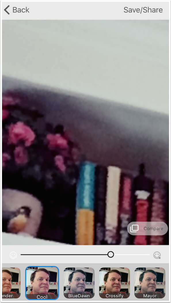
Of course, the results can be further edited in other apps, as we will see when I turn to Prisma. But before I do that, let me show you that the noise reduction in MS Selfie is not limited to the faces in the image (although the facial recognition does some extra work to the faces). Below is a before of some non-facial detail.
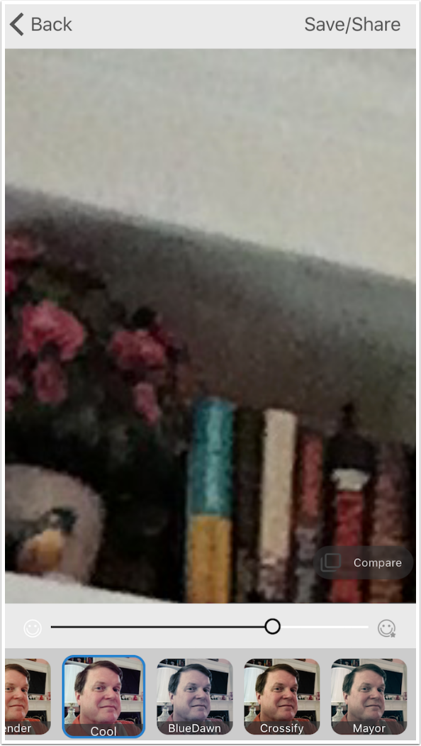
And here is the after. There’s no denying Microsoft Selfie gets rid of a lot of ugly noise.
Prisma
Just like Dreamscope before it, Prisma has taken the app world by storm. Since its release in June, I’ve seen many people who had no interest in art apps take it up and use it immediately. It’s free, very simple to use and can deliver some striking results. However, there’s no denying that it is not intended for serious artwork. Its effects are strong and blocky for the most part, and the user is constrained to a square, low-res image.
Bringing up Prisma takes you to a camera. In addition to the Flash control and the camera “flip” control just below the image, you will see that there is both a gray sill image shutter button and a red video capture button. Prisma will process short videos as well as still images. You can also import stills and videos from your albums, and that is what I will be doing here.
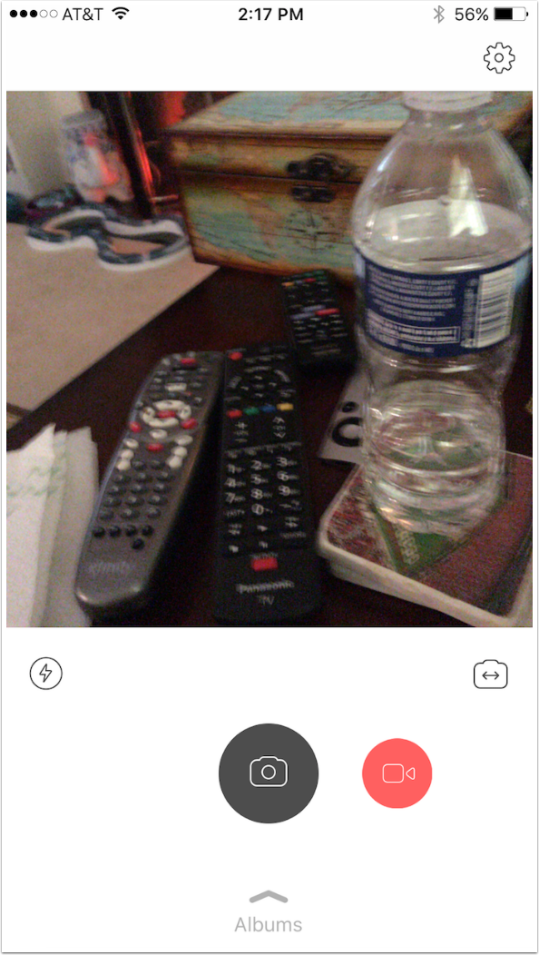
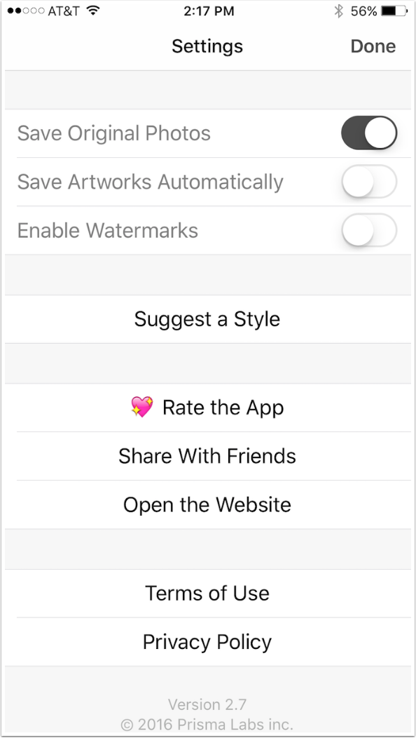
There’s also a Gear button that takes you to the Settings seen below. There’s a Save Original Photos switch for use when you capture images using Prisma. There’s a Save Artworks Automatically switch that I don’t use, because I don’t want every experiment I try to be saved, cluttering up my Camera Roll. And there’s an Enable Watermarks switch that I turn off, because I’m not in the business of advertising for an app with every image I post. Turn it off to get rid of the intrusive, large Prisma logo placed on the lower right of saved results.
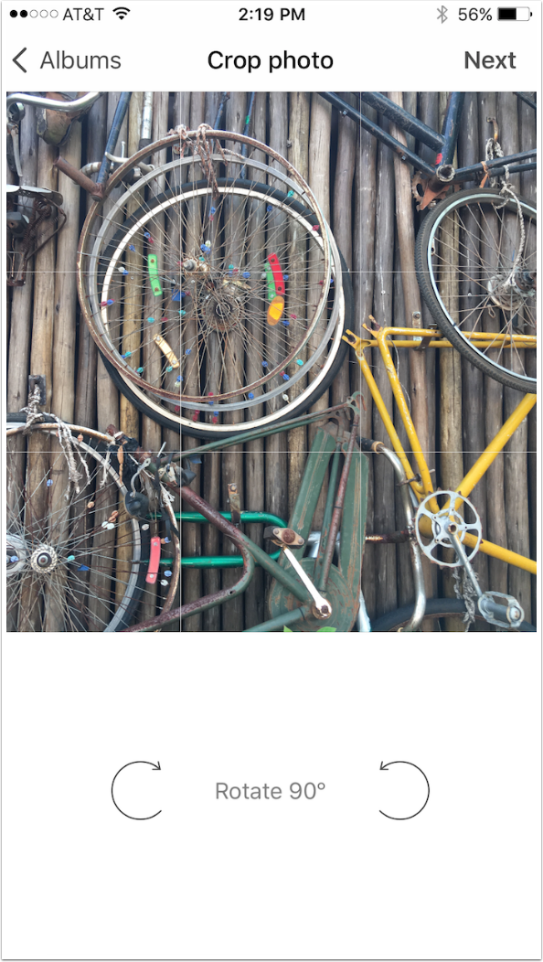
Next you are taken to a Crop screen. If you have a rectangular image, you may not want to crop to the center, but more to one side, as I did here. Click the Next button to continue.
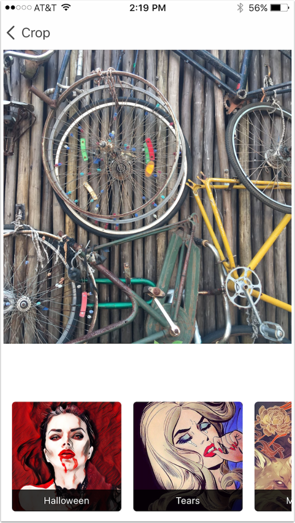
There are currently 43 different filters in Prisma. Each time you bring up the app, the filters that you used most recently will be placed at the front of the line. Therefore, you will never know what order you will find the filters in. To find an infrequently used filter, you will have to scroll.
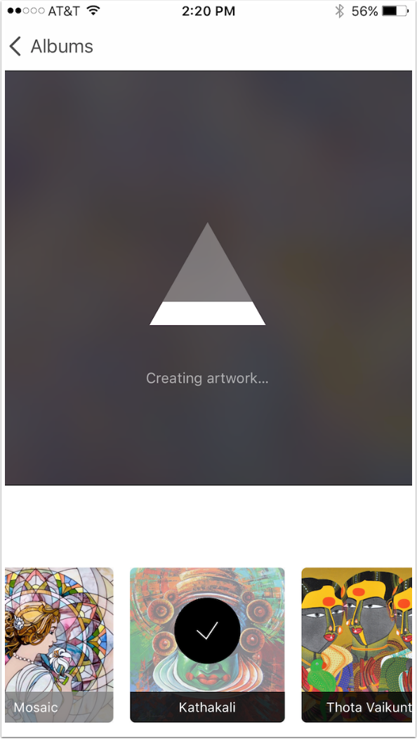
Once you select a filter, Prisma goes to work. Unlike Dreamscope and other apps like it, Prisma does not upload to a server to have the work done. It’s all done on the device, and it only takes a few seconds.
Once the results are available, four buttons appear just below the image. They are Instagram, Facebook, Save to Camera Roll and Share to other apps. There’s also a Split button that appears in the upper right.
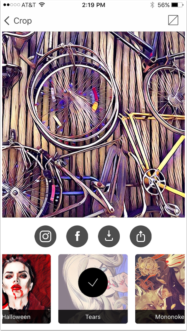
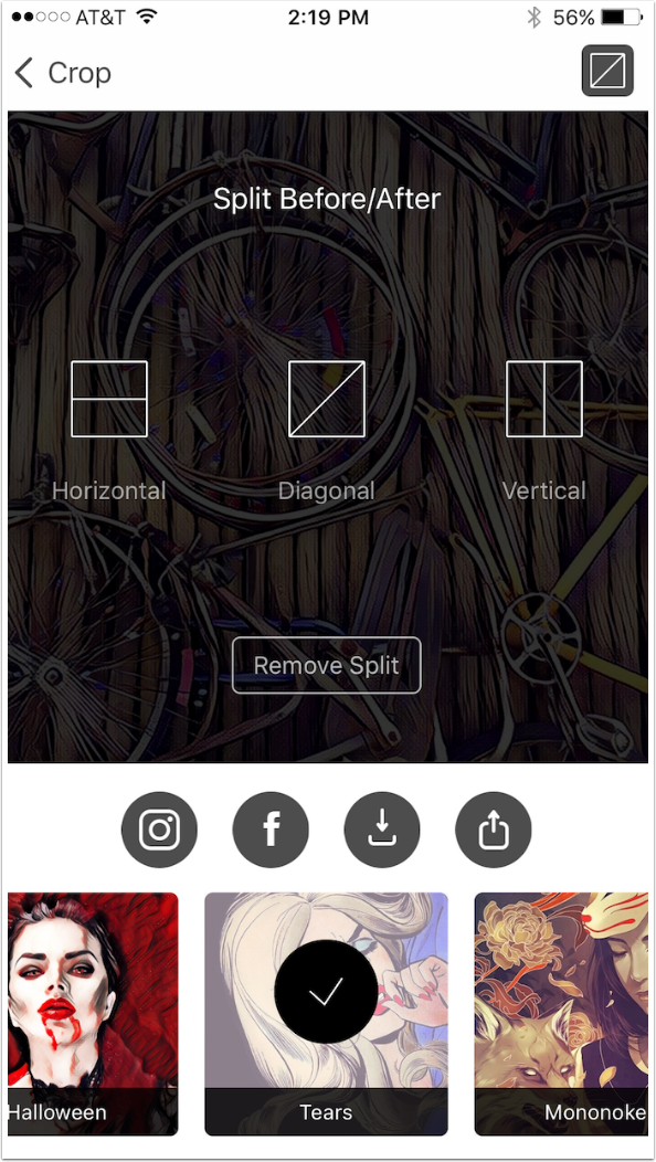
Split gives you the option of creating a before/after shot. There are three options for the split: Horizontal, Diagonal and Vertical. You also have to opportunity to come back to the same screen and removing a Split.
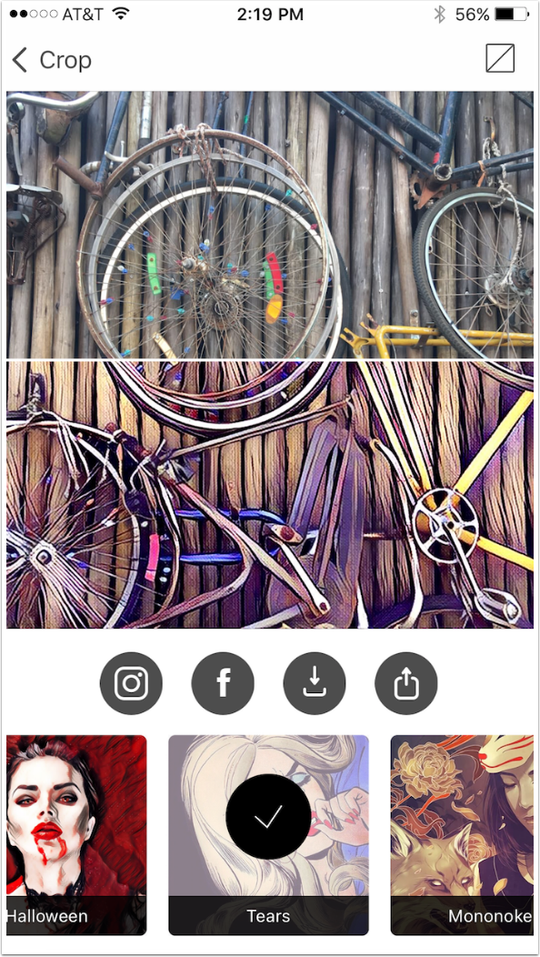
Below is an example of a Horizontal Split.
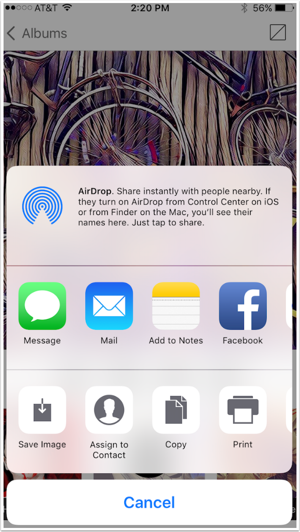
The Share option brings up the standard iOS dialog.
I find the results of Prisma to be too strong. But with some judicious blending back with the original, I can dial back the effect. For this reason, it’s best to crop into a square before running an image through Prisma. In the image below, I had to blend the square Prisma image over the rectangular original, and it took some time to get them to line up correctly.
As one of my readers, Sherry, pointed out, it is possible to swipe right on the image and reduce the effects. However, these results would still be the lower resolution. By blending the low-res Prisma results with a high-res original, I get larger results in a single step. Also, I can have more control over the blend by masking it into portions of the image, or changing the blend mode. So if you want to use the Prisma output as is, with no further modification, then you do have a way to tone down the effect inside Prisma.
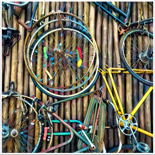
I’ve discussed before how I like to use apps to give me edges, which I can then color in or blend with a simplified version. Prisma has some nice edge filters.
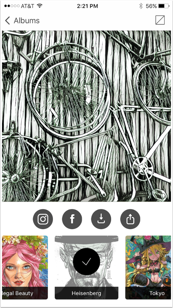
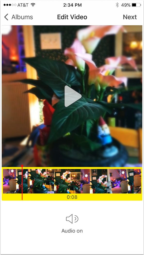
As I’ve said, you can also use Prisma on videos. Just like getting the Crop screen for still images, you get an Edit window for videos. The only edit available is to trim videos longer than 15 seconds to that maximum length. Since the video below is eight seconds long, no editing can be done.
Only nine filters are available for styling a video. It’s a shame, because I prefer some of the unavailable filters.
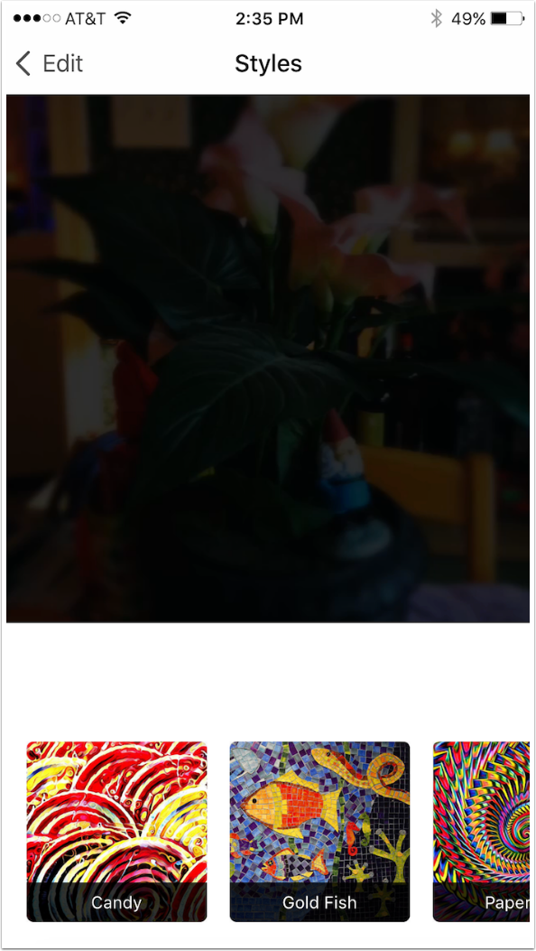
It takes significantly longer to process a video than it does a still photo, but the time is still 1-3 minutes. Not bad.
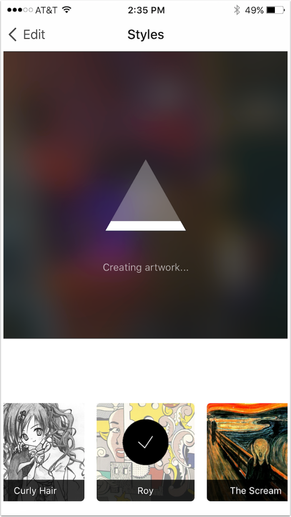
Here’s an example video, using the Illegal Beauty filter.
Output image size is only 1080 pixels square. However, given the blockiness of the result, blowing the image up to three times that size, as I did below with the app Big Photo, does not significantly degrade the quality.

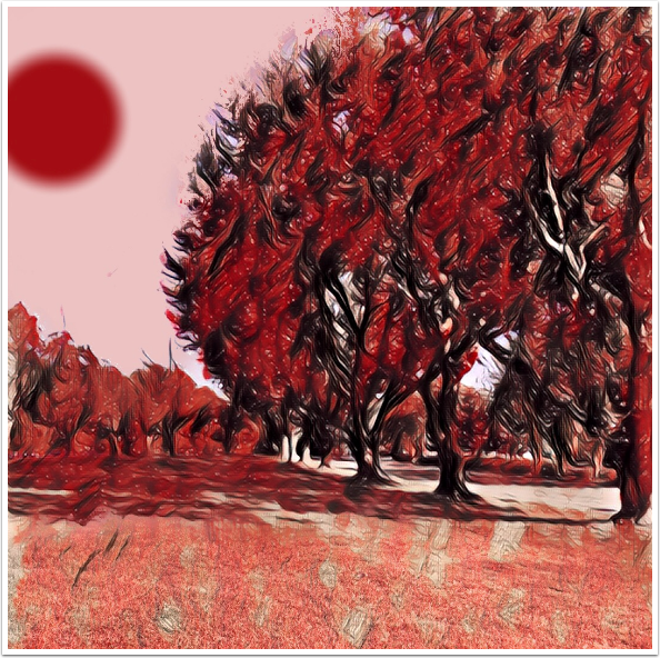
Blending and deciding which parts of the result to keep is crucial to keep your images from looking like every other image out there. I tried the newest Halloween filter, but decided to keep just the color from the grass and sky, eliminating the heavy lines the Prisma filter gave them. I added a “sun” and the result reminded me of a book by Elspeth Huxley: “The Flame Trees of Thika”.
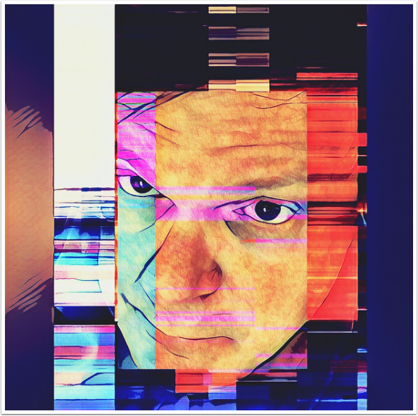
My current Facebook profile photo used a watercolour version that was run through Decim8 twice. I blended the two versions before using Prisma, then used about 30% of the blended version and 70% of the Prisma version.
The bottom line is, I like Prisma and about a quarter of its filters. Since I am using parts of the Prisma results in a blend, I have less of a problem with the square crop and the low resolution. I’m not interested in using Prisma results as a finished product.
Until next time, enjoy!


2 Comments
Jennifer
I like Microsoft Selfie in theory, but why do the photos come out backwards – or mirror imaged? I don’t see any way to fix this in app.
Carlos
Thanks Jerry!