iOS Mobile Photography App Tutorial – ‘Stackables’ Part 3 by Jerry Jobe
We are delighted to publish Part 3 of 3 of the mobile photography app tutorials with Stackables by Jerry Jobe, if you missed Part 1 please go here and for Part 2, please go here, (foreword by Joanne Carter).
Stackables retails for $1.99/£1.69 and you can download it here.
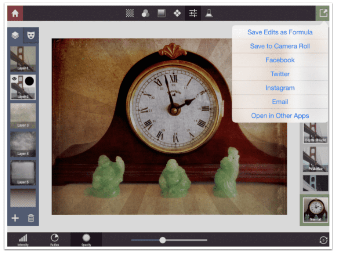
We’ve come to the last part of my series on Stackables, and we’ve covered the Textures, Filters, Gradients, Patterns and Adjustments you can add to your images in layers. We’ve also covered the new masking features that allow you to mask out or mask in the added layers. (Go back and look over those articles, if you haven’t, because they show you a lot.) I’ve shown you what my starting image of a clock looks like with all those added layers, but I haven’t shown you how to save the image. That’s done by tapping the green arrow at the upper right, as shown below. The drop-down menu allows you to save the image, share it on various social media platforms, or open the image in other apps.
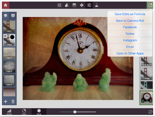
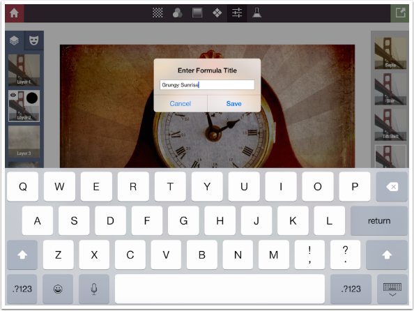
But Stackables allows more. It allows you to save all the layers, with all of the adjustments and masking you’ve done, so that you can apply the layer stack to other base images. This layer stack is called a Formula. Stackables allows you to save your own Formulas, as well as use Formulas created by the developer and others. If you tap the option “Save Edits as Formula”, seen above, you’ll be given the opportunity to name your formula. I name mine Grungy Sunrise because of the burst pattern I used.
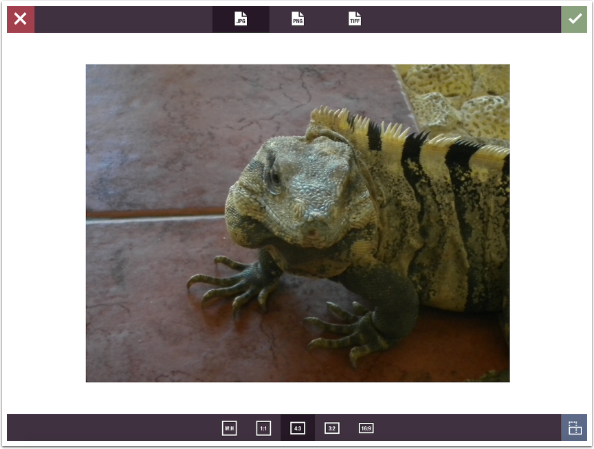
Now, how do we access and manipulate these layer stacks, or Formulas? We will start by using a new image, a little guy I encountered in Cancun.
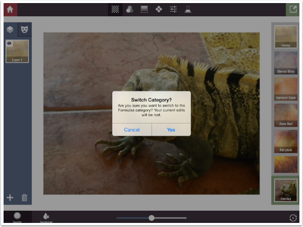
Formulas are accessed through the “flask” button on the right end of the top line of buttons, just before Save. Since Formulas are an entire stack of layers, those layers will replace any you have already added. A confirmation dialog box will make sure you want to make the wholesale replacement of layers.
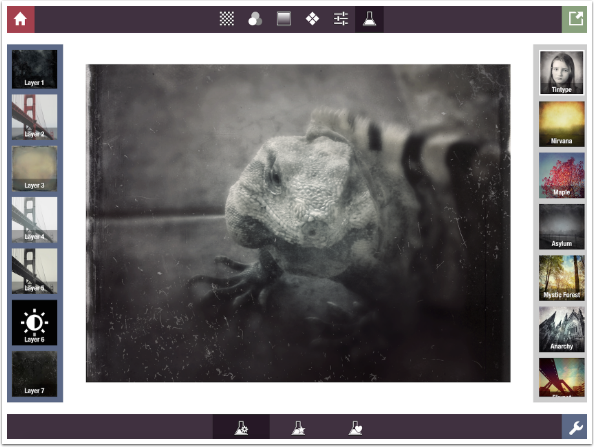
There are three groups of Formulas, accessed through the three buttons on the bottom center. The leftmost button accesses the developer’s formulas, starting with Tintype. Tintype is an excellent formula that shows off the capabilities of Stackables quite nicely.
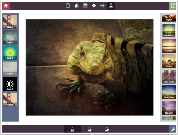
The developer, Samer Azzam, has provided 32 different formulas. Another nice one is seen below, Spring Bloom.
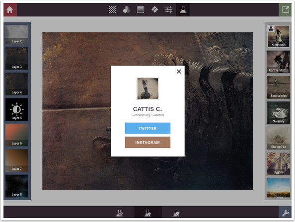
The middle button at the bottom, the flask with the star, shows user-developed formulas that have been incorporated into the app. You can easily tell they are user formulas by the little figure at the top left of each thumbnail as you tap it.
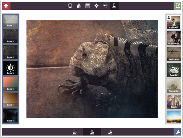
If you tap the little figure on the thumbnail, then you get information on the user who submitted the formula. In this case, Happiness was created by Cattis C.
Below you’ll see Abandoned, a formula devised by the wonderful iPhone artist Geri Centonze, who until recently had an excellent blog entitled Art of Mob. (Even though she has discontinued new articles, you can get a lot out of the old ones.) Abandoned works well with my image, but not perfectly. The six layers shown on the left – the ones that make up the formula – are not modifiable on this screen, nor is there a way to add layers. Can we not tweak formulas? Of course we can. Just tap the wrench button at the lower right.
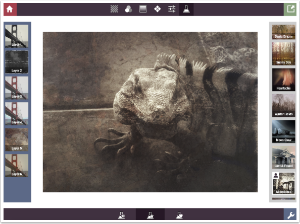
When you tap the Wrench button, you are taken back to the regular workspace with all the layers from the formula added to your layer stack. You can tweak the settings of the layers from the formula, or add new ones.
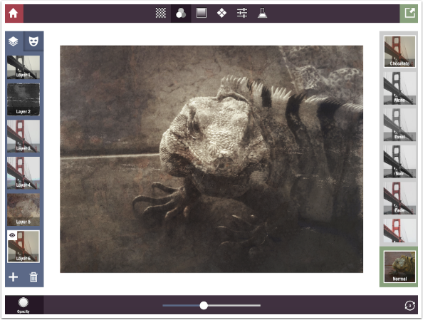
I decided that my original image was too dark, so I added a Color Adjust layer and dragged it upwards to the top (“closer” to the original image). Then I boosted the Shadows.
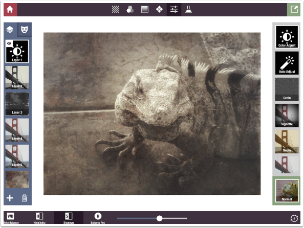
If you’ve been paying attention over the last couple of years of my articles, you know that I like a vignette to emphasize the subject of the photo. I add one at the bottom and bring down the opacity.
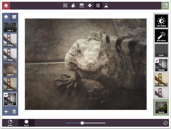
And here’s my lizard pal.
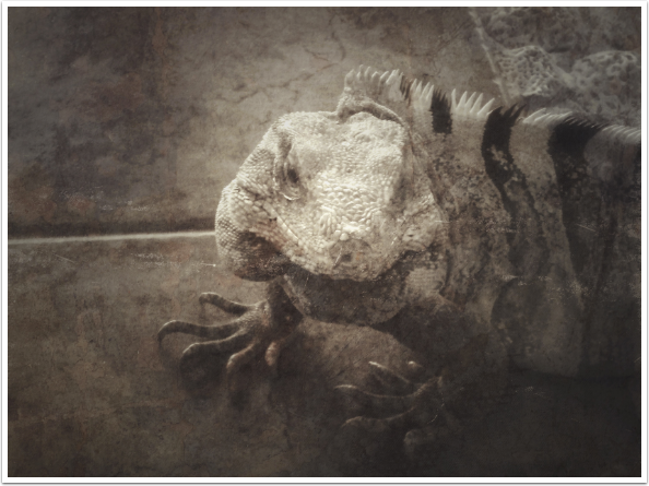
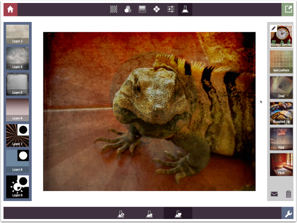
The third of the three buttons at the bottom of the Formulas screen, the flask with the heart, is your own saved formulas. You can see below that I have applied Grungy Sunrise to the lizard image. There’s a pencil icon on the thumbnail, and tapping that allows you to change the name of your formula. You can change the order of your formulas by tapping and dragging the thumbnail up or down in the order. You can delete the selected formula by using the trash can at the bottom of the formula list.
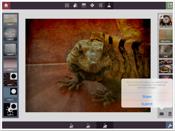
The envelope at the bottom of the formula list is used to Share the formula with others through an email, or Submit the formula to the developers for use in future releases. I have yet to Submit any formulas, because most I have created are specialized and don’t work that well with different images.
Here’s one I called Roughed Up. As I said, it doesn’t work that well here.
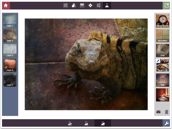
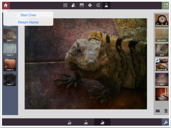
As I promised, I am going to walk you through creating an abstract in Stackables completely from scratch. I want to start from a clean slate, so I tap the home button at the top left. I have two options available to me: Start Over, which discards all the layers in my stack; and Return Home, which allows me to load another image. I’m going to Start Over, which means my abstract will be the dimensions of the underlying lizard image.
But before I start the abstract, let’s take a minute and look at the iPhone layout for Stackables instead of the iPad. Because of the smaller screen size, things have to be condensed somewhat. Below is the opening screen on the iPhone.
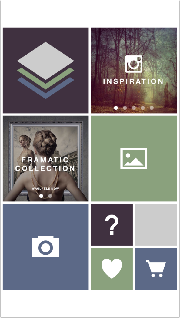
There’s enough space to have the eight buttons along the top for Home, Texture, Filter, Gradient, Pattern, Adjustment, Formula and Save. There’s enough space for the slider at the bottom as well as the button for choosing what the slider adjusts and the Rotate button. But there’s not enough room for putting the layers palette on one side and the Presets and Blend Modes on the other, so they are combined on the right side.
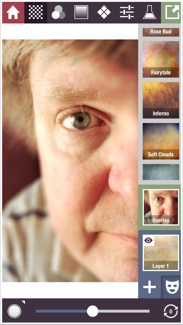
Tapping on the image will hide all the thumbnails on the right side; tapping again will restore them. Tapping and holding, just as in the iPad version, will show the original image.
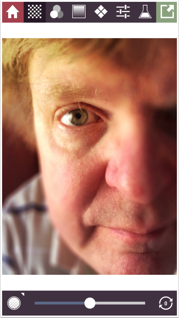
Tapping the plus sign will bring up the menu to add, duplicate or delete layers.
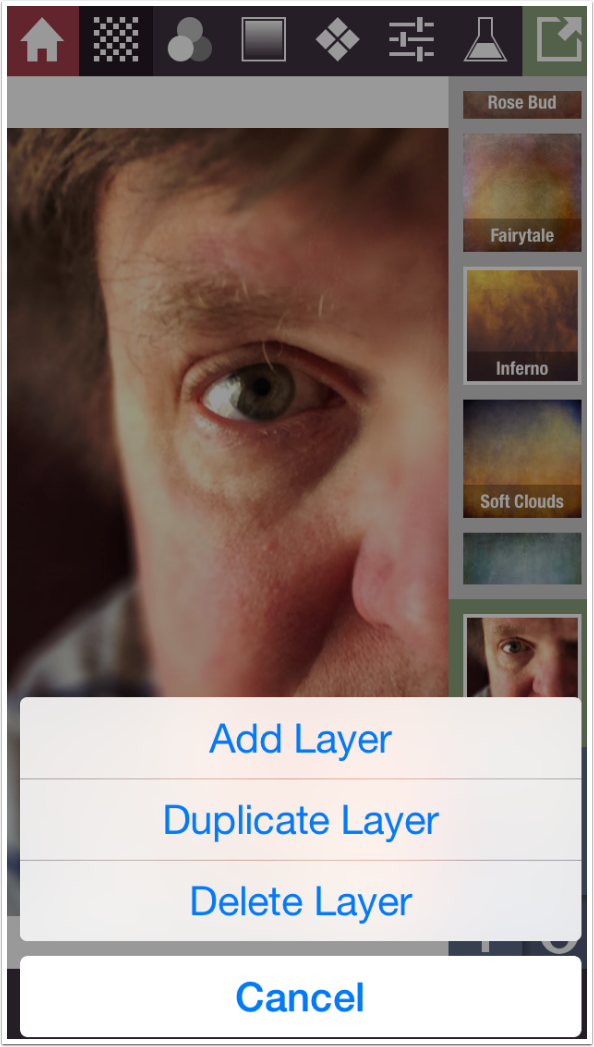
The Presets have a beige background; the Blend modes have a green background; and the Layers have a blue background. Tapping on the thumbnail for the layer, as seen below, will open up that part of the menu and allow you to scroll through the layers or options.
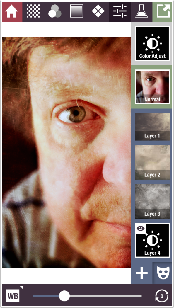
I’ve added a few texture layers and a Color Adjust layer that uses White Balance to take some of the yellow out. I’m ready to tap Save.
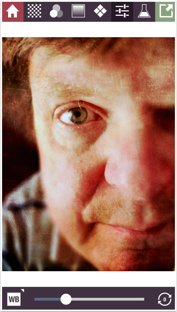
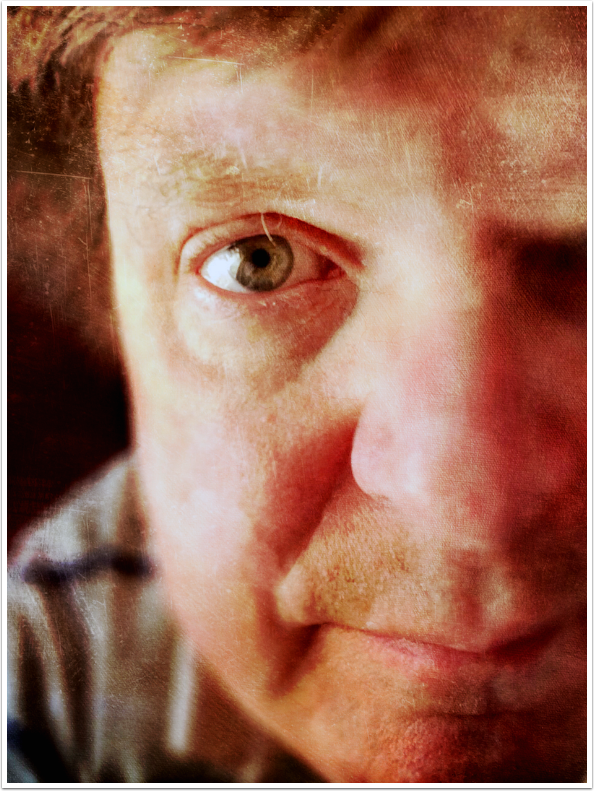
And here’s a quick result. (And by the way, that stray eyebrow hair is bugging the heck out of me also!)
The following abstract was constructed entirely on the iPhone version using the method I will now return to.
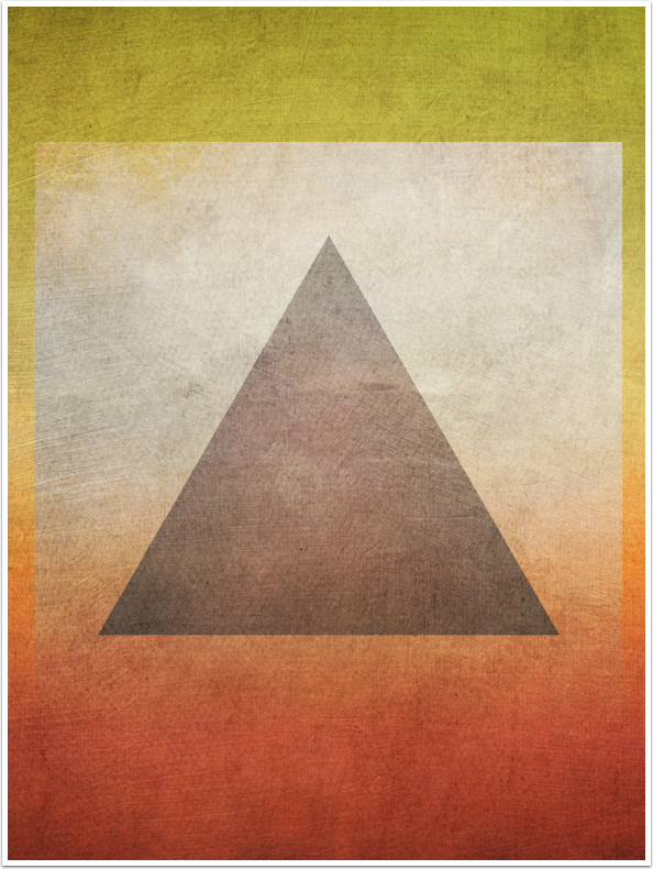
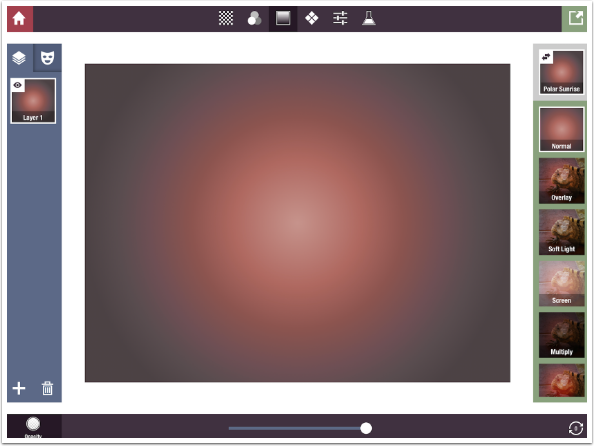
If you’re wanting to create an abstract entirely from scratch, you have to start with a background. Gradients make a nice background. You have to apply them at 100% in Normal mode, so absolutely nothing from the underlying image (in this case, the lizard image) shows through.
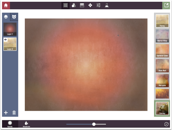
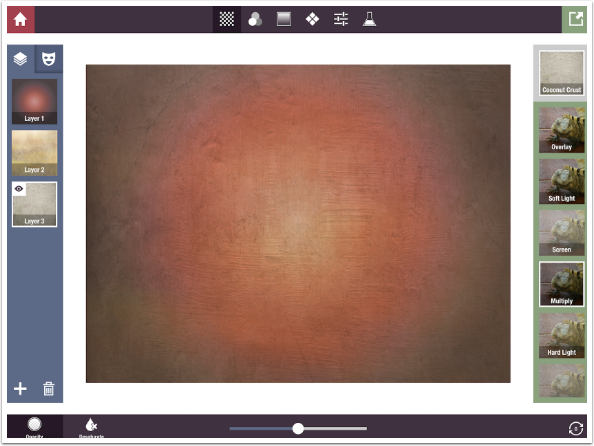
Next I start layering on textures. I start with Honey in Overlay mode with increased opacity.
Next I add Coconut Crust in Multiply mode. Notice how the Blend mode thumbnails show the lizard image. The thumbnail always shows the effect as if it were applied directly to the image; it does not reflect the intervening layers.
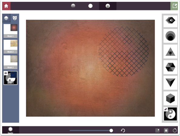
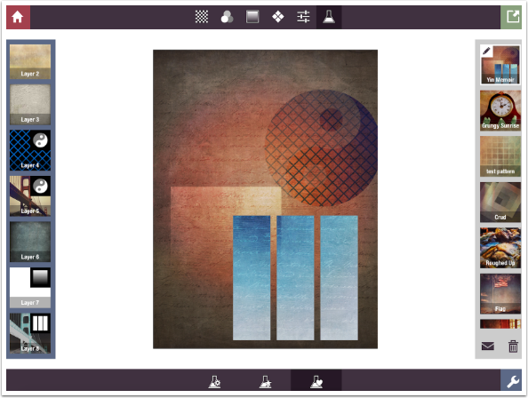
Next I choose a dark blue Diamond Knit pattern, but I apply a yin-yang mask to that layer and place it in the upper right corner.
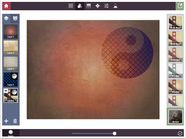
I duplicate the layer so that the mask will stay in the same place and apply an Arctic Dawn filter to darken the same masked area.
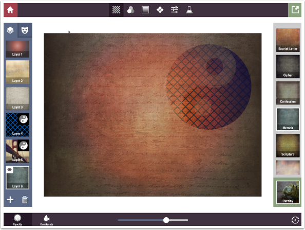
I want to go back to applying changes to the entire image, so I add a layer rather then duplicating. I choose the Memoir texture in Overlay mode.
The Gradient Masks can make some interesting effects. Here I just use a Plain white pattern in Overlay blend mode at 50% opacity in a square that fades out at the bottom.
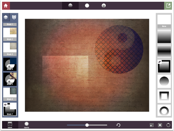
Next I use a Composite mask of three vertical bars to mask in an Invert RGB layer.
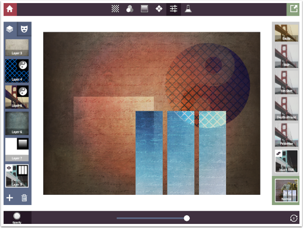
I’m pretty happy with that; I save it.
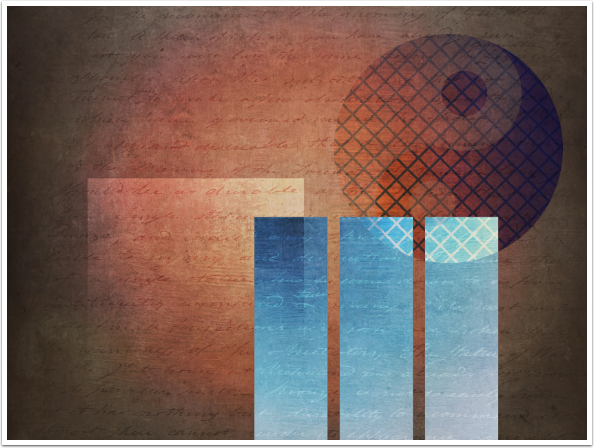
At the end of part 2, I asked a question: What happens when you save a layer stack that creates an abstract as a formula? Maybe by this point, you’ll be able to guess. I saved the edits as a Formula, and named it Yin Memoir. Now, instead of having an underlying image in landscape mode, I load an image in portrait mode.
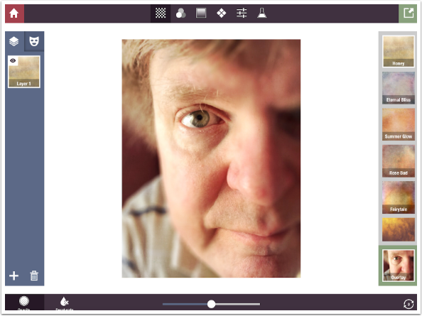
Applying the formula reconstructs the abstract in portrait mode.
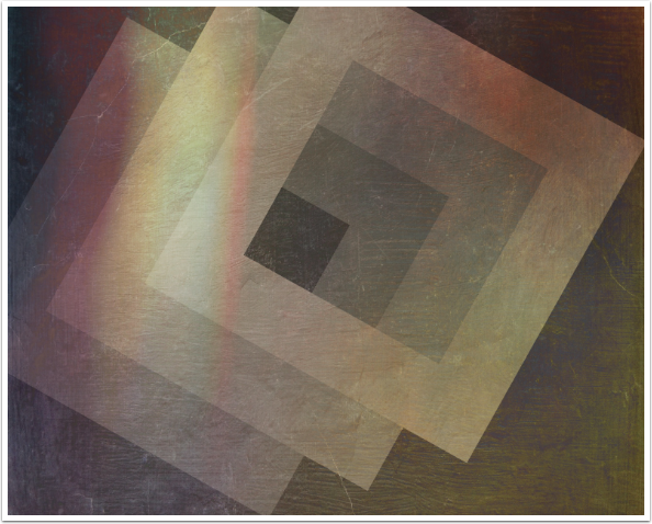
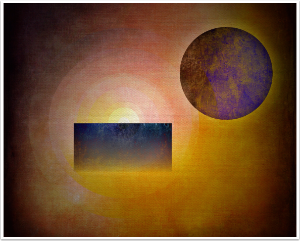
So unlike other grunge apps, Stackables allows you to create images entirely within the app. Although I enjoy creating, and the results are pleasing to my eyes, that is not the sole criterion for choosing this app over others in its genre.
In comparison to other grunge apps I have covered, Stackables is at the top of the heap. Distressed FX and Grungetastic have some nice effects, but without layering, it becomes difficult to create subtle effects. Mextures comes close to Stackables with its ability to layer, rotate textures and change blend modes, but the user interface is a bit clunkier and the range of available effects is much smaller. On top of that, Stackables allows for masking!
It is definitely one of my top apps, and most of my images will have at least a touch of Stackables. I hope that you will find it useful in your arsenal as well. Enjoy!
One Comment
Diana Jeon
LOL. We agree on this app! Stackables is one of my most used apps.