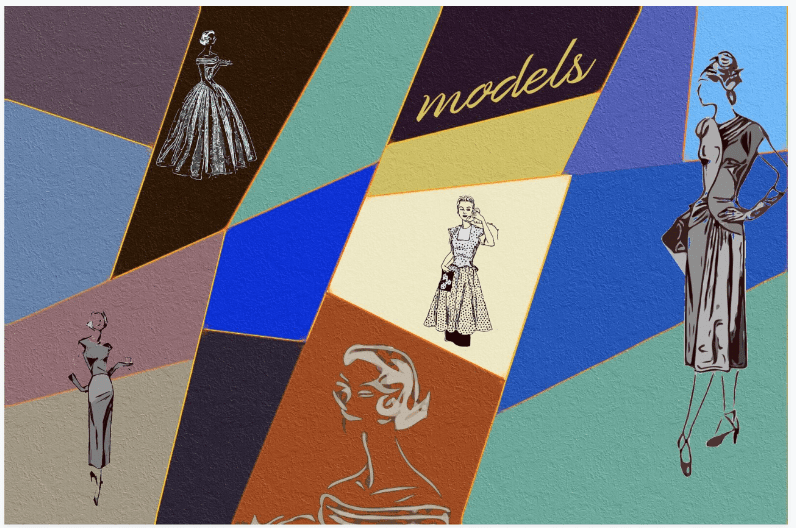
Mobile Photography / Art Tutorial – Creating and Using Reusable Elements with Jerry Jobe
We are delighted to publish Jerry Jobe’s latest mobile photography/art tutorial for our reading and viewing pleasure. Read Jobe’s thoughts about creating and reusing elements in your artwork (foreword by Joanne Carter). Take it away Jerry…
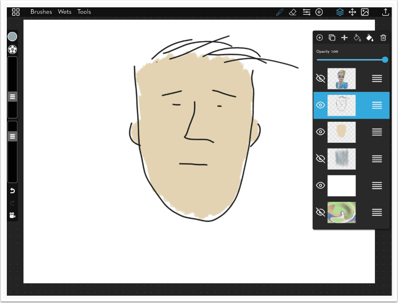
Some artists who use photos as a base for their art are capable of capturing everything they want in the frame. That’s wonderful, but some of us find our creative fires burn brighter if we piece elements together in our work. We spend hours masking elements to place them in the exact position we need them. Then we discover that we want to use the same flower or cloud or drawing or face or whatever a couple of weeks later. After remasking only one or two times, we start looking for a way to make those elements reusable.
There are three ways of making items reusable that I’ll be describing here: Chroma, dropping out a solid white or black background, and using PNG files with transparent backgrounds. Each has their advantages and drawbacks. As usual, I will be working mostly in iColorama, but I’ll also be taking forays into MetaBrush and the layering apps Leonardo and Affinity Photo for iPad (Affinity).
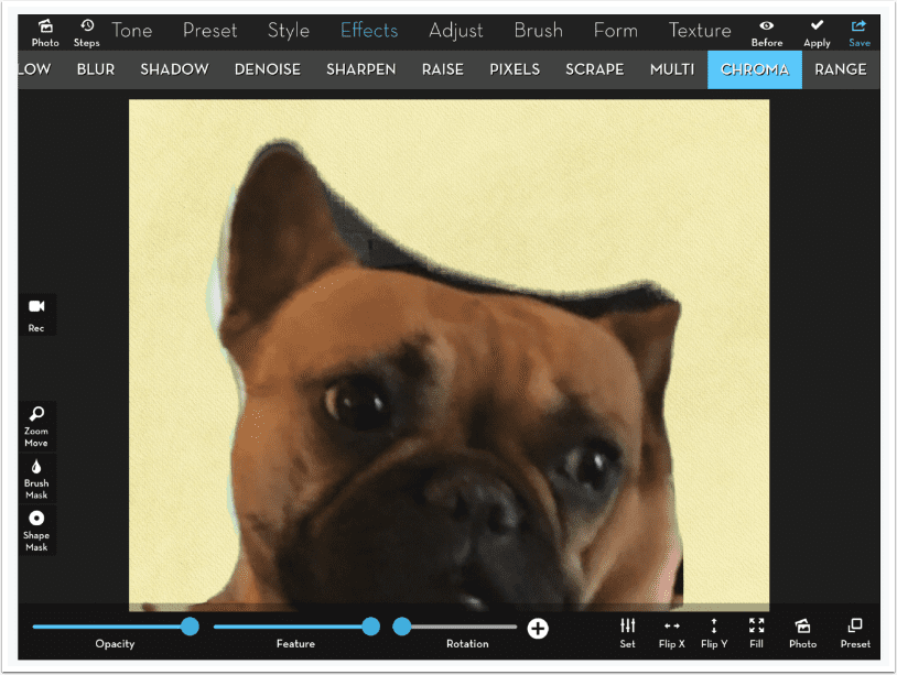
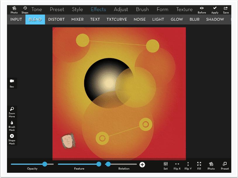
In the image above, I use Effects>Chroma in iColorama. Chroma Key has been used for decades in television and film. It’s more commonly known as “green screen”. All the pixels that are either green or blue are dropped out to reveal the underlying image. In iColorama, Preset 1 drops out the green, while Preset 2 drops out the blue.
In order to use the Chroma option, you must save the element with a green or a blue background. Below you’ll see the saved caricature, from the app Moment Cam. In Moment Cam I discarded the provided background and laid the element on top of a plain green background I had previously created in iColorama using Preset>Gradient.

Chroma gives you a nice sharp edge. You have to be careful, however. All green pixels are dropped out. If any leaves in the drawing were more green than brown, they would leave a hole in the middle of your image. Later on, I’ll show an example where I used Chroma on a tree, and made the background blue, so I could choose to drop out the blue instead of the green of the leaves. If your element has both greens and blues, then Chroma is not a good solution for you. Luckily, there is another choice for you.
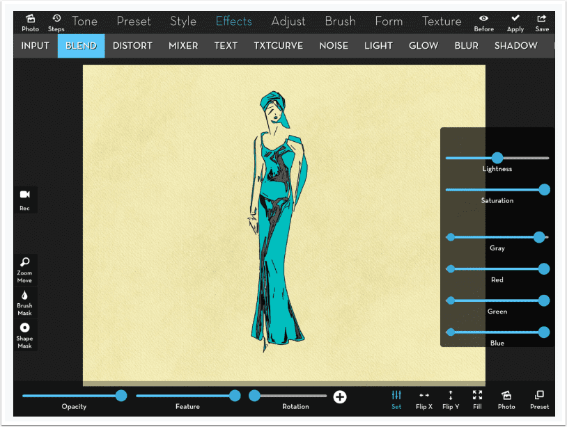
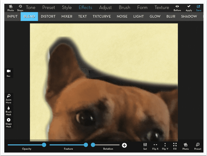
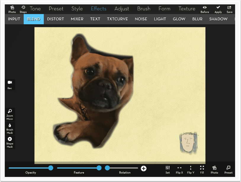
Below I used Effects>Blend to bring in an element with a blue-green color, created in Imaengine, on a white background.
You might think that you could use a brush mask and mask out the white using the Limits function. Limits, however, masks out based on the color of the underlying image, not the element you are adding. On the other hand, you have the Gray slider in the Settings for Blend that bases its function on the element.
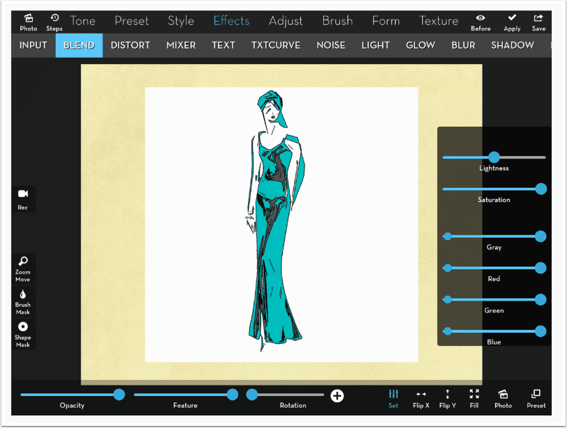
Using the Gray slider will allow you to drop out the white or the black parts of an image. By moving the right end of the gray slider towards the middle, I’ve dropped out the white below. If I moved the left end, it would drop out the black.
Using white or black as the background gives you the same problem as Chroma. What happens when there are highlights or white within the element? That gets dropped out, just as it did in the image above. These methods work well if one of the four backgrounds – green, blue, black or white – is sufficiently different from the entirety of the element you wish to reuse.
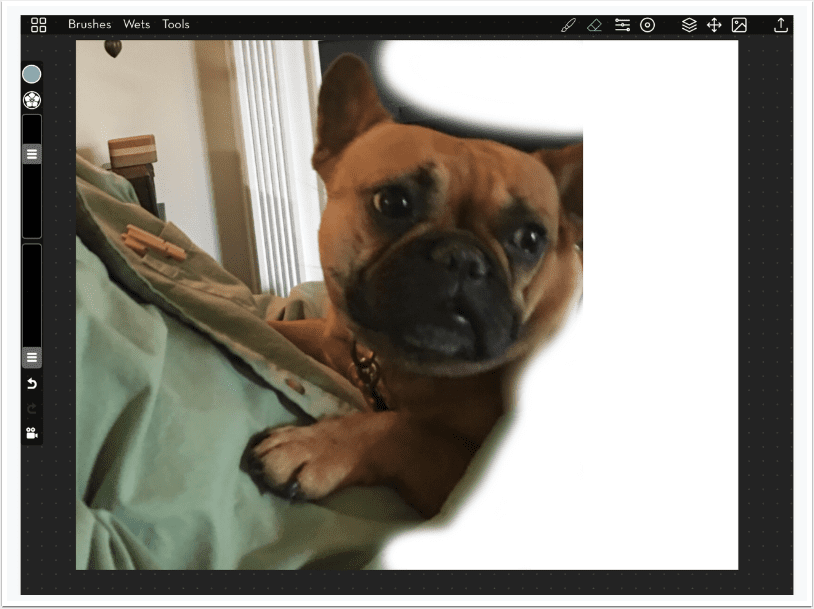
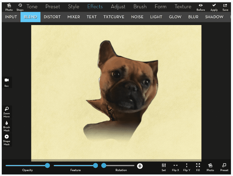
Another issue is partial transparency, or a soft edge. In the image below I’ve masked in green surrounding the dog with a soft brush. It looks fine as is, but when I bring the element in using Chroma, I get a nasty, blocky mess instead of a smooth transition. That’s because Chroma will evaluate each pixel to see if it is “green enough” to be eliminated. The algorithm used doesn’t account for “partial”; each pixel is either used or not.
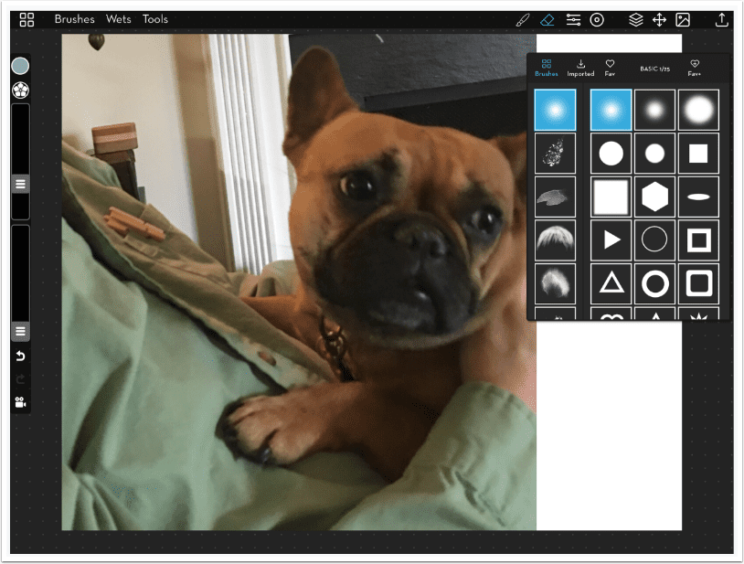
The way to handle partial transparency is by creating an image that contains your element on a transparent background. The standard file format, JPG, does not accommodate transparent backgrounds – but PNG does. iColorama can not create transparent backgrounds, but its partner painting app, MetaBrush, does. Let’s walk through creating a partially transparent element in MetaBrush.
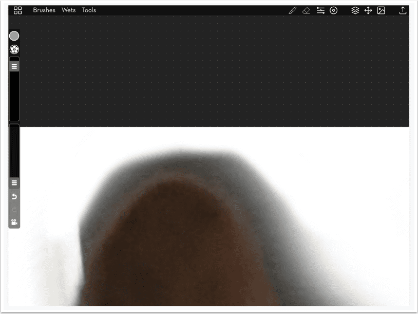
I opened a blank canvas and added a new photo layer by tapping the “landscape” button at the upper right (right next to the Share/Save button). When you choose the image you are allowed to resize the image to fit correctly on the canvas. We will not paint at all. We will just use the eraser to erase around the element. Next to the Brush option is the Eraser option, marked in blue in the screenshot below. A choice of brushes to use to erase appears. We want the first group, first brush – a very soft round brush.
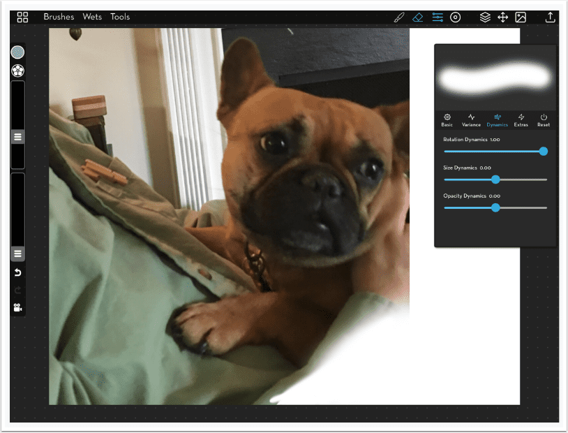
MetaBrush, as a painting program, has several controls for the characteristics of the brush – or, in this case, the eraser. The top slider on the left side controls the size of the brush and the bottom slider controls the opacity. There are further controls under the Settings button, which is next to the Eraser button on the top. By default, Size Dynamics under the Dynamics tab is set to 1, which means the speed of the stroke changes the size. I don’t want that in an eraser. I want to know how much I will erase. So I drag the Size Dynamic slider back to the middle, or zero change. If you look at the bottom of the image you will see part of the area was erased with a smaller brush with not much transition, while the remainder has a large transition. That was the doing of the Size Dynamics slider – I did not touch the Size slider on the left.
I continue erasing around the dog.
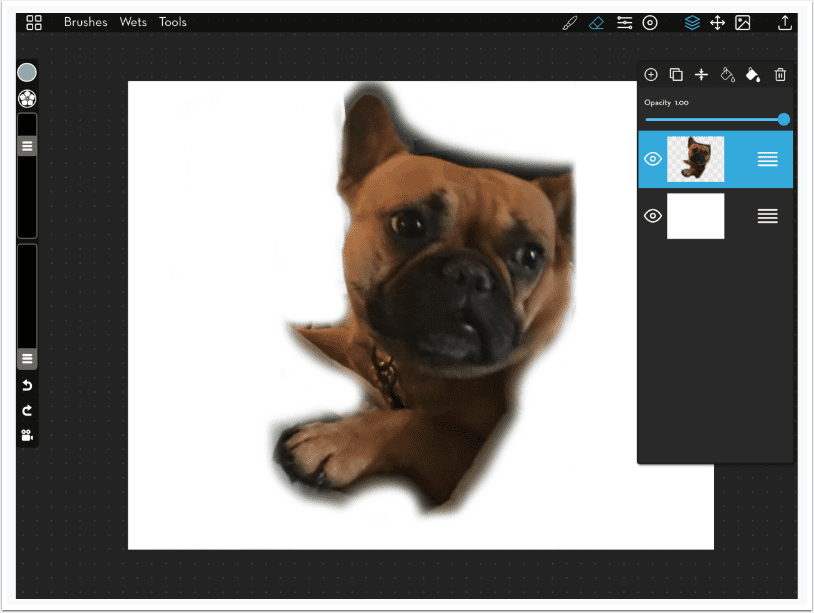
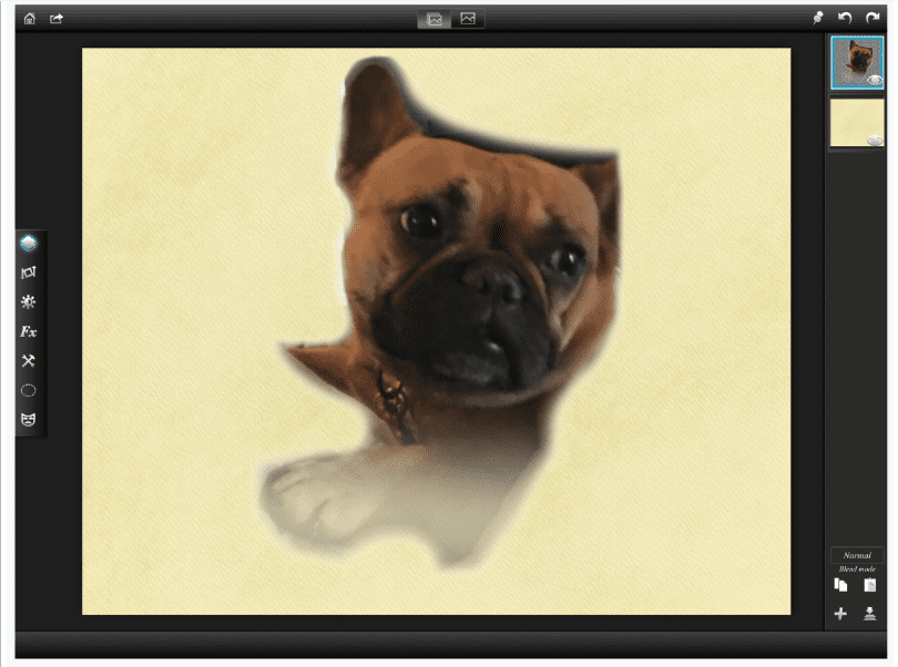
When I finish erasing, I take a look at the Layers palette, accessed by the icon of stacked diamonds. I see the dog is on a layer with a checkerboard pattern behind it, which denotes transparency. Underneath is the plain white background layer.
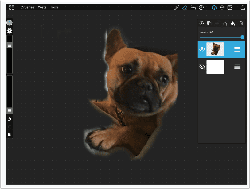
If I tap the eyeball on the white layer to hide it, I see the dog layer over the black with gray dots. At several points you can see the gray dots through the soft edge.
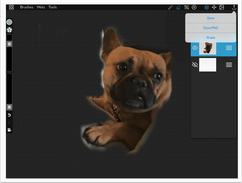
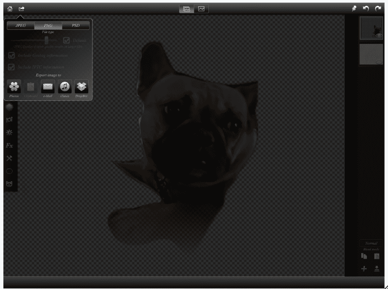
We now have an image with a transparent background. I tap the Save icon at the upper right and Save PNG. If I just hit save it will save it as a JPG with a white background.
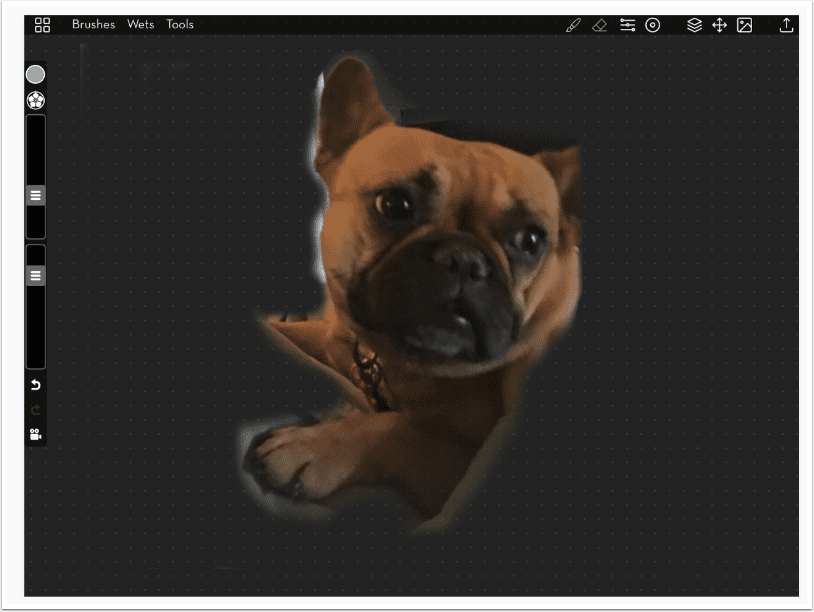
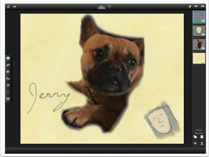
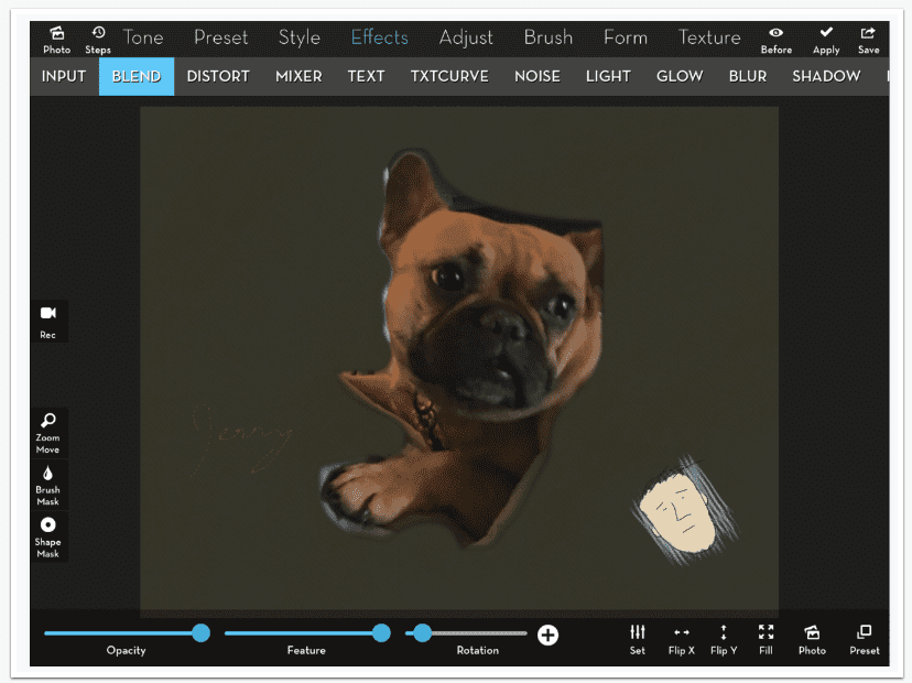
Below you’ll see the saved element brought into iColorama using Effects>Blend. It has a nice, soft edge. One thing I didn’t notice is the ear has a sharp, straight edge because it was near to the edge of the canvas.
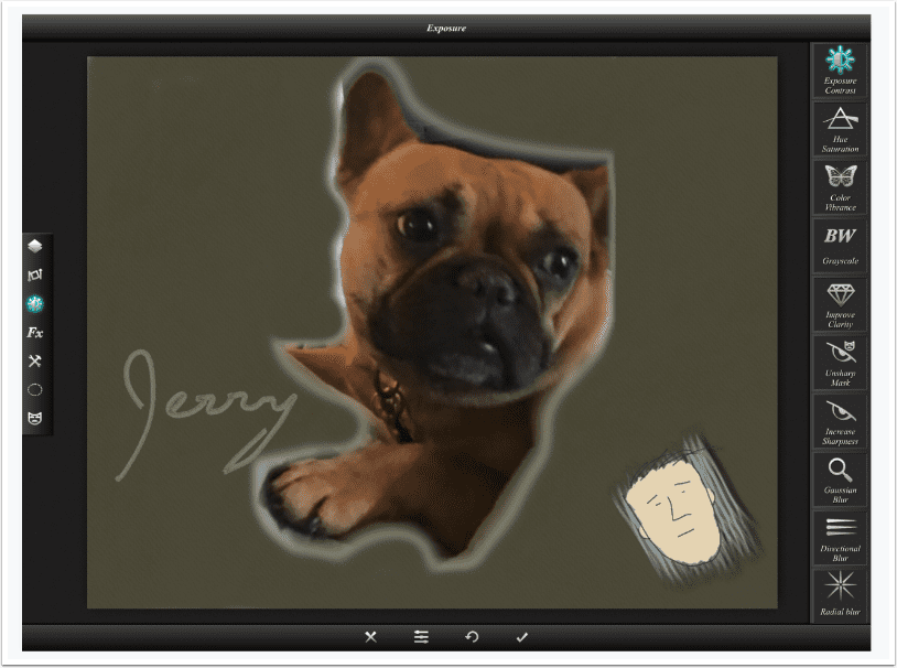
I go back into MetaBrush to repair that edge before making my final save.
I also make an extra swipe with a low-opacity eraser over the bottom of the element to illustrate a wider area of partial transparency. You can see the grey dots through the dog’s foot. I’ll use this later on to show you some quirks in using partially transparent elements.
Another way to create elements with partial transparency (rather than erasing or masking parts of a photo) is to draw the element yourself. MetaBrush is useful in that regard, even for people like myself who have no drawing ability. Below I’ve turned off every layer except the white background and used a small black brush to draw a figure on a blank layer. (Blank layers are added by tapping the +-in-the-circle icon on the Layers palette.)
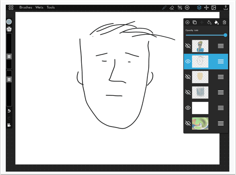
Another advantage of painting on layers is the ability to rearrange layers. You can paint over or under another layer. Below I painted over the black drawing with a tan color, then used the three lines at the right end of the layer in the palette to drag the tan below the drawing.
I did the same thing with the blue background squiggle, which has partial transparency at the edges of the strokes. I moved it below both the tan wash and the black drawing.
Once I turn off the white background, I am ready to save the drawn element. The three layers are saved as a single image with a transparent background.
I could use this element as a sort of “graphic signature” on my work. I could create a logo this way.
Since it’s reusable, I can place it anywhere, at any size, on any image.
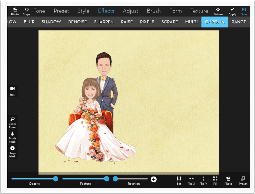
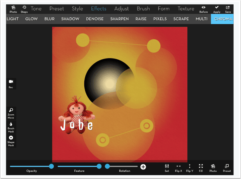
MetaBrush does not have text capabilities for you to use in your logos or graphic signatures. But you can use the text capability in iColorama to create a text-and-graphic logo, as long as you don’t require partial transparency. Below I used the Chroma feature since I had sharp edges and no green in the element.
Below I’ve brought three different elements, saved on transparent backgrounds, into Leonardo. The “logo” at the bottom right shows a particular capability of layering apps: the ability to add a drop shadow to these reusable elements.
We also see one of the quirks of using a partially transparent background. Examine the edges of the dog element. Those edges seem to be light and colorless.
If I darken the background, it becomes even more apparent. You can also see a lighter, greyer fringe around and within the partially-transparent signature.
That light edge is a quirk of Leonardo. iColorama has a quirk of its own – a darker edge. That dark edge is hidden fairly well on the signature and drawing below – but the darker edge is still apparent (but not as bad as Leonardo’s bright edge) around the dog.
I brought the partially-erased element, created earlier, into Leonardo to emphasise the lightness/darkness issue. As you can see on the lower half of the element, that lightness is beneath all of the element, and the partial transparency lets that come through.
The issue is also not entirely the fault of the app creating the partially-transparent element. It is possible to create a partially-transparent element in Leonardo, too, using the same method. I hide the background layer, using the eye icon on the layer, and save the result as a PNG.
When I bring that same element back into Leonardo, as shown below, there is still some of the light, colorless backing that wasn’t there when it was created.
And in iColorama, the dark backing is visible
The next three examples images are of the same element, with partially-transparent edges, being brought into three apps. The element is a cloud painted in MetaBrush. The first use is in iColorama, and you can see the dark edges. The dark is especially apparent at the top of the cloud, which shouldn’t have darkness.
The second is in Leonardo, and the light edge really shows up on the bottom edge, which defeats the purpose of the bottom of the cloud being darker than the top.
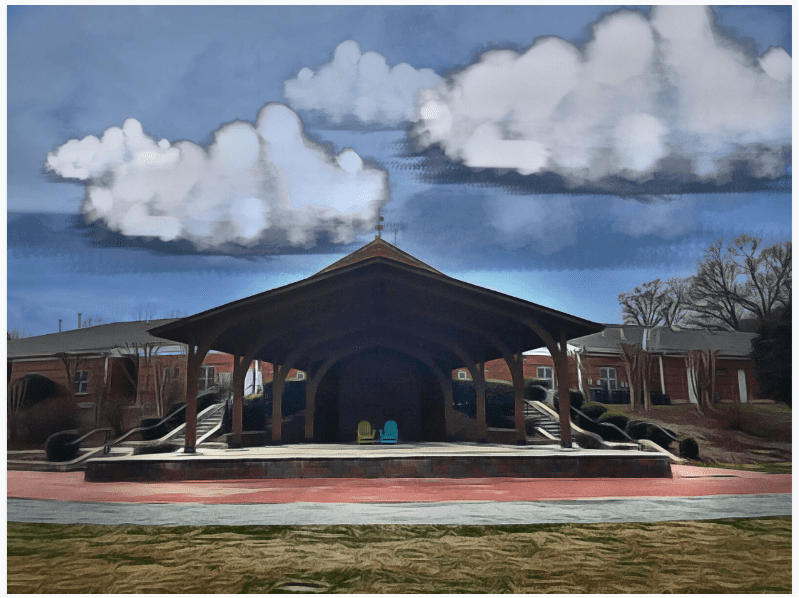
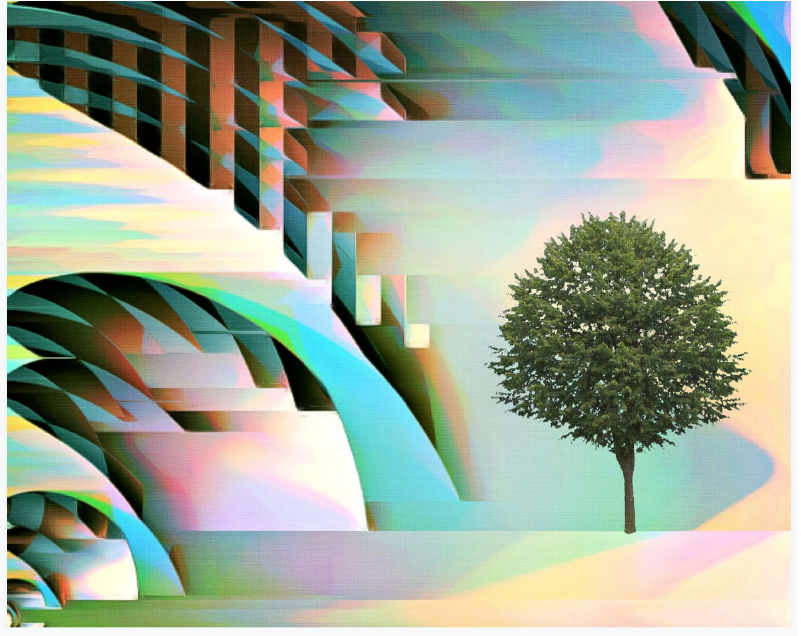
Yet even if you don’t have Affinity, the value of creating reusable elements is great. In my first example below, I use a tree that was masked onto a blue background. I then used Chroma, Preset 2, to drop the green, leafy tree onto an abstract background.
Using the Gray slider to drop out the white background on multiple elements gave me the next example. You may notice that I used the same element twice: the one at the top left is flipped and enlarged at the bottom center.
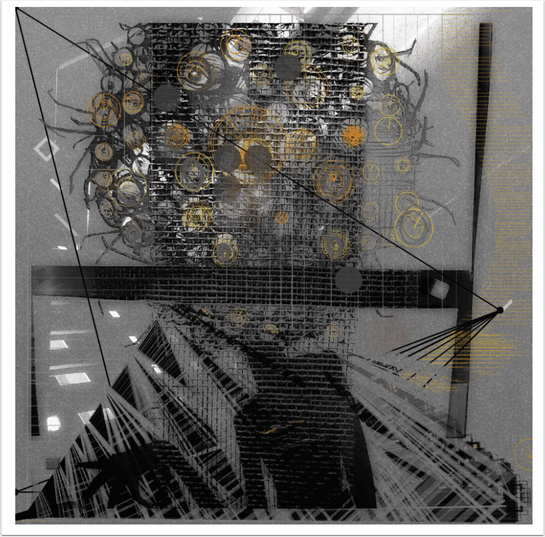
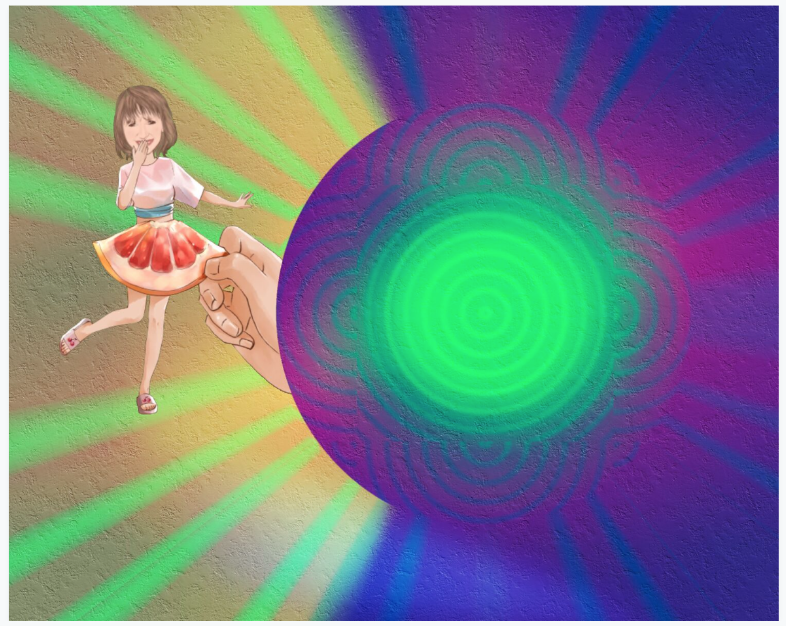
In the next example, I used a circle mask in addition to the Chroma-keyed element.
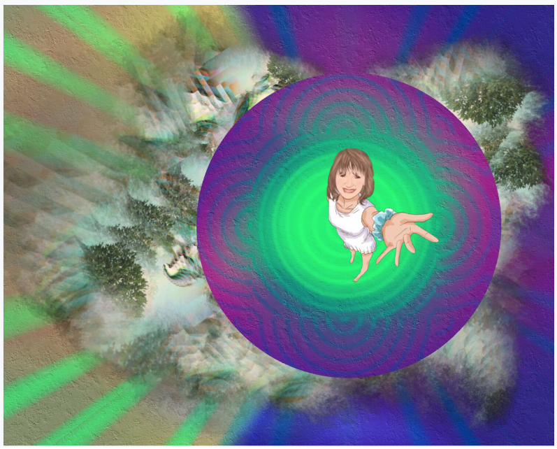
Don’t let the “quirks” keep you from creating and saving elements with partial transparency. Sometimes it works just fine. I painted in MetaBrush using the abstract tree image above as a brush tip. The “cloudy” results gave me an interesting look, using a recycled background ans circle mask, and another caricature from Moment Cam.
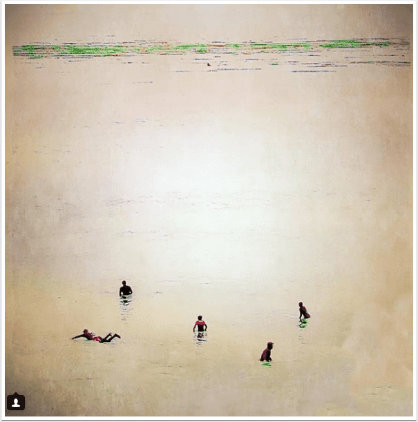
I’ll finish up with a different abstract background repurposed from earlier in the lesson, combined with two uses of the same soft-edged element from a Sktchy photo by Jessica Hodan.
So, in conclusion: if you like to collage items together, and if you want to save yourself from the effort of remasking an item over and over again, consider creating reusable elements with backgrounds of green or blue (Chroma), white or black (iColorama’s Gray Blend slider), or a transparent PNG created with Leonardo or MetaBrush. Until next time, enjoy!
Please Read and Help – every contribution makes a huge difference to us!
TheAppWhisperer has always had a dual mission: to promote the most talented mobile artists of the day and to support ambitious, inquisitive viewers the world over. As the years passTheAppWhisperer has gained readers and viewers and found new venues for that exchange.
All this work thrives with the support of our community.
Please consider making a donation to TheAppWhisperer as this New Year commences because your support helps protect our independence and it means we can keep delivering the promotion of mobile artists that’s open for everyone around the world. Every contribution, however big or small, is so valuable for our future.
Jerry Jobe
Never content with just scratching the surface of what an app can do, Jerry Jobe decided to pass on what he learned about imaging apps to others. He’s constantly trying to figure out just what tools other artists have used, and trying to incorporate them into his own work, in an attempt to find his style. He’s written tutorials on over 145 apps so far, which you can find (along with his Song of the Day entries) at http://enthusiasmnoted.wordpress.com/ He lives near Atlanta, Georgia, where he also finds a creative outlet in acting and directing in community theater.