Creating Magical Collage Ephemera Cards With Layout and HalfTone
My partner’s father and grandfather were magicians and a couple of years ago, we inherited their magic books. They are a treasure trove of vintage imagery and typography and I’ve been thinking of all the ways I might integrate them into artworks. One idea is a set of surreal postcards. In this tutorial, I’m going to take you through my process of creating a design for the first of the set, using LAYOUT and HALFTONE by app developers Juicy Bits.
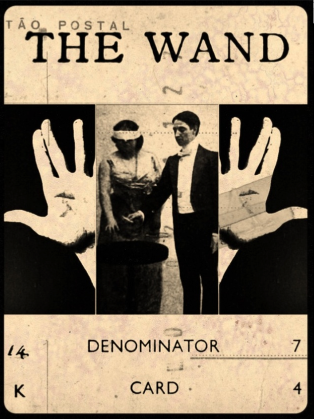
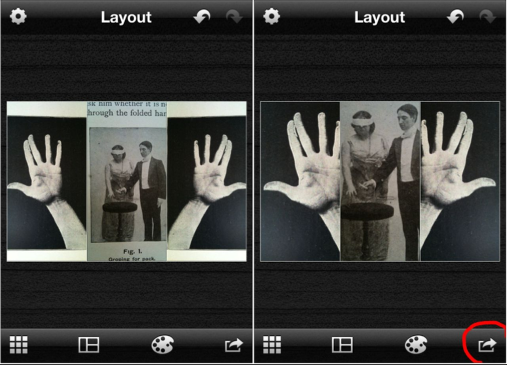
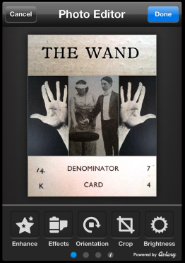
Before we begin, here’s a peek at the finished design. I used LAYOUT to create a composite, then exported the artwork into HALFTONE where I re-colored and applied several textured layers . This unified the collaged elements and invested my postcard with extra vintage patina and mystery.
Creating a photo library album for your project
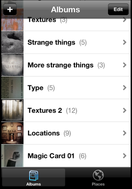
Before embarking upon any design process, I always create a special album on my camera roll, to store all the raw material and versions of my artwork as it progresses through apping stages. Actually, I don’t really do that at all because I am a typically disorganized creative type who dumps everything onto my camera roll so that it generally resembles the iPhone equivalent of a teenagers bedroom, complete with moldy cups of tea and piles of dirty, smelly laundry. However, this is a tutorial, so I’m going to tell you what I SHOULD do. Above is a fantasy screenshot of my camera roll in which I’ve created a folder entitled “Magic Card 01”, inside it are the shots that I’m going to collage together. As you’ll discover, taking time to do this little bit of housekeeping will come in handy later.
Opening Layout
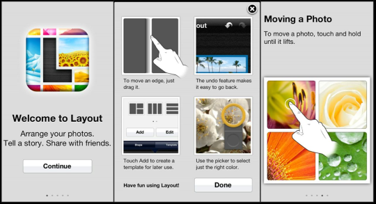
Here’s the LAYOUT welcome screen. That message: “arrange your photos”: it’s just for me isn’t it? Hmm…
Once we hit the CONTINUE button at the bottom of the Welcome Screen, we’re presented with a handy interactive introduction that walks us through the app’s key features. If, like me, you have the attention span of a Goldfish, you’ll be pleased to know that it’s easy to access this introduction at any time: just hit the SETTINGS icon (it looks like a little wheel/cog) at the top left hand corner of the LAYOUT screen (see below) and scroll to the bottom of the SETTINGS screen to the button that says SHOW INTRODUCTION.
The Settings screen
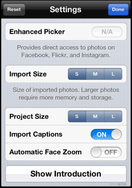
While we’re here, let’s take a closer look at the settings screen. Activating the ADVANCED PICKER enables me to import photographs not only from my camera roll, but also my Flickr, Facebook or Instagram feeds. Furthermore, I can select one of three import sizes. So if I’m only going to publish my layout online, I can work with smaller files, which will speed up my work flow. Similarly, I can select one of three export sizes for my work.
The Layout Screen
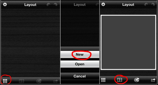
In the left hand screen shot above, is a just-opened LAYOUT screen, ready and waiting to be filled with magical things! To get the ball rolling, hit the grid-like icon at the bottom left-hand corner and select NEW from the pop-up menu.
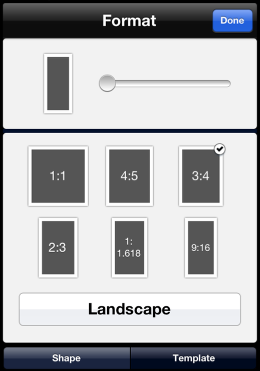
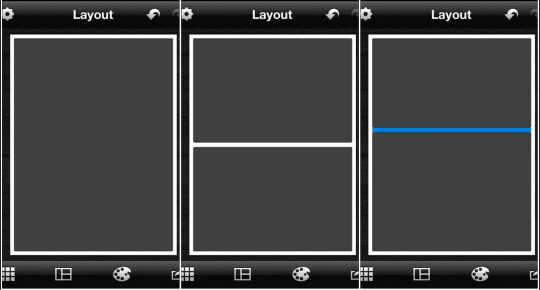
Selecting NEW activates a blank square template, ready for modification: handy for me, because I generally work in square format. However, with Layout, you can work in a wide range of ratios. Select the second icon from the left, at the bottom of the screen, to access a menu of six landscape and portrait ratios (or, as Layout refers to them: SHAPES)
Modifying Shapes
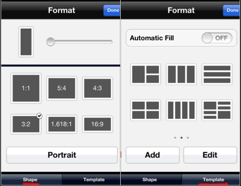
In the left hand screen shot above is the SHAPE menu. You’ll see that it presents us with six standard picture ratios (SHAPES) but these may be adapted by using the slider. Now: although my final postcard design is going to be in Portrait format, I have decided that it will be made up of three horizontal panels. As that’s what I’m going to work on first, I’ve selected the 3:2 ratio SHAPE. I’ve also decided that this panel will be a triptych, so next I select TEMPLATE.
Selecting TEMPLATE activates an in-app menu of of ten basic grid templates. The little preview icons modify to reflect the SHAPE that I’ve chosen for my layout. This handy feature helps me to visualize how my final layout will look. These templates are just a starting point, if need be, I can easily return to these screens and modify my layout as I work.
After selecting the three panel template preview, I hit DONE.
Incidentally, I created all of this tutorial’s screen shot layouts in LAYOUT, using the SHAPE and TEMPLATE features.
Importing photos into Layouts
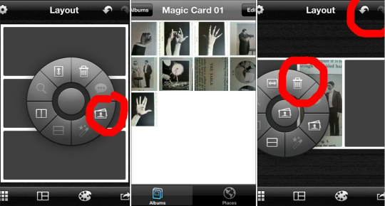
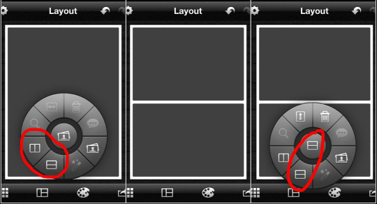
Hitting DONE returns us to Layout’s main work screen. To import my first photo, I tap inside the middle panel of the template: this activates the RADIAL MENU. Tapping the little photo icon on the wheel of the Radial Menu, activates the photo import window.
Once inside the photo import window, I can choose to select a photo from my iPhone camera roll, or, if I have chosen ADVANCED PICKER in the SETTINGS window, from my Flickr, Facebook or Instagram feeds. If, like me, you have several thousand photos on your phone, this is the point when you will be very pleased that you created a project sub-folder in your camera roll. Importing a photo from a folder containing twenty photographs is a considerably faster process than waiting for Layout to load over eight thousand.
Once back in the LAYOUT screen, should I decide that I want to use a different photograph, I can delete the one that I’ve just imported by tapping on it, activating the RADIAL MENU and selecting the TRASH CAN icon. Notice also, that it’s possible to navigate forwards and backwards through the design process, with the UNDO and REDO arrows (top right hand corner of screen)
Photo Editing
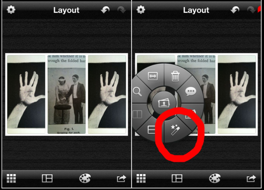
Here are my imported photographs. The first thing I want to do is flip the left hand hand so that it mirrors the right hand hand (try saying that quickly!) to do this, I tap the photograph, to activate the Radial Menu, and select the PHOTO EDITOR icon: the one that looks like a magic wand…how very apt!
The Photo Editor Menu
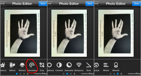
Shazam! The PHOTO EDITOR screen magically appears. As you can see from the above three screenshots, Layout has three pages of editing tools. I’m not going to describe them all right now, but I will tell you that the red mark ups used to highlight features in this tutorial were created with the DRAW tool.
To flip the hand photograph, I select ORIENTATION: the icon that’s second from the right at the bottom of the first page of the PHOTO EDITOR.
Flipping a photo
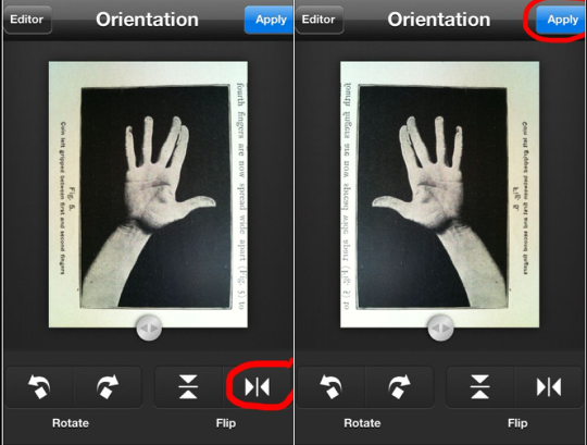
To flip my photo, I select the horizontal FLIP button, then hit APPLY. This opens my flipped photograph in the LAYOUT window.
Modifying borders in the Style screen
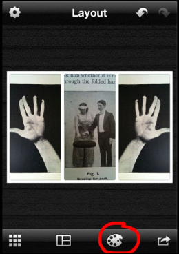
I want to resize the three photographs to fit in their respective panels, but first, I’m going to modify the template borders. To do this, I select the icon that looks like a painter’s palette. This opens up the STYLE screen.
Modifying borders 2.
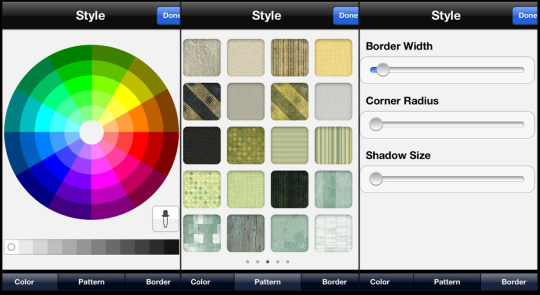
Inside the STYLE screen there are three sub sections to choose from:
COLOR enables me to select from a color wheel, greyscale or use the dropper to select a color from within the photos in my layout.
PATTERN provides 5 pages of border pattern fills.
BORDER enables me to modify border WIDTH, CORNER RADIUS and SHADOW size.
I select a white border color, set CORNER RADIUS and SHADOW size to nil and a fine BORDER width.
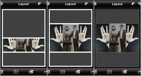
Resizing and repositioning photographs
The borders of the template are now much thinner. In my opinion, this looks much more attractive. I also have more space for my photographs within the panels. Resizing and repositioning is a simple matter of dragging each photo within its cell or pinching and stretching the photo with two fingers. Incidentally, if I want to rearrange photographs, I hold my finger over one until it “pops” up and then drag it into another of the template’s panels. If I hold and drag a photograph to the top of the Layout screen, a placeholder appears. Photos can be stored in this placeholder, just in case I want to use them later.
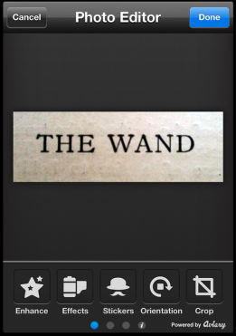
I could do more work on this triptych: for instance, I could use one or two of the tools in the PHOTO EDITOR to adjust the levels of the centre photograph to bring it closer to the two outer photographs, but for now, I’m saving it to the camera roll. To do this, I hit the arrow icon at the bottom right hand corner. This opens the SHARE window…
Saving work
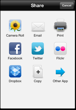
Selecting the CAMERA ROLL icon saves my design to the camera roll, but automatically returns me to the LAYOUT screen…
Opening a new file
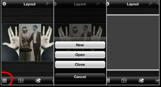
I’m now going to create my final postcard design of which the triptych I’ve just completed is going to be the centre panel. So, having saved it to the camera roll, I hit the little grid icon at the bottom left hand corner. I may then choose to CLOSE the work I’ve just done (this saves my artwork in the LAYOUTS library where I shall be able to OPEN and modify it further, should I choose) or select a NEW project.
Selecting a Portrait format shape
I now select the SHAPE for my postcard. The 3:4 ratio looks about right, but I can easily change it later.
Remember how last time, I selected a preset layout from the TEMPLATE menu? Well, this time, I’m going to create a custom template. So, having selected a SHAPE, I hit DONE and return to the LAYOUT window…
Creating a custom template and splitting frames
There are two methods by which to split a frame. Here’s the first: swipe a finger across the screen. For a horizontal line, swipe horizontally, for a vertical line, swipe vertically. Lines may be repositioned by dragging them with your finger. A selected line turns blue as it is dragged. Lines snap to half, third or quarter divisions.
Another way to split a frame
Here’s another way to split a frame: tapping the screen where you want a line to appear, brings up the RADIAL MENU and, depending on whether you want a horizontal or vertical line, tap one of the icons I’ve highlighted in the left hand screen shot above.
By the way, have you noticed how the last selected icon appears in the middle of the RADIAL MENU, the next time it’s selected?
Importing photos into frames, modifying frames, and border resizing (quick quiz!)
You probably remember these stages, but it always helps to recap! Here’s a quick quiz to see how much you can remember…
Q1. How do you import a photograph into a frame? Do you: a. Click the grid icon at the bottom left hand corner of the screen. b. Click inside a frame to activate the Radial Menu c. wave you hands in the air and whisper the magic word abracadabra!
Q2. What are the two methods by which you can split screens?
Q3. Which icon to you select to modify borders?
Answers at the end of this tutorial!
More importing
Next, i import photographs into the upper and lower panels of my layout. LAYOUT has a TEXT tool for applying text to photographs but in this instance, I’d like to use some vintage type from my collection of magic ephemera.
Auto Adjusting Levels
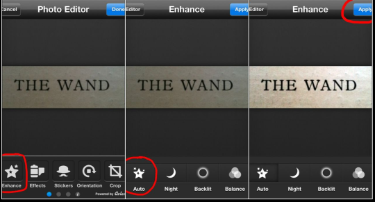
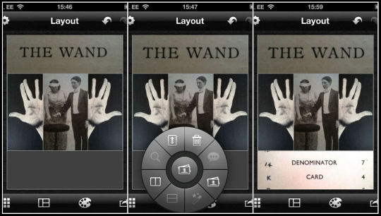
The photograph in the top panel is a little dark, so tI tap on it, to activate the RADIAL MENU, and select the PHOTO EDITOR icon (the little wand).
From the PHOTO EDITOR menu, I select ENHANCE and then AUTO. Happy with the level adjustment, I hit APPLY
I don’t want to make any further edits to this photograph, so I hit DONE to return to the LAYOUT screen
Exporting to another app
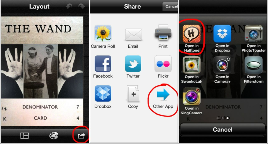
The layout of my card is now complete but now I want to unify the composite elements and add more textural depth and character. To do this, I’m going to export my layout into another Juicy Bits app: HALFTONE.
So, once again, I hit the export arrow at the bottom right hand side of the LAYOUT screen, activating the SHARE screen and selecting OTHER APP, in the bottom right hand corner.
Layout currently has a three-page menu of apps that a photo may be exported to. The link too HALFTONE is at the top left hand corner of the third menu page….
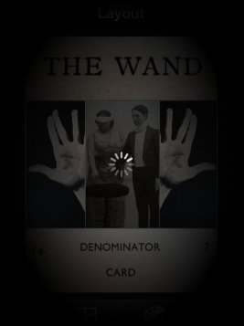
Maestro, spooky music please! The screen becomes dark and mysterious, and there is a little moment of tension as I wait to see if my iPhone (with only about 1 GB of space left on it) crashes…
Abracadabra! By the magical powers of apping, my layout opens in the PHOTO EDITOR window of HALFTONE!
However, there will now be a short break in the magic show, so that you can buy refreshments, check the quiz answers.
See you after the interval, apprentice Layout magicians!
Here are the quiz answers…
Q1: b; Q2: there are two ways to split a frame. tapping inside a frame to activate the radial menu, or selecting and dragging a line with a finger; Q3: The artist’s palette icon (second from the left at the bottom of the LAYOUT screen).
Nettie Edwards (@lumilyon)
Nettie Edwards (@Lumilyon) took up photography 13 years ago, following a successful career spanning two decades as a Theatrical Designer. In 2009 she embraced mobile art and photography and has not looked back since. Her mobile career is exploding at a phenomenal rate and she has won a huge number of awards and accolades including: winner, Fine Art category, 4th Julia Margaret Cameron Awards and runner up: 2013 Lumen Prize for Digital Art. She was a Lead Juror for The Mobile Photography Awards 2011 & 2012. Her work has been published and exhibited extensively including Mobile Photo Paris and the LA Mobile Arts Festival. Nettie runs Mobile Arts and iPhoneography workshops and is featured in Mobile Masters - an ebook featuring 50 of the World's leading Mobile Artists and Photographers. Nettie is the first ever Mobile Photographer to have her work exhibited at the birthplace of photography: the Fox Talbot Museum, Lacock Abbey, England, as one of six photographers featured in the exhibition "Arrangements in Black and Grey, Black and White Photography in the 21st century" 'You can read more about Nettie on her blog http://lumilyon.wordpress.com/about-2/ To look more closely at her work, go to her Flickr Photostream here - http://www.flickr.com/photos/lumilyon/
12 Comments
Peg Price
Thank you! I’m going to dig through my father’s old photography method books and see if I can come up with a fun project like this. Excellent directions!
Nettie Edwards - @lumilyon
Thanks Peg, I’m delighted that you’ve been inspired to do some digital cut and paste and look forward to seeing your creations! I have my dad’s photo books on another pile!
Laurence Zankowski
Nettie,
I have a collection of ephemera from the 1700s to the 1940s. The holiday postcards and adverts from the late 1800s numbers in the hundreds if not thousands. This is a good way to get them in circulation again. COOL BEANS! And i am still trying to figure out away to create a Tarot deck.. This is good! Thank you
Be well
Laurence
Nettie Edwards - @lumilyon
Hi Lawrence! Yes, I have a similar “Affliction”, coupled with an inability to throw away almost any scrap of paper, just in case if comes in handy! Glad the tutorial has fired you up!
JQ Gaines
You’ve totally inspired me to give Layout a try, Nettie… thanks for this very instructive (and entertaining tutorial. I had to chuckle when you shared that you are not at all organized with your art materials. But you certainly teach good organizational skills, m’dear… and that’s the true sign of an expert! 🙂
Nettie Edwards - @lumilyon
Glad you enjoyed it, dear JQ! Yes, I wage a constant battle against clutter!
Gerry Coe
Wonderful Tut Nettie, I think we are all the same, disorganized, 1gb or less left on iPhone etc. Must look more closely at those apps. Thanks . G
Nettie Edwards (@lumilyon)
Cheers Gerry! Glad to hear I’m not alone!
Maryjane Sarvis
This was a fabulous tutorial. I hadn’t gone into layout very far, usually choosing Diptic. Now I’m going to! So true about the teenager’s bedrooms and the camera roll metaphor. That made my day! Thank you both.
Pingback:
Pingback:
Larry Barsh
I love these tutorials but it’s extremely frustrating that when I find one I’d like to try, to learn that the app is not available in the United States like these. I would like to suggest that the author suggest a one that is similar or available and/or be made available in the US app store