iPhone Photography Tutorial – How To Create A Tantalizing Vintage Look
Hopefully you will recall our ‘A Day In The Life Of Veevs’ article that we recently published, if not, you can read it here. We were so impressed with Veevs’ images and we know so many of our readers were too, that it has inspired us to launch another new section on theappwhisperer.com.
This new section contains iPhone photography tutorials, and we launched it with the help of Veevs a few days ago. The first tutorial we published explained how to recreate Veevs’ wonderful pastel effect seagull shot. If you missed that, you can read it here. The second tutorial explained how to create a stunning still life image, you can read that here. We also recently published another excellent tutorial by Lene Basma, it explains all about blurring, cropping, blending and more, you can read that here.
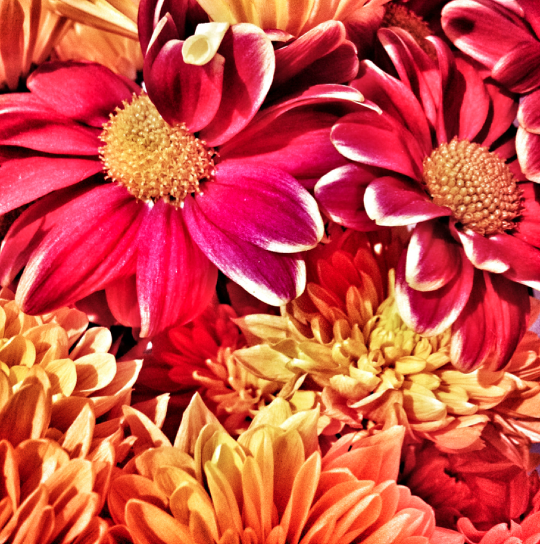
In this tutorial with help from Veevs we have retraced the steps she took to create the wonderful vintage look to the image below. The original image was taken with an iPhone 4S and the editing was completed on an iPad.
Read this easy to follow tutorial and see if you can too create a similarly stunning shot too.
(We have put links to the iTunes app store of every app that was used, just in case you feel inspired enough to download them).
Final Image
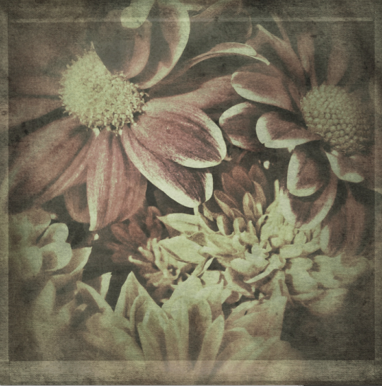
The image above is the final image, the one that we are going to show you how to recreate.
SnapSeed
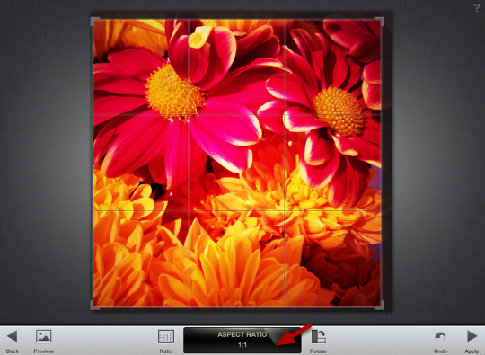
First off, Veevs opened the image in Snapseed. She did not want to keep the whole image, so she needed to crop it. As Veevs wanted a square image she chose the 1:1 ratio.
Filter
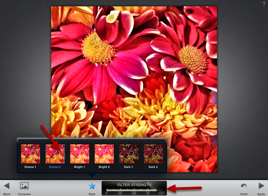
Veevs wanted to adjust the filter strength and saturation options, to do so she clicked on the photograph (whilst still in Snapseed) to bring up those options. Next she opened the Drama Filter and Selected Drama 2.
Next choose the menu you want to modify by moving your finger up or down and then use your finger and slide it horizontally right or left to increase or decrease the filter :
Veevs increased the Filter Strength to 100 and decreased the Saturation to 25.
Finally, click on Apply.
Grunge
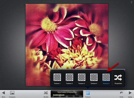
Next go to Grunge filter (still in Snapseed), Veevs usually keeps pressing the Shuffle button until she sees a look that she likes.
Veevs wanted a different texture look so she clicked on the Texture button and selected Texture 5.
Saturation
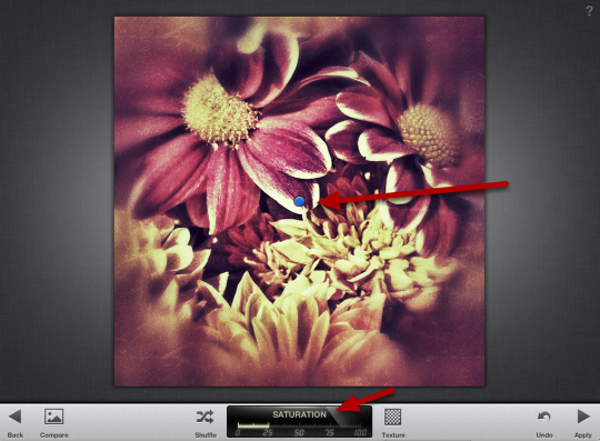
Next click once on the image for the menu to pop up. For this image Veevs just modified Texture Strength (to +31) and Saturation (to +25).
Next, click on the image once more and click on the little blue dot if you want to move the centre size. Then click and drag with two separate fingers to increase or decrease the centre size amount.
Next, click on Apply.
Finally, click on Save.
VintageScene HD
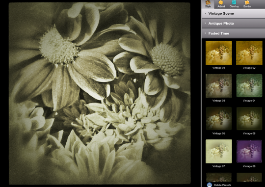
Next, open your image in VintageScene HD. Choose a preset that you like from the styles menu or use the Randomize button.
Further Adjustments
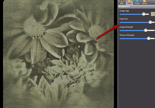
Veevs was pleased with the above result but wanted to make further adjustments.
Next, click on Adjust. Veevs then played around with the four sliders until she found the look that she wanted.
You can also change the Image age color (Veevs didn’t change it) by clicking on the little color box and choosing a different color.
Color
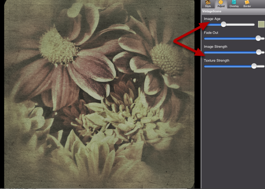
Veevs wanted some of the color to come through so:
She lowered the Image Age slider and increased the Image Strength slider.
Overlay
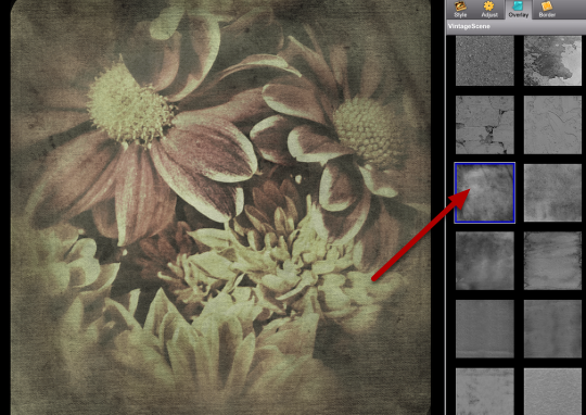
You can also play around with the Overlay and Border Adjustments. Veevs often goes through the different Overlays and selects one, if she doesn’t like it she clicks on Undo.
Borders
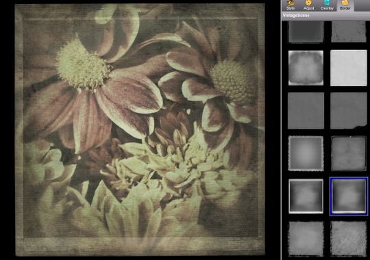
Repeat the steps above with the Borders.
Sharing & Save
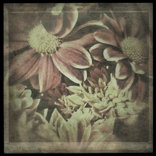
Once you have a look that you like click on Share and Save your image.
Additional Editing
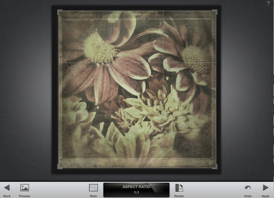
Veevs didn’t like the dark brown border that VintageScene put on the image. She got rid of it by opening the image in Snapseed and cropping it again.
Final Image
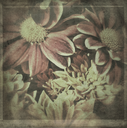
And here is that awesome image again. We hope you successfully managed to follow that tutorial, please send us your similar examples, we’d love to take a look.
