iPhone Photography Tutorial – ‘How To Create An Incredible ‘Weaving’ Style Image
Our new mobile photography tutorial section is in full swing and we’ve received much acclaim from the mobile photography community, thanks to all. If you’ve missed our previous tutorials you can read them here.
My A Day In The Life article was recently published by Joanne and if you missed that you can read it here. I totally love iPhone photography and specialize in flower and plant images. I love to tell a story with the flowers; many times giving them human characteristics as in the photo of the sunflower entitled Remorseful, mentioned in the A Day In the Life Of interview. I also like to create abstracts.
Read this easy to follow tutorial and see if you too can create a similarly wonderful shot. A list with links to all the apps used in this tutorial is at the end of this article.
Original Photograph
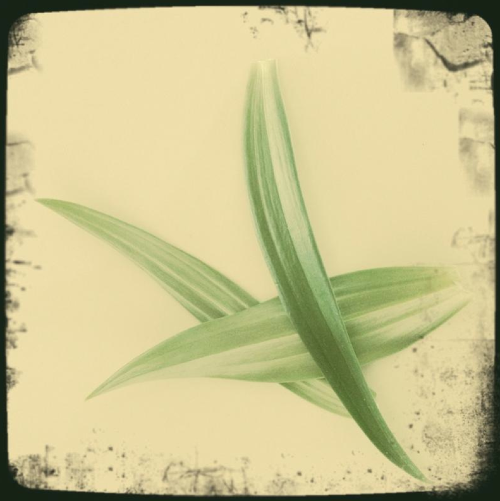
Despite looking awesome to begin with, this is the original photo taken with the Hipstamatic camera using Float film and Adler 9009 lens. I wanted to generate a lot more atmosphere and effects to this initial image though, this is just the beginning.
addLib
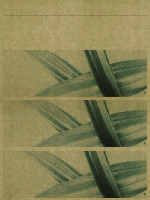
In order to achieve that, I next ran the original shot through addLib. addLib is a great app that allows you to change your photographs into beautiful graphical design pieces, it is one I use regularly. Once I loaded the image into addLib, it generated the above effect with the look of three panels.
Iris Photo Suite
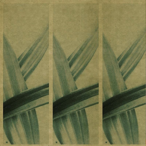
I really wanted to rotate the image, so I saved it in addLib and then opened it in Iris Photo Suite. As well as rotating the image here, I also sharpened it up too. I much preferred the look of the horizontal image.
Moku Hanga
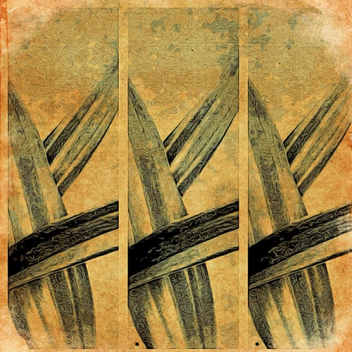
I still wanted to change the overall effect though and in order to create the image above, I saved the image in Iris Photo Suite and then opened it in Moku Hanga to achieve the painted/textured look. Instead of using the pre-set images I chose to use the random function to get the desired effect. I then saved the image.
Final Image
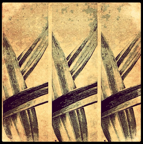
This is the final image and combines all the effects I wanted to achieve. In order to get to this finalized look, I opened the image file in Instagram and selected the Brannan filter because I felt the effect from the step preceding this one was too dark.
Links to All Apps Used In This Article

7 Comments
Laurence Zankowski
Lisa,
Beautiful work. I have been going back and forth about addlib for weeks now. To see what can be done with it, just pushed me over the edge.
Hopefully it will get an iPad size version soon.
Laurence
Lisa
Thanks so much Laurence! I’m glad you decided in favor of Add Lib. I think you will enjoy using it.
David
Beautiful image! I love using all the apps you did and use them all the time…but I certainly learned a few new “tricks” reading this! Thanks for sharing!!
Lisa
Thank you David! Glad I was able to offer some new uses for these apps.
Gerry Coe
Nice Tut Lisa, Great image, One problem I find with addlib is, although very good the file sizes are so very small, really only suitable for web use or very small prints. What are your thought on that?
Gerry
Lisa
Thanks Gerry! Glad you liked the tutorial and I’m happy you found out about the full-res!!
Gerry Coe
Follow up to my last comment, there must have been an update to Addlib that I did not notice. I checked file size earlier and it seems to be now working at full resolution.