iPhone Photography Tutorial With Catherine Restivo – Creating Stunning Art
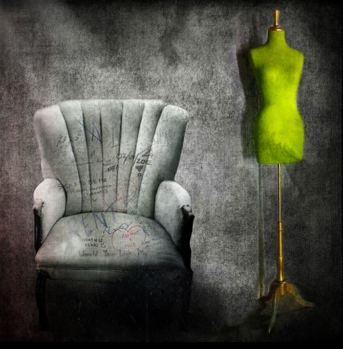
Welcome to our iPhone photography tutorial section, today we talk to Catherine Restivo about her incredible image ‘Waiting for a Sign’. Catherine talks us through the complete process as you can read below.
We previously interviewed Catherine for our A Day In The Life section, if you missed that you can read it here. Catherine is a hugely talented iPhone photographer. Her work has been featured at the Giorgi Gallery in Berkeley, CA; SOHO Gallery for Digital Art in NYC; First Annual iPhoneography Miami Exhibition at Artspace Gallery Miami; “iPhoneography: Updated Visual Dialogs” at the Lunch Box Gallery in Miami, FL; Mobile P1xels Show at the Los Angeles Center for Digital Art; she was a semi-finalist in the 2011 IPA Mobile Art Grant and has been featured in Pixels: The Art of the iPhone.
Don’t miss this awesome tutorial below…
Introduction
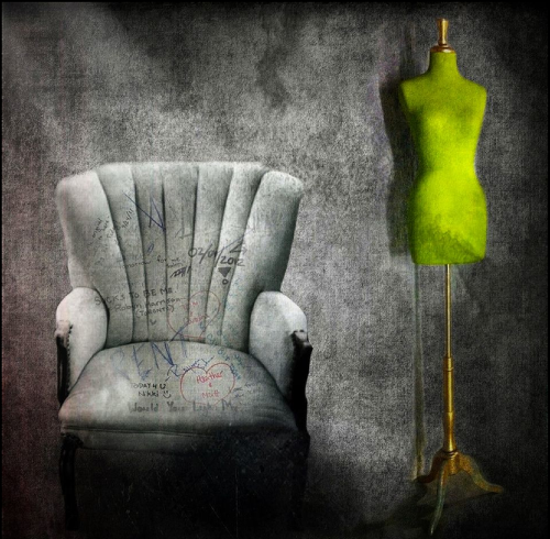
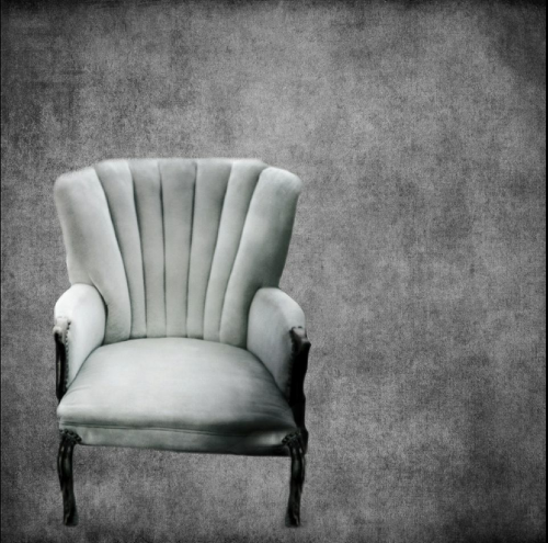
‘I took a Hipstamatic shot of a chair on a sidewalk in New York City I just really liked the chair and from this shot I created Waiting for a Sign. Recently I felt that I wanted to create a small series (there will probably be one more piece in the series). I find something about the empty chair rather mysterious, open to numerous different interpretations.
In the Hipsta shot there was a taxi parked behind the chair, which detracted from the composition, but I knew I could erase the background in Juxtaposer and save the chair as a stamp (unfortunately I deleted my original Hipsta shot so I can’t show it here).
For the background I used Blender to combine two of the free textures from www.MobiTog.com that our community has offered up for the taking. You can find them here. The lovely textures I chose were created by the talented Vivi Hanson Sacerdote’. 😀
Step 1
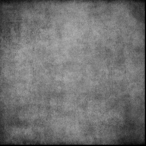
‘I then took this background into Juxtaposer and added the stamp of my chair’.
Step 2
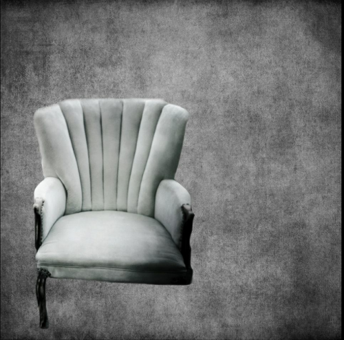
‘The right leg of the chair is not visible, so I saved this photo, flipped it in FilterStorm and saved it to the camera roll’.
Step 3
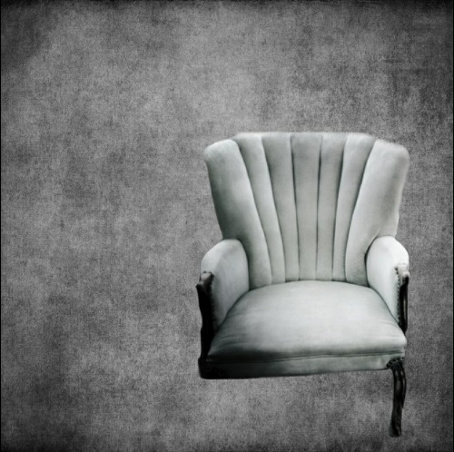
‘Then I combined the 2 photos in Blender, masking out all but the needed right leg’.
Step 4
‘Staying in Blender, I brought in a photo of a dress form that I took with ProCamera’.
Step 5
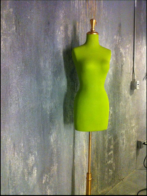
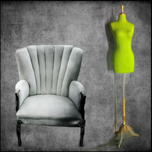
‘and using the mask function erased what I didn’t need and blended that into the photo using the Multiply blend’.
Step 6
‘Still working within Blender, I brought in a shot of some wall graffiti and blended this into the chair, erasing what I didn’t want, using the Multiply blend again. I wanted to add some smoky shadows to the bottom of the chair/photo, so I used Blender to work in some dark texture from another photo in my camera roll’.
Step 7
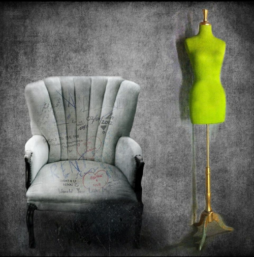
‘Next came one of my favorite apps, Pixlromatic. I applied the frame “Colortin”, which added some nice dark shadows around the edges and a hint of red along the left side’.
Step 8
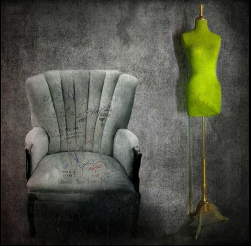
‘It looked a bit flat to me so I ran it through LensLight and added the Cloud Rays 2, using the slider to tone it down. A final run through Iris to add a bit of the Polarizer filter, sharpening and resizing finished off the piece’.
Final Image
Screen Show Of The Process
Links To Apps Used In This Tutorial


8 Comments
David
I was blown away when I first saw this image a couple of days ago…so I’m thrilled to read/see how you did this Catherine! Thanks for sharing!!! I’m going back to reread and to take notes…can’t wait to try this out on my own!!!
kathy
one of my favorite artists
David
P.S.
Just watched the screen show…don’t know why I missed this the first time…loved it!!
Cat
Great tutorial! Catherine is one of my favorite artists and you do such a fantastic job getting these interviews and tutorials together! Do you mind if I ask what app you used to make the slideshow at the end?
Cheers!!
Cara Gallardo Weil
Thanks for the tutorial… and I remember that chair… you shot it when we were together right? 🙂 Inspired piece Catherine! Love it!
Veevs
Awesome tutorial matey and thanks for the mention of my textures 🙂 You use them so beautifully!
Irene Oleksiuk
Catherine, wonderful tutorial! Great image
Janine Graf
Wow that was great Cat! I really love this series a lot and it was great to see how you created this piece . . . which is awesome!! 😀