A Picture’s Worth With Davide Capponi
A Picture’s Worth… is where we ask mobile photographers that have taken or made, as the case may be, powerful mobile art to explain the processes they took. This includes their initial thoughts as to what they wanted to create, why they wanted to create it, how they created it, including all apps used and what they wanted to convey. We also ask these incredible artists to explain their emotions and how the image projects those feelings.
We have published a few A Picture’s Worth articles recently, if you have missed those – please go here.
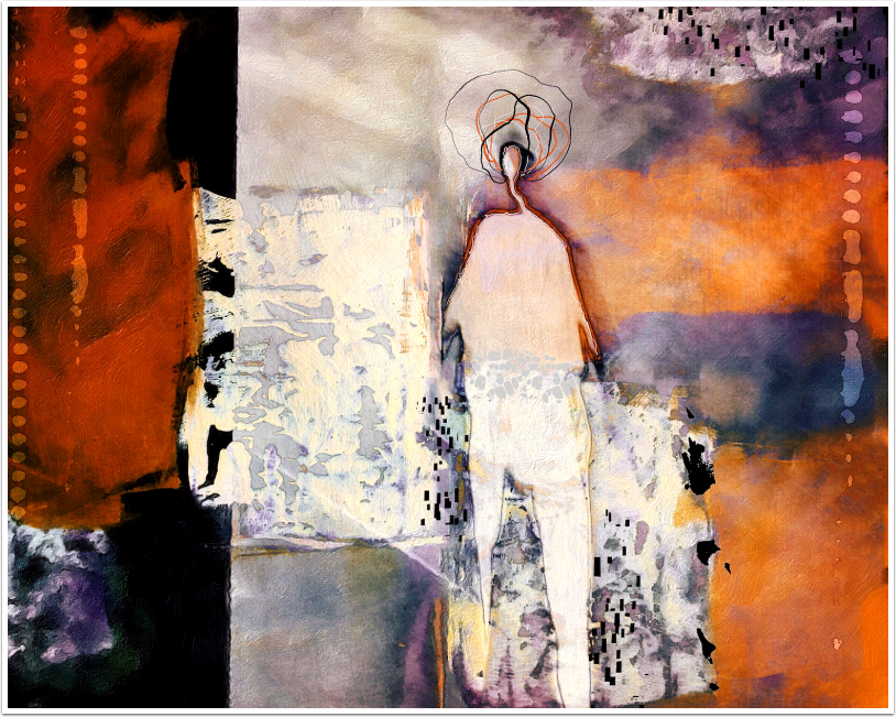
In this A Picture’s Worth today, Davide Capponi talks us through his incredible ‘My welcome prison’ image shown below.
(If you would like to contribute to this section or if you have seen an image that you would like to learn more about, just email Joanne@theappwhisperer.com and we will get it all set up).
Over to you Davide…(foreword by Joanne Carter).
The Birth Of A Concept
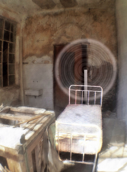
‘Urban exploration has always been an important source for my photography. For those of you that never heard of Urbex, it is a passion that moves some of us to visit abandoned buildings, shooting photos and leaving things exactly the way they are, our motto is “Take only pictures, leave only footprints…” .
Some time ago I visited an abandoned sanitarium in northern Italy; this type of abandoned structures is usually left on its own and even though they are not meant to be accessible, a way in is not hard to find.
On this specific location, though, the situation was unusual: the abandoned mental hospital was part of a working sanitary district and it was possible to visit by appointment accompanied by an employee of the district.
Our “guide” had worked for over 40 years in this low but extensive structure and had been an accountant of the sanitarium, so he had a wealth of information and anecdotes to share, but the downside of this guided tour was that only a small part of the mental hospital could be visited and most of the rooms had been emptied of all furniture.
Then came the unexpected: someone of the group pointed to an old wooden door; our guide replied that the door had been blocked since decades, but when he tried the handle to show us, the door unexpectedly broke open.
We found ourselves in a walled garden that had been left on its own for decades and that was connected to many courtyards from which we had access to rooms that were long abandoned, such as the one that you see in the photo.
When I saw this room though the broken window, my imagination connected with the tales we heard from our guide about the life of the mentally ill patients in that place, and strangely this bleak, decayed place gave me a feeling of intimacy, of a place that had become “home” for some.
The Process
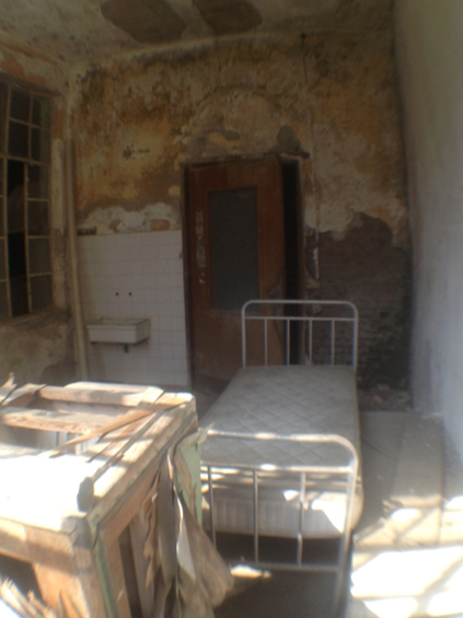
Here’s the original unedited shot so that you can share better my experience:
Starting from the initial shot (captured with ProCamera), the first pass was a preliminary tuning of contrast, brightness and saturation, executed with Filterstorm; I usually tend to saturate less but in this case I wanted to bring out all the details of the image.

I wanted to give a subtly painterly feel to this shot, and decided to use Repix to this end; I selected the “Hatching” brush that I found most appropriate for this image and applied a regular diagonal brushing to the whole image.
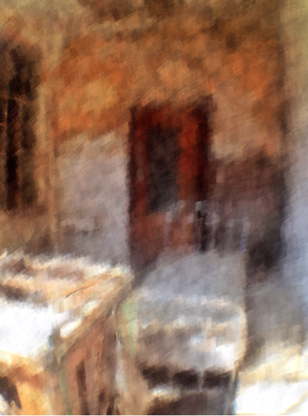
This was just an intermediate step for me: I like to apply effects from any app with a light hand, so I always blend the “effected” image (with Image Blender) with the original in order to achieve the following result.
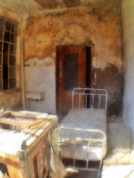
Having achieved this not too obvious painterly feel, the next objective was to bring to the foreground the main subject of the photo: the bed.
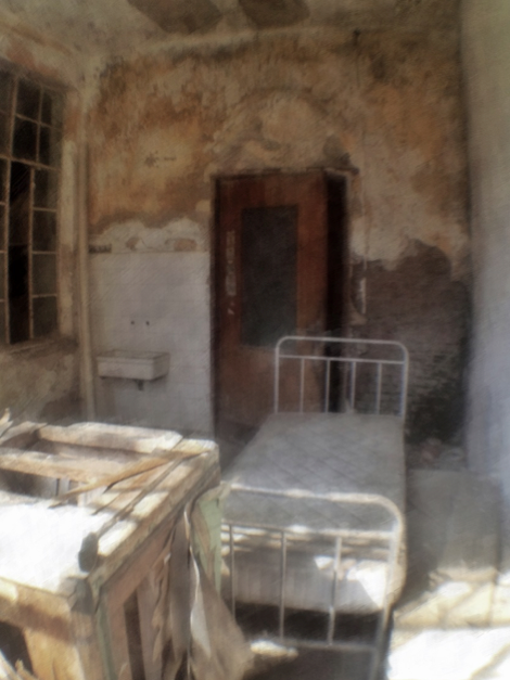
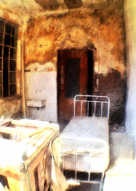
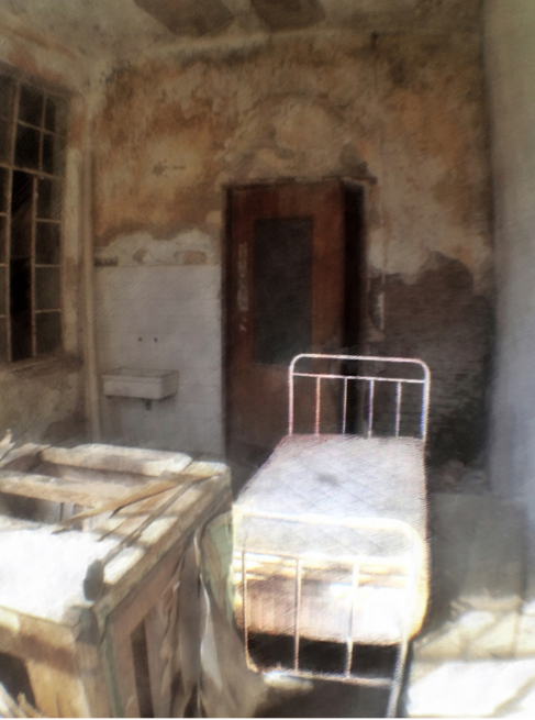
This was done adding brightness, contrast and saturation to the bed and doing the opposite to the rest of the image; I did this in a three step approach.
First step: tone down a first layer.
Second step: tone up a second layer.
Third step: merge the two layers masking the bed.
At this point I had a clearly identified subject in the image. But somehow I felt this was not enough to represent my idea of this room as a refuge for his occupant; I decided to add an aura to the room to achieve my goal, and after some tests, I chose Deco Sketch to draw it, as you see it in the final image.
Afterthoughts
The idea of this image was to convey to the viewer the same feeling I had experienced, of a safe place in a sad and bleak environment. Only you can judge if I was successful or not, but I hope anyway that you like this image and the story behind it’.
Please help us…
TheAppWhisperer has always had a dual mission: to promote the most talented mobile artists of the day and to support ambitious, inquisitive viewers the world over. As the years pass TheAppWhisperer has gained readers and viewers and found new venues for that exchange. All this work thrives with the support of our community.
Please consider making a donation to TheAppWhisperer as this New Year commences because your support helps protect our independence and it means we can keep delivering the promotion of mobile artists that’s open for everyone around the world. Every contribution, however big or small, is so valuable for our future.

7 Comments
Alex
Great article, fantastic image … and very interesting!
Thank you. Brilliant work!
Davide Capponi
Thank you Alex, and thanks to Joanne for publishing me on her fantastic blog!
Gianluca Ricoveri
Wonderful article Davide!!!
Davide Capponi
Grazie Gianluca!
Robert Lancaster
Thanks for sharing your workflow. I really appreciate it.
Thank you too for Joanne for bringing us more outstanding content.
Davide Capponi
Thank you Robert!
Tracy Mitchell Griggs
Sounds like it was an interesting field trip. I enjoyed the workflow information as well – while I appreciated the interesting addition in Deco Sketch, I think the blended image without that added layer stood very well on its own with all of your creative editing.