Creative Android Mobile Photography Tutorial by AlyZen Moonshadow – Part 3
We’re delighted to republish the third in a series of Android mobile photography tutorials by AlyZen Moonshadow. This series of tutorials started as an experiment for AlyZen to create seamless repeating patterns and in many ways it has now taken on a life of its own. This is is the third from the series and we’ll be publishing the others very soon.
If you have missed the earlier parts, please follow the links below:
Over to you AlyZen (foreword by Joanne Carter).
Click here to download PicsArt from the Google Play Store
“So today I decided to try pushing the envelope a little bit further. I’m really enjoying experimenting with creating pattern repeats using the Android app “PicsArt”. And I want to keep experimenting to see what else I can come up with.
In my previous post, I created a half-drop effect by using a “bulge” effect, and then alternating that with a “normal” image.
In this tutorial, I have gone one step further and used 2 different effects on the same processed image. The effects being “Bulge” and “Caricature”. Bulge gives a fish eye effect to the image, “Caricature” gives an imploded look. I like the fluid look of the final image.
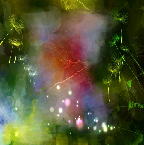
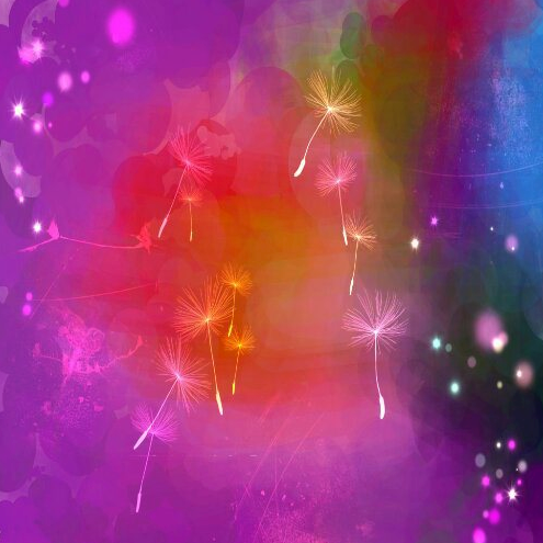
This time, the “original” image itself is actually a composite of 2 different images. I used the Android App “Impressionist Fingerpaint” on 2 separate images of flowers, to get a wonderful colourfield abstract, as seen above. Then, I ran the images through the universal app “Repix” and added the dandelions, light spots and scratch marks.
Next, I used PicsArt to combine the 2 images.
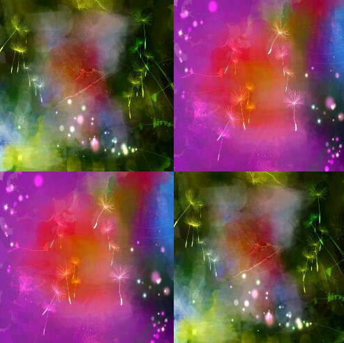
I played with the Offset filter until I got this image:
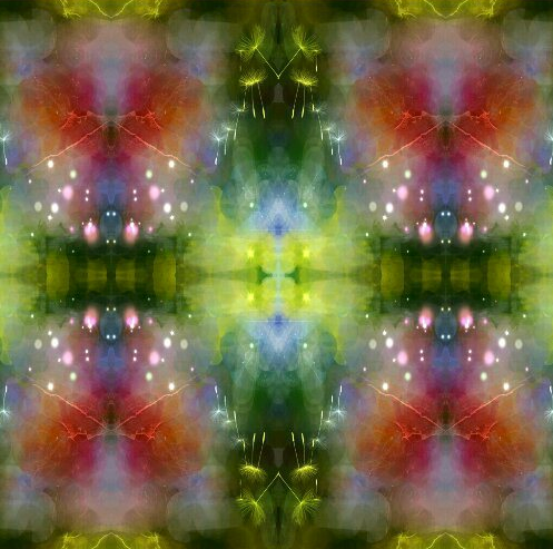
Then, I passed this through PicsArt’s Collage to get this image:
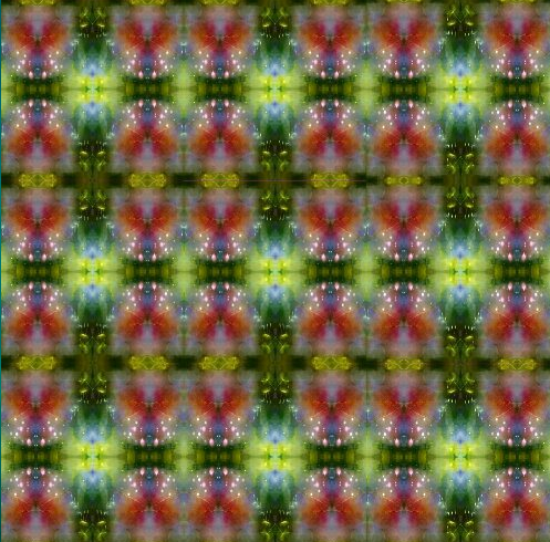
This looked good, all the lines met up and flowed. But it looked too rigid and square. I wanted to give it some curves, to give the design some dynamic movement.
I passed one of this images through the “bulge” filter, and another through “caricature”, both under the heading “Distort” in PicsArt.
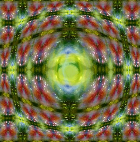
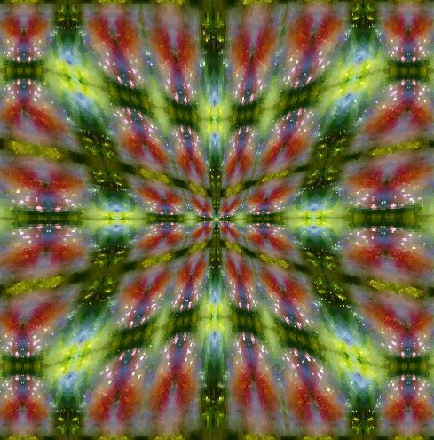
Then, using a 4-square grid in the Collage section of PicsArt, I combined these images to create this:
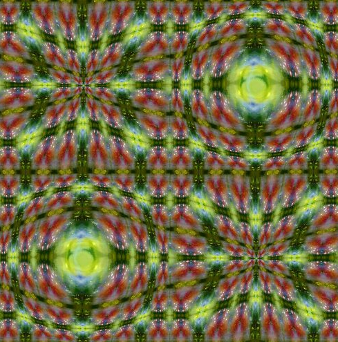
I really liked the look of this, so I ran another pass of it and got this:
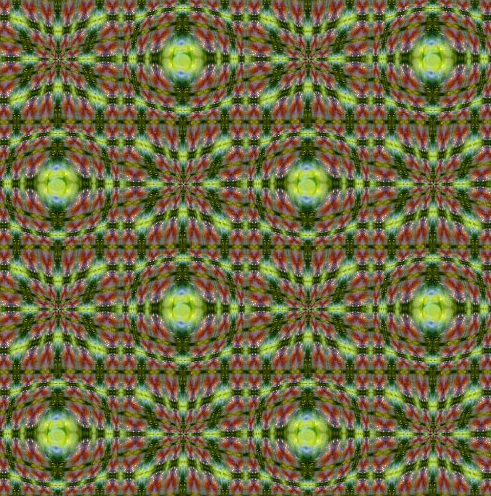
Now I found the colourway too green-and-brown, so I ran the image through the Android App “Smoothie” to alter the hue, brightness and contrast.d the colourway too green-and-brown, so I ran the image through the Android App “Smoothie” to alter the hue, brightness and contrast.
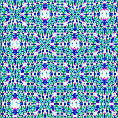
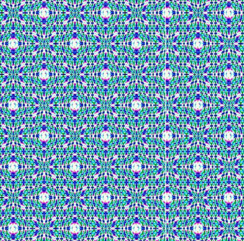
Really pleased with this! ”
