Mobile Photography / Art Tutorial – Artoon: Keeping it Simple
We are delighted to publish Jerry Jobe’s latest mobile photography/art tutorial for our reading and viewing pleasure. This time Jobe takes a look at the app Artoon. Read his thoughts as he puts it through its paces (foreword by Joanne Carter). Take it away Jerry…
Artoon retails for $1.99/£1.49 and you can download it here.
“I’m rather fond of JixiPix apps in general, although there are some, like Fold Defy and Chalkspiration (covered back in May), that are so specialized as to be essentially useless. On the other hand, today’s app, Artoon, performs a task that I frequently wish to use in my artwork: creating a simple, flat image that is useful as part of a piece using several apps or all by itself.
Like most JixiPix apps, Artoon is a separate app for iPhone vs. iPad. I am using the iPad version, and have not purchased the separate iPhone app. The user interfaces will likely differ between the two devices, but the controls will be similar. Learning what the “Color Smoothing” slider does will help you, regardless of whether the user interface is the older standard JixiPix interface seen in this tutorial or the newer “gray” interface”.
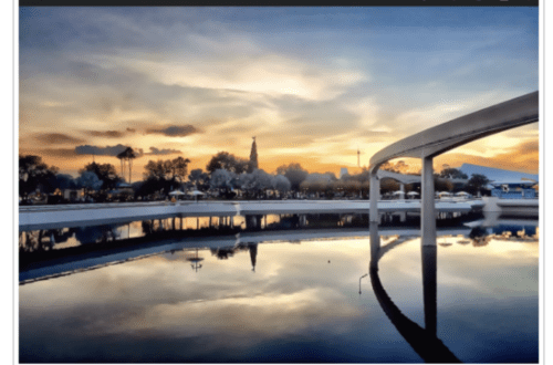
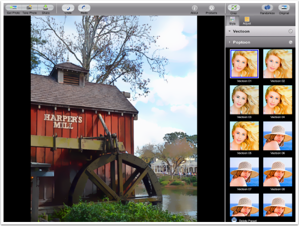
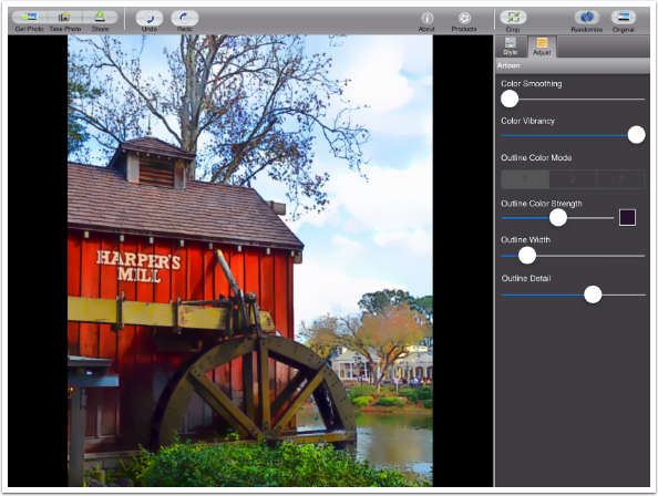
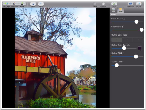
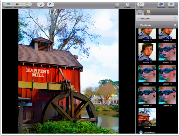
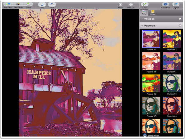
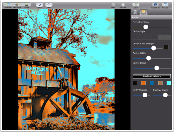
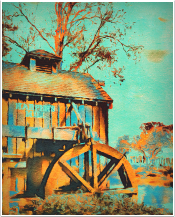
I’ve brought in this image of Harper’s Mill at Disney World by using the Get Photo button at the upper left. (You are offered the option to Take Photo, but don’t.) The buttons along the top are standard: Undo, Redo, an About button that takes you to a web-based help screen, Crop, Randomize and Original. On the right side are the Presets, and Adjustments to those Presets. Presets are grouped; in this case, it’s Vectoon and Poptoon groups. The Vectoon presets are a combination of smoothing, lines and color vibrancy settings, while the Poptoon settings add recoloring. “Vectoon 01” is the setting used in this first screenshot below.
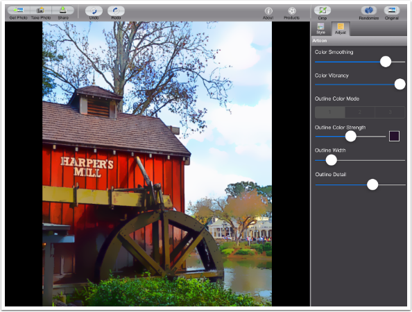
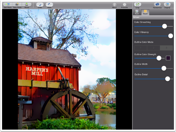
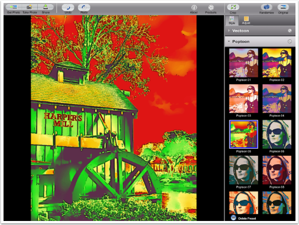
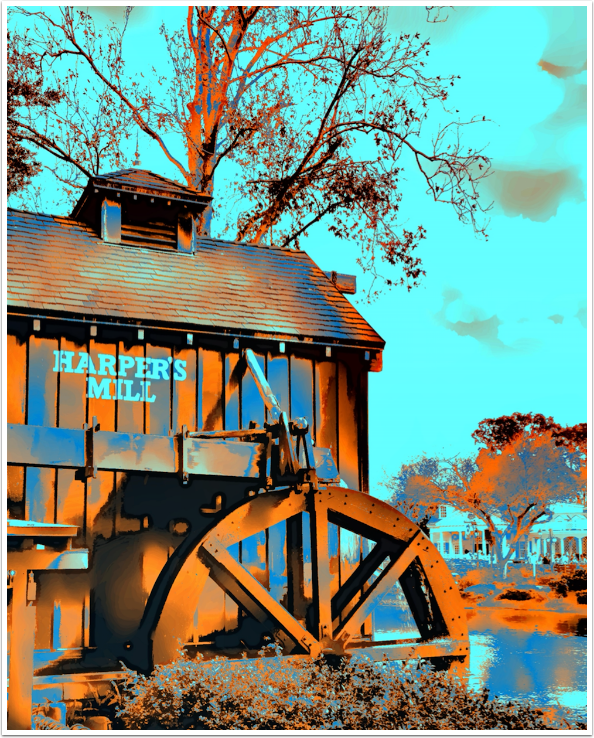
Tapping the “Vectoon 05” preset button applies new settings. Notice there are more noticeable lines and the colors are more saturated.
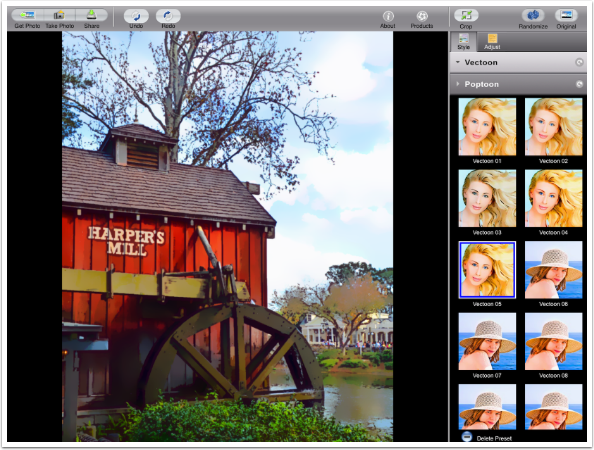
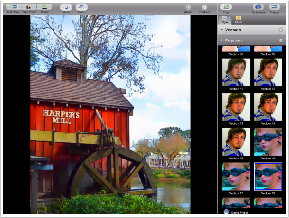
Scrolling down will show you more presets.
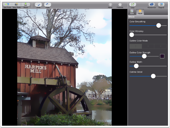
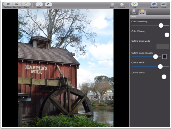
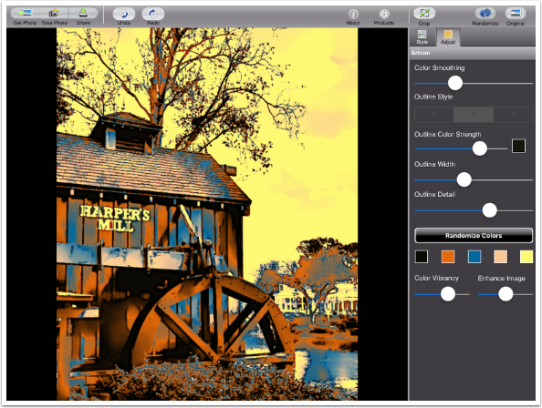
Tapping Adjust will show you the settings applied for the Style preset, and allow you to change those settings. Color Smoothing is at its lowest setting, and Color Vibrancy is at its highest.
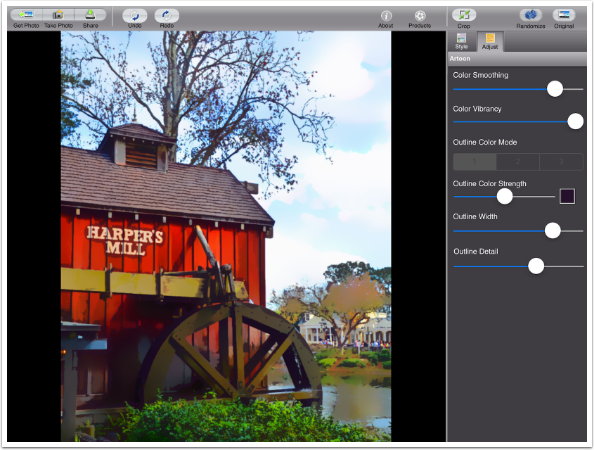
Increasing the Color Smoothing increases the simplification of the image. This is most noticeable below in the tree across the water.
Reducing the Color Vibrancy makes this a very dull “cartoon” indeed.
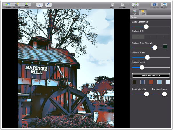
Increasing the Outline Width increases the dark halos or lines. Look at the obvious dark halo around the words “Harper’s Mill” below.
Decreasing the detail eliminates some of the finer halos.
You can change the color of the lines or halos by using the color picker shown to the right of the Outline Strength line. Also, even though it seems they are “grayed out” and inactive, there are three different Outline Modes. Below I’ve changed to the second Outline Color Mode, which is stronger.

Next is the third, lighter, Outline Color Mode.
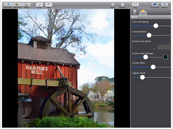
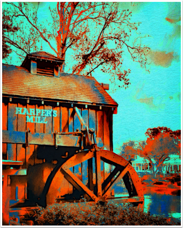
At any time, you can tap the Original button at the upper right to compare the result with the original image, as shown below.
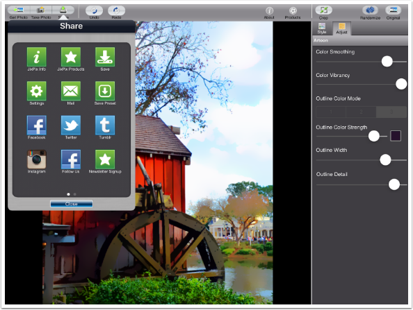
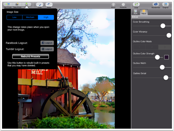
The Share button allows you to save to the Camera Roll or to various other social media. It also allows you to access the Settings and Save new Presets.
Here are the Settings. Presets are editable; in addition to adding new ones you can delete presets. If you delete a JixiPix-issued preset by mistake, there is a button in settings that allows you to rebuild them.
I’ve decided to save my current adjusted preset. A box pops up to allow me to name the preset. Presets are placed at the end of the current group (Vectoons, in this case).
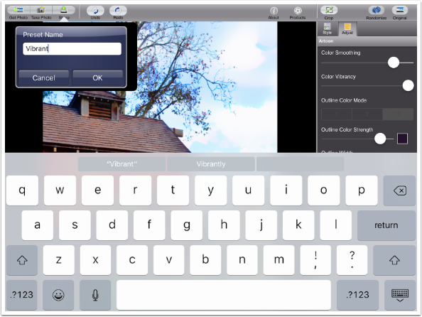
When presets are added, the thumbnail is of the image being worked on at the time of the save. The Vibrant preset I just added has a thumbnail of Harper’s Mill.
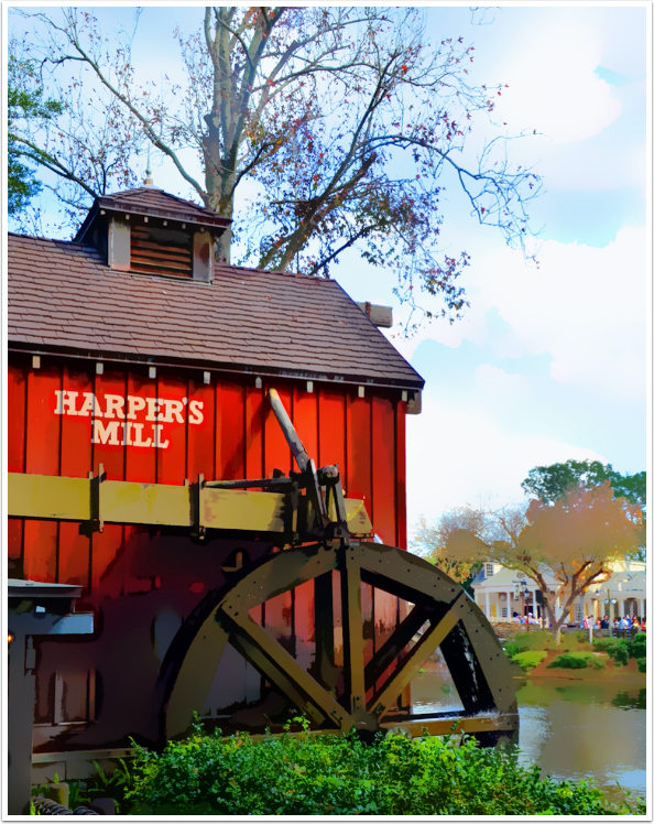
Here’s the image with the Vibrant preset applied.
Poptoon presets recolor the image based on a defined color palette. It works like a Gradient Map in Photoshop.
You can get some pretty bizarre color combinations in the Poptoon presets.
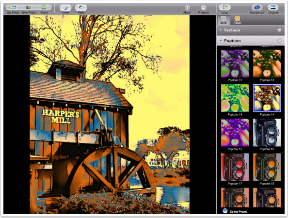
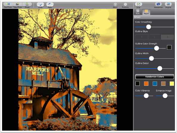
I’ll be using “Poptoon 15” as my basis for a pop art version of the mill.
Switching to the Adjustment pane, you can see that the Color Vibrancy slider is moved. Now, it’s down at the bottom with a five-level color picker along with an Enhance Image slider.
You can tap any of the color swatches and a color picker will appear. I think the light orange is too subtle next to the yellow, so I’m going to choose a darker brown.
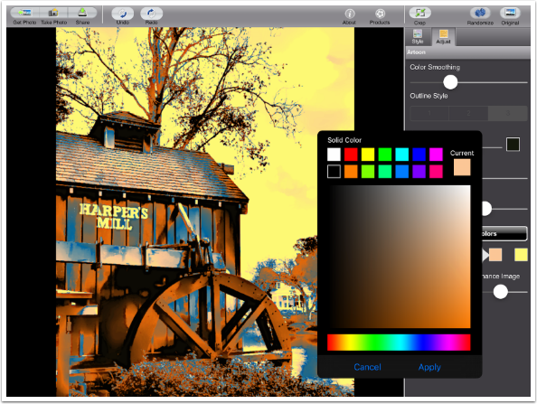
Once I’ve chosen the color and hit Apply in the color picker, that brown replaces the light orange in the image.
The Enhance Image increases the contrast of the image, making it brighter. Remember, lighter tones can not “hold” as much color, so brightening the colors will make them less saturated.
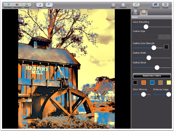
It may be hard to compare the image below, with Enhance Image at zero, to the image two above this paragraph, where the Enhance Detail slider was set at the default center. Suffice it to say that there’s not any difference that I can see.
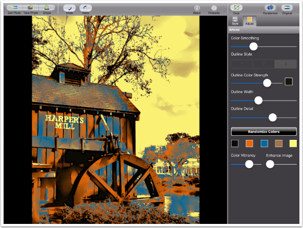
I decided I didn’t like the yellow sky, so I changed tit to a blue. Because the letters on the mill are a bright tone also, they were changed to the blue.
Here’s the Harper’s Mill image with the blue/orange Poptoon style
The Randomize button works across groups of styles. The first time I tap Randomize, it remains within the Poptoon group.
The second time I tap Randomize, it switches to the Vectoon group.
Of course, you can always continue apping after Artoon. Below is a version using Brushstroke and Distressed FX on the blue/orange Poptoon.
The next version used Glaze and Stackables, I think. (You know, you get caught up in things and can’t remember every time what you did.)
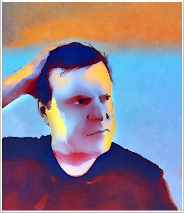
Below is a selfie created with Artoon and some tonal adjustment in iColorama.
All in all, Artoon is a simple method of simplifying your images. I’d put it in the top third of JixiPix apps, since the results can be fine in themselves, without blending and re-apping. Until next time, enjoy!
TheAppWhisperer has always had a dual mission: to promote the most talented mobile artists of the day and to support ambitious, inquisitive viewers the world over. As the years passTheAppWhisperer has gained readers and viewers and found new venues for that exchange.
All this work thrives with the support of our community.
Please consider making a donation to TheAppWhisperer as this New Year commences because your support helps protect our independence and it means we can keep delivering the promotion of mobile artists thats open for everyone around the world. Every contribution, however big or small, is so valuable for our future.
Jerry Jobe
Never content with just scratching the surface of what an app can do, Jerry Jobe decided to pass on what he learned about imaging apps to others. He’s constantly trying to figure out just what tools other artists have used, and trying to incorporate them into his own work, in an attempt to find his style. He’s written tutorials on over 145 apps so far, which you can find (along with his Song of the Day entries) at http://enthusiasmnoted.wordpress.com/ He lives near Atlanta, Georgia, where he also finds a creative outlet in acting and directing in community theater.