Mobile Photography Tutorial – Ansel: Channeling a Master or Taking his Name in Vain?
We are delighted to publish Jerry Jobe’s latest mobile photography/art tutorial for our reading and viewing pleasure. This week Jobe takes a look at the mobile photography app, Ansel. Read his thoughts as he puts it through its paces (foreword by Joanne Carter).
Ansel retails for $0.99/£0.79 and you can download it here.
“As you might guess from the title of this article, I think it’s a gutsy move to name your app after one of the greats in black and white photography, Ansel Adams. His name and several of his images are familiar to anyone who takes even a passing interest in photography. He’s known for his painstaking attention to detail, so I don’t think it’s too much to ask to have an app named after him have the same focus. While Ansel is a nice app, I don’t think it lives up to the high expectations”.
Ansel has a few features to try to set it apart from other B&W apps. The first thing that makes it different is the lack of a feature – a camera. Ansel only allows for modification of previously captured images. There is no camera capability.
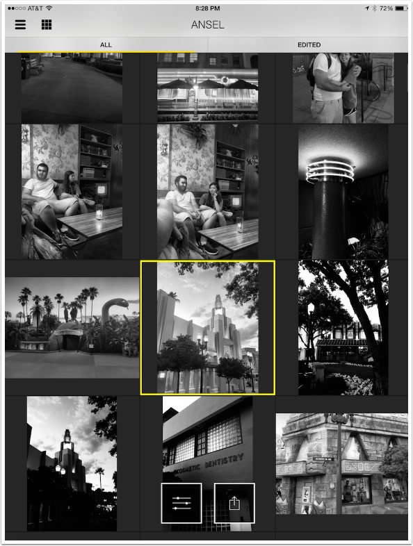
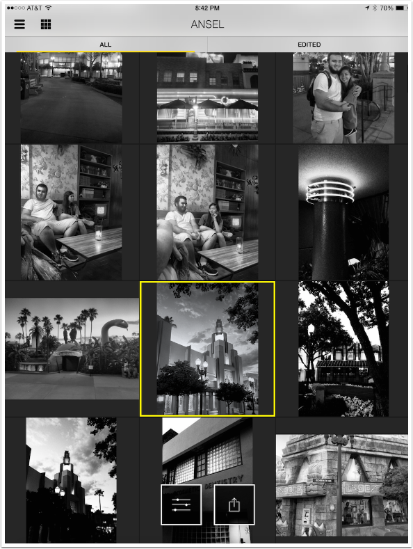
Entering the app takes you to a view of the images in your Camera Roll and Photo Stream, like the “Moments” option in the Photos app. There is no ability to change albums.
The images are displayed with a default B&W treatment, so that you can easily tell whether the image is a good candidate for B&W processing. That is a nice touch, in my opinion. Images that have already been edited using Ansel will display the image with those changes rather than with the default setting.
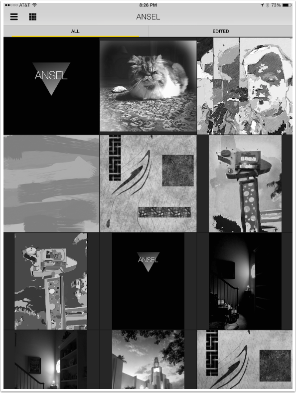
The images are displayed in rows of 1, 2, 3 or 4 columns. Tapping the Grid icon, second from the left at the top, changes the layout. (The “three lines” icon accesses Settings, but there are no real settings; just an opportunity to report problems or give feedback.)
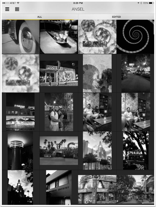
Once you select an image by tapping on it, two options appear at the bottom center. The Sliders option should be chosen to edit the image. The Save option (box with arrow) will save a copy of the image to your Camera Roll. Saving right now would give me a version with the default setting, if that’s acceptable to me. That’s a very quick way to get a B&W version.
Once you choose Edit, you are taken to the Edit workspace. Ansel will occasionally display tips in a blue bar at the top, as shown below. Tap on the Question Mark icon to hide the tip.
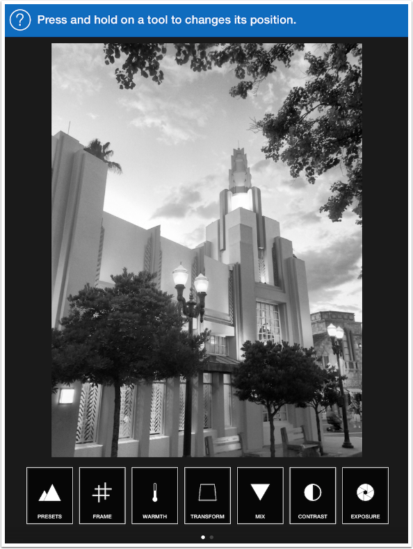
The first Edit option is Presets, which is a good place to start. There are a limited number of presets, and they cannot be added to with user presets. In the image below the None preset is chosen.
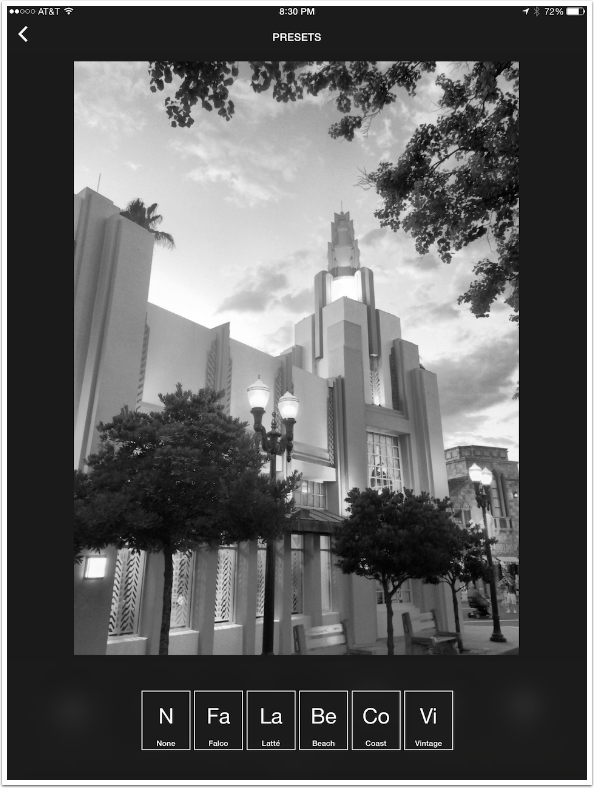
I tap on the Latte preset and it is applied. Unfortunately, there is no highlighting to show which preset you’ve chosen. Tapping on the < at the upper left applies the changes and returns you to the main Edit workspace.
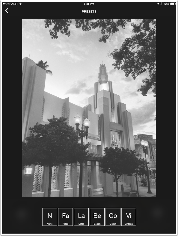
I decided on the Coast preset as my starting point. When I return to the main Edit screen I see that the Contrast control has a yellow dot. That means that the preset, Coast, made changes to that particular control. I can make further changes by tapping on each of the controls, and any changes I make would be indicated by a yellow dot.
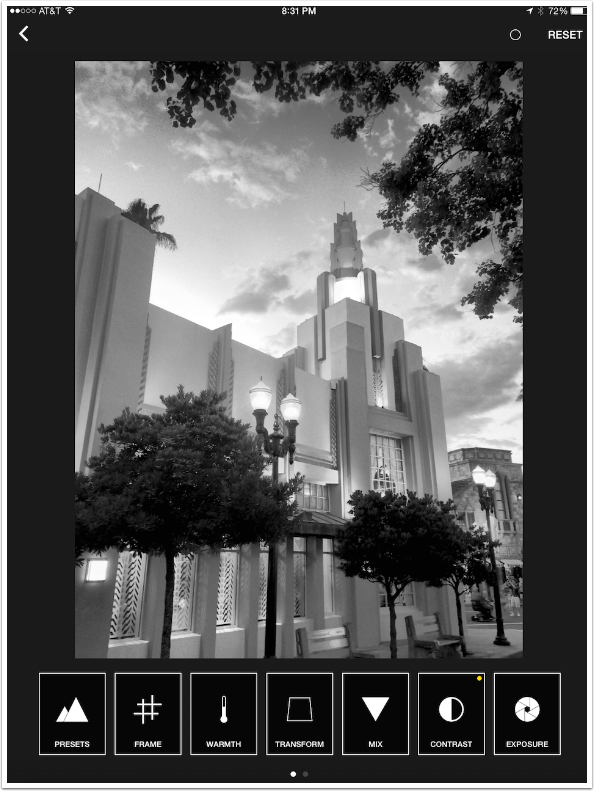
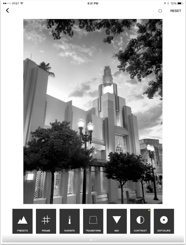
At the upper right are two buttons. Reset will reset all the controls to the default. The circle changes the background of the Edit space from black to white, as shown below.
The next control, Frame, has a slider that would be called Straighten in other apps. It allows you to rotate the image. The default position of the slider is the center (no rotation).
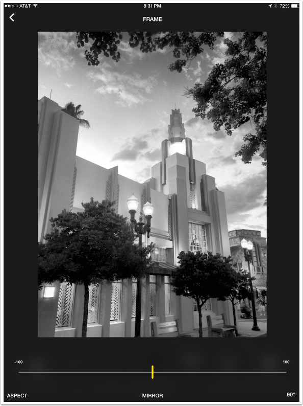
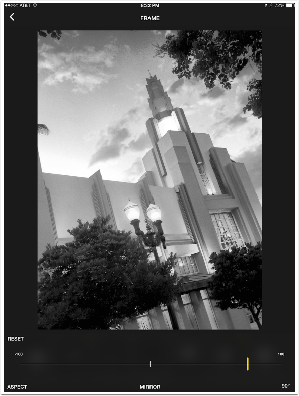
The slider shows the rotation in real time. As the slider is moved, a grid is displayed to help with precise placement.
The Aspect button at the lower left is the Crop tool. You are given the option of several standard crop aspects; there is no Custom crop. Mirror is a horizontal mirror, and 90º rotates the entire image ninety degrees clockwise.
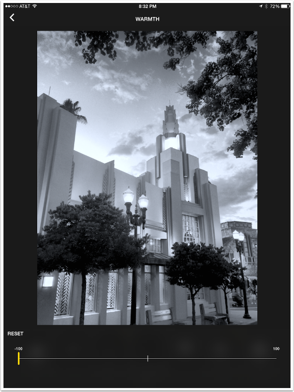
The next option is Warmth. The slider adds an orange (right) or blue (left) tint to the image. Even at its highest value, the Warmth control is subtle, which is fine by me.
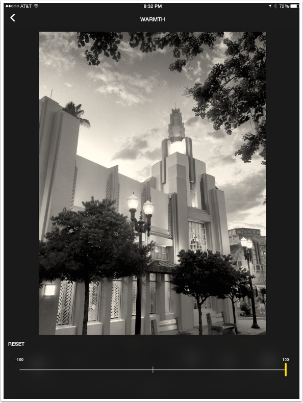
Compare the maximum Warm, above, with the maximum Cool, below.
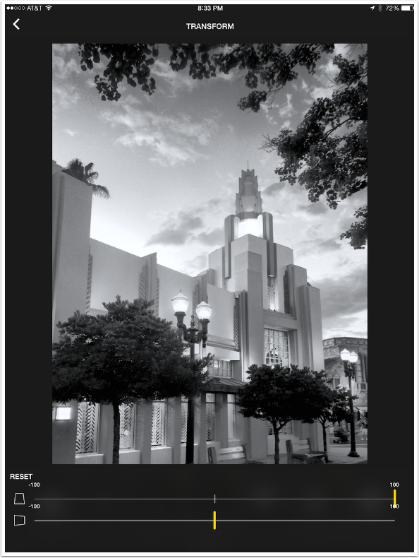
Transform allows you to fix vertical and horizontal perspective issues. Below I’ve moved the vertical slider all the way to the right to fix the perspective problem caused by shooting up at a building from the street.
Of course, I can also emphasize the perspective by moving the slider to the left.
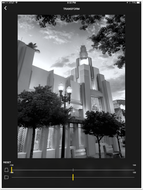
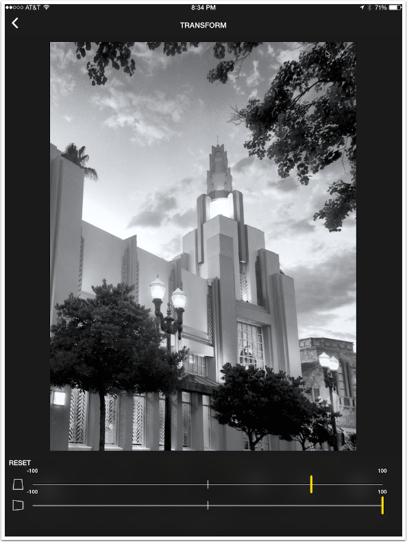
Horizontal perspective is not as useful a tool. Below is an example of moving the horizontal slider all the way to the left.
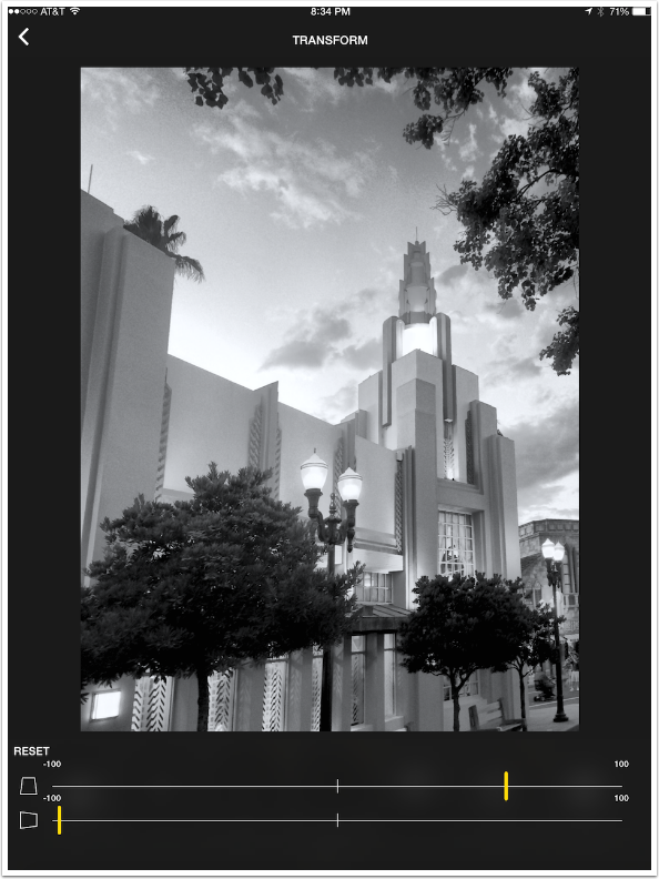
And the next, really distorted image moves the slider all the way to the right.
The next control is Mix, which is the heart of the app. They even chose the color triangle as the icon for the app, reflecting its importance.
Most B&W apps give you a choice of color filters: red, green, blue, orange. These filters have their matches in the image capture, where a filter is placed over the lens to make certain colors darker or lighter in the B&W image. Those basic filters can be accessed through the Presets button at the lower left of the Mix screen.
But the color triangle control gives you continuous control of the filter’s color, allowing for non-standard filters like purple or teal. As you move the puck around within the triangle you can see immediately the changes it makes to your image, allowing for a finer adjustment of filtering than in most other B&W apps.
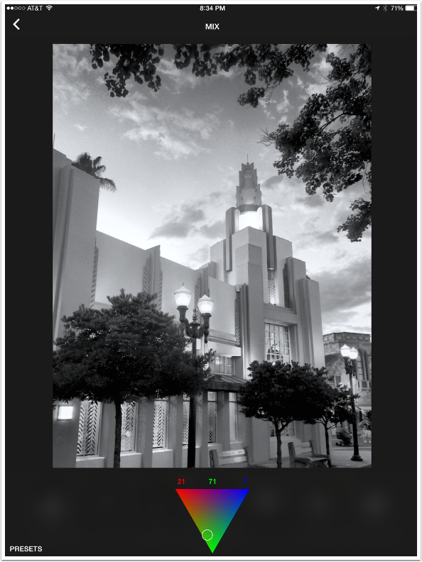
Below is the equivalent of a blue filter, washing out the sky.
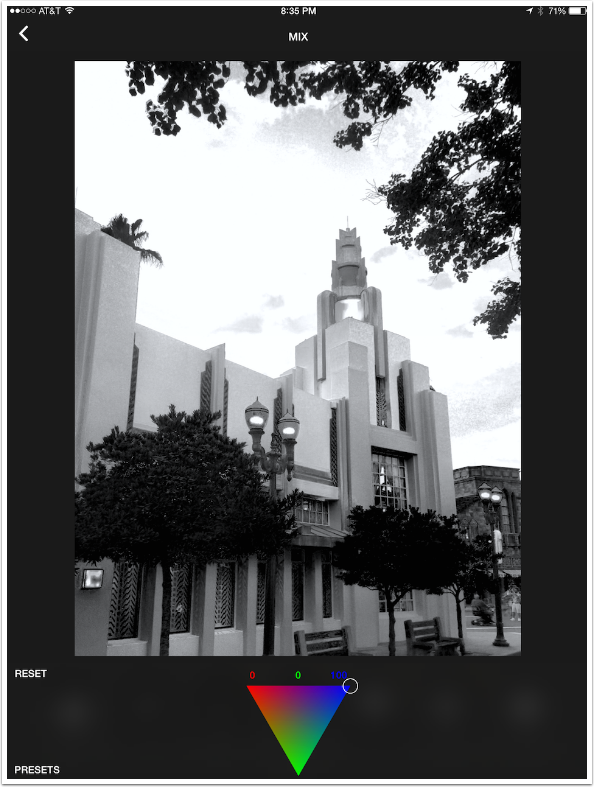
I decide on a filter that is a reddish-orange, falling in between the standard red and orange filters.
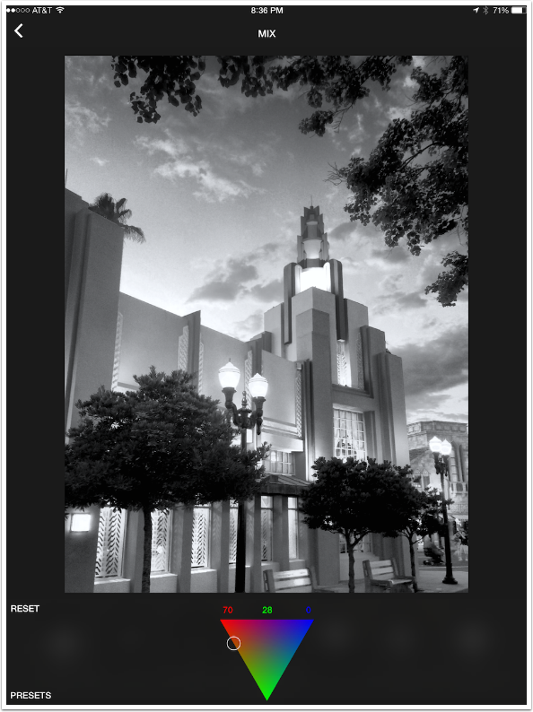
Contrast and Exposure, the next two controls, are standard sliders that default to the center positions, allowing for more or less Contrast, or brighter or darker Exposure. Following those, you access the next group of controls by swiping to the left. There are Shadow and Highlights controls that allow you to brighten shadows and darken highlights.
The next control I’m showing is Sharpen. This does not default to the center. So you can add sharpness, but you cannot blur the image.
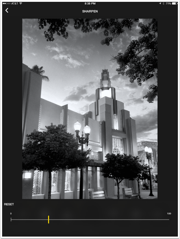
By using a two-finger pinch, you can zoom into the image to help you determine the proper amount of sharpness to add.
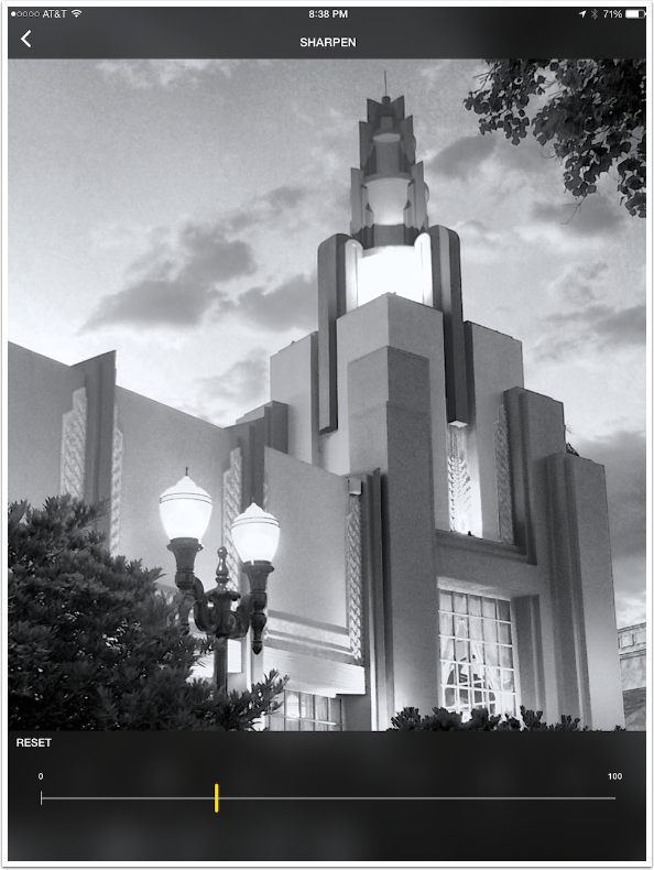
There are two controls marked as Gradient. The first is actually Grain, with no “gradient” (more at the top than the bottom, for example) applied. There is only a single type of grain, with the amount controlled by a slider. If you like grain, and I’m not a fan, then this is where you add it.
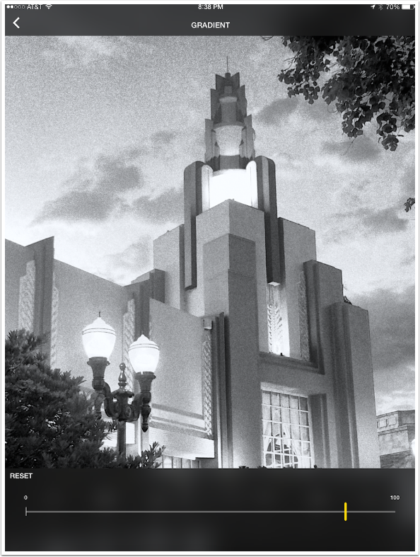
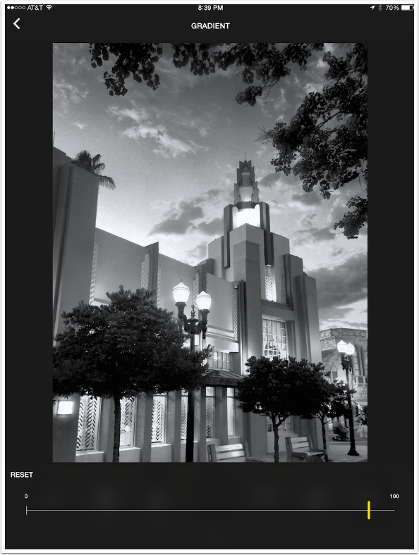
The other Gradient control is an actual gradient, which darkens the upper part of the image (usually the sky). The amount is controlled by a slider.
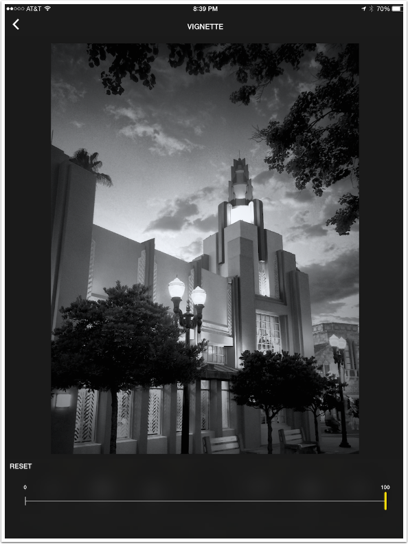
Vignette is next. There are no Radius or Softness controls, just an Amount slider.
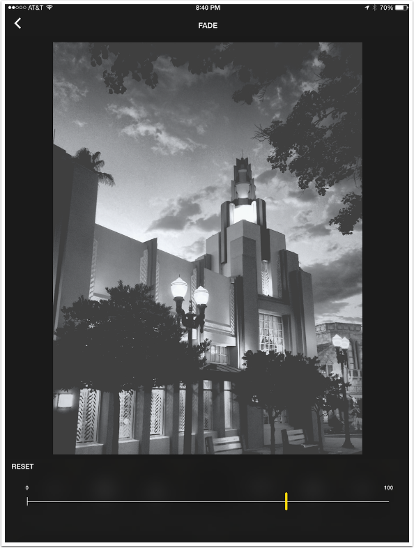
The final control is Fade. This is a lessening of contrast that looks as though you are adding “age” to the image. It’s not something I want to use on this particular image.
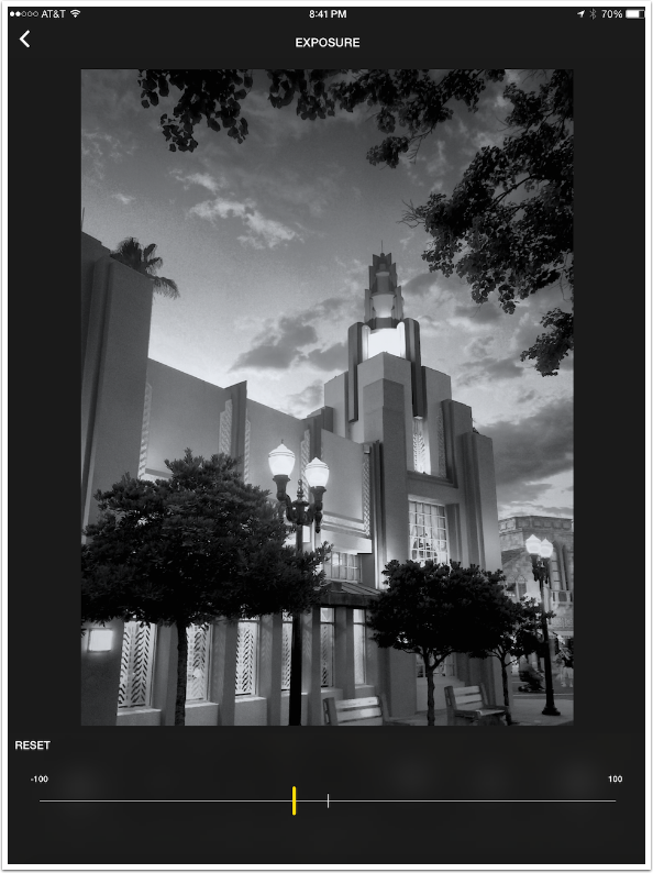
You don’t have to go through the controls in the order listed, and you can always go back and tweak. I decided to go back and lower the exposure just a tad.
To save an image, you tap the Back arrow from the Edit screen to go back to the Gallery. The changes you made will be shown in the grid. You have to re-select the image to have the Save icon show at the bottom.
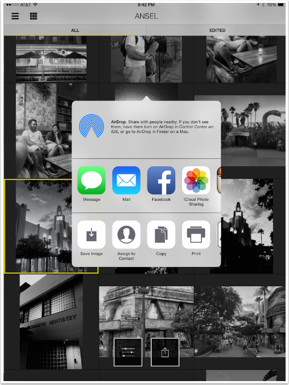
The standard iOS share dialog appears, which includes Save Image. Ansel saves a copy of the image. It does not overwrite the original, even though it shows the original with the edits in the gallery.
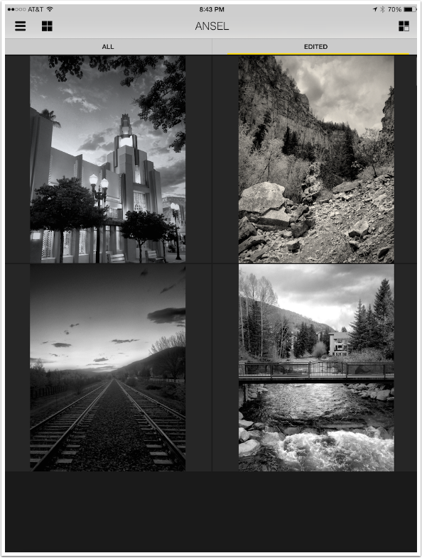
You may have noticed that there are tabs at the top of the Gallery: “All” and “Edited”. Edited limits the Gallery to those images edited by Ansel.
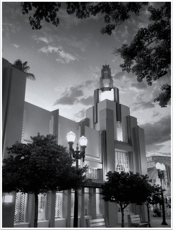
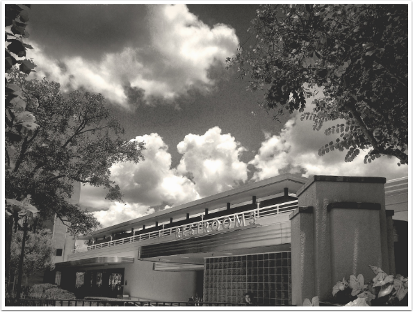
Below is my final edited image.
To summarize: I really like the fine control that is available through the Mix filtering function. Unfortunately, that is the only option that offers really fine control. No custom cropping, no control over radius or positioning of the vignette, no grain type control, no blurring. And to truly live up to the name of Ansel Adams, there should be masking, or targeting of controls. Imagine being able to darken the sky, but not the trees that are also at the top of the image. That’s the kind of control Ansel Adams achieved in the darkroom, but Ansel the app is incapable of achieving.
That’s why I think the app is good, but does not live up to the promise of its name.
Below you’ll see another example that uses Warmth and Fade. Until next time, enjoy!
TheAppWhisperer has always had a dual mission: to promote the most talented mobile artists of the day and to support ambitious, inquisitive viewers the world over. As the years passTheAppWhisperer has gained readers and viewers and found new venues for that exchange.
All this work thrives with the support of our community.
Please consider making a donation to TheAppWhisperer as this New Year commences because your support helps protect our independence and it means we can keep delivering the promotion of mobile artists thats open for everyone around the world. Every contribution, however big or small, is so valuable for our future.


2 Comments
Pam Chambers
Aloha from Honolulu, Jerry. Today I got the Ansel app, but quickly realized that I needed a tutorial. Thank you very much for taking the time to share your tips with us. It helped a great deal! ~ Pam
Ron Boger
I agree, Jerry. Thank you for your in-depth post. As we know, Ansel’s Zone System brings richness to the scene, HDR in it’s time. Contrasting whites and blacks with his tilt-shift sharpness make his scenes come alive. Imo, Ansel’s work is strikingly more than just edited b/w.