
Mobile Photography / Art Tutorial – Leonardo: a matter of perspective
We are delighted to publish Jerry Jobe’s latest mobile photography/art tutorial for our reading and viewing pleasure. This time Jobe takes a look at the app Leonardo and continues his recent discussion using layers and selections in composites. Read his thoughts as he puts it through its paces (foreword by Joanne Carter). Take it away Jerry…
Leonardo retails for £3.99/$4.99 and you can download it here.
“In my first look at Leonardo I emphasised the value of layers. Any discussion of Leonardo begins and ends with the flexibility that layers gives you. Modifications can be made to single layers, and the opacity and position of layers can be changed after the fact, making compositing a breeze.
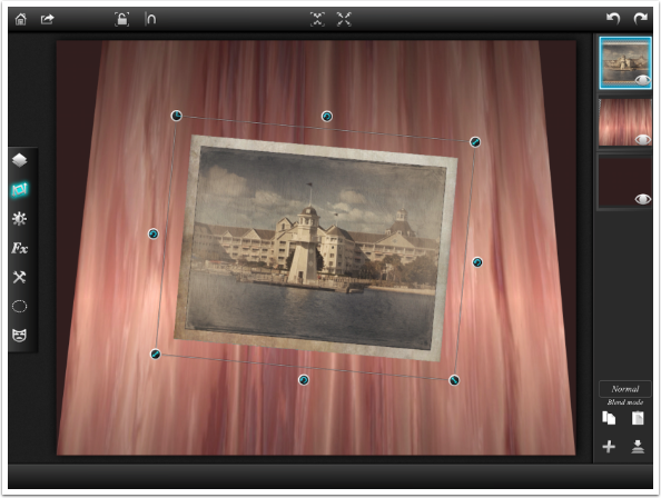
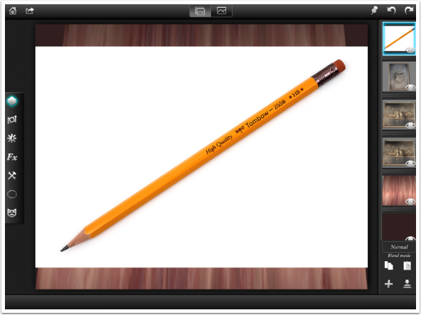
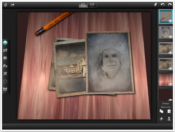
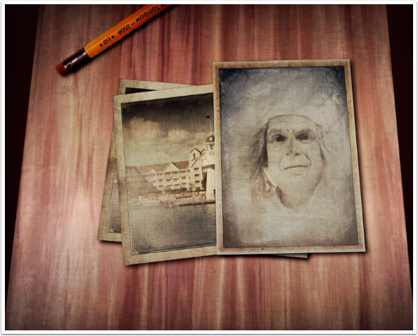
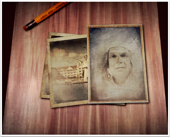
The image shown below is a composite, and today we are going to explore some tools within Leonardo that will help you make more realistic composites: Perspective, Flip and Selections”.
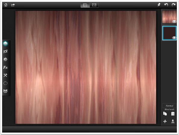
I want to create my composite entirely from scratch, so I need to create a “table” to lay my photos on. iColorama has a couple of wood textures, so I start there with Organic texture 131. The Normal blend mode gives me just the texture, but Multiply blend mode on a white background is essentially the same.
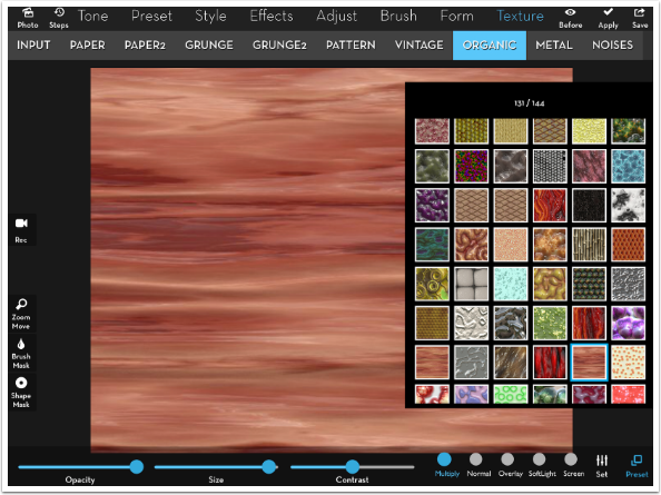
I want the tabletop to have some perspective. I want to make it look as though it gets smaller as it becomes farther from the viewer, rather than looking as though I’m shooting straight down at it. Having the grain of the wood run vertically makes that perspective more obvious. I open the Set menu and tap the circular arrow twice. Each time the arrow is tapped the texture is rotated 45 degrees, so two taps takes it from horizontal to vertical.
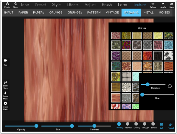
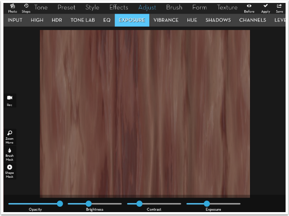
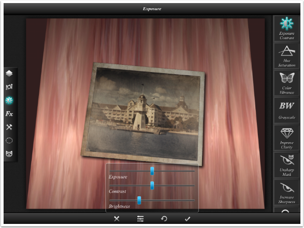
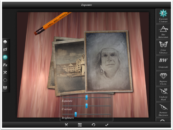
The wood is too “fresh”, so I dull it by using Adjust>Exposure to lower the Exposure and Contrast.
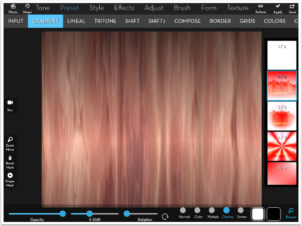
Finally I want to apply some lighting to the wood. I use Preset>Gradient in Overlay mode. I use preset 2, the two-color gradient, with black at the top and white at the bottom. By moving the X Shift control, the white is moved up the image and fades to black on both sides. Now I’ve got a nice gleam. I save the wood tabletop and move on to Leonardo.
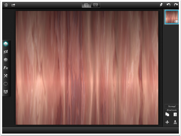
Below is a screenshot of Leonardo. I’ve started a new project with my wood tabletop as my sole layer. When I think of a table in perspective, I see the edges move in, revealing what’s behind the table. So it will be with my fake table. That means I need to have a background for my table, for which I’ll add a layer.
Tapping the + sign at the bottom of the layer palette opens the add layer dialog. By tapping the color thumbnail I can change the color of the empty layer added by using the color picker. Rather than black, I use a dark reddish-brown.
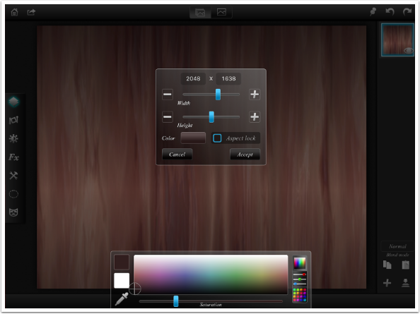
That places my color layer at the top of the stack. I want it to be behind the table, so I hold and drag the color layer down to the bottom of the stack.
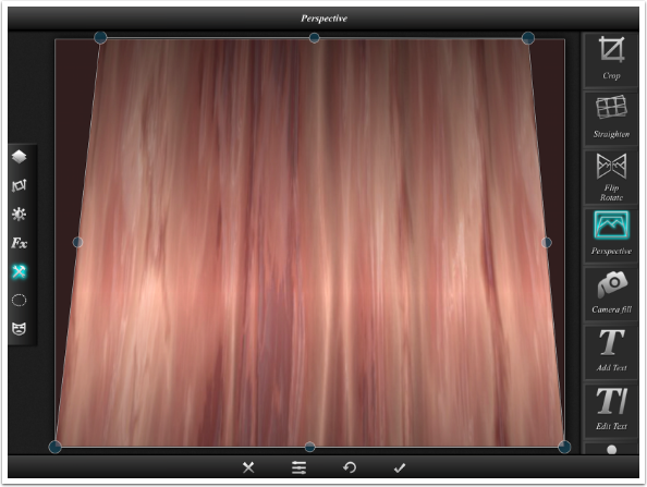
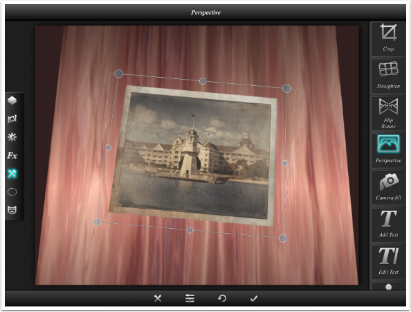
I select the wood layer in the Layers palette to make sure it’s the active layer. Then, I tap the Tools button (fifth from the top on the left side) and Perspective in the menu that appears on the right side. I can now see handles on the wood layer that can be moved independently. I move the top right and left handles toward the center of the image, giving me the look I’m after. When I am satisfied, I click the check mark at the bottom.
Now I’m ready for the photos I want to place on the table. In order to be realistic, the photos need to throw a shadow onto the table. Leonardo’s Drop Shadow effect does not cast a shadow outside the edges of the layer, So I have prepared the photos by putting them on a blue background that I can mask out, thus allowing for a drop shadow. I go back to the Layers palette by tapping the top button on the left, then the + to add the layer from the photo library.
I need to mask out the blue, so I tap the left bottom Mask button. I tap the Magic Wand button at the right top, then tap anywhere in the blue border. The blue is masked out and disappears.
Transform is the second button from the top on the left side. (As a refresher, those buttons, from top to bottom, are Layer, Transform, Filters, Effects, Tools, Selection, and Mask.) I use a two-fingered pinch to shrink the photo, and the circular arrow Rotate button to rotate the photo.
Any object laying on the table that’s in perspective would also need to be in perspective. I use Tools>Perspective, once again pulling in the top handles towards the middle.
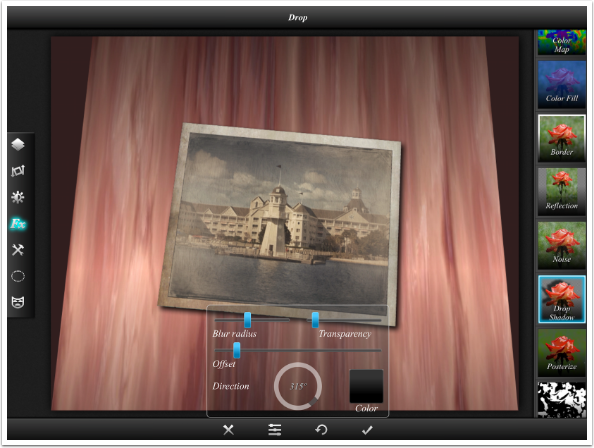
Next, I add the drop shadow, which is found under Effects. I change the Offset to draw the shadow closer to the photo, so it doesn’t look like it’s hovering an inch off the table. The lighting in my fake room isn’t harsh, so I increase the blur and lower the opacity.
There’s still something that’s not quite right about my photo, and after some examination, I realize that the lighting is even across the face of my photo, while it is not even across the top of my table. I did not account for that “gleam” that I added to the table. So how do I add a shadow to the upper half of my photo? I could lower the exposure of that upper half if I could select it properly.
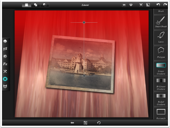
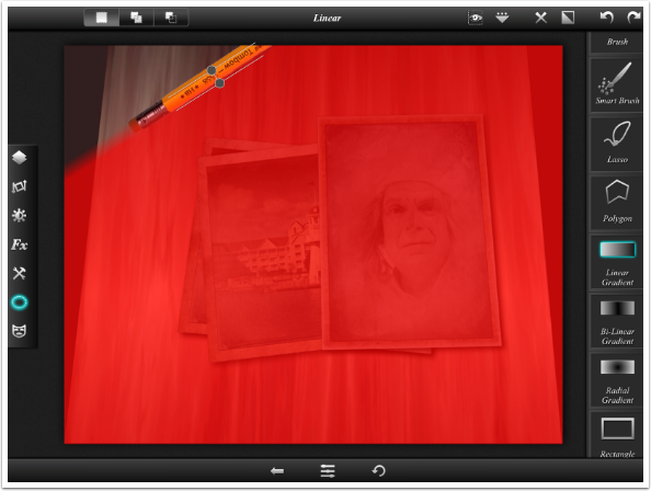
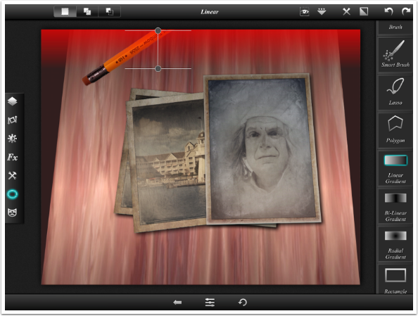
Thus we see the power of the selection tool. By tapping the dotted ellipse, I open a menu on the right filled with selection tools. I choose Linear Gradient, and draw a line from the top to the center of the “gleam”. A red overlay appears showing the selection. This selection only applies to the chosen layer, not the entire image. To put it another way – the overlay is shown over the entire image, but any changes you make based on that selection will only be applied to the active layer (in this case the photo).
Now I can go to Filters>Exposure and lower the Brightness. I’m only darkening the top of the photo, where it falls into the “shadow”, because of the selection I made. The tabletop is not affected.
I add another copy of the lighthouse photo and rotate it the other way. I follow the same steps: Add Layer, Mask, Transform, Perspective, Drop shadow, Select, Lower Brightness. I could have duplicated the completed photo layer and rotated it, but it would have rotated the Perspective, the Shadow and the Exposure change as well, making them look extremely unnatural. They would not match the bottom picture.
Perspective can be a tricky thing. My first two photos fell on the center line of the tabletop, so I could adjust the perspective to match the table. My third photo falls entirely on the right side of the tabletop, so I have to change the perspective to accommodate that. This is what I ended up with, but I probably should have pulled the left top handle outside the box entirely.
Once again, I use the Linear Gradient selection tool and Filters>Exposure to darken the top of the third photo.
I decide I want to have something else besides a few photos on my table. Perhaps a pencil. I find an image of a pencil on a white background, knowing that I can drop out the white. I add it as a new layer.
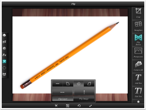
The pencil has the point at the bottom and the eraser at the top, and I want to reverse that – have the point away from the photos. I use Tools>Flip to accomplish this. Flip Layer is selected by default. You’ll notice that the two buttons in the middle are flip horizontal and flip vertical. I don’t want to use these since the writing on the pencil would be mirrored, rather than just turned around. The top buttons rotate the image, and I select the third – rotate 180 degrees.
When I enter mask mode and tap the white surrounding the pencil with the Magic Wand, there is still some white remaining. This was the slight shadow that was on the pencil image, making that area gray rather than pure white.
I zoom in and touch the gray with the Magic Wand. The gray is masked out. However, I see that the mask left some stray highlight pixels along the bottom edge of the pencil that make the pencil look pasted in.
I choose the Brush masking tool rather than the Magic Wand. I want a small, soft brush, so I tap the sliders button at the bottom and the brush controls appear. By dragging the small red dot on the graph toward the bottom left corner, the brush tip becomes smaller and softer. I paint along the bottom edge of the pencil to take off just those highlight pixels.
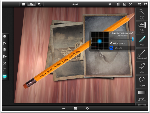
I use Transform to place the pencil in the upper left part of the image, where the table is shadowed. This emphasises the fact that when I flipped the pencil, the slight shadow was flipped to the top, with the highlights along the bottom. I need to darken the bottom of the pencil. Once again, I can use the Linear Gradient selection tool. It can be difficult to manipulate exactly, but within a few tries I created a tight linear gradient that fell at the same angle as the pencil.
I use Filters>Exposure and the Brightness slider to add the right shading to the pencil.
The pencil, since it is farther away on the table, should be shaded more. I use the Linear Gradient and Exposure to add more shadow at the top of the image.
Finally I added a drop shadow for the pencil. I want you to look at the thumbnail of the pencil in the Layers palette. The Exposure changes were not made to the entire pencil, just to the part that is visible within the confines of the edges of the image. If I decided to move or resize the pencil, then chances are I would have to start over with it. At this point I could hit Undo a couple of times and the shading would disappear, but as I modify the image further, I might find that Undo is not the best course to take.
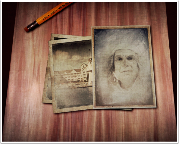
At this point I could continue and add more items, try to create a more realistic background, or any number of other tweaks and changes. But I will save it for now. I tap the box-with-arrow and choose to save to Photos.
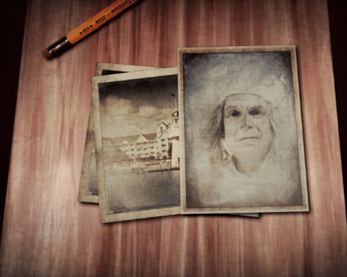
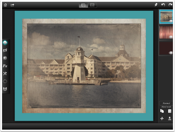
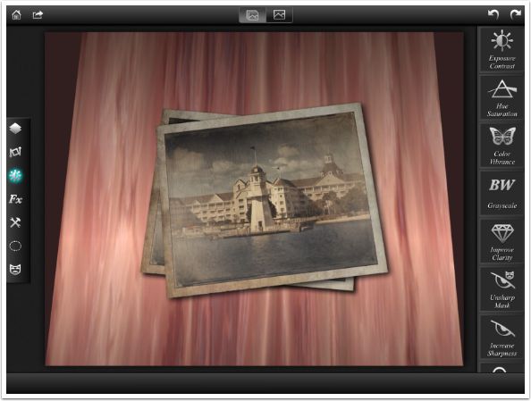
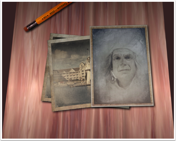
Here’s my result, for now.
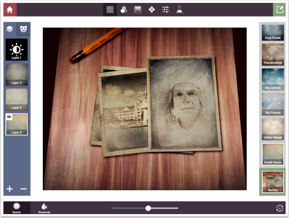
Composites can tend to look rather antiseptic: too neat. Adding some texture with Stackables will help soften that neatness. I add four layers, starting with an adjustment layer to darken and desaturate the image before adding textures in overlay mode. (Overlay mode will lighten and saturate images.)
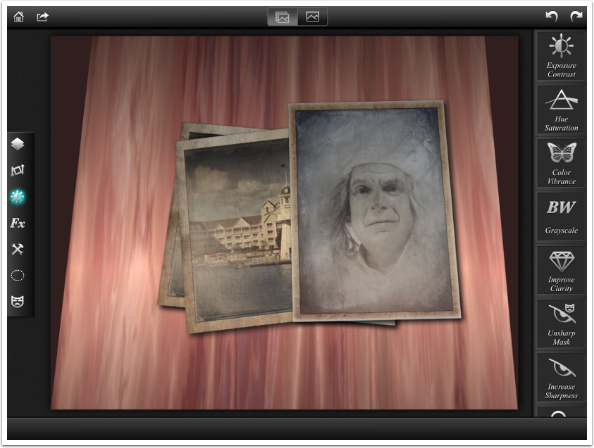
And the result, which you already saw at the beginning of this article.
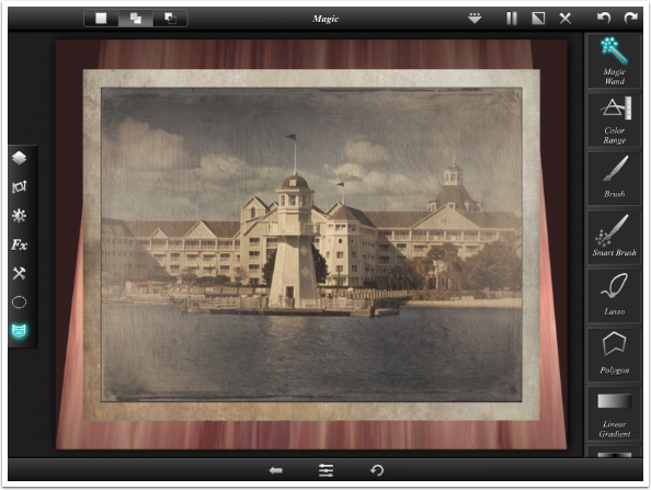
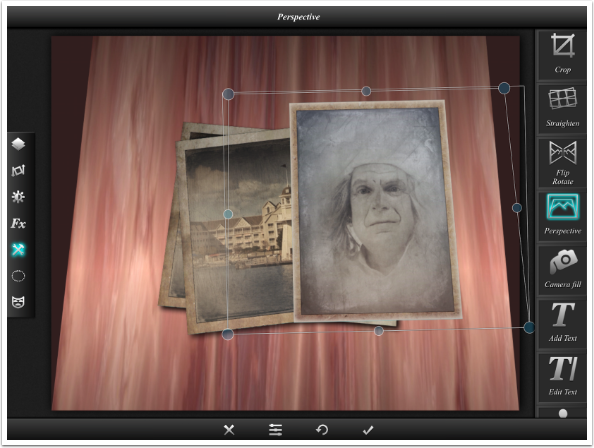
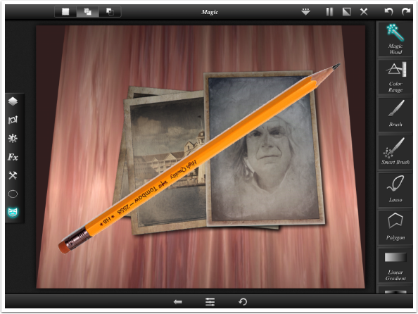
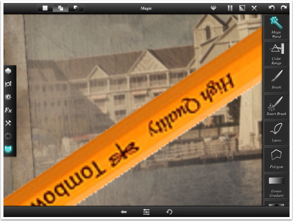
There’s been a lot covered in this article, so let’s recap some of the major points. Selections in Leonardo may look as though they affect the entire image, but they only affect the active layer. The red overlay shows where the effect or filter is to be applied. In the image below, the red overlay covers all but the face in the top photo.
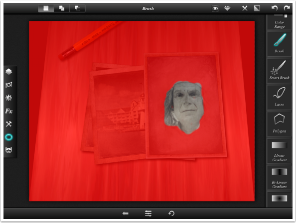
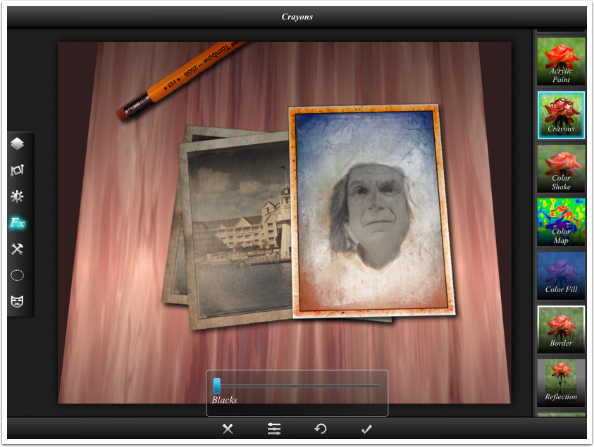
When I apply the Crayons Effect using that selection, the effect only applies to the remainder of the active layer (the top photo) that falls outside the face.
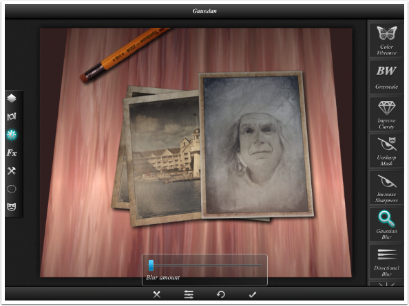
The second major point is that using layers means you can go back and change things quickly afterwards. I decide that part of what looks unrealistic about this image is that the writing on the pencil is sharp all the way into the “distance” I go back and use a very tiny amount of Filters>Gaussian Blur on the pencil layer.
Then, since I saved off the four layers in Stackables as a formula, I was able to quickly recreate the texture on the image.
You may find that compositing isn’t your thing. However, the use of layers, selections, and perspective can help you with your digital artwork, no matter what form it takes. Until next time, enjoy!
Jerry Jobe
Never content with just scratching the surface of what an app can do, Jerry Jobe decided to pass on what he learned about imaging apps to others. He’s constantly trying to figure out just what tools other artists have used, and trying to incorporate them into his own work, in an attempt to find his style. He’s written tutorials on over 145 apps so far, which you can find (along with his Song of the Day entries) at http://enthusiasmnoted.wordpress.com/ He lives near Atlanta, Georgia, where he also finds a creative outlet in acting and directing in community theater.


2 Comments
Carolyn Hall Young
Thanks for doing this tutorial, Jerry! Thanks to Joanne for publishing it, here!
Leonardo is a terrific app. I am reinspired to use it, more often!
Jerry Jobe
Like everyone else, I will fixate on a particular app and not use others for months. When I “rediscover” those apps, I am also inspired to add more layers to my artwork. If you enjoy Stackables, don’t forget Mextures. If you enjoy Glaze, don’t forget Brushstroke. And if you work a lot with non-layering apps, don’t forget the joys of layers with Leonardo!