
Mobile Photography / Art Tutorial – iColorama: Brush Tips #2
We are delighted to publish Jerry Jobe’s latest mobile photography/art tutorial for our reading and viewing pleasure. This time Jobe takes another look at the app iColorama and offers some very useful brush tips – if you missed Part 1 of this series, please go here. Read Jobe’s thoughts as he puts it through its paces (foreword by Joanne Carter). Take it away Jerry…
iColorama retails for $2.99/£2.29 and you can download it here.
“Last time I went over the Colorize brushes, which (for the most part) use assigned colors to paint. I even showed you how to paint with a photo as your brush tip. This time we will take a look at brush types that sample the color underneath them, allowing you to paint photographs. I’ve featured these brush types many times, in discussions on Artist, Rebound, Plane, Clone, Stamped, Edged and Raised brushes. The tip I’ll be sharing is not the operation of these brush types, but a workflow you may not be using that has multiple advantages.
The standard workflow is to load an image, then select one of the types from the brush menu. A white “canvas” overlays your image, and you can use the Background button to change that canvas to another color or an image you have saved that’s appropriate for a canvas. Any brushstrokes you make pull the initial image through the canvas, in the style of that brush type.
This works fine, and many iColorama artists use this method to create fine artworks. But what happens if you want to change the canvas? Make changes to the underlying image because the painting is coming out too muddy? Add another element to your painting? Perhaps more important: what if you are interrupted and want to pick up your painting again later? This workflow I’m describing will solve these issues.
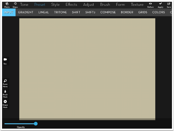
The first thing you have to do is get out of the habit of loading an image and beginning to paint. You have to make preparations. First, just as you would with oils, acrylics, markers, ink, watercolours or charcoal, you have to prepare your surface. Have your canvas created and saved so it is easy to return to. I start with an image the correct proportions for my painting and overlay it with Preset>Gradient”.
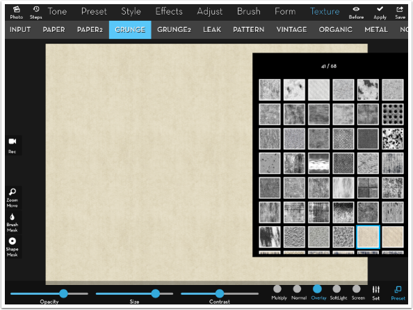
I add some texture to the paper/canvas. Here I’m using Grunge 41 in Overlay blend mode. The Opacity is pulled back to 60%.
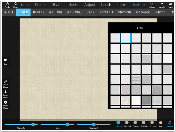
Now that I’ve got a little mottling, I add the canvas texture. Paper 2 in Multiply mode is good, and I increase the size a bit and lower the opacity a bit.
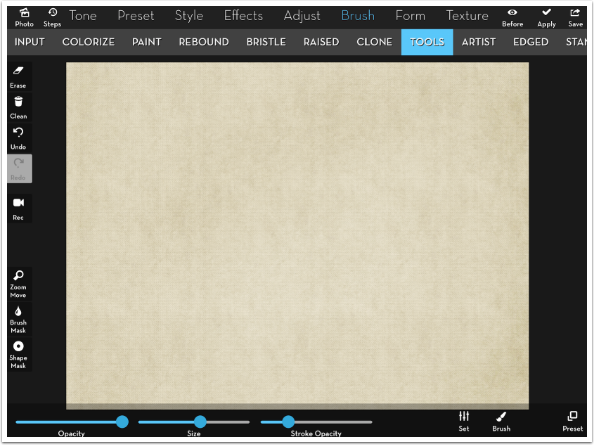
It’s still a little too “regular” to me, and looks artificial. One thing that can solve that is some random strokes with the Burn and Dodge brushes under Brush>Tools. Keep the Stroke Opacity low to avoid “damaging” the canvas.
I have now created my canvas, and I save it off. It can be used for multiple paintings, and I won’t have to reinvent the wheel each time.
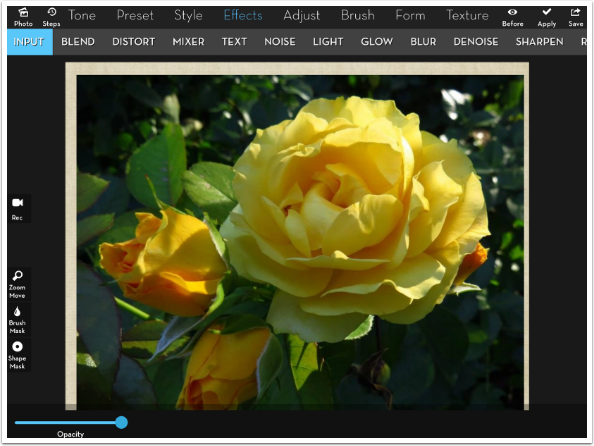
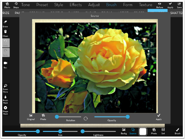
Now I use Effects>Blend to put my source image, a flower, on top of the canvas. Why would I do that? It helps me put the subject of the image in the correct place for my painting, which may not be exactly where it is in the original. In this case, I want to make the main bloom smaller within the canvas, and more centered vertically. It really is a simpler way to crop your source to make it fit in the space. I don’t care that I can see part of the canvas along the outside; I won’t be painting along the edge of the canvas.
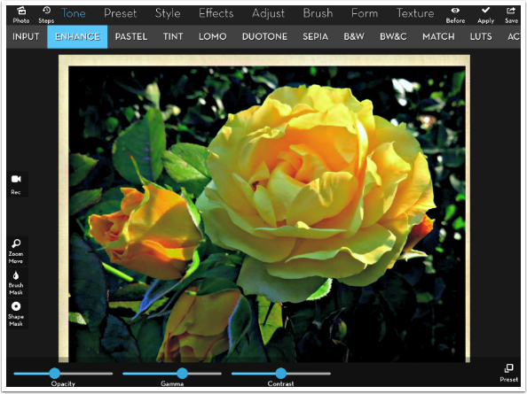
Now I can make further adjustments to get the image ready for painting. In my case I know that I want to get rid of some of the softness, because softness in a photograph is more blurry in a painting than soft. I also want to lighten the shadows a bit. I use Enhance preset 1. I save off the new painting source.
Now I have my canvas and source established. At this point, I can go straight to the Brush menu. I will step back in History until I get back to the canvas, only because that allows me to have the background in place – I don’t have to reload it from the Camera Roll, where it is saved.
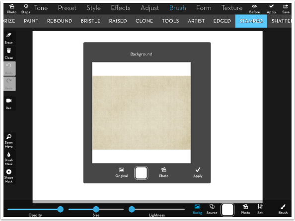
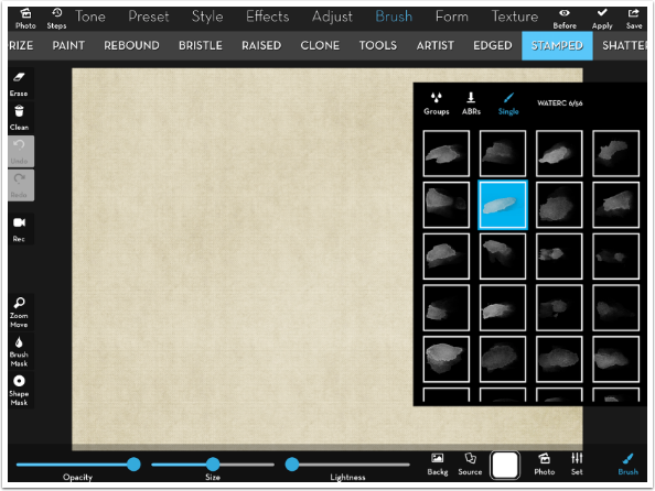
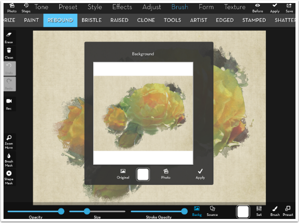
I often will paint in layers – establish structure with one brush type, a kind of wash with another, and detail with a third. I am going to try Stamped for my structure. I choose Stamped in the Brush menu, and my canvas is overlaid with the plain white that I do not want. So I re-establish the canvas as my background by tapping the Background button at the bottom and the Original button in the resulting window. I tap the Apply checkmark (in the Background window, not at the top) to cement my canvas in.
If I started to paint now, I would paint in canvas over canvas. The default source for painting is the starting image, and I started with the canvas. I need to override the source. I tap the Source button, tap Photo to access the Camera Roll, and choose my modified flower image. I tap Apply in the Source window, and I’m taken back to my empty canvas for painting.
I choose the WATERC 6 brush tip.
A single tap and I get a huge splash of color. Definitely more than mere structure.
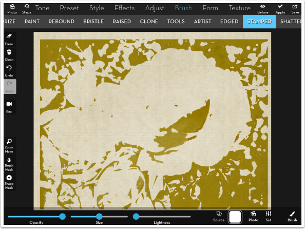
Reducing the size of the brush still resulted in some big patches, and even the use of the Erase function around the edges did not give me the base look that I wanted.
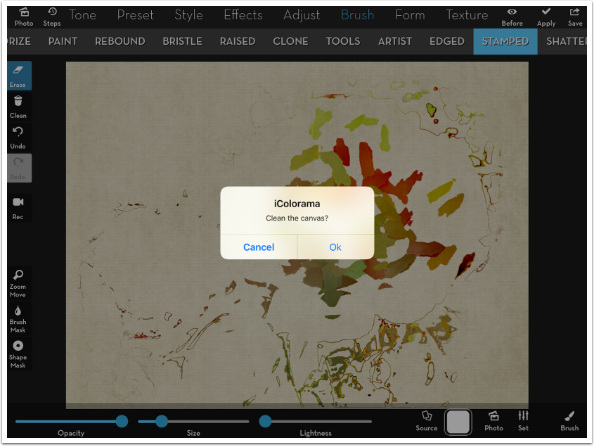
I tapped Clean to clean all the Stamped brush off the canvas.
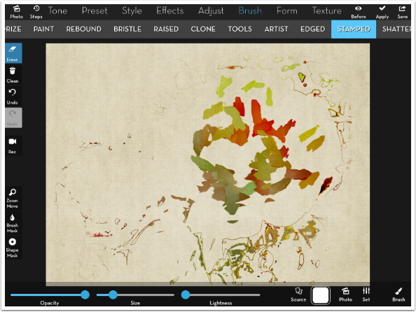
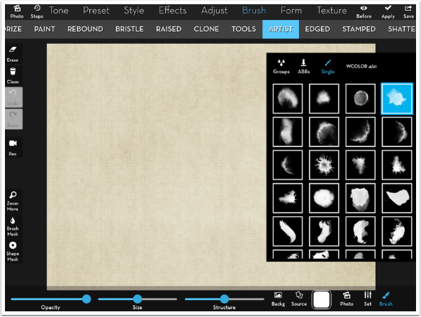
I switched to Artist brushes. I had to use the Back and Source buttons to establish the canvas and source image again. I choose the WCOLOR 4 brush.
This Artist brush type gives me more what I was expecting. It’s more dependable than the Stamped brushes. Notice how blurred the petals are – I would not use Artist brushes for fine detail, but it’s good for establishing the basic shape of the painting.
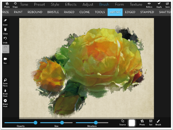
I want my painting to fade into the canvas at the edges, so I lower the opacity of this base layer. I Apply the Artist paint.
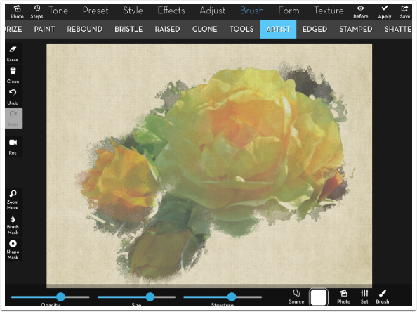
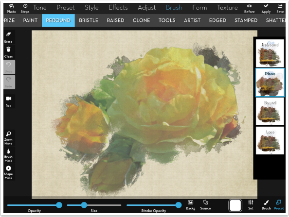
I’m going to do more work under the Rebound category. Once again, I want to establish background and source. For my background, I choose original again, because I want to paint on top of the Artist paint already on the canvas. I choose the same source we’ve been using, since I don’t want to repaint the Artist strokes.
As I said, I like a low-opacity wash next. It establishes what will be seen between the detail brush strokes. For that, I like to use the smeary Plane brushes, which are the second preset under Rebound.
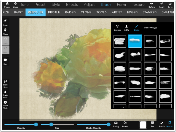
For the brush tip, I choose DRYTWO 2.
I lower the Stroke Opacity to about .3 and make a few dabbing strokes. I especially like what it does to the left top bloom.
I use Rebound brushes, which bring out the most accurate representation of the photo, as my detail brush type. Since I am not changing the Brush Menu item (both Plane and Rebound are under Rebound), I do not have to set background and source again. I merely change the preset.
The size of Rebound brushes is relative to the screen, so zooming in makes them smaller without changing the Size slider. I start brushing around to get details. The strokes, made with the same DRYTWO 2 tip, look like a brushstroke.
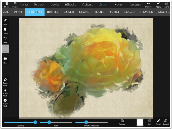
I work on the main bloom, not on the other blooms. I also don’t get near the edge of the painted area, because I like the way it blends into the canvas.
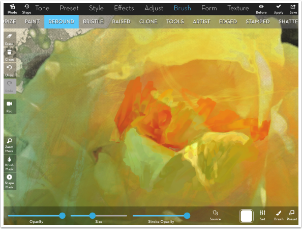
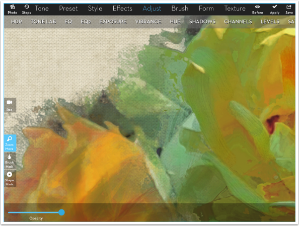
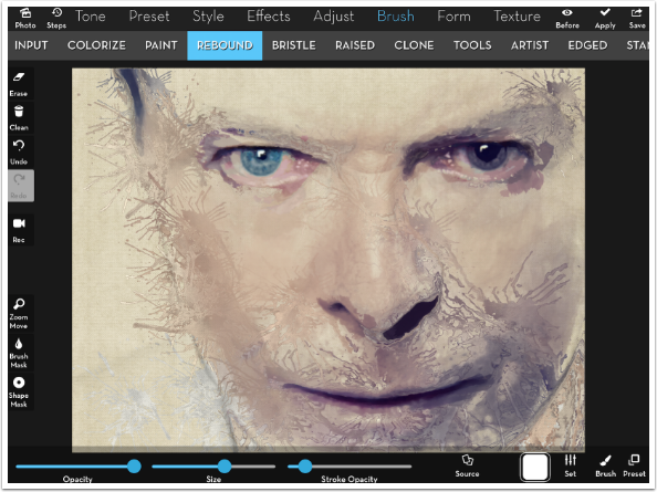
Rebound brushes tend to make strong edges while staying within the limits. Look at the screenshot below, for example. There’s a blotch of green right above the Size slider, among other strong color changes. Here’s a tip for making them blend more naturally.
Lowering the Stroke Opacity to about .3 can make the brush work almost like a smudger, or a brush without paint. The green above the Size slider was almost completely blended in, and the other strong edges were made softer.
Another tip, and the most important one about this workflow: at any time, you can save your painting and leave the app. To continue, load the saved painting as your background, and the Source from the Camera Roll, and you can continue from exactly where you left off.
After using the Rebound brush to blend as well as bring in detail, some parts of the bloom became smooth areas of color. I like to add some brush texture back in, and that is best accomplished with some use of Bristle brushes. Since I am changing brush types in the Menu, I Apply the Rebound and Plane brush strokes, and then re-establish the Background (Original) and the Source from the Camera Roll.
To create the brush marks, I am using the Stipple brush tip 4. Bristle brushes give a slight edge, making all the dots in the Stipple brush stand out.
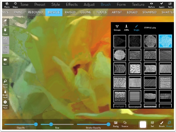
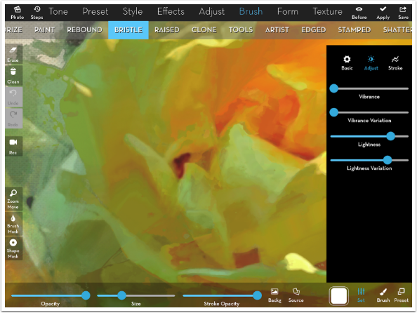
The slight edges given to a Bristle brush make it darker. To make the Bristle brush more closely match the underlying Rebound strokes, I raise the Lightness slider to a value of .40 – .44.
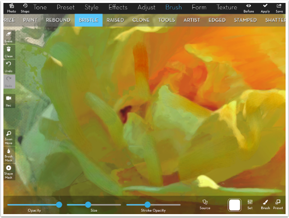
I personally use the Bristle brush sparingly. I don’t brush over the entire image, just in places where I want the brush marks to come through.
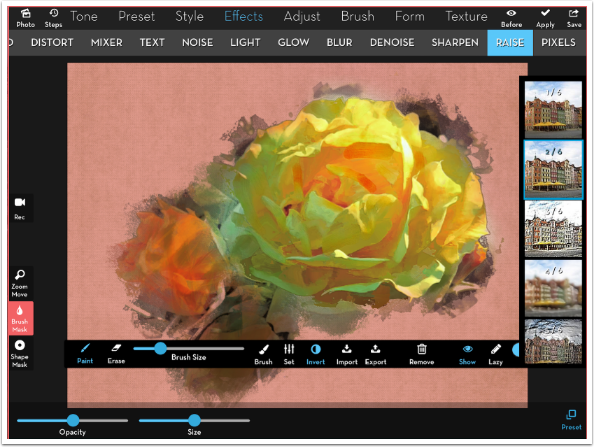
After you complete your brushing, you can make some of it stand out more by adding some Raise. Below I’m using Preset 2 of Raise, but I mask it away from the canvas and the painted edges of the image. Those painted brushstrokes at the edge are partially transparent, and so don’t have the depth that is artificially given by the Raise.
That brings us to another advantage of creating the canvas before starting brush work. I have seen (and created) many works where canvas texture was applied after the paint. This looks artificial, because then all the brushstrokes are transparent, allowing you to see the texture which is supposedly underneath. This method, as you can see in the detail below, allows for some of the brushstroke to allow you to see the canvas texture, and some to be fully opaque, as you would see if you were using real paint on canvas.
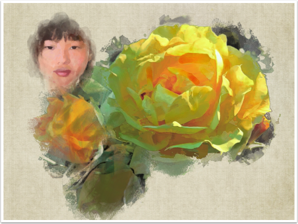
By using the Source button, you allow yourself to alter the source of the painting as you go. Below you’ll see a screenshot where I used Effects>Blend to add another painting of my daughter on top of the flower painting as completed so far, saved it and brought it back in the Source window.
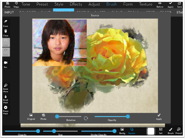
I use a Plane brush at low Stroke Opacity to bring in her face.
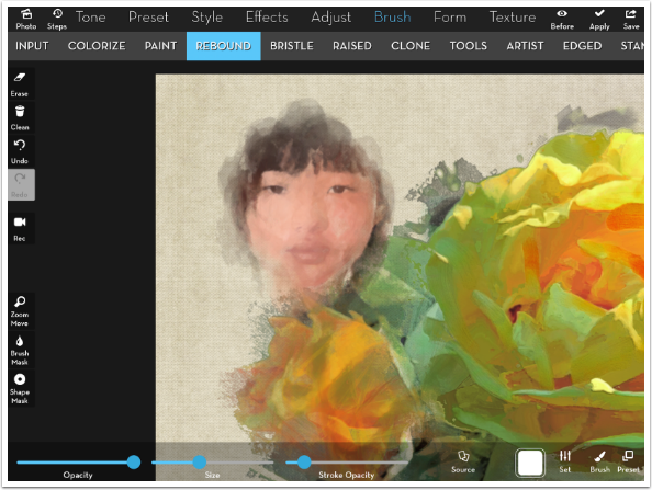
And finish with a Rebound brush at half Stroke Opacity.
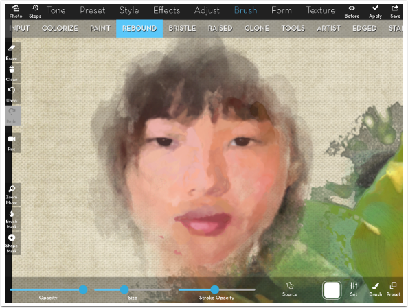
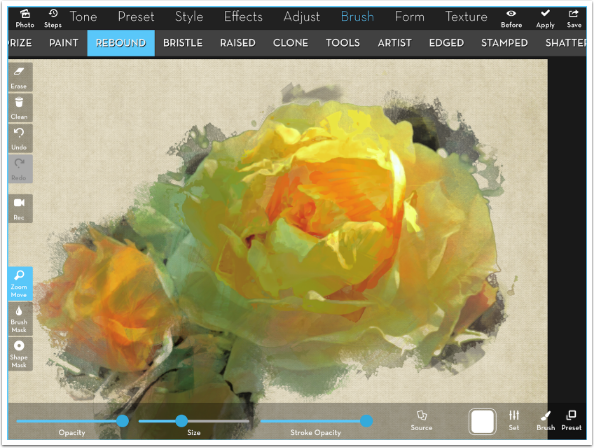
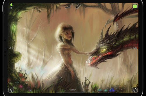
This is my finished painting. Because of my workflow of establishing my canvas and source separately, and using the Backg and Source buttons, I was able to create this over several sessions rather than just one. I was able to decide which brush strokes should let the underlying texture show through, and which shouldn’t. And I was able to change the source in the middle of the process.
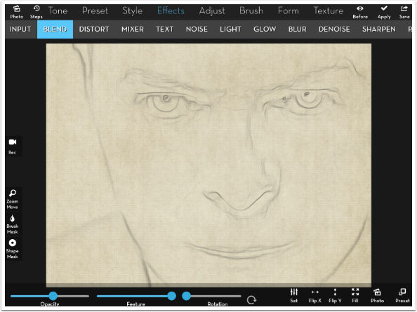
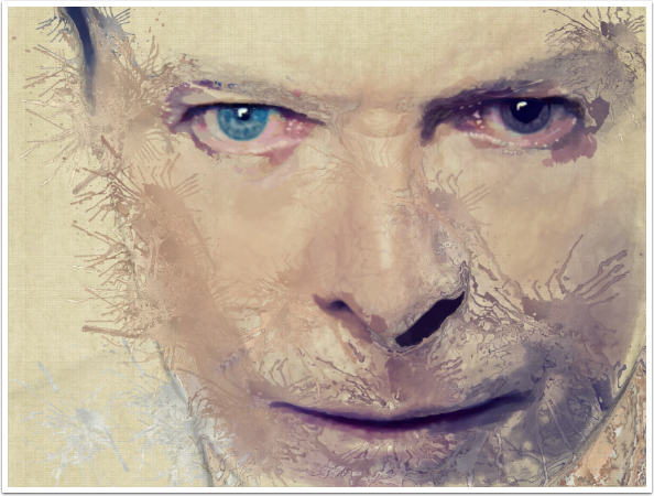
Let’s use the same canvas for a portrait. In other tutorials, I’ve shown you how to use Edges to create an outline that can be used in paintings. Below, I’ve put the Edges created from a photo of David Bowie directly on the canvas. I can paint directly on it, and it will show through in some places and not in others.
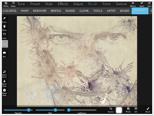
This time, a Stamped brush gives me an “action” look I like for my base.
Next, I once again use Plane at low Stroke Opacity as a “wash”.
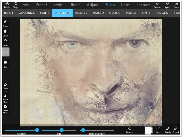
Rebound adds detail around the features.
And my finished painting.
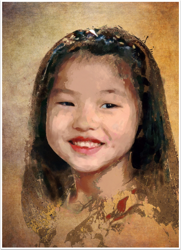
As a final example, here’s another portrait done with Stamped, Plane and Rebound. This one is on a different canvas.
iColorama is a terrific art app, giving you many, many tools to create. Experimentation is rewarding, since you can find different ways to accomplish the same task. I hope these tips are useful to you, since I will return to more tips like these in the future. Until next time, enjoy!
Donating = Loving = TheAppWhisperer.com
TheAppWhisperer has always had a dual mission: to promote the most talented mobile artists of the day and to support ambitious, inquisitive viewers the world over. As the years passTheAppWhisperer has gained readers and viewers and found new venues for that exchange.
All this work thrives with the support of our community.
Please consider making a donation to TheAppWhisperer as this New Year commences because your support helps protect our independence and it means we can keep delivering the promotion of mobile artists that’s open for everyone around the world. Every contribution, however big or small, is so valuable for our future.
Jerry Jobe
Never content with just scratching the surface of what an app can do, Jerry Jobe decided to pass on what he learned about imaging apps to others. He’s constantly trying to figure out just what tools other artists have used, and trying to incorporate them into his own work, in an attempt to find his style. He’s written tutorials on over 145 apps so far, which you can find (along with his Song of the Day entries) at http://enthusiasmnoted.wordpress.com/ He lives near Atlanta, Georgia, where he also finds a creative outlet in acting and directing in community theater.
2 Comments
Evon Kurtz
Great advanced tutorial. Thank you Jerry!!
Phyllis Shenny
Thank you Jerry for these tutorials – I’ve been trying to get to them for some time and finally started. I thought I had some command of brushes but I see how much more I can learn.