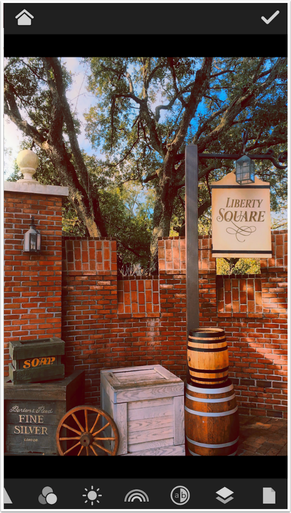
Mobile Photography / Art Tutorial – MaxCurve Part Three: Throwing A Curve!
We are delighted to publish Jerry Jobe’s latest mobile photography/art tutorial for our reading and viewing pleasure. This time Jobe takes another look at the app called MaxCurve. This is Part 3 of 3 Tutorials that we have published on this app. (If you missed Part 1, please go here and for Part 2, please go here). Read Jobe’s thoughts as he puts it through its paces (foreword by Joanne Carter). Take it away Jerry…
MaxCurve retails for $2.99/£2.29 and you can download it here.
“In the first part of my series on MaxCurve, I showed how MaxCurve implements the standard RGB curves. In part two, we saw how curves could be applied to controls like Opacity, Contrast, Hue, and Saturation that normally don’t use curves. In this final part, we will venture into more uncharted territories by discussing an entirely new colorspace – LAB.
First of all, what is a colorspace? It’s a method of mathematically describing all the colors we can see in an image. The most common colorspace is RGB, which describes each color as a combination of the three different color channels. Since RGB describes the color of light, a value of 0 in any channel means a lack of that color light. If all three channels are 0, we have no light at all – it’s pure black. If all three are 255, the maximum value, then we have all the light available – it’s pure white.
The second common colorspace is CMYK, which is used in printing. These are the colors of inks available to print on white paper – Cyan, Magenta, Yellow and blacK. The absence of ink (value of 0 in all four channels) is white, and all other colors can be described by a combination of the four ink colors. You will often have to convert RGB values to CMYK when sending work to a professional printer.
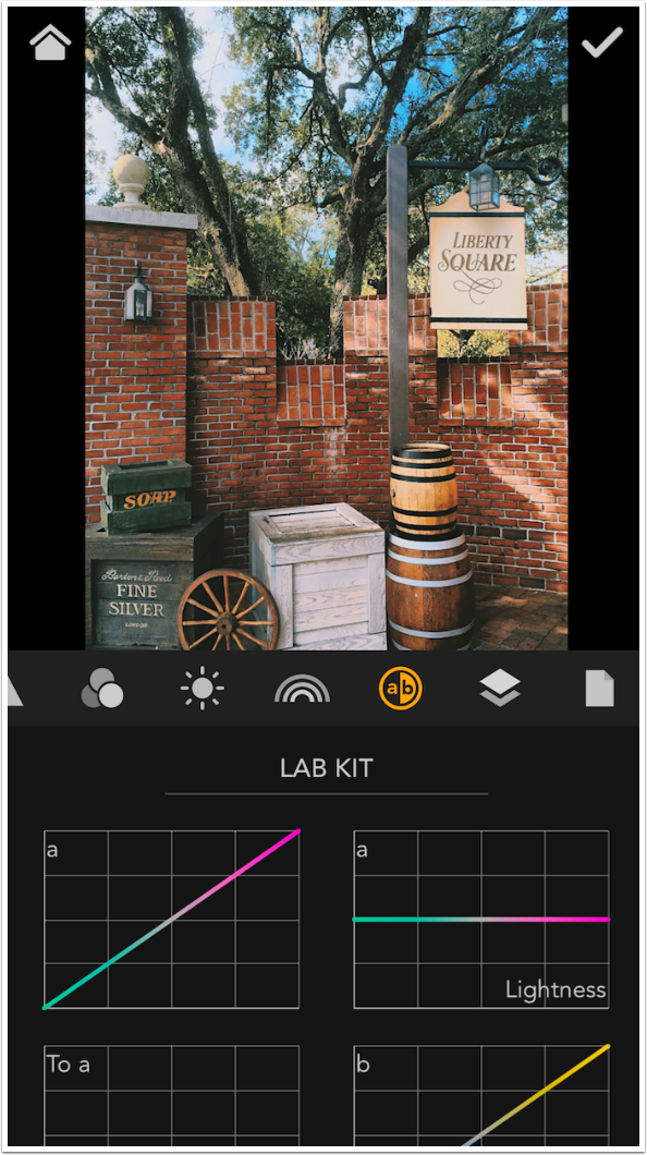
The their colorspace is LAB. L stands for Lightness or Luminosity. Looking at the L channel is exactly like looking at a grayscale version of the photo. The other two channels, the a and b channels, are not abbreviations of anything. The a channel is the green to magenta spectrum, which is often referred to as tint. The b channel is blue to yellow, referred to as temperature or warmth. Working in this colorspace can give you some wonderful results. As far as I know, working with a and b channels is only accomplished on the desktop with Photoshop, and only accomplished on mobile devices with MaxCurve.
I do want to mention that everything I say about LAB color comes from a terrific book by Dan Margulis, “Photoshop LAB Color: The Canyon Conundrum and Other Adventures in the Most Powerful Colorspace”. (Yes, an entire book on this set of curves. Believe me, it’s that deep).”
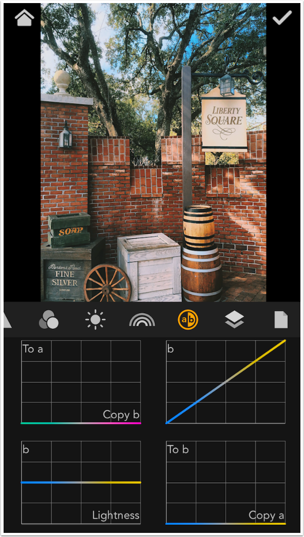
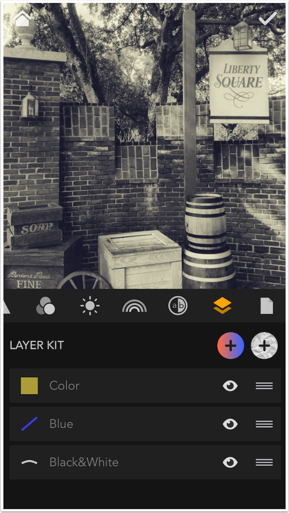
We won’t go too deeply into the Lab colorspace. MaxCurve’s implementation differs from Photoshop’s in that there is no separate manipulation of the L channel. (There is value in sharpening the Lightness channel in LAB, because any color noise is not sharpened. MaxCurve does not do sharpening, and contrast in the Lightness channel can be accomplished through other curves.) There are six curves in the LAB kit: a, a by lightness, copy b to a…
…b, b by lightness, and copy a to b.
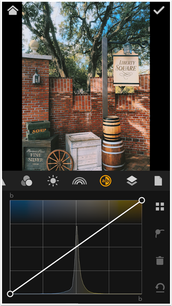
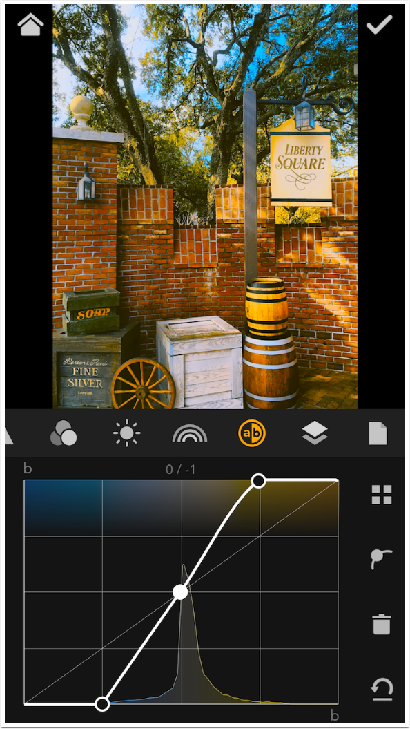
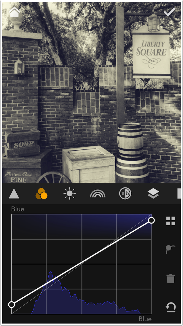
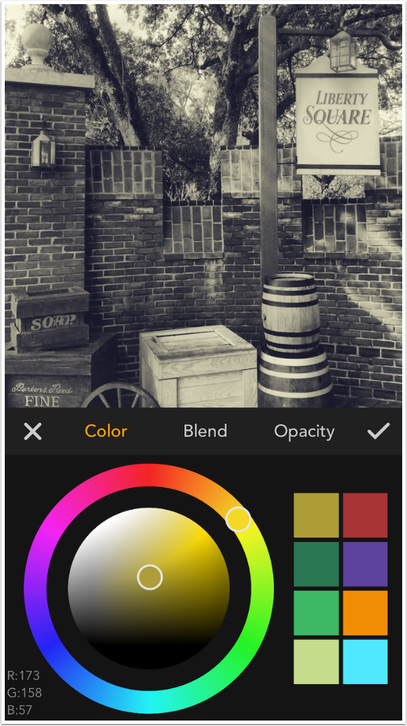
We are starting with the b curve, which goes from blue to yellow, and can be called the “warmth” curve. Look at the histogram and how it peaks so sharply in the center. If pure blue and pure yellow are to the sides, then nothing in the image approaches pure blue or yellow. Normally, when you look at a histogram, you want the values to be spread across the entire spectrum, and you accomplish that by making the curve steeper, pulling the endpoints in until they meet the highest and lowest values in the histogram. The b histogram of any image you capture will look like this, and changing the curve by pulling in the endpoints will create more “color contrast”, widening the gap between the bluest and yellowest colors in the image.
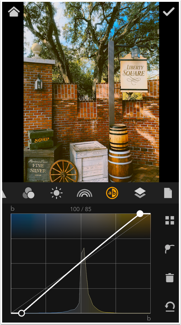
Below I’ve pulled in the endpoints, intensifying the colors. You might consider this to be the same as a saturation adjustment. It differs in that saturation controls, when increased dramatically, sill cause a “blooming” that eliminates detail in areas of saturated color. The adjustments to the a and b curves will not do that, so it is a more realistic way of emphasising the colors in your image.
You should be careful to move the left and right endpoints the same amount. If you do that, the curve will go through the center point. If the curve does not go through the center point, a color cast is introduced. In the image below, the curve is slightly above the center point, and a slight yellow, or warm, cast is introduced. (You can also manipulate the center point to eliminate a color cast that exists in the original image).
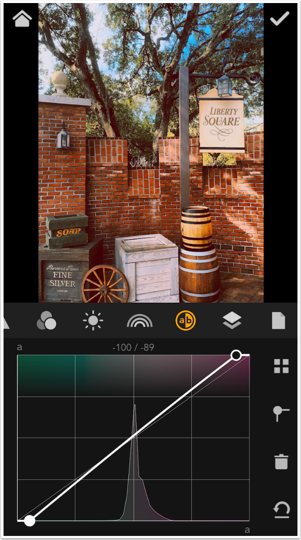
Slight changes make a large difference in a and b curves. Below I’ve pulled in each endpoint to about a quarter of the way along, and I’m beginning to get some otherworldly colors. If you turn on display of numeric values (found in Setup under the gear icon in the initial screen), then you should limit changes in the a and b curves to no more than 20, i.e., changing the endpoint from 100 to 80. The change illustrated below was closer to 50.
The a curve is the green to magenta curve, which can also be called tint. Once again, you can pull the endpoints in to intensify the colors. Any deviation from the center point will introduce a green or magenta color cast, but can be manipulated to eliminate a tint color cast.
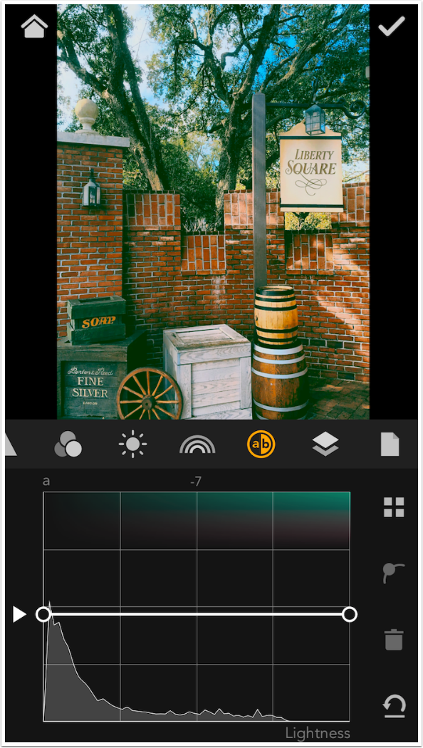
The remaining two sets of curves are hard to describe (and MaxCurve has no help anywhere that I can find). Below I’ve got an example where the entire a by lightness curve is pulled down. Once again, the fact that the curve does not go through the center point means that a color cast is introduced. Since the curve is pulled down, that is a green color cast. It seems to me that this is the quickest way to offset a color cast that is present in the original. That is how I would use the a by lightness or b by lightness curve.
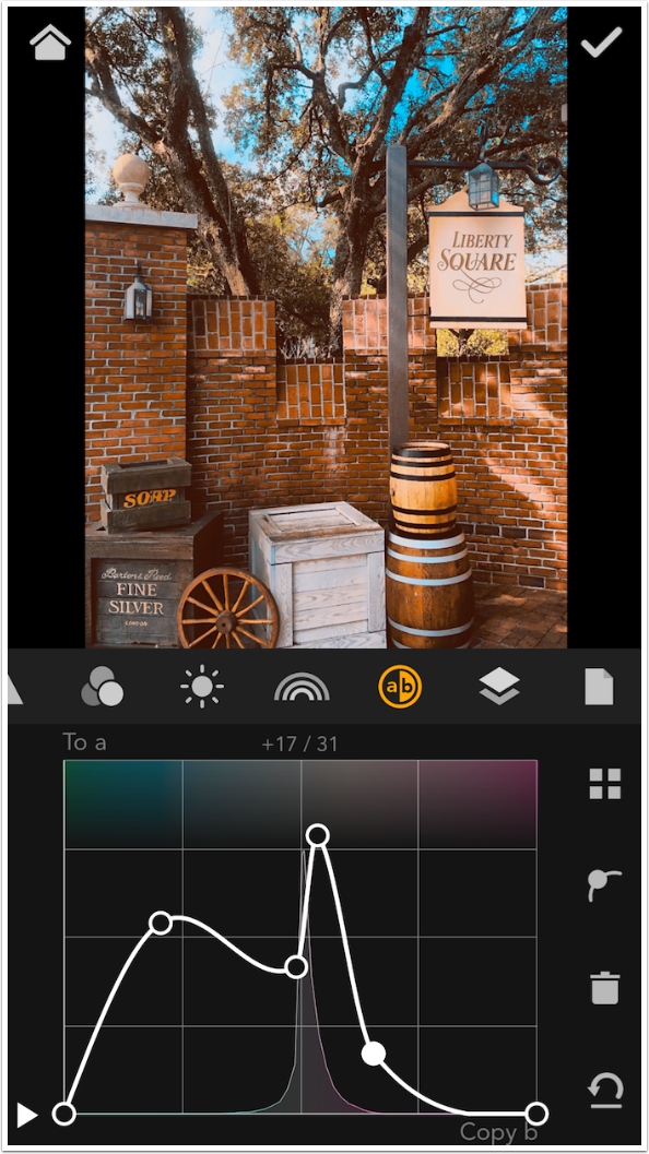
The Copy a to b or Copy b to a curves – I’m not convinced that they are any use at all. I made the Copy b to a curve very wild below and I can’t see any difference.
So the a/b curves manipulate values in the LAB colorspace, and can be used to intensify or de-emphasise colors and to eliminate color casts. Use them wisely, and you may find them to be of great benefit!
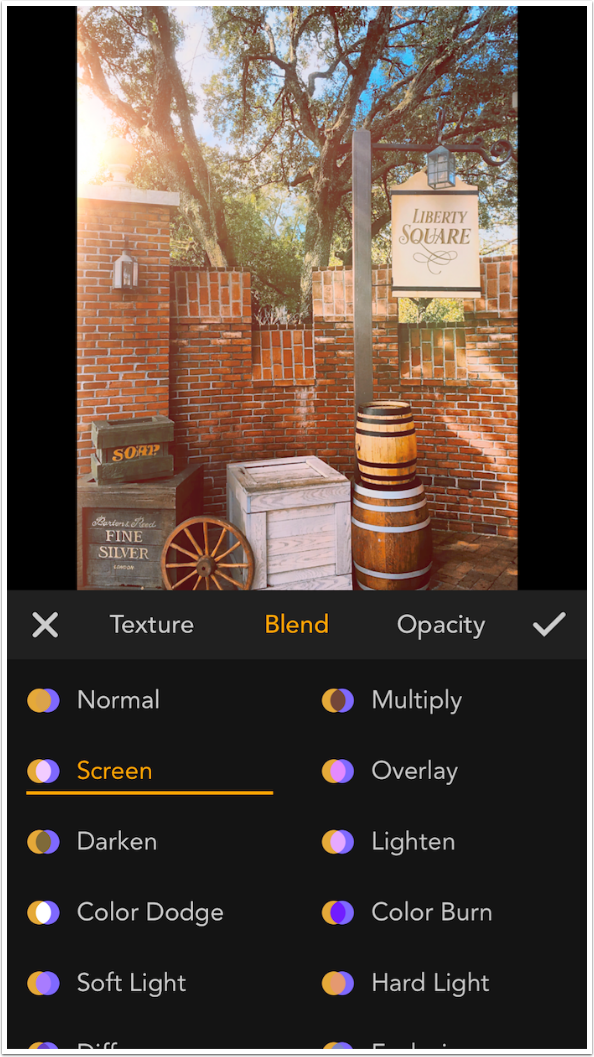
Hidden in the Layer Kit, in addition to Color overlays, are various texture overlays. Texture is the rightmost button with a + sign, as seen in the screenshot below.
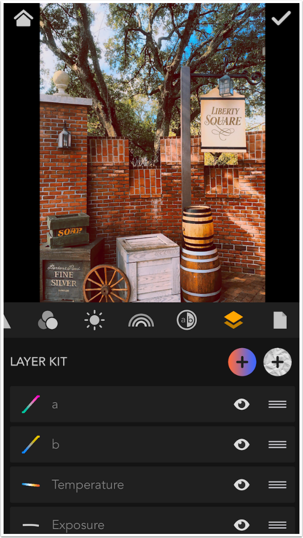
Textures are grouped, and the groups are accessed through the circle thumbnails. Individual textures within the groups are square thumbnails. Groups seem to be Grunge, Light Rays, Light Leaks, Bokeh, Scratches, Color Gradients and Color Geometrics. These are accessed by scrolling the circle thumbnails from left to right. Individual textures are scrolled up and down.
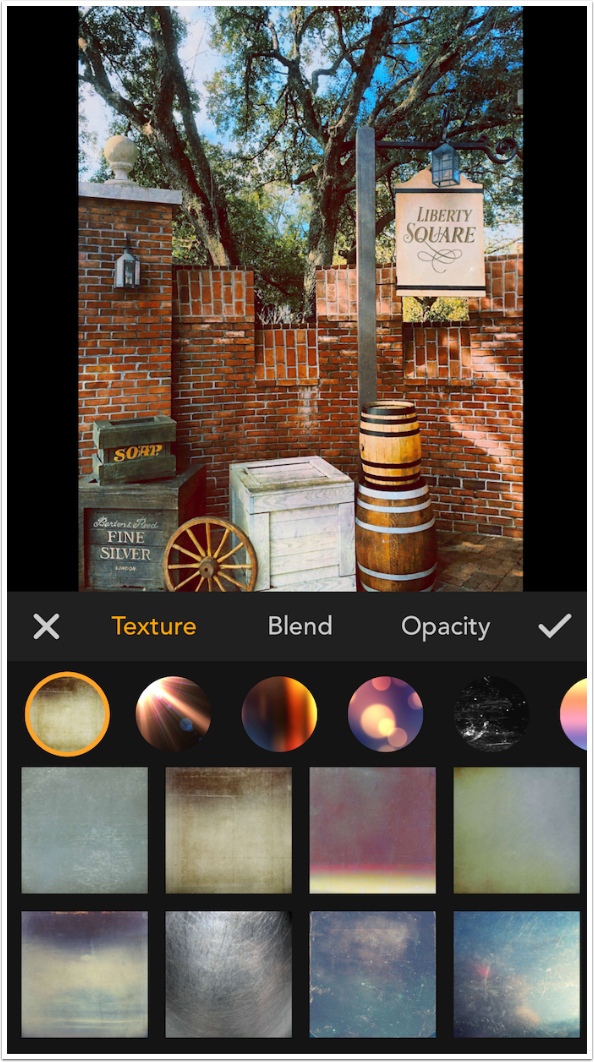
Certain of the textures can be flipped left to right, as shown by the double arrows that appear when a texture is selected.
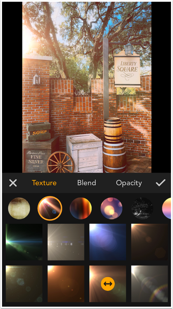
Tapping the double arrows will flip the texture. Rotation and resizing is not supported.
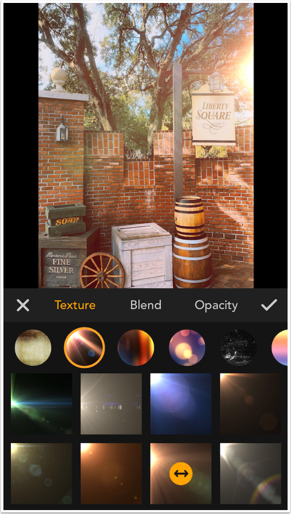
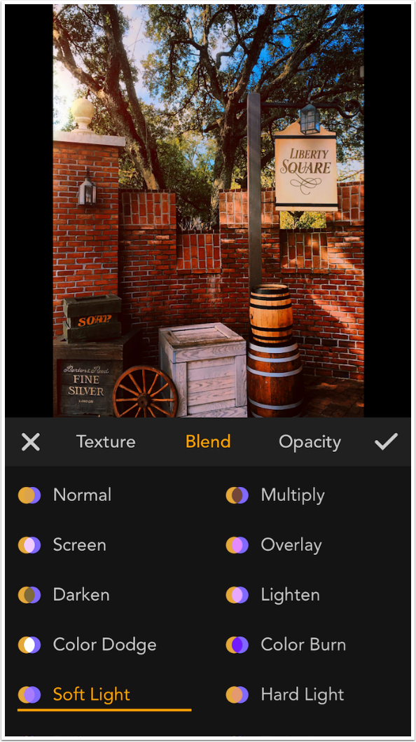
Just as with the Color layers, Textures can use any one of the sixteen blend modes. Rays, Leaks, Bokeh and Scratches default to Screen blend mode; the rest default to Overlay.
Remember that Overlay, Soft Light and Hard Light blend modes affect saturation. You may want to work Saturation curves after adding a texture.
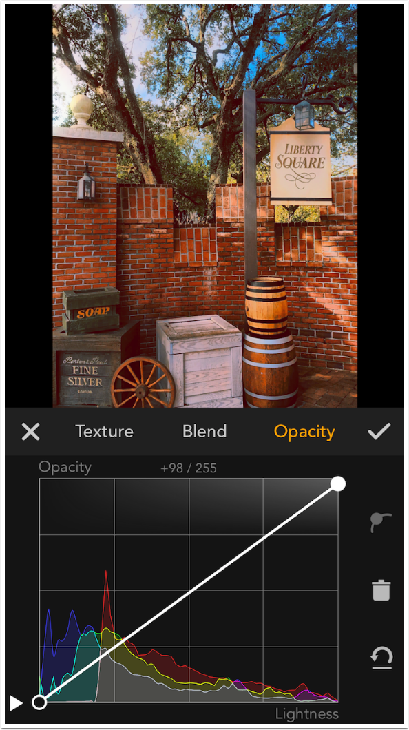
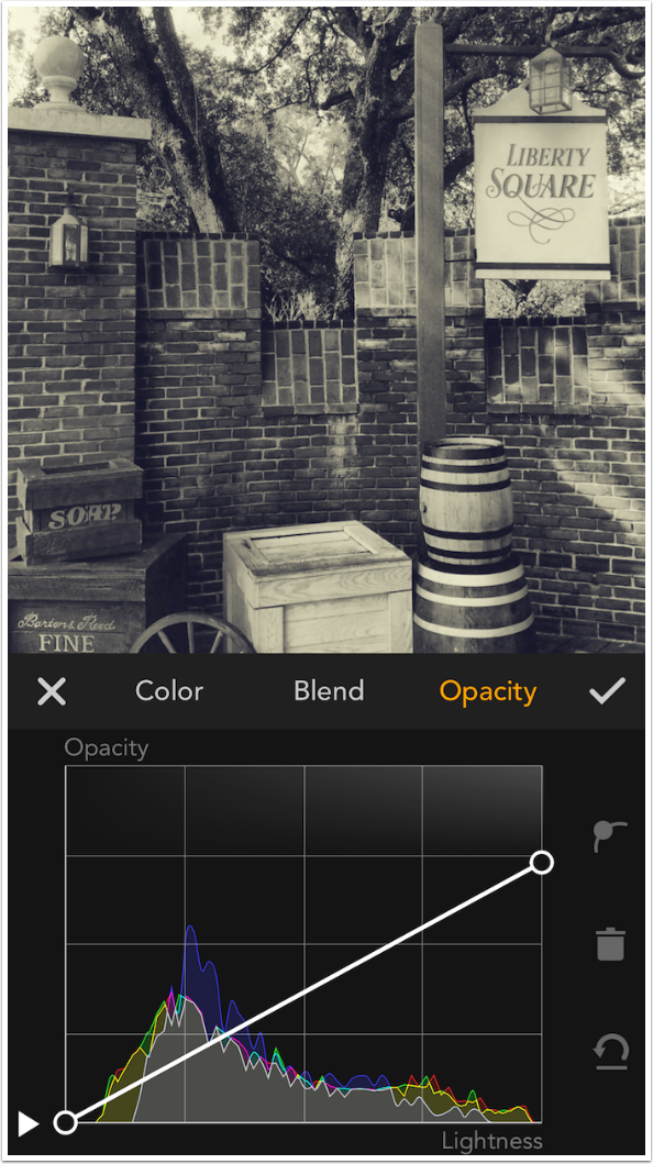
The Opacity curve for Textures works just the same as with Color overlays. The Opacity curve below adds the texture at 100% in the lightest areas of the image, and does not add it to the darkest areas
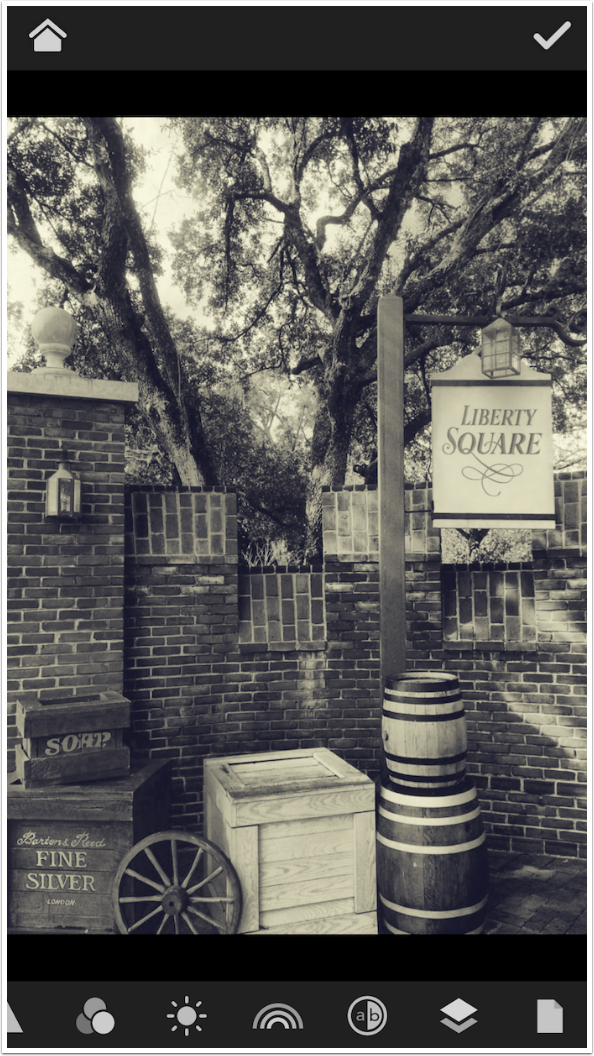
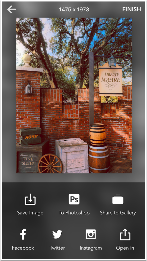
Here’s the before image, accessed by tapping and holding the image.
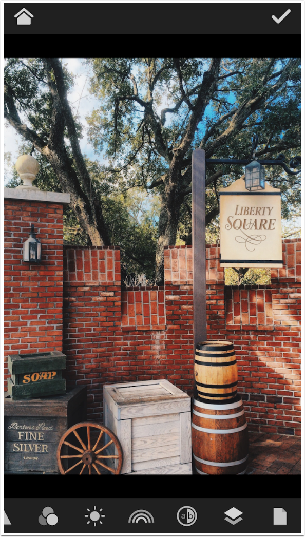
Here’s the after. It does not differ greatly from the original, but sometimes obvious changes are not what are required.
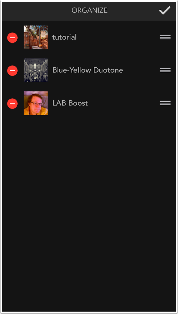
If you create a set of curves that you think will be useful for other images (such as the LAB a and b curves that move in the endpoints 10-20%), then you can save those curves in a preset. Presets are kept under the icon that looks like a sheet of paper. You can press the button to Create a new preset, or select an already existing preset by tapping the thumbnail.
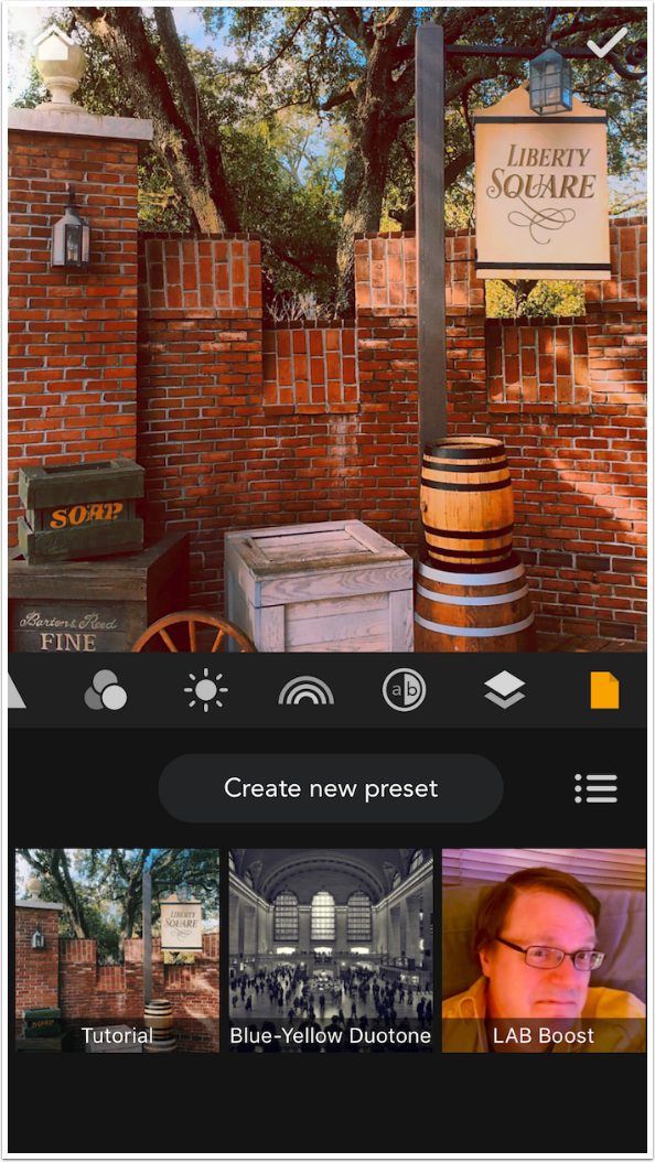
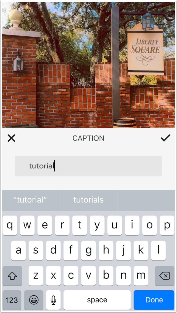
If you tap “Create new preset”, a keyboard appears so you can name the preset.
Tapping the three lines to the right of the “Create new preset” button allows you to edit your presets, moving them around or deleting them. You cannot modify them directly; you have to make the changes, save them as a new preset and delete the old.
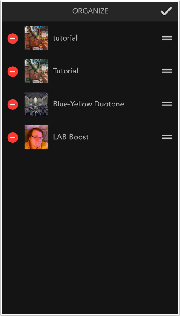
In the image below I deleted the partially-created preset called Tutorial.
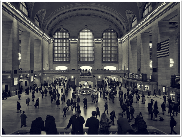
Through the judicious use of curves, you are able to do things you might not have thought possible. How about a duotone, where the dark areas are blue and the light yellow? I have a preset that performs that function, and I thought it might be instructive to show how the preset was made.
The duotone is made up of three curves, Black&White, Blue and a yellow Color overlay. The Black&White curve has an arch to it, which lightens the Cyan tones in the center and darkens the reds at the ends.
The Blue curve raises the blues in the shadows and lowers them in the whites. (There is no blue in the whites after the B&W curve, but moving the white endpoint brings the center point of the curve back into the center point of the grid, so that midtone grays are neither blue nor yellow.)
Lowering the white endpoint on the Blue curve does not make the highlights yellow, so I have to add a Color Overlay layer.
I use the Opacity curve on the yellow layer to eliminate the yellow from the blacks and add yellow at about 75% opacity to the whites. Thus I have a blue-yellow duotone.
Tapping the check mark at the upper right of the image area takes you to the Save dialog. Images are saved at full resolution, so don’t worry about your prized images! You can also share to the MaxCurve gallery, which is an online repository of presets. The presets are saved in the gallery, with your image as the thumbnail. The image cannot be saved, but the preset can be, allowing you to take advantage of the work of others.
I like what my duotone did to this image I took in Grand Central Station.
I must say, I am impressed with MaxCurve. It gives the same old controls new life with the addition of curves, and is the only app to my knowledge that includes the LAB colorspace and its a/b curves. With the promised addition of masking MaxCurve will give mobile photographers and artists the finest control available over their images. Until next time, enjoy!
Donating = Loving = TheAppWhisperer.com
TheAppWhisperer has always had a dual mission: to promote the most talented mobile artists of the day and to support ambitious, inquisitive viewers the world over. As the years passTheAppWhisperer has gained readers and viewers and found new venues for that exchange.
All this work thrives with the support of our community.
Please consider making a donation to TheAppWhisperer as this New Year commences because your support helps protect our independence and it means we can keep delivering the promotion of mobile artists that’s open for everyone around the world. Every contribution, however big or small, is so valuable for our future.
Jerry Jobe
Never content with just scratching the surface of what an app can do, Jerry Jobe decided to pass on what he learned about imaging apps to others. He’s constantly trying to figure out just what tools other artists have used, and trying to incorporate them into his own work, in an attempt to find his style. He’s written tutorials on over 145 apps so far, which you can find (along with his Song of the Day entries) at http://enthusiasmnoted.wordpress.com/ He lives near Atlanta, Georgia, where he also finds a creative outlet in acting and directing in community theater.