Mobile Photography / Art Tutorial – BeCasso: Painting for Powerful Devices
We are delighted to publish Jerry Jobe’s latest mobile photography/art tutorial for our viewing pleasure. This time Jobe takes a look at a painting app, BeCasso. Take it away Jerry…(foreword by Joanne Carter).
BeCasso retails for $1.99/£1.49 and you can download it here.
“Apps that give your images a painted look are numerous on the App Store. I’ve covered several apps that produce an overall painted look, like Glaze, Brushstroke, Waterlogue and Artista Impresso. I’ve also covered several that allow the user to control the painting themselves through brush strokes, like Mobile Monet, Adobe PaintCan, and (of course) iColorama.
DigitalMasterpieces has given us another one of the first type of painting app, and it’s called BeCasso. BeCasso creates oil and watercolour looks, but it’s not for everyone: it is limited to only the newest of devices. If your iPhone is before the 5S, or your iPad is before the Air, then BeCasso can’t be loaded to your device. (I fall into the latter category, since I have an iPad 4.) This is a pet peeve of mine. Although I can’t be certain that there are some algorithms that absolutely cannot be run on a device that is more than two years old, it certainly seems like developers can’t be bothered to work for anyone that can’t afford to constantly upgrade. All screenshots for this tutorial were captured on my iPhone 6S Plus”.
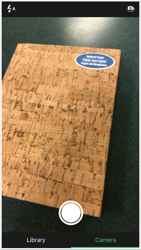
BeCasso prompts you to select an image from your library or capture an image with the Camera. As usual, I suggest you capture your image elsewhere. As a matter of fact, once you see the effect, I am sure you’ll be as convinced as I am that some pre-processing of your image will be necessary to get the best possible painting.
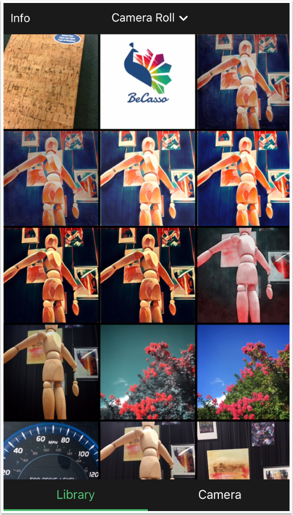
You are able to import images from any folder, including your Photo Stream. The Info button at the top left gives contact information, but little else.
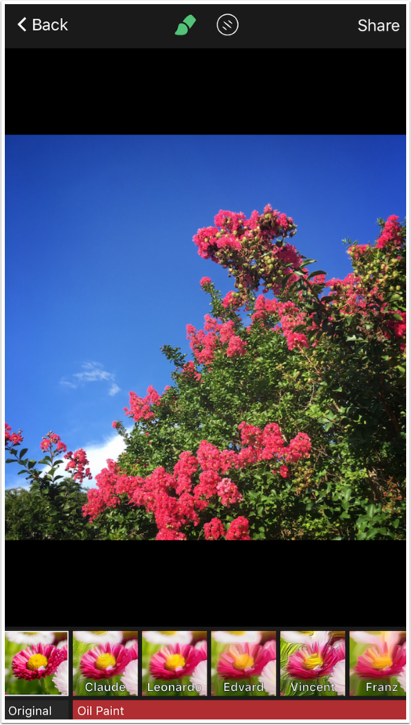
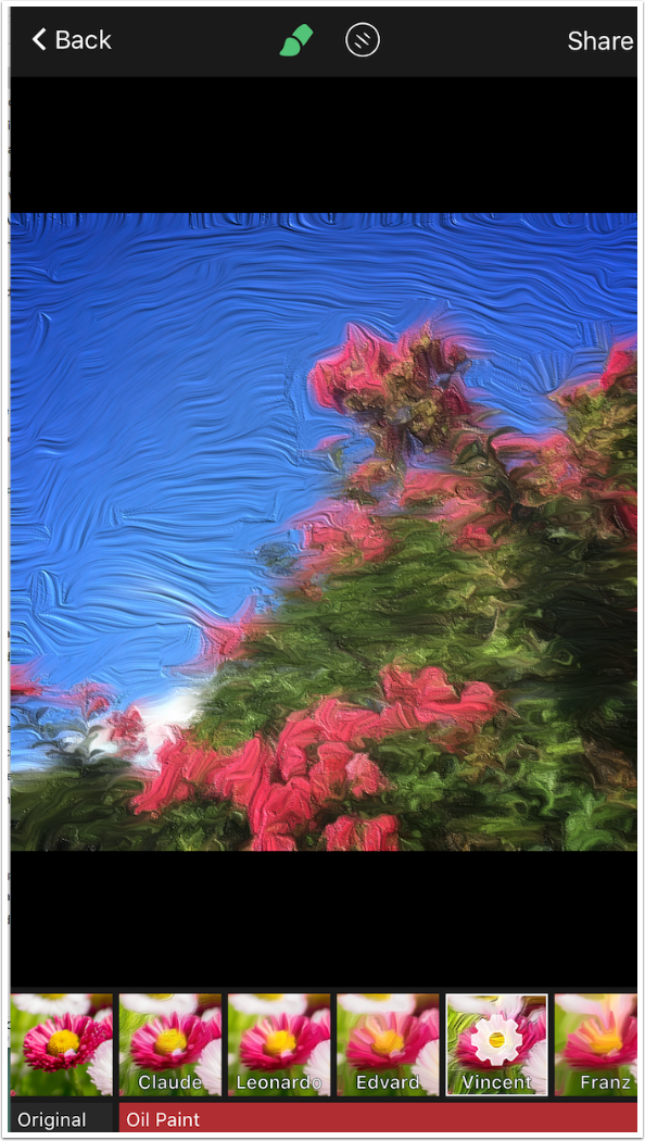
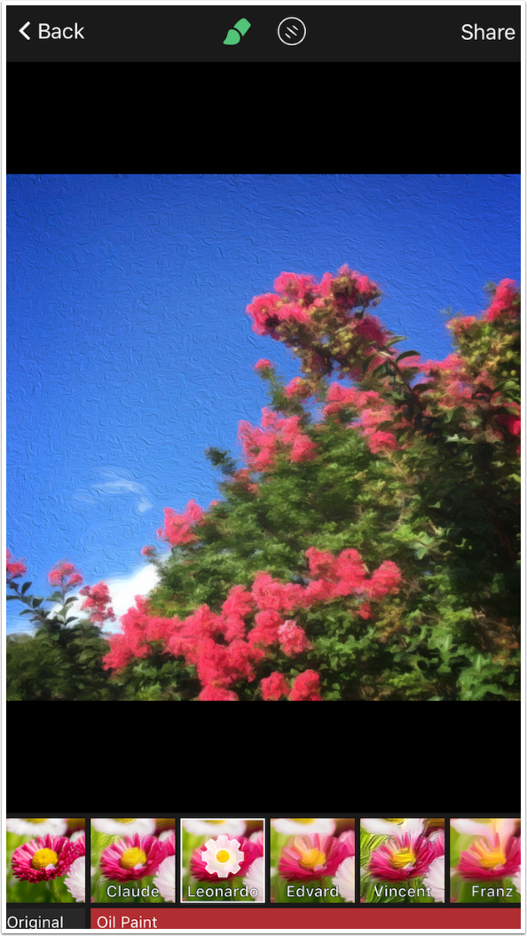
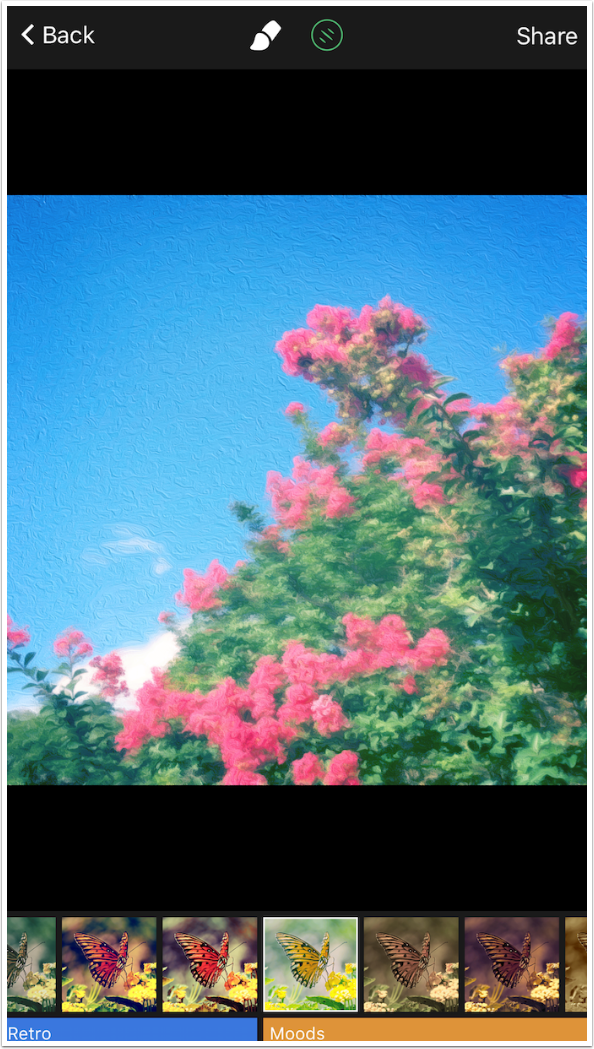
There are two buttons at the top: Brush and Filter. We will look at the Brush first. At the bottom you will see that Original is highlighted, showing the unchanged image. Then there are five Oil looks: Claude, Leonardo, Edvard, Vincent and Franz.
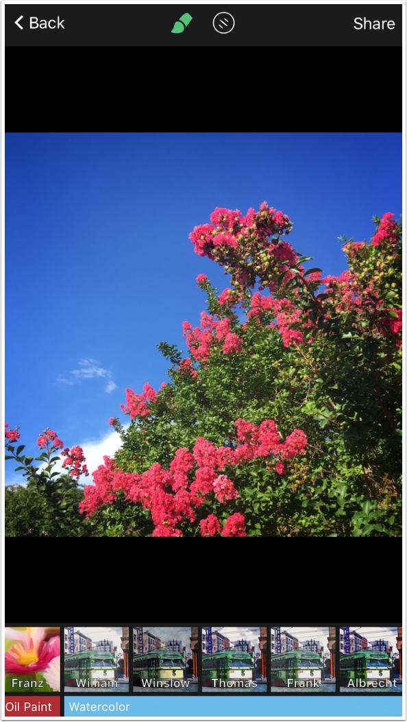
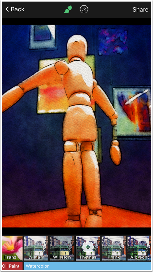
BeCasso also has five watercolour looks: William, Winslow, Thomas, Frank and Albrecht. Watercolour looks have different controls than the oils, so we will explore them later.
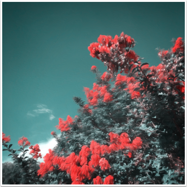
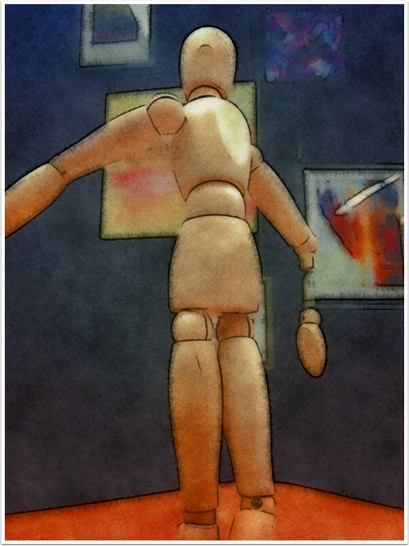
The “looks” are presets that use different combinations of attributes like thickness of paint and length of brushstroke. The Vincent look, shown below, uses thick paint and long brushstrokes.
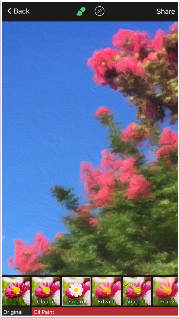
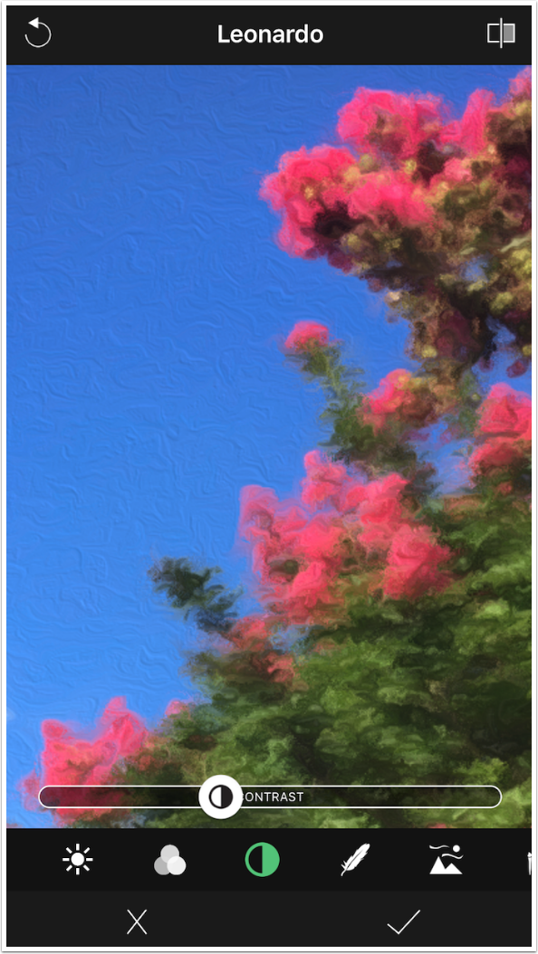
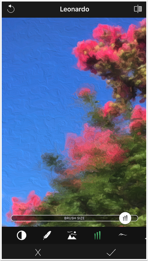
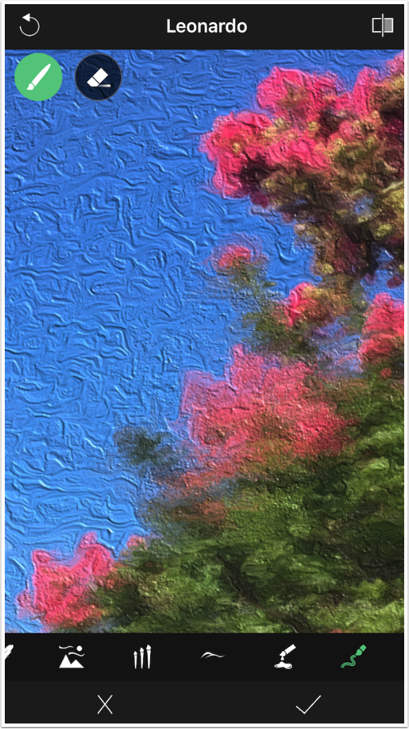
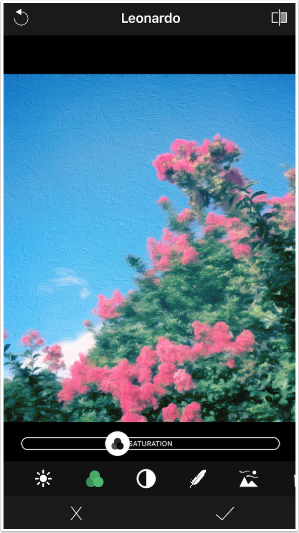
Below I’ve chosen the Leonardo look as my starting point. I zoomed in so you are able to see the changes that can be made. The controls for the look are accessed by tapping the gear within the look’s thumbnail.
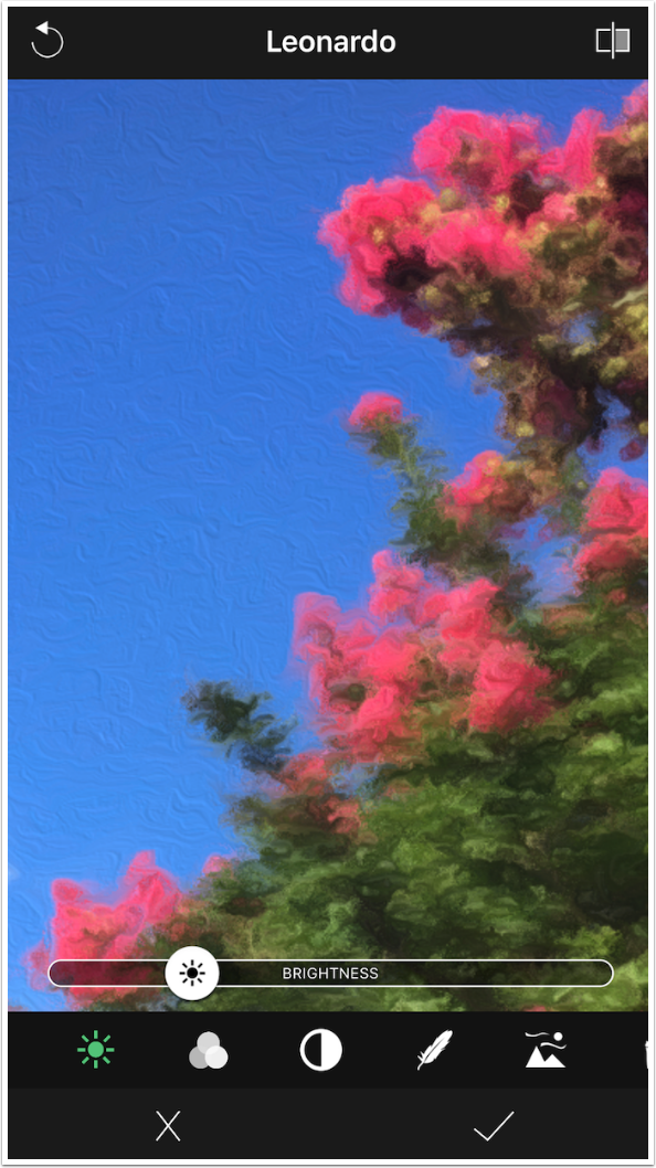
The first control is Brightness. As with all controls, it is assigned a value based on the look. The slider can be moved left or right to decrease or increase the brightness.
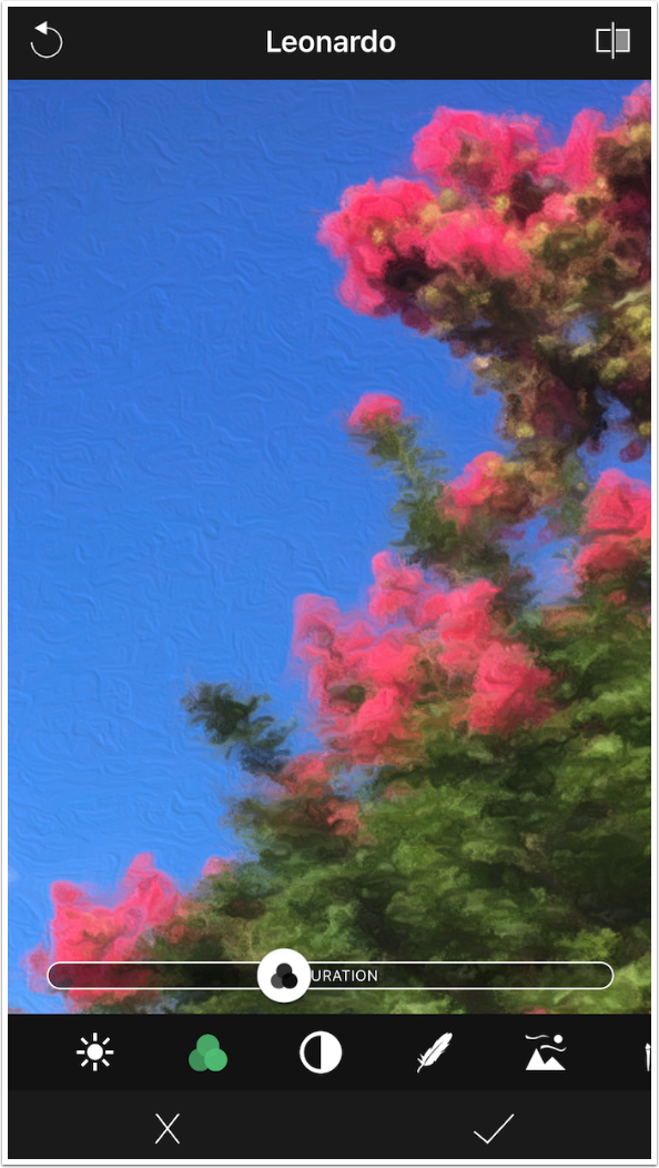
The next slider is Saturation. I will not want to change this slider on this particular image, since the colors are already sufficiently bright.
The third slider is Contrast. These three sliders are most useful if you use a filter that changes the Brightness, Saturation or Contrast in ways that need to be corrected.
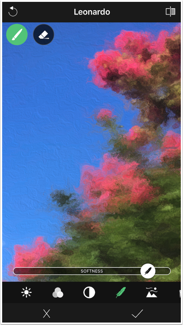
The remaining controls are specific to a painting style. The first of these is Softness. The default value for Softness for the Leonardo look is somewhat low.
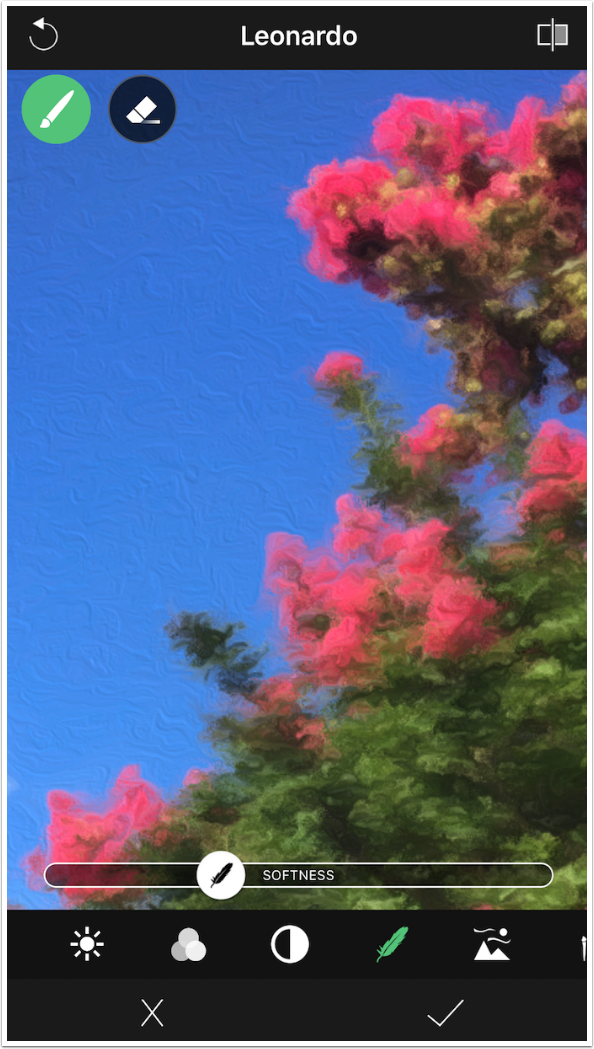
Increasing the Softness smudges and blurs the brush strokes.
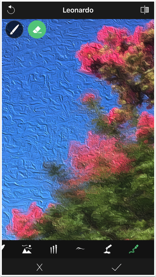
You may have noticed the brush and eraser icons at the top of the image itself. Most of these painting controls have the capability of being erased from certain parts of the image or brushed back in. Below I erased the Softness from the center of the image.
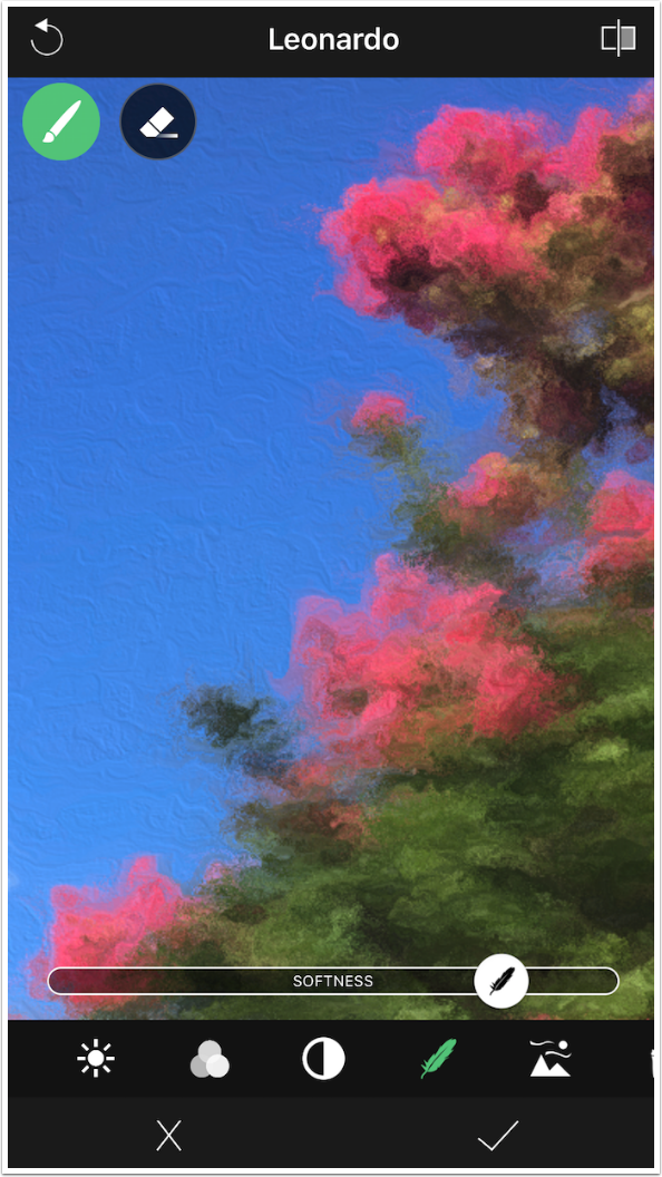
Using the paintbrush below, I painted the Softness back in. What you may not be able to see is that it was painted in at 100%. The only way to return the entire image to the same level of Softness is to reset the look using the circular arrow at top left.
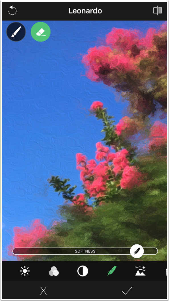
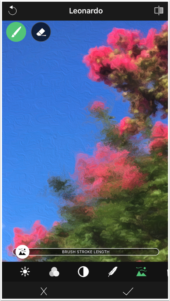
When I return the Softness level to the original value and switch to the next control, Brush Stroke Length, it’s easier to see the section that still has 100% Softness.
The Leonardo look has a very short Brush Stroke Length.
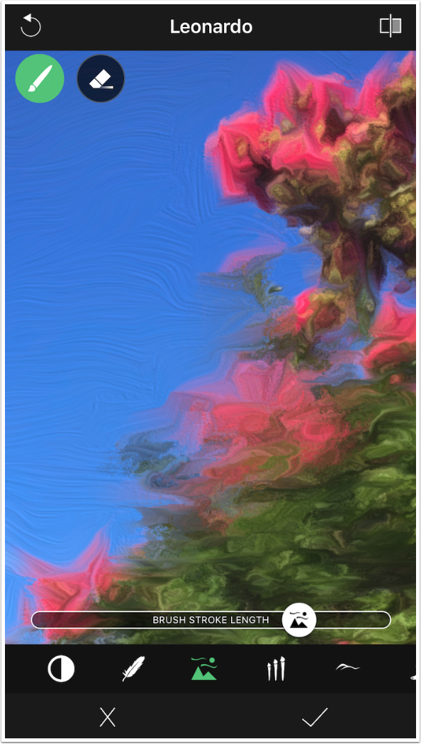
The change to a longer Brush Stroke Length is very obvious.
Brush Size is more subtle. Changing it does not increase or decrease detail.
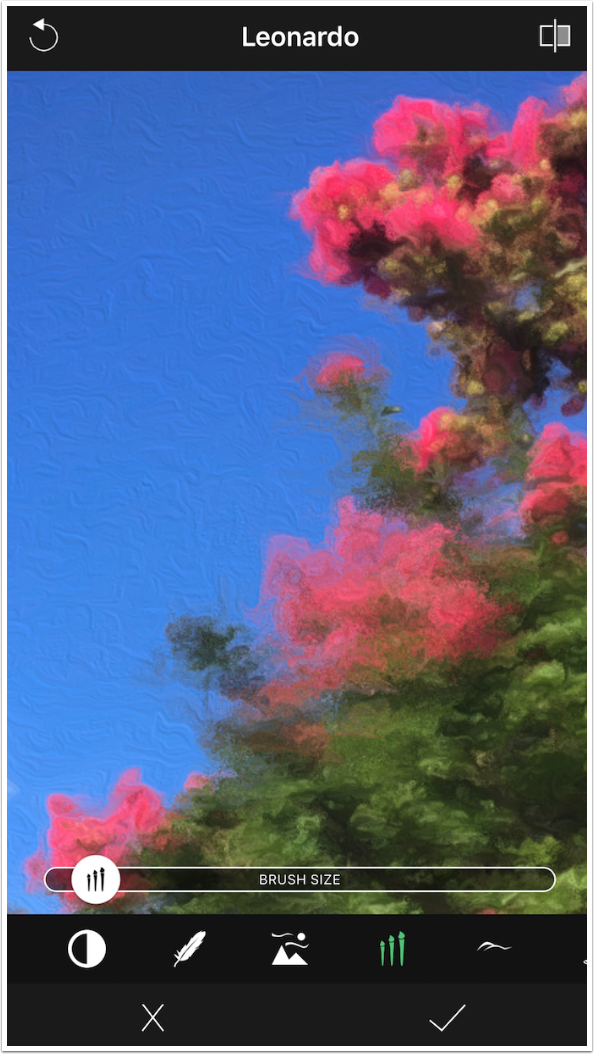
Instead, increasing Brush Size brings out more texture in flat areas, like the blue of the sky.
Bumpiness controls the amount of relief, or how far the paint stands out from the canvas.
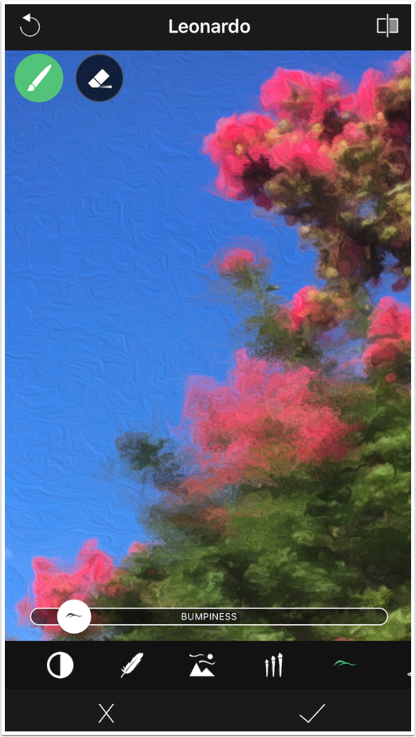
High values of Bumpiness make it look as though a lot of paint was used.
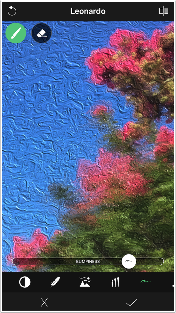
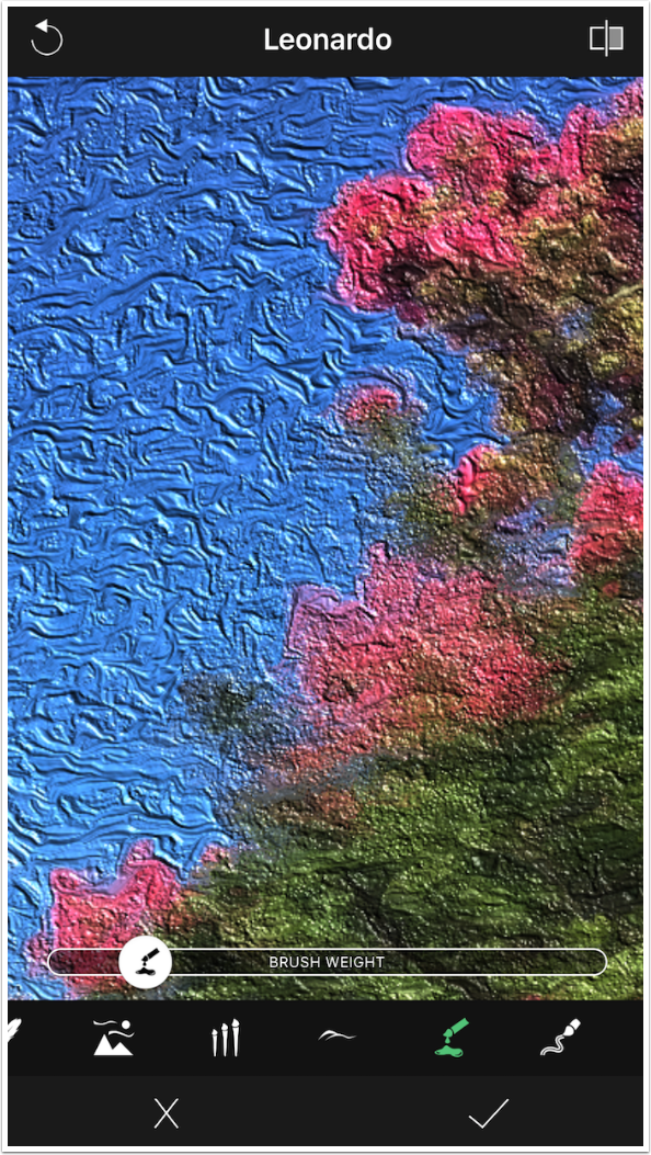
I left the Bumpiness high to show the difference made by the next control, Brush Weight. The default value of Brush Weight is high.
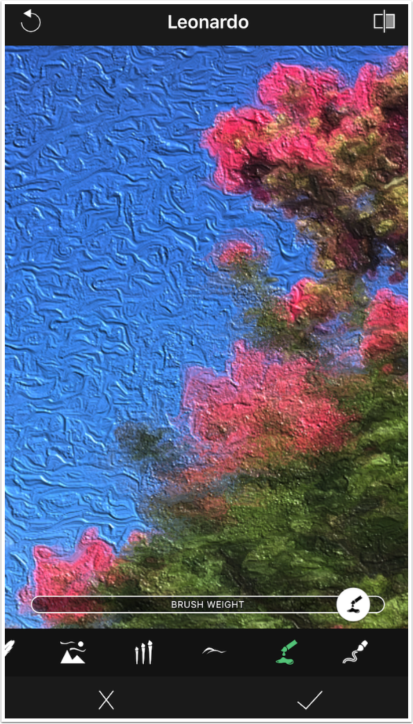
Moving the Brush Weight slider to the left results in greater relief. If you have a heavier brush, that would flatten the relief as it pushes down the paint.
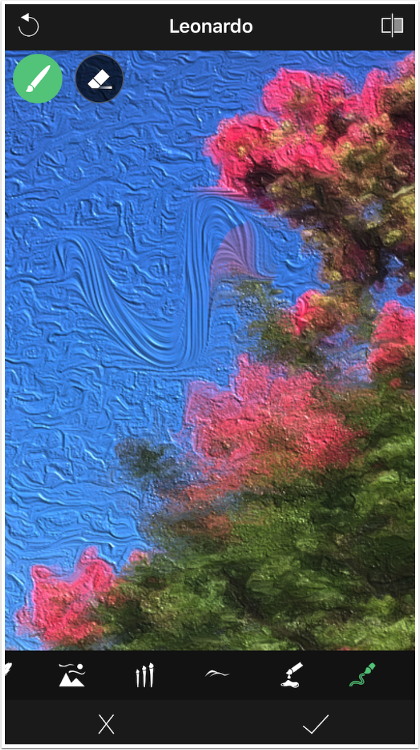
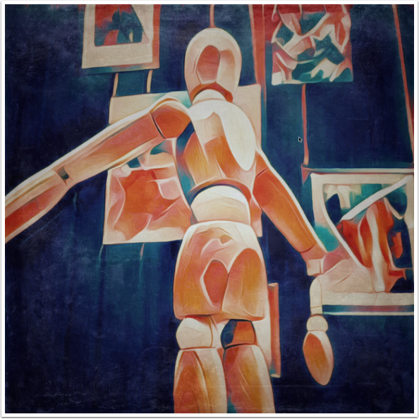
The algorithm that many apps use to smooth out lines results in a squared-off, blocky look to the strokes. Look at the sky in the image below – there are short strokes with very definite corners. The last control for Oil looks, the Brush with the squiggle, allows you to paint out those “machined”, square strokes.
Painting directly on the image with the “Squiggle” control, I make an S-curve in the sky. This can make the image look more organic and less “machine made”.
Continuing to brush, I smooth out a large area of the sky. But I brushed too far into the tree, obscuring one of the blooms.
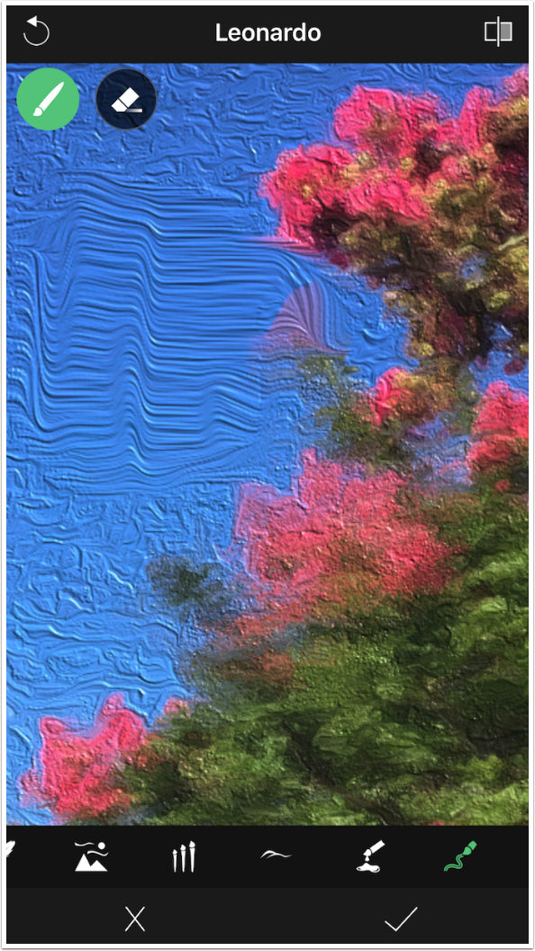
Using the eraser, I can remove all the smoothing I’ve done.
As I said, the circular arrow at the top left is not an Undo button, removing the last change you made. It resets ALL of the controls back to the factory preset for that look. You get a confirmation dialog to make sure you want to reset everything.
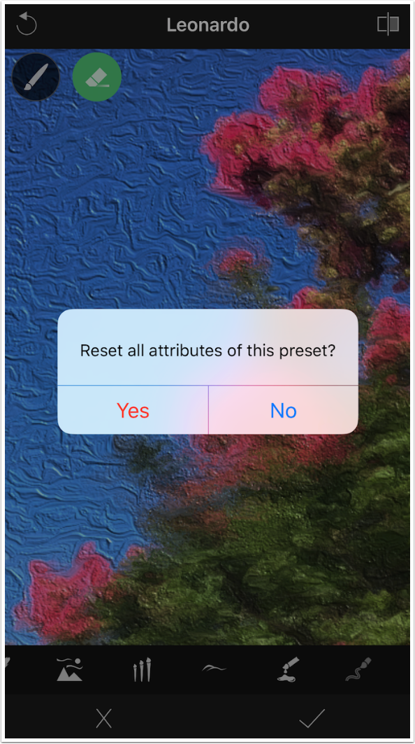
It truly resets all controls, forcing you to start all over again.
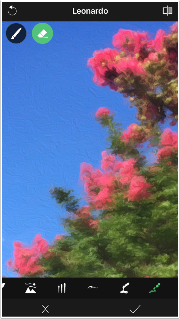
Tapping the checkmark hides the controls and returns you to the screen with presets.
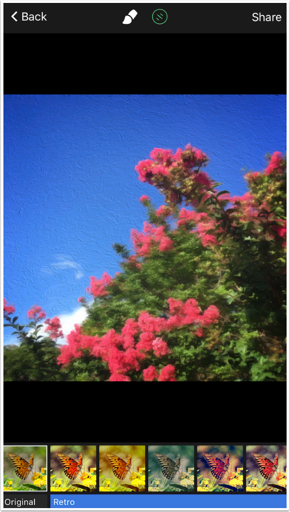
From here you can choose to add a filter by tapping the Filter button at the top, next to the Brush. There are five Retro filters.
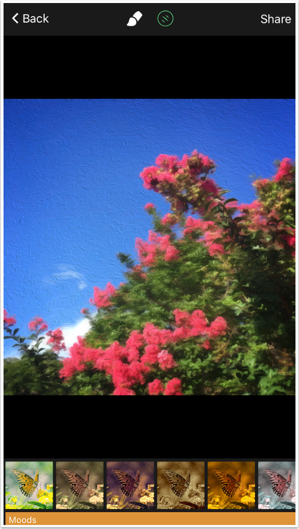
Scrolling the filters at the bottom, we see that there are eight Moods filters.
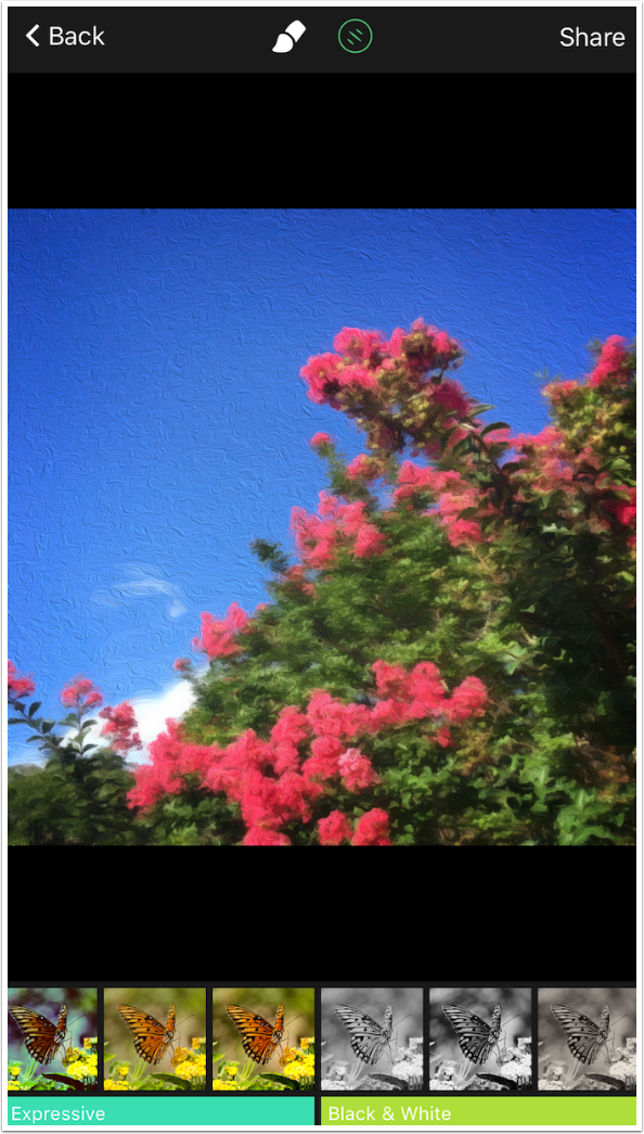
The Moods filters are followed by five Expressive filters.
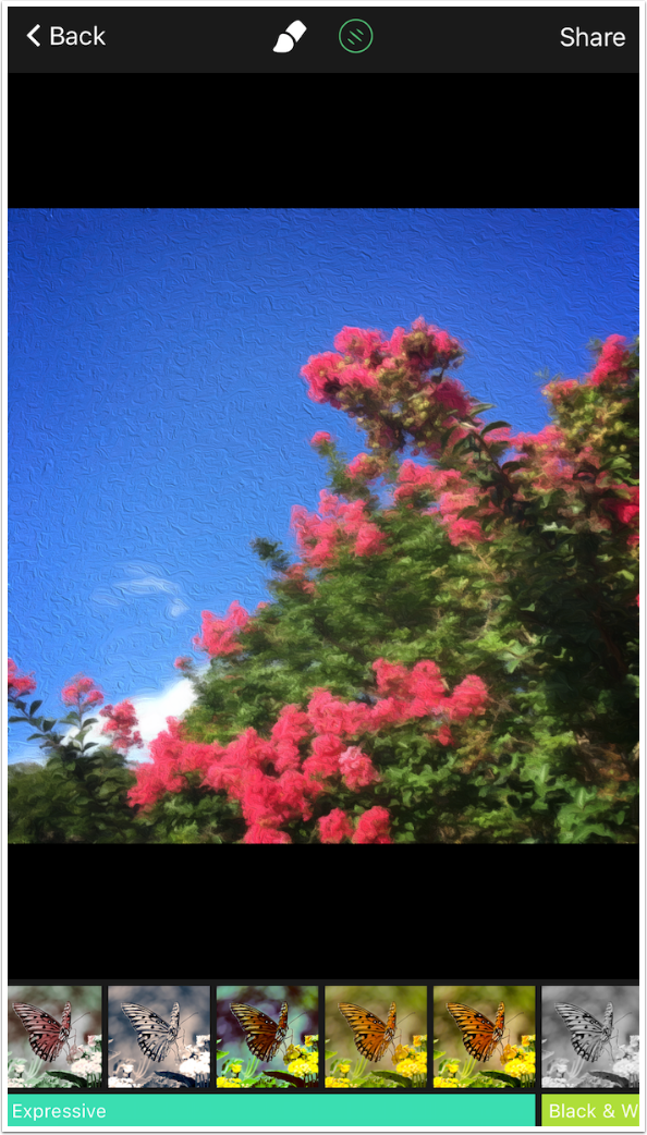
The filters are completed with three Black & White filters.
No Gear appears in the thumbnails for the filters. They are not adjustable.
However, you can return to Brightness, Contrast and Saturation under the Brush controls to tweak a filter further.
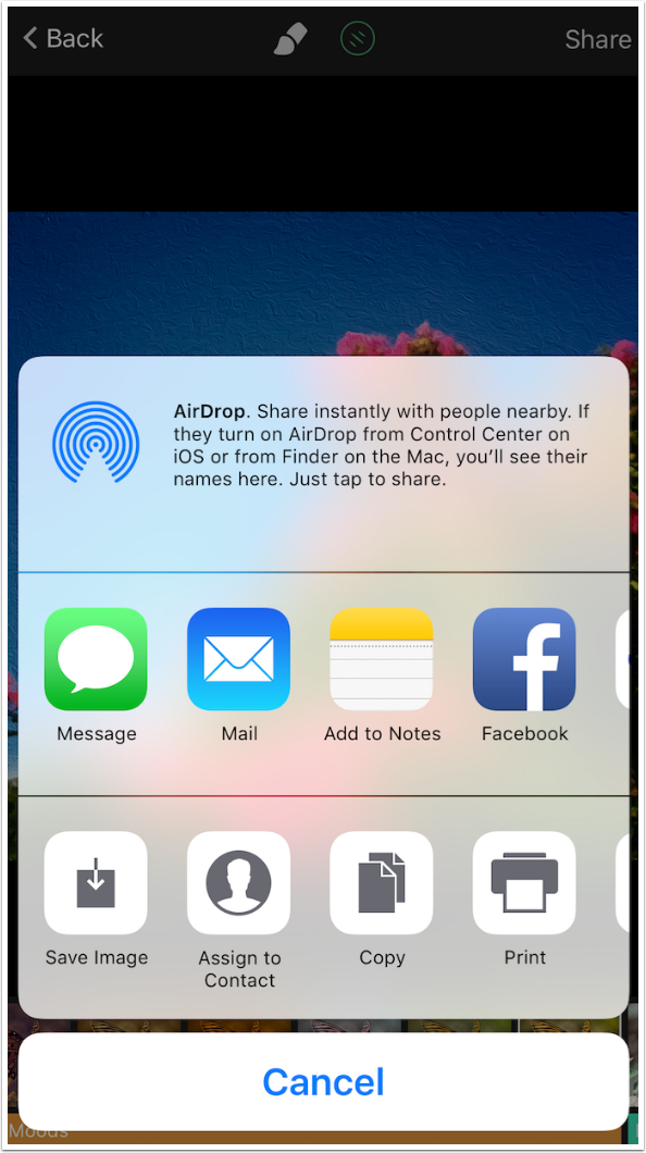
Tapping the Share button brings up the iOS Share dialog. I Save the Image.
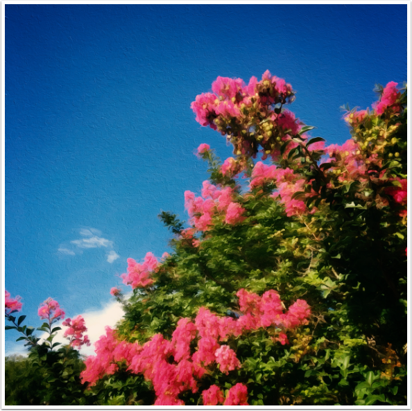
Below is my finished image. You will notice, when you use BeCasso yourself, that the saved image does not match the preview exactly. DigitalMasterpieces assure us that they are working to make the preview more faithfully match the finished image.
The saved resolution is not quite original size, but it is larger than most apps will save. For example, the original image was 3024 pixels square, while this saved BeCasso image is 2828 square.
Here’s the same image with a filter applied. Although the filters are normally too intense for my taste, in this case I liked the look it gave me.
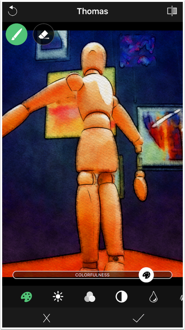
Let’s move on to the Watercolour looks. I start with this image I took on the set of a recent stage show I appeared in.

Once again, once a look is chosen, a Gear appears in the thumbnail to allow access to the controls.
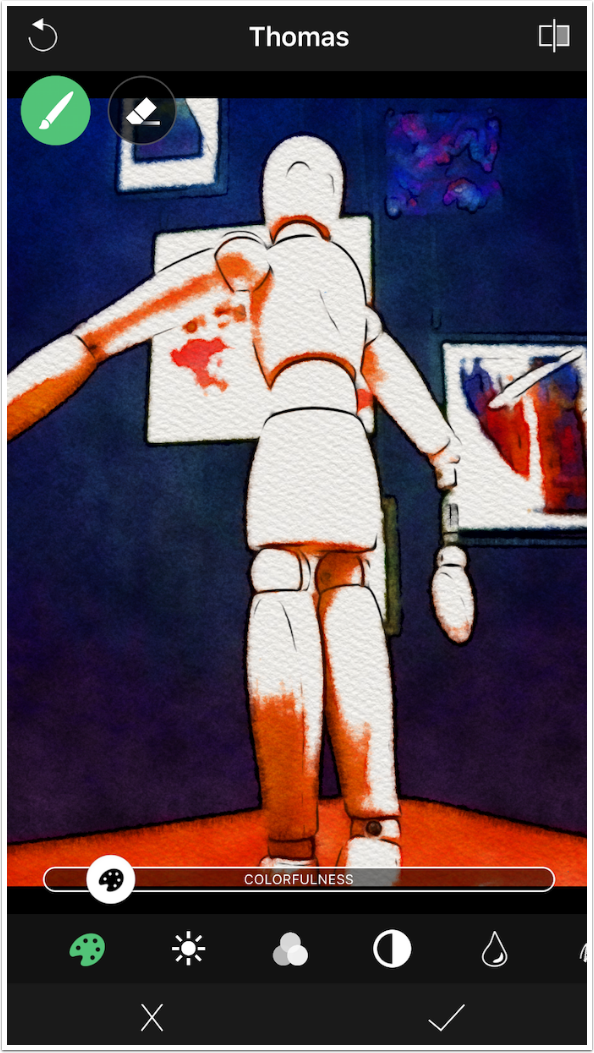
The first control, the Palette, is Colourfulness. This controls how much of the white paper is seen under the watercolours.
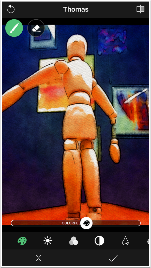
When I move the slider to the left, more of the canvas is shown.
For this image, I prefer to see more color and less white paper.
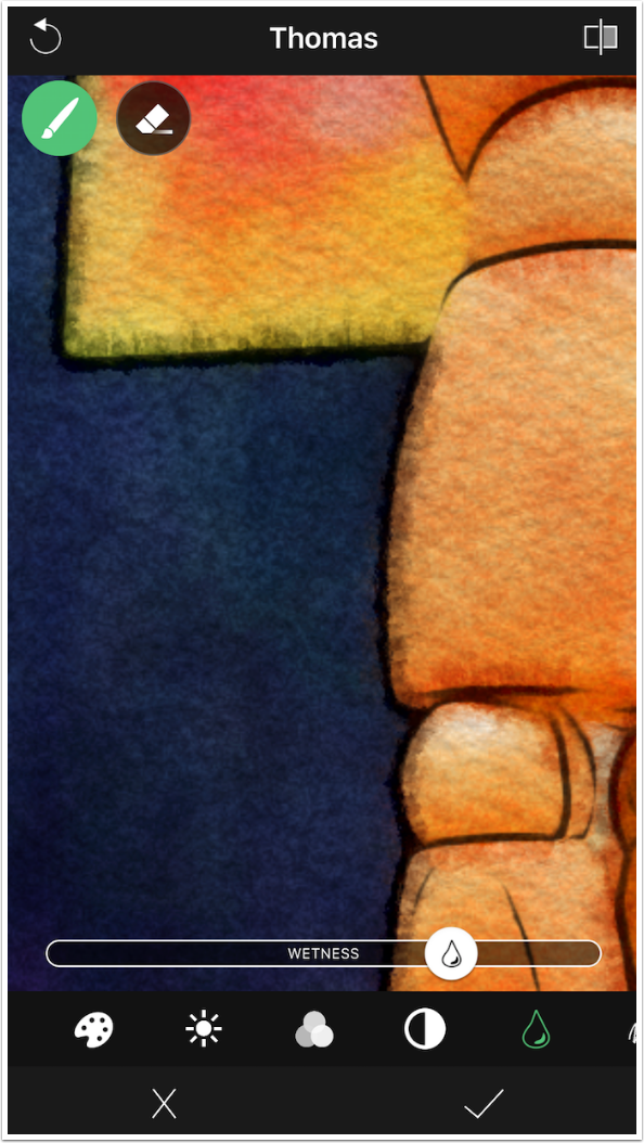
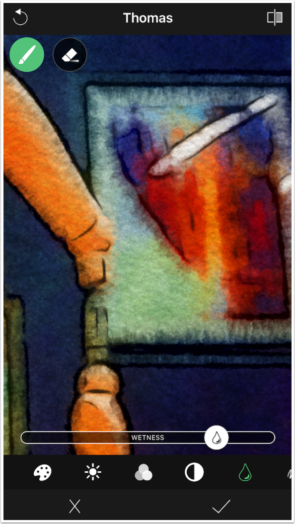
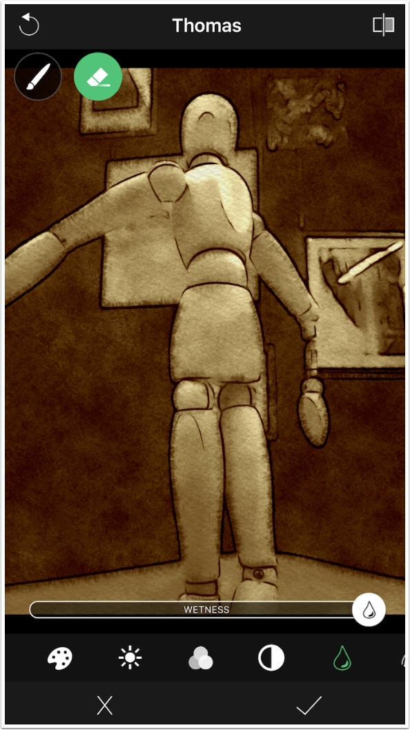
The next three controls are the familiar Brightness, Saturation and Contrast. Following that is the Wetness control. The wetter the color is, the more it will bleed into the surrounding area. I zoomed in so you could see that a high Wetness value makes the dark areas bleed into the lighter ones.
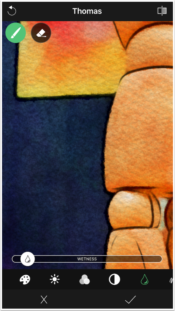
A low value, or dryer color, does not bleed.
The Brush and Eraser work the same in Watercolour looks. Below I erased the high Wetness value from the background painting.
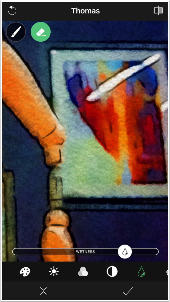
In the next screenshot I painted the Wetness back in, but it came in at 100%, just as it did in the Oils above.
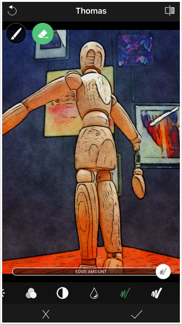
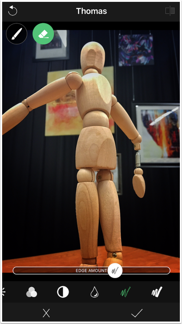
The next control is Edge Amount. The higher the value, the more edges you will see outlined in the result.
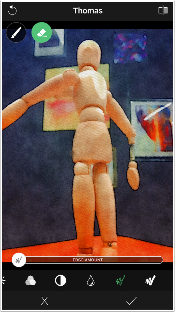
Moving the Edge Amount slider all the way to the left removes all edges.
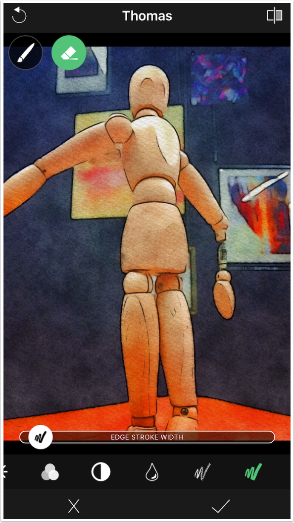
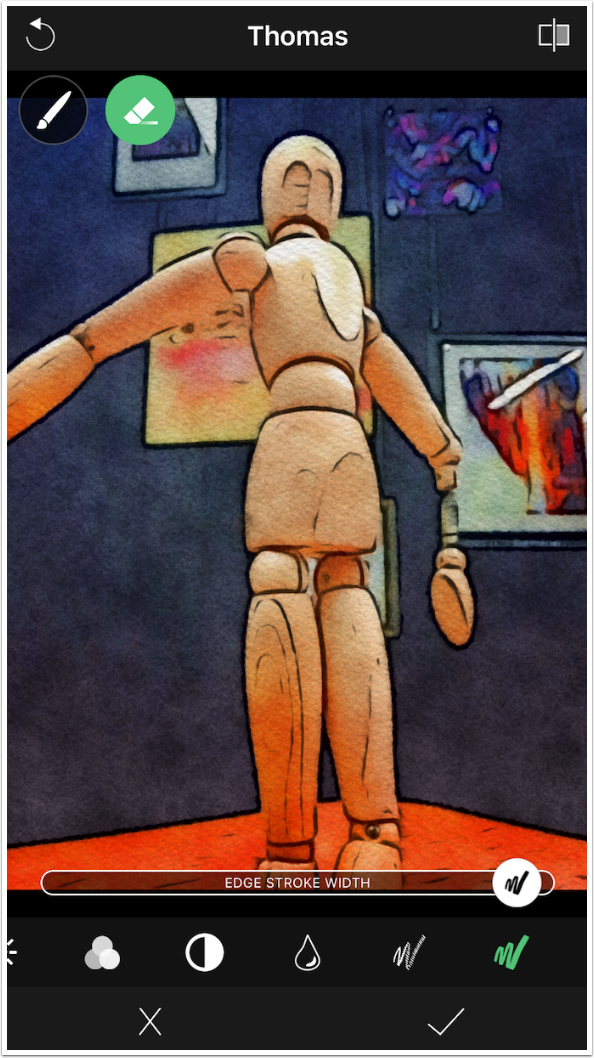
The final control is Edge Stroke Width. Below you’ll see a thin Width.
The image below has a Width that is near maximum thickness.
The compare button at the upper right shows you the original unpainted image, not the unmodified preset.
Of course, you can add a filter to the Watercolour looks as well.
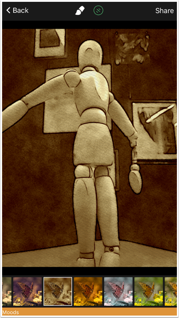
After adding a filter, you can adjust the Brush settings. Here I thought the Wetness value looked better at maximum with the sepia filter.
Here is my completed watercolour.
You can get interesting results from bringing different inputs into BeCasso. Below I processed the figure through Prisma before using an Oil look in BeCasso. I finished by adding some texture in Stackables.
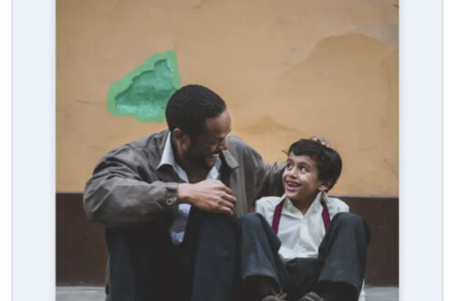
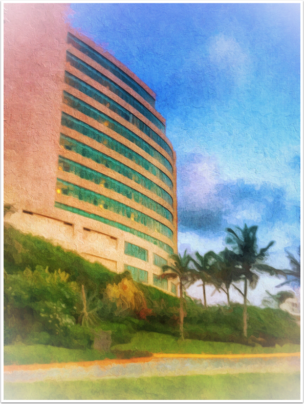
I processed this image in Snapseed before BeCasso, using HDR Scape and adding a white vignette.
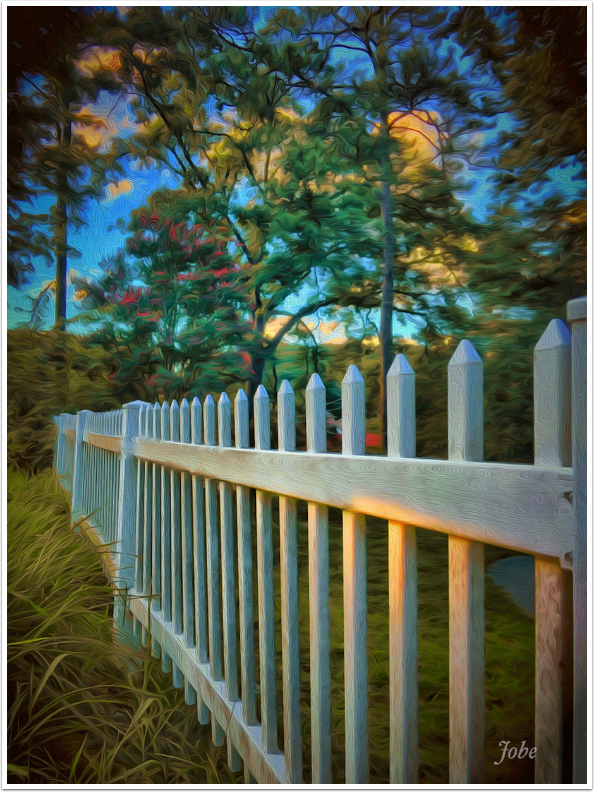
I’ll wrap up this long tutorial with one more example, also preprocessed with Snapseed’s HDR Scape and dark Vignette. If you look at the horizontal fence post, you’ll see that I used the “Squiggle” tool to smooth the paint in the direction of the post.
BeCasso can produce some quality looks at a relatively high resolution. It should run on older devices – I’d like to run it on my iPad. I also wish the Brush and Eraser would not default to 100% and 0%, so that I could truly control on a spot basis. So it’s not perfect, but it is a worthy app. Until next time, enjoy!
Jerry Jobe
Never content with just scratching the surface of what an app can do, Jerry Jobe decided to pass on what he learned about imaging apps to others. He’s constantly trying to figure out just what tools other artists have used, and trying to incorporate them into his own work, in an attempt to find his style. He’s written tutorials on over 145 apps so far, which you can find (along with his Song of the Day entries) at http://enthusiasmnoted.wordpress.com/ He lives near Atlanta, Georgia, where he also finds a creative outlet in acting and directing in community theater.