Mobile Photography / Art Tutorial – Four years of Tutorials: iColorama Basic Photo Enhancement
We are delighted to publish Jerry Jobe’s latest mobile photography/art tutorial for our viewing pleasure. This time Jobe takes a look a back at the past year and the 37 app tutorials he has created (we have linked to them below). He also takes a look at the highly accomplished app – iColorama to help you get to know it a little better. Take it away Jerry…(foreword by Joanne Carter).
“Well, another year has gone by. Four years ago, the day after the last US presidential elections, I started posting tutorials on iPhoneography apps. A lot has changed in those four years. I’ve covered over 150 apps, and learned a lot about how to manipulate images on your iPhone or iPad. Some consider me an expert, but all I really want to do is to make sure the average person who finds a love for digital artistry can use the tools they pick up, and perhaps let them know which tools to pick up in the first place.
If you’re interested in which 37 apps I covered in the last year, I will list them at the end of this article. But for now, let’s move forward!
Last week I covered Microsoft Selfie, an app that does noise reduction and skin smoothing on the fly on those selfies you grab. I was going to turn to Microsoft Pix, which does the same sort of thing for images you capture with the back camera. However, it’s a little more complicated than it should be and the results are mediocre. Also, it does not capture at full resolution. Quite frankly, I am getting tired of these kinds of apps that tout themselves as quick and wonderful and yet deliver below-par results. We deserve better. The technology is there, but the instant profit is not, so we get stuck with low-res images from a huge company like Microsoft.
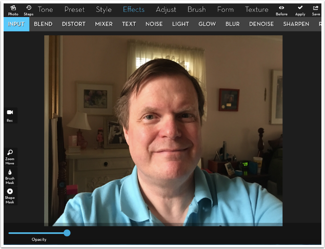
Can I get results as good with apps I already have? Well, sure. I can even do more, in just a couple of minutes, using an app like iColorama. In order to prove that I could get good results through iColorama using a low-res original, I took a shot with the front camera on my iPad. These cameras are known for not producing very nice images, and this one had a lot of noise and blockiness. Nevertheless, I wasn’t happy with the after image since it wasn’t that good an image to start with. The lower the resolution, and the more noise you have, the less likely you are to recover dark areas, such as the ones surrounding my eyes”.
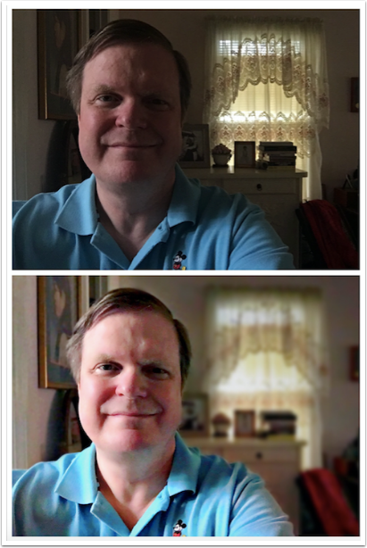
I’m using this image captured by my iPhone 6S+ back camera. There are a lot more pixels to capture that way. But I’ll be using the methods to recover a low-res photo, including the ones used by Microsoft Selfie and Pix. First of all, we’ll tackle noise reduction.
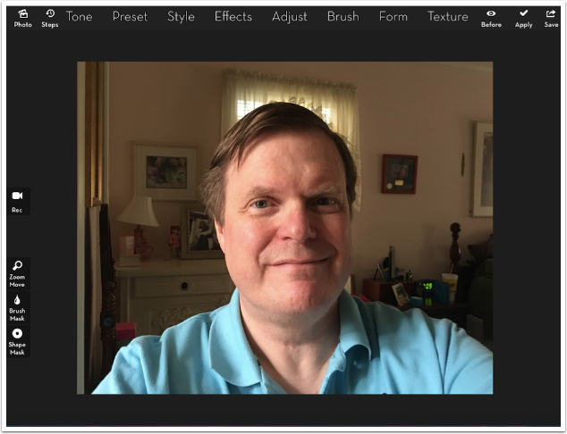
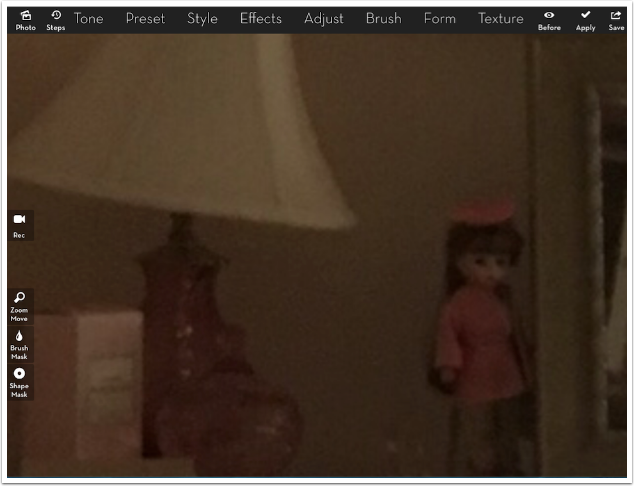
Zooming into the shadows reveals a lot of noise, even though we are working with a higher-res photo. I’m not a big fan of noise, but when I have any, I want it to be there because I put it there, not because the sensor produced it.
Effects>Denoise has four presets. The first and last are anti-aliasing, which is for the blockiness found in low-res photos. Anti-aliasing will try to smooth out the stairstep edges that are produced from enlarging pixels. This image doesn’t need those presets, so I choose preset 2 to Denoise.
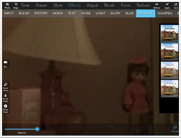
Denoise, even at a small Amount, smooths out all the noise, but at the cost of detail. We lose the doll’s features, the highlights on the lamp base, the ribs of the lamp shade, and other telling details.
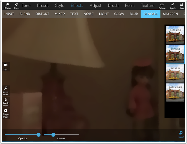
Therefore, I choose on this photo to lower the opacity of the Denoise to bring back some of the detail. It brings back some noise, but it’s negligible.
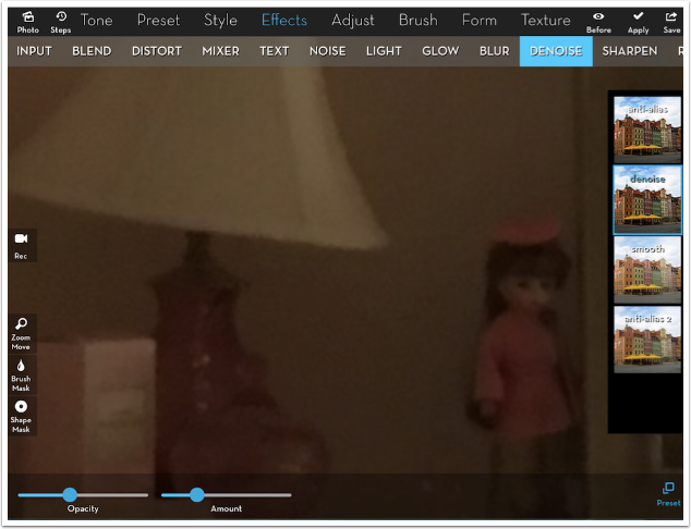
I zoom back out to see the effect applied to the whole image. Looks pretty good.
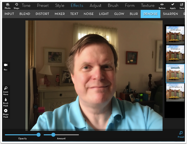
Selfie and Pix will also smooth skin. Many of us are happy to have our skin smoothed: it lessens the blotchiness fair-skinned people like me can get, and it reduces the impact of pores and freckles. Below I’ve applied Smooth, the third preset of Denoise, to the entire image. I like what it’s doing to my face, but not what it’s doing to the rest of the image. The curtains, especially, become a light, glowing block without a lot of the detail. But iColorama has masking, which allows me to apply smoothing to the skin without it affecting the hair, shirt or background.
I turn on the Brush Mask, and press Invert. I want to paint in the Smooth preset, not paint it out. I reduce the Brush Size and touch the chin. I press Show on the brush mask toolbar, and a red overlay shows the area that will not have Smooth applied.
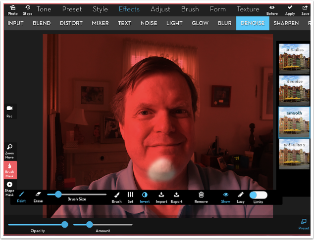
Zooming in and moving around, I paint over all the skin except for the eyes/eyebrows and the lips. I do not want to lose the details there. I even don’t mind the crow’s feet.
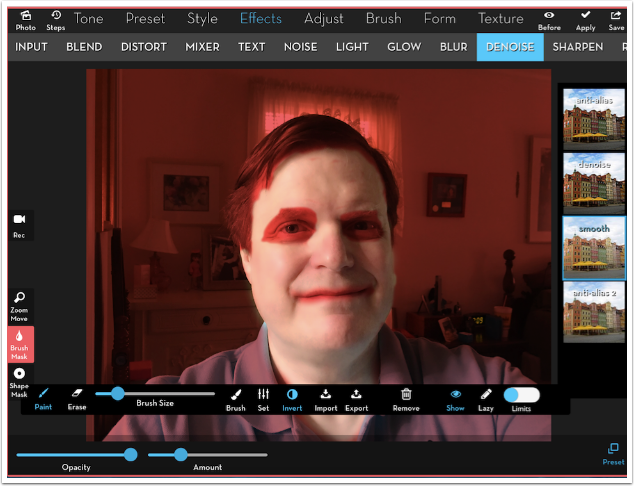
I tapped Show to remove the overlay and Brush Mask to hide the toolbar. Then I can use the Opacity slider to dial in just the amount of Smooth I want – in this case, about 90%.

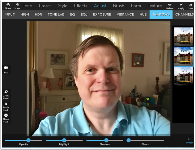
The next thing I’d like to do is bring up the shadows in the image a little – some of them are too deep. Under the Adjust menu is a Shadows option, and I use preset 2. Wow. That is ugly.
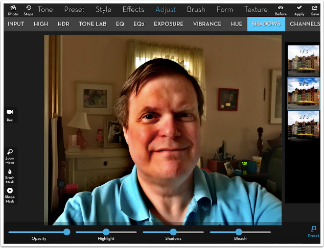
It’s ugly because I don’t need any of the Bleach. I move the Bleach slider all the way to the left and then bring up the Shadows slider a bit.
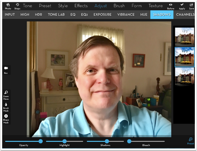
That’s really a bit too much, so I reduce the opacity to about 60%.
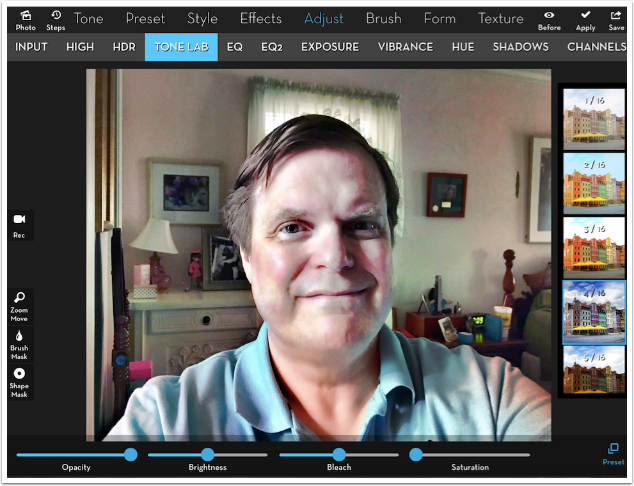
I want to give it a little pop by increasing local contrast. As it happens, Adjust>Tone Lab>4 is my favorite way to do that, even though it does some weird things to the colors. (It reduces the warmth, which I want to do at this point.) I’m obviously not going to use it at 100%.
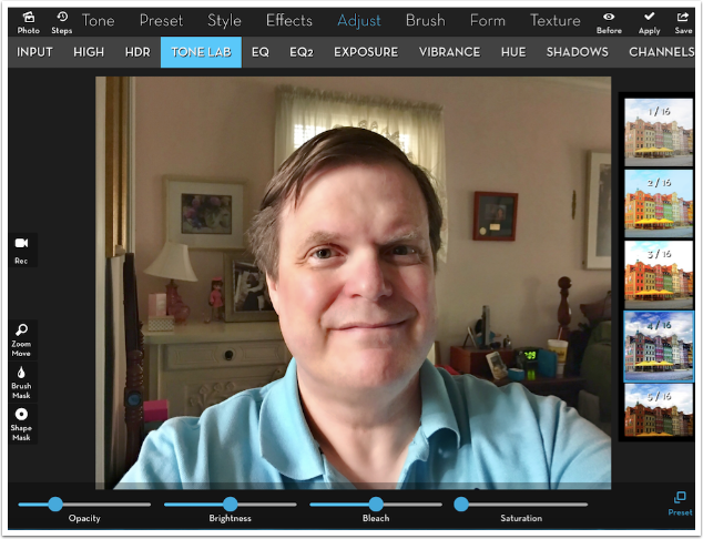
Reducing it to one-quarter strength is about right.
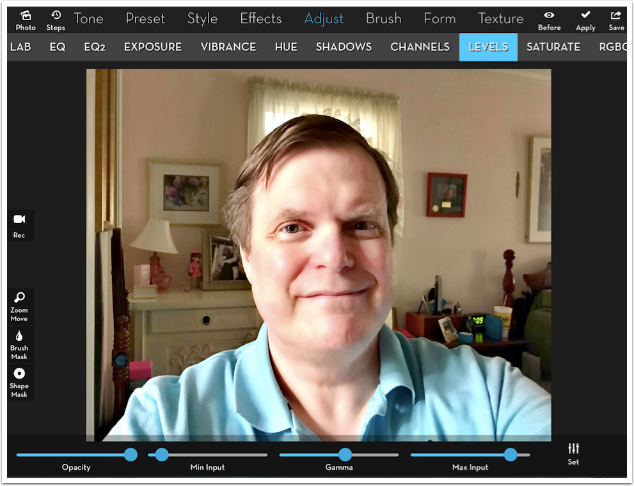
The Tone Lab preset was for local contrast. For overall contrast, I use Levels. I pull in the Min and Max Input sliders, and add a touch of Gamma.
The first app I covered in this fourth year was AfterFocus, which allows you to fake three different levels of focus. You mask in the area in focus, the area just out of focus, and the blurred background. Well, guess what? You can do the same thing in iColorama. Below you’ll see Effects>Blur>1 affecting the entire image.
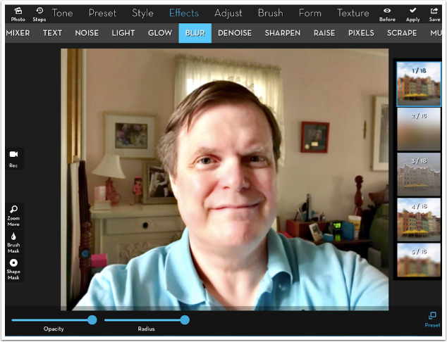
I want my face to be in focus, so I mask the Blur away from the face.
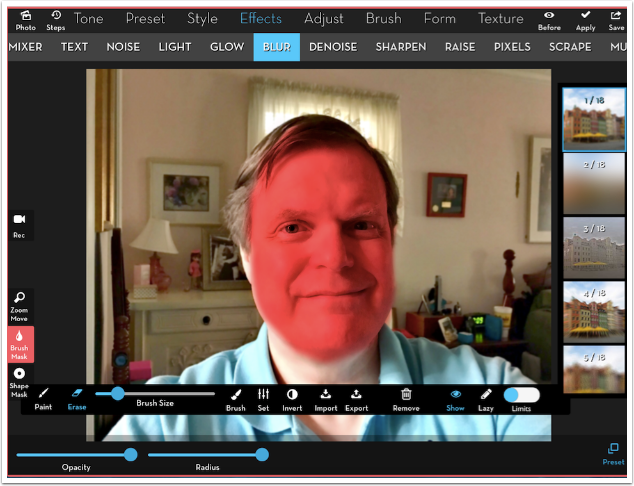
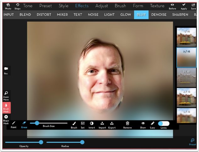
I also invert the mask and apply Adjust>High>2 to sharpen the face (not shown). I invert the mask again and switch to Effects>Blur>2 for the fuzzy background. This, of course, is way too fuzzy.
I pull the Radius slider almost all the way to the left, and get a good amount of blur.
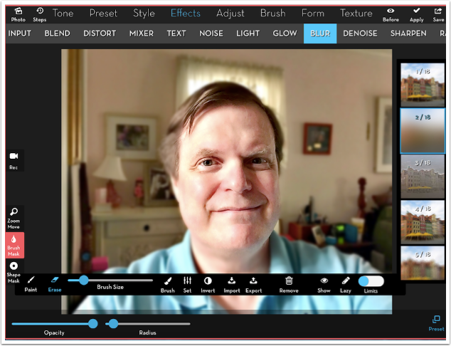
Now we need to add to the mask, to allow the “midground” to show through. I mask out the shirt, the remainder of the hair, and the nearest objects on the left side of the image.
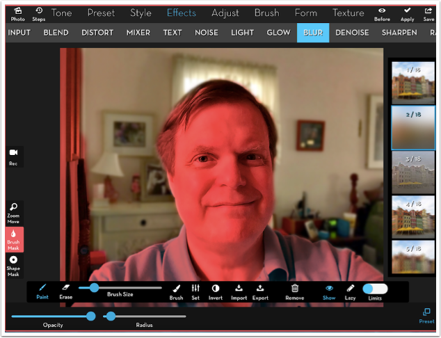
Below I’ve removed the red overlay to show you that you can get a fairly realistic “bokeh”, or depth of field, effect this way.
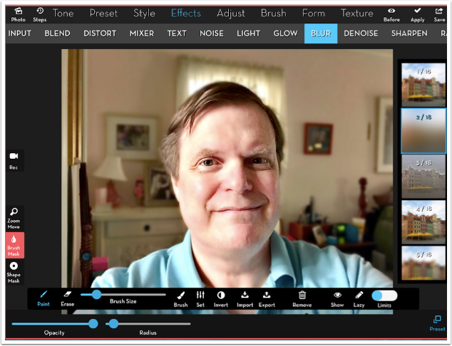
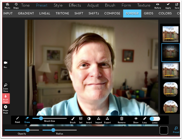
I decide I want to emphasise the figure a little more and make it stand out from the background. Focus is one way, and vignetting is another. Below I use Preset>Border>2 to do that. I keep the mask over the figure, and remove the portion of the mask that was masking the wall along the leftmost side.
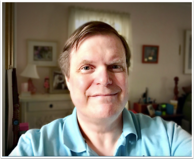
Here are the results so far.
There are any number of apps that give you filters that alter the color. Warming filters, cooling filters, cross processing filters, filters that change the tint. Did you know that iColorama has all kinds of these filters under the Tone menu? They really put all other filtering apps to shame, due to the number of them and the adjustability offered with masking and Opacity sliders. The Tone option shown below is LUTs, which I discussed in another article.
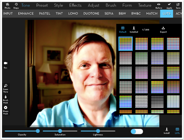
You can get some really interesting effects using LUTs.
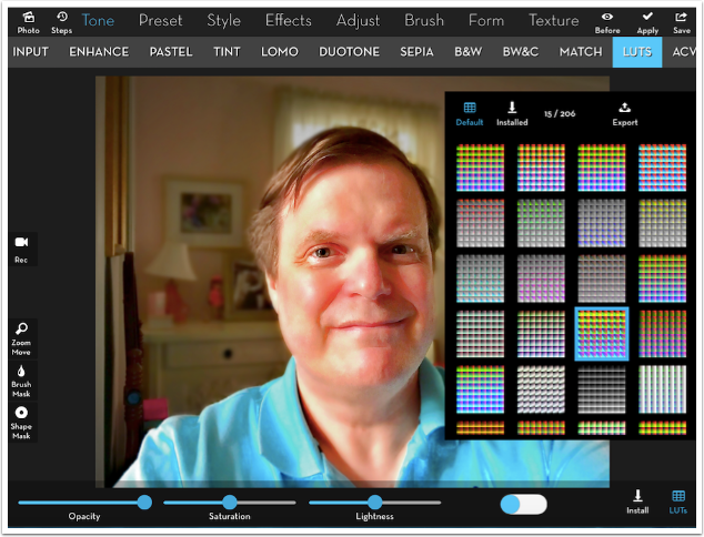
However, they are more “realistic” when you use the Opacity slider to reduce the effect.
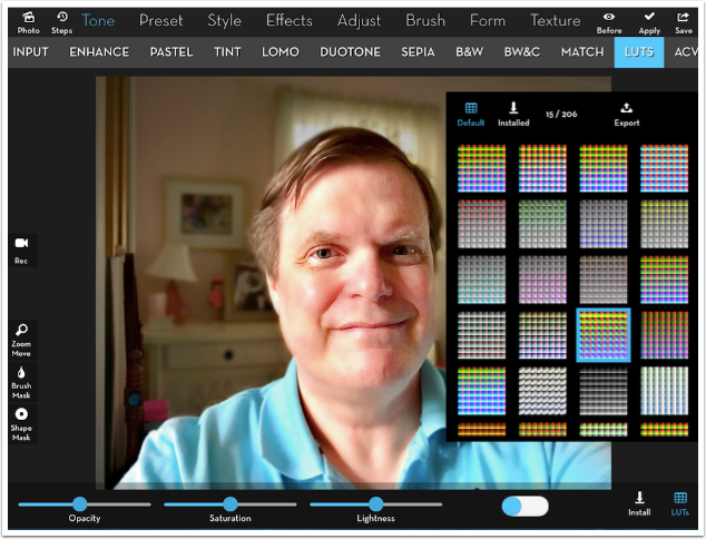
Many of the LUT presets will create a single tint or desaturate the image, but some act just like Instagram filters.
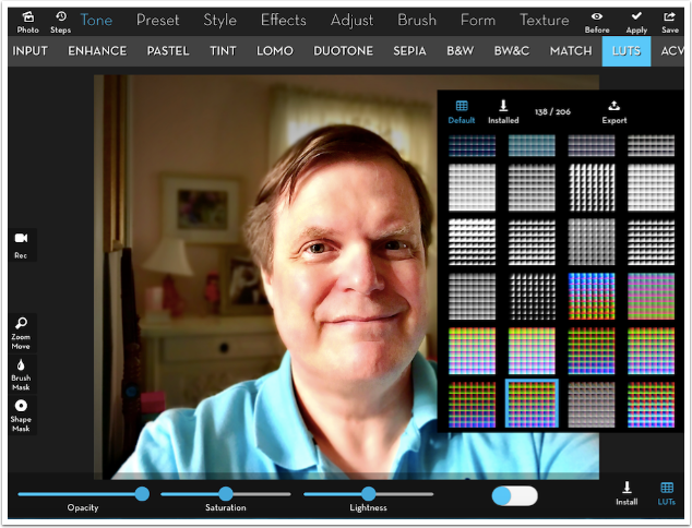
Filter presets are not limited to the Tone menu. Under the Preset menu are the five Colors options.
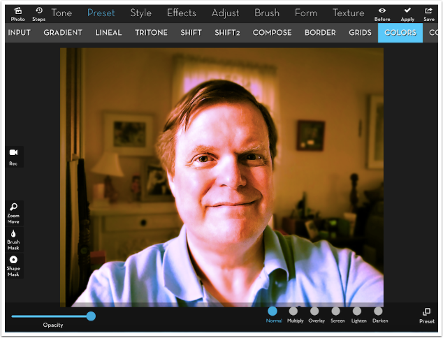
Each has anywhere from eight to 33 presets, and they can be applied in one of six different blend modes. By my count, that makes 786 different looks before you even touch the Opacity slider.
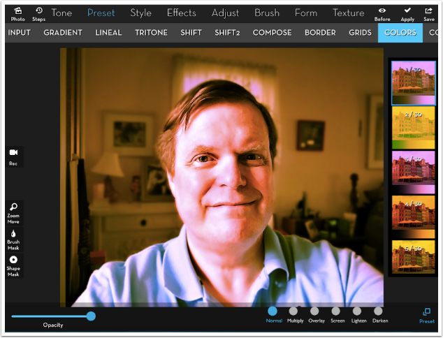
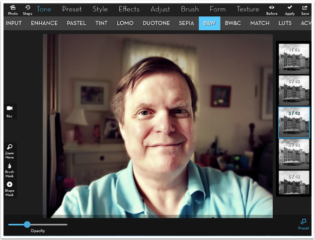
I decide to reduce the saturation. I could do that by using the Saturation slider under Adjust>Vibrance, but instead I use a Tone>B&W preset filter at lower opacity instead.
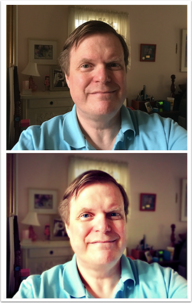
After adding some blue to my eyes, here is the finished image.

Of course, iColorama is not the only app out there that could perform the same tasks. Any app that allows for basic edits and masking or layering can do that. Leonardo, Pixelmator, Filterstorm, even Snapseed can do most or all of these things. The broader point I’m trying to make here is that sometimes you shouldn’t get caught up in the latest “app of the day”. Sometimes, you already have the ability to duplicate the “brand new” effect already in your arsenal. And sometimes the effect you create yourself is better, or at least more adjustable, than the effect you get quickly from the brand new app.
Until next time, enjoy!
Here are the 37 apps I covered in year four of providing tutorials. They are in alphabetical order rather than chronological, just click on anyone to be taken to the tutorial.
Popsicolor
Sky Lab
Please Support Us…
TheAppWhisperer has always had a dual mission: to promote the most talented mobile artists of the day and to support ambitious, inquisitive viewers the world over.
As the years passTheAppWhisperer has gained readers and viewers and found new venues for that exchange. All this work thrives with the support of our community.
Please consider making a donation to TheAppWhisperer as this New Year commences because your support helps protect our independence and it means we can keep delivering the promotion of mobile artists that’s open for everyone around the world.
Every contribution, however big or small, is so valuable for our future.
