Mobile Photography / Art Tutorial – A Return With Tips on iColorama’s Text on a Curve
We are delighted to publish Jerry Jobe’s latest mobile photography/art tutorial for our viewing pleasure. This time Jobe features some tips using the uber popular mobile art app iColorama to help you get to know it a little better. Take it away Jerry…(foreword by Joanne Carter).
“Life does go on, and people still have questions on mobile photo/art apps, so here we are with some tips on the latest feature for iColorama, Txtcurve. In July 2015 I wrote about an app called Path On that places text on a curve, which worked adequately. I am pleased to say that iColorama now gives you the ability to perform the same function within the app. Naturally, Path On has some bells and whistles that are not present within iColorama, but the feature is highly customisable and can deliver some nice results.
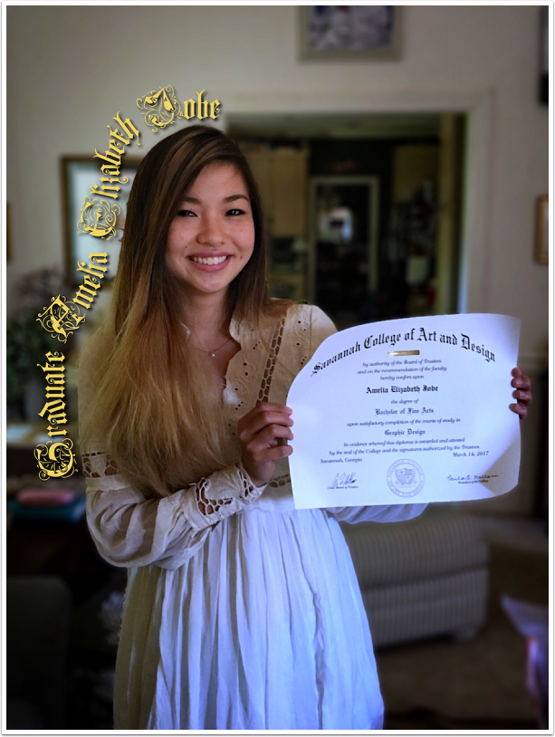
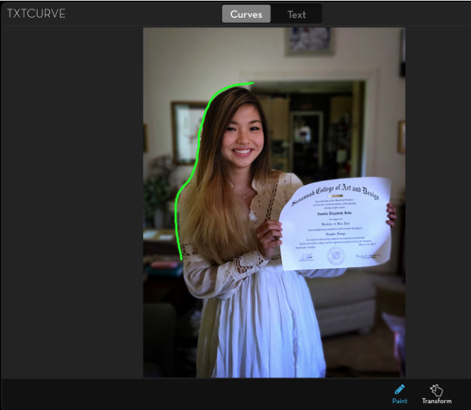
Here’s my daughter, a recent college graduate!”
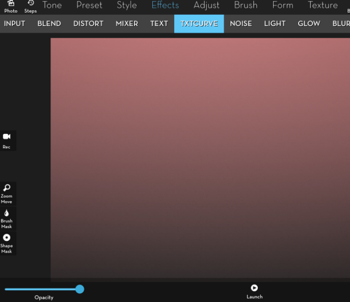
I start by creating a Gradient background so you can clearly see the text. Txtcurve is in the Effects submenu, next to Text. At the bottom you will see the word Launch, which opens up a “separate window” which will do the work.
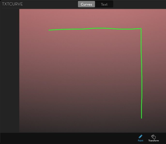
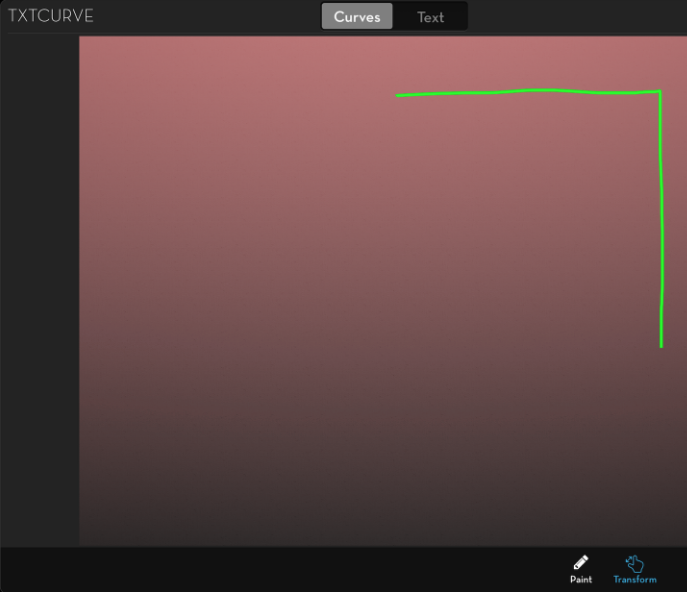
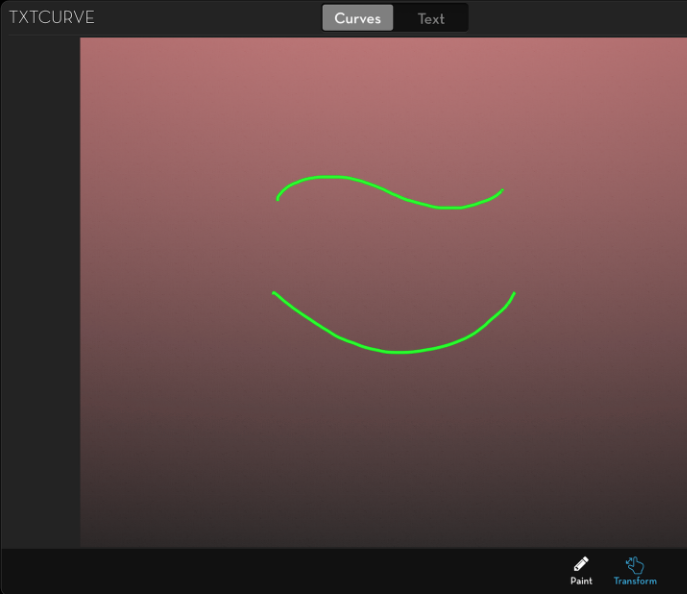
There are two buttons at the top center which bring up separate windows for you to create the Curve and edit the Text. We start in the Curve window, with Paint highlighted at the bottom. I draw across the screen from the top left, then down. The curve is in a bright green.
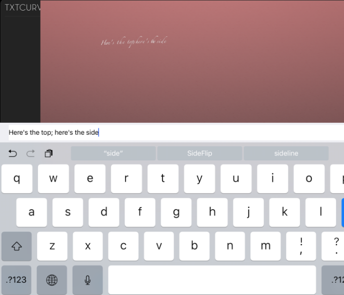
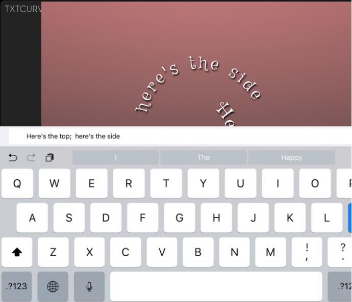
When I switch to the Text window, the curve is outlined with some “lorem ipsum” boilerplate text. Tapping the Edit button with the keyboard icon at the lower right brings up a keyboard for the entry of text. Unlike the Effects>Text feature, you can paste text, copy it, and edit misspellings and spacing by tapping into the text and correcting it. In the Text feature, you have to backspace through the text to edit it.
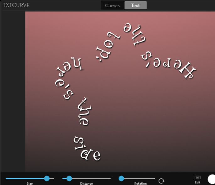
The default text is in a small, fancy font. Below I’ve changed the font and increased the size slider. As I increase the Size or the Distance between characters, the text will slide along the curve. Increase it too much, and the text will “drop off” the end.
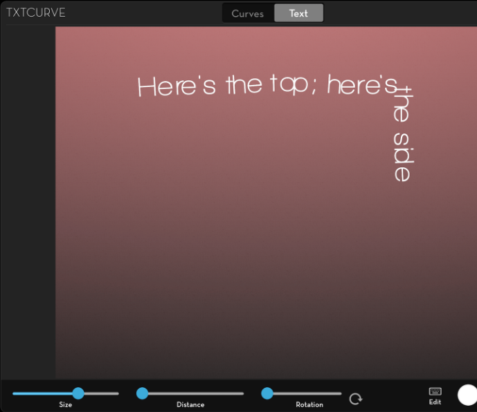
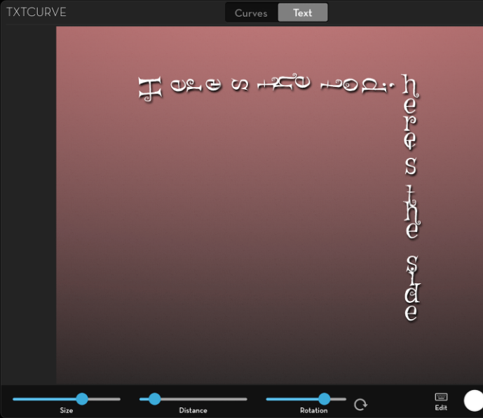
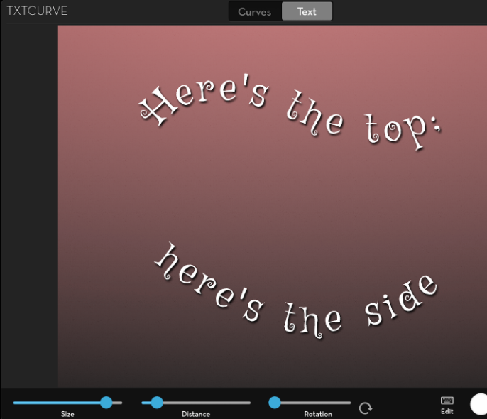
Below I increased the Size and the Distance until it broke correctly between “Here’s the top;” and “here’s the side”.
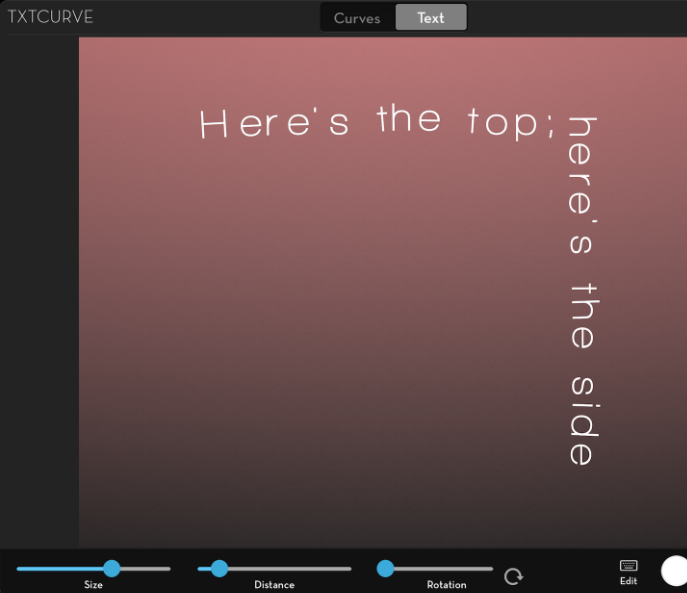
One of the drawbacks of text on a curve is that the curve can affect spacing between letters in a word. A tight curve can bunch letters together until they’re unreadable. There are two approaches to handling the kerning. Path On forces the letters into a rigid spacing, and you can increase or decrease the space overall. iColorama seems to use an automatic type of kerning, in which the software tries to compensate for the vagaries of the particular curve. It the example below, you can see that sometimes the kerning is not particularly good. “Here’s” comes out looking like “H er e’ s”. This automatic kerning is a function of the particular curve, text and font, and it can be hard to predict or adjust.
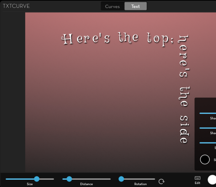
Below I’ve mitigated the kerning problem by changing fonts. The problem is still there; it’s just not as obvious. I’ve also added a Shadow by changing the Shadow X, Y, and Blur sliders. There is a color picker if you want to change the shadow’s color.
Rotation can come in handy to create vertical text, something that’s not available elsewhere in iColorama. I would want to increase the Distance if I wanted vertical text.
If you’re not happy with the curve, you can change it. Below I switched back to the Curve window and tapped the Transform button at the bottom. I dragged the curve up and to the right with a single finger, and a two-fingered pinch reduced it in size. You can also rotate the curve with two fingers, which is really nice.
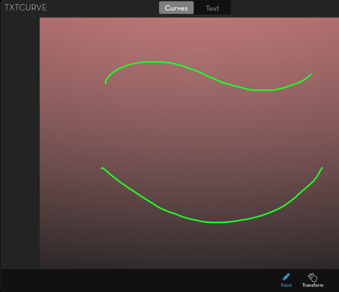
I can also Remove the curve using the trashcan at the bottom and draw in a new curve or curves. When you draw two curves, the text is added to the curves in the order you drew them. I drew the wave at the top before the bowl at the bottom.
When you return to the Text window, the text remains the same. There is no need to re-enter it. Now you can see that the text filled in starting with the wave, followed by the bowl. You can also see that since the curve changed, the kerning problem disappeared.
When you Transform curves, all curves are changed in tandem. It is not possible to change individual curves.
Txtcurve has already been updated, but I had the following screenshots that illustrated a concept I wanted to show that used the unfinished version. That’s why you don’t see the Transform and Curves buttons.
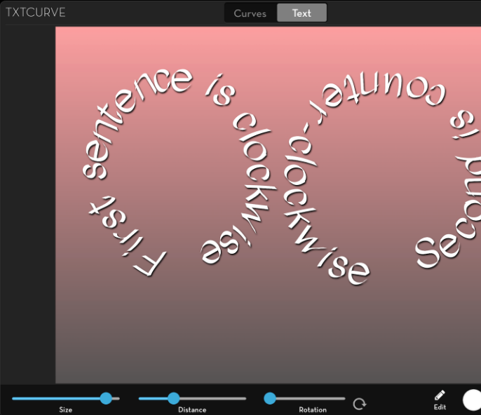
I drew two circles, both starting at the bottom. The one on the left was drawn clockwise, while the one on the right was drawn counter-clockwise. Will that affect the text that uses the circles?
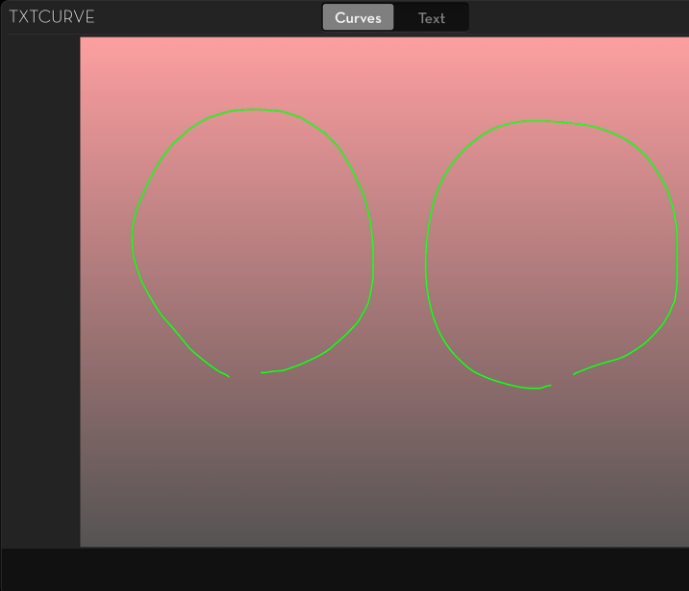
Yes it does! The text follows the direction in which you draw the curves.
iColorama contains some “canned” curves for your use, including hearts, stars, triangles, squares and spirals. There are ten of them available.
Below I used Curve 4/10, a curved star. You can tell by the text that the star was drawn starting at the top right and travelling counter-clockwise.
The spiral was drawn starting in the middle, moving clockwise. It gets pretty crowded at the middle.
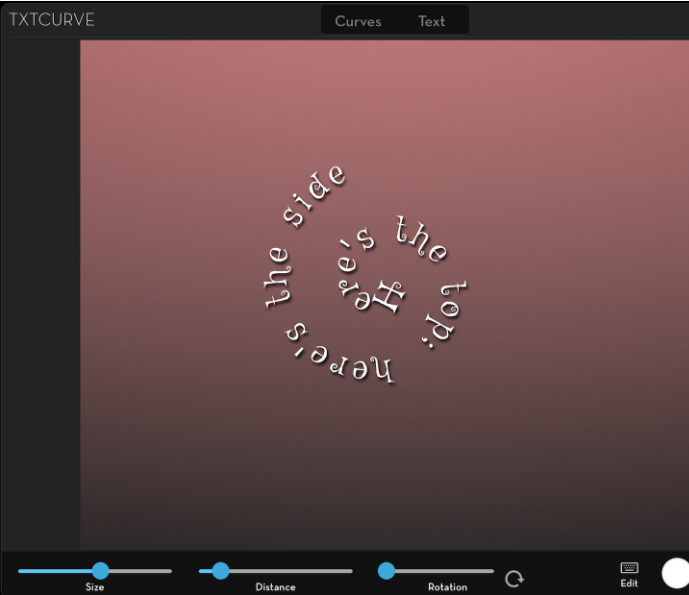
By adding some space at the beginning of the text, you can bypass the tight part of the spiral.
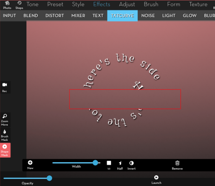
When you use iColorama’s Text feature, the text is applied as you leave the Text window. Using Txtcurve, the text has NOT been applied. (Remember to Apply so you don’t lose your work!) Therefore, it is possible to change the Opacity before applying. More importantly, you can mask the text before applying, using either Shape masks, as seen below, or Brush masks. In this way, text can be partially hidden behind mountains, clouds, trees or people.
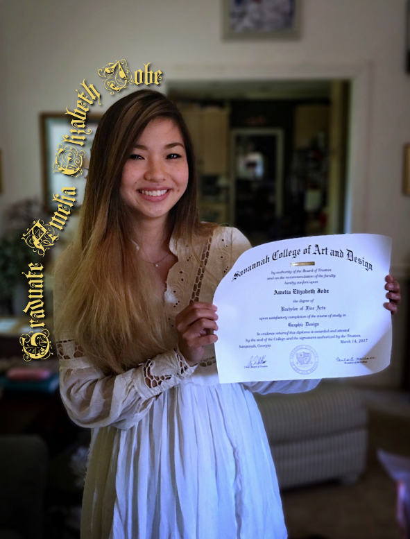
In the app Path On, text is placed on top of the curve that you draw, just like writing on lined paper. In iColorama, the curve passes through the center of the letters. This can make a difference. Below I drew my curve tightly hugging the outline of my daughter.
When I add the text, it overlaps onto her. It is obvious that the text is centered on the line I drew
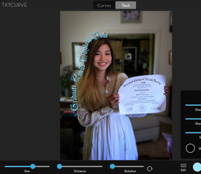
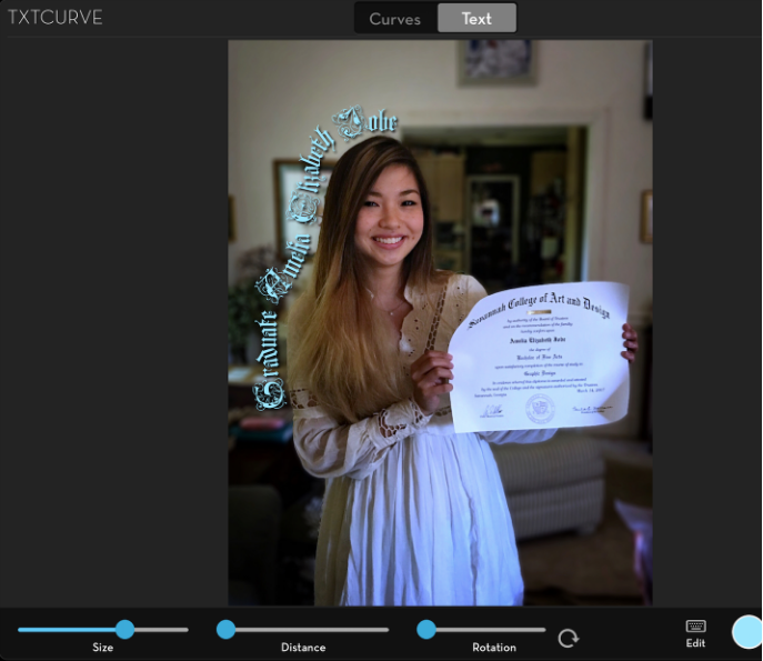
That’s no problem, since I can return to the Curve screen, tap Transform, and drag the curve away from her. It gives me the image that I posted at the top of the article.
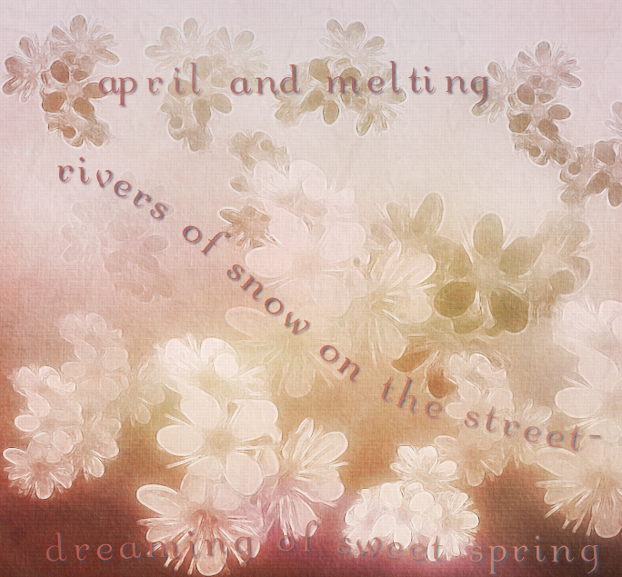
If you have need for text on a curve – and you may be surprised at what a nice thing it is – then try out the new Txtcurve feature in iColorama. Here’s an image I created with using the Clone Brush on a Gradient background. The text is from a haiku by a poet that calls themselves Broken Flowers.
Until next time, enjoy!
Please help us…
TheAppWhisperer has always had a dual mission: to promote the most talented mobile artists of the day and to support ambitious, inquisitive viewers the world over. As the years passTheAppWhisperer has gained readers and viewers and found new venues for that exchange. All this work thrives with the support of our community.
Please consider making a donation to TheAppWhisperer as this New Year commences because your support helps protect our independence and it means we can keep delivering the promotion of mobile artists that’s open for everyone around the world. Every contribution, however big or small, is so valuable for our future.
Jerry Jobe
Never content with just scratching the surface of what an app can do, Jerry Jobe decided to pass on what he learned about imaging apps to others. He’s constantly trying to figure out just what tools other artists have used, and trying to incorporate them into his own work, in an attempt to find his style. He’s written tutorials on over 145 apps so far, which you can find (along with his Song of the Day entries) at http://enthusiasmnoted.wordpress.com/ He lives near Atlanta, Georgia, where he also finds a creative outlet in acting and directing in community theater.
One Comment
Pingback: